Theatre Picasso at Tate Modern

From a hurried glance at the exhibition title and web page, I mistakenly assumed this was an exhibition about Picasso’s involvement in the theatre i.e. a detailed look at the succession of plays and ballets he did set or costume design for. This turns out to be completely wrong. There is one, relatively small, display case about his theatre, ballet (and film) work, but it’s a relatively small part of this exhibition. No, to explain it, we have to start from a different position.

2025 marked the centenary of the painting of one of Tate’s strongest Picasso possessions, The Three Dancers. Instead of doing the usual chronological overview of his career, Tate invited a couple of guest curators, contemporary artist Wu Tsang and author and curator Enrique Fuenteblanca, to review the entirety of Tate’s Picasso collection and come up with a new and inventive way of presenting it.

The Three Dancers by Pablo Picasso (1925) Tate

Performance

So, after some research and thought, the two guest curators came up with the idea that Performance was a central aspect of Picasso’s work and persona. Many of his works depict performances, not only onstage, but in the many paintings and drawings he did of bullfights, circus performers, acrobats and so on.

Portraits You can consider portraiture as a sort of performance, by both artist and sitter, in which both are playing a part. What else does the sitter do but pose? And so the exhibition contains a dozen or so portraits in different styles. What is being scripted, dramatised and performed in this picture?

Nude woman in a red armchair by Pablo Picasso (1932) Tate

Studio as theatre In which case, the studio is a kind of theatre in which the artistic performance takes place – so there are photos of his studio, paintings of the studio, and a particularly poignant late painting of an empty studio made in tribute to his friend and rival Henri Matisse a year after his death.

The Studio by Pablo Picasso (1955) Tate

Performing for the camera Picasso was always shrewdly aware of his image and loved performing for the cameras – so we have a short film of him dressed up as Carmen! photos of him posing on the beach wearing a fake bull’s head, and even a sound recording of him reading his own poems (all dwarfed by him performing in the documentary about him, see below).

Pablo Picasso wearing a cow's head mask at the beach, Pablo Picasso, Photography, 1949 : r/Art

Picasso wearing a bull’s head used for the training of bullfighters in La Californie, Cannes (1959) Courtesy Gagosian Photograph by Gjon Mili/Time and Life, in ‘Picasso Theatre’ at Tate Modern

Ballet and theatre And, as mentioned above, he was involved in costume and set design for a number of plays, operas and ballets so there are several display cases showing photos, designs and programs connected to productions of, for example Pulcinella, Parade, Mercure. He even wrote directed his own play, ‘Desire Caught by the Tail’, in 1941.

So as you can see, the exhibition takes Performance in the broadest sense as being the central thread or theme of Picasso’s life and art and then works through its implications.

Staged

First among these is the fact that the exhibition itself is conceived as a show and a sort of performance.

Behind the scenes This approach explains why 1) the first thing you see (before you get into the dark room) is a metal fence with random works tied to it and then 2) the passageway you walk along to get into the dark room is designed to look like the back of a stage set i.e. rude, unfinished wooden slatting supporting the fancy audience-facing facade on the other side. We are behind the scenes in a theatre, about to walk into the darkened performance area.

A gallimaufrey of Picasso works grouped together under the theme of Transgression (brothels and naked women) at ‘Theatre Picasso’ at Tate Modern (photo by the author)

Darkened space Normal exhibitions are divided into distinct whitewalled rooms. By contrast this one is a) set in a darkened space with black walls, and b) amounts to one main central space with temporary partition walls scattered about to support the works. It feels far more open, loose and walk-aroundable than most formal exhibitions.

Installation view of ‘Theatre Picasso’ at Tate Modern showing the black walls, darkened layout, mixed display (on the immediate left are the display cases showing photos and programmes from theatre and ballet productions he did. On the right is the ramp down to the audience viewing area, explained below (photo by the author)

A performance space This perspective explains another massive design aspect of this exhibition which is that the main space, the main display area for paintings, drawings, sculptures, photos and so on, is raised and framed by curtains as if it was itself a theatre, and the second space visitors walk into is on a lower level with a bench for you to sit and look through a prosceniun arch fringed by curtains at all the other visitors as if they’re on a stage. Yes, the curators have turned their own exhibition into a performance.

Visitors watching other visitors ‘onstage’ ie through a curtain-edged proscenium arch, in ‘Picasso Theatre’ at Tate Modern (photo by the author)

And here’s a view of the viewing room (which itself contains three fairly large works, notably The Painter and His Model (1926) on the right. Note the girl sitting on the floor drawing the scene; arguably she’s the one with the right idea: don’t watch, do).

Reverse view of visitors watching other visitors ‘onstage’ ie through a curtain-edged proscenium arch, incidentally showing a couple more late-period works, in ‘Picasso Theatre’ at Tate Modern (photo by the author) You can see how excited they are by the whole thing

The Mystery of Picasso

And finally, by far the most dominant feature of the whole show is a massive cinema screen onto which is projected in its entirety a 1956 French documentary film titled ‘The Mystery of Picasso’, directed by Henri-Georges Clouzot, which shows Picasso at work creating some 20 drawings. This is a huge installation, it is dynamic, it has lots of movement and colour, and it has a soundtrack by the avant-garde composer Georges Auric which is also very loud, varied and dramatic.

The size, the colour, the movement and the loud music totally dominate the entire space. So much so that the curators have installed tiered rows of benches for people to settle down on and watch the entire thing which runs to 75 minutes! On a rainy Sunday morning I settled down leaned back and watched the entire film, savouring the way the great man starts by creating simple marker drawings in black and white before progressing to full-scale collages and oil paintings.

The entire film is available to watch online. This appears to be the most complete version if not the best picture quality.

Comment on the film

One thing which comes over really, really, really strongly from the film is that, without exception, he overdoes it. All of the images start with a few simple lines and then he adds in more details and shading so that you magically see the image coming to life before your eyes. However, in almost all cases it reaches a kind of perfection of lightness and deftness but he doesn’t stop. He keeps on adding heavier and heavier washes of colour and ink, obliterating the airy lightness of the original under swamps of murky blues and thick black lines, until they feel utterly ruined.

Mixing it up

One last point. Having done all this, the curators take one more step which is not to present the 50 or so other works (paintings, drawings, fabric, sculpture, collage, cartoons, photos, set designs, theatre programs and so on) in boring chronological order. No, no, they take their inspiration from the first retrospective of his work which Picasso himself supervised, in 1932, where he went out of his way to mix it up, to place works from completely different periods and styles side by side. And so that’s what the curators do here, pairing up works from completely different periods by virtue of their theme or the aspect of performance which they demonstrate.

A nice mix of Picasso works from across his periods and styles in ‘Theatre Picasso’ at Tate Modern (photo by the author)

Thoughts

I’m not sure whether I like Picasso. I can appreciate that he was a genius who revolutionised art etc but that doesn’t mean I particularly warm to any of his individual works. He’s certainly not my favourite modern artist, I like scores of 20th century artists more than him, Paul Klee, Kandinsky, Schiele, Wyndham Lewis, Epstein, Nevinson, Spencer, Pollock, Riley, Saville, loads.

I like the lightness of some of his works, like the woman in a red armchair. But I actively dislike the pre-cubist portraits and I find the cubist stuff deadly dull – bottles of wine and fragments of Figaro, seen a couple and you’ve seen thousands. I can appreciate that the 1920s tubular women running along beaches is an achieved style, and I suppose I ought to admire the 1930s weeping women biting their fingernails etc. And ought to be moved by Guernica et al. The first time you see one of his dove sketches you think Wow, but after you’ve seen 20 or 30 the effect wears off.

I’m ranging over his different styles like this because that’s what this exhibition does, showcasing good examples of each of Picasso’s styles and periods, as well as demonstrating his range of materials or formats, such as painting, drawing, etching, woodcut, lithograph, print, fabric, sculpture and the aforementioned set and costume designs. It’s a very varied and impressive selection, and I could see that much of it is very good, but none of it touched me.

When I was a student I liked the Minotaur prints, in fact a girlfriend bought me a book of them I liked them so much, but I’ve gone off them too. They feel too fussy and too amateurish. Silly poses, cartoon faces, monotonous subject matter.

In fact wandering round the show I realised I’ve slowly gone off Picasso’s entire masculine ethos, the obsession with bulls and bullfighting and bullheaded men has come to seem steadily more ridiculous to me. Living in a culture where gay and lesbian and gender fluid ideas have become more prevalent, most of Picasso’s masculinist posing now seems not just dated but ludicrous. As you wander round this striking and ambitious exhibition, dominated by the big loud central film, you can’t help thinking: what a lot of naked women; what a lot of bulls.


Related links

Related reviews

Picasso

Tate

Turner and Constable at Tate Britain

Joseph and John

Joseph Turner was born in 1775, John Constable in 1776. In other words, it’s just about 250 years since their joint births. Tate owns big holdings of paintings, watercolours, sketches and related paraphernalia (paintboxes, journals, letters, sketchbooks) by both of them, so they’ve used the anniversaries to bring lots of this up out of the archives – plus substantial loans from other collections – in order to create a blockbuster exhibition placing two of England’s most popular painters side by side. The aim is to compare Turner and Constable’s differing origins, styles, subject matters and careers, and the way that, even during their lifetimes, they were pitted against each other as rivals, with rival visions of art.

Turner versus Constable: ‘The Golden Bough’ (left) by Turner, faces off against ‘Dedham Lock’ (right) by Constable, in ‘Turner and Constable’ at Tate Britain (photo by the author)

Obviously, it’s full of lot and lots of good stuff but I confess I didn’t really enjoy it. I finished it with a great sense of relief and couldn’t wait to escape.

Massive exhibition

I expected the exhibition to be packed and it was, but I hadn’t anticipated it being quite so big, thorough and exhaustive. It contains some 190 oil paintings, watercolours and sketches, as well as seven or eight display cases containing everything from their paintboxes and brushes to Turner’s dismantled fishing rod (!).

Four outdoor sketches by Turner along with his dismantlable fishing rod, in ‘Turner and Constable’ at Tate Britain (photo by the author)

Most exhibitions are in 7 or 8 rooms but this one stretches to 12, concluding with a set of videos by contemporary artists (Bridget Riley, George Shaw, Emma Stibbon and Frank Bowling) describing aspects of Joseph or John which inspire their own practice.

The wall labels are admirably thorough in introducing each of the 11 or so major themes which each room addresses, plus detailed captions for many of the paintings, watercolours, sketches and objects – but there are just so many that by the end I was full, I couldn’t read anything more, and I was relieved to give up the effort.

Also, heretical though it is to admit it, I don’t really like Turner, I never have; and I like Constable in small doses but here, faced with 80 or more works, the brilliantly glorious works are diluted by a lot of much more humdrum stuff. Exposed at such length, over so many works, the weaknesses of both artists become more and more glaring and – for me – began to drown out their strengths.

For example whereas Turner arguably came into his own in his later years, from 1830 onwards, the final room shows four of Constable’s last works from 1835 to 37, and I thought they were really dire: they look like his Hay Wain-style landscapes but put through a blender or painted by someone with serious eyesight problems (details below).

In the end I found myself equally put off Turner’s huge shimmering light experiments and Constable’s sometimes lovely but often very scrappy Suffolk landscapes, and found relief in the much smaller, lighter watercolours and sketches by both artists, although Turner was generally better at these (see below).

To put it another way, I came away from the National Gallery’s small, thoughtful, very focused exhibition about the Hay Wain liking and appreciating Constable more. Whereas I left this exhibition with a measurably lower opinion of him, and hoping I don’t see another Constable for a long time.

Main points

Constable focused largely on the English countryside, especially the Stour Valley in Suffolk, developing a distinctive practice of outdoor oil sketching to capture natural light, weather, and atmosphere with unprecedented immediacy. His textured brushwork, bright colours, and close study of skies challenged academic conventions and gradually earned critical recognition.

Turner, by contrast, was a prolific traveller whose work ranged across Britain and Europe. He explored dramatic subjects from the sublime forces of nature to modern technology, working across oil, watercolour, and print. His radical handling of colour and light, particularly in watercolour, pushed the medium to new artistic heights.

So Constable was, on the whole, a homebody, whereas there’s an entire room devoted to Turner’s extensive trip to Italy, displaying his sketchbooks, explaining the detailed preparations he made, showing preparatory sketches and some of the huge oils he did of dramatic Alpine scenery. For the rest of his life was liable at the drop of a hat to produce another enormous work set in Venice or Rome or the Alps.

Still, the early works produced soon after that trip can be breath-taking.

The Passage of Mount St Gothard from the centre of Teufels Broch (Devil’s Bridge) by JMW Turner (1804) © Abbot Hall, Kendal (Lakeland Arts Trust)

Room summary

Room 1. Starting out (8 prints, 10 paintings)

Eight paintings including Turner’s self portrait and two portraits of Constable.

Turner was born in London, the son of a Covent Garden barber, Constable to a prosperous family in the Suffolk village of East Bergholt.

As a teenager, Turner earned money alongside his art studies at the Royal Academy. He worked as an architectural draughtsman’s assistant and a watercolour copyist, which introduced him to a wide range of art. He was a commercially minded, fast-rising young star who first exhibited at the Royal Academy in 1790 aged just 15.

By contrast, Constable was largely self-taught and undertook extensive sketching tours in order to perfect is artistic technique, not exhibiting at the Royal Academy until 12 years after turner, in 1802.

Both trained at the Royal Academy. Training at the Royal Academy centred on drawing the human figure. It aimed to produce painters of grand historical and mythological subjects. Landscape was far down its artistic hierarchy – so the main way both artists were innovators was in proclaiming landscape painting as a high genre in its own right.

It’s odd that the Academy focused on figure drawing when both Turner and Constable are dreadful, awful painters of human beings. It’s one of the things I dislike about them both. Any Turner painting with people in is going to be embarrassingly bad (see below). Constable’s figures are more superficially attractive until you go up close and see how gawkily the bodies are composed and how terrible the faces are, if he’s bothered with them at all. Constable’s clouds, ten out of ten. His faces, nil.

Room 2. Constable sketching outdoors (14 sketches, display case, chair)

Fourteen sketches and a display case showing his paintbox and palette. My wife and I both thought the most interesting thing in this room was Constable’s sketching chair.

Constable’s outdoor sketching chair in ‘Turner and Constable’ at Tate Britain (photo by the author)

Room 3. Turner in the Alps and Italy (4 big paintings, 7 sketches, 5 sketchbooks, display case)

A pause in the long war with France in 1802 allowed the 27-year-old Turner to travel to Paris, then on south to the Alps, Switzerland and the Val d’Aosta. Thirteen years later, when the wars finally ended in 1815, he went again. His extensive preparations for the six-month trip included reading guidebooks and making sketches of other artists’ views of key sites to visit. Turner was hungry for Italy’s scenic riches. He filled 23 sketchbooks five of which are on display here and came home with imagery that would underpin decades of finished paintings.

One of Turner’s extravagant fantasias from Italian history – Caligula’s Palace and Bridge by J.M.W. Turner (1831) Tate

Remember I was saying how poor Turner’s human figures are? From a distance they pass, they appear to fit in with the blurry mode of the paintings. But go up close and they’re embarrassing. Here’s a close-up of the most prominent two figures in this work.

Detail of Caligula’s Palace and Bridge by J.M.W. Turner (1831) Tate

The basket and hula hoop and kettle and the blue cloak at bottom right, yes. The two goats at top right, yes. But the two human figures on the left? The bloke’s legs, yes, but their faces? They look like Punch and Judy.

Room 4. Turner’s watercolours (6 watercolours, 10 sketchbooks)

Going back and forth through the rooms, slowly overcoming the sheer scale of some of the enormous paintings here, it takes the mind a little while to adjust to the scale of the smaller, more delicate sketches and watercolours. Eventually I came to think these were the works I liked best.

Turner at his most attractive: four (relatively) small watercolours, in ‘Turner and Constable’ at Tate Britain (photo by the author)

A contemporary critic wrote: ‘Another mused: ‘blended and sometimes delicately contrasted as [Turner’s] colours are – the effects are exquisitely tender, but not without sufficient force, from a certain magic arrangement, a graphic secret of his own’ and in many of them, you can see what he meant.

Room 5. Turner’s studio (9 paintings, 10 cloud studies)

Turner’s studio was a chaotic shambles. His landlady owned seven Manx cats and these are allowed to roam over wet paintings; we know this because their paw prints have been found. At his death it was discovered that he’d used his own paintings to block up gaps in the roof and had cut a catflap into one of them.

Room 6. Constable fields and sky (9 paintings, 10 cloud studies)

Most contemporary artists made extensive sketches on location then took them back to their studios to work up into finished compositions under controlled indoor conditions. In 1814 Constable began completing entire paintings on location, out of doors, and there are plenty of examples in the Hay Wain / Dedham Lock manner, as well as numerous preparatory sketches.

Taking this a step further, in 1819, Constable rented a house in Hampstead, then a village outside London where he started making rapid oil sketches of clouds, a practice he called ‘skying’. These works reflect Constable’s keen interest in weather.

Some of Constable’s cloud studies in ‘Turner and Constable’ at Tate Britain (photo by the author)

His preoccupation with the sky is evident in his dramatic 1823 depiction of Salisbury Cathedral, which became another recurring subject and is given the full Mona Lisa treatment in this show, complete with visitor bench to sit and gaze in awe.

Constable’s painting of Salisbury cathedral given the full treatment in ‘Turner and Constable’ at Tate Britain (photo by the author)

Room 7. Big is beautiful (5 Turner, 4 Constable huge paintings)

Both artists struggled to get noticed and one easy way to do this was to make their paintings big, really big, ginormous. Turner was already doing his huge classical and mythological paintings. In 1819 Constable joined him by exhibiting the first of his huge canvases (what he called his ‘6-footers’) ‘The White Horse’, and its appearance for the first time triggered comparisons with Turner. They were both now competing in sheer size – but what a complete difference in subject matter and style.

The White Horse by John Constable (1819) © The Frick Collection, New York (photo by Joseph Coscia Jr)

This feels like a great painting. If there had been just 4 or 5 works like this you’d have gone away inspired. It’s the fact that it’s accompanied by about 80 others, sketches, scraps and some decidedly bad works, which dilutes its effect.

Room 8. Fire and water (4 massive paintings: 3 JC, 1 T)

The rivalry was real. By the late 1820s Turner was the well-established master in all forms of landscape (oil, watercolour, prints). Constable only achieved official recognition in 1829 when he was finally made a member of the Royal Academy. To quote the curators:

Two years later, they came to blows. Artists hated being hung next to Turner in the Royal Academy’s annual exhibition because his paintings ‘caught your eye the instant you entered the room’. In 1831, Constable took up the challenge. As a member of the committee responsible for placement of works in the exhibition, he hung his Salisbury Cathedral from the Meadows next to Turner’s Caligula’s Palace and Bridge. The arrangement gave Constable’s own painting prime position. At a dinner party, Turner apparently came ‘down upon him like a sledge-hammer’. One onlooker recalled dramatically that Constable ‘wriggled… like a detected criminal’.

Room 9. Late Constable: ‘beyond Constable country’ (9 sketches, 3 big paintings)

With election to the Academy in 1829, Constable moved to expand his subject matter, producing works set in Brighton and London, away from his home turf in the Stour Valley. He tackled coastal storms and grand neoclassical architecture. I didn’t like his Brighton paintings but some of the sketches of the beach were appealing.

Rainstorm over the Sea by John Constable (1824-1828) © Photo Royal Academy of Art (photo by John Hammond)

I was tickled to read that Constable didn’t like Brighton and dismissed it as ‘Piccadilly by the seaside’. Plus ça change, eh?

In this room the curators are showing a clip from Mike Leigh’s 2014 movie, Mr Turner, dramatising another famous moment in their rivalry, when both painters had work hung in the 1832 Academy exhibition and Turner (played by Timothy Spall) adds a last-minute red buoy to his painting Helvoetsluys: Fishermen at Sea in order to catch the viewer’s eye and distract it from Constable’s long-laboured over piece, The Opening of Waterloo Bridge – which triggered Constable (played by the stalwart character actor James Fleet) to walk out in a huff. At least it’s all very dramatic in movieland.

Room 10. Late Turner (9 paintings, 8 sketches)

Turning 60 in 1835, Turner could have rested on his financial position and slowed down but he kept up the pace. 1835 saw him take one of his most extensive and taxing European sketching tours and he continued to travel abroad for another decade. He made topical paintings of contemporary subjects, including the fire that destroyed the Houses of Parliament.

The Burning of the Houses of Lords and Commons, 16 October 1834 by JMW Turner (1835) Cleveland Museum of Art

Favourite locations like Venice and the Swiss Alps came back into focus with repeat visits. There’s a really dreadful giant monster of a painting depicting Juliet and her nurse in a typically gauzy, highly romanticised Venice when, of course, the play is set in Verona, 120 kilometres away.

On the other hand, some of these late watercolours are truly visionary, and the curators are right to single out The Blue Rigi, Sunrise (1842) as awe inspiring.

The Blue Rigi, Sunrise by Joseph Mallord William Turner (1842) Tate

Room 11. Landscape and memory (3 Turner, 4 Constable, 4 prints)

Constable died in 1837, by now accepted as a classic. But his last years were saddened by the absence of his dead wife. The curators suggest his late paintings are clouded by melancholy but optimistically claim they reverberate with energy. Well, the four they hang in the final room are awful. They revert to the Suffolk subject matter but as if someone had thrown a bucket of mud over them. The palette has lost all its brightness and sparkle, everything is black and grey and mud. A couple of them have sets of diagonal white slashes across them as if someone had repeatedly stabbed them with a knife. They’re so horrible I made a list to show you:

My wife wondered whether he must have been suffering from some eye problem, cataracts or something, which would explain their dirgelike darkness, their fevered, cluttered, murky feeling. But that can’t be true because alongside it the curators hang a marvellously limpid and detailed drawing of fir trees on Hampstead Heath.

Fir Trees by John Constable (c. 1833) The Higgins Art Gallery & Museum, Bedford, UK/Bridgeman Images

(Incidentally,  you can see the join three-quarters of the way down the work; this is because Constable had originally drawn just the upper part of the tree but ended up devoting so much time and effort to it, that he glued on an extra strip of paper at the bottom so he could continue it down to the roots.)

Anyway, the point is that, if he could produce extremely clear, detailed and lucid drawings like this, then the dire appearance of a late painting like On the river Stour (1834) was an artistic choice.

By contrast with the murky Constable, this final room contains arguably the best Turner in the exhibition, certainly the one I liked best, Norham Castle, a work of pure luminousness, almost completely untainted by worldly subject matter.

Norham Castle, Sunrise by Joseph Mallord William Turner (c.1845) Tate

Room 12

This room is devoted to a big video screen onto which is projected an 11-minute-long film featuring interviews of contemporary artists Bridget Riley, George Shaw, Emma Stibbon and Frank Bowling, giving their opinions about T and C.

What’s really striking about this video is that it contains many tasteful close-ups of T and C’s works and these often make the paintings seem much more interesting and exciting and innovative than the complete, wider works do. It was a revelation to think of both their paintings like this, as collections of good bits which frequently impress more as inventive and wonderful details than they do as often contrived and stagey wholes.


Related links

Related reviews

The 80s: Photographing Britain @ Tate Britain

Linton Kwesi Johnson

Johnson isn’t mentioned anywhere in this exhibition but thinking about the 1980s made me dig up favourite playlists, and I ended up writing most of this review listening to his great 1979 album, ‘Forces of Victory’.

Introduction

Sometimes you wonder whether exhibitions at the Tate galleries are really about art at all any more, but aren’t more like polemically woke sociology lectures, with art, photography, sculpture and other evidence used merely as illustrations for a familiar set of well-worn, ‘radical’ themes.

This exhibition contains rooms or sections devoted to immigration, race, race riots, racism, the Black Experience, the Black Body, the Queer Black Body, feminism, identity, gender, colonialism, imperialism, immigration, sectarianism, pollution and environmentalism. As you can see, these look like the topic tabs on the Guardian website or a list of fashionable humanities subjects at any modern university.

As to the lived experiences of anyone not a left-wing activist, not a feminist, not Black or Asian, and not gay or lesbian during the 1980s, these are less in evidence than the subjects I’ve just listed and where they do appear, it’s mainly to be mocked and ridiculed.

I visited with a friend and we loved the first room because it is packed with a Greatest Hits selection of political issues from the 1980s: photos of anti-racism demonstrations (by Syd Shelton and Paul Trevor), of Rock Against Racism gigs, of the Miners Strike (by John Harris and Brenda Prince), of Greenham Common (by Format Photographers), protests about Section 28 and AIDS, all leading up to the Poll Tax riots – yes, all the usual suspects, shot in vivid black and white, which took us both back to our heady student days.

But as the exhibition progressed her enthusiasm turned to puzzlement and then irritation and, by the end, she was so fed up with being lectured about identity and gender and race and queer Black bodies that she gave up. She described it as the worst exhibition we’ve been to this year and I came to agree. If you read all the wall captions (as I’m addicted to doing), it felt like being trapped in a lift full of woke humanities lecturers all talking at the same time.

‘No title’ from the series Strictly by Jason Evans (1991) Tate © Jason Evans

The central problem with this exhibition

I naively thought the exhibition would be a portrait of the 1980s, that the curators would make an honest attempt to give a balanced account of this troubled decade and the wide range of social and cultural changes it witnessed, as captured in photography – that it would be a visual history of the decade.

Very wrong. What the curators have done is to make a personal selection of just the radical photographers from the period who covered what they think are the important issues (then, as now), the disruptors, the radicals, the subversives. And, as mentioned, although they initially touch on many of the obvious issues of the time (the Winter of Discontent, Thatcher, Miners Strike, unemployment, inequality, Greenham Common, poll tax) this is not where the curators’ hearts lie.

The curators are far more concerned with contemporary woke issues of gender and ethnicity than with genuinely trying to reach back and understand what it was like to live through the 1980s, as my friend and I (and, obviously, scores of millions of other Brits) did.

The result is an exhibition which feels top heavy with the woke curatorial concerns of our own day – gender, race, colonialism, immigration, inequality – but feels like it misses out important aspects of the decade in they’ve chosen to cover.

While the wall labels are fairly neutral and factual about the political history (Callaghan government; winter of discontent; days lost to strikes; Thatcher elected; deindustralisation; working class poverty; anti-nuclear protests) the actual exhibits are utterly one-sided, with a plethora of photos, pamphlets and posters decrying the authorities, the police, the government, for their racism, lack of concern for the poor, inequality, tax and regulation changes to benefit business and the middle classes, and so on.

While all these criticisms are true, they fail to take account of the key fact of the decade which is that Mrs Thatcher was, and continued to be, phenomenally popular with about 40% of the population. Here’s how many voted for her three Conservative administrations.

  • 1979: 13,697,923 (44%)
  • 1983: 13,012,316 (42%)
  • 1987: 13,760,583 (42%)

Lots and lots of people thought Britain had gone down the drain in the 1970s, thought the Labour governments of Wilson and Callaghan were in hock to the trade unions who, despite all their promises, seemed to be continuously on strike, while all manner of public services collapsed – that Britain was becoming a failed state or Third World country.

In this narrative, Thatcher not only saved Britain from endless decline under Labour, but went on to remodel the entire economy, letting unprofitable nationalised industries go to the wall while privatising other state monopolies in order to enable international investment (for example, modernising the dire railway network or allowing greater innovation in telecoms). The deregulation of the City of London allowed British banks and investment companies to compete more aggressively around the world and become phenomenally successful. Selling council houses to their owners (as per the 1980 Housing Act) allowed millions of poor people to feel the pride and security of owning their own home for the first time. And, on the patriotic front, her staunch attitude in the Falklands War and victory against quite daunting odds, allowed tens of millions of Brits to feel proud about their country again.

I personally disagree with a lot of this or can point out the obvious criticisms of most of these policies – but 40% of the population enthusiastically agreed with it, saw the world this way, voted for her, and hero-worshipped her.

And my point is simple: None of that is in this exhibition. This is an exhibition of radical feminists, Black and Asian civil rights marchers, gay rights activists, of campaigners against race hate and misogyny and unemployment and nuclear weapons etc. It is like a collection of all the fringe groups you find at a Labour Party conference vying for the attention of those in power who are always too busy to listen, today as 40 years ago.

The large number of people who were relieved by the breaking of union power, the end of permanent strikes, the people who made fortunes in the City or found their pay doubling in newly privatised companies or suddenly owned a home for the first time in their lives or felt the government was (unlike labour) seriously backing them in the war against the IRA, all the people who benefitted from the booming North Sea oil industries in Aberdeen or working on the rigs, all the people who were encouraged by the new spirit of entrepreneurism to set up their own business and prospered – none of them are here.

To be clear, and to bend over backwards for the curators, the main wall labels which introduce each room and give the historical facts behind each theme are broadly objective historical summaries, albeit of the predominantly leftish issues they’ve chosen to discuss. It’s the selection of photos and objects which are unrelentingly one-sided, tendentious and biased and it is, of course, these which make the main impact on the visitor.

For example, the exhibition includes a photo by Anna Fox of this jokey cutout of Mrs Thatcher which has been splattered with orange or something. But to really convey the atmosphere of the decade it should have included many more images of Thatcher, including some of the terrifying ones of her at her most domineering. Now I think about it, the show could have had an entire section devoted just to images of Mrs Thatcher, showcasing all the photographic and image manipulation styles of the day, from adoring Conservative posters to satirical photomontages by Peter Kennard or photos of the Spitting Image puppet of her. That would have been interesting, funny and thought provoking but no. Just this image of the cutout spattered with soup. Disappointing. Missed opportunity. Photos of the woman who dominated a decade.

Friendly Fire, target (Margaret Thatcher) by Anna Fox 1989 © Anna Fox

The relentlessly left-wing perspective of the curators quickly comes to feel so narrow. Can it really be true that every single photographer, photographic studio or collective during the entire 1980s was vehemently left wing, concerned only with radical causes, with ‘pushing boundaries’ and ‘subverting’ all the usual suspects (gender norms, heteronormative stereotypes, racist myths etc)? Can the entire decade‘s photographic output really have been so narrow, repetitive and obsessed with the same handful of left-wing themes and issues?

Facts about the exhibition

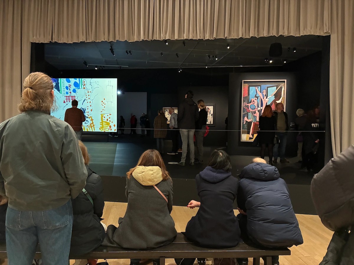
This is a vast show: ten rooms, 16 themes, over 70 ‘lens-based artists and collectives’ are represented by over 550 art works and archive items: lots of ‘radical’ photography magazines such as Ten.8 and Camerawork; lots of posters, leaflets, handouts, Greenham Common posters and flyers and badges, anti-racism pamphlets, posters etc. It is massive. Prepare to be overwhelmed and exhausted.

No reasonable human being can be expected to fully process and assess 550 photos and objects at one go – so the curators are either assuming people will go back a second time (probably a good idea) or will hop from one section to another, or will skim through and not give anything enough attention (all too likely).

The negative affect of this jumble-sale overcrowding is exemplified by the sections devoted to the black-and-white documentary photography of two photographers I revere, Tish Murtha and Chris Killip. I raved about their depictions of dirt-poor working class communities when I first saw them in shows at the Photographer’s Gallery entirely devoted to their work, when they had a devastating impact on me. Tish Murtha, in particular, was a photographer of genius.

But here, half a dozen of their (outstanding) photos are wedged in between 6 by someone else, 9 by someone else, 4 by someone else, 7 by someone else, a section about Asian identity, another about the Black Experience, some stuff about pollution in Devon, a sequence of seaside snaps… and so on and so on until the whole thing becomes a blur. They both deserve a better environment and more respect.

Critch’ and Sean by Chris Killip (1982) Tate © Chris Killip

It’s the difference between walking through a landscape, stopping to give every tree and plant time and attention – and driving through the same landscape in a car, noticing the occasional standout feature against the general blur.

Chronological slippage

The exhibition is so huge that it overflows its own boundaries. It is everywhere referred to as ‘The 80s’ and yet the first photo dates from 1976 and the last one from 1993. That’s a 17-year spread, not a ten-year one. It feels bloated chronologically as well as content-wise.

Exhibition structure

At one point I drafted a long section comparing my own lived experience of the 1980s (including going on protest marches as a student, then living in the Brixton depicted in some of these photos, clubbing, protesting, walking through one of the Brixton riots etc) with the depictions given here but it got too long and irrelevant. Instead here is a boiled-down version of Tate’s own exhibition guide (which you can read in full here).

As you can see, the opening sections tick all the boxes, contain interesting facts and seem set fair to give you an interesting historical overview of the decade. It’s only slowly that the curators’ obsession with race and gender become more prominent and you begin to wonder, and then become irritated by, the absence of so many other things.

First a list of what is in the exhibition. Then my list of what, in my opinion, has been omitted.

1. Documenting the decade

Protests and riots from the 1976 Grunwick strike through the Miners Strike, National Front rallies met with anti-racist demonstrations, the Clash playing their famous Rock Against Racism gig in Victoria Park, the election of Mrs Thatcher and the ideology of Thatcherism, Greenham Common (obviously), the poll tax riots.

Paul Simonon of the Clash at a Rock Against Racism concert, Victoria Park, East London, April 1978, photo by Syd Sheldon/White Riot, in The 80s: Photographing Britain at Tate Britain

2. Anti-racist movements

The 1948 British Nationality Act allowed everyone born in Britain or its Empire to become a ‘Citizen of the United Kingdom and Colonies’ and tens of thousands came to fill job vacancies. Regrettably, sometimes tragically, this triggered hostility and racial discrimination, marking the beginning of decades of racist rhetoric, rioting and civil rights activism. 1968 Enoch Powell’s river of blood speech. By the mid-1970s, the far-right, anti-immigration National Front was England’s fourth largest political party. So the show has many photos of their rallies and protests by opponents (and posters, badges and flyers), including quite a few about the so-called Battle of Lewisham which took place on 13 August 1977.

Darcus Howe addressing the anti-racist demonstrators, Lewisham, 13 August 1977 by Syd Shelton (1977) Tate © Syd Shelton

Was 1977 in the 1980s? No. Why is it in the exhibition? Because this isn’t an exhibition about the 1980s: it is an exhibition about radical causes the curators support, and which had their origins in the 1970s.

Also, a bit of digging revealed that quite a few of the black-and-white protest photos in this first room are loans from the National Portrait Gallery a mile up the road. Handy. And they’re not just dusty old photos from the archive but are, in fact, star entries in the National Portrait Gallery’s Schools Hub. This includes the Darcus Howe photo and the photo of Jayaben Desai by David Mansell.

3. The Miners’ strike

In March 1984, the National Coal Board announced plans to close 20 collieries, putting 20,000 jobs at risk. The National Union of Mineworkers, led by Arthur Scargill, responded with a series of year-long strikes. Observed across England, Scotland and Wales, the strikes put industrial issues and workers’ rights on the national agenda. Many dramatic photos including the famous one of a mounted policeman wielding a baton against photographer Lesley Boulton at the Battle of Orgreave, 1984.

4. Greenham Common

On 5 September 1981, a group of women marched from Cardiff to the Royal Air Force base at Greenham Common in Berkshire. The site was common land, loaned to the US Air Force by the British Government during the Second World War and never returned. The group called themselves Women for Life on Earth. They were challenging the decision to house nuclear missiles at the site. When their request for a debate was ignored, they set up camp and the site became a women-only space. The camp lasted for 19 years although it was after only 6 years, in 1987, that Soviet President Mikhail Gorbachev and US President Ronald Reagan signed a treaty which paved the way for the removal of cruise missiles from Greenham.

Greenham Common, 14 December 1985 by Melanie Friend (1985) reprinted 2023. © Melanie Friend, Format Photographers

I smiled when the curators proudly explained that Gorbachev subsequently paid tribute to the role ‘Greenham women and peace movements’ played in this historic agreement as if they, the curators, were partly responsible for its achievements. And I also liked the implication that you should always believe what a Russian politician says.

The massive political exhibition which filled the same Tate Britain galleries before this, Women In Revolt! Art and Activism in the UK 1970 to 1990, also featured an entire room about Greenham Common. My friend jokingly suggested that maybe every Tate exhibition should have a section devoted to Greenham Common: The Pre-Raphaelites and Greenham Common. Victorian sculpture and Greenham Common.

5. Poll Tax

The community charge, commonly known as the ‘poll tax’, was introduced by Margaret Thatcher’s Conservative government in 1989 in Scotland, and 1990 in England and Wales. This flat-rate tax on every adult replaced previous taxation based on property value. The tax was accused of benefitting the rich and unfairly targeting the poor. The national anti-poll tax movement began on the streets of Glasgow and led to a series of anti-poll tax actions across the UK. Many demonstrations saw clashes between police and protestors, and resulted in rioting. The fallout from the tax triggered leadership challenges against the prime minister and, in 1990, Thatcher resigned. In 1991, following vehement national opposition, John Major’s Conservative government announced the poll tax would be replaced by council tax.

So news photos of anti-poll tax marches, some of which turned into riots, ‘ordinary people’ carrying placards, burning cars in Trafalgar Square. Ah, those were the days.

Nidge and Laurence Kissing by David Hoffman (1990) © David Hoffman

6. The Gay Rights Movement

In 1967, the Sexual Offences Act partially decriminalised sexual acts between two men. It was the result of decades of campaigning but did nothing to address the discrimination gay and lesbian communities continued to face. So photos of LGBTQ+ people protesting for equal rights.

In 1981 the UK saw its first identified cases of AIDS. By 1987 the HIV/AIDS epidemic was a global health crisis. The public focus was largely on gay men who were being infected in much greater numbers than the general population, fuelling anti-gay rhetoric in politics and the press. Queer activists organised in opposition to the resulting homophobia, as well as Conservative ‘family values’ campaigns. Do you remember some media labelling it the gay plague? Bigotry on a national scale. Lots of photos of anti-homophobia and AIDS awareness marches.

7. (Political) Landscapes

This is the first and, as it turns out, pretty much the only section which isn’t about political protest, gender awareness and Black issues. But don’t imagine it’s pretty photos of the British Isles. It, also, takes a heavily ‘theoretical’ i.e. politicised approach to its subject.

This section points out how the entire concept of ‘landscape’ is socially, culturally and politically constructed, and how the British tendency to see the countryside as cosy and reassuring often conceals the way the land has been a battlefield for rights to common land and to roam.

Also, in line with the gloomy focus elsewhere in the show, there’s an emphasis on landscapes as places of deindustrialisation and ruins, and as degraded by pollution and fly tipping.

That said this room contained some of the best sets of images, neither part of the obvious political issues of the first few rooms nor of the gender and race obsession of the second half of the exhibition. Having walked through the whole exhibition twice I found myself gravitating towards this room for the understated, sometimes elusive quality of its photos.

For example, I liked the red river sequence by Jem Southam, a set of 12 colour photos of the country around a stream in west Cornwall. None of them individually are ‘great’ photos but the fact there’s 12 of them collectively creates a great sense of location and strangeness. And the dramatic black-and-white study of a standing stone on Orkney by Albert Watson.

Orkney Standing Stones by Albert Watson (1991) © Albert Watson. Courtesy Hamilton Gallery

But the pull of politics is unavoidable. Nearby are upsetting images from the Troubles in Northern Ireland, namely The Walls by Willie Doherty, and the disturbing series Sectarian Murder by Paul Seawright. This records the sites where murdered bodies were found, after the bodies had been removed and they had returned to their normal, litter-strewn banality.

Even this apparently bucolic image by Paul Graham contains the tiny detail of a Union Jack high up in the tree which, in its little way, throws the shadow of 800 years of history across the green fields and blue sky.

Union Jack Flag in Tree, Country Tyrone by Paul Graham (1985) © Paul Graham

8. Remodelling history

Extensive coverage of radical feminist photographers Jo Spence and Maud Sulter who set out to ‘challenge photography’s sexist and colonial past’, and its relationship to class politics.

Remodelling Photo History: Revisualization by Jo Spence (1982) Tate © The Jo Spence Memorial Archive

There’s a surprising amount about these two figures, Spence and Sulter, including a separate section on Spence’s collaboration with artist Rosy Martin to develop photo-therapy. As with other Tate exhibitions, maybe there’s so much of it simply because Tate owns their archive and needs a pretext to display a decent amount of their work. (We’ll see the same is true of the unexpected prominence given to an American photographer, Lyle Ashton Harris, at the end of the show. Tate owns them so this is a prime opportunity to dust them off and display them.)

9. Black women

There’s a separate section devoted to Maud Sulter who’s quoted as saying, ‘Black women’s experience and Black women’s contribution to culture is so often erased and marginalised’, and so set about rectifying this in series of photos of her dressed up in period costume looking like an extra from Bridgerton.

Zabat, Terpsichore, 1989 from Zabat by Maud Sulter (1989) © Estate of Maud Sulter. All rights reserved, DACS/Artimage 2023. Image courtesy of Street Level Photoworks, Glasgow

10. Image and Text

A section on the use of text in photos, texts designed to amplify or undermine the central image. There is much citing of the artist and theorist Victor Burgin who, the curators tell us, was very influential during this period. He’s represented by some of his series of large, poster-sized photos which include ironical texts, titled ‘UK 76‘. 1976? But I thought this was an exhibition of photography from the 1980s? No. As with all the photos of anti-National Front marches, the Battle of Lewisham and so on, the curators bend their own rules and boundaries when it suits them. (As with the Jason Evans photo at the top of this review, and Albert Watson’s Orkney Standing Stones, both from 1991 and so spilling over the other end of the boundary.)

This section also included some big poster-sized images of rubbish new townscapes with official-sounding quotes from brochures pasted on top (which I liked very much). And it’s the section with the satirical images of office workers by Anna Fox (with mockingly ironic text) and Kroll’s sequence of posh chaps in private clubs (with mockingly ironic text) which I’ll describe below.

10. Reflections of The Black Experience

This is the biggest room in the exhibition. It takes its name from ‘Reflections of the Black Experience’ which was an exhibition held at Brixton Art Gallery in 1986, commissioned by the Greater London Council’s Race Equality Unit. It was followed by D-MAX: A Photographic Exhibition in Bristol.

Both exhibitions played an important role in the development of the Association of Black Photographers, which is now called Autograph ABP. Established in 1988, Autograph’s mission was to advocate for the inclusion of ‘historically marginalised photographic practices’. Working from a small office in Brixton, the agency delivered an ambitious programme of exhibitions, publications and events. Autograph is now one of my favourite small galleries in London, which I’ll discuss below.

There’s lots in this big room, including photos of Brixton from the later 1980s, when I lived there. The display that made the most impact on me was the brilliant series of Handsworth self portraits. This project was set up by Derek Bishton, Brian Homer and John Reardon in which they set up a makeshift studio in Handsworth, a multicultural part of Birmingham, and invited people to take self portraits of themselves. Over 500 people took part and the joy of people messing about, as solo shots, in pairs or larger family groups, is infectious. Once again, though, as throughout the show, works are included from outside the nominal time range because, well, they’re good.

Ting A Ling, from Handsworth Self Portrait, 1979 © Derek Bishton, Brian Homer and John Reardon

11. (Political) Self portraiture

You might have thought this would feature a fascinating range of self portraits by people across society throughout the ten years of the 1980s but no, this is Tate and so only a handful of social groups really count, namely radical feminists, Black activists and LGBTQ+ people. In the curators’ words:

In the nineteenth century, photography was a valuable tool for colonial powers. Ethnographic images of Indigenous Peoples and landscapes were distributed through postcards and magazines. They ‘othered’ subjects and created racist stereotypes that legitimised the mission of empire. The photographs on display here challenge this colonial gaze. They present nuanced, multi-dimensional representations of Black and Asian British selfhood.

So the self portraits in this section are entirely concerned with subverting imperialist, colonialist stereotypes. They link up with the series in the last room by Grace Lau of him or herself dressing up as types from the decade in order to subvert gender norms etc.

From the series ‘Interiors’ by Grace Lau © Grace Lau 1986

Black activists or gender activists. Little attempt to consider the myriad other types of self portrait taken outside these areas, by anybody else, at any other part of the decade.

12. Community

This room hosts series from half a dozen photographers who went to live with communities around the UK to share their experiences and create accurate depictions. Most are in black and white with a 100% left-wing focus on poverty, crappy housing, unemployment, aggressive policing and racial stereotypical. It includes outstanding photos by Chris Killip which, for some reason, didn’t hit me as hard as when I saw his one-man show at the Photographers’ Gallery. I think being set next to the work of 3 or 4 other photographers (for example, the equally as good Sirkka-Liisa Konttinen) doing more or less the same, attenuated all of them.

13. Colour photography

A room full of big, blaring, gaudy colour photos. Apparently, Britain’s first exhibition of photography taken on colour film was Peter Mitchell’s 1979 show at Impressions Gallery in York. During the 1980s technological developments continually improved the quality of colour photography and this room brings together sequences of giant colour photographs by Martin Parr, Paul Reas and Tom Wood. Because they are almost entirely very unflattering photos of very ordinary white people I came to think of it as the Chav Room or the White Trash Room (fuller explanation below).

14. Black bodyscapes

In case you didn’t get enough Blackness in the opening room about anti-racist protests, in the room about Black women or the massive room about The Black Experience, here is a room devoted to the Black Queer Experience. The assembled photographs of Rotimi Fani-Kayode, Ajamu X and Lyle Ashton Harris ‘explore masculinity, sexuality and Blackness’.

Fani-Kayode was described by Ajamu X as ‘the most visible, out, Black, queer photographer’ of the 1980s’. Ajamu X’s desire to document ‘the whole of Black queer Britain’ has been dubbed ‘Pleasure Activism’. Harris describes his photographs as a celebration of ‘Black beauty and sensuality’. The photos of Ajamu (black and white) and Fani-Koyode (moody, shadowy colour) are, in their different ways, staggeringly impactful.

Body Builder in Bra by Ajamu X (1990) Tate © Ajamu X

15. Celebrating subculture

The final room. You might have thought that a documentary look at the ‘subcultures of the 1980s’ might have covered some of the movements closely associated with ever-changing fashions of pop music such as post-punk, industrial music, Goths, New Romantics, synthpop and, later, Madchester, acid house, raves and so on. These affected how people dressed, thought about themselves, danced, partied, affected not just styles of music but graphics, album art, posters and many other types of visual content.

But no. None of that is here. Tate curators only know two subjects, race and sex, gender and ethnicity, and so they ignore all the pop cultures I’ve listed. Instead, at the mention of ‘subculture’ their thoughts immediately go to gender issues, to LGBTQ+, and to the furore surrounding the notorious Section 28 of the Local Government Act.

The wall labels go into great detail about how Section 28 prohibited local authorities from ‘promoting homosexuality’ and triggered a wave of protest from gay and lesbian communities. They tell us how Section 28 forced many LGBT groups to disband and saw literature depicting gay life removed from schools and libraries, but that it also galvanised the Gay Rights movement. People took to the streets in a series of marches and so, with thumping predictability, the exhibition ends with lots of photographs of people protesting, marches, banners etc, very much as in the first room, or the Greenham Common room, or the Black Experience room.

If you’re maybe a little bored by the subject of gay activism, tough, because not far away there’s photos by Tessa Boffin who ‘subversively reimagines literary characters as lesbians’, while nearby Grace Lau ‘documents members of various fetishist sub-cultures’.

To be crystal clear, none of this is ‘bad’ in itself, some of it is very good. It’s just that by this stage the visitor who’s been reading all the wall labels is exhausted by the curators’ obsessive harping on just the same two or three subjects to the exclusion of everything else.

End of exhibition summary

I suppose I could stop here, having given you a good summary of what there is to see and my own negative response to it. And you might be wise to stop reading here. But several things triggered me so much I needed to work them through in print.


Omitted subjects

As explained, my friend and I got increasingly frustrated as we looked for evidence of the other, non-political, non-woke aspects of the 1980s which we and millions like us like us experienced. Without trying too hard I made a list of the domestic and international events, music, style and commercial changes which I associate the decade with.

Take sport. There’s nothing about sport at all. Apparently there was no sport during the 1980s and no sports photography. Even if you wanted to ‘keep it Tate’ and make sport as political as possible, they could have mentioned the disastrous Bradford City stadium fire, the legislation which followed forcing all football grounds to become all-seated, and the resulting accusations that the sport was losing its working class fanbase and becoming embourgeoisified. And there were lots of other sporting events, highlights and scandals. But not a hint here.

Pop music. There’s one photo of The Clash performing at a Rock Against Racism gig in Victoria Park and that’s it. Nothing else: no industrial rock, post-punk, synth pop, New Romantics, no Smiths and, at the end of the decade, no Madchester, no ecstasy, no raves, no ambient music. There’s a wall of style magazines at the end, sections on the impact of, for example, i-D magazine, but somehow the curators’ focus purely on design manages to omit the extraordinary output of a decade many consider the greatest era in British pop history. Where’s Wham for God’s sake?

This was the decade when MTV arrived in the UK (1981) and its reliance on pop videos changed the dynamic of how people consumed pop. Same with cable TV generally, and the arrival of Sky TV (1984) with its crazy aerials. I appreciate these aren’t photographic but someone must have taken photographs of them and of this huge transformation of the cultural and visual landscape. Not here.

No jazz. No classical music. None. They didn’t exist during the 1980s or if they did, no one took any photos of them. Whereas I remember in the early 1980s transitioning away from pop music altogether and listening to the likes of Courtney Pine, Loose Tubes or Andy Shepherd. OK they’re not photographers, but it felt like a big cultural shift at the time and surely someone took photos of them.

World music same. Lots of young people got fed up with boring old rock music and sought new sounds from around the world. WOMAD (World of Music, Arts and Dance) was founded in 1980 and the first WOMAD festival was held in Shepton Mallet 1982. Nothing here.

Live Aid, remember that, Saturday, 13 July 1985? Not here, not a whisper, not so much of the event itself, but as the invention of really epic mass charity events which it invented. It was based around images because of Bob Geldof’s response to Michael Buerk’s reporting of the Ethiopia famine. I know that’s TV reporting, but there were lots of photographs of it (of the famine and of the concert). Why is Greenham Common included but Live Aid, which was a vastly bigger event and, arguably, more socially transformative, not? All curators are feminists. 39 iconic photos of Live Aid at London’s Wembley Stadium

Fashion photography? No. None. There’s a wall about style magazines but this is chiefly about the magazine design itself: I saw nothing recording the drastic new looks which appeared in the early 1980s, the New Romantics, Blitz nightclub, big hair, big shoulder pads which became crazy fashionable. According to this exhibition, never happened. 38 Iconic ’80s Fashion Photos.

The royal wedding On Wednesday 29 July 1981 Prince Charles married Lady Diana Spencer. It was a huge social and media event. If you think about it, royal photography is a specialised area or genre all to itself. As with Mrs Thatcher, the curators could have done an intellectually reputable section on how royal images are created, curated, marketed and disseminated, mocked and satirised. 70 Rare Photos From Princess Diana’s Wedding.

The Brighton bombing on 12 October 1984. See the relevant photos by brilliant photojournalist John Downing.

Architecture The 1980s was the great decade of postmodernism in architecture with its flagship building, Lloyds of London. Surely there were photographers specialising in the built environment across the UK and in particular this completely new look which swept across Britain? Not according to this exhibition. A Spotter’s Guide to Post-Modern Architecture.

Foreign reporting? Live Aid was of course a response to the Ethiopian famine and, in particular, the work of photojournalist Mohamed Amin, but there is no photography of events outside the UK in this exhibition. I take the point that the curators decided to limit their scope to the UK, but images of the major foreign stories of the decade were published in the UK and many taken by British photographers. So why aren’t they included here? How Mo Amin Inspired Change in Ethiopia

Chernobyl? No. No British photography of any aspect of it.

The Mujahideen in Afghanistan? Signature images of the decade were the reports on the evening news by some BBC or ITV journalist wearing a keffiyeh or pakol hat while Islamic freedom fighters fired off a Stinger missile in the background. Did no British photographers take any photos of this ten-year war? If they did, why are they excluded from this exhibition? To take one example from hundreds, the Afghan War photos of Scottish photographer David Pratt.

The fall of the Berlin Wall, 9 November 1989. That was a massive, world historic event with photos and footage beamed into every home. The curators can quote Gorbachev when it suits their agenda, when he’s praising the Greenham women, but on none of the other vast issues of the 1980s, namely the collapse of communism and the Soviet Union in which he was the prime actor.

Photos linked to film and theatre, glitz, actors, red carpets – forget Hollywood, just here in the UK? No. Didn’t happen during the 1980s. None here.

One of the biggest domestic stories of the decade was the deregulation of the City of London, nicknamed the Big Bang, which transformed the worlds of finance, banking and insurance, and made lots of people very rich, with far-reaching consequences for the British and maybe global economies. There’s text about it in the room labels but not a single image. Surely someone took photos of the changing culture in the City of London? No? Why not?

North Sea oil? Nada. Did no British photographer take photos of oil workers, Aberdeen, the creation of the refining infrastructure in that boom town? No photographer made a project of recording all this?

And what about The Falklands War (2 April to 14 June 1982) which had a seismic impact on British society and politics – footage of ships setting sail, news photos of battles, muddy paratroopers yomping through the long grass, looking shattered after a firefight, guarding nervous Argentinian captives, the celebrations when the ships arrived back in Portsmouth or Southampton? Even, if you are a Tate curator and insist on taking a left-wing view of the war, surely there was a world of anti-war photos, posters, and what not. Here are 30 Photographs From The Falklands Conflict they could have borrowed from the Imperial War Museum. But no, nothing, zip. Zilch.

Summary

Can you see why I became increasingly dismayed, and then irritated, by how many issues, events, music and fashion styles, new industries and technological innovations that were absolutely central to the 1980s the Tate curators left out because they didn’t fit their handful of woke concerns?

Omitted ethnic groups

As I’ve shown there is plenty of stuff about Black photographers, Black resistance, Black identity, Black photographic practice, Black selfhood, Black representation and much more and yet there are other ethnic groups in the UK – where are they?

From the series Revival, London by Roy Mehta (1989 to 1993) Courtesy of the artist and L A Noble Gallery

It’s not that extensive coverage of Black issues is ‘wrong’, it’s that the curators’ monomaniacal obsession feels like it comes at the neglect of all the other issues, types of people, professions and experiences alive in 1980s UK. Here are some wall labels to recreate the experience:

Frustrated by the misrepresentation of Black people in British mainstream media of the period, Zak Ové used his camera to challenge this visual discourse.

Dave Lewis‘s photographs of Black British communities in South London emphasise the diversity of experiences within these communities.

Marc Boothe‘s photographs sought to challenge traditional documentary practices and introduce viewers to a ‘Black aesthetic’.

Suzanne Rodan‘s candid shots capture moments of everyday life within Black and South Asian communities in 1980s London.

In Impressions Passing Roshini Kempadoo manipulates photographic prints to reflect how racist imagery is perpetuated in modern media.

Ajamu‘s portrait photographic series Black Bodyscapes focuses on intimate sexual desires.

Autoportrait is a series of nine self-portraits which challenge the under-representation of Black women in British fashion and beauty magazines.

Magenta Dress with Pink Tulips by Joy Gregory (1984) Courtesy of the Artist © Joy Gregory. All rights reserved, DACS

To be fair, there’s also quite a lot in the early rooms about the Asian experience, starting with the very first photos of the 1976 Grunwick strike which was triggered by Asian women walking out of the Grunwick Film Processing Laboratories in Dollis Hill. In that first room there are photos of Asians protesting about racism, against police violence (again, from the 1970s). The ‘Representing the Black Experience’ room also contains images of many Asians. The Communities room has some quieter photos celebrating Asian communities, religious festivals and so on.

Outside police station, Bethnal Green Road, London E2, 17 July 1978. Sit down protest against police racism, 1978 by Paul Trevor © Paul Trevor

I smiled when I saw the section devoted to Indian-born Canadian photographer Sunil Gupta. Gupta also has a wall dedicated to him at the Barbican exhibition of contemporary Indian art, and had no fewer than three sections dedicated to him in the Barbican’s epic exhibition about Masculinity.

Why is Sunil Gupta so popular with art curators? Because he is Asian and gay and so ticks two boxes in the curator’s diversity and inclusion checklist. No exhibition of 1980s or ’90s photography dare be without its Sunil Guptas. Now, you may love Gupta’s work but I found the photos at the Barbican and again, here, very meh. He is represented by ‘Pretended Family Relationships which juxtaposes portraits of queer couples with the legislative wording of Section 28 in order to subvert the blah blah bah. They seemed very average to me, but they are gay activism, so he’s in!

Anyway, despite the Asian presence in many of the photos, the word ‘Asian’ appears precisely once in the exhibition guide while the word ‘Black’ appears 27 times. Draw your own conclusion.

And were they any other ethnic groups in the UK in the 1980s? Apparently not. I tell you a word which doesn’t appear anywhere in the exhibition, which is ‘Jew’. Apparently there were no Jewish photographers in Britain during the 1980s and no Jews to photograph. In the ‘Community’ room there are (inevitably) Black communities, Asian communities and working class communities, but no Jewish community. Didn’t exist or no one bothered to photograph it.

In the same spirit of omission, there are no photos by or of Chinese, Arabs or Muslims. They either didn’t take photographs during the 1980s or have been omitted by the curators. Why? Hispanic communities, all the Brazilians in Stockwell, or European immigrants like the Poles, or the Somalis of Streatham, just to mention ethnic communities I live near? No. Nada.

Because feminism, Black and queer is where the money is. It’s where the academic courses and academic careers are. When I flicked through the exhibition catalogue and saw chapters titled ‘Feminist praxis’ and ‘Challenging colonialism’ I couldn’t help laughing. That’s where the money is, kids. Specialise in those areas and you’ll never be unemployed. Unlike being a trawlerman or a steel worker, being an expert in feminist praxis or post-colonial theory is a career for life.

Underground Classic (John Taylor) by Zak Ové (1986) © Zak Ové

Why Yanks?

Remember I was irritated by the lack of coverage of central events of the 1980s like Chernobyl, Afghan War, the fall of the Berlin Wall and so on while it seemed fine to have stuff about strikes or race riots from the 1970s? You could argue that those pivotal events are omitted because they’re in some sense foreign / happened abroad – which is why I was irritated by the presence of an American photographer, Lyle Ashton Harris, in the exhibition.

Why, you might well ask, are nine photos by American photographer Lyle Ashton Harris (born and works in New York) of American subjects – including one titled ‘Miss America’ – included in an exhibition about Britain and British photographers in the 1980s? Why is one entire wall devoted to four massive self portraits of the American photographer wearing bits of ballet costume?

Constructs 10 to 13 by Lyle Ashton Harris (1989) Tate

Because 1) Harris is Black and queer and, with Tate curators, Black or Queer trumps all other considerations, including the criteria of their own exhibition.

Because 2) America is like heroin to art curators. Everything ends up being about America.

And because 3) it turns out, after a bit of digging, that Tate owns these big Lyle Ashton Harris photos and so, like the room devoted to extensive coverage of Jo Spence and Maud Sulter – whose archives Tate also owns – it’s a good example of the way exhibitions are created around what a gallery already owns, or what curators can cheaply get their hands on, rather than an accurate, objective exploration of the nominal subject matter.

Conclusion

I hope you can see now why I told you this is very much not a photographic history of Britain in the 1980s – it is a selection of ‘radical’ left-wing, feminist, politically committed Black and Asian or LGBTQ+ photographers who were working from the late 1970s through to the early 1990s, some of whose work touches on social or political issues from the time, but a lot simply doesn’t. Unless you consider gay pride or feminism or anti-racism as uniquely 1980s phenomena – which, of course, they very much weren’t and aren’t.

Photos of the white working class

Amid the radical deconstructions of colonialism and the subverting of heteronormative stereotypes and celebrations of the Black Queer Body, there are some powerful photos of British working class life. Two of the best photography exhibitions I’ve ever been to were of Tish Nurtha and Chris Killip at the Photographers’ Gallery in Soho, and both are represented here by half a dozen or so photos of supernatural power. In this vast show they were, however, swamped by so many other images along similar lines, and so neither of them had the devastating power of their Photographers’ Gallery shows.

There’s a set of vividly squalid colour photos by Paul Graham of the unemployed waiting like souls in hell in smelly 1980s job centres. Ken Grant took grim photos of working class people in and around Liverpool. There’s an excellent set of black-and-white photos of working class white people on the Meadow Wall Estate in North Shields taken by Finnish photographer Sirkka-Liisa Konttinen.

Apparently it was in the 1980s that the phrase poverty porn was first used and, somehow, having so many series of stark black-and-white photos of poor people living in squalid or sad circumstances, demonstrated the law of diminishing returns. They began to seem rather samey. Again, this feels like an example of poor curatorship.

Photos of the white middle class

And what about the middle class people, the political, cultural and demographic centre of the United Kingdom? Not just the 13 million who consistently voted for Mrs Thatcher but all the people who made up the bulk of the population: the accountants or lawyers, doctor and dentists, people running family businesses or working at big corporations, the police and fire and ambulance services, people who worked in local government, the social services, in thousands of care homes, in the hundreds of thousand of charities, ordinary people? Not Black or gay or radical feminists or horribly impoverished Brits, but run-of-the-mill, ordinary people like the hundreds I saw visiting this exhibition, people like you or me?

Well, it was hard to not to conclude that these kinds of people, what you could call the white bourgeoisie, appear in this exhibition solely to be mocked and ridiculed. Anna Fox is represented by a series titled Work Stations which satirises people working in London offices. These are horribly vivid colour shots of ordinary office workers captured in the most awkward and unflattering poses, accompanied by ironic captions pinched from business articles and magazines in order to take the piss out of them and their values. Here’s a prime example. The text under the photo reads ‘Fortunes are being made that are in line with the dreams of avarice’, from Business magazine 1987.

Work Stations, Café, the City. Salesperson by Anna Fox (1988) © Anna Fox. The Hyman Collection, Courtesy of the Centre for British Photography

Next to Fox is the Old Master of colour photodocumentary, Martin Parr, represented by works from his ‘Cost of Living’ series (1986 to 1989). Parr felt the kind of people he mixed with, the comfortably-off middle class, had been systematically under-represented by 1970s and ’80s photography, so he set out to depict them. So he simply went along to art gallery openings, garden parties, Conservative party fetes, and photographed the people he saw. Because it’s Parr deploying his customary, unforgiving colour technique, all these people come out looking extraordinarily awkward and ugly, just like the people in the Anna Fox series.

The mere fact that an expert on contemporary photography believed that this huge tranche of the British population, the middle classes, the inhabitants of Middle England, was under-represented in his medium speaks volumes about the narrow ideological focus of the photography of his day. And the way both Fox and Parr’s photos are described as ‘satirical’ confirms how this huge class of people have become, as pictorial subjects, almost an outsider group in their own country.

Installation view of the ‘satirising the white bourgeoisie’ corner at ‘The 80s: Photographing Britain’ at Tate Britain, with the Anna Fox sequence at the back, Martin Parr on the right. Photo © Tate (Jai Monaghan)

Near to the Parr ‘mocking the middle classes’ photos is a selection of 9 photos from the 26 in the famous series Gentlemen by Karen Knorr. Knorr was given permission to photograph the very posh members of the most exclusive gentlemen’s clubs in London’s St James’s district. Beautifully staged and shot, she then ironically undercut the images with texts taken from news reports and parliamentary speeches (just as Fox had done with her office workers). Again, the aim is to mock and satirise.

It’s hard to avoid the conclusion that all of the depictions of the English middle classes in this exhibition are associated with irony and satire. Now, nobody takes the mickey out of the Black or Asian or women subjects – they are all portrayed as dignified or joyous or righteously angry. But posh white people? Look at the ugly, rich, privileged wankers air kissing, answering phones, stuffing their faces!

The Colour Photography room gives interesting explanations of the technological developments which made colour photography cheaper and better – but it, also, flays its white subjects mercilessly. It includes another series by Parr, his famous seaside scenes, The Last Resort, in which everyone is captured in bright colour with unforgiving candour.

Next to them are half a dozen similarly merciless photos of very ordinary people in Welsh supermarkets by Paul Reas. Like Parr’s photos, like Fox’s series, these seem so pitilessly unflattering as to be actively cruel. The Photography of Cruelty. Or maybe just mockery. Look at the poor white chavs.

Hand of Pork, Caerphilly, South Wales by Paul Reas (1988) © Paul Reas. Martin Parr Foundation

White trash, Black gods

The humiliation of white chavs and poshos in Parr and Fox and Wood’s photos is emphasised by the way that, in the rooms directly before and after them, Black people are depicted in stylish black-and-white photos which make them look dignified, noble or even godlike.

In the room before the white chavs is this set of serious, searching portraits made by Pogus Caesar. They were taken on an Ilford HP 5 camera using 35mm film to achieve a rich grainy effect as he travelled round the country taking shots of people in the street, as far as I can see, solely Black people. They’re really good. Stylish and atmospheric, they dignify and enrich their subjects.

Installation view of ‘The 80s: Photographing Britain’ at Tate Britain showing ‘Into the Light’ by Pogus Caesar (1985 to 89) (photo by the author)

The room after the white trash room is the one titled ‘Black Bodyscapes’, the one featuring photos by Rotimi Fani-Kayode, Ajamu X and Lyle Ashton Harris, photos which ‘explore masculinity, sexuality and Blackness’. I dare say these are important issues to the curators but to the ordinary visitor what you see is a set of spectacularly buff Black male bodies. Wow! Gorgeous, hunky men in prime physical condition, what’s not to lust after?

The Golden Phallus by Rotimi Fani-Kayode (1989) © Rotimi Fani-Kayode / Autograph ABP. Courtesy of Autograph ABP

(I first encountered both Rotimi Fani-Kayode and Ajamu X at the drolly titled A Hard Man is Good to Find! exhibition at the Photographers’ Gallery, and loved them both. I dare say they’re exploring this issue and subverting that stereotype but they are also extraordinarily sexy pictures of beautiful male bodies.)

Anyway, it’s impossible to miss the stark contrast between the dignified Black people in Pogus Caesar, the stunning Black nudes of Fani-Kayode and Ajamu X, and the 15 or so images of the pale, pasty, fat, badly dressed white people captured by Wood, Parr and Reas in the Chavs Room. Step into the Black room to be thrilled. Then back into the white room to be appalled. This isn’t a contrived comparison. The two rooms are right next to each other. They make for an unavoidable and extremely powerful visual contrast.

Autograph ABP versus Tate

Autograph ABP in Hoxton specialises in photography by Black photographers from around the world and is maybe my favourite small gallery in London. Everything I’ve ever seen there has been outstanding. It is a centre of photographic excellence and I was interested to read about its history in the ‘Representing the Black Experience’ room here in this show.

But it also made me wonder, why do I love Black photography at ABP but bridle at the exact same work when it is shown here in Tate Britain? Three reasons. 1) The attitude of the curators. At ABP it is taken for granted that the work is by Black photographers. There may be some stuff about combatting racism, if relevant, but quite often the labels just explain the specifics of the particular project. The ABP curators treat their artists and visitors with respect, as if they’re grown-ups.

Whereas Tate curators can’t stop haranguing their visitors about the horrors of racism and colonialism and the white gaze, as if we’re first year arts students who need to have all the evils of the world explained to us in a tearing hurry. The photographers’ Blackness or queerness becomes the primary thing about them.

This is what I meant be saying the Tate curators treat their artists and works as specimens in extended lectures on their handful of woke topics, about the evils of capitalism and colonialism and racism and sexism, explaining all these issues in words of one syllable or less as if it’s the first time their visitors had ever heard of such things.

So I’m not bridling at the photographers or their works. In other contexts I’ve really loved many of them. I’m reacting very negatively to the patronising tone of Tate’s curators.

2) Individually, many of the works here are great but something negative happens when a load of works by different photographers are all bunched together in a room demonstrating a thesis. So, for example, when I first saw Rotimi Fani-Kayode’s photos, I read the captions about the queer sensibility and undermining stereotypes of Black male sexuality etc, but I also responded to their plain weirdness. To what they look like. These are strange, disconcerting, haunting images which trigger responses beyond the verbal or easily expressed. They did what all good art does which is take you to strange places in the imagination, open doors you didn’t know were there.

But here, lumped together in one room, they feel subservient to the curators’ concerns to lecture us all about the Black Queer Body. This is what I mean by turning art into specimens, pinned like butterflies to a board to make a point.

3) Bulk. Volume. Sheer number. Same point I made about Tish Murtha and Chris Killip. Seen by themselves, their work felt seismic. Bundled together with half a dozen photographers working on the same subject (dirt-poor white communities), and making the same point (Thatcherism, inequality, poverty = bad), a lot of the power and individuality leached out of them.

Message to the curators

  1. Less is more.
  2. If you’re going to group lots of artists together, doing it by their most obvious feature (feminists, Black, queer, working class) tends to diminish their individuality and impact. Think of more imaginative, left-field ways of arranging them. Try to create surprises.
  3. If you claim your exhibition is about a subject, please make an effort to make it fully and adequately about that subject and don’t just restrict it to the handful of woke subjects dear to your hearts plus chucking in some archives you happen to own. Make it about the world, not just the same three curator obsessions (gender, ethnicity, class).

Yet another conclusion

So you can see why, by the end, I was fed up of being lectured about the wonders of queerness and feminism and the Black body and post-colonial identity, and deeply disappointed that so much of the actual history of the 1980s, the global incidents or – just to restrict it to the UK – the key social and media events, and the changing face of technology, music and style which meant so much to me personally, had simply been left out.

This is why the friend I went with thought it was the worst exhibition we’d visited all year: because of its glaring omissions of loads of the things we liked and remembered about the 1980s, because of its systematic rewriting of cultural history to be only about radical left-wing artist-activists, because of its flagrant political bias, because of its mockery of the white middle class which (I’m afraid) I belong to (just like everyone else I saw visiting this show) but, above all, because of its terrible, terrible narrowness of vision.

Well, I’ve given you a strong flavour of my own negative reaction to the thing, but I’ve also tried to give an accurate summary of the exhibition structure, objective summaries of all the rooms, and a good selection of the images, along with the curators’ own words.

This is a massive, exhausting and deeply problematic exhibition – but there’s lots of very good stuff in it and maybe you’ll have a completely different response. Go along and make your own mind up.


Related links

Related reviews

I Didn’t Do It For You: How The World Used and Abused A Small African Nation by Michela Wrong (2005)

Michela Wrong has had a long career as a journalist, working for Reuters, the BBC and the Financial Times, specialising in Africa. She came to the attention of the book-buying public with the publication in 2001 of ‘In the Footsteps of Mr. Kurtz: Living on the Brink of Disaster in Mobutu’s Congo’, which I read and reviewed.

This is the follow-up, a long and thorough (432 pages, including chronology, glossary, notes and index) account of the modern history of Eritrea, the country to the north of Ethiopia which, at independence, was bundled in with Ethiopia and which fought a 30 year war to be free.

The milky haze of amnesia

I’m afraid Wrong alienated me right at the start, in her introduction, by claiming that the ex-colonial and imperial powers (Britain, Italy, America) have made a conscious effort to erase their involvement in such places in order to conceal all the wrongs we did around the world

History is written – or, more accurately, written out – by the conquerors. If Eritrea has been lost in the milky haze of amnesia, it surely cannot be unconnected to the fact that so many former masters and intervening powers – from Italy to Britain, the US to the Soviet Union, Israel and the United Nations, not forgetting, of course, Ethiopia, the most formidable occupier of them all – behaved so very badly there. Better to forget than to dwell on episodes which reveal the victors at their most racist and small-minded, cold-bloodedly manipulative or simply brutal beyond belief. To act so ruthlessly, yet emerge with so little to show for all the grim opportunism; well, which nation really wants to remember that? (Foreword, page xi)

This is an example of conspiracy theory – that everything that happens in the world is the result of dark and threatening conspiracies by shady forces in high places. It may sound trivial to highlight it so early in my review, but it is the conceptual basis of the entire book, and an accusation she returns to again and again and again: that there are so few available histories of Eritrea purely because the imperial powers want to suppress the record of their behaviour there, to display ‘the conquerors’ lazy capacity for forgetfulness’ (p.xxii). I’m afraid I take issue with this for quite a few reasons.

1. First, I tend towards the cock-up theory of history. Obviously there are and have been countless actual conspiracies but, in geopolitics at any rate, events are more often the result of sheer incompetence. Read any of the accounts of the US invasion of Iraq or Britain’s military efforts in Iraq and Afghanistan. The idea that the establishments of three or four countries have placed an embargo on discussion of imperial interventions in Eritrea is, obviously, unlikely.

2. Second, there has been no embargo on accounts of Britain’s involvement in plenty of other and far worse colonial debacles: the concentration camps we set up during the Boer War or during the Mau Mau emergency in Kenya are common knowledge or, at least, there are loads of books and articles about them. Or take India. Nowadays there’s a growing pile of books about how we looted and ruined the subcontinent; Britain’s responsibility for the catastrophic partition featured in an episode of Dr Who for God’s sake, about as mainstream as you can get.

Books about the evils of the British Empire are pouring off the press, so these are hardly ‘forgotten’ or ‘erased’ subjects. Quite the reverse, they’re extremely fashionable subjects – among angry students, at middle class dinner tables, in all the literary magazines here and in the States, among BBC and Channel 4 commissioning editors falling over themselves to show how woke, aware and anti-colonial they are.

Or check out the steady flow of anti-Empire, anti-slavery exhibitions (like the current installation in Tate’s Turbine Hall about empire and slavery, or Kara Walker’s installation in the same location about empire and slavery, or the upcoming exhibition at the Royal Academy about empire and slavery). Anti-racist, anti-imperialist, anti-slavery sentiments are not some kind of revolutionary disruption but the received opinion of our time, one of its central ideological underpinnings.

Eight reasons why nobody’s much interested in Eritrean history

Wrong makes a big deal of the fact that so many Italians, Brits and Americans she spoke to during her research had no awareness of their nations’ involvements in Eritrean history, but this has at least eight possible explanations, all more plausible than it being due to some kind of joint conspiracy by the British, Italian and American governments. Let’s consider just Britain:

1. British imperial history is huge

First, the history of the British Empire is a vast and complicated subject. Hardly anyone, even specialists, even professional historians, knows everything about every period of every colony which the British ruled at one point or another. Understandably, most people tend to only know about the big obvious ones, probably starting with India and the slave trade, not least because these are hammered home via every channel and medium.

2. Second World War history is huge

Second, the British took over the running of Eritrea from the Italians only after we fought and defeated them in North Africa in the spring of 1941, in a campaign which was wedged in between the bigger, more important and better known Desert War in Libya. So the same principle applies as in the point about the empire as a whole, which is: even professional historians would probably struggle to remember every detail of every campaign in every theatre of the Second World War, so why should they care about this relatively small and strategically insignificant one?

Here’s Wikipedia’s list of the main theatres and campaigns of the Second World War. Did you know them all?

It was only reading up the background to Evelyn Waugh’s ‘Sword of Honour’ trilogy that I realised there was a whole theatre of war in West Africa, Gambia and so on, which I’d never even heard about before. Was this due to what Wrong calls the ‘milky haze of amnesia’ deriving from some government-wide conspiracy to forget? Nope. The reality is people only have so much time and attention to spare.

3. The limited attention span of ordinary people

What percentage of the British population do you think gives a monkeys that Britain was, for ten years or so, from 1941, responsible for administering Eritrea? Weren’t we also running about 50 other countries at the time? I suspect my parents’ experience of being bombed during the Blitz and watching Battle of Britain dogfights over their London suburb were quite a bit more relevant to their lives than the details of British administration of the faraway Horn of Africa. People have only so much hard drive.

4. General historical awareness is dire, anyway

Most people don’t care about ‘history’, anyway. If you gave a quick basic history quiz to the entire British population of 67 million, I wonder how many would pass. Auberon Waugh once joked that the fact that Henry VIII had six wives is the only fact from history which all Britons know, but I suspect this is way out of date. I live in Streatham, the most multi-ethnic constituency in Britain. Most of the people I interact with (doctor, dentist, shopkeepers, postman, electrician, council leafblowers) were not born in this country and many of them barely speak English (e.g. my Chinese postman). I struggle to explain that I want to buy a stamp at the shop round the corner because they don’t speak English so don’t know what ‘stamp’ is until I point to a pack. I can’t believe many of the millions of non-English-speaking people who now live here give much of a damn about the minutiae of Britain’s imperial history unless, of course, it’s the bit that affected their country and possibly not even then.

5. Busy

And this is because people are busy. The difference between Wrong and me is that she thinks it’s of burning importance that the British ‘confront’ every aspect of their ‘colonial past’, whereas I take what I regard as the more realistic view, that a) most people don’t know b) most people don’t care because c) most people are stressed just coping with the challenges of life.

By this I mean trying to find the money to pay their rent or mortgage, to buy food, to pay for the extras their kids need at school, or to find money to pay for their parents’ ruinously expensive social care. Most people are too busy and too stressed to care about what happened in a remote country in Africa 80 years ago. Most people are too busy and worried about the day-to-day to care about even the contemporary global issues that newspapers and magazines are always trying to scare us about, whether it’s the alleged impact of AI or the war in Ukraine or the strategic threat from China. Most don’t know or care about ‘history’ and, I’d argue, they’re right to do so, and to live in the present.

I’m a bookish intellectual who’s interested in literature and history but I’ve had to learn the hard way (i.e. via my children and their friends) that there are lots of people who really aren’t. They’re not ‘erasing’ anything, they just live lives which don’t include much interest in history, be it imperialist, early modern, medieval or whatever. They’re too busy going to music festivals or shopping at Camden market, and sharing everything they do on TikTok and Instagram, getting on with their (exciting and interesting) lives, to know or care about the minutiae of the historical record of every single one of the hundred or so nations Britain had some kind of imperial involvement in.

Wrong thinks it’s some kind of conspiracy on the part of the British authorities not to give Eritrea a more prominent part in our history. I think it’s a realistic sense of perspective.

6. Commercial priorities

Books tend to be published, documentaries commissioned and art exhibitions organised, if the editors think there is a commercially viable audience for them. Last time I visited the Imperial War Museum I spent some time in the bookshop chatting to the manager because I was struck by the very, very narrow range of subjects they stock books about. There were entire bookcases about the First and Second World War, a big section about the Holocaust, one about Women in War, and that was about it. I couldn’t even find a single book about Northern Ireland. Northern Ireland, for God’s sake! When I quizzed him, the bookshop manager explained that they’re a commercial operation, they need to maximise their revenue and so only stock books on the subjects which are reliable bestsellers.

So, living in a commercial/consumer capitalist society as we do, maybe the lack of awareness, books and articles about the modern history of Eritrea is not due to a government conspiracy to suppress it but simply because it is a really niche subject which interests hardly anyone, and so – there’s no money in it. No government conspiracy required.

7. News agendas

Even now, the current conflicts between Eritrea, Tigray and Ethiopia barely reach the news because they are, in fact, minor conflicts, they are far away, they have been going on for decades with no particularly dramatic changes to report on and, crucially, no signs of a conclusion – so they just never make the news agenda. Why would they, when Russia is threatening to start world war three?

8. Predictable

And I suppose there’s an eighth reason which is that, for anybody who is interested in modern history, it is utterly predictable that today’s historians or historical commentators will take a feminist, anti-racist, anti-imperial line. Nothing could be more predictable than a modern historian ‘revealing’ the racist truth about British imperial behaviour. This is the stock, standard attitude across the modern humanities. To reveal that European imperial behaviour in Africa was ‘racist and small-minded, cold-bloodedly manipulative or simply brutal beyond belief’ is the opposite of news – it is the utterly predictable compliance with modern ideology, as expressed through all available channels of print, TV, social media, films and documentaries, art galleries, plays and books and articles.

So, those are my eight reasons for not buying into the central premise of Michela Wrong’s book which is that there has been some kind of conspiracy of silence among the ex-imperial powers, that they have deliberately let the history of their involvement in Eritrea sink into ‘the milky haze of amnesia’ in order to conceal from a public which would otherwise be desperate for every scrap of information they could get about Italy, Britain and America’s involvement in one of the world’s smallest countries 80 years ago.

Presumable origin of the book

Wrong first visited Eritrea in 1996 in order to do a country profile for the Financial Times. She was surprised to discover that there was very little published about the place. She saw an opportunity. She approached her publisher, who agreed there was an opportunity to sell to the kind of niche audience which is interested in the history of tiny African countries. Obviously she would be building on the success of her first book to extend her brand.

But, to make the book more marketable it would have to try and make the story more ‘accessible’, more saleable, and so ought to incorporate several features: 1) elements of touristic travelogue, passages dwelling on, for example, Asmara’s surprising Art Deco heritage or the vintage railway that snakes up into the high plateau of the interior, the kind of thing that appears in ‘Train Journeys of The World’-type TV documentaries. Tick.

The second way to sex it up would be to adopt the modern woke, progressive, anti-imperial ideology so much in vogue, and take every possible opportunity to criticise all the western powers for their racism, sexism, massacres and exploitation. Tick.

And so we’ve ended up with the book we have. It is a history of Eritrea in relatively modern times i.e. since the Italians began annexing it in the 1890s, up to the time of writing in about 2004, written in a superior, judgemental, often sarcastic and sneering tone, regularly facetious and dismissive about every action of the colonial powers, and hugely reluctant to point out that the relevant Black African powers (i.e. Ethiopia) behaved ten times worse than anything the imperialists did.

I’m not saying Wrong is wrong to point out that the Italians were racist exploiters who carried out appalling, semi-genocidal massacres and installed apartheid-style laws; or that the British, to their shame, maintained many of Italy’s racist discriminatory laws and practices while dismantling and carting off much of the country’s infrastructure; or that the UN screwed up big time when it assigned Eritrea to be part of Ethiopia against the wishes of its people; or that the Americans should have done more to foster statehood and encourage Eritrean independence when they used the place as a listening post during the Cold War.

I’m sure all her facts are completely correct and they certainly build up into a damning portrait of how successive western powers abused a small African nation. No, what put me off the book was a) Wrong’s assumption that the lack of knowledge about Eritrea was the result of some kind of cover-up among the imperial powers, and b) her tone of sneering, sarcastic superiority over everyone that came before her. Her snarky asides about this or that imperial administrator or British general quickly become very tiresome.

It is possible to write history in a plain factual way and let the facts speak for themselves. Nobody writes a history of the Holocaust full of sneering asides that the Nazis were ‘racist’ and ‘discriminatory’ – ‘Hitler, in another typically racist speech…’. You don’t need to say something so obvious. The facts speak for themselves. Constantly poking the reader in the ribs with sarcastic asides about the awful colonialists gets really boring.

Travel writing

Wrong strikes a note of travel writer-style indulgence right from the start of her book. The opening pages give a lyrical description of what you see as you fly over the desert and come into land at Eritrea’s main airport. From her text you can tell she regards flying from one African capital to another, jetting round the world, as an everyday activity. It isn’t though, is it, not for most people, only for a privileged kind of international reporter.

She then goes on to explain that Eritrea’s capital, Asmara, has one of the finest collections of Art Deco buildings anywhere in the world. In other words, the opening of her book reads just like a Sunday supplement feature or upscale travel magazine article. Although she will go on to get everso cross about Eritrea’s agonies, the opening of the book strikes a note of pampered, first world tourism which lingers on, which sets a tone of leisured touristic privilege. I know it’s unintended but that’s how it reads.

Anti-western bias

Like lots of posh people who have enjoyed the most privileged upbringing Britain has to offer and then become rebels and radicals against their own heritage, Wrong is quick to criticise her own country and very slow to criticise all the other bad players in the story.

In particular, she downplays the elephant in the room which is that most of Eritrea’s woes stem from its 30-year-long war to be independent of Ethiopia, the imperialist nation to its south. She downplays the extent to which this was two African nations, led by black African leaders, who insisted on fighting a ruinous 30-year war in which millions of civilians died… and then started up another war in 1998, conflicts which devastated their economies so that, as usual, they needed extensive food aid to be supplied by…guess who?.. the evil West.

Gaps and absences

Imperial benefits, after all

There’s a particular moment in the text which brought me up short. In the chapter describing the machinations of various UN commissions trying to decide whether to grant Eritrea its independence or bundle it in with Ethiopia (Chapter 7, ‘What do the baboons want?’), Wrong describes the experiences of several commissioners who toured the two countries and immediately saw that Eritrea was light years ahead of Ethiopia: Ethiopia was a backward, almost primitive country ruled by a medieval court whereas Eritrea had industry and education and a viable economy which were established by the Italians. And the British had given Eritrea an independent press, trade unions and freedom of religion (p.171).

Hang on hang on hang on. Back up a moment. Wrong has dedicated entire chapters to excoriating Italian and British administrators for their racism, their exploitation of the natives, Italian massacres and British hypocrisy. Entire chapters. And now, here, in a brief throwaway remark, she concedes that the Italians also gave the country a modern infrastructure, harbours and railway while the British introduced modern political reforms, freedom of the press and religion, and that taken together these meant that Eritrea was head and shoulders more advanced than the decrepit empire to its south.

When I read this I realised that this really is a very biased account. It reminded me of Jeffrey Massons’ extended diatribe against therapy. Nothing Wrong says is wrong, and she has obviously done piles of research, especially about the Italian period, and added to scholarly knowledge. But she is only telling part of the story, the part which suits her unremitting criticism of the West.

And she is glossing over the fact that the Italians, and the British, did quite a lot of good for the people of Eritrea. This doesn’t fit Wrong’s thesis, or her tone of modern enlightened superiority to the old male, misogynist, racist imperial administrators, and so she barely mentions it in her book. At a stroke I realised that this is an unreliable and deeply biased account.

Magazine feature rather than history

Same sort of thing happens with chapter 10, ‘Blow jobs, bugging and beer’. You can see from the title the kind of larky, sarky attitude Wrong takes to her subject matter. Dry, scholarly and authoritative her book is not.

The blowjobs chapter describes, in surprising detail, the lifestyle of the young Americans who staffed the set of radio listening posts America established in the Eritrean plateau in the 1950s and 60s. The plateau is 1.5 miles high in some places and this means big radio receivers could receive with pinprick accuracy radio broadcasts from all across the Soviet Union, Middle East and rest of Africa. The signals received and decoded at what came to be called Kagnew Station played a key role in America’s Cold War intelligence efforts.

As her larky chapter title suggests, Wrong focuses her chapter almost entirely around interviews she carried out with ageing Yanks who were young 20-somethings during the station’s heyday in the late 60s. One old boy described it as like the movie ‘Animal House’ and Wrong proceeds to go into great detail about the Americans’ drinking and sexual exploits, especially with prostitutes at local bars. She sinks to a kind of magazine feature-style level of sweeping, superficial cultural generalisation:

This was the 1960s, after all, the decade of free love, the Rolling Stones and LSD, the time of Jack Kerouac, Jimi Hendrix and Hunter Thompson. (p.223)

This is typical of a lot of the easy, throwaway references Wrong makes, the kind of sweeping and often superficial generalisations which undermine her diatribes against the British and Italian empires.

Anyway, she tells us more than we really need to know about service men being ‘initiated in the delights of fellatio’ by Mama Kathy, the hotel in Massawa nicknamed ‘four floors of whores’, about a woman called Rosie Big Tits (or RBT) who would service any man or group of men who paid her, about the disgusting behaviour of the gang who accurately called themselves The Gross Guys (pages 225 to 226).

This is all good knockabout stuff, and Wrong explains how it came about after she got in touch with the surviving members of The Gross Guys via their website, and then was given more names and contacts, and so it snowballed into what is effectively a diverting magazine article. She includes photos, including a corker of no fewer than seven GIs bending over and exposing their bums at a place they referred to as Moon River Bridge.

I have several comments on this. 1) Interwoven into the chapter are facts and stats about the amount of money the US government gave Haile Selassie in order to lease this land, money the Emperor mostly spent on building up the largest army in Africa instead of investing in infrastructure, agriculture and industry, with the result that he ended up having loads of shiny airplanes which could fly over provinces of starving peasants. So there is ‘serious’ content among the blowjobs.

Nonetheless 2) the blowjob chapter crystallises your feeling that this book is not really a history of Eritrea, but more a series of magazine-style chapters about colourful topics or individuals (such as the chapter about the Italian administrator Martini and the English activist Sylvia Pankhurst), which don’t quite gel into a coherent narrative.

3) Most serious is the feeling that this approach of writing about glossy, magazine, feature-style subjects – interviews with badly behaved Yanks or Sylvia Pankhurst’s son – distracts her, and the narrative, from giving a basic, reliable account of the facts.

It’s only after the chapter about blow jobs and drinking games that we discover, almost in passing, that the very same period, the late 1960s, saw the rise and rise of the Eritrean Liberation Front (ELF) which waged a steadily mounting campaign of attacks against symbols of Ethiopian power e.g. police stations. And that the Ethiopian police and army, in response, embarked on a savage campaign to quell the insurgents / guerrillas / freedom fighters in the time-old fashion of massacring entire villages thought to be supporting them, gathering all the men into the local church and setting it on fire, raping all the women, killing all their livestock, burning all their crops, the usual stuff.

For me, this is the important stuff I’d like to have known more about, not the ‘four floors of whores’ popular with American GIs. Magazine mentality trumps history.

Religious division

And it was round about here that I became aware of another massive gap in Wrong’s account, which is a full explanation of Eritrea’s ethnic and, in particular, religious diversity. Apparently, the low-lying coastal area of Eritrea, and the main port, Massawa, was and is mostly Muslim in make-up, with mosques etc, whereas the plateau, and the capital, Asmara, are mostly Christian, churches etc.

Wrong’s account for some reason underplays and barely mentions either religion or ethnicity whereas, in the countries I’ve been reading about recently (Iraq, Afghanistan, Syria, Sudan, Rwanda, Congo), ethnic and religious divides are absolutely crucial to understanding their histories and, especially, their civil wars.

Instead Wrong only mentions very briefly, in passing, that it was ethnic difference which led to there being two Eritrean independence militias, the ELF and the ELPF. It was only from Wikipedia that I gathered the former was more Arab and Muslim, the latter more Christian or secular, and socialist. Wrong nowhere explains the ideological or tactical differences between them. She nowhere names their leaders, gives histories of the movements or any manifestos or programs they published. All this Wrong herself has consigned to the ‘milky haze of amnesia’. Is she involved in an imperialist conspiracy to suppress the truth, I wonder? Aha. Thought so. It’s all an elaborate front.

Similarly, when the ELPF eventually eclipse the ELF to emerge as the main Eritrean independence militia, Wrong doesn’t explain how or why this took place. Her description of this important moment in rebel politics is described thus:

The EPLF, which emerged as the only viable rebel movement after a final clash with the ELF, built its society on defeat. (p.283)

That’s your lot. A bit more explanation and analysis would have been useful, don’t you think?

Key learnings

Each chapter focuses on a particular period of Eritrea’s modern (post-1890) history and Wrong often does this by looking in detail at key individuals who she investigates (if dead) or interviews (if living) in considerable detail. This is fine, it makes for vivid journalism but biased and partial ‘history’.

Ferdinando Martini

Thus the early period of Italian colonisation is examined through the figure of Ferdinando Martini, governor of Eritrea from 1897 to 1907, who made heroic activities to modernise the country even as he endorsed Italy’s fundamentally racist laws. Wrong draws heavily on his 1920 literary masterpiece about his years as governor, ‘Il Diario Eritre’ which, of course, I’d never heard of before. Maybe Wrong thinks that almost all foreign literature has been sunk in ‘the milky haze of amnesia’ whereas I take the practical view that most publishers find most foreign publications commercially unviable and so not worth translating or publishing.

It was, apparently, Martini who gave the country its name, deriving it from the ancient Greek name for the Red Sea, Erythra Thalassa, based on the adjective ‘erythros’ meaning ‘red’.

It was Martini who commissioned the Massawa to Asmara train line, a heroic feat of engineering from the coast up into the steep central plateau, which Wrong describes in fascinating details and wasn’t completed during his time as governor.

Italian emigration

The Italian government hoped to export its ‘surplus population’ i.e. the rural poor from the South, to its African colonies but Wrong shows how this never panned out. Only about 1% of the Italian population travelled to its colonies compared to a whopping 40% who emigrated to America, creating one of America’s largest ethnic communities.

The Battle of Keren

Wrong’s account of the British defeat of the Italians in Eritrea focuses on a gritty description of the awful Battle of Keren, in March 1941, where British troops had to assault a steep escarpment of bare jagged rocks against well dug-in Italian (and native) troops, in relentless heat, with much loss of life. Once in control the British embarked on a scandalous policy of asset stripping and selling off huge amounts of the infrastructure which the Italians had so expensively and laboriously installed, including factories, schools, hospitals, post facilities and even railways tracks and sleepers.

Sylvia Pankhurst

Surprisingly, one of the most vocal critics of this shameful policy was Sylvia Pankhurst, daughter of the redoubtable Emmeline Pankhurst, the leading suffragette. Sylvia fell in love with Ethiopia and ran a high-profile campaign against Mussolini’s brutal invasion of 1936, demanding the British government intervene. After the war, her relentless pestering of her political contacts and the Foreign Office earned her the gratitude of the emperor Haile Selassie himself. Wrong estimates that the British stole, sold off, or shipped to her full colonies (Kenya, Uganda) getting on for £2 billion of assets (p.136). When she died, in 1960, aged 78, she was given a state funeral and buried in Addis Ababa cathedral. A lot of the material comes via her son, Richard Pankhurst, who was raised in Ethiopia, founder of the Institute of Ethiopian Studies at Addis Ababa University, and who Wrong meets and interviews on several occasions.

John Spencer

Wrong describes several meetings with John Spencer, an American who was international legal adviser to Haile Selassie. In the early 1950s the UN was worried (among many other pressing issues) with the future of Eritrea. There were three options: full independence; full integration into Ethiopia; federal status within Ethiopia. There were strong views on all sides. Independent commentators wondered whether Eritrea could ever be an economically viable state (good question since, 73 years later, it is still one of the poorest countries on earth). Ethiopians wanted complete assimilation in order to give them access to the Red Sea. As a canny, aggressive American lawyer, Spencer lobbied hard for the Ethiopian option with the result that he is remembered with hatred to this day in Eritrea.

Kagnew Listening Station

The Americans discovered the high Eritrean plateau was uniquely located to receive clear radio signals from all over the hemisphere. From the 1950s onwards they paid Selassie a hefty premium, plus military and development aid, for the right to build what ended up being some 19 separate listening stations. Ethiopia became the largest recipient of American aid in Africa. Wrong tells its story via interviews with half a dozen of the thousands of GIs who staffed it in the 1960s. She (repeatedly) blames them for ignoring and erasing the reality of the violent insurgency and brutal repression spreading throughout Eritrea. What does she expect a bunch of 20-something GIs to have done? Launched an independent peace mission?

Wrong works through interviews with Melles Seyoum and Asmerom to tell the story of the widely supported EPLF insurgency against the Ethiopian occupying forces.

Keith Wauchope

Similarly, she tells the story of the brutal Ethiopian crackdown of the 1970s through the eyes of Keith Wauchope, deputy principal officer at Asmara’s US consulate from 1975 to 1977. In particular the ‘Red Terror’ when the Ethiopian revolutionaries, like the French revolutionaries, Russian revolutionaries and Chinese revolutionaries before them, moved to eliminate all political opponents and even fellow revolutionaries who deviated even slightly from the party line. By this stage I’d realised that the book doesn’t proceed through events and analysis but by moving from interviewee to interviewee.

Nafka

Bombed out of their towns and villages by the Soviet-backed Ethiopian regime’s brutal campaign, the EPLF withdrew to the high Eritrean plateau where they holed up for a decade. they developed a cult of total war, total commitment, even down to the details of combat wear (basic, functional), disapproval of romantic relationships between fighters. They built an entire underground town including hospitals and schools, the famous Zero school, around the highland town of Nafka, to evade Ethiopia’s Russian-supplied MIG jets.

Wrong has met and interviewed a number of ex-fighters. It comes over very clearly that she venerates them as, she says, did most of the other western journalists who made their way to the EPLF’s remote bases and were impressed by their discipline and commitment, not least to education, holding seminars and workshops about Marxism, Maoism, the Irish struggle, the Palestinian struggle and so on. Western journalists called them ‘the barefoot guerrilla army’. She calls these western devotees True Believers.

But she is candid enough to admit that the hidden redoubts of Nafka also nursed a fanatical sense of commitment and rectitude. This was the Marxist practice of self criticism and self control, which would translate into the overbearing authoritarianism the Eritrean government displayed once it won independence in 1993.

‘Eritrea is a militarized authoritarian state that has not held a national election since independence from Ethiopia in 1993. The People’s Front for Democracy and Justice (PFDJ), headed by President Isaias Afwerki, is the sole political party. Arbitrary detention is commonplace, and citizens are required to perform national service, often for their entire working lives. The government shut down all independent media in 2001.’ (Freedom House website, 2023)

Ah, not so cool and fashionable once they actually come to power.

John Berakis

In line with the rest of the book, the chapter about the EPLF’s long years in its secret underground bases and highland redoubts, is told / brought to life via the biography of John Berakis, real name Tilahun (p.299) who was, improbably enough, both a committed fighter but also a qualified chef. Wrong interviews him and hears all about improbable banquets and feasts and recipes which he cooked up for the Fighters.

Asmara tank graveyard

The huge graveyard of tanks and other military equipment on the outskirts of Asmara is the peg for describing the astonishing amount of hardware the Soviet Union gave to Ethiopia: at one point in 1978 Soviet aircraft bearing equipment were arriving every 20 minutes in Ethiopia. By the end of the Soviets’ support for the Derg, the Russians had sent nearly $9 billion in military hardware into Ethiopia , about $5,400 for every man, woman and child in the population (p.314).

She makes the point that the USSR’s influence was on the rise. In 1975 Angola and Mozambique both became independent under Marxist governments. Across Africa one-party rule was ripe for Soviet influence. Ethiopia, Yemen and Somalia all had Marxist governments. It felt like the tide of history was flowing Russia’s way. By contrast America, had been weakened and humiliated by its defeat in Vietnam which had promptly turned communist, as did Laos and Cambodia.

Mengistu Haile Mariam

Wrong profiles Mengistu, his personal grievances for being looked down on by Ethiopia’s racial elite, his slavish devotion to the USSR (he declared Brezhnev was like a father to him), busts of Marx on the table, erected the first statue of Lenin anywhere in Africa etc.

But, of course, over the years Mengistu slowly morphed into another African strongman, driving in his open-topped Cadillac through the hovels of Addis Ababa, eliminating all possible opponents, living in a miasma of paranoia, surrounded by courtiers and flunkeys, turning into Haile Selassie. During the catastrophic famine of 1983/84 Ethiopia continued to spend a fortune on its military, which had ballooned to almost 500,000 troops, and spent $50 million on the tenth anniversary of the overthrow of Selassie and their coming to power. Over a million Ethiopians died in the famine.

Mikhail Gorbachev

The arrival of Gorbachev in 1985 worried all the communist regimes and his coterie slowly changed the tone of political commentary, starting to question the huge amount of aid the USSR was giving to supposedly Marxist African regimes. Even so between 1987 and 1991 Moscow still sent Addis $2.9 billion in weaponry (p.327).

Yevgeny Sokurov

Wrong appears to have interviewed quite a few Russian diplomats and military men. Former major Yevgeny Sokurov has some savagely candid words about the USSR’s entire African policy:

‘Helping Mengistu, that arrogant monkey, was pointless… In Moscow there was a pathological desire to support these thieving, savage, African dictatorships. It was a waste of time.’ (quoted p.340)

Anatoly Adamashin

A really profound comment is made by Anatoly Adamashin, deputy foreign minister under Mikhail Gorbachev, who points out that the Cold War led both America and the USSR and the African countries themselves to believe that each African nation was engaged in a historic struggle between reactionary capitalism and revolutionary communism, but this was never really true, it was a huge historical delusion. In actual fact what was taking place in all those countries was wars between ethnically-based factions, or ambitious individuals, simply for power.

As with Mobutu (Zaire) or Mugabe (Zimbabwe) or Jonas Savimbi (Mozambique) or Eduardo dos Passos (Angola) or here in this story, Mengistu in Ethiopia, when the Cold War evaporated it revealed that most of those conflicts had, in fact, been nothing more than the crudest struggles to achieve and maintain power.

It’s such a powerful view because it comes from a former Soviet official i.e. not from what Wrong regards as the racist imperialist West.

Mengistu flees

As the EPLF closed in on the capital, Mengistu took a plane to Zimbabwe, where he was granted asylum by another bogus Marxist dictator, Robert Mugabe, given a farm (probably confiscated from the ghastly white colonists) and lived an allegedly pampered life for decades. During his rule over a million Ethiopians died in the famine, and over 500,000 in the wars and/or the Red Terror, or the forced relocation of millions of peasants which, of course, led to famine and starvation.

The Organisation of African Unity

Wrong delivers an entertainingly withering verdict on the Organisation of African Unity:

One of the most cynicism-inducing of events: the summit of the Organisation of African Unity (OAU), that yearly get-together where insincere handshakes were exchanged, 29-year-old coup leaders got their first chance to play the international statesman, and the patriarchs of African politics politely glossed over the rigged elections, financial scandals and bloody atrocities perpetrated by their peers across the table. (p.357)

Even better, she describes it as ‘a complacent club of sclerotic dictators and psychopathic warlords’ (p.358).

Eritrean independence

In 1993 the population voted for independence and Eritrea became an independent country with its own political system, flag, army and so on. Five years of reconstruction and hundreds of thousands of exiles returned home. When war broke out again, Wrong characteristically doesn’t blame it on the new Ethiopian or Eritrean governments, the parties that actually went to war, but on the wicked imperialists:

The national character traits forged during a century of colonial and superpower exploitation were about to blow up in Eritrea’s face. (p.361)

It’s because of our legacy, apparently, that the Eritreans and Ethiopians went back to war, bombing and napalming and strafing each other’s citizens, killing 80,000 in the 2 years of war, 1998 to 2000. Two of the poorest countries in the world spent tens of millions of dollars trying to bomb each other into submission. Surely the leaders of those two countries have to shoulder at least some of the responsibility themselves?

The result of this second war was impoverishment for Eritrea which was rightly or wrongly seen as the main aggressor. Foreign investment dried up. Ethiopia imposed a trade blockade.

Afwerki Isaias

The man who rose to become secretary general of the ELPF, and then president of independent Eritrea in 1993. The trouble is that, 30 years later, he is still president, in the time-honoured African tradition. To quote Wikipedia:

Isaias has been the chairman of Eritrea’s sole legal political party, the People’s Front for Democracy and Justice. As Eritrea has never had a functioning constitution, no elections, no legislature and no published budget, Isaias has been the sole power in the country, controlling its judiciary and military for over 30 years. Hence, scholars and historians have long considered him to be a dictator, described his regime as totalitarian, by way of forced conscription. The United Nations and Amnesty International cited him for human rights violations. In 2022, Reporters Without Borders ranked Eritrea, under the government of Isaias, second-to-last out of 180 countries in its Press Freedom Index, only scoring higher than North Korea.

Tens of thousands have fled one of the most repressive regimes in the world and the jaundiced reader is inclined to say: you fought for independence; you made huge sacrifices for independence; you won independence; at which point you handed all your rights over to a psychopathic dictator. You had the choice. You had the power. Don’t blame Italy. Don’t blame Britain. Don’t blame America. Blame yourselves.

Paul Collier’s view

Compare and contrast Wrong’s sneering, sarcastic, anti-western tone with Paul Collier’s discussion of Eritrea in his 2008 book The Bottom Billion.

Collier is an eminent American development economist who is concerned to improve the lives of people in Africa here and now. He gives short shrift to third world rebel movements. In very stark contrast to Wrong’s 400 pages of grievance and complaint against the West, Collier’s account of Eritrea’s plight is brisk and no-nonsense:

The best organised diaspora movement of all was the Eritrean People’s Liberation Front. The diaspora financed the war for thirty years and in 1992 they won. Eritrea is now an independent country. But did the war really achieve a liberation of the Eritrean people? In September 2001, after an unnecessary international war with Ethiopia, half the Eritrean cabinet wrote to the president, Isaias Afwerki, asking him to think again about his autocratic style of government. He thought about it and imprisoned them all. He then instituted mass conscription of Eritrean youth. Ethiopia demobilised, but not Eritrea. Eritrean youth may be in the army as much to protect the president from protest as to protect the country from Ethiopia. Many young Eritreans have left the country…Was such a liberation really worth thirty years of civil war?
(The Bottom Billion by Paul Collier, 2008 Oxford University Press paperback edition, page 23)

Or compare Wrong with the chapter describing the horrific punishments, prisons and reign of terror run by Afwerki, in Paul Kenyon’s 2018 book, ‘Dictatorland’. The horror of Afwerki’s rule is glossed over in Wrong’s account because of her relentless concern to blame the West for absolutely everything. These two other accounts provide a necessary balance to Wrong’s biased agenda, or just a simple reminder that sometime African nations’ dire plights are less to do with colonial oppression 80 years ago, and more the result of gross mismanagement and terrible leadership in the much more recent past and even now.

Eritrea timeline

16th century – Ottoman Empire extends its control over the Red Sea/Ethiopian/Eritrean coast.

1800s – The Ottoman Turks establish an imperial garrison at Massawa on the Red Sea coast.

1869 – An Italian priest buys the Red Sea port of Assab for Italy from the local sultan.

1870 – Italy becomes a unified nation.

1885 – The British rulers of Egypt help Italian forces capture the Red Sea port of Massawa. This was to prevent the French getting their hands on it.

1887 to 1911 – Italians construct the Massawa to Asmara railway.

1890 – Italy proclaims the colony of Eritrea.

1894 – revolt of the previously loyal chief, Bahta Hagos, crushed.

1896 – 1 March, Italian army trounced by the Emperor Menelik at the Battle of Adwa; the borders of Eritrea are agreed.

1912 – After defeating Ottoman forces Italy seizes the two provinces of Tripolitania and Cyrenaica, which it joins under the name Libya (a division which reopened after the ousting of Colonel Gaddafi in 2011, and last to this day).

1915 – Italy is persuaded by France and Britain to join their side in the First World War, with the promise of Trieste, southern Tyrol, northern Dalmatia and expansion of her territories in Africa

1922 – Mussolini seizes power, campaigning on many grievances one of which is the Allies never gave Italy the empire they promised

1930 – coronation of Ras Tafari as emperor of Ethiopia; he takes the regnal name Haile Selassie. The coronation is attended by Evelyn Waugh who writes a hilarious satirical account, which is also full of accurate details about the country, Remote People (1931). (As a side note Waugh’s book is extensively quoted in Giles Foden’s humorous account of First World War naval campaigns in Africa, ‘Mimi and Toutou Go Forth’.)

1935 – Mussolini launches a campaign to conquer Ethiopia. The Emperor Haile Selassie addresses the League of Nations to complain about the invasion, the use of poison gas and atrocities, but is ignored.

1936 – Italian troops enter Addis Ababa and Eritrea, Ethiopia and Somalia are all incorporated into ‘Italian East Africa’. Italy institutes apartheid-style race laws stipulating segregation. Evelyn Waugh was sent to cover the war and turned his despatches into a book, which includes a surprising amount of straight history of Ethiopia, Waugh In Abyssinia (1936).

1941 – During the Second World War, British advance from Sudan into Eritrea, fighting the brutal Battle of Keren (February to March 1941), which Wrong describes in detail, featuring a map.

1941 to 1942 – Britain crudely strips Eritrea of all the facilities the Italians had spent their 5-year-imperial rule installing, removing factories, ports, even railways sleepers and tracks, stripping the place clean. Britain also keeps in place many of Italy’s race laws.

1945 to 1952 Britain administers Eritrea, latterly as a United Nations trust territory.

1948 – The UN Four Powers Commission fails to agree the future of Eritrea.

1950s – former suffragette Sylvia Pankhurst devoted her final decade (she died in 1960) to denouncing the asset stripping of both Eritrea and Ethiopia carried out by the British.

1950 – A fractious UN commission settles on the idea of making Eritrea a federal component of Ethiopia, which is ratified by the General Assembly in 1952 in Resolution 390 A (V). The US signals that it favours the integrated model because it needs a quiescent Ethiopia as location for its huge radio listening station.

1950s – Ethiopia slowly but steadily undermines Eritrea’s identity: closing its one independent newspaper; having its sky-blue flag replaced by the Ethiopian one; having its languages of Tigrinya and Arabic replaced by Amharic; downgrading the Eritrean parliament, the Baito, to a rubber stamp for the Emperor’s decisions.

1953 – The US and Ethiopia sign a 25-year lease on the Kagnew radio listening station.

1958 – The Eritrean Liberation Front (ELF) is formed with a largely Muslim membership, looking to brothers in the Arab world.

The Eritrean war of Independence

1961 – First shots fired by ELF guerrillas, against a police station.

1962 – On 14 November 1962 members of the Baito were browbeaten and bribed into accepting full union and abolishing themselves i.e. Ethiopia annexed Eritrea without a shot being fired. A day of shame, a day of mourning, many of the Baito fled abroad. For the next few years the UN refused to acknowledge or reply to petitions, letters, legal requests from independence activists. The UN washed its hands and walked away.

1963 – Organisation of African Unity set up in Addis Ababa, largely at the Emperor’s initiative, and freezes African nations’ borders in place.

1967 – Full-scale guerrilla war. The Ethiopian army carries out numerous atrocities.

1970 – ELF splits and the Eritrean People’s Liberation Front (EPLF) is formed, a secular socialist predominantly Christian highlanders. By the early 70s the liberation movements had secured some 95% of Eritrean territory.

1974 – Ethiopian Emperor Haile Selassie is overthrown in a slow-motion military coup (see ‘The Emperor: Downfall of an Autocrat’ by Polish journalist Ryszard Kapuściński). A military junta calling itself the Dergue or Derg comes to power. After squabbling (and killing) among themselves, a forceful lieutenant, Mengistu Haile Mariam, emerges as its leader and driving force. The Derg declares Ethiopia a socialist state committed to Marxism-Leninism. It rejects Selassie’s alliance with the US and turns instead to the Soviet Union.

1975 – In response to increasing insurgent attacks, the Ethiopian army goes on the rampage in Asmara, slaughtering up to 3,000 civilians, then destroys over 100 villages, killing, burning, raping wherever they go.

1977 to 1978 – Massive Soviet support enable Ethiopian forces to reverse the EPLF’s hard-won gains, thus ensuring the war would double in length, continuing for another 14 years.

1978 – Somalia launches a campaign to seize the Ogaden region of Ethiopia which is now fighting two wars, in the north and east. Soviet ships and artillery mow down EPLF fighters, airplanes carpet bomb Eritrean villages.

1982 – Ethiopia launches a massive military assault named the Red Star Campaign in an effort to crush the rebels, but itself suffers heavy casualties.

1985 – Mikhael Gorbachev comes to power in the Soviet Union.

1988 – March: Battle of Afabet is the turning point of the war, when the Eritrean People’s Liberation Front smashes an armoured convoy and then takes the town with barely a shot fired. Wrong describes the surreal way the Ethiopian commanders destroyed their own armoured column, once it had been trapped in a steep valley, burning hundreds of their own troops to death. Basil Davidson on the BBC described it as the equivalent of the Viet Minh’s historic victory over the French at Dien Bien Phu (p.337). It is described in an article by Peter Worthington.

1989 – May: senior Ethiopian generals try to stage a coup the day after Mengistu flew to East Germany to plea for more arms. The coup was foiled, several key generals, 27 other senior staff and some 3,500 soldiers were executed in the month that followed, further weakening the demoralised Ethiopian army. The Soviets, fed up with supplying Ethiopia (and their other African ‘allies’) huge amounts of munitions, withdraw their ‘special advisers’. The last one leaves in autumn 1989.

1990 – February: The EPLF takes Massawa in a daring land and speedboat operation.

1991 – Spring: the Eritrean People’s Liberation Front captures the entire coast and moves on the Eritrean capital, Asmara. In the last few years disaffected Amharas and Omoros in central and southern Ethiopia had formed the Ethiopian People’s Revolutionary Democratic Front (EPDRF). Running parallel to Eritrea’s history, the equally rebellious province of Tigray had spawned the Tigray People’s Liberation Front (TPLF) in 1975. Now the three groups worked together to topple Mengistu.

Eritrean independence

1993 – In a UN-supervised referendum, 99.8% of Eritreans vote for independence.

1994 – Having won independence, the EPLF reconstituted itself as the People’s Front for Democracy and Justice (PFDJ) and went onto establish one of the most autocratic, dictatorial regimes in the world.

1998 to 2000 – Eritrean-Ethiopian border clashes turn into a full-scale war which leaves some 70,000 people dead.

2001 – September: Eritrea’s president, Isaias Afwerki, closes the national press and arrests a group of opposition leaders who had called on him to implement a democratic constitution and hold elections.

END OF WRONG’S NARRATIVE

That’s as far as Wrong’s narrative covers. What follows is from the internet. There are loads of websites providing timelines.

2007 – Eritrea pulls out of regional body IGAD (Intergovernmental Authority on Development) as IGAD member states back Ethiopian intervention in Somalia.

2008 June – Fighting breaks out between Djiboutian and Eritrean troops in the disputed Ras Doumeira border area. At least nine Djiboutian soldiers killed. The US condemns Eritrea, but Eritrea denies launching an attack.

2009 December – The UN imposes sanctions on Eritrea for its alleged support for Islamist insurgents in Somalia.

2010 June – Eritrea and Djibouti agree to resolve their border dispute peacefully.

2014 June – The UN Human Rights Council says about 6% of the population has fled the country due to repression and poverty.

2016 July – The UN Human Rights Council calls on the African Union to investigate Eritrean leaders for alleged crimes against humanity.

2017 July – UNESCO adds Asmara to its list of World Heritage sites, describing it as a well-preserved example of a colonial planned city.

Peace with Ethiopia

2018 July – Ethiopia and Eritrea end their state of war after Ethiopian diplomatic overtures.

2018 November – The UN Security Council ends nine years of sanctions on Eritrea, which had been imposed over allegations of support for al-Shabab jihadists in Somalia.


Credit

I Didn’t Do It For You: How The World Used and Abused A Small African Nation by Michela Wrong was published in 2005 by Fourth Estate. References are to the 2005 Harper Perennial paperback edition.

Related reviews

More Africa reviews

The Rossettis @ Tate Britain

This is a spectacular exhibition, by turns absorbing, inspiring, fascinating and deeply educational about the individuals, their lives and their times. Not all the work on display is good, some is positively poor, but there are good things throughout, and it’s huge – featuring over 150 paintings and drawings as well as photography, design, wallpapers, furniture, rare books, printed and spoken poetry and more. And then, in the last few rooms, it turns into a spectacular celebration of Dante Gabriel Rossetti’s huge, sumptuous paintings of stunning pre-Raphaelite women, an orgy of masterpieces to leave you reeling. More than just an exhibition it feels like a sustained immersion in their lives and times.

I thought the exhibition might disintegrate into a general splurge about the extended network of artists and models which made up the Pre-Raphaelite Brotherhood – surely, the most written-about subject in British art – the gift shop is heaving with books about the Pre-Raphaelites.

But I was wrong. The exhibition remains very, very focused on the Rossetti family and, above all, on the favoured son, Gabriel. (Only in adult life did Gabriel move his middle name, Dante, to the front of his three names – maybe partly to catch up with triple-barrelled friends like John Everett Millais and William Holman Hunt – but the curators refer to him as Gabriel throughout and so shall I.)

Firsts

Tate owns a lot of Pre-Raphaelite paintings and drawings so it’s surprising to learn that this is the first retrospective of Rossetti ever held at Tate, and the largest exhibition of his iconic pictures in two decades. Less surprising to learn that this is also the most comprehensive exhibition of Elizabeth Siddal’s work for 30 years, featuring rare watercolours and important drawings, because most of us have never hear of her.

The rooms devoted to them show how Gabriel and Elizabeth’s relationship and works intertwined and reflected each other. If you like reading about the lives of great artists, then this deep dive into biographical minutiae will be right up your street.

Immigrants

First of all, they were immigrants. Gabriele Rossetti (1783 to 1854) arrived in London in 1824, as a political refugee from Italy. More than that he was an Italian nobleman, poet, constitutionalist, scholar, and founder of the secret society, the Carbonari. A noted Dante scholar he secured the post of Professor of Italian at King’s College London from 1831 as well as teaching Italian at King’s College School. He and his wife Frances Polidori Rossetti had four children, two sons and two daughters. Raised in a home drenched in poetry and literature, all four children went on to become artists or writers in their own right. They were: the writer Maria Francesca Rossetti (1827 to 76); poet, artist and designer Gabriel Charles Dante Rossetti (1828 to 1882); artist and critic William Michael Rossetti (1829 to 1919); and poet Christina Rossetti (1830 to 1894).

The curators add into this gang of four the figure of Elizabeth Siddal, model, artist and poet, who posed for many of the Pre-Raphaelites (most famously as Ophelia in the classic painting by John Everett Millais) but who enjoyed a lengthy relationship with Gabriel, in which they drew and painted the same subjects, copying and learning from each other. They married in 1860 at which point she became Elizabeth Rossetti and this, from a naming point of view, justifies her inclusion in the exhibition.

Christina Rossetti

The curators do something genuinely bold and interesting which is to start a major art exhibition with a room devoted almost entirely to poetry. Never seen that before. They are mostly by Christina Rossetti and are not only printed directly onto the walls in very large font size but, if you stand in places marked by signs on the floor, you can hear the poems being recited by what must be very cleverly focused loudspeakers, which seem to be addressing you and you alone.

Installation view of ‘The Rossettis’ at Tate Britain, showing Room One which features just three paintings because it is devoted to the poetry of Christina Rossetti, which are reproduced on all the walls. Photo by Madeleine Buddo © Tate

All four Rossetti children were artistic and wrote and drew from early ages, but it was Christina who had the earliest success, having a volume of 42 poems published when she was just 16, some of which were written when she was as young as 11!

Remember by Christina Rossetti

Remember me when I am gone away,
Gone far away into the silent land;
When you can no more hold me by the hand,
Nor I half turn to go yet turning stay.
Remember me when no more day by day
You tell me of our future that you plann’d:
Only remember me; you understand
It will be late to counsel then or pray.
Yet if you should forget me for a while
And afterwards remember, do not grieve:
For if the darkness and corruption leave
A vestige of the thoughts that once I had,
Better by far you should forget and smile
Than that you should remember and be sad.

This bold start does two things. One, it fulfils Tate’s feminist aims of promoting women, bringing women out from the shadow of more famous men, giving women more of a voice etc (as the promotion of Elizabeth Siddal later in the show also does). Two, it vividly demonstrates the extraordinary combination of sensitivity and sensuality which, arguably, were to be distinguishing features of the family, and especially the arch-sensualist, Gabriel.

Christina’s talent peaked with the volume containing her most famous poem, Goblin Market, of 1859. During her career she published over 900 poems, a phenomenal output. Taking five minutes to read all the works written on the walls here, and let them alter and direct your thoughts towards her strange combination of Victorian piety, with astonishing sensuality, is a rare and lovely experience.

Early sketches

The narrow but scholarly depth of the exhibition’s focus is established in the second room which contains 30 or so very early drawings and sketches by the boy Gabriel, alongside some by his sister, and two by his brother William. They demonstrate his precocious skill and his enthusiasm for original voices like William Blake and Edgar Allan Poe. Gabriel was an early devotee of the small cult of Blake, who didn’t become widely known until the 1860s. And he did numerous illustrations of Edgar Allen Poe stories and poems, notably The Raven.

The Raven by Dante Gabriel Rossetti (1848) © Victoria and Albert Museum, London

These are very uneven: some have great verve but many of them are cranky and cramped. So I suppose the idea of a progression of beautiful young girl ghosts, on the left, is well done, but nothing about the figure on the right is good, his tangled legs, the odd posture of his hands. But they’re all very interesting in a dry, scholarly way. You rarely get to see the early beginnings of a major painter in such detail and for this reason alone I found myself taking the time to study each of the sketches. I liked two sketches drawn with thick black lines which reminded me of Goya, but these were exceptions.

Man with a Woman Wearing Trousers by Dante Gabriel Rossetti (1844)

To buck the curators a bit, possibly the best things in this room are two marvellous charcoal and white chalk drawings by brother William, studies of Yarmouth beach. These far exceed in sophistication, depth and technique anything by Gabriel. And they are outdoors, giving them an airiness and lightness unlike anything by brother Gabriel. I can’t find them anywhere on the internet 😦

Gabriel’s unevenness

Maybe it’s worth making the point now, early on, that Gabriel Rossetti is strangely patchy or uneven as an artist. Many of these sketches are positively poor. What I mean is their depiction of the human frame is awkward and cranky. Gabriel’s figures are often bent at improbable or at least uncomfortable angles. His faces are sometimes smooth and angelic but sometimes angular and amateurish.

Later on there’s a room devoted to the period he spent living and working with Elizabeth Siddal, originally a model but, as this exhibition goes to great lengths to demonstrate, an artist in her own right. The curators place sketches, drawings and small paintings by Gabriel and Siddal alongside each other but I had the same experience as in Room 2 i.e. a lot of both of their work seemed to me poor, amateurish, ungainly, badly modeled figures and badly drawn faces.

The sketches introduce another theme which is how cramped and confined so much of Gabriel’s art is. At one point the curators point out that The Artist In His Study was a recurring theme of Gabriel’s work, but it’s not just the artist trapped indoors. In sketch after drawing after painting, the subject (always people, never landscapes or still lifes) has to bend over, lean in, wry their neck into the claustrophobic confines of the framing space. Almost all of his people are indoors and in a very cluttered, cramped and confined indoors at that.

All these qualities are on display in Ecce Ancilla Domini. It’s indoors; in a very cramped narrow room, emphasised by the vertical line of the narrow bed and, of course, the standing figure. Look how tightly frame it is with the picture edge right up against the left side of the angel’s gown and the red stand on the right, and the terrified woman pressed up tight against the hard cold whitewashed wall. I can barely breathe.

Ecce Ancilla Domini (The Annunciation) by Dante Gabriel Rossetti (1850)
© Tate

What’s so odd as to be barely believable is that the artist who produced these small cramped images, up to and beyond his Pre-Raphaelite phase in the late 1840s and 50s, then blossomed into the artist of the big, lush, sensual masterpieces of the 1870s and 1880s. It’s as if they were two completely different people.

The Pre-Raphaelite Brotherhood (the PRBs)

The exhibition has to cover Gabriel’s involvement with the Pre-Raphaelite Brotherhood which he founded in 1848 along with soul mates William Holman Hunt, John Everett Millais, James Collinson, Frederic George Stephens and Thomas Woolner, but it keeps it under control, as it were, not splurging but maintaining its focus on Gabriel (and to a lesser extent Christina).

This room is the one place where the curators bring in other works, by Millais and Hunt in particular, in order to explain the shared aims of the group. The idea was to reject the shadowy forms and stylised poses of the Italian Mannerist artists who succeeded Raphael and Michelangelo. The PRBs believed the classical poses and elegant compositions of Raphael, in particular, had been a corrupting influence on the academic teaching of art, hence their ambition to go back before Raphael to recapture the clean, detailed and precise style of artists who preceded the High Renaissance.

This led to a kind of super-realism where you can make out every hair on the head of the figures, where the background isn’t shady and blurred to indicate distance, but everything is seen in full detail, sparkling with a kind of universal light. This is one of the 3 or 4 paintings that the curators include as examples of the early, radical style of the Pre-Raphaelite Brotherhood, a typical selection of a medieval subject by William Holman Hunt. Note the hallucinatory clarity of every detail, of the flowers at bottom centre, the hair of the horseman on the right, the loving detail of the light reflecting on all the armour.

Rienzi vowing to obtain justice for the death of his young brother, slain in a skirmish between the Colonna and the Orsini factions by William Holman Hunt (1849) Private collection of Mrs E. M. Clarke

Realists and rebels – or inventors of a new form of escapism

A comment on the wall caption made me smile. The curators state that ‘The men and women in the Pre-Raphaelites’ circle wanted to express themselves authentically, with art and poetry based on lived experience and nature.’ Elsewhere they talk about the PRB’s commitment to depict the life of their times, and imply that this or that painting is a piercing critique of Victorian sexism, social inequality, poverty and so on. And indeed some, a very small number of paintings and drawings, can be interpreted in this way.

But a wider truth is conveyed in the wall label’s very next sentence: ‘Their paintings and writings explored stories from the Bible and medieval books that resonated with their modern lives.’ That’s closer to the mark because what comes over is the PRB’s commitment to flee the social realities of their time. The curators themselves point out how Gabriel, his family and friends sought inspiration in anything but their own time, in stories from the Bible, fairy tales, folk tales, Greek myths and legends and, above all, by escaping into a beautifully rendered and idealised version of the Middle Ages.

The Decameron, The Canterbury Tales, The Roman de la Rose, the Arthurian legends and, above all of them, a lifelong obsession the 14th century Dante Alighieri – all this was about as far away as you could possibly get from the political, economic or social life of their times.

The PRB’s speciality was escapism, and in this they followed the other poets of their day who mined John Keats’s lush sensuality to produce the medievalising monologues of Robert Browning but above all the tremulous emissions of the presiding poet of the era, Alfred Lord Tennyson. Take Browning’s poem ‘Pippa Passes’, allegedly written ‘to speak for the masses … cuffed and huffed from morn to midnight’. but whose subject, Pippa, is a silkworker who walks through the medieval Italian town of Asolo, singing and inspiring good. Or Tennyson’s log work the ‘Idylls of the King’, the king in question being King Arthur. While the British army subjugated more and more parts of the world, Britain’s poets vapoured about knights and damsels. And the Rossettis? Well, could they have made more drawings, sketches and paintings of knights in armour and damsels in distress?

Arthur’s Tomb by Dante Gabriel Rossetti (1860) © Tate

No, for actual lived experience of the mid-Victorian period the Rossettis and Pre-Raphaelites are the very last source you would consult. You would look in the novelists – the poet laureate of London, Dickens, to a lesser extent Thackeray, or the gritty novels of Mrs Gaskell with their harrowing accounts of working class life.

So taken at face value the notion that the PRBs were radicals who sought ‘authenticity’ and to depict life  with a new realism in defiance of the conventions of the society around them and of the artistic establishment represented by the Royal Academy seems nonsensical.

But maybe I’m missing the point. I think PRB fans would point out that the realism and authenticity they were seeking was an emotional and psychological realism. In the subjects of their art they fled the reality of their times to Greek legends and medieval stories in order to capture complex, fleeting, intense and evanescent emotions which the banality of day-to-day living in industrialising London seemed to crush and stifle.

Thus Gabriel’s very strange painting of Arthur’s Tomb, above, is radical in the sense that it rejects the entire tradition of Salon art, of the huge Grand Historical or Mythological Subjects promoted by the founder of the Royal Academy, Sir Joshua Reynolds, with their grand gestures and beautiful finish. Instead the characteristically cramped and claustrophobic composition, the sense that both figures are being squashed by the tee above, the awkward bending of Lancelot, Guinevere’s hand fending him off – the cramped awkwardness of the entire thing conveys a very modern, complex psychological moment, fraught with tensions.

So the flight into the Middle Ages which is enacted in painting after painting, was it a flight from contemporary reality – or was it the adoption of distant subjects the more easily to convey complex modern psychological states? Discuss.

Elizabeth Siddal

Following new research, Elizabeth Siddal’s surviving watercolours are shown in a two-way dialogue with contemporary works by Gabriel, exploring modern love in jewel-like medieval settings. As a working­ class artist who was largely self-taught, Elizabeth’s work was highly original and inventive, but has often been overshadowed by her mythologisation as a tragic muse (see, for example, this BBC article, The tragedy of art’s greatest supermodel).

According to the curators Siddal and Gabriel’s work together marks a turning point from Pre-Raphaelitism to the new, more imaginative and expressive Aesthetic style which emerged in the 1870s.

Lady Affixing Pennant to a Knight’s Spear by Elizabeth Eleanor Siddal (1856) © Tate

Aestheticism – Gabriel’s second revolution

There’s such a huge difference between Gabriel’s often clunky, cramped compositions of the 1850s and the huge, gorgeous flowing masterpieces of the 1870s that it’s as if they’re by two completely different people. The curators clarify that, a generation after helping found the Pre-Raphaelite Brotherhood, Rossetti was at the epicentre of a second great artistic revolution, this time the Aesthetic Movement with its credo ‘Art for Art’s Sake’.

He went on to lead a new avant-garde group even more influential than the Pre-Raphaelites: the aesthetic movement. This would change ideas, art and design around the world.

Already in 1864 the hazy light, colour and heavy symbolism of Beata Beatrix looked forward to the Aestheticism and the international Symbolist movement later in the century.

Gabriel’s portraits [in the later 1860s and 1870s] reflected the aesthetic movement’s ideals of ‘art for art’s sake’ and a new modern beauty. He adapted the likenesses of working-class women of unconventional appearance, notably model Alexa Wilding, into fantasies of enchanting femininity. Inspired by Renaissance portraiture and mythological texts, these sensual portraits suggested touch, sound and scent as well as vision. They emphasised the pleasure of form and colour, looking ahead to the abstract art of the following century.

This is the thinking behind the final two rooms which amount to an orgy of spectacular Rossetti classics.

Installation view of ‘The Rossettis’ at Tate Britain, showing Room Seven which features ten stunning paintings from Rossetti’s sensual prime. Photo by Madeleine Buddo © Tate

We learn about the art collector Frederick Leyland who owned the three paintings in the photo above plus two more which are hanging nearby. He displayed all five in the drawing room of his mansion at Princes Gate, London, and the exhibition features a contemporary photograph to prove it. Apparently it’s the first time all five paintings have been reunited in one space since Leyland’s heyday in the 1880s.

Originally from a modest background, Leyland rose to run one of the largest transatlantic shipping companies of his day. Because they see it as their job to take every opportunity to remind us of woke and feminist issues, the curators tell us that much of Leyland’s trade was based on the cotton that fed textile manufacturing in northern British towns and that the cotton came from the American South where exploitative labour continued long after the abolition of slavery.

Leyland used the money he made from his business to become a key figure in the aesthetic movement, transforming his Liverpool and London homes into palaces of modern art. It was Leyland who commissioned The Beguiling of Merlin by the Pre-Raphaelite painter Edward Burne-Jones and commissioned the architect Thomas Jeckyll and the American ‘aesthetic’ painter James McNeill Whistler to decorate his dining room, a commission which resulted in the Peacock Room, considered one of Whistler’s greatest works. A really key figure, then, and purchaser of some of Gabriel’s most stunning and sensuous portraits of beautiful, strong-jawed, thick-necked, frizzy-haired aesthetic beauties.

Monna Vanna by Dante Gabriel Rossetti (1866) © Tate

The femme fatale

Uneasy with these lush and opulent depictions of sensual, semi-erotic women, the curators take refuge in a familiar feminist trope. This is the notion that some of Gabriel’s paintings in his mature late style are of femmes fatales. This allows the curators to take refuge in familiar tropes about sexual objectifying of women and gender stereotyping and male anxiety about female sexuality, the usual shopping list.

Gabriel engaged with the idea of the dangerous, sexualised ‘fatal woman’ or the ‘femme fatale’. This usually negative figure of feminine power responded to Victorian anxieties about social change. It became a popular fantasy figure towards the end of the century, and persists in literature and art today.

Persists in literature and art today? Tut tut. And despite all the brave attempts of feminist curators to change the world. Shame. Sometimes I wonder how old art curators think their readers are. 10?

The kind of painting we’re talking about is Gabriel’s depiction of Lady Lilith. The ancient story has it that Lilith was Adam’s independent-minded first wife who he put away and replaced with Eve. In revenge, Lilith seduced and persuaded the serpent to tempt Eve which led to Adam and Eve’s expulsion from Eden’s bower and the fall of mankind. Naughty Lilith.

Lady Lilith by Dante Gabriel Rossetti (1866 to 1868) Delaware Art Museum, Samuel and Mary R. Bancroft Memorial, 1935

If you allow yourself to get worked up about millennia-old stories this is obviously a sexist trope designed to demean and blacken independent women everywhere. For those not so easily upset, it’s a pretext for a staggeringly sensual painting, rich in details of fabric, hair and flowers. Doesn’t look much like a denizen of prehistoric Mesopotamia, does she? Desert, snake, tree? The picture could, frankly, be given the name of almost any woman from myth and legend and make as much sense.

In fact, my view would be that this is a painting about money and luxury. These are the kind of extraordinarily richly coloured, beautifully detailed, dreamily luxurious images of extremely attractive women which Gabriel sold by the cartload to mega-rich patrons like Leyland. It is a luxurious depiction of luxury for those rich enough to live in luxury.

The magic of exhibitions like this is that we poor peasants, for the hour or so that we spend strolling round masterpieces like this, are also lifted into a realm of luxury, beauty, sensuality that has never existed with this kind of other-worldly perfection but which we, for a tenner, can for fleeting moments, enter and inhabit. The scent of the roses! The texture of that silk dress! The luxury of those endless tresses!

Lilith poem

As we’ve learned, Gabriel and many of his friends and lovers often wrote poems about the subjects they were painting or painted their poems, the two art forms interpenetrating. Thus next to this amazing painting there’s a striking sonnet by Gabriel. If you stand in the right spot (on one of the signs on the carpet) you magically trigger a reading of the poem in the lugubrious tones of actor Bill Nighy.

Lilith by Dante Gabriel Rossetti

Of Adam’s first wife, Lilith, it is told
(The witch he loved before the gift of Eve,)
That, ere the snake’s, her sweet tongue could deceive,
And her enchanted hair was the first gold.

And still she sits, young while the earth is old,
And, subtly of herself contemplative,
Draws men to watch the bright web she can weave,
Till heart and body and life are in its hold.

The rose and poppy are her flowers; for where
Is he not found, O Lilith, whom shed scent
And soft-shed kisses and soft sleep shall snare?

Lo! as that youth’s eyes burned at thine, so went
Thy spell through him, and left his straight neck bent
And round his heart one strangling golden hair.

The slightly knotty syntax takes a couple of readings to get quite straight (it took me a couple of goes to understand the importance od ‘not found in the 9th line) but then, wow. You could argue the slight entanglement of the lines deliberately mimics the strangling effect of Lilith’s golden hair.  Maybe. Presumably Lilith’s hair is golden in the poem because ‘golden’ sounds good, but orange-auburn in the painting because orange is such a dramatic and deeply luxurious colour as, for example, in Frederick Leighton’s famous painting, Flaming June.

Special attractions

Curators not only need a theme or pretext with which to concoct an art exhibitions but score extra points if they can come up with rare or unique or special features that make the show extra-special. The curators of this exhibition have excelled themselves with four or five of these ‘special features’ to look out for / be impressed by.

1. The wallpaper

Dante Gabriel Rossetti’s previously unrealised work as a designer is brought to life in The Rossettis. A wallpaper he designed 160 years ago has been created for the first time especially for Tate Britain’s exhibition. Intended to decorate the home that Dante Gabriel shared with Elizabeth Siddal after their marriage, the artist sketched and described the design for this unusual wallpaper in close detail but ever, it was never put into production and only existed as a drawing until now.

Now Tate Britain has worked with illustrator and designer llyanna Kerr to bring Rossetti’s design to life. The design depicts a grove of apple trees at dusk, with stars appearing in the deep blue sky above, in a style that looks forward to the Art Nouveau movement at the end of the 19th century.

Installation view of ‘The Rossettis’ at Tate Britain, showing Room Five which showcases a wallpaper designed by Gabriel but never produced in his lifetime. Photo by Madeleine Buddo © Tate

And it’s not just wallpaper. This room also includes some big bits of furniture, namely a Rossetti-related cabinet, chair, and sofa.

Installation view of ‘The Rossettis’ at Tate Britain, showing King René’s Honeymoon Cabinet (photo by the author)

King René’s Honeymoon Cabinet (1861)

J.P. Seddon (1827 to 1906) designed this architect’s desk, including the metalwork and inlay, in 1861 for his own use. Seddon had the desk made at his father’s cabinet-making firm. He also commissioned ten painted panels depicting the Fine and Applied Arts from Morris, Marshall, Faulkner & Co. Ford Madox Brown, who also designed the panel representing ‘Architecture’, suggested the overall theme. The ‘Painting’ and ‘Sculpture’ panels were by Edward Burne-Jones, while Gabriel was responsible for ‘Music’ and ‘Gardening’. Morris designed the decorative background for each panel. (Text from the V&A article about the cabinet.)

Installation view of ‘The Rossettis’ at Tate Britain, showing chair and sofa designed and decorated by Gabriel (photo by the author)

The chair and sofa

The conspicuous consumption that characterised fashionable Victorian interior design did not suit Elizabeth and Gabriel’s ideal of a more authentic life. They sought out and adapted furniture that was basic and true to its materials and methods of making. They found beauty in handcraft rather than elaborate ornamentation and liked open, gracefully turned wood.

Gabriel collaborated with William Morris’s design firm to create rush-seated chairs like the one on display here, and this early-19th-century style sofa for his and Elizabeth’s home. On the sofa backrests are insets representing Love, the Loving or Lover, and the Beloved, painted by Gabriel.

Honeysuckle wallpaper

The big blue wallpaper isn’t the only one created specially for this exhibition. Room 8 has a wall covered in honeysuckle wallpaper made specially for this exhibition. It’s based on an embroidered hanging designed by William Morris and sewn by Jane Morris. Jane, her sister Bessie and her daughters May and Jenny played a key creative role in the making of textiles and embroideries for the family firm Morris & Co. This collective approach makes it difficult to identify individuals’ work. We know Jane was embroidering Honeysuckle around the end of Gabriel’s life. The finished embroidery was exhibited at the first Arts and Crafts exhibition in 1888.

Installation view of ‘The Rossettis’ at Tate Britain, showing the honeysuckle wallpaper in Room Eight. Photo by Madeleine Buddo © Tate

The blue wallpaper, the closet and the sofa had one overwhelming impact on me which was to get rid of them. ‘Chuck out your chintz’ as the old Ikea ad had it. This was precisely the kind of heavy, dark, wooden, over-decorated clutter which the Modernist designers of the Bauhaus had to reject in order to create the modern, clean, simple design aesthetic of the twentieth century. It has great historical interest, and kudos to Tate for recreating it, but I cordially disliked all of it.

2. A handwritten poem

A handwritten poem by Gabriel is exhibited for the first time, on loan from the University of Delaware Library, Museums and Press. Entitled The Portrait, this is believed to be one of the pages which were buried with Elizabeth Siddal’s body in Highgate Cemetery in 1862. The coffin was later exhumed in October 1869 to retrieve the pages when Gabriel was preparing to publish his first collection of poetry. The manuscript shows his frantic revisions ahead of its publication, including editing out some of the more sensual lines like ‘our hair had to be untangled when we rose’.

The poem describes the ability of a portrait painting to inspire memories of an absent lover and bring her to life. It is closely associated with Gabriel’s iconic painting of Elizabeth, Beata Beatrix, which was created at the time of the poem’s retrieval, seven years after her death. The two are now brought together in this show, and their paring is typical of the way both Gabriel and Elizabeth conceived of poems accompanying paintings and paintings made to accompany poems.

Beata Beatrix by Dante Gabriel Rossetti (1864) © Tate

3. Three Proserpines brought together

Tate’s famous Rossetti painting of Jane Morris as the mythological figure Proserpine has been brought together with two later paintings of the same subject, both on loan from private collections. They reveal the artist’s obsessive attention to detail and his fondness for revision and experimentation, developed over multiple versions spanning many years. The languid yet studied pose, and the amazing finish of the dress, went on to influence many modern artists who wanted to express emotion in art through colour and shape.

Proserpine by Dante Gabriel Rossetti (1874) © Tate

Gabriel first began depicting Jane as Proserpine around the time they became lovers in 1870. Her sadness and longing for the summer months is perhaps intended to evoke the time Jane and Dante Gabriel are not able to be together. The painting is also a study in melancholy, a subject the two often spoke about. The exhibition includes a book on the subject, Robert Burton’s famous ‘Anatomy of Melancholy’, which Dante Gabriel gave to Jane as a Christmas present in 1873. An ink drawing of her, intended for her eyes only, was hidden inside.

4. Portrait of Fanny Eaton

The exhibition is a rare opportunity to see one of Gabriel’s finest drawings. On loan from Stanford University in California, this portrait of Fanny Eaton is one of a series of portrait studies of working-class professional models whose likenesses reappear in paintings throughout the exhibition. Eaton was one of the most successful and sought-after of these models, often shown by other artists in expressive and dramatic roles, but Rossetti here depicts her in a private moment of quiet thought. It is one of the finest images in the show.

Born in 1835 in Surrey, Jamaica, probably the daughter of an enslaved mother, Eaton came to Britain after abolition and set up home with James Eaton, a coach driver. She bore him 10 children who she continued to provide for on her own after James died in his 40s. Her grave in Margravine Cemetery, Hammersmith, was finally marked with a headstone 6 months ago, followed by a blue plaque on her last home near Shepherd’s Bush.

Head of a Young Woman [Mrs. Eaton?] by Dante Gabriel Rossetti (1863 to 1865) © Cantor Arts Center, Stanford University

The Eaton study appears in a fascinating room, Room Six, which is devoted to just one painting, The Beloved.

The Beloved (‘The Bride’) by Dante Gabriel Rossetti (1866) © Tate

To quote the curators:

Gabriel’s composition for ‘The Beloved’ was inspired by Renaissance artist Titian’s painting ‘Woman with a Mirror’ (1515) conceived as a Venus figure surrounded by many mirrors. He adapted this into an image inspired by the biblical ‘Song of Solomon’, about a young woman meeting her bridegroom, surrounded by attendants. In his eyes, the seven figures represented a universal vision of female beauty’. Created at a time when Britain was more connected to the globe through travel and colonial expansion, ‘The Beloved’ is Gabriel’s only oil painting to include models of colour. The work was conceived during the American Civil War (1861 to 1865) when newspapers debated universal freedom and the liberation of Black people enslaved in the Southern US states. The figures, flowers and accessories in the painting are appropriated from cultures around the world, particularly those from Asia and North Africa. They represent an ‘orientalist’ fantasy which mis-imagined these areas as archaic, exotic and interchangeable.

There you have a good example of the censorious, scolding tone of modern art scholarship. The purpose of devoting a room to this one painting is that the curators have assembled Gabriel’s preparatory sketches for each of the six heads which appear in the finished painting. It’s in this context that the stunning Head of a Young Woman appears a study of Mrs Eaton who appears in the final work as the third head from the left, with a completely different expression.

Thus there’s also a study of the black boy at the front of the painting. We don’t know his name but, as you can imagine, the Tate curators are super-alert to all the possible negative implications of his appearance:

Little is known of this boy, a visitor to London. Gabriel met him outside a hotel. Children had few rights in Victorian times. In this case, Gabriel negotiated the boy’s modelling work with an American described as his ‘master’, suggesting he was a student, servant or born into slavery. His gaze engages the viewer strongly, but Gabriel’s main intention was aesthetic. He wanted a model with what he described as ‘pure’ African heritage to add a different skin tone to the composition [giving him a] decorative and dehumanising role…

They go on to say something which slightly puzzled me:

Little is known of the boy’s experience of sitting. Gabriel is believed to have said he was both playful and tearful, and wondered whether he missed his mother. Where the girl models were drawn clothed, the boy was required to pose partly undressed. This may have contributed to his discomfort, expressed, perhaps, in the serious gaze. For the artist, the nudity objectified his appearance, displayed his dark skin and removed him from the present to the archaic fantasy space.

The bit that puzzles me is the idea that just this one boy, because he is black, has suffered a unique and grievous crime in being removed ‘from the present to the archaic fantasy space.’ Hang on. Haven’t the other four models been just as removed ‘from the present to the archaic fantasy space’? In fact, a moment’s reflection suggests that pretty much every model who ever posed for Gabriel and his friends was removed from the gritty realities of 1860s London and magically recreated in, the generally medieval, ‘fantasy space’.

I was genuinely puzzled why this ‘removal to fantasy space’ is absolutely fine and not worthy of comment on the hundreds and hundreds of occasions when it happens to white models, but troubles the curators so much that they comment on it in two separate captions, when the subject is black.

5. Rarely seen photographs of Elizabeth Siddal’s lost drawings

After Elizabeth Siddal’s death, Gabriel collected her drawings, had them photographed, printed and pasted into albums. Three pages of these albums are on display for the first time in this exhibition, on loan from the Ashmolean Museum in Oxford. Many of the original drawings have since been lost, such as her evocative depictions of the knight’s enchantment with the femme fatale from Keats’ poem ‘La Belle Dame Sans Merci’. New research into these drawings has revealed the ‘call and response’ of ideas between Elizabeth and Gabriel, with poses she used in her work reappearing in his later work.

The inclusion of these dozen or so photos of Siddal drawings is important to the curators because it furthers their deep aim of boosting women in art, in this particular instance adding just that bit more evidence to their case for the importance of Elizabeth Siddal, as an artist in her own right, and as a creative partner with Gabriel. They’re not, to be honest, anything special, but I appreciate where the curators are coming from.

Summary

I’m not a particular fan of the PRBs nor of Rossetti but, even as a semi-sceptic, I was blown away. This is a lovingly assembled, deeply intelligent and learned exhibition, beautifully designed and laid out, which includes many fascinating digressions and diversions, before leading up to the final rooms packed with staggering masterpieces. Wonderful. Amazing.

The video


Related links

Merchandise

More Tate Britain reviews

Cornelia Parker @ Tate Britain

Cornelia Parker (CBE, RA) is a very well-known and successful figure in British art. Born in 1956, she’s become famous for her ‘immersive’ i.e. BIG works. Above all she is a conceptual artist. What is conceptual art? According to the Tate website:

Conceptual art is art for which the idea (or concept) behind the work is more important than the finished art object. It emerged as an art movement in the 1960s and the term usually refers to art made from the mid-1960s to the mid-1970s.

In some exhibitions you react to the painting or sculpture immediately, as an object in space which fills your visual cortex with sensations and impressions. You don’t necessarily have to read the wall labels. With conceptual art it is almost always vital to read the wall label in order to understand what you’re looking at. Sure, you could still respond naively and sensuously to the work’s appearance but you would be missing out on 99% of its meaning and intention.

The wonderful wall labels

This major retrospective of Parker’s career brings together almost 100 works, spanning the last 35 years. So that’s quite a lot of reading you have to do in order to understand almost every one of these pieces.

But a major feature of the exhibition is that the wall labels are written by Parker herself. Most wall labels at exhibitions are written by curators who, in our day and age, are obsessed with the same handful of issues around gender and ethnicity and lose no opportunity to bash the visitor over the head with reminders of Britain’s shameful, imperial, racist, slave-trading past etc etc.

So it is a major appeal of this exhibition that, instead of every single piece explained solely in terms of race or gender – as it would be if Tate curators had written them – Parker’s own wall labels are fantastically interesting, insightful, thought-provoking insights into her way of thinking and seeing the world. Instead of the world of art being reduced to a handful of worn-out ideas, Parker’s wall labels are as entertainingly varied as her subject matter, full of stories, anecdotes, bright ideas, explanations of technique, aims, collaborations.

They give you a really privileged insight into her worldview and into her decades’-long ability to be interested, curious, take everyday objects and have funny and creative ideas about how to transform them. After spending an hour and a half working through her thought processes for the different pieces, some of her creative spirit begins to rub off on you, you begin to see the everyday world the way she does, full of opportunities for disruptive and fun interventions. In this respect, this exhibition is one of the most genuinely inspiring I’ve ever been to.

Types of work

The exhibition includes immersive installations, sculptures, photographs, embroidery and drawings, as well as four large-scale, room-sized installations, and two rooms showing her art films. At the simplest, physical level, the pieces can be divided into two categories: Small and Large. Examples of the small will serve as an introduction to the large.

Introductory

In the downstairs atrium of Tate Britain stands a single sculpture, preparing you for the exhibition ahead.

The Distance (A Kiss with String Attached) by Cornelia Parker (2003) © Tate Photography

It is, of course, a life-size cast of Rodin’s sculpture, The Kiss, wrapped up in a mile of string. A vague symbolic gesture towards ‘the ties that bind’ people in relationships, maybe. In the nearby wall label Parker describes this as a ‘punk gesture’, which I found very significant. It’s the only time she mentions punk but she was just 20 when it hit, maybe at art school by then, so its attitude of really offensive, in-your-face irreverence must have taken her art school by storm. The point is, various later wall labels repeatedly say that she is interested in destruction and violence – but not violence against persons, against things. Her art does violence to inanimate objects in all kinds of inventive, creative and often very funny ways.

But there is, as so often, a further twist to the tail. Wrapping The Kiss in string is a relatively tame thing to do compared with Dada, Surrealist, Duchamp provocations from 100 years ago. It becomes more interesting when you learn that some opponents of conceptual art within the art world, fellow young irreverent artists, vandalised the original version of The Distance by cutting up the string into short sections, thus ‘liberating’ the sculpture.

And best of all, that Parker was undaunted and promptly gathered up all the cut-up pieces of string and tied them back together around a mysterious object at the centre, ‘a secret weapon’, which is unnamed and unknown.

‘The Distance (with concealed weapon)’ by Cornelia Parker (2003) © Cornelia Parker (Photo by the author)

Small

I’ll jump straight in and give examples.

‘The Negative of Words’ (1996)

Parker realised that when an engraver engraves words into silver, for example into a cup like the Wimbledon champion’s cups, tiny fragments or curls of silver are generated. This piece is a pile of the shavings thus created. Parker contacted a silversmith, who agreed to her proposal, and it took several months to accumulate enough shavings for her to create the little mound, with sprinkled outliers, which we see on display here. As she points out, each sliver represents a letter, is the trace of a letter, is the inverse of writing, of language. They are absences made solid. This idea really resonated with me as I admired this carefully created little mound and its sprinkled outliers.

‘The Negative of Words’ by Cornelia Parker (1996) © Cornelia Parker (Photo by the author)

‘Luck Runs out’ (1995)

In the case next to it is an old dictionary. Under careful supervision, Parker arranged for a shotgun loaded with dice to be fired into the back of the book. The die penetrated to different depths into the text and jammed most of the pages together. As it happens the post-shooting dictionary automatically fell open at a page about ‘luck’. Hence the title, The luck of the draw. The roll of the dice.

‘Luck Runs Out’ and ‘The Negative of Words’ by Cornelia Parker © Cornelia Parker (Photo by the author)

Apparently it’s part of a series titled ‘Avoided Objects’, so-called ‘object poems’ which ‘explore the fractured, unmade and unclassified’. The series explores ‘the denied and repressed’, which sounds a bit hackneyed and stale until she goes on to specify what that means in practice – the backs, underbellies or tarnished surfaces of things, which is much more interesting. Hence shooting this dictionary ‘in the back’.

‘Embryo Firearms’ (1995)

While in Hartford Connecticut, Parker asked to visit the factory where the famous Colt 45 handgun is made. She was surprised to discover the process began with blank featureless gun-shaped casts, before any working parts were added. She asked if she could have one and the Americans, obliging as ever, gave her two and gave them a nice smooth industrial polish. Adding the word ’embryo’ to firearm juxtaposes the birth of the gun with the general idea of the birth of a human being, alongside a tool which might potentially bring it to an end.

‘Embryo money’ (1996)

Fascinated by money, Parker asked permission to visit the Royal Mint in Pontyclun, Wales. She asked for some samples of coins before they were ‘struck’ i.e. had the monarch’s face, writing, value, corrugated edges and everything else added – just the blank dummy coins. Embryo money, before it has accrued any of the power which so dominates all our lives.

‘Embryo Firearms’ (1995) and ‘Embryo money’ (1996) by Cornelia Parker © Cornelia Parker (Photo by the author)

See what I mean by ‘conceptual’. You could relate to these just as intriguing objects, but the stories behind them – the anecdotes of Parker’s expeditions to interesting and unusual places to see industrial processes in action – add immeasurably to the enjoyment.

‘Exhaled cocaine’ (1996)

Parker developed a relationship with His Majesty’s Customs and Excise. She visited and got to know them at their Cardiff headquarters over a period of several months. One of the many, many types of contraband objects they confiscate are drugs. Parker persuaded them to let her have a seizure of cocaine after it had been incinerated. A million pounds worth of cocaine turned to ash, which is on display here, as a sad little pile.

In her wall label, Parker adds the coda, which you’d never have got from a curator, that she really loves the way Customs and Exercise destroy things in such a theatrical way, steamrollering fake Rolex watches or alcohol. ‘Like me, they are often symbolically killing things off.’ This kind of casual, candid opinion is a lovely insight into her way of thinking.

Inhaled cliffs’ (1996)

A personal favourite was ‘Inhaled cliffs’. She asked Customs about methods people use to smuggle stuff into the country, especially drugs, and discovered that some drugs can be used to ‘starch’ sheets, so a set of innocuous looking sheets turn out to be drenched in heroin, cocaine or other illicit substances which can be extracted once they’re safely in the country. This notion inspired ‘Inhaled cliffs’ in which Parker starched sheets with chalk from the white cliffs of Dover, ‘smuggling’ those great symbols of England into bed with her. She is tickled by the notion of ‘sleeping between cliffs’.

‘Exhaled cocaine’ (1996) and Inhaled cliffs’ (1996) by Cornelia Parker © Cornelia Parker (Photo by the author)

I’m focusing a bit much on these objects in cases. There were conventional things attached to the wall, prints, flat objects treated in various ways. Photographs, for example. On her way to her studio past Pentonville Prison she noticed workmen plastering cracks in the perimeter wall, creating vivid white abstract shapes. They then started to whitewash the wall as a whole so, before these irregular, crack-shaped gestures disappeared, she quickly took photos with her phone and developed a set of 12 prints which are hung here, titled ‘Prison Wall Abstract’.

Or the ‘Pornographic drawings’ (1996). As part of her ongoing conversations with HM Customs she asked for examples of contraband and they gave her (along with the bag of cocaine ashes) chopped up lengths of pornographic film. Parker dissolved the fragments in solvent to create her own ink. She used this ink to create Rorschach blots i.e. poured them on one side of a piece of folded paper, pressed the other side down on the inked side and reopened it to have a symmetrical image. For some reason, all the ones she made (or chose to display) came out ‘to be particularly explicit’.

It dawns on me that these works are beyond ‘conceptual’ in the sense that they might better be described as anecdotal. Often there isn’t a grand concept, project or goal behind them – there is happenstance and accident. Seeing an opportunity to do something interesting and seizing it.

The other obvious thing is that she’s about transforming objects from one state to another. She starts with ‘found objects’ – gun moulds, unstamped coins, porn movies, cocaine and so on – and, in the examples I’ve given, doesn’t even transform them herself, but recognises their artistic potential.

Medium

Using this technique of remodelling the existing and everyday, is a middle-sized work titled ‘Black Path (Bunhill Fields)’ from 2013. Parker describes playing hopscotch on pavements with her daughter. This led her to pay attention to pavements and to notice the antiquity of the old stone paving in Bunhill Fields near Old Street. She got permission to pour liquid rubber into the cracks in a path through Bunhill Fields. When the rubber dried she used the mould to make a metal cast, memorialising the captured cracks in bronze. She then suspended the mould on pins so that the cracks in the pavement hover a few inches above the floor, making it seem more spectral and ghostly. (It’s an accidental quirk that my photo of it features so many people’s feet.)

‘Black Path (Bunhill Fields)’ (2013) by Cornelia Parker © Cornelia Parker (Photo by the author)

Large

The interest in destruction I’ve mentioned earlier really comes to the fore in the three most famous room-sized installations in the exhibition. These are by way of being her greatest hits. They are:

  • Thirty Pieces of Silver (1988 to 89)
  • Cold Dark Matter: An Exploded View (1991)
  • Perpetual canon (2004)

Cold Dark Matter: An Exploded View (1991)

I’ll quote her wall label in its entirety:

We watch explosions daily, in action films, documentaries and on the news in never-ending reports of conflict. I wanted to create a real explosion, not a representation. I chose the garden shed because it’s the place where you store things you can’t quite throw away. The shed was blown up at the Army School of Ammunition. We used Semtex, a plastic explosive popular with terrorists. I pressed the plunger that blew the shed skywards. The soldiers helped me comb the field afterwards, picking up the blackened, mangled objects. In the gallery, as I suspended the objects one by one, they began to lose their aura of death and appeared reanimated. The light inside created huge shadows on the wall. The shed looked as if it was re-exploding or perhaps coming back together again. The first part of the title is a scientific term for all the matter in the universe that can’t be seen or measured. The second part describes a diagram in which a machine’s parts are laid out and labelled to show how it works.

I’ve seen photos of this many times. Seeing it in the flesh I realised several things:

  1. it is a mobile – a very complex mobile, but in principle the same kind of thing my son makes to hang his origami figures from his ceiling
  2. it has a cubic, rectangular shape i.e. it is the opposite of chaotically exploding outwards; it is very contained
  3. this is achieved by hanging multiple objects from the same string, not just one
  4. as people walk slowly respectfully round it the eddies of air they stir
  5. and placing a single light bulb at the centre of it means not only that is casts shadows on the wall, but as the string move gently, so a) your perspective through the multiple layers of debris shifts and changes b) the shadows they cast on the wall subtly change

Cold Dark Matter: An Exploded View (1991) by Cornelia Parker © Cornelia Parker (Photo by the author)

Perpetual canon (2004)

Again, I’ll give Parker’s words verbatim:

I was invited to make a work for a circular space with a beautiful domed ceiling. I first thought of filling it with sound. This evolved into the idea of a mute marching band, frozen breathlessly in limbo. Perpetual Canon is a musical term that means repeating a phrase over and over again. The old instruments had experienced thousands of breaths circulating through them in their lifetime. They had their last breath squeezed out of them when they were squashed flat. Suspended pointing upwards around a central light bulb, their shadows march around the walls. This shadow performance replaces the cacophonous sound of their flattened hosts. Viewers and their shadows stand in for the absent players.

Perpetual canon (2004) by Cornelia Parker © Cornelia Parker (Photo by the author)

The ghosts of music past. I was really taken by the idea that the shadows of us, the visitors, stand in for the long-dead players of these instruments.

Thirty Pieces of Silver (1988 to 1989)

Tate own this piece. In Tate’s words:

‘Thirty Pieces of Silver’ comprises over a thousand flattened silver objects, including plates, spoons, candlesticks, trophies, cigarette cases, teapots and trombones. All the objects were ceremoniously crushed by a steamroller at Cornelia Parker’s request. She then arranged the transformed silver artefacts into thirty disc-shaped groups, which are suspended about a foot from the floor by hundreds of fine wires. Each ‘disc’ is approximately ninety centimetres in diameter and they are always hung in orderly rows, although their overall configuration is adapted each time to the space in which the work is displayed. The title refers to the biblical story of how the apostle Judas Iscariot betrayed Jesus in return for thirty pieces of silver.

And in Parker’s own words:

Drawn to broken things, I decided it was time to give in to my destructive urges on an epic scale. I collected as much silver plate as I could from car-boot sales, markets and auctions. Friends even donated their wedding presents. All these objects, with their various histories, shared the same fate: they were all robbed of their third dimension on the same day, on the same dusty road, by a steamroller. I took the fragments and assembled them into thirty separate pools. Every piece was suspended to hover a few inches above the ground, resurrecting the objects and replacing their lost volume. Inspired by my childhood love of the cartoon ‘deaths’ of Roadrunner or Tom and Jerry, I thought I was abandoning the traditional seriousness of sculptural technique. But perhaps there was another unconscious reason for my need to squash things. My home in east London was due to be demolished to make way for the M11 link road. The sense of anxiety lingers even now.

‘Thirty Pieces of Silver’ by Cornelia Parker (1988 to1989) © Cornelia Parker (Photo by the author)

Newer works

‘War Room’ (2015)

The biggest thing in the show is a big long room entirely lined with red paper with holes in, titled ‘War Room’, from 2015. As usual, you need to read the wall label to understand what this is about.

‘War Room’ by Cornelia Parker (2015) © Cornelia Parker (Photo by the author)

In Parker’s own words:

I was invited to make a piece of work about the First World War. I had always wanted to go to the poppy factory in Richmond, London. Artificial poppies have been made there since 1922. They are sold to raise for money for ex-military personnel and their families. When I visited the factory, I saw this machine that had rolls of red paper with perforations where the poppies had been punched out. The fact that the poppies are absent is poignant, because obviously a lot of people didn’t come back from the First World War, and other wars since. In this room there’s something like 300,000 holes, and there’s many more lives lost than that. I decided to make War Room like a tent, suspending the material like fabric. It’s based on the magnificent tent which Henry VIII had made for a peace summit with the French king in 1520, known as the Field of the Cloth of Gold. About a year later they were at war again.

The story, the anecdote, is, as usual, interesting but the resulting work less so.. You walk in, you walk round, you walk out. Meh. A slightly shimmery effect is created by having two layers of hole-y red paper hanging everywhere but…this is a minimal effect.

‘Magna Carta (An Embroidery)’ (2015)

One work dominates the penultimate room. It is an enormous, thirteen-metre long, hand-sewn embroidery of the Wikipedia page about Magna Carta.

‘Magna Carta (An Embroidery)’ by Cornelia Parker (2015) © Cornelia Parker (Photo by the author)

It is a collaborative work which involved over 200 volunteers including public figures, human rights lawyers, politicians and prisoners. On the wall is a list of the worthies who signed up to be involved, an entertaining list of the usual suspects: media-friendly left-of-centre politicians (Tom Watson, 55), actors, psychotherapists (Susie Orbach, 75), academics (Germaine Greer, 83), other high profile artists (Antony Gormley, 72), writers (Jeanette Winterson, 63, Philip Pullman, 75) and so on.

What struck me was how old all these people are. Our generation is declining, now, Cornelia. We’ve trashed the planet, wrecked the economy and degraded the political system for our children: best to withdraw tactfully and not keep on shouting and marching and trying to dominate everything. We’ve had our time. Over to a younger generation and hope they can do better.

The videos

There are two rooms featuring 7 or 8 art videos running consecutively. The best thing in the first room is a new six-minute video titled ‘FLAG 2022’ and made specially for this exhibition. Very entertainingly this shows the creation of a Union Jack by seamstresses in a factory only run backwards – so we see the British flag being systematically unsown and unstitched. It’s accompanied by a straight orchestral rendition of the hymn Jerusalem. Shame. It would have been funnier if Jerusalem had been played backwards, too – but maybe that would be a bit too 1960s, too much like the old avant-garde.

The second film room is about America. Oh dear. That far away country of which we hear so little, which is so rarely in the news, whose cultural products we so rarely get to see. This room contains:

  • One film which Parker shot at the annual Halloween Parade in New York, that city we so rarely hear about. Personally, I’d have though New York has enough artists of its own to do this kind of thing.
  • Another film showing supporters of Donald Trump milling about in New York outside Trump Tower sometime during his election campaign. I don’t know whether you’ve heard of Donald Trump? He was quite big in America, apparently.

Frankly, these films are a let-down. It’s disappointing to see Parker genuflecting to God’s Own Country – as if New York or America need the slightest bit more coverage or publicity than the saturation exposure they already enjoy in the British media, TV, radio, films, academia, all across the internet and the toxic marshes of social media. There are other countries in the world, you know.

I’d like to have shared FLAG or any of the others in t his review, but I can’t find any of them on the internet.

Politics

From here onwards – in the second half of the exhibition – politics emerges as an increasingly dominant theme.

As well as the flag movie, the British film room includes a film made in the empty chamber of the House of Commons in 2018 using a camera attached to a drone, titled ‘Left Right and Centre’. Not only did they make this film, but they made a film about the making of the film, in which I caught Parker telling us how damn difficult it was to make because of health and safety, fire risk assessment etc. When artists start to think they are heroes…

I thought the result was very underwhelming. The drone hovered over the table you see in front of the Speaker of the House’s chair, set between the two front benches, which usually has the Mace on it – except in this film it had been covered with copies of England’s daily papers, which fluttered in the downdraft of the drone’s little rotors.

As with Donald Trump, I am sick to death of Parliament, the succession of incompetent politicians we have had leading our nation for the past 12 years, and the corrupt newspapers which lie and distort in order to keep the ruling party in power. Watching a 10-minute film on the wretched subject of contemporary British politics went a long way to destroying the happy, creative, open impression inspired by the first half of the exhibition.

In 2017 Parker was the first woman to be appointed official artist for the General Election. In this role, she observed the election campaign leading up to the 8 June vote, meeting with politicians, campaigners and voters and producing artworks in response. She made several films during this period including the aforementioned drone movie, and one titled ‘Election Abstract 2018’, a documentation of Parker’s observations during the campaign, posted on her Instagram account.

None of this, to my mind, is as funny or inventive as flattening a load of silverware with a steamroller, or displaying a little pile of incinerated cocaine, or soaking sheets in white cliff chalk, or taking a mould of Bunhill pavement. It just looks and sounds like the news, with little or no inventiveness and no particular insight. British politicians are idiots. Our newspapers are studies in bias and lies. So what’s new?

My heart sank even further when I read that another of her films is titled ‘Chomskian Abstract 2007’ and is an interview with the American social critic and philosopher Noam Chomsky, apparently about ‘the entwined relationship between ecological disaster and capitalism’.

Oh dear God. It’s not that Chomsky’s wrong or that hyper-capitalism driven on by American corporations and banks is not destroying the planet; it’s just that he is such a bleeding obvious choice for Great Man of the Left to interview. And so very, very, very old (born in 1928, Noam Chomsky turns 93 this year).

Is this the best Parker can do in the field of ‘radical’ or oppositional politics – interview a 93-year-old? It’s like waking up one morning and deciding you need to make a film about the environment and, after careful consideration, deciding you’d like to interview David Attenborough (aged 96) on the subject. Topics, and interviewees, don’t come more crashingly obvious than this.

Each year thousands and thousands of students in Britain graduate from international studies, politics or environmental courses. It would have been so much more interesting to interview the young, the future generation, and get their point of view rather than the done-to-death, decrepit old.

And he’s another Yank for God’s sake. What is it with the British cultural establishment and their cringing obeisance to American culture, artists, film-makers, politicians and intellectuals. Of the 200 contributors to the Magna Carta embroidery, in their summary of the show the curators single out just two – Wikipedia founder Jimmy Wales (who stitched ‘user’s manual’ into the embroidery) and Edward Snowden (who stitched the word ‘Liberty’).

Notice anything about them? Yes, they’re both American. Americans just seem carry more weight with Britain’s art establishment. They have a little more human value than mere Brits like you and me. More pizzazz, more glamour.

Lastly, what has Chomsky actually changed in his 50-odd years of railing against the American government and global capitalism? Nothing. Come to that, what good does getting 200 media-friendly worthies to contribute bits to a 13-metre-long embroidery achieve? Nothing. It’s a feel-good exercise for everyone involved and maybe it makes some of the gallery visitors feel warm and fuzzy and virtuous, too. Which is nice, but…

But meanwhile, out in the real world, Liz Truss and Kwasi Kwarteng are destroying the economy, ruining Britain’s standing in the financial world, and declaring war on the poor, the unwell, the vulnerable, even trashing support among their own middle-class, mortgage-paying supporters, in a zombie march of ideologues divorced from reality.

Flying a drone round the House of Commons or stitching a room-length embroidery are not only feeble responses to the world we live in but, worse, I found them imaginatively limiting and cramped. If you’re going to tackle the terrible world of contemporary politics, at least do it with some style and imagination. Old newspaper photos of Theresa May or Jeremy Corbyn didn’t take me anywhere new – unlike the pile of silver shavings or a cast of Bunhill pavement or most of the pieces in the first half of the show, which opened magic doors in my mind.

Maybe Parker should stick to what she does best – blowing things up. Guy Fawkes Night is coming. Just a thought…


Related links

More Tate Britain reviews

Young Bomberg and the Old Masters @ the National Gallery

The National Gallery regularly uses room to house interesting and quirky, FREE exhibitions. To get there, go up the grand main stairs, then left up a spur of the stairs and then, on the mezzanine, as you come to the shop, turn left into a relatively small exhibition room.

This one claims to be setting the early work of the radical Modernist, English painter David Bomberg (1890 to 1957) against some of the Old Master paintings in the National’s collection which we know inspired him. We know this because he recorded his enthusiasm for Old Masters at the National in letters and diaries and the exhibition quotes his sister and girlfriends who he would drag, at the drop of a hat, along to the National to show them his latest passion.

Young Bomberg and the Old Masters

Except that, surprisingly, and despite the explicit title, this isn’t what the exhibition actually does.

There are only two Old Master paintings in the exhibition: Sandro Botticelli’s Portrait of a Young Man in oil is hung next to Bomberg’s chalk self-portrait and they do indeed share a certain intensity, Bomberg’s confrontational direct gaze modelled on the Florentine’s.

Portrait of a Young Man by Sandro Botticelli (1480 to 1485) © The National Gallery, London and Self Portrait by David Bomberg (1913 to 1914) Courtesy of the National Portrait Gallery, London / © The estate of David Bomberg

And a crucifixion from the studio of El Greco which is interesting, but mostly for the strange moulded nature of the background, which reminded me of the Surrealists.

As for the rest of the Old Masters, the final wall label has a list of precisely five other Renaissance paintings which apparently influenced Bomberg – but they’ve all been left in situ in their original rooms and you have to go on a treasure hunt through the National Gallery to find them:

  • Michelangelos The Entombment (room 8)
  • Veronese’s Unfaithfulness (room 11)
  • Botticelli’s Mystic Nativity (room 58)
  • Antonio Poliaullo’s Martyrdom of Saint Sebastian (room 59)
  • Piero della Francesca’s Baptism of Christ (room 61)

Bomberg’s sketches and paintings

No, the real thing about this exhibition is much more interesting: they’ve brought together half a dozen of Bomberg’s greatest early paintings and Bomberg’s preparatory sketches for them. Setting them next to each other is fascinating.

Who was David Bomberg?

Bomberg’s early paintings were among the most excitingly dynamic and abstract created in the first flush of modernism just before the Great War. Visitors to his first solo show in 1914 thought he had completely rejected the entire existing tradition of painting in order to create dazzling abstract works like the justly famous Mud Bath, painted when he was just 23.

The Mud Bath by David Bomberg (1914) © Tate

Alongside Mud Bath are hung three masterpieces from his early, Modernist period and next to each one, a preparatory sketch:

  • Vision of Ezekiel (1912, Tate) inspired by the sudden death of his beloved mother Rebecca and the theme of the resurrection in the Old Testament
  • Ju-Jitsu (c.1913, Tate) a geometrical and fractured painting based on his brother’s East End gym
  • In the Hold (c.1913–14, Tate) where dockers appear to be unloading migrant adults and children from a ship

Take In The Hold. Here’s the preparatory sketch:

Study for In the Hold by David Bomberg (about 1914) © Tate

From this sketch you can clearly see that the objects ‘in the hold’ of the ship are human beings. You can see the ladder coming up out of the hold on the right, and two particularly obvious hands being waved up out of the hold in the centre middle. You can just about make out that the figure on the right is holding a horizontal child up over his head. The whole thing depicts the none-too-gentle removing of immigrants from the hold of an immigrant ship, maybe the kind of old steamer that brought Bomberg’s parents, Jewish immigrants, to London in the 1890s.

Already the curved human figures have been transformed into semi-abstract geometric patterns. Not only that but the clashes of angles and geometries powerfully convey a) the nervous energy and b) the sheer cramped claustrophobia of the ship’s belowdecks.

Now look at the painting he made from this sketch.

In the Hold by David Bomberg (1913 to 1914) © Tate

A masterpiece, in my opinion.

The most fundamental aspect of it is the grid of 64 squares which make it seem like a kaleidoscope. Next that he has painted the rectangles and other angular shapes between the figures with as much power and brightness as the figures themselves. The result is that everything is presented on the same plane, with no depth or perspective, a wonderfully bright and brilliantly arranged puzzle.

It’s fascinating to keep referring back to the sketch, then coming back to the painting and seeing just how expertly he has elided, obscured and displaced what were already geometrised human figures, until they are barely legible.

I couldn’t ‘read’ the painting by itself at all, I had no real sense of it being a depiction of a scene. But looking at the preparatory sketch is like having the key to undo its secret. And then I found that switching from one to the other was like alternative points of view of a landscape, or like stereo – like seeing two aspects of the same view. There was a kind of visually dynamic pleasure to be had simply from turning from one version to the other and back again.

And you can do the same – compare the detailed sketch and then the final painting – of Ju-Jitsu and Vision of Ezekiel, two other powerful (if rather smaller) hyper-modernist works.

Conclusions

1. It’s a small room, but it contains four or five masterpieces which remind you how great 1914 Bomberg was. Mud Bath and In The Hold are enormous paintings which dominate the room. Amazing that so much energy and beauty can be contained in such a small space.

2. In small letters, the introduction wall label says this is a collaboration with Tate. When you look closely you realise that all bar two of the nine works by Bomberg are actually from the Tate collection. So it’s more than a collaboration, it’s an inventive way of airing and sharing some of their key Bomberg holdings, bringing them together with some of the sketches which are held at completely different collections. Well done to the curators!

3. Lastly, it is hard not to lament the way Bomberg abandoned his avant-garde style after the Great War, adopting a more figurative style and ‘rediscovering nature’ – sigh – just like many other artists did, contributing to the undistinguished blah of a lot of English art in the 20s and 30s. Hard not to see it as a sad falling-off.

Evening, The Old City and Cathedral, Ronda by David Bomberg (1935)


Related links

Reviews of other National Gallery exhibitions

Mark Leckey: O’ Magic Power of Bleakness @ Tate Britain

This is an absolutely brilliant, transformative piece of work, hugely staged and thrillingly experienced. It consists of a massive installation and three videos by contemporary artist Mark Leckey. Here’s the promotional video to gt a quick feel:

The big exhibition space on the east side of Tate’s central atrium has had all its partitions removed to create one enormous gallery space. In this space they have recreated a lift-size model of an enormous concrete motorway bridge. To be precise, a recreation of a section of the M53 flyover close to Leckey’s childhood home on the Wirral where he used to play with his boyhood friends.

The bridge goes over our heads at a diagonal, supported by enormous concrete piers. Off to the left is the concrete slope between the hard shoulder which ramps up to the underside of the bridge. It is an enormous brooding presence and absolutely brilliant, cavernous and terrifying.

The first motorway was opened in 1958 and these huge concrete monsters have been part of the British landscape for over 60 years. Why is so little written or painted or arted about them, and about the poisonous mega-roads and planet-strangling super-traffic they carry.

The room is almost pitch black. I nearly bumped into one of the enormous fake concrete motorway piers. But just about made them out because they – and the handful of concrete ‘benches’ scattered about  are illuminated by the flashing, fleering images from two enormous video screens on the far wall, and from a suite of six or so smaller screens off to the right.

Onto these are projected three art videos or films:

  • Fiorucci Made Me Hardcore (1999)
  • Dream English Kid, 1964 – 1999 AD (2015)
  • Under Under In (2019)

I used to work in TV. In the late 1980s I produced and directed a dozen or so videos for commercial clients, before going on to produce live and prerecorded programmes for Channel 4, ITV and BBC1 So I’ve spent a lot of time in edit suites, with editors and directors, editing, discussing, cutting and mixing material. This means I have quite high standards and so find a lot of experimental art videos unwatchably amateurish.

To my own surprise, however, I ended up staying to watch all three videos in their entirety and being riveted, transfixed, transported. Yes yes yes, I wanted to shout, this is actual modern life in its shittyness, in its squalor, with working class lads making the most of the appalling built environments, the failing schools, the windswept concrete shopping centres and the high-rise slums designed for them by avant-garde architects and progressive town planners, by getting off their faces on booze and pills and dancing themselves stupid on the dance floors of thousands of provincial dance halls and clubs.

Fiorucci Made Me Hardcore

Fiorucci Made Me Hardcore is a compilation of found footage from dance floors chronicling Britain’s underground club scene from the 1970s to the 1990s, from the era of mullets and Northern Soul through to the ecstasy-fuelled raves of the 1990s.

God it takes me back to having that kind of haircut in the 1970s and crappy church halls discos where lads in Doc Martens ended up fighting each other, through the pogoing and gobbing of the punk era, with the straights going to crappy mirror-ball discos, and then on into the suddenly hard core, techno, trance and rave scene of the late 80s which burst out of nowhere with its amazing sound systems, lasers and powerful psychotropic drugs.

So much for the social history, but what makes Leckey’s films a cut above others in the same style is the use of sound. He has a phenomenal grasp of the importance of sound, sound effects and sound editing. Having sat in those darkened edit suites for years and years and years I can vouch for the drastic affect sound editing and mixing has on the pictures in TV or film. Take a sequence of a beautiful girl smiling: then superimpose on it the sounds of – someone having an orgasm, a woman screaming, or a little girl saying a nursery rhyme. Identical image, radically different impacts.

The picture cutting is brilliant and worth commenting on in its own right; but what lifts Leckey’s films into brilliant is the extremely sophisticated and creative use of sound effects; mashups of music, deep ominous booms, clips of speech, electronic or industrial sounds.

So it’s the sound effects which, in my opinion, make these more than films, but into a fully immersive experience. The space under the mocked-up motorway is pitch black, cavernous and echoing. That’s why it’s worth traveling to Tate Britain to have the full huge, disorientating, slightly scary and sense-bombardment experience. Watching it on a computer or phone screen is too small and contained. You need to be overwhelmed by it. Possessed.

Dream English Kid, 1964 to 1999 AD

In 1979, Leckey went to Eric’s, the Liverpool nightclub, to see a gig by Joy Division. Recently, the artist located amateur footage of the event on YouTube. He realised that many, maybe most, of what we think of as treasured personal memories can now be found online, and that was the inspiration to assemble a film.

So Dream English Kid 1964 – 1999 AD uses archival material from television shows, advertisements and music, to recreate a record of all the significant events in his life from the 1970s until the 1990s.

God, it’s wonderful a) as straightforward nostalgia – I didn’t grow up in Liverpool or a slum, but I remember the look and feel of shitty England in the 1970s, and the sequence which shows all the horrible packed food – Nesquik, Marmite, Smash, Kelloggs Frosties – brought back the look and taste of all the crap our parents stuffed us with;

b) again because of the sophistication of the picture editing, but more than that, of the sound: it creates a really haunting beguiling, shocking, in your face soundscape, alternating soft silent moments, with raucous live gig sound, urchins in the street, lads, and other much more haunting, weird and unsettling sound effects. It is as if History itself is struggling to break through the bounds of petty human existence. As if some deeper force is struggling to break free from our everyday concerns about haircuts and boyfriends and pop songs, and tell us the big all-important thing, which we’re all too busy to listen to.

Under Under In (2019)

The last of the three film is Under Under In 2019 is noticeably different in feel. It’s because the other two are mostly made up of old film and video footage cannily edited together, while this one is all contemporary, shot on digital camera.

It is all shot under the actual motorway bridge whose model we are standing under and it features half a dozen or so young gang members, dressed in up-to-the-minute street fashion (I assume) – Adidas hoodies zipped up over their faces, trainers, rap hand gestures. For the first ten minutes or so they’re just hanging under the bridge, pushing each other, giggling, and what looks like getting high by car oil products (I think).

But as I’ve highlighted above, the real impact derives not from the visuals – but from the amazing soundscape Leckey has crafted, in which whatever conversation the lads are having is cut and fragmented and distorted and mangled into spare phonemes and loose grunts and blips and frags of speech, echoing, dismantled, lost under the roaring motorway bridge.

Still from Dream English Kid, 1964 – 1999 AD (2015) © Mark Leckey

Apparently the film in some way addresses a supernatural encounter Leckey believes he had under the bridge as a child.

Many of my works have their wellspring in things and experiences from my childhood and youth that still haunt me.

What this means is that one of the larking-about kids seems to see something, a creature tucked in the angle of the bridge, hands reach out, small hands, large hand, white images, intercut sound track, it’s impossible to make out what’s happening but a little kid’s voice repeats, ‘Where you been?’ in a strong Scouse accent.

I’ve made it sound much more comprehensible than it is, the images are quickly intercut, treated, amplified distorted shown from above, the camera swoops down, the same gestures are repeated in juddering cuts or vanish.

It’s all shown on the six smaller screens I mentioned above. You have to stand throughout the entire screening but after a while I realised that behind us, up in the cramped space where the ramp meets the bridge of the model, was another screen onto which were projected images of the pumped-up lads crouching in a row, pushing each other joshing and interacting, which complemented the main action on the six screens. Which cut out at some moments, leaving us in puzzling darkness. Haunting & spooky.

Suddenly something more or less understandable emerges out of the blizzard of fragments and rave-era jump cuts. This is a completely computer-generated diagram of the flyover bridge, and then the point of view descends, under road level to reveal… another view o the same thing, an older type of wooden bridge… and keeps on going down to reveal an older structure yet over the same ravine… and down again and again until we come to a layer of standing stones, dolmen like Stonehenge is built from, and the camera stops descending but moves forward, between the stones, into some dark ominous mysterious chamber.

Leckey has written and spoken about his interest in older visions of Albion, in older imagery connected with faeries and magic inhabiting the countryside, and this sequence obviously comes out of that interest. But it’s one thing to say something, and quite another to come up with a visual and audio presentation of it which is so huge and overwhelming that it makes the viewers’ hair stand up on end.

The film below doesn’t feature in the installation, but it gives you a good sense of the mashup of ancient magic, incantation, a visionary way of reconceiving the shitty, concrete slabverse of our poisonous, toxic streets and motorways and flyover cities, choked with fumes, killing us all, and the aggressively visionary cutups of imagery from all available sources which Leckey uses. And the weird spellbinding obsession with the motorway flyover as a metaphor for our entire ruinous civilisation, which I found preposterous, ungainly, and yet weirdly compelling


Related links

More Tate Britain reviews

Alfred Munnings: War Artist, 1918 @ the Army Museum

The story

During the First World War, Canadian multi-millionaire press baron Max Aitken (b.1879) made it his mission to document the war effort of his compatriots. He set up the Canadian War Records Office in London, and made certain that news of Canada’s contribution to the war was printed in Canadian and British newspapers.

Aitken also commissioned artists, photographers, and film makers to record life on the Western Front. In 1916 he established the Canadian War Memorials Fund, a charity that commissioned artists to record the war. The Fund ended up employing some 100 artists, resulting in over 800 paintings, prints and sculptures.

One of these was Alfred Munnings. Born in Suffolk in 1878, Munnings had progressed through apprenticeship to a Norwich printer, to Norwich Art School, and then had some of his works selected for the Royal Academy Summer Exhibition (1899). Throughout the Edwardian era he made a minor name for himself as a painter of landscapes and horses, especially in Cornwall, where he became associated with the Newlyn School of painters.

When the First World War broke out Munnings volunteered for the army but was rejected due to the (amazing) fact that he was blind in one eye, having managed to damage it in a bramble bush aged 20.

In 1917, his participation in the war was limited to a civilian job outside Reading processing tens of thousands of Canadian horses en route to France. Later that year he was assigned to one of the horse remount depots on the Western Front.

It was at this point that he was contacted by the Canadian War Memorials Fund and commissioned to record the activities of the Canadian Cavalry Brigade. He made numerous paintings of officers and men on horseback, marching, training, resting, watering the horses. All of this was well behind the lines for Munnings never saw any kind of action. Only one of the paintings in this exhibition shows the cavalry in combat, mounting a charge, and this was an imaginative reconstruction of a charge he didn’t witness.

On the basis of his popularity with the cavalry, Munnings was then invited by the Canadian Forestry Corps to tour their work camps, and he produced drawings, watercolors and paintings showing draft horses and men involved in the arduous work of chopping down trees, shaping and hewing them and piling them on horse-drawn carts to be transported to lumber mill and the finished planks sent, again by horse-drawn carts, to the front.

These paintings shed light on an under-reported aspect of the war – not only the use, by both sides, of millions of horses as draft animals, but the use of lumber as a material which needed to be felled, drawn to lumber mills (themselves constructed behind the lines) with the planking then also taken to the front by horse.

Thus by the end of the war he had produced a large number of drawings, sketches and some 44 oil paintings depicting

  1. the Canadian cavalry
  2. the Canadian Forestry Corps
  3. landscapes, rather idyllic landscapes of the scenery well behind the front

In January and February 1919 the Royal Academy held an exhibition displaying 355 art works produced through the Canadian War Memorials Fund, including forty-five paintings by Munnings. His paintings received praise from critics and visitors alike.

This body of work, and publicity from the RA exhibition, laid the foundation for Munnings’ post-war career. He spent the next thirty years painting old-fashioned equestrian portraits for an impressive number of aristocratic and upper class clients, as well as producing a large number of paintings of race horses.

In 1919 Munnings was admitted to the RA, and 25 years later, for his unbending commitment to utterly conventional political and artistic tastes, Munnings was elected president of the Royal Academy (1944) and then knighted. In recent decades his racehorse paintings have become very collectible and one was auctioned for nearly $8 million in 2007.

The exhibition

This exhibition is the first time Munnings’s forty-five paintings made for the Canadian War Memorials Fund have been reunited and shown together since that Royal Academy exhibition 100 years ago.

(Almost all of the paintings have been loaned from the Canadian War Museum in Ottawa and, once it closes here in the Army Museum, the exhibition will move on to the Munnings Art Museum in Munnings’s old house at Dedham in Suffolk.

The paintings

Once you’ve seen the first few, you immediately get Munnings’s style, which doesn’t change much.

It is Newlyn School-style plein air realism, without the wonderful luminousness of, say, Henry Scott Tuke or the charm of Stanhope Forbes. He uses wide thick semi-impressionist brushstrokes but for a solidly realistic goal.

I was put off by the gloss finish of much of the oil which reflects the gallery lights. You have to find the right angle not to be distracted by reflections. Then again, the further back you stand, the more effective this kind of semi-impressionistic style becomes.

Idyllic landscapes

You can see the influence or the similarity with similar idyllic sunlit landscapes of the Newly School painters. And the two fancy-free Edwardian children at left, little girl with straw boater.

A Stream Bed at Labergement, Jura Forest by Alfred Munnings (1918) © Canadian War Museum

A Stream Bed at Labergement, Jura Forest by Alfred Munnings (1918) © Canadian War Museum

The Canadian cavalry

There are a dozen or so paintings like this showing the Canadian cavalry marching along a straight French road, along another straight French road, stopping by a stream, bivouacking among tents, marching along another straight French road, punctuated by the one imagined depiction of a charge. They all have a sort of muddy realism.

Fort Garry's on the march by Alfred Munnings (1918) © Canadian War Museum

Fort Garry’s on the march by Alfred Munnings (1918) © Canadian War Museum

Timber work

I think the subject of work, real work, hard work, physical labour, is often absent from both literature and art, and I welcome its depiction.

Did you know that the Canadian Forestry Corps was established in 1916 to supply wood for the war? Some 22,000 soldiers served in Scotland, France and England, ‘wielding axes and saws instead of rifles and machine guns’. These forestry units produced 70% of the lumber used by the Allied armies on the Western front. They look used to it. These paintings could have been done in Canada, they capture so well the lumberjack spirit. They were, according to Munnings, ‘grand fellows’.

Felling a tree in the Vosges by Alfred Munnings (1918) © Canadian War Museum

Felling a tree in the Vosges by Alfred Munnings (1918) © Canadian War Museum

Equestrian portraits

This is the kind of utterly conventional equestrian portrait which inspired hundreds of aristocrats to commission Munnings to do their portraits in the 1920s and 30s and which made him a rich man. To my eye, it’s an adequate enough depiction of the subject but surprisingly rough and loose. It lacks precision and vim. The commentary several times remarked on the accuracy of Munnings’s portraits but they look like generic posh chaps to me. I kept being reminded of the ineffable tedium of Siegfried Sassoon’s book, Memoirs of a Fox Hunting Man.

Captain Prince Antoine of Orleans and Braganza by Alfred Munnings (1918) © Canadian War Museum

Captain Prince Antoine of Orleans and Braganza by Alfred Munnings (1918) © Canadian War Museum

Display cases

There were three or so display cases showing a range of authentic memorabilia from the period and from the cavalry Munnings depicted bridle, stirrups, brushes and grooming equipment, a rifle and bullets, some medals each with an interesting, sometimes poignant, story behind it.

Installation view of Alfred Munnings: War Artist, 1918 at the Army Museum (photo by the author)

Installation view of Alfred Munnings: War Artist, 1918 at the Army Museum (photo by the author)

Anecdotes not art

When you consider what had been going on in Continental art for several generations before this the Impressionists, van Gogh, Gauguin, then Matisse and the Fauves, Picasso and Cubism, German Expressionism, Die Brücke, Der Blaue Reiter, Italian Futurism you realise that Munnings’s whole approach could hardly have been more conservative and old fashioned.

A moment’s reflection on just the English painters who served as war artists like Stanley Spencer or Paul Nash or the fabulous C.R.W. Nevinson makes you realise how heroically fuddy-duddy Munnings’ paintings are.

Let alone memories of Tate Britain’s recent Aftermath: Art in the Wake of World War One exhibition. That tried to capture the incredible explosion of creativity which took place all across the continent, during and immediately after the war. Next to any of it, Munnings is a Sunday afternoon crossword in Country Life.

On the positive side, if you ignored its failings as art and remember that he saw no actual fighting, then it’s possible to that Munnings did a good and responsible job of reporting what he did see, life and work behind the lines.

His paintings have a lot of anecdotal and historical value, and the exhibition is larded with all kinds of interesting information about a) the role of horses b) the role of the Canadians and c) the role of lumber and wood, in the war on the western Front, all of which are rather neglected subjects.

For example, did you know that horse fodder was the single largest commodity shipped to the front by some countries? Did you know that the charge of Flowerdew’s Squadron at the Battle of Moreuil Wood, in 1918, was ‘the last great cavalry charge’ of the British Army?

Did you know that the Canadian lumberjacks were so productive that British imports of lumber fell from 11.6 million tonnes in 1913 to 2 million tonnes in 1918? No, neither did I. Initially much of this lumber had had to be carried on ships crossing the Atlantic. Since German submarines sank a high percentage of these, it was vitally important that the space given to wood declined so drastically, making way for food and munitions. So much so that a contemporary wrote that the Canadian Forestry Corps ‘helped to defeat the submarine… more surely than a fleet of ships.’

There are a number of paintings of working lumbermills which are very atmospheric. They cut tens of thousands of planks a day. One forestry company in the Jura mountains cut more than 156,000 feet of board in a record-breaking ten hours!

Lumbermen among the pines by Alfred Munnings (1918) © Canadian War Museum

Lumbermen among the pines by Alfred Munnings (1918) © Canadian War Museum

‘Galloping Jack’ Seely and Warrior

There is a little section devoted to one particular fellow, Brigadier-General J.E.B.’Galloping Jack’ Seely, head of the Canadian Cavalry Brigade. Seely’s horse, Warrior, became a legend and has had several books devoted to him. After an hour of posing for the artist, the Brigadier-General was called away and replaced, for artistic purposes, by his batman wearing one of his beribboned uniforms. The commentary tells us that Munnings and the batman were most amused that many of the cavalry trooping by at a distance sternly saluted the chortling batman. Munnings thought the Canadians ‘the finest fellows I ever met’. If you like that kind of anecdote, and you like this kind of semi-modern painting of horses then this exhibition is for you!

Major-General the Right Honourable J.E.B.Seely by Alfred Munnings (1918) © Canadian War Museum

Major-General the Right Honourable J.E.B. Seely by Alfred Munnings (1918) © Canadian War Museum

Summary

From a purely technical, oil painting point of view, it is interesting to study Munnings’s technique, and see up close how he large and roughly applied brushstrokes which are impressionist technique in order to achieve essentially conservative, old fashioned realist effects.

It’s interesting to see what a scion of the Establishment actually looks like, the kind of crusty old buffer which the younger generation at Slade or Bloomsbury were reacting against. Fox-hunting men. It makes you realise the depth and breadth of philistinism which dominated early 20th century Britain.

It reminds me of the Courtauld exhibition, which is still on at the National Gallery, in which we learned of the struggles Samuel Courtauld had to persuade the National Gallery, or any British gallery, to buy works by van Gogh or Gauguin or Monet or Toulouse-Lautrec when they came on the market. Foreign rubbish, said the powers that be. They preferred Munnings.

Which is why American galleries ended up with all the best modern art and both the Tate and National have a very limited collection. Throughout the crucial decades, the philistines were in charge.

All that said, if you like paintings of horses you’ll love these. Personally, I preferred the ones of horses at work in the forests and lumberyards rather than the rather repetitive ones of cavalry trotting along French roads. Working horses of the First World War struck me as being a unique subject which no-one else had painted.

And the exhibition is packed with facts and figures about horses and about the Canadian war effort which are genuinely interesting, and shed light on your understanding of the war.

So, for me then, this exhibition handsomely staged and full of informative wall labels is more interesting as history and anecdote than as art.


Related links

Reviews of other NAM exhibitions

World War One-related art reviews

World War One-related book reviews

Christmas slugs by Monster Chetwynd @ Tate Britain

Monster Chetwynd is the pseudonym of Alalia Chetwynd, born in 1973, a British artist known for reworkings of iconic moments from cultural history in improvised performances. In the past she has gone under the names of Spartacus Chetwynd and Marvin Gaye Chetwynd. (This immediately reminded me of the punk band Spizz Energi who, in their heyday, changed their name every year, rotating through Athletico Spizz 80, Spizzoil and The Spizzles.) In 2012, she was nominated for the Turner Prize.

This year Tate invited her to create a special Christmas installation and she has come up with the idea of two enormous soft sculptures of slugs, which currently decorate the main steps and entrance to Tate Britain.

Monster Chetwynd’s installation at Tate Britain. Photograph by the author

Monster Chetwynd’s installation at Tate Britain. Photograph by the author

To be precise, they are huge mock-ups of ‘leopard slugs’, their fabric bodies dotted with spots and lined with blue and white LED lights. Monster has explained to the Tate press people, the Guardian, the Telegraph and everyone else who’s interviewed her, that she got the idea after watching leopard slugs mate on Life in the Undergrowth, a television documentary series by David Attenborough.

Monster Chetwynd’s installation at Tate Britain. Photograph by the author

Monster Chetwynd’s installation at Tate Britain. Photograph by the author

In the wild leopard slugs slowly rotate together, dangling from the branch of a tree by a glittering rope of mucus. The idea is that this night-time mating ritual can be reimagined to show that the darkness of winter can also be a time of renewal and rebirth. And that giant slugs can show us how.

Indeed, after dark, not only the slugs themselves light up, but the entire facade of Tate Britain is illuminated as if covered by a great web of limacine slime.

The facade of Tate Britain flanked by giant slugs and illuminated by limacine slime

The facade of Tate Britain flanked by giant slugs and illuminated by slime-like lianas of fairy lights

Merry Christmas!


Related links

More Tate Britain reviews