The National Army Museum, at the west end of Royal Hospital Road, between the Royal Chelsea Hospital (home of the famous Chelsea Pensioners) and the Chelsea Physic Garden (and just round the corner from Oscar Wilde’s main London home in Tite Street) is a lovely place to visit on a Saturday morning.
It’s clean and light and airy and you just waltz right in with only a minimal bag search, there’s a lovely clean café with free drinking water, lovely clean toilets, and it’s never very busy so it’s easy to stroll around the exhibitions without having to fight your way through crowds of tourists unlike, say, the pressure cooker experience of visiting British Museum or National Gallery.
There are 3 or 4 permanent galleries accompanied by one or two rotating exhibitions, and it’s all completely FREE.
In the exhibition space on the second floor the Museum is currently hosting quite a large display of oil paintings, watercolours, sketches and memorabilia on the theme of the Victorian Army – some 140 works and objects in total.
I enjoyed it very much: there are lots of talking points, not only about the specific history/battles/wars behind many of the paintings, but about individual artists, about the evolution of artistic styles across the period, about the relative merits of big oil paintings, watercolours or sketches to capture the reality of soldiering, the spirit of battle, and so on.

Installation view of Myth and Reality: Military Art in the Age of Queen Victoria at the National Army Museum showing, on the left, a print of the Charge of the Light Brigade by Lady Elizabeth Butler and, on the right, the huge painting of ‘Reveille at Waterloo’ by the same artist (photo by the author)
First I’ll list the rooms or sections which the curators have divided their material up into, as a kind of evidence base, and then I’ll go on to my own topics or headings.
The official themes
- Myth and Reality
- Lady Butler
- Women and Military Art
- Patriotism and Portraiture
- The Victoria Cross
- Realism and Reportage
- The End of an Era
The general premise is that it was during Queen Victoria’s long reign (1837 to 1901) that not only did artists come to depict war and soldiers more realistically than ever before, but developments in publishing and print technology made these images more accessible and popular than ever before. This meant that major exhibitions were attended by huge crowds, while affordable prints and publications and even cheap postcards could be mass produced at increasingly affordable prices, and so found in homes across the country.
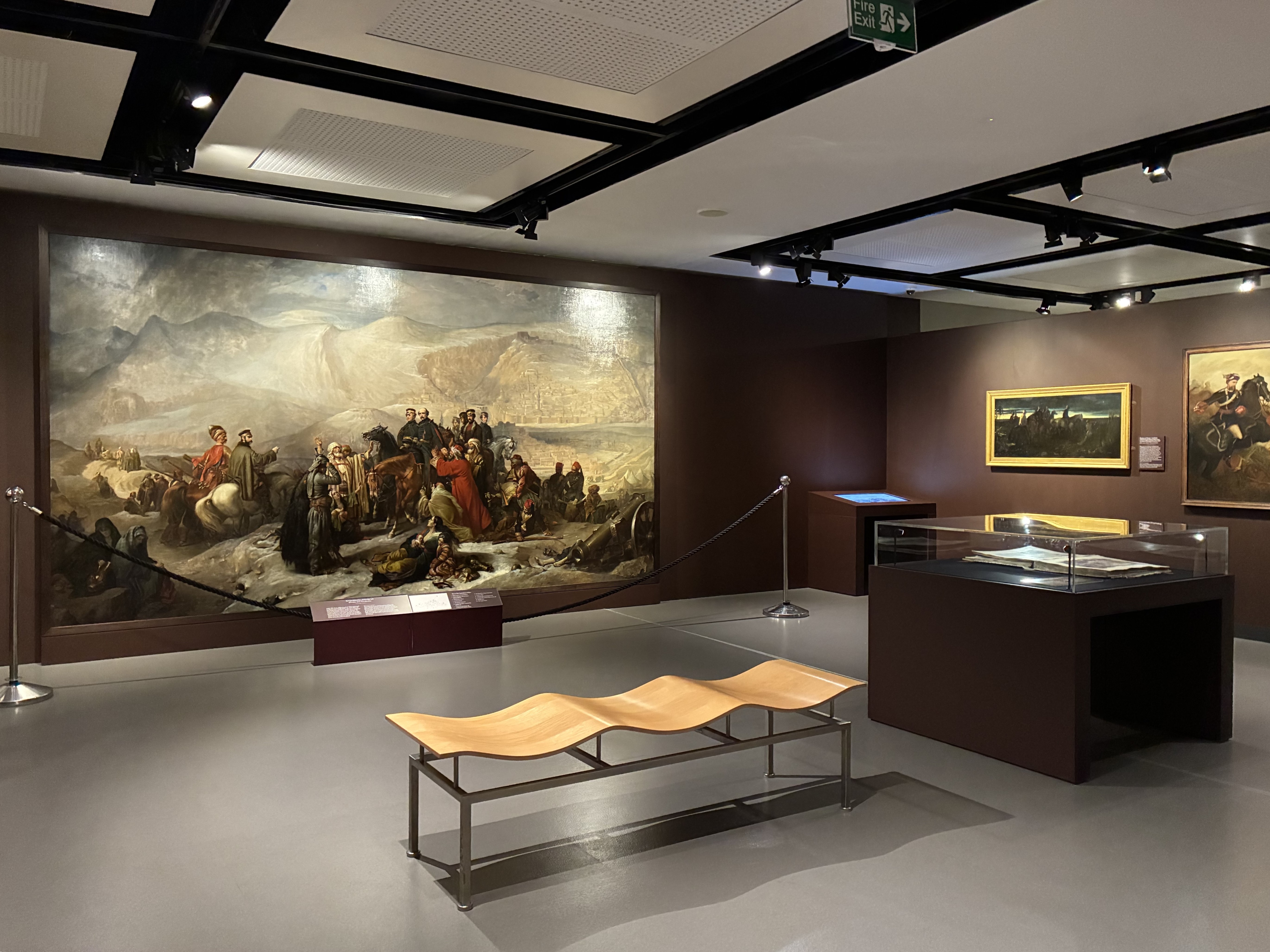
Installation view of Myth and Reality: Military Art in the Age of Queen Victoria at the National Army Museum showing the five-yard-wide oil painting ‘The Capitulation of Kars, Crimean War’ by Thomas Jones Barker (1855) with its static explanatory panel in front and an interactive screen off to the right (photo by the author)
Victoria’s Wars timeline
The exhibition includes a timeline of wars fought during Victoria’s reign. The point is that the British Army campaigned almost constantly throughout the period. There were a few big wars (the Crimean War, the Indian Mutiny and, right at the very end, the Boer War) but most of the conflicts we were involved in were small and localised, what modern historians call Victoria’s ‘small wars’.
- 1837 – Queen Victoria ascends the throne
- 1839 – the first photographs by Louis Daguerre in France and William Fox Talbot in England
- 1842 – the world’s first illustrated weekly news magazine launched, the Illustrated London News
- 1845 to 1846 – First Sikh War
- 1852 to 1853 – The Second Anglo-Burmese War
- 1853 to 1856 – the Crimean War
- 1854 – Florence Nightingale travels to Crimea with 38 nurses. William Howard Russell’s reporting for The Times transforms people’s understanding of the squalid reality of war. 25 October – Battle of Balaklava and Charge of the Light Brigade.
- 1854 – the Victoria Cross (VC) was introduced by Royal Warrant on 29 January 1856 to acknowledge the bravery displayed by soldiers and sailors during the Crimean War and soon after the Queen awards it to 62 Crimean war veterans

Queen Victoria and Prince Albert inspecting the wounded Grenadier Guards in Buckingham Palace. Coloured lithograph by George Thomas after himself (1855) Wellcome Collection
- 1857 to 1858 – the Indian Rebellion
- 1873 to 1874 – Third Anglo-Ashanti War
- 1878 to 1880 Second Anglo-Afghan War
- 1879 Anglo-Zulu War, featuring the Battle of Rorke’s Drift, 23 January 1879
- 1880 to 1881 First South African War
- 1882 Anglo-Egyptian War
- 1884 to 1885 – Siege of Gordon at Khartoum, leading to its fall on 26 January 1885
- 1885 Third Anglo-Burmese War
- 1895 to 1896 Fourth Anglo-Ashanti War
- 1898 – British reconquest of Sudan, featuring the Battle of Omdurman, 2 September 1898
- 1899 to 1902 – Second South African War, featuring the sieges, the concentration camps etc
- 1900 Fifth Anglo-Ashanti War
My take
There are about 40 artists, amateur and professional, soldiers and civilians, represented across the exhibition but the exhibition begins in a very decided way which raises a number of questions, because it starts with a strong emphasis on women war artists.
A feminist emphasis on women’s military art
The curators – all women – have decided that the first dozen or so works you see are all by women artists and devote several sections to them.
Victorian women artists, they tell us, helped to shape public perceptions of Army life. Many women were connected to soldiers through marriage or family, sometimes travelling with them abroad and depicting the people and places they saw.
Women were also important supporters and collectors of art, none more so than Queen Victoria herself. The Queen was also one of the most prominent subjects of military art, along with another celebrated figure of the time, Florence Nightingale – which explains why there’s a wall of works depicting the Queen meeting war veterans, awarding medals etc, and a little section about Florence Nightingale (who was famously averse to having her image captured, as she believed it detracted from her work).
However, as the exhibition proceeds you realise that most of the artists on display are not women, and, of course, none of the soldier artists are female – so why start this way unless you’re making a polemical feminist point? The implication seems to be that, after centuries or millennia of The Patriarchy, of tellings of history and art which downplay or completely ignore the role of women in the creation and consumption of art, this exhibition is doing its bit to redress the balance.
Fine. I understand. Why not? But there’s a second element to this approach which is notable and, maybe, problematic: this that one of the greatest, if not the greatest war artist of the Victorian era was Lady Elizabeth Butler, and so, hand-in-hand with the ‘women and military art’ section goes the ‘Lady Elizabeth Butler’ section. On one level there’s no quibbling with this: Butler was an outstanding artist and produced some of the standout works of the entire century. She was an absolute mistress of her craft, the half a dozen big paintings of hers brought together here are alone worth travelling to visit the show for, especially as several of them are usually buried in the Royal Collection.
So on the plus side, ignoring all its other features for a moment, you could say this is an outstanding selection of paintings, sketches and anecdotes by one of the nineteenth century’s great artists, and this is all to the good.
So why am I kvetching? Because the curators state, in these opening sections, in these early wall labels, that Lady Butler transformed military painting, depicting the life of soldiers with a new realism, taking a new, humane approach and setting a new standard for the subject. And this is all well and good, too, except that… In order to understand why Lady Butler is so important, and what she transformed, and what she changed it would have been good to have been fully introduced to the tradition of Victorian military painting which preceded her.
Instead, the result of placing Lady Butler right at the start of the show is to jump quite a long way into the later Victorian period without any preliminary explanation.
The work which really brought her to general attention was her ‘Roll Call’ which was displayed in 1874, 37 years into Victoria’s reign – and the first big work of hers which the curators feature, on the first wall of the exhibition, is ‘Dawn of Waterloo’ which was first displayed in 1895! 58 years into Victoria’s reign and only 6 years before her death. It’s a great painting but it comes at the very fag end of the period being covered and so is pretty misleading about the military art of Victoria’s era.

‘The Dawn of Waterloo: The Reveille in the Bivouac of the Scots Greys on the morning of the battle’ by Lady Butler (1895) the first full-scale painting by Lady Butler which the visitor encounters in ‘Myth and Reality: Military Art in the Age of Queen Victoria’ at the National Army Museum
Recap
So the decision to emphasise women’s role in military art may be laudable, and bringing a number of women’s works all together in the first few rooms ensures that the subject gets the prominence it deserves, rather than interspersing women’s works chronologically among the men’s pictures where they might be overlooked and unnoticed (as very probably happened in so many previous exhibitions on the subject).
Fine. And if you’re going to mention women artists of the time, then it would be silly not to mention and indeed have a section about the greatest of them, Lady Butler, also here right at the start. OK. Fine.
But the (maybe unintended) consequence of all this is that the visitor is deprived of a chronological understanding of the subject – of what military art looked like before Victoria, then at the start of her reign, how it developed through the decades leading up to the two seismic conflicts of the Crimean War and the Indian Mutiny in the 1850s, how it reflected trends in the broader art world, and so on.
You see how a chronological survey like this would have been interesting in itself and might also have better prepared the way for Lady Butler’s dramatic innovations: by the time you got to Lady B you’d have had a much better understanding of The Tradition she was transforming… but instead you have to work it out for yourself.
Five styles
This unchronological approach characterises the rest of the exhibition, too. Particularly in the sections about ‘Patriotism and Portraiture’ and ‘Realism and Reportage’, works from the 1840s or ’50s are placed next to works from the 1880s, ’90s or even early 1900s – it’s up to the visitor to make chronological, historical and aesthetic sense of the many different styles on display.
Having gone round the exhibition three or four times, dwelling on favourite works (and being drawn back again and again to the brilliant Butler paintings) I think I came up with about five different, roughly chronological styles of painting. They are:
- Romantic-sublime
- Patriotic-sentimental
- Mid-Victorian anecdotal
- Lady Butler
- Stiff official portraits
(This isn’t taking into account the pencil or charcoal sketches, and the many watercolours, which are specialist areas unto themselves.)
1. Romantic-sublime
Although painted in 1853 this picture strikes me as epitomising high Romanticism with its fondness for dramatic mountainous scenery and The Sublime. Look at the big baby eyes of Wellington (and his horse), the ethnic outfits of the local guides – it all has the rosy, soft-focus approach of Sir Water Scott’s novels.

Wellington at Sorauren, 27 July 1813 by Thomas Jones Barker 1853 © National Army Museum
2. Patriotic-sentimental
Kars is a city in north-eastern Turkey. In June 1855, as part of the during the Crimean War (1854 to 1856) it was besieged by a Russian army of 25,000. Demoralised by their defeats at the hands of the Russians, the Turks left the defence of Kars to Brevet Colonel (later General Sir) William Fenwick Williams, the British commissioner. The garrison was able to repulse three major Russian attacks but eventually cold, famine and an outbreak of cholera forced it to surrender on 26 November 1885. In recognition of their heroism, the Russians allowed the British garrison to march out of the city with the honours of war and into captivity.

‘The Capitulation of Kars, Crimean War’ by Thomas Jones Barker (1855) (National Army Museum)
This is a huge painting, over five yards wide (!), and it’s accompanied by not one but two diagrams identifying all the figures in it, one a static diagram, one an interactive display of the same. But it was only chatting to one of the (very well-informed) visitor assistants that I really understood what is going on.
You see the local in the red cloak clutching the hand of the bald British officer on his horse (Major General Fenwick Williams) and the cascade of similar locals off to his right, and the pitiful woman lying on the ground with her helpless children in the foreground, and similar locals on his left?
These are the local Turks who the British are abandoning to the kindness of the conquering Russians. So they are pleading with the British not to leave and abandon them but the British, defeated, have to. (Maybe a modern analogy would by NATO forces pulling out of Afghanistan and letting the Taliban take over.) It is this acute sense of regret and shame which explains the expression on the face of the British officer.
(You could write a book about the peoples the British Army promised to protect, only to abandon them – I’m currently reading a book about the Dutch Revolt which mentions that Queen Elizabeth I made all kinds of promises to the Dutch patriots in the 1580s which she then completely broke… It’s a long tradition.)
Back to the painting: ‘The Capitulation’, then, is a psychological study in the pain and embarrassment of duty, of a fine upstanding officer mortified to be abandoning the people he promised to protect. As such it is full of all kinds of melodramatic details, the thrown-up hands of the man in white on the left, the tearful eyes of the woman on the ground. It’s like a tableau from a mid-Victorian melodrama, at the centre of which is the British officer maintaining a stiff upper lip despite being deeply moved.
In fact it tells you a lot about mid-Victorian art and audiences that the work was commissioned, not by an aristocratic patron, but by the art dealers and print makers Agnew and Sons, precisely to be turned into prints and widely sold. So it is very deliberately catering to popular taste and demand.
3. Mid-Victorian anecdotal
The Victorians loved detail and clutter. Dickens’s novels overflow with wonderfully telling details and so do classic mid-Victorian paintings like William Powell Frith’s Derby Day (1858) or The Railway Station (1862), packed with little stories and anecdotal details. The exhibition includes an absolute classic of this style, ‘Home Again’ by Henry Nelson O’Neil.

‘Home Again’ by Henry Nelson O’Neil (1860)
‘Home Again’ depicts soldiers disembarking from a troopship at Gravesend on their return from the Indian Mutiny (1857 to 1859). For military history buffs the curators tell us that about 40,000 British troops were sent to India (more than had been mobilized for the Crimean conflict) to suppress the mutiny among the Indian troops of the East India Company’s Bengal Army.
But in purely visual terms we are invited to relish the details! At the very top a young woman peers over the shoulder of a bearded infantry corporal, who holds their baby for the first time. In the middle-right a young soldier of the 60th (The King’s Royal Rifle Corps) dressed all in black leans down to offer his Victoria Cross to a Chelsea Pensioner. The central action depicts sailors assisting a wounded sergeant to disembark. We are told that he wears a Kilmarnock ‘pork-pie’ cap under the white cotton ‘Havelock’ cover distinctive to the campaign, with the neck flap for protection from sunstroke.
There is patriotic pride here, and sentimentality of a sort, but it is very clearly all about the common people, ordinary soldiers (and sailors) and their reunions with wives and sweethearts. As such, it a little bit anticipates Lady Butler’s humanism but still with that mid-Victorian obsession with anecdote and detail.
4. Lady Butler
‘The Roll Call’ is one of the most celebrated British paintings of the 19th century. On its public appearance in 1874 it cemented Butler’s reputation as one of the leading painters of the age. It depicts a roll call of soldiers from the Grenadier Guards following the Battle of Inkerman in 1854 but can stand for thousands of similar occasions.

The Roll Call by Lady Elizabeth Butler (1874) © Royal Collection Enterprises Limited 2025 | Royal Collection Trust
The composition expresses Butler’s profound feel for the plight and experiences of the ordinary soldier, for the pity of war and the walls of the show feature not one but two quotations by her, emphasising how she eschewed patriotic guff in her concern for the actual lived experiences of the men who fought and suffered.
‘I never painted for the glory of war, but to portray its pathos and heroism’.
‘The Roll Call’ was fantastically successful. When it went on display at the Royal Academy it attracted over 300,000 visitors in a 3-month period and the more you look, the more brilliant it becomes.
The curators explain that historical or military painting for a long time worked with the basic design of a triangle which places the most important person – generally the commanding officer – at the apex (as in the pictures of Wellington and Major General Fenwick Williams, above). As soon as that’s pointed out to you, you realise really drastic difference her, the polemical message sent by the composition which is the equality of the men, all placed on the same level.
There’s still an anecdotal aspect to the thing, if you go up close and work slowly from left to right, starting with the two soldiers on the left lighting a sneaky fag or cigar, and working along through the bandages and blood of the wounded to the striking element of the man who’s collapsed into the snow. It really conveys the wretched pity of war, 44 years before Wilfred Owen coined the phrase for his volume of First World War poetry.
There is, of course, a figure on horseback, but he isn’t treated with the Romantic sentimentalism of the Wellington, above. Instead we can feel the gruff sympathy of the sergeant in charge as he reviews his wounded troops. And he also acts as the viewer’s entrance point into the work. If it was just the row of soldiers it would be slightly impenetrable: the officer on horseback not only relieves what might have been monotonous, but his movement carries the eye into the composition.
But there’s more because, after you’ve finished admiring the overall shape and canny dynamism of the composition, if you step back you notice the colours. You notice how Butler has depicted the uniforms of the men with great accuracy but used them as a springboard to create a composition of shades of grey. The grey coats and badges are reflected under the line of men by the different shades of snow and above them by the extremely nuanced and varied shading of the clouds.
On a literal level the coldness of the winter is evoked by the dominant tones of black, grey, white and brown, contrasting with small splashes of red from coatees and flags. But on a more aesthetic level, the awareness of shades of grey makes you think of James McNeil Whistler’s compositions, symphonies of certain palettes and timbres.
And then you notice the crows, the brilliant broken flight of crows coming from the middle of the composition and looping up over the head of the reviewing officer.
In its: 1) absence of sentimentality; 2) its immediately felt humanistic concern for the plight of the average soldier; and 3) its stunning painterliness, its brilliance of composition and colouring, ‘Roll Call’ really is a masterpiece. It’s worth visiting the exhibition just to see this one work in the flesh.
5. Stiff official portraits
Something the curators of the Army Museum must struggle with is that so much military art is decidedly average, if not actively poor. One or two of the battle paintings here struck me as ludicrously bad, but there’s a more subtle problem and that’s to do with military portraits.
I bet there are tens of thousands of these up and down the land, professional portraits of Britain’s countless officers, generals, admirals and so on which are good enough, decent enough, professional likenesses, but are never going to make it into anyone’s history of art because they are, by their nature, a very conservative wing of the medium.
Their number, their prevalence and popularity in Victorian times explain why there is a section titled ‘Patriotism and Portraiture’ here. Not only did ‘the people’ want to see portraits of heroes like Wellington or Gordon or Roberts, but countless military families wanted professional portraits of their eminent male members to hang alongside all their forebears, and hundreds of officers messes and regimental headquarters, ditto.
Hence a half dozen masterpieces of stultifying conventionality and woodenness.

Lieutenant The Honourable Frederick Hugh Sherston Roberts VC, Kings Royal Rifle Corps by Julian Russell Story (1899)
There’s a story behind this portrait, which is that Roberts not only won the Victoria Cross, but the same medal was awarded to his father, Field Marshal Frederick Sleigh Roberts, 1st Earl Roberts, making them one of only three father-and-son pairs to be awarded the VC in its 169-year history.
Watercolours
As mentioned, the exhibition includes 20 or so watercolours, much smaller and more intimate than the bombastic oil paintings. In a sense, watercolours under-promise and so are often able to over-deliver.

Installation view of Myth and Reality: Military Art in the Age of Queen Victoria at the National Army Museum showing a set of six watercolours of the Crimean War by William Simpson (photo by the author)
General Cannon’s landing, July 7 1854
My wife and I play a simple game when visiting exhibitions. Having crawled through the exhibits and rooms, reading and processing every wall label, we reach the end, turn round and go back through it, this time lightly, airily choosing one work per room which we like and having to explain why. A variation is to choose a work we would buy and take home to hang in the landing or hall or wherever. As I’ve stated, the Lady Butler paintings are all brilliant, but in terms of something I’d actually buy and live with, something a bit more modest, I kept returning to one of the 20 or so watercolours on display, ‘General Cannon’s landing, July 7 1854’, a pencil and watercolour by Joseph Archer Crowe (who has seven works in the exhibition).

‘General Cannon’s landing, July 7 1854’ Pencil and watercolour by Joseph Archer Crowe
Crowe worked at the Crimean War as a special artist for The Illustrated London News. This watercolour depicts how, on 7 July 1854, Turkish forces launched an amphibious assault across the River Danube on Russian positions at Giurgiu (in modern day Romania). The Russians were driven back and Giurgiu was occupied by the Turks.
It’s not going to rock anyone’s world, I just liked the composition, the line of ships going in from roughly right to left, and the light impressionistic touches of colour.
Women artists
I may have missed some but, for the record, here are the women military artists featured in the exhibition:
- Lady Elizabeth Butler
- Jane Drummond (portrait of Mrs Anne Steele)
- Gertrude Ellen Burrard (portrait of Nussiban, our ayah)
- Elizabeth Anne Leslie Melville (portrait of Major General Sir Owen Tudor Burne)
- Emily Henrietta Ormsby (portrait of Colonel Henry Francis Strange; portrait of Major General John William Ormsby)
Lady Butler’s works
- Tenth Bengal Lancers tent pegging (1873)
- The Roll Call (1874)
- Study of a Wounded Guardsman (1874)
- Quatre Bras (engraving of oil painting, 1879)
- Patient Heroes: A Royal Artillery Gun Team in Action (1882)
- Scotland Forever! (engraving after oil painting, 1882)
- After the Battle of Tel-el-Kebir (engraving of original painting, 1888)
- After the Battle of Tel-el-Kebir (fragment of original painting, 1888)
- The Defence of Rorke’s Drift (1882)
- The Ballad of the Royal Irish at Sebastapol (6 x pencil illustrations of a poem, 1890)
- Military sketches (pen, watercolour and pencil, 1893)
Summary
I don’t know whether my point about the lack of chronology and build-up to Lady B is even worth mentioning. My wife went round the displays two or three times with me and didn’t even notice or care, just enjoyed various works on their own merit.
So: if you’re interested in military history the exhibition contains lots of titbits about key wars and engagements of Victoria’s reign, about medals and uniforms, some lovely watercolours and a dozen or so really impressive oil paintings, along with a number of average or also-ran works which, however, illustrate interesting topics, such as the section about the creation of the Victoria Cross, and so on.
And the National Army Museum is always a lovely place to visit because – ironically, given its subject matter – it’s such a calm, clean and peaceful place to be. Go see.
Related links
Related reviews