Lucian Freud: Drawing into Painting @ the National Portrait Gallery

Lucian Freud (1922 to 2011) was a British painter and draughtsman, specialising in figurative art, who is known as one of England’s leading 20th-century portraitists.

Towards the end of his life, the Lucian Freud Archive was created by accumulating the artist’s personal papers, sketchbooks, and working materials over his lifetime. Spanning his long working life from about 1939 to 2011, the Archive contains over 160 childhood drawings, 47 sketchbooks containing some 600 drawings, and personal letters. In 2015 the Archive was officially acquired by the National Portrait Gallery.

Now a generous selection of images from the Archive is on display at the National Portrait Gallery. These include a wealth of early drawings and sketches, newly acquired etchings of family members which, along with Freud’s etching tools and his paintbox. As we progress through the show, we watch him evolve from his early bug-eyed cartoony style, into something more caustic and realistic, showing his development from standalone drawings into sketches which are obvious preparations for paintings, and then on to a dozen or so finished oil paintings in his mature style. The combination of all these formats is designed to showcase Freud’s skill as a draughtsman across many mediums, in

Created in close collaboration with David Dawson, Director of the Lucian Freud Archive, this is the first exhibition of Freud’s work at the National Portrait Gallery since the major painting retrospective Lucian Freud Portraits, in 2012.

Gallery

The show opens with a wall-sized blown-up image of Freud’s studio.

Wall-sized photo of Freud’s studio towards the end of his life, in ‘Lucian Freud: Drawing into Painting’ at the National Portrait Gallery (photo by the author)

There’s a selection of schoolboy drawings, for real completists.

Lucian Freud schoolboy drawings in ‘Lucian Freud: Drawing into Painting’ at the National Portrait Gallery (photo by the author)

Early style – portrait drawings from the 1940s.

Early ‘cartoon’ style in ‘Lucian Freud: Drawing into Painting’ at the National Portrait Gallery (photo by the author)

‘Girl with Roses’, painted in 1948, is a seminal early oil-on-canvas portrait by Lucian Freud, of his first wife, Kitty Garman. It depicts a tense, pregnant Kitty looking away with a stiff posture, clutching a ‘Peace’ rose while another lies in her lap.

Girl with roses / portrait of his wife (1948) in ‘Lucian Freud: Drawing into Painting’ at the National Portrait Gallery (photo by the author)

One of several display cases showing drawings from the sketchbooks.

Display case of drawings in ‘Lucian Freud: Drawing into Painting’ at the National Portrait Gallery (photo by the author)

Portraits from the 1950s – in my opinion, scrappy and inconsistent.

Wall of 1960s portraits in ‘Lucian Freud: Drawing into Painting’ at the National Portrait Gallery (photo by the author)

Forty years later, 2000s portraits: more consistent, more detailed, darker, closer up. Far more impactful.

Wall of 2000s portraits in ‘Lucian Freud: Drawing into Painting’ at the National Portrait Gallery (photo by the author)

Transitioning to his mature style i.e. naked figures, in ungainly poses, painted with a kind of brutal honesty. This relatively small work is one of a series of naked portraits of his lover Jacquetta Eliot.

Small naked portrait from 1973-4 in ‘Lucian Freud: Drawing into Painting’ at the National Portrait Gallery (photo by the author)

Preparatory sketches and final painting, in his mature style. Studying these, it struck me that the drawings have an open quality – the poses are somehow more free and suggestive – whereas the finished oil painting is much more heavy and closed. On reflection maybe part of this is because the painting has a detailed backdrop – the sofa and rumpled white sheet, depicted in great detail – whereas the bodies in the sketches float free in an abstract white space.

Preparatory sketches and final painting in his mature style in ‘Lucian Freud: Drawing into Painting’ at the National Portrait Gallery (photo by the author)

Letters and comments by friends reveal that as a boy and young man, Freud did lots of drawings of animals. The exhibition includes some of these, including a number of etchings of his whippet, Eli. Here’s one from 2002 set next to a drawing of a toy rabbit from 60 years earlier, in his early style.

Eli (2002) and Rabbit on a chair (1944) in ‘Lucian Freud: Drawing into Painting’ at the National Portrait Gallery (photo by the author)

The exhibition has a section on group portraits he made as direct homages to works by classical painters, one by Watteau (Large interior W11, 1983), a few etchings inspired by Chardin.

The last few rooms contain prime examples of both his massive full body nude paintings, alongside more ‘discreet’ portrait busts. There are famous portraits of David Hockney (2002) and Queen Elizabeth II (2001), alongside equally vivid portraits of less well-known figures, and a couple of his really vivid self portraits.

Thoughts

In my mind I had a simple mental model of Early style – Naked style – Mature style, but this exhibition is distinguished by a lot more variety and digressions and distractions than that suggests (the school drawings, animals, Old Master homages, among many others) which you will either find enchanting (if you’re a Freud fan) or maybe a little confusing (as I think I did).

A problem with Freud is that, once you’ve seen a number of his naked portraits, especially the ones where the sitters are showing off their big, sore-looking red scrotums, it’s a little hard to expunge the shock of these images from your mind.

Sprawling naked men in ‘Lucian Freud: Drawing into Painting’ at the National Portrait Gallery (photo by the author)

In among the mix, a distinct and different theme which came over to me was the importance of Family and Friends – a recurrent theme in the sketches, drawings and paintings of his wife, his lovers, his children and grandchildren. (Freud was known for his vast, often chaotic family life, having acknowledged at least 14 children with various women.) These are ‘intimate’ in a different sense, an emotional sense.

Intimate late portraits in ‘Lucian Freud: Drawing into Painting’ at the National Portrait Gallery (photo by the author)


Related links

Related reviews

Portrait of the Artist as a Young Man by James Joyce (1916)

Joyce is the most intimately autobiographical of writers.
(Hugh Kenner)

By thinking of things, you could understand them.
(Stephen Dedalus as a boy)

Words which he did not understand he said over and over to himself till he had learnt them by heart: and through them he had glimpses of the real world about them.
(Stephen’s boyish fascination with words)

Ad majorem Dei gloriam!
(Motto of the Jesuit order who run the schools where young Stephen is educated)

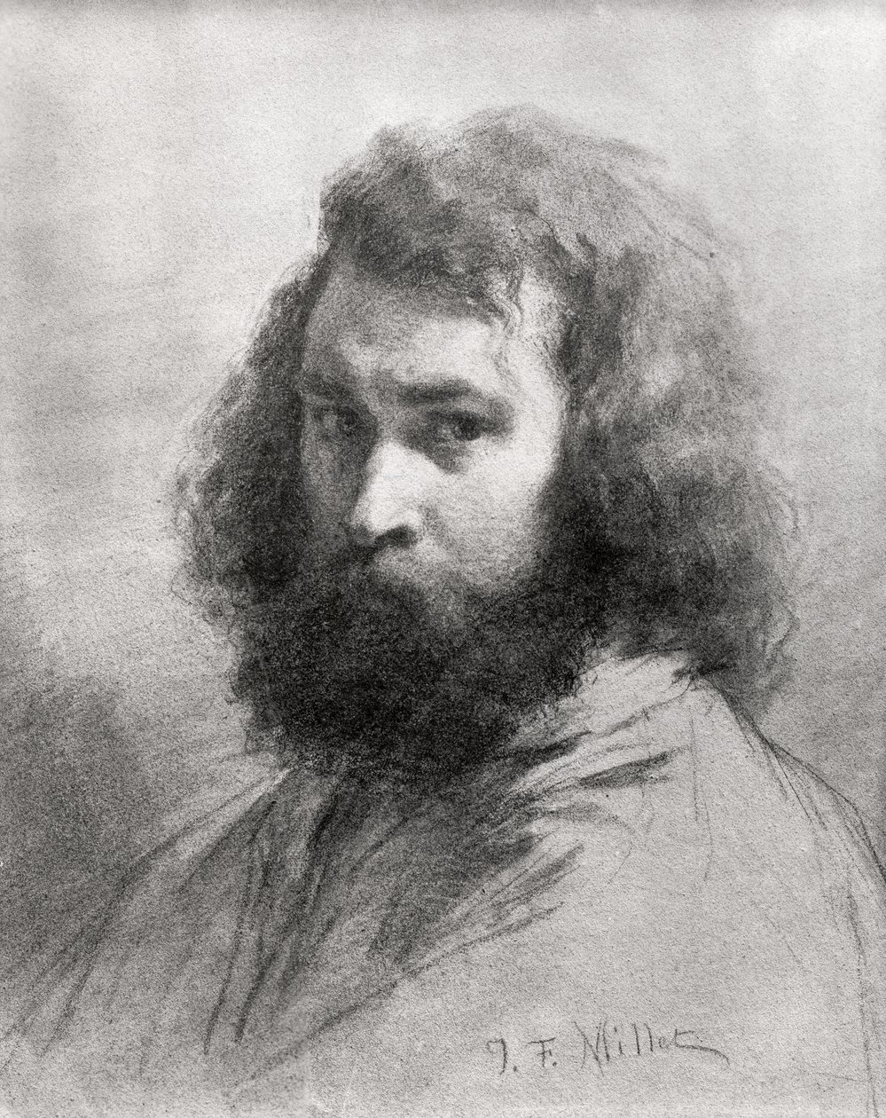
‘A Portrait of the Artist as a Young Man’, published in 1916, was the second book and first novel by Irish writer James Joyce, following Dubliners, published in 1914. It is a Bildungsroman, a German term for a novel which describes the growth of a personality or mind, in this case, as the title indicates, it is pretty much a self portrait of the development of Joyce’s mind, although cast in the shape of his fictional alter ego, Stephen Dedalus.

The meaning of his name

Like everything in Joyce, Stephen Dedalus’s name is highly symbolic or meaningful. Stephen was the first Christian martyr, suggesting that the character is the inventor of a new aesthetic, mocked and martyred for a new vision of art. While his surname obviously alludes to Daedalus, the skilled artificer of Greek mythology who built the labyrinth to contain the monstrous Minotaur begging the question, Are the complex texts Stephen creates also designed to hide and contain some monstrous secret? The character is well aware of the connection.

Now, as never before, his strange name seemed to him a prophecy… Yes! Yes! Yes! He would create proudly out of the freedom and power of his soul, as the great artificer whose name he bore [Dedalus], a living thing, new and soaring and beautiful, impalpable, imperishable.

One-stop synopsis

So the narrative traces the religious and intellectual awakening of young Stephen Dedalus, divided into 5 chapters or phases. In a nutshell, Stephen grows up in a Catholic family which is initially wealthy enough to send him to a private Jesuit school but which then slowly sinks in the world. His education by systematic and intellectual Jesuits decisively forms Stephen’s mind, which becomes highly intellectual and systematic in its turn.

There are various boyhood and schoolboy adventures (the injustice of being ‘pandybatted’ (hit on the palm of his hand by a pandybat) when he had done nothing wrong; an extended passage around a theatrical performance at his secondary school) before Stephen hits puberty in chapter 3 and, as far as I can tell, becomes addicted to masturbation and sleeping with Dublin prostitutes.

This generates feelings of self-loathing which climax when his class at school goes on a four-day Catholic retreat. Here Stephen and his schoolmates are subjected to a series of sermons about hell and damnation which are brilliantly written, unrelenting in their Jesuitical logic, and terrify young Stephen so much that he overcomes his fears and goes to confession for the first time in eight months, and compulsively lists his sexual sins. To my amazement the text tells us that Stephen is, at this stage, still only 16 years old.

After this psychological purgation Stephen feels wonderfully liberated and cleansed and the shortish chapter 4 shows him undertaking a life of devout religious fervour, continually praying, counting off his rosary, observing all the Catholic feast days, and so on. His devoutness brings him to the attention of his teachers and he is called in by the Dean of his school who asks him to reflect on whether he has a vocation to become a priest, prompting the boy Stephen to reflect, not for the first time, on what this life would be like as Father Stephen Dedalus S.J. (i.e. of the Society of Jesus). Only towards the end of the chapter are there signs that he is starting to doubt his own sincerity, starting to doubt how effective his incessant religious practice really is.

The final chapter, chapter 5, is the longest and is set in real time rather than a scene-skipping retrospective. It shows Stephen as a student at Dublin university, placing him among a cohort of students of his own generation. Without much explanation he has shaken off the fervent religious faith and practice we were told about in the previous chapter and is now a cynical, worldly student.

At least that’s how he comes over to his peers, who are also playing at being cynical worldly students. In reality Stephen has retained a lot of his youthful idealism but it has been redirected away from conventional religion towards a religion of Art. (This, of course, very much reflects the fin-de-siecle movement right across Europe towards Art for Art’s Sake and Aestheticism which was – exactly as with Stephen – an attempt to create a secular religion of Art to replace the traditional Christian faith which had been so undermined by all aspects of nineteenth century life, from industrialisation to Darwin’s theory of evolution see Symbolism by Michael Gibson.)

Entirely in keeping with all this, we learn from a conversation he has with the Dean of Studies, that Stephen is working on a long essay on a theory of aesthetics. In chapter 5 he attends a university lecture then walks around Dublin, accompanied by a student friend who (conveniently enough) asks him about his essay, prompting Stephen/Joyce to a long and systematic explanation of his aesthetic theory.

Among other things he speculates that there is an evolution in art forms from the lyric – which is entirely about the artist, a magnification of the artist’s own feelings – to the dramatic, at the other end of the spectrum – in which the artist completely effaces themself in order to present the subject as objectively as possible. However, the artist can never completely eliminate themselves and so, even though they nowhere refer to themselves, their personality remains present in their choice of subject matter and style. This is the context of Stephen’ famous statement:

The dramatic form is reached when the vitality which has flowed and eddied round each person fills every person with such vital force that he or she assumes a proper and intangible aesthetic life. The personality of the artist, at first a cry or a cadence or a mood and then a fluid and lambent narrative, finally refines itself out of existence, impersonalizes itself, so to speak. The aesthetic image in the dramatic form is life purified in and reprojected from the human imagination. The mystery of aesthetic, like that of material creation, is accomplished. The artist, like the God of creation, remains within or behind or beyond or above his handiwork, invisible, refined out of existence, indifferent, paring his fingernails.

Throughout the text, Joyce had dropped in umpteen phrases indicating Stephen’s alienation from his surroundings, from his family, from his friends, from the same old repetitive political issues (Irish nationalism) all of whom he regards with a kind of mocking detachment – and, finally, from the Catholic religion which he at one point embraced with all the enthusiasm he was capable of, before finding his faith slipping away from him. This lifelong sense of being an outsider looking on at everyone else is what underpins the book’s other famous declaration, in the last few pages, where Stephen tells us that he needs to escape the ‘nets’ which trap him.

— When the soul of a man is born in this country there are nets flung at it to hold it back from flight. You talk to me of nationality, language, religion. I shall try to fly by those nets.

Which he amplifies and explains further:

—Look here, Cranly, he said. You have asked me what I would do and what I would not do. I will tell you what I will do and what I will not do. I will not serve that in which I no longer believe, whether it call itself my home, my fatherland, or my church: and I will try to express myself in some mode of life or art as freely as I can and as wholly as I can, using for my defence the only arms I allow myself to use—silence, exile and cunning.

And so the book ends with Stephen determined to fly all the nets which threaten to imprison him and leave Ireland for good. As Joyce himself, of course, did.

Autobiographical timeline

First readers of any of Joyce’s works, especially those featuring Stephen Dedalus, sometimes ask how autobiographical the work is. The answer is, very autobiographical. Here are the relevant dates from Joyce’s own life – you can see how closely they match the career of Stephen Dedalus:

  • 1882 Joyce is born in Rathgar, Dublin on 2 February
  • 1888 Joyce begins school at Clongowes Wood College, a Jesuit boarding school near Clane, County Kildare
  • 1891 Has to leave Clongowes when his father could no longer pay the fees; studied at home and briefly attended the Christian Brothers O’Connell School on North Richmond Street, Dublin
  • 1893 Starts attending Belvedere College, a fee-paying day school for boys run by Jesuits; attends for 5 years
  • 1898 Begins college at University College, Dublin, to study English, French and Italian

Publication history

‘A Portrait’ began life in 1904 as ‘Stephen Hero’ — a projected 63-chapter autobiographical novel in a realistic style. After writing 25 chapters, in 1907 Joyce abandoned ‘Stephen Hero’ and set about reworking its themes and protagonist into the condensed five-chapter novel we have now. He abandoned the first novel’s strict realism and switched to making extensive use of free indirect speech that allows the reader to directly share Stephen’s developing consciousness, to feel, see and hear things from Stephen’s point of view.

The American modernist poet Ezra Pound arranged for the novel to be serialised in the English literary magazine The Egoist in 1914 and 1915, and published as a book in 1916 by B.W. Huebsch of New York. The publication of ‘A Portrait’ just two years after the short story collection ‘Dubliners’ (1914) earned Joyce a place at the forefront of literary modernism, a position which was, of course, to be clinched by the scandal and notoriety surrounding the publication of Ulysses, which began to be published in serial form in the literary magazine The Little Review in 1918, finally published in book form in 1922. 1914, 1916, 1918, a concentrated burst of publication which helped cement his reputation.

Here are sometimes abbreviated notes on the individual chapters.

Chapter 1 (48 pages)

Father’s nursery rhyme. Home life with Dante (Mrs Riordan) the nationalist. At school at Clongowes Wood College. Being bullied. Football. The sound of the word suck.

Suck was a queer word. The fellow called Simon Moonan that name because Simon Moonan used to tie the prefect’s false sleeves behind his back and the prefect used to let on to be angry. But the sound was ugly. Once he had washed his hands in the lavatory of the Wicklow Hotel and his father pulled the stopper up by the chain after and the dirty water went down through the hole in the basin. And when it had all gone down slowly the hole in the basin had made a sound like that: suck. Only louder.

Thoughts about God and the universe. Holidays and prayers. The story of the ghost. The mystery of kissing:

What did that mean, to kiss? You put your face up like that to say goodnight and then his mother put her face down. That was to kiss. His mother put her lips on his cheek; her lips were soft and they wetted his cheek; and they made a tiny little noise: kiss. Why did people do that with their two faces?

After being pushed into a mucky ditch by another boy, Wells, Stephen gets a cold. In the infirmary. Friendship with Athy.

He told Stephen that his name was Athy and that his father kept a lot of racehorses that were spiffing jumpers and that his father would give a good tip to Brother Michael any time he wanted it because Brother Michael was very decent and always told him the news out of the paper they got every day up in the castle.

Later, in Chapter 3, Stephen looks back at life at Clongowes which he summarises as: ‘the wide playgrounds, swarming with boys, the square ditch, the little cemetery off the main avenue of limes where he had dreamed of being buried, the firelight on the wall of the infirmary where he lay sick, the sorrowful face of Brother Michael.’

Home for Christmas dinner, which is scene to a flaring row between Mr Dedalus, his friend Mr Casey and inflexible Dante about whether Parnell was hounded to his grave by lackey priests, or deserved punishment for being a fornicator. Story of the famous spit. Mr D says the Irish are ‘A priestridden Godforsaken race!’ When Casey says Ireland must be free of religion (‘No God for Ireland! he cried. We have had too much God in Ireland. Away with God!’) devout Dante storms out while Mr Casey burst into tears for his lost leader.

Back at school, gossip about why some fellows (Simon Moonan and Tusker) got a flogging (is it for some kind of homosexual escapade referred to as ‘smugging’?). Because Stephen’s glasses are broken (someone bumped into him and they fell and broke on a cinder path) Father Arnell gives him permission not to write, but when the sadistic Prefect of Studies, Father Dolan, visits his class, he ignores this excuse, accuses Stephen of slacking, calls him to the front of the class and hits him on the hands with a pandybat, inflicting intense pain. Stephen’s sense of injustice is so strong he overcomes his own fear to go down the special corridor to the rector’s room and report it. The rector assures him it must be a mistake and shakes hands. Back among the fellows, Stephen is cheered as a hero.

Chapter 2 (40 pages)

Opens with the Dedalus family enjoying an extended summer holiday in Blackrock, a seaside suburb of Dublin. Stephen accompanies old Uncle Charles on shopping trips. At the park, he is ‘trained’ as a runner by unhealthy looking Mike Flynn, mate of his dad’s, a fad which doesn’t last. On Sundays Stephen goes with his father and grand-uncle on huge walks. He is reading ‘The Count of Monte Cristo’ and sees himself as the book’s hero Edmond Dantès seeking for his equivalent of the heroine, Mercedes.

Friendship with Aubrey Mills and they set up a gang but at the end of the summer the gang breaks up. He senses change at home, where his father’s fortunes are failing which is why he isn’t sent back to the fee-paying Clongowes school. The beginnings of the adolescent sense of frustration and aloneness:

The ambition which he felt astir at times in the darkness of his soul sought no outlet.

A fever gathered within him and led him to rove alone in the evening along the quiet avenue… his restless heart… The noise of children at play… made him feel, even more keenly than he had felt at Clongowes, that he was different from others…

Removal vans turn up and move the household stuff from Blackrock to a new house in Dublin. Stephen doesn’t like the city, finds it overwhelming. More alienation:

  • his mood of embittered silence… He was angry with himself for being young and the prey of restless foolish impulses… He chronicled with patience what he saw, detaching himself from it and tasting its mortifying flavour in secret…

The text breaks down into short vignettes which demonstrate how ‘His silent watchful manner had grown upon him’. In the last of which a young woman is near him on the tram steps. Haunted by her, he goes home and tries to write a poem i.e. burgeoning sensuality and sensitivity.

His father arranges for him to go to a Jesuit day school, Belvedere. Long passage describing the first night of a school play at Belvedere, where Stephen is ragged by his frenemy, Heron. He’s now in the sixth form and filled ‘with unrest and bitter thoughts’. He goes onstage, performs and is so pumped with adrenaline when he comes offstage that he runs right past his waiting parents and wanders the streets till he’s calmed down and can go back.

Stephen accompanies his father on the latter’s nostalgic journey back to Cork. This is mainly to sell some of his remaining property at an auction, a financial necessity reflecting the family’s declining fortunes, but Mr D uses it to recapture his long-vanished youth. Stephen is appalled at his father’s sentimental drinking sessions with his old buddies. He is now permanently filled with self-disgust.

A leader afraid of his own authority, proud and sensitive and suspicious, battling against the squalor of his life and against the riot of his mind… Nothing stirred within his soul but a cold and cruel and loveless lust.

Stephen wins money for an exhibition (to college?) and a prize, and blows it all on luxuries for his family.

He feels completely alienated from his father, mother and brother (Maurice). He keeps talking about secret riots and orgies (‘dark orgiastic riot’) and living in sin (‘the wasting fires of lust’) so it began to dawn on me maybe all this refers to masturbation. He wanders the streets in a fever of lust. All this leads up to a visit to a prostitute. Lust leads to all other sins:

From the evil seed of lust all other deadly sins had sprung forth: pride in himself and contempt of others, covetousness in using money for the purchase of unlawful pleasures, envy of those whose vices he could not reach to and calumnious murmuring against the pious, gluttonous enjoyment of food, the dull glowering anger amid which he brooded upon his longing, the swamp of spiritual and bodily sloth in which his whole being had sunk.

Chapter 3 (39 pages)

A cold lucid indifference reigned in his soul.

Stephen has become a regular frequenter of Dublin’s red light district, sauntering and taking prostitutes as his fancy takes him.

He had sinned mortally not once but many times and he knew that, while he stood in danger of eternal damnation for the first sin alone, by every succeeding sin he multiplied his guilt and his punishment.

At Belvedere he now holds the position of prefect of the Sodality of the Blessed Virgin Mary, responsible for supervising the young boys at Mass, which sits bitterly ironically alongside his night-time debauchery but ‘ The falsehood of his position did not pain him.’

A little way into Chapter 3 his class are sent on a religious retreat which is marked by the series of sermons given by Father Arnall (who appears to be on secondment from Clongowes – after all, they’re both Jesuit establishments). The sermons’ subject is the four Last Things: death, judgment, heaven and hell, and it triggers ‘a crisis of guilt and piety’ in Stephen, prompting a period of profound introspection and desire for repentance but which reads more, to me, like a panic attack:

The next day brought death and judgement, stirring his soul slowly from its listless despair. The faint glimmer of fear became a terror of spirit as the hoarse voice of the preacher blew death into his soul. He suffered its agony. He felt the deathchill touch the extremities and creep onward towards the heart, the film of death veiling the eyes, the bright centres of the brain extinguished one by one like lamps, the last sweat oozing upon the skin, the powerlessness of the dying limbs, the speech thickening and wandering and failing, the heart throbbing faintly and more faintly, all but vanquished, the breath, the poor breath, the poor helpless human spirit, sobbing and sighing, gurgling and rattling in the throat. No help! No help!

The sermons describe in exquisitely logical detail: the original sin of Lucifer and his fellow angels who fell from heaven at God’s command; the torments of hell in terrifying detail, beginning with the physical horrors: the pestilential air of hell; the stench of rotting bodies; the nature of the fires of hell which rage intensely and eternally; how the blood and the brains of the sinner boil with no hope of relief; the torment deriving from the squalid company endured by every soul in hell, devils as well as other sinners.

This first sermon leaves Stephen paralysed with fear and convinced that he, personally, is going to hell. After chapel he listens to the trivial talk of the other students who are not as affected by the sermon as he is. There is an academic class, then it’s back to the chapel for another sermon in which Father Arnall continues his tour of hell, switching from physical to spiritual torments, chief among which is the pain of separation from God.

Stephen is terrified all over again. When he goes to his room he hallucinates a devil waiting in it to attack him. When he closes his eyes he has an image of being stuck in a muddy swamp with devil creatures, forever. He runs to the window, throws it open and gasps for air.

Walking through the city that evening he asks an old woman the way to the nearest church, restlessly waits his turn, and then makes a big confession to the priest. We learn that it is 8 long months since his last confession, and that he is a mere boy of 16. The priest offers forgiveness and Stephen walks home feeling light and purged and full of grace.

Chapter 4 (24 pages)

Following on from his confession and feeling of having been born again, Stephen becomes a religious fanatic, living every day and every hour according to optimum best practice, praying all the time, saying his rosary etc. This reaches a climax when he is called in by the director of Belvedere College and asked to ponder whether he thinks he has a vocation for the priesthood which, in fact, is something he has often wondered…

Only slowly, towards the end of the chapter, do doubts set in – and the whole chapter is capped by a walk on the beach where he sees a young woman with her skirt hitched up standing in a stream, and his whole being is shaken, not with lust exactly, but a rarefied sense of her transcendent beauty. I take this moment as symbolising the waning of his religious vocation, and its replacement by a romantic aestheticism.

Chapter 5 (71 pages)

— I have a book at home, said Stephen…

Chapter 5 is the longest one and describes Stephen the university undergraduate. He wakes up, his mother washes his neck, his father yells down the stairs asking whether he’s gone to the campus yet, so Stephen hurries off, reflecting on the urban scene, is briefly accosted by a beggarwoman selling lavender. I’ve given headings to the episodes which follow:

Stephen’s sense of English as an alien tongue

At the university buildings he comes across the Dean of Studies, who is English, and has a famous exchange in which he reflects on how natural the English language sounds on his lips and yet how Stephen can’t help feeling it alien. This all starts because the Dean is filling a lamp with oil and Stephen tells him the device he’s using to do so is called a tundish, a word the Dean has never heard before.

The little word seemed to have turned a rapier point of his sensitiveness against this courteous and vigilant foe. He felt with a smart of dejection that the man to whom he was speaking was a countryman of Ben Jonson. He thought:
—The language in which we are speaking is his before it is mine. How different are the words home, Christ, ale, master, on his lips and on mine! I cannot speak or write these words without unrest of spirit. His language, so familiar and so foreign, will always be for me an acquired speech. I have not made or accepted its words. My voice holds them at bay. My soul frets in the shadow of his language.

Why consider English foreign but Latin as somehow Irish?

This all very is stirring but I nowadays I perceive it as facile: we all speak a foreign tongue; or, to put it another way, which of us invented the language we speak? None of us. Stephen’s thought is incomplete and doesn’t go far enough. All of us speak words invented by others. If you want to be super-sensitive, we are all oppressed by the un-usness, the non-us origins of the language we are compelled to speak. So what difference does it make whether he speaks words invented by long-dead Gaelic ancestors or long-dead Anglo-Saxons (and Vikings and Normans)? All of us speak words created by long-dead peoples. What alternative is there? Making up our own language?

Inconsistency between Stephen’s attitude to language and to religion

There is also a glaring inconsistency between Stephen’s nationalist approach to language and but subservient approach to religion. He resents speaking ‘another race’s language’ but has no problem at all believing another race’s religion.

Did Stephen invent Christianity? Obviously not. Christianity occurred against the background of Judaism, the sophisticated religion first developed by Jews speaking Hebrew at least two and a half thousand years ago in Palestine; it was created and spread among Jews who spoke Aramaic at the dawn of the Roman Empire; its leading theologians were initially eastern Greeks writing in Greek (the four Gospels are all written in Greek); only centuries later was it co-opted by Romans speaking Latin and then imposed across their empire, under duress – in fact after 380 AD under pain of death – by the brutal Roman Empire.

Which bit of this derived from the Celtic inhabitants of Ireland? Absolutely none of it.

Stephen goes to a school run by Jesuits, a religious order founded by a Spaniard, based in Rome, tasked with wiping out heresy and independent thought all across Europe and then around the brutally exploitative Catholic empires of Spain and Portugal. Stephen prides himself on his independence, on casting off all shackles, but for a while in chapter 4 he contemplates joining this repressive foreign order.

If he feels that English from a few hundred miles away is a foreign imposition on Gaelic-speaking Celts, then why accept 1) a religion created 2,500 miles away (Palestine) which is 2) expressed in a language created 1,100 miles away (Rome)? Why rebel against English linguistic imperialism and whole-heartedly accept Roman religious and linguistic imperialism?

Anti-Britishness

Because Britain was the current imperial oppressor of Ireland when Joyce wrote, and anti-British, pro-independence Irish nationalism was the dominant political issue of his time and the time he describes in his works (the pre-war Edwardian era). This passage describing his alienation from the English language only makes sense against the atmosphere of Irish nationalism i.e. the desire to overthrow everything English as part of a wider Irish national liberation, which pervaded the culture he was raised in and describes.

If he really wanted to escape the detested coloniser’s language a simple solution was ready to hand: why not write in Gaelic, the native speech of what he calls ‘his race’? Like Patrick Pearse, Liam O’Flaherty, and Seán Ó Riordáin? That would have been a simple and decisive statement of independence.

But he didn’t. We know that Joyce studied Gaelic for a while, and knew enough from his general upbringing in Dublin to sprinkle a handful of phrases into his texts. And he wrote in his stories and novels a number of fine-sounding anti-English passages like this. But they’re not borne out by his actual choices. Stephen says ‘I have not made or accepted its words’ but he has, hasn’t he? What language is he writing, thinking, arguing in? Which author does Stephen deliver a long analysis of in ‘Ulysses’? Shakespeare. Not exactly Ireland’s national writer, is he?

I think Joyce is making the character Stephen pose as a linguistic Irish nationalist. In the same way as Stephen will outgrow his high-flown romantic rhetoric by the time of ‘Ulysses’, in the same way as he will have moved drastically on from the aesthetic theory he expounds to Lynch (see below), I think in the same way Stephen will reject this linguistic nationalism. Although part of his sensitive soul will always rebel against it, English it will be.

Davin asks Stephen to ‘Join us…’

Back to the narrative, Stephen attends a lecture in physics, in which various student mates horse around and make clever remarks and continue to do so after the lecture ends and they mill around in the corridors. He encounters fellow students in a semi-schematic way, each one standing for a cause or issue, thus allowing Joyce to state his position on them: the nationalist one, the hearty one, the cynic, the joker and so on.

A case in point is Davin the nationalist who tells Stephen it’s his duty to join the Irish nationalist cause. This dialogue gives rise to a series of much-quoted declarations in which Stephen vehemently rejects Davin’s Irish nationalism.

When the soul of a man is born in this country there are nets flung at it to hold it back from flight. You talk to me of nationality, language, religion. I shall try to fly by those nets.

What does this mean for the anti-English passage about the tundish? I think it means Stephen felt himself between a rock and a hard place. With his immense sensitivity to language he resiles against the feel of English words in his mouth. And yet he in no way wants to be hamstrung and confined by the crude rhetoric of Irish nationalism which we see him angrily rejecting here, and brutally lampooning in the Cyclops episode of ‘Ulysses’. The only way out of feeling trapped by all these fences, is to get out, to flee the country which places him in this (and other) impossible quandaries.

This is why the Irish have such an ambivalent attitude towards Joyce. He provided them fine-sounding nationalist quotes such as the one quoted above. But scratch the surface, actually read Dubliners, let alone ‘Ulysses’ and you come to think that he maybe despised his own fellow countrymen as much as he resented British cultural rule.

Stephen expounds his aesthetic theory to Lynch

Tiring of his argument with Davin, Stephen takes his mate Lynch for a walk in which Stephen lays out the main points of his essay on aesthetics. He makes some lofty definitions:

—Art, said Stephen, is the human disposition of sensible or intelligible matter for an aesthetic end.

He tells Lynch that literature is ‘the highest and most spiritual art’ – which will come as a surprise to all composers and musicians.

He claims to have achieved what Aristotle failed to do, which is to provide clear definitions of pity and fear, thus underpinning the ancient Greek’s analysis of tragedy as a genre. The central idea is that the highest aesthetic experience is static – any artistic artefact which creates kinetic feelings (for example, desire or repulsion) is impure. The highest art is static and, as he goes on to explain, utterly detached.

Stephen posits four types of literature

He suggests that it comes in four forms or genres which exist on a spectrum defined by the writer’s relationship with their material: At one end, 1) the lyrical represents a direct expression of the writer’s feelings; 2) the epical arises when the writer thinks of himself in relation to an epical event; 3) the narrative is when ‘the personality of the artist passes into the narration itself, flowing round and round the persons and the action like a vital sea’; and 4) the dramatic is reached when ‘the vitality which has flowed and eddied round each person fills every person with such vital force that he or she assumes a proper and intangible esthetic life’. At this point, Stephen speaks a passage which became famous and much quoted:

The personality of the artist, at first a cry or a cadence or a mood and then a fluid and lambent narrative, finally refines itself out of existence, impersonalizes itself, so to speak. The aesthetic image in the dramatic form is life purified in and reprojected from the human imagination. The mystery of aesthetic, like that of material creation, is accomplished. The artist, like the God of creation, remains within or behind or beyond or above his handiwork, invisible, refined out of existence, indifferent, paring his fingernails.

Brief reaction to Stephen’s aesthetic

This and what follows is fine and clever and has been quoted and debated over for a century. But it is, in a sense, irrelevant. From Dada and surrealism onwards, art has increasingly been whatever artists say it is and an artist is someone who is accepted as such by the self-policing community of artists, critics and curators.

Of course there’s been extremely clever debate about aesthetics for as long as human beings have been writing, some two and a half thousand years, and certain ideas – or maybe a better word is ‘obsessions’ or maybe ‘dead ends’ – recur again and again. But the mere fact that there has been so much energetic debate proves the simple point that there is not now, and never has been, any broad agreement about art and aesthetics. Any definition of art you settle on will leave out huge swathes of what people think of as ‘art’, while artists themselves have come up with all kinds of definitions of art which generally supported whichever kind of art they happened to make.

The study of aesthetics is a bottomless pit, an endless ocean, which it’s fun to swim and play in. But anyone who expects to discover some kind of ‘truth’ or settled definition, doesn’t understand the nature of the game they’re playing.

Joyce’s theory doesn’t even apply to his own book

So I read Stephen’s aesthetic theory with interest, noted his invoking of Saint Thomas Aquinas’s definition of the work of art as requiring three qualities – integritas, consonantia and claritas – but yet another intellectual fussing about Aristotle’s two-and-a-half-thousand-year-old definitions of pity and tragedy, or worrying about the formal attributes of ancient Greek literary genres, or redefining Thomistic terminology, couldn’t be further from our modern reality.

None of Stephen’s elaborate theory really applies to this book itself. ‘A Portrait’ is not an ‘aesthetic object’, not a picture or a statue you can pick up and move around, but a text which contains hundreds of passages and moments, most of which are far from static and far from isolated in the sense which the Thomas term integritas implies but are, on the contrary, part of a continuous narrative or flow of text, each element leading on to the next, each new element adjusting and changing your understanding of the previous ones, a process which continues after you’ve finished reading the book and dip into the secondary literature around it, or go on to read another book by the same author or from the same period or about the same subject.

The actual lived experience of reading this, as any, book is the precise opposite of an isolated moment of aesthetic stasis but is instead a collection of Joyce-flavoured passages within the endless flux of texts which themselves form part of the broader, never-ending flux of our lives.

The role of comedy in debunking Stephen’s high-falutin theories

So Stephen’s long disquisition reaches its climax with the claim that the godlike detachment of the writer mirrors the non-kinetic, godlike stasis triggered by the ideal work of art. But throughout the lecture, Joyce has been well aware of how pompous and pretentious this all risks sounding – and this is why he has Stephen 1) not write it out in one continuous essay 2), nor think it to himself, but 3) enunciate it all in dialogue with Lynch, and the main reason for this is so that Lynch can keep interjecting jokes.

Lynch fails to understand bits, takes the mickey out of Stephen’s phrasing, makes mock tributes, tells Stephen he’s forgotten key definitions so Stephen has to repeat them, and so on and so on. In other words, Joyce puts a lot of effort into dramatising the presentation of his theory; and, in my opinion, this is partly what makes it so memorable.

This strategy of Joyce’s tends to be overlooked or forgotten by critics who extract from the extended dialogue the bits they need to quote to summarise the theory but, in my opinion, it’s the way it is part of an extended and often comic dialogue which makes it so memorable.

Thus, as Stephen reaches the climactic part of the theory, it starts to rain and Lynch jokes:

—What do you mean, Lynch asked surlily, by prating about beauty and the imagination in this miserable Godforsaken island? No wonder the artist retired within or behind his handiwork after having perpetrated this country.

(Incidentally, a few days later, I was reading Hugh Kenner’s book about ‘Ulysses’, in which he quotes Ezra Pound saying that Joyce complained to him, ‘If only someone would say the book was so damn funny.’ So I’m agreeing with Joyce’s opinion of his own works. Woven among the Jesuitical theology and the Thomist aesthetics, there are lots of sly Irish gags.)

Stephen’s invisible girlfriend

The outbreak of rain ends Stephen’s long disquisition, as he and Lynch hurry to take shelter under an arcade of the university, and it is here that Stephen sees his girlfriend (again). Now the notes tell me that the beloved young woman who haunts this final chapter is called Emma Clery but her name is very well hidden: a control + f search of the entire online text reveals just three mentions of ‘Emma’ and none at all of ‘Clery’, so I’m puzzled how commentators have extracted her name so confidently.

Reflecting on her near invisibility, I wondered whether she isn’t named because her role is to be The Woman With No Name; more precisely, her function is to be a semi-abstract peg for Stephen’s resentment and jealousy, notably when he sees her (in two earlier scenes I haven’t mentioned yet) joking with a priest and/or flirting with Cranly. I’m not sure we even get to hear her speak, certainly Stephen doesn’t have a dialogue with her as he does with his male friends. So she’s the Nearly Invisible and Totally Silent Woman.

Maybe there’s another, more bucket reason. It was arduous enough for Joyce just to nail down Stephen’s aesthetic theory and relationships with fellow male students. As it is, this final chapter which contains all this intellectual content is longer than the preceding four and already contains several abrupt cuts of scene. Maybe if Joyce had embarked on describing a full-blown love affair for Stephen, it would have doubled or tripled the size of the chapter and ended up distracting attention away from his political and artistic statements. Seen in this practical way, maybe Emma’s elusiveness and the role assigned her simply reflect the lack of space for her in Joyce’s overall design.

Whatever the precise reason, Emma’s role as a fleeting presence who never speaks but nonetheless haunts Stephen’s consciousness certainly fits with the rest of his character. It is entirely characteristic of the alienated outsider we have seen him to be in so many previous situations, that Stephen makes no effort to go and talk to her even when she’s only ten yards away, but prefers to watch, and bubble over with resentment and jealousy, from a distance.

Stephen composes a poem (by Shelley)

I mentioned abrupt cuts. One occurs in the middle of the chapter. After the long walk with Lynch and the exhaustive exposition of aesthetic theory ends with the pair taking shelter in the arcades and spotting his lady love at a distance, does the scene develop in any natural way i.e. Stephen goes after her, talks to her, or goes on to hang with his pals maybe go for a drink?

No, none of those. There is a line space and suddenly the narrative cuts to the next morning and Stephen waking up in his bedroom from a lovely dream and reaching out for pen and paper to write down a poem which has come to him. The next few pages are presumably Joyce’s attempt to describe the state of mind in which lines of poetry come to you, you shape and perfect them, and they trigger more until the poem feels ‘finished’ i.e. you have no more to say. I’ve had this experience many times as, I imagine, have hundreds of millions of other people, maybe most of my readers… It’s a common enough sensation among bookish people.

Here’s the first verse of Stephen’s poem:

Are you not weary of ardent ways,
Lure of the fallen seraphim?
Tell no more of enchanted days.

What’s really striking is the fantastically old-fashioned Shelleyan style of the poem. In fact it may be deliberately echoing the famous Shelley fragment which Stephen quotes in chapter 2:

Art thou pale for weariness
Of climbing heaven and gazing on the earth,
Wandering companionless…?

Although the line length is different, the wistful sentiment is very similar. In fact, having read and reread it I’ve realised it’s as much late-Victorian, fin-de-siecle as Shelleyan. ‘Lure of the fallen seraphim’ is deliberately langorous and sensual, with hints of naughty Wildean transgressions (in strict Christian theology there is nothing alluring about the fallen angels; they are devils pure and simple; only in the naughty Nineties did lots of poets and artists flirt with blasphemy, black magic, Salome etc etc). Maybe it would be more accurate to attribute it to Swinburne, the naughty boy of Victorian poetry, rather than Shelley the romantic angel.

Anyway, the writing of the poem takes place across several pages of the novel. Maybe it’s meant to be a practical demonstration of the creation of a literary work which fits the aesthetic theory he outlined at such length to Lynch the day before; maybe Stephen is putting his money (metre) where his mouth is.

The pages describing the composition are also meshed with Stephen’s feelings about his beloved (the elusive Emma he saw the day before) who he is cross with for flirting (he thinks) with one of the priests. In angry jealousy Stephen says he doesn’t care if she throws away her beauty (and lovely body) on ‘the unworthy’. In other words, even here at the end of the novel he is displaying standard Goth, alienated teenager feelings.

Stephen wants to be free as a bird

Cut to later on this second day and Stephen standing outside the National Library and looking up at birds wheeling in the sky. Are they swallows which migrate from the south? This introduces the theme of flight and exile.

He comes across some mates inside the library, they chat and then, mindful of being told off for talking, leave, engaging in banter in the corridors: these buddies are Cranly, Temple, Dixon, O’Keeffe, Goggins. Older and less impressed by Stephen’s purist theories, I am (as I explained above) more entertained by the humour of these student scenes.

The stout student who stood below them on the steps farted briefly. Dixon turned towards him, saying in a soft voice:
—Did an angel speak?

Amid all this banter, Stephen again sees HER walking away from the library and is mixed up in a confusion of memories, something to do with her body and her smell but also a teenage attempt to save himself by damning and scorning her.

Well then, let her go and be damned to her! She could love some clean athlete who washed himself every morning to the waist and had black hair on his chest. Let her.

Reading this you realise that, for all his precocious reinterpreting of Aristotle and Aquinas, Stephen is emotionally still a child.

Stephen’s last walk with Cranly

Stephen goes for the last of the walks which characterise this chapter, this time with his best friend Cranly. Their conversation turns to the fact that Stephen has argued with his mother: she wants him to take mass at Easter and he refuses to. In a half-joking way, Cranly presents a series of arguments for why Stephen should, from theological reasons (is he not afraid of damnation?) to humane (his mother has had a hard life; if he disbelieves in religion, why not go through this performance in order to make her happy?). The dialogue is crafted to build up to Stephen’s angry declaration that he will not submit or as he puts it, a bit more pompously, he will not serve.

—Look here, Cranly, he said. You have asked me what I would do and what I would not do. I will tell you what I will do and what I will not do. I will not serve that in which I no longer believe, whether it call itself my home, my fatherland, or my church: and I will try to express myself in some mode of life or art as freely as I can and as wholly as I can, using for my defence the only arms I allow myself to use—silence, exile and cunning.

This is often quoted as a version of Joyce’s own manifesto. Less noticed is the way it is undercut by Cranly making jokes, much as Stephen’s earlier disquisition about aesthetics was undercut by Lynch’s joshing. Less impressed by Joyce’s rhetoric than I was as a young man, what I notice this time round is how all the high-minded statements appear in dialectic tension with comic responses. Stephen rarely makes any serious declaration without having some school or student buddy around to deflate him.

Stephen’s diary

In the last four pages the text disintegrates (again). Right at the start, ‘A Portrait’ opened with the disjointed perceptions of a very small child. Now, right at the end, the continuous narrative falls back into disintegrated fragments, in this case into four pages of brief diary entries, starting 20 March and ending on 27 April, so covering 38 days in total. They end with a phrase Joyce must have realised sounds ridiculously immature and overblown:

Welcome, O life! I go to encounter for the millionth time the reality of experience and to forge in the smithy of my soul the uncreated conscience of my race.

This kind of thing is widely quoted as expressing Joyce’s attitude. But in my opinion, like the overblown romanticism of other final passages, it instead indicates Stephen’s emotional and intellectual immaturity. I.e. it is a limited, imperfect and slightly ludicrous character who says this, not the canny author (aged 34 when the novel was published).

Cast

Sometimes creating a cast list sheds different light on the text, highlights characters as motifs, suggests alternative routes through the story. Also, it’s just handy to remember key attributes of leading figures.

Family

  • Stephen Dedalus – the main protagonist, who we follow from small boyhood, through junior school, secondary school and on to university, as he experiences all the stages of growing up from being bullied at school to adolescence where he goes through phases of sexual debauchery, then of religious enthusiasm, before his final dedication to a religion of art; named Stephen because Stephen was the first Christian martyr, and Dedalus after the ingenious inventor from Greek mythology
  • Simon Dedalus – Stephen’s father, a former medical student whose fortunes decline throughout the book, forcing the family to move from a large house in the suburb of Blackrock into a smaller house within Dublin itself; he’s a good man but, like many sons, Stephen is embarrassed by his sentimentalism and increasing drunkenness
  • Dante (Mrs. Riordan) – governess to the two Dedalus children, Stephen and Maurice, a devout and fiery Catholic who has a bitter argument with Simon and his friend about the fate of the Irish nationalist leader Parnell. In ‘Ulysses’, chapter 17, detail is given: ‘Mrs Riordan (Dante), a widow of independent means, had resided in the house of Stephen’s parents from 1 September 1888 to 29 December 1891 and had also resided during the years 1892, 1893 and 1894 in the City Arms Hotel owned by Elizabeth O’Dowd of 54 Prussia street where, during parts of the years 1893 and 1894, she had been a constant informant of [Leopold] Bloom who resided also in the same hotel.’
  • Uncle Charles – Stephen’s great uncle who lives with the family. Young Stephen enjoys taking long walks with his uncle and listening to Charles and Simon discuss the history of both Ireland and the Dedalus family
  • Mike Flynn – a friend of his father’s who tries to train Stephen as an athlete with little success
  • Aubrey Mills – friend his own age Stephen forms a gang with for adventures one summer
  • Mary Dedalus – Stephen’s mother, a shadowy figure who rarely appears or talks: who tries to keep the peace at the big Christmas day argument, a lot later chides Stephen for being late to lectures; her most notable appearance is when, at the start of chapter 5, she washes his neck and face from a bowl of hot water
  • Cranly – Stephen’s best friend at university who he confides in

At Clongowes Wood College (as a boy)

  • Nasty Roche –
  • Saurin
  • Cantwell
  • Jack Lawton
  • Wells – taunts the boy Stephen for kissing his mother before he goes to bed, and one day he pushes Stephen into a dirty cesspool, causing Stephen to catch a bad fever and be sent to the infirmary
  • Rody Kickham
  • Simon Moonan
  • Tusker
  • Corrigan
  • McGlade
  • Fleming – who gets pandybatted
  • Paddy Rath and Jimmy Magee
  • Cecil Thunder

Staff

  • Father Conmee – rector i.e. headmaster of the school
  • Father Arnall – Latin teacher who stands by and lets Stephen get pandybatted; he later reappears on the religious retreat from Belvedere and delivers the series of sermons which terrify Stephen
  • Father Dolan – bully who unfairly pandybats Stephen
  • Brother Michael – the kindly brother who tends to Stephen and Athy in the Clongowes infirmary after Wells pushes Stephen into the cesspool

At Belvedere (as a teenager)

  • Vincent Heron – Stephen’s antagonist, always ready to rap his calves with his cane
  • Boland – Heron sidekick
  • Wallis – Heron sidekick
  • Nash – Heron sidekick
  • Doyle – producing the school play which Stephen appears in
  • Mr Tate – English master, erroneously thinks he detects Stephen committing a heresy in an essay

At the beach he sees some of his schoolfriends stripped to their trunks:

  • Shuley without his deep unbuttoned collar
  • Ennis without his scarlet belt with the snaky clasp
  • Connolly without his Norfolk coat with the flapless sidepockets

At university

  • Davin – the peasant student who tells the story of a peasant woman, Irish nationalist, asks Stephen why he doesn’t learn Gaelic and become ‘one of us’; his insistence that Stephen devote himself to the cause of Irish independence prompts one of Stephen’s famous outbursts: ‘—Do you know what Ireland is? asked Stephen with cold violence. Ireland is the old sow that eats her farrow.’
  • Cranly – Stephen’s best friend at the university, a kind of secular confessor
  • MacCann – politically committed student who tries to recruit Stephen to the causes of world peace etc: ‘MacCann began to speak with fluent energy of the Tsar’s rescript, of Stead, of general disarmament, arbitration in cases of international disputes, of the signs of the times, of the new humanity and the new gospel of life which would make it the business of the community to secure as cheaply as possible the greatest possible happiness of the greatest possible number.’
  • Temple – with his dark gypsy eyes, literal-minded and limited he admires and tries to copy the cleverer students, leading Cranly to mock him: ‘You flaming floundering fool! I’ll take my dying bible there isn’t a bigger bloody ape, do you know, than you in the whole flaming bloody world!’
  • Lynch – a coarse and dryly sarcastic student who is even poorer than Stephen; big and muscular with a ‘whinny like an elephant’; but it is Lynch that Stephen explains his theory of aesthetics to as they walk round Dublin
  • Moynihan – witty student, prone to whispering comic remarks to Stephen
  • Donovan – member of the university field club
  • Glynn – a student who gives private tuition, Cranly calls him ‘a bloody ape’

Theology

Clearly the central chapter containing the hellfire sermons is awash with precise and detailed theology. I am not qualified and not particularly interested in enumerating and analysing it.

He found an arid pleasure in following up to the end the rigid lines of the doctrines of the church and penetrating into obscure silences…

The sermons are constructed with impressive logic and have an awesome rhetorical and emotional effect… And yet I was more entertained by a passage where Stephen dwells on the absurdities which theological speculation can lead you into:

If a man had stolen a pound in his youth and had used that pound to amass a huge fortune how much was he obliged to give back, the pound he had stolen only or the pound together with the compound interest accruing upon it or all his huge fortune? If a layman in giving baptism pour the water before saying the words is the child baptised? Is baptism with a mineral water valid? How comes it that while the first beatitude promises the kingdom of heaven to the poor of heart, the second beatitude promises also to the meek that they shall possess the land? Why was the sacrament of the eucharist instituted under the two species of bread and wine if Jesus Christ be present body and blood, soul and divinity, in the bread alone and in the wine alone? Does a tiny particle of the consecrated bread contain all the body and blood of Jesus Christ or a part only of the body and blood? If the wine change into vinegar and the host crumble into corruption after they have been consecrated, is Jesus Christ still present under their species as God and as man?

This has more the feel of Rabelais or scholastic satirists of the minutiae of Catholic philosophising.

Style

Initially I was impressed by the sensual lyricism of many passages, dawn or dusk in the city, the soft beauty of women etc. But as in ‘Dubliners’, I was also aware that Joyce’s prose is not as relaxed as it first appears; after a while you realise it is more studied and detached than it seems, more calculating.

When I read ‘A Portrait’ as a boy I was duly terrified by the series of retreat sermons; now, 40 years later, I am still impressed by the power of the rhetoric but what I notice is Joyce’s careful structuring of his material: the overall structure of subject matter, its crisp division into focused paragraphs, and, within individual sentences 1) an insistence on the logic of the content or 2) an intense attention to the detail of description, both of which take precedence over everyday word order and rhythm.

They are just the most obvious way in which Joyce’s careful and elaborate phrasing can make many of his sentences feel clotted and effortful, a little stilted, a little formal, pedantic, continually drawing attention to their own grammatical correctitude. Officiously accurate. Nitpickingly precise. Even at his most lyrical, there’s always a kind of metallic finish to Joyce’s prose.

A girl stood before him in midstream, alone and still, gazing out to sea. She seemed like one whom magic had changed into the likeness of a strange and beautiful seabird.

I know this particular passage is meant to be sensual and overblown romantic. I know it also indicates the way Stephen’s taste is still adolescent and immature. But I also feel the tremendous control and intentionality of it.

Detachment battles passion

The text bombards us with messages about Stephen’s cold, aloof, detachment:

His silent watchful manner had grown upon him and he took little part in the games…

He, apart from them and in silence..

‘You’re a terrible man, Stevie, said Davin, taking the short pipe from his mouth, always alone.’

And yet at the same time we know from the hundreds of passages of free indirect speech, that Stephen’s mind is a seething swamp of angers and resentments, of lusts and self-hatred or, as Cranly puts it: ‘You’re an excitable bloody man, do you know.’

I’ve already argued that the aesthetic of stasis and detachment which Stephen so famously expounds is wildly inappropriate for a form like the novel, and especially Joyce’s own novels, which unravel in all directions and are thus the precise opposite of detached and static objets d’art.

But there’s another way of thinking about Stephen’s theory, namely it could be interpreted in psychological terms as a man permanently driven by wild passions trying to establish control of himself. That it’s not just an aesthetic aim but a psychological goal. That what he’s really talking about is a kind of therapy. He wishes his mind was more calm and cold and detached and static, and not the seething swamp of lusts and resentments which the novel very vividly describes it as being.

Super-romanticism

One subset of Stephen’s stormy, troubled personality is his penchant for exceedingly lush hyper-romantic visions and sensations. On and on he goes about logic and detachment and yet the novel abounds in passages which demonstrate the precisely opposite qualities:

He closed his eyes in the languor of sleep. His eyelids trembled as if they felt the vast cyclic movement of the earth and her watchers, trembled as if they felt the strange light of some new world. His soul was swooning into some new world, fantastic, dim, uncertain as under sea, traversed by cloudy shapes and beings. A world, a glimmer or a flower? Glimmering and trembling, trembling and unfolding, a breaking light, an opening flower, it spread in endless succession to itself, breaking in full crimson and unfolding and fading to palest rose, leaf by leaf and wave of light by wave of light, flooding all the heavens with its soft flushes, every flush deeper than the other.

Is this parody or does he actually believe in writing like this? Many a natural description throughout the book is in this tenor:

Evening had fallen. A rim of the young moon cleft the pale waste of skyline, the rim of a silver hoop embedded in grey sand; and the tide was flowing in fast to the land with a low whisper of her waves, islanding a few last figures in distant pools.

‘Cleft’? No wonder young Stephen tells Heron his favourite poet is Lord Byron. When, half-way through chapter 5, he awakes from an enchanted sleep with a poem echoing in his mind and hurries to write it down, it is a clear pastiche of Shelley or his mid-Victorian avatar Swinburne.

Are you not weary of ardent ways,
Lure of the fallen seraphim?
Tell no more of enchanted days.

And here is young Stephen is sounding even more like Shelley in prophetic mode, imagining himself as:

a priest of the eternal imagination, transmuting the daily bread of experience into the radiant body of everliving life.

Joyce may have been taken up by Pound as a saint of modernism but reading the many, many passages like this can’t help but convince that his core values are arch-Romantic. And the characteristic aspect of romanticism is self-indulgence, indulgence of The Self, a grandiose rejoicing in the importance of our own emotions:

He spoke the verses aloud from the first lines till the music and rhythm suffused his mind, turning it to quiet indulgence…

A few pages later he watches birds flying which triggers a snatch of poetry and responds:

A soft liquid joy flowed through the words where the soft long vowels hurtled noiselessly and fell away, lapping and flowing back and ever shaking the white bells of their waves in mute chime and mute peal, and soft low swooning cry; and he felt that the augury he had sought in the wheeling darting birds and in the pale space of sky above him had come forth from his heart like a bird from a turret, quietly and swiftly.

I can see it’s beautifully, sensitively written. But I am also aware behind everything he published of Joyce’s steely focus.

Aesthetic

The last third or so of the book deal with Stephen’s development of an aesthetic. This has provided grist for tens of thousands of books, articles and papers. What struck me as key to his entire attitude is Joyce and Stephen’s poor sight as described in this passage.

He drew forth a phrase from his treasure and spoke it softly to himself:
—A day of dappled seaborne clouds.
The phrase and the day and the scene harmonised in a chord. Words. Was it their colours? He allowed them to glow and fade, hue after hue: sunrise gold, the russet and green of apple orchards, azure of waves, the greyfringed fleece of clouds. No, it was not their colours: it was the poise and balance of the period itself. Did he then love the rhythmic rise and fall of words better than their associations of legend and colour? Or was it that, being as weak of sight as he was shy of mind, he drew less pleasure from the reflection of the glowing sensible world through the prism of a language manycoloured and richly storied than from the contemplation of an inner world of individual emotions mirrored perfectly in a lucid supple periodic prose?

Having poor sight, Joyce is less distracted by the richness of the actual visual world and leans more towards its description in words. Indeed, as we have seen, the text repeatedly describes Stephen’s fascination with the sound of certain words (kiss, tundish, mulier) right from the start.

The focus of all his writings on the quality of words and language have proved a goldmine to academics, accompanying as they do the entire twentieth century ‘linguistic turn’, the turn towards endless theories of language, its structure, its fugitive nature, the way it creates and encodes reality and much more. Joyce is like the patron saint of this movement whose handful of revolutionary texts provide an endless reservoir of reinterpretations.

Poverty

Anyway, rereading Joyce as a middle-aged man who’s struggled to raise a family, I am less impressed by the flashy manifesto commitments of an over-intellectual youth and this time round noticed other, less prominent aspects of the novel. I’ve mentioned the sly ubiquity of the humour, easy to miss if you’re dazzled by the nationalist posing, the theology and aesthetics. Another is Stephen’s sheer poverty.

In the course of the book, the Dedalus family really goes down in the world. At the start of chapter 5 they are living in a poor dirty house. As he prepares to leave for his morning lecture, Stephen looks with pity at his younger brothers and sisters who will never enjoy the privileged education he had. They use jam jars instead of teacups. When he wants to write his poem down Stephen has to do it on a torn-open fag packet. When he walks in the street, he stumbles because the broken soul of his shoe snags in a grating. At the university physics lecture he has to ask a colleague for a sheet of paper to make notes on because he has no paper of his own. Breakfast is watery tea and crusts of fried bread. Supper is a bowl of rice, like a poor Chinese peasant. None of this is dwelt on but is what struck me this time round.

And the other members of his swarming impoverished family? His father and great-uncle Charles loom large in the early chapters but there’s no mention of Charles (presumed dead) at the start of the climactic chapter 5, where his father only makes an off-stage appearance, a voice yelling down the stairs to see whether he’s left for university yet, and his mother actually appears but only briefly, to wash his neck and tell him off for being late.

But it’s his kid brothers and sisters which get me. Before he leaves their slum for the university, Stephen looks at them with pity, knowing they’ll never have the advantages he’s had. At one point he tells Cranly in an offhand manner that his mother bore nine or ten children and that some died (!). We never learn how many there are, although a couple of names are casually mentioned (Katey, Maggie, Boody). What did they think of him, Mr Linguistic Nationalism, Mr Romantic Poet? What did they make of their too-clever, self-obsessed, lucky older brother, the one who fled to the continent and abandoned the family to its poverty?

I wonder if anyone’s ever written a short story or novel about Stephen Dedalus’s siblings in which the great Martyr to Art appears as the self-centred narcissist that he so clearly is?

Comparison with Katherine Mansfield

I read all of Joyce while still at school and then reread ‘Ulysses’ when I had to study it at university. I was swept up by the depth of Joyce’s intellectual worldview and readily agreed with the idea that he had a Shakespearian grasp of language. But now, 40 years later, I’m not so convinced. The persistent romanticism, the frequent passages of olde worlde, Shelleyan lyricism, now come across to me as very dated and as dating the entire text. While its main appeal, from the hellfire sermon onwards, is in the rigour and thoroughness of Stephen’s intellectual positions, 1) first Catholic, 2) then aesthetic.

I have, I think, two objections: One is that I now have no sympathy at all with any of his intellectual positions; I can 1) appreciate the thoroughness of the sermon and the intellectual structure of his Catholic belief, and 2) I sort of sympathise with the aesthetic position he reaches, but I just disagree with both.

My worldview is based on 1) biology, biochemistry and Darwinian evolution (Stephen explicitly dismisses Darwin at one point, which I simply regard as a profound intellectual mistake), and 2) my aesthetic position is an acceptance of the wild chaos of aesthetic theories produced by the twentieth century, not to mention the new ones being created by the digital age. The world, and the world of art, are so chaotic there is no point restricting yourself to one theory or type of response. The opposite; you should be open to as many ways as possible of receiving and responding to works of art. Stephen’s scholarly reintepretations of Aristotle and Aquinas strike me as impressive achievements which are completely irrelevant to anyone except scholars and students having to write about them.

The second objection is that the whole things seems too calculated; it too obviously has designs on me and on all its readers. ‘A Portrait’ is packed with not just subtle symbolism, but the structuring of incidents and the narrative as a whole according to clever references and precedents, are designed to encourage attentive readers to spot them, unravel them, and construct multiple frameworks of interpretation.

In this it was a spectacular success: there was already a cohort of fans busily decoding the text’s meanings even before ‘Ulysses’ was published, based on the instalments published in the Little Review. The advent of the finished book signalled the start of the Joyce industry which has grown hand-in-hand with the growth of Literary studies as an academic discipline. A century later, there are more essays, papers, articles and books written about Joyce than any one person could read, along with more seminars, lectures and conferences than any one person could possibly attend.

When I was a student I contributed my grain of sand to this mountain (I was particularly proud of an essay which compared the use of the ‘epiphany’ in the works of Joyce and Kafka) but now it turns me off.

And so to my own surprise, of the works I’ve read over the past few months, I’m surprised to find myself preferring Katherine Mansfield’s short stories to Joyce. I can see and understand Joyce’s mastery as a writer, his astonishing control of structure and symbolism, his fluency. But whether due to age and fatigue, or to having had a family of my own and been through various tribulations, I find life stranger and more uncanny than ever; and so I find the systematisation in Joyce – the creation of multiple systems of symbolism, resonance and meaningful structuring – I find his control to be metallic and repelling.

Whereas the 33 Mansfield short stories I read before Christmas are a) less controlled and systematic and so more accurately reflect the chaotic unplanned nature of life; and b) within each story the meanings are beautifully fugitive, fleeting; at every moment in a Mansfield story strange things happen, people’s lives are disrupted, events and emotions they can’t control derail their intentions, upsetting their entire understanding of their lives, and even what it means to be alive. This, it seems to me, is more what life is like, even the etiolated intellectual life Joyce is ostensibly recording.

There is no strangeness in Joyce; everything is controlled, every detail is subordinated to a very canny plan, and this is all very well in its own terms – nobody ever constructed a bigger, more multi-levelled matrix of meanings and symbols and associations than ‘Ulysses’. And yet one short story by Katherine Mansfield says more to me about the strangeness, the uncontrolledness and the uncanniness of human existence, than all of Joyce.


Credit

‘Portrait of the Artist as a Young Man’ by James Joyce was published in 1916 by B.W. Huebsch.

Related link

Related reviews

Millet: Life on the Land @ the National Gallery

Jean-François Millet (1814 to 1875) was the leading painter of rural life in France during the 19th century.

His many drawings and paintings portray farm labourers and rural workers at a variety of activities, with a vivid feel for the physicality of their work, and a quiet, unassuming empathy for their hard lives. His often faceless figures assume a kind of monumental quality as they stolidly go about their work until, without abandoning any of his rural realism, they rise to the level of symbols or allegories.

All this is demonstrated in this small but beautifully formed and FREE exhibition at the National Gallery. The display is in Room 1 (up the grand staircase of the main entrance, turn left then left again) and consists of 15 moderate-sized pieces – seven paintings, seven drawings, and one striking self-portrait — and yet in their understated way, these pictures convey a whole world.

Why show them now? Well, the show coincides with the 150th anniversary of Millet’s death, and is also the first exhibition devoted to his work in England for 50 years. Seen from this angle you might ask: why not more, and bigger, he certainly merits it? But let’s be thankful for what we’ve got…

Born and raised on a farm

Millet (pronounced Mee-A) knew whereof he drew: he was born into a family of farmers in the village of Gruchy in Normandy. His grandparents, parents, siblings and he himself all took part in the often gruelling physical labour involved in life on a farm. But unlike the others, as well as helping in the running of the farm, Millet read widely and drew from an early age.

Career

Millet’s first formal training was with portrait painter Paul Dumouchel in Cherbourg. He subsequently entered the studio of Paul Delaroche in Paris, famous for his dramatic scenes from history, the most famous of which is probably The Execution of Lady Jane Grey. Note its smooth, airbrushed finish.

Well Millet couldn’t be more different. He cultivated a heavier, far more unfinished, proto-Impressionist style and, for subject matter, chose not theatrical moments from the past but the hard lives of working people in the present. It’s no surprise to learn that his training ended badly when Delarouche contemptuously called Millet ‘the wild man of the woods’.

When he’d finished his training, in 1849 Millet moved to the village of Barbizon on the edge of the forest of Fontainebleau south-east of Paris, and this was to be his base for most of the rest of his career.

Country work

In Barbizon Millet set about perfecting his subject matter and approach. In paintings, pastels and drawings he portrayed the heavy, seasonal work of farm workers such as ploughing, sowing, harvesting, winnowing, gathering firewood into faggots, cutting tree trunks and much more. Here’s his breakthrough work, ‘The Winnower’, painted when he was 33.

‘The Winnower’ by Jean-François Millet (about 1847-8) © The National Gallery, London

It’s all about the pose and posture of the winnower. As soon as you realise the burst of yellow in centre-left is the mixed wheat and chaff which he is tossing in the air to be filtered, you realise the full dimensions of the winnowing fan or basket he’s holding, its weight and heft, the effort involved in repeatedly shaking it – and this, too, makes sense of the splay of his feet, braced to bear the weight and effort of his upper body.

The politics of labour

In terms of his career, ‘The Winnower’ was one of Millet’s first paintings to explore the theme of rural labour. It was exhibited at the Paris Salon of 1848 where it was well received, but later works triggered controversy. Progressive politicians and commentators claimed his work promoted their socialist agendas while conservatives to decried his ‘socialist’ motivations. In fact Millet’s own political convictions remain unclear to this day except for the obvious fact that he had great sympathy with the workers around him.  He identified with the hard-working peasantry: ‘A peasant I was born, a peasant I will die’.

Faceless

When out in the countryside Millet would make many small sketches, but when painting in the studio he often worked from memory. As a result, the forms and faces of his figures became simplified, even abstracted. Art scholars argue that this deliberate eliding of individuality, together with the paintings’ large scale, lends his figures a nobility normally only given to figures from history, the Bible or mythology. Personally I don’t think this is quite right. If you think of any history paintings, they tend to very much show the precise facial features of the protagonists, be they gods or Roman emperors, popes or generals. No, the blurring out of Millet’s faces does something else.

That he could draw faces, and draw them very well indeed (so many artists actually can’t) is demonstrated by the rather stunning self-portrait on display here.

Self-portrait by Jean-Francois Millet (1845-46)

So it was a very conscious decision to anonymise his workers and I think he does it in order to turn them into allegorical or even symbolic figures (see The Faggot Gatherers, below).

Depicting women

Another way in which he quietly rebelled against traditional compositions and portraits was in taking as much time to depict women labourers as men. The curators certainly do, carefully ensuring that precisely half the paintings and sketches here depict women – at their work as shepherdesses and milkmaids, goosegirls and wood gatherers. There’s a vivid but mysterious depiction of a woman drawing water from a well. The wonkiness and rich gold colouring of the two jugs reminds me a bit of Rembrandt’s palette…

‘The Well at Gruchy’ by Jean-François Millet (1854) © V&A Images / Victoria and Albert Museum, London

Feet

Suddenly – walking round for the third time – I realised something had been quietly nagging at me which is the attention Millet to hands and feet. Particularly the feet. He takes care to depict the torque or tension displayed by feet carefully placed at optimal angles to manage the tools of their work, holding a winnowing fan or, as here in the most dynamic image of the show, wrangling a huge saw.

‘The Wood Sawyers’ by Jean-François Millet (1850-2) © V&A Images / Victoria and Albert Museum, London

Note the way the sawyers left foot is not planted flat on the ground but braced up against the side of the huge tree trunk. In the gallery I had a go at copying the stance of his figures in the various pictures, and immediately felt the stress and tension and effort and movement of their bodies, entered into their world of labour.

Hands

The curators explain that gathering sticks of wood to be used as fuel for fires was a task generally given to the weakest, for example old women, much like the similarly humble task of gleaning corn after the main harvest.

Larger sticks and dead wood would be tied together into bundles called ‘faggots’. (It may just be worth explaining to younger readers that until recently ‘faggot’ meant: ‘a bundle of sticks bound together as fuel.’) There are not one but two depictions of women faggot gatherers in the exhibition. The second one is smaller in scale and atmosphere, but is an absolute killer.

‘The Faggot Gatherers’ by Jean-François Millet (about 1850-5) © National Galleries of Scotland

The more you ponder it, the more highly symbolical it becomes, an allegory of Youth and Age. Youth has the energy to stand; Age is exhausted and has to sit. Youth has pink young skin; Age’s skin is dark with sun and toil. Youth is predominantly in the light; Age is in deep shadow. Paying attention to feet, youth is innocently bare-footed… But it’s the old lady’s hands, it’s her gnarled hands, tested with age, which grabbed my attention, which came to haunt me…

Detail of ‘The Faggot Gatherers’ by Jean-François Millet showing an old woman’s hands, gnarled by a lifetime of hard labour

Spirituality

One of the highlights of the show is a loan from the Musée d’Orsay in Paris of ‘L’Angélus’. According to National Gallery Director, Sir Gabriele Finaldi, the Angelus is ‘Millet’s most celebrated work’ and, in some ways, it’s intended to be the centrepiece of the show.

‘L’Angélus’ by Jean-François Millet (1857- 9) © Musée d’Orsay, Dist. Grand Palais Rmn / Patrice Schmidt

French villagers would recite the Angelus prayer three times a day, at dawn, at noon and at dusk which traditionally marked the end of the working day. The whole composition is about capturing the light after the sun has gone down, and conveying the obviously spiritual mood of the man and woman who have ended their work for the day and are reciting the evening prayer.

Clearly the silhouetting of the two quiet figures against both land and sky is intended to convey ‘a profound sense of meditation and introspection’. In fact, for me, on this visit, I wasn’t moved. It was the hands and feet of the hard-working peasants which had tugged at my imagination.

The Angelus is an image of great peace and calm, in its way a comforting image, an image to reassure the bourgeois viewer that life on the land is specially authentic and spititual – so I can see why it has become an iconic painting for so many people.

But for me, as I’ve explained, real worship, the holiness even, is found in Millet’s images of hard physical labour, the deep abiding truth of work and the hard-won endurance and human resilience that it conveys.

‘The Faggot Gatherers’ by Jean-François Millet (1868-75) © Amgueddfa Cymru – National Museum Wales

A note on reproductions

I’ve used the reproductions which the National Gallery Press Office makes available to people reviewing the exhibition online, and it’s worth pointing out that they are rather poor. They look dark and dingy, don’t they? Whereas in the flesh, seeing the paintings in real life, all of them glow – ‘The Wood Sawyers’ blues and yellows and reds are surprisingly bright, ‘the Angelus’ has a mystical nimbus and ‘The Faggot Gatherers’ grabbed me, drew me in, hypnotised me not just with with the power of its understated symbolism but with the vivid impact of its muted colours – in a way that these competent but rather drab reproductions don’t.

Maybe Millet’s generally rather muted palette and brown overtone just doesn’t reproduce very well in photographs. So all the more reason, then, to pop along to the National Gallery and see these lovely paintings for yourself. Forty minutes of loveliness which will enrich your day.


Related links

Related reviews

Edvard Munch Portraits @ the National Portrait Gallery

Munch at the British Museum 2019

Six years ago the British Museum held a big exhibition of Edvard Munch’s prints, including the famous Scream. In my review of the exhibition I summarised the exhibition’s narrative of how Munch (1863 to 1944), when a youngish man, in the 1890s, was part of a hard-drinking, permissive Bohemian set in the capital of his native Norway, Oslo (then called Kristiana), and how the hedonistic free-love and hard drinking ethos of this world clashed with his strict Protestant rural upbringing to produce an often unbearable tension and angst in the young man. Not just unhappiness – intense mental distress. The British Museum show had numerous quotes from Munch’s journals and diary up on the walls all making the same point:

For as long as I can remember I have suffered from a deep feeling of anxiety which I have tried to express in my art. (1908)

I was walking along the road with two friends – the sun was setting – suddenly the sky turned blood red – I paused, feeling exhausted – and leaned on the fence – there was blood and tongues of fire above the blue-black fjord and the city – my friends walked on, and I stood there, trembling with anxiety – and I sensed an infinite scream passing through nature. (22 January 1892)

All art, like music, must be created with one’s lifeblood – Art is one’s lifeblood. (1890)

You get the picture, and a feel for the troubled mentality which produced not only The Scream but a host of other deeply haunting woodcuts – of vampire-like young women, of traumatised couples standing in front of lakes of bottomless meaning and forests of endless threat.

However, alongside the woodcuts and paintings with titles like Despair, Anxiety, Death, and so on, Munch throughout his life was an accomplished painter of portraits, of his family, his Bohemian friends, of society patrons, and of himself. In fact he produced hundreds of them.

Munch at the National Portrait Gallery 2025

This fine exhibition at the National Portrait Gallery brings together 40 of Munch’s portraits, ranging across 40 years of his long career, from the 1880s to the 1920s, for us to enjoy, savour, compare and contrast. It is the first such exhibition to focus on Munch’s portraits ever held in the UK and includes foreign loans never before seen in the UK.

A mixed bag

The main point to make at the start is the great variety of size and treatment over these 40 or so years – and the very variable quality. Munch’s star is obviously in the ascendant and the curators, and many of the media reviewers, make a big case for him being one of the twentieth century’s great portraitists. I just don’t think that’s true. It’s nearly true, there are a lot of good portraits here, including some portraits of writers which have long been classic – but there are a lot of poor paintings here as well; ones I thought were poorly executed, showed bad draughtsmanship, sketchy painting technique.

There are quite a few powerful, notable works, but just as many that I’d cross the road to avoid or wouldn’t look twice at in a general exhibition.

Stories

One other point. The gallery labels accompanying the portraits are excellent and full of interest. Very often exhibition labels fall back on woke clichés or very general descriptions of what you can already see for yourself, and can be exasperating or futile, accordingly.

However the picture captions here are uniformly excellent. Almost all of them move beyond a brief background of the image to give fascinating potted biographies of the subjects, and seeing as these come from a surprisingly broad range of figures, in Norway but also Germany where Munch spent a lot of time, all these potted biographies build up into a fascinating mosaic of the times. They range all the way from the biography of Munch’s father and sisters, via the various writers, artists and poets he knew in his merry Bohemian times, through to fascinating accounts of the physicians, industrialists and patrons he painted, and their lives and fates after he painted them.

Putting to one side the questionable merit of some of the paintings, these potted biographies bring to life a whole world of culture and patronage in north-central Europe which we in Britain, in thrall to a very Paris-based view of modern art, are almost completely ignorant of.

Layout

The exhibition is arranged thematically and chronologically, taking visitors on a four-part journey through Munch’s immediate family, bohemian artists and writers, his patrons and collectors, and finally his closest confidants, the so-called ‘Guardians’ who supported him in his later years. I’ll pick a key work from each section.

1. Family

The earliest paintings, from his early 20s, are small oil paintings of himself, his father and the aunt (Karen Bjølstad) who moved in after his mother died of tuberculosis when he was five (in 1868). I really liked the small portrait of his bearded father – Dr Christian Munch, a military doctor – lighting his pipe. They’re small, dark and inside and hark back to naturalist painting of the 1860s and 70s which he would swiftly work through and move beyond.

Quite quickly we move outside, though, to a much larger work like ‘Evening’ (1888). This, the caption tells us, depicts Munch’s sister, Laura, on a family holiday, just a year before she was permanently hospitalized with schizophrenia. The curators claim it captures her sense of alienation from her surroundings. Do you agree? Apparently in the centre of the painting was a standing figure but Munch painted over it in order to emphasise and increase the sense of distance between the soulful woman and the figures by the lake.

Evening by Edvard Munch (1888) © Museo Nacional Thyssen-Bornemisza

2. Bohemian friends

Munch left his family home to study art formally in the mid-1880s, becoming part of the bohemian scene in Kristiania. This was a network of internationally-connected artists and writers whose their ideals ran contrary to the strict religious principles of Munch’s upbringing. They advocated free love, atheism and women’s emancipation.

It was here that he developed a free-er more expressive way with paint which he called ‘soul art’, and which relied on the intensity of the relationship with the sitter as much as technical proficiency. In other words, his brushwork became looser. Leader of this set of freethinkers was the anarchist Hans Jæger whose portrait dominates this section and was chosen by the curators to promote the entire show. They comment on the cynical, confident pose of a man who knows he bosses his social group, comfortably slouched on a sofa in the Grand Café, Kristiana.

Hans Jaeger by Edvard Munch (1889) © Nasjonalmuseet for kunst, arkitektur og design, The Fine Art Collections. Photo: Nasjonalmuseet/Børre Høstland

Munch didn’t stay in Kristiana but travelled to Berlin where he had been invited to show. Here he met the Polish writer and dramatist Stanisław Przybyszewski whose 1894 monograph ‘Das Werk des Edvard Munch’ was the first publication to promote Munch internationally and to suggest the idea of the ‘Naked Soul’ as being fundamental to his work. Przybyszewski believed that society placed such a constraint on basic human instincts that it was the artist’s duty to compensate by giving free rein to unconscious impulses and desires – what he termed ‘the naked soul’.

The other strong work in this section is the portrait of lawyer Thor Lütken. Do you notice anything odd about this picture?

Thor Lütken by Edvard Munch (1892) Private Collection. Photo: Munchmuseet / Sidsel de Jong

The oddity is that, on close inspection, the lawyer’s left sleeve, along the bottom of the picture, contains a moonlit landscape inhabited by two mysterious figures, a man in black and a woman in white.

Detail of Thor Lütken by Edvard Munch (1892) Private Collection. Photo: Munchmuseet / Sidsel de Jong

Are they lovers or a symbolic portrayal of life and death, Death and The Maiden? Whatever the intention, it’s a pretty unconventional thing to do in a professional portrait but indicates the tremendous influence the 1890s movement of Symbolism had on Munch’s thinking.

Talking of Symbolism, the section includes a series of works which aren’t paintings but black-and-white lithographs. These depict some super-famous figures from the time, notably the playwrights Henrik Ibsen and August Strindberg, the French Symbolist poet Stephane Mallarmé, and the composer Frederick Delius who Munch met at the health resort of Wiesbaden, alongside group sketches of north European Bohemians in a number of cafes and bars.

The point is that for some of these portraits – notable Ibsen, Mallarmé and a striking portrait of himself – created a novel approach, presenting the sitters as disembodied heads floating in space. The detached floating head was a familiar motif in Symbolist art, signifying a split between the physical and spiritual self but hadn’t been used in such intimate and realistic portraits before.

The novel format does several things. In the portrait of Ibsen it emphasises the distance between the floating head and the busy life going on outside the window; in the wonderful portrait of Mallarmé, probably the most successful likeness in the show, it focuses you on the face and eyes so you feel you are just about to hear a pearl of wisdom from the witty old gent. According to the ever-interesting picture caption, Mallarmé was fascinated by the occult, which may explain the ghost-like feel of the portrait. And he said that the image reminded him of one of the images of Jesus on a holy shroud…

And in the self portrait with skeleton, the jet black background makes Munch’s head seem as if guillotined and floating in space, as in a bizarre dream.

3. Patrons and collectors

The third section of the exhibition examines Munch’s relationship with his patrons and collectors. By the early 20th century, Munch was one of the most exhibited artists in Europe. Returning to Berlin in 1902, he won the support of a group of wealthy and influential collectors, whose patronage further elevated his profile. It’s fascinating to learn that, in the curators’ words, ‘Many had Jewish heritage and held key professional and institutional positions in German society. They all shared an enthusiasm for the philosophy of Friedrich Nietzsche and his belief in the creative power of the individual’ – indeed the influence of Nietzsche’s insistence on the Superman overthrowing all society’s traditional values and creating his own, is mentioned in the commentary of quite a few works from this period. Also, disapproving moralists nowadays frequently associate Nietzsche with the strains of thought which led to the Nazis, so it’s striking to learn that quite so many Jewish figure were attracted by his ideas.

From 1902 to his breakdown in 1908, Munch began to take commissions from the rich and successful and this marked a turning point in his portrait style. Increasingly he painted in bright and bold colours to reflect the dynamism of his sitters. The outstanding work in this section is the super-striking portrait of German physicist Felix Auerbach, commissioned in 1906.

by Edvard Munch (1906) © Van Gogh Museum, Amsterdam (Vincent van Gogh Foundation)

In my opinion, you can see at least three things going on in this portrait. 1) The face and in particular the eyes address you really directly, with startling immediacy. Their clarity and figurative accuracy are comparable to the Mallarmé image’s eyes.

2) This immediacy distracts you from the fact that a lot of the secondary detail is no precise, is done using Munch’s trademark curves. Look at the hand holding the cigar: the fingers, the hand, the sleeve do not stand out with photographic realism from the background coat but instead are moulded with his trademark blurred curves. Instead of focusing on light and shadow to make the detail crisp, he prefers to go over the rounded outline of the hand again and again, in different colours, to give it an almost cartoon simplicity.

Lastly, of course 3) the bright red background. Maybe it’s an attempt at the actual wallpaper behind this rich patron when he painted him, but it feels more like an aesthetic statement. At first glance it made me think of the Fauves and Matisse who were just starting to do the same kind of thing in France but the wall caption tells me it’s a homage to Van Gogh’s use of bright and non-naturalistic colours. (n fact this painting now resides in the Van Gogh museum in Amsterdam.) It certainly feels like Munch felt free to create any kind of background he wants, and to use very strong vibrant colour in order to create an effect, in this case an extremely powerful and stirring effect.

The redness of the image reminded me of John Singer Sargent’s masterpiece, Dr Pozzi at Home (1881). Look at Sargent’s treatment of the hands, and indeed of the face. Pretty much none of the works in this exhibition demonstrate the draughtsmanship, the accuracy, or the painterly precision of Sargent.

In a very different mode, and much more reminiscent of his famous woodcut prints in its appreciation of feminine sensuality and its air of mystery, is The Brooch (1902), Munch’s lithograph of the Brixton-born violinist Eva Mudocci. As we’ve seen, Munch created a series of Symbolist ‘floating head’ portraits but almost all of them are of men. This portrait of Mudocci is a rare example of a woman depicted in this manner.

The Brooch (Eva Mudocci) by Edvard Munch (1902) © Private collection, courtesy Peder Lund

As usual the picture caption gives us a fascinating potted biography of the sitter and I couldn’t help laughing out loud when I read that ‘Eva Mudocci’ was actually born Evangeline Hope Muddock in Brixton.

These are the outstanding good works in this section, but there began to be ones I didn’t like or felt fell far short of a professional standard. There are three prints from a set of 16 commissioned by a Dr Linde of his wife and young children. These ought to be good and they’re nearly good, but when you look closely, you see that they’re not good. Look at this drawing of his four sons – all the faces are bodged and wonky. Sorry to be so literal minded, but compared to the draughtsmanship of Holbein or Sargent or Lawrence or numerous other painters, ancient and modern, Munch’s technique feels good, but not wow.

Breakdown

Ten years of heavy drinking, of numerous affairs and moving constantly from place to place took their toll and in 1908 Munch had a breakdown. He was admitted to a private nerve clinic in Copenhagen, run by Dr Daniel Jacobson and slowly, steadily made a full recovery, going on to become a virtual teetotaller.

When Jacobson requested a portrait, Munch chose to pose him in a powerful stance echoing Holbein’s iconic portraits of Henry VIII, painted in bright swirling colours as if engulfed by flames. The wall caption amusingly tells us that Jacobson hated the portrait.

Dr Daniel Jacobson by Edvard Munch (1908) © SMK, National Gallery of Denmark. SMK Photo/Jakob Skou-Hansen

This reproduction makes it look quite dark and more coherent than it is in the flesh. In the flesh it is enormous, larger than life size, and scrappy. You can clearly see the untouched canvas through the scrappy hurried brushstrokes. Now ordinarily I really like this kind of thing when it conveys a sense of dynamism, as in Degas, or experimentalism, as in Cézanne. But, sorry everyone, in Munch, for me, it just felt scrappy and half-hearted.

My opinion was exacerbated by the presence in this room of quite a few other middling to poor paintings, which had the effect of dragging the whole thing down. Take Olga and Rosa Meissner from 1908. I can see that Munch is moving into the new world of German Expressionism, in the breakthroughs of post-impressionism, anticipating the scrappy portraits of English artists like Dora Carrington or Vanessa Bell a decade later. But I don’t like it. The faces are poor and the painting style is scrappy and half-hearted.

There were quite a few paintings with this half-finished scrappy vibe in this section and even more in the fourth and final room.

4. The Guardians

Following his recovery at Dr Jacobson’s clinic, in 1909 Munch moved back home and settled permanently in Norway. In that year (1909) Norway had gained independence from its union with Sweden and Munch was hailed a national hero, having been knighted the previous year.

Munch’s recovery of his health and turning away from the ruinous ways of his Bohemian lifestyle were supported by a small group of new friends who he came to call his ‘Lifeguards’ or ‘Guardians’ – friends and supporters he found among writers, artists and patrons. These Lifeguards were so important to Munch that he refused to be parted from their portraits, which acted as talismanic substitutes for them when they weren’t around. So this last section of the exhibition brings together ten or so portraits of these people which, I’m afraid to say, I found almost uniformly ‘bad’.

In its press images the NPG supplies the two strongest pictures in the room, which are the full-length portrait of Jappe Nilssen and the one of Birgit Prestøe in ‘Seated Model on the Couch’ (1924). They do not supply any of the weaker ones, such as the double portrait of Käte and Hugo Perls, of painter Ludvig Karsten or writer Christian Gierløff.

Here’s the best image in the room, the portrait of Jappe Nilssen.

Jappe Nilssen by Edvard Munch (1909) © Munchmuseet. Photo: Munchmuseet / Juri Kobayashi

As you can see, it’s a powerful work, employing van Gogh-style slabs of primary colours to create a dynamic image – although the real source of its power is in the man’s four-square, virile pose. But it’s arguably the best image in the room, and not typical of almost all the others, which feel far weaker and less finished, in at least one case, literally so.

The only other work in the this section that I liked is a portrait of a regular sitter for Munch, Birgit Prestøe. He painted her many times between their meeting in 1924 and 1931.

Seated Model on the Couch (Birgit Prestøe) by Edvard Munch (1924) © Munchmuseet. Photo: Munchmuseet / Sidsel de Jong

I liked this image because, from a distance, it reminded me of the kind of mathematical modernism I really like – the post-cubist angularity of Futurism and Vorticism. But of course, it’s more by accident than design. When you go closer you see that not many of the lines are straight, most are in fact bent or curved or swirly, although I still like the random pools of colour, such as the dark orange on her shoulders and hip and knee.

And here are links to some of the much more characteristic, much less finished, much scrappier, and less pleasing works:

The Olsen, in my view, showcases all Munch’s weaknesses. The draughtsmanship of the face is poor, the arms are worse (at first glance, she looks like a thalydomide victim), the shadow looks like a pool of spilled dirty water.

The Christian Gierløff demonstrates the hold of what I early on came to think of as The Swirl on Munch’s technique, the way 1) the outlines of a figure’s body are echoed and repeated in multiple lines to create a kind of shadowy, faltering effect, and 2) the way the figure doesn’t stand out distinctly from the background, as people do in real life, but what background he can be bothered to paint in shapes itself around the foreground figure. This is most obvious in the rock of whatever it is behind Gierløff and on his right, whose contours entirely shape themselves around his figure, and the yellow line outlining the black which is presumably his shadow, and which curves round to a kind of golden loop on the ground at his feet, which to the schoolboy mind, suggests a puddle of urine.

Clearly Munch considers the backgrounds to his later portraits to be very secondary, to have a mostly decorative effect. Now whereas this works excellently in the striking and very finished portrait of Felix Auerbach, which is indoors, and whose backdrop hovers with pleasing ambiguity between a real wallpaper and pure abstraction – in my opinion this approach does not work when the figure is out of doors and so the background becomes more important, is necessarily more varied, we as animals want to understand the context and precise positioning of a fellow human, so I found Munch’s collapse into semi-abstract swirls and half-arsed shadows, frustrating and incomplete. They’re neither the realism of a Singer Sargent nor the purely decorative abstraction of a Matisse, but a muddy no-man’s-land in between.

Conclusion

The curators, and a surprising number of critics in the papers and magazines, try to persuade us that Munch was one of the great portrait artists of the 20th century. This excellent exhibition makes the strongest possible case for its cause, and is certainly very enjoyable for the biographical and historical facts to be found in all the picture captions – but, in my opinion, ultimately fails. Some of his paintings are excellent, the famous writer lithographs are classic – but, in my opinion, quite a few, especially of the later portraits, are badly drawn, scrappily painted, and the deployment of the swirly outlines which made his 1890s trauma works and the Symbolist portraits so powerful, has degenerated into a messy, irritating mannerism.

Here’s another work which features in the fourth room, a portrait of himself with friend, Torvald Strang.

It’s mildly interesting to learn from the wall caption that 1) the lawyer and barrister Torvald Stang had been a friend of Munch’s since the 1880s, often supporting him during difficult times. He was said to be an elegant man about town. And also to learn that 2) Munch had a strong liking for yellow and often used it as a background for his portraits.

But is this painting any good? Not really, no.

The promotional video


Related links

Related reviews

Van Gogh: Poets and Lovers @ the National Gallery

Obviously this is an absolutely fabulous, to-die-for, once-in-a-century exhibition, 61 works showcasing van Gogh’s genius, half a dozen of them super-world famous classics (Self portrait, Starry Night over the Rhône, Sunflowers, Van Gogh’s Chair), many of them about as thrilling an encounter with a work of art as you could possibly imagine.

Self-Portrait by Vincent Van Gogh (1889) Image Courtesy National Gallery of Art, Washington

Surprisingly, this is the first van Gogh exhibition ever staged at the National Gallery; it’s been timed to commemorate a century since the Gallery bought the famous Sunflower and Chair paintings. But, as NG Director Gabriele Finaldi put it, a centenary isn’t enough – ‘every exhibition needs to have an idea, a concept’ and this one is no exception. It is very much a show with a thesis or argument to make, which it maintains across its six big exhibition rooms (which are):

  • Room 1 Introduction
  • Room 2 The Garden: Poetic Interpretations
  • Room 3 The Yellow House: An Artist’s Home
  • Room 4 Montmajour: A Series
  • Room 5 Decoration
  • Room 6 Variations on a Theme

And the thesis which holds it all together? Rather than summarise I’ll let the curators explain in their own words:

In February 1888, the Dutch artist Vincent van Gogh (1853 to 1890) went to live and work in the South of France. Over the next two years, in both Arles and Saint-Rémyde-Provence, he created an extraordinary and innovative body of work in which he transformed the people and places he encountered in life. Parks, landscapes and corners of nature became highly expressive, idealised spaces full of literary and poetic references. Similarly, Van Gogh chose individuals from his new surroundings to create portraits of symbolic types, such as The Poet or The Lover.

The careful planning behind Van Gogh’s art extended to creating works in groups or series, and to thinking about how these might be displayed both at his home in Arles and for exhibition in Paris. By gathering a selection of his most famous and beloved creations – and showing them alongside his carefully developed works on paper, a less familiar Van Gogh emerges: an intellectual artist of lucid intention, deliberation and great ambition.

So the curators raise and address about five themes (the ones I’ve put in bold, plus one more which emerges later):

1. Painting archetypes

So this is why the introductory room has just three paintings in it, all of which have the kind of generic, typical titles the curators are talking about, being The Lover, The Poet and the Poet’s Garden. And, indeed, why the entire show is titled ‘Van Gogh: Poets and Lovers’.

In later rooms we see many more paintings of The Garden, along with image of the beautiful Woman of Arles and The Peasant. The idea is to impress us that van Gogh was seeking for archetypes behind the everyday.

2. Literary references and poetic effects

On the walls are quotes from van Gogh’s letters which have been selected to show how he invoked poets and writers as he thought about his painting. Thus the park at Arles is said to be worthy of Dante or Petrarch while, later on (in the room full of landscape drawings) he says the countryside of Montmajour outside Arles strongly reminds him of a favourite Émile Zola novel, ‘The Sin of Abbé Mouret’. Wherever possible, the curators quote Vincent referring to literature or reflecting how views, scenes and people remind him of literary types.

3. Drawing

Room 4 is devoted to showing six amazing drawings. Drawings, being quicker and easier, are more given to being conceived as sets or series than paintings, which are often unique one-off works. As the curators put it:

Van Gogh marvelled at the landscapes surrounding Arles, some of which put him in mind of places mentioned in his favourite novels. Among the most evocative were the grounds surrounding the ruined 12th century Montmajour Abbey, a well-known landmark north of Arles. After making a number of drawings of Montmajour in May 1888, he returned in July to create a series of large-scale works on paper. These remarkable drawings depict a hybrid place; at once the result of meticulous observation and the artist’s imagination.

According to the curators it was during van Gogh’s 2-year sojourn that he realised for the first time that he could really draw, as opposed to paint, and the drawings here show him revelling in that discovery.

Landscape near the Abbey of Montmajour by Vincent van Gogh (1888) © Rijksmuseum, Amsterdam

4. Series

In Room 2 we see quite a few paintings on the theme of the garden, specifically 1) the public gardens at Arles and 2) the garden at the hospital of Saint-Paul de Mausole at Saint-Rémy-de-Provence where he admitted himself in May 1889 after a series of mental breakdowns in the preceding months.

Later on, the last room – Room 6: Variations on a theme – shows how he worked on series or sets depicting variations on several themes, notably 1) the Arles woman, 2) views of the mountains and 3) most brilliantly of all, an amazing series of paintings of wild, writhing olive groves.

Olive trees with the Alpilles in the Background by Vincent Van Gogh (1889) © The Museum of Modern Art, New York/Scala, Florence

5. Displaying his work

Finally, the idea that van Gogh put a lot of thought into how he wanted his work displayed. This is based on what he did with the house he rented in Arles.

Initially Van Gogh only used the Yellow House, which he rented in early May 1888, as a studio because it needed both renovation and furniture. By September he moved in and had bold plans to turn the modest house into an ‘artist’s home’ and a communal ‘studio of the South’ in which his artist friends from Paris could join him to work. He devised a decoration for the house that included his major paintings. This then evolved into carefully conceived ideas about how to present his
art to the public.

So, again, the curators are are at pains to overhaul the image of van Gogh as a kind of naive or mad genius, instead bringing out the sophisticated, calculating, planning and designing part of his personality. A lot of the evidence for this is based on the famous painting of his bedroom.

The Bedroom by Vincent van Gogh (1889) © The Art Institute of Chicago

All very casual, you might think, but the curators bring out van Gogh’s conscious effort to hang and display his works in a deliberate way to create an effect and so describe the 6 paintings you can see hanging in this picture, what they meant to the artist, and why he arranged them the way he did.

6. In the studio

Not mentioned in the curators’ initial survey, as the show progresses another theme emerges, which is Van Gogh’s work painting in the studio, composing scenes from memory.

It came as a surprise to learn that when he was a patient in the asylum he was given a room as a studio to paint in. Some of the paintings in The Garden part of the show (Room 2) depict the view from this ‘studio’ out over the asylum gardens, but we also learn that – in line with the curators’ emphasis on the artifice and intentionality of his work – a number of paintings were painted entirely in the studio, from memory and imagination, as he mixed and matched elements from the real world to achieve a creative and ‘poetic’ effect.

A small example is how in the classic ‘Starry Night over the Rhône’ can Gogh added in the constellation of stars in the sky and the lovers walking in the foreground, to create the poetic effect.

Starry Night over the Rhône by Vincent van Gogh (1888) Photo © Musée d’Orsay, Dist. RMN-Grand Palais / Patrice Schmidt

Larger-scale inventions included adding trees to the garden views of the asylum, along with female figures (which we know are fictional because no women were allowed into the asylum).

And, in the last room, we see many more examples of this invention: landscapes where he added in mountain backdrops to fields or groves which didn’t, in reality, have them. And learn that, lastly, the fabulous rhythmic elements in the paintings of olive trees which cover the last wall in the show, were products of the studio i.e. depicting trees and landscape which he’d certainly seen, but reconfiguring their shapes and layout to create the swirling rhythm he was seeking (see below).

Drawings

I’ve mentioned drawing several times. I think about a dozen of the 61 works are drawings and they serve a number of purposes:

One, they are preparatory studies. Vincent drew and sketched a scene before he painted it to work out his composition and treatment. This applies to the several drawings of the garden at the asylum which he made before he painted the scene.

2) Sometimes he made a drawing after he’d made the painting. These were drawings he sent to his brother Theo as quick guides to paintings he had just made and was describing.

3) Lastly, as indicated above, he realised that he could make series of drawings with a thematic unity, that drawing was a new and distinct medium separate from oil painting. Hence, as I’ve mentioned, the room here devoted to the six brilliant Monmajour drawings.

What you get from the drawings (apart from their intrinsic beauty) is a sense of how his pictures are built up from different types of markings. There are lots of the arrays of dashes and hatching, blizzards of centimetre-long rectangular marks, in sets or groups which you see in the paintings. But there are also dots, intense patches of cross-hatching. If I were a teacher I’d ask my pupils to count how many different types of hatching, shading, stippling and so on he uses in this drawing.

The Rock of Montmajour with Pine Trees by Vincent van Gogh (1888) Van Gogh Museum, Amsterdam

In this respect the drawings are like x-rays of the paintings. In the paintings you can see the same technique at work but the paint is ‘joined up’ to cover the whole canvas, creating a kind of continuous sea of marks and ridges. In the drawings the marks remain isolated, more distinct, much clearer. In this sense the drawings are much more conventional but still radiate the Vincent intensity.

And it’s fascinating to learn that all the drawings were done with reed-pens and quills that he carved and made himself.

Impasto

Impasto is the Italian word used as a technical term in painting and meaning ‘the process or technique of laying on paint or pigment thickly so that it stands out from a surface’ – and, my God! van Gogh is a genius at it.

All the reproductions in this review are useless. They make the paintings seem flat and slick whereas, in the flesh, they are tormented with whorls and ridges of paint applied as with a trowel, building up landscapes of paint across the surface which work with or against the landscapes of the composition. Here a close-up of leaves on an autumnal tree.

Detail of The Public Garden, Arles, by Vincent van Gogh (1888) (photo by the author)

Seeing them so close up, seeing the great ridges of impassioned paint, is like being swept up in a maelstrom of emotions.

Detail of Starry Night over the Rhône by Vincent van Gogh (1888) (photo by the author)

The tiles on the floor of the famous picture of his chair seem to be melting and reforming, rising and rippling from the surface.

Detail of van Gogh’s Chair by Vincent van Gogh (1888) © The National Gallery, London (photo by the author)

In some his technique goes way over the edge, leaving realistic depiction far behind in the really heavy, clotted effect seen in the frankly bizarre ‘The Green Vineyard’.

Detail of The Green Vineyard by Vincent van Gogh (1888) (photo by the author)

This felt like an experiment which he took as far as he could in a particular direction, although there are one or two others of the same murky heaviness. And yet in the same painting, he uses the same technique to create a bird-haunted sky with spectacular results. You feel as you’re entering another universe.

Detail of The Green Vineyard by Vincent van Gogh (1888) (photo by the author)

Maybe simply because it was hung at head height so that my eyes were exactly level with it, but I found that in the painting of his bedroom it wasn’t the table or chairs or paintings hanging on the wall, but the wooden floor which I became more and more mesmerised by, transfixed by.

Detail of The Bedroom by Vincent van Gogh (1889) photo by the author)

Amazing! It’s like a modern abstract painting, a delirious adventure of industrial green and scrappy pink, sculpted into abstract patterns. It feels like the paint has not been applied but has been scraped away to reveal another world beyond, as if we’re peering through a dirty windowpane into a different reality.

Genius

It’s not very often you find yourself in the presence of real genius but in painting after painting, and before some of the drawings, you feel yourself in the presence of a mighty power, a primal energy, a supernatural ability to carve and sculpt blotches and pads of primary colours so as to create great swirling images overflowing with life and energy. I was spellbound, I was overcome, I kept going back to the ones I really liked, it was like drinking sweet wine or strong liqueurs, drinking at the fountainhead, fuelling my eyes and soul.

More masterpieces

Van Gogh’s chair (in which, as I’ve said, it was the floor tiles which got me).

Van Gogh’s Chair by Vincent van Gogh (1888) © The National Gallery, London

The exhibition for the first time brings together two paintings of sunflowers, the one the National Gallery owns hung alongside the one owned by the Philadelphia Museum of Art, reuniting them for the first time since they were painted.

Sunflowers by Vincent van Gogh (1888) © The National Gallery, London

Another example of the vivid depictions of an olive grove which hang side by side in the last room, creating a tremendous impression.

Olive Grove by Vincent van Gogh (1889) © Photo: Gothenburg Museum of Art / Hossein Sehatlou

And an example of maybe his quieter more domestic style, one among several still lives and studies of flowers, in this case a vase of oleanders but still done with his vibrant use of dramatic colour contrast and, when you look close, great swirls of impasto paint.

Oleanders by Vincent van Gogh (1888) © The Metropolitan Museum of Art, New York

The promotional video

This is the best exhibition in London for years, outclassing everything else. Go along and be rhapsodised and bewitched by works of unique genius and intensity.


Related links

Related reviews

Angelica Kauffman @ the Royal Academy

Angelica Kauffman (1741 to 1807) was one of the most celebrated artists of the 18th century. She isn’t an obscure figure from the past who’s been dug up by revisionist feminist curators – she was genuinely a leading artistic and cultural figure of her time, one of the most successful portrait painters in Britain, celebrated here and across Europe, prints of whose works sold in the thousands, described by one of her contemporaries as ‘the most cultivated woman in Europe’.

Self-portrait with Bust of Minerva by Angelica Kauffman (1780 to 1781) Grisons Museum of Fine Arts, on deposit from the Gottfried Keller Foundation, Federal Office of Culture, Bern

This exhibition is not a blockbuster, it isn’t an encyclopedic overview of her career. Instead it’s staged in just three rooms in the Jillian and Arthur M. Sackler Wing of Galleries at the top of the Academy building, and contains just 30 or so works, including 20 or so paintings, 7 or 8 prints, some historical letters and her sales book.

It is, in other words, not an arduous ordeal of an exhibition like the vast ‘Entangled Pasts’ show in the main galleries downstairs – instead it is a light and airy overview, as calm and civilised, as interesting and undemanding as her Enlightenment-era portraits.

Potted biography

Angelica Kauffman was born in the Swiss town of Chur in 1741. She trained with her father, the Austrian painter Joseph Johann Kauffman, and was quickly recognised as a child prodigy.

The family moved between Austria, Switzerland and Italy and Kauffman trained as both a musician and as a painter. She eventually chose to pursue the latter career professionally, a decision she dramatised in one of her most famous paintings, ‘Self-portrait at the Crossroads between the Arts of Music and Painting’ (1794). (Note the three facial poses – half-turned, slightly turned, and profile – something we’ll come back to later.)

Self-portrait at the Crossroads between the Arts of Music and Painting by Angelica Kauffman (1794) National Trust Collections (Nostell Priory, The St. Oswald Collection) Photo: © National Trust Images/John Hammond

It was in Italy that she established a reputation as an artist and was elected a member of the Roman Accademia di San Luca at the age of just 23. Although, as a woman, Kauffman was not able to officially enrol at an art academy, she nevertheless studied the works of the Old Masters and classical sculpture at first hand.

In Italy, she mixed with neoclassical artists and scholars and also met many Britons undertaking the Grand Tour. Her popularity among the community of British visitors and expatriates encouraged her to move to London in 1766.

London

Soon after arriving in London, Kauffman established a close friendship with Joshua Reynolds, the leading portrait painted in Britain, a friendship commemorated in the portraits they painted of each other. Her friendship with Reynolds and other artists, along with Royal approval, helped to ensure that when the Royal Academy of Arts was established in December 1768, Kauffman was among the group of 36 founder members (along with one other woman, the painter Mary Moser).

The founding is commemorated in Johan Zoffany’s famous group portrait of the Royal Academy members, ‘The Academicians of the Royal Academy’ (1772). As women, Kauffman and Moser were not allowed into the Life Room, where the portrait is set (on account of the nude male models). Instead, their presence was signalled by their portraits on the wall on the right (Kauffman on the left, Moser on the right).

The Academicians of the Royal Academy by Johan Zoffany (1771 to 1772) © Royal Collection

For her part, Kauffman portrayed Reynolds in his studio seated at his easel with a desk full of books and a bust of Michelangelo, his artistic hero, by his side. Standing in front of Kauffman’s atmospheric portrait of Reynolds, and reflecting on his role on getting her elected a founder member, I couldn’t help remembering the old proverb, ‘It’s not what you know, it’s who you paint that counts’.

Portrait of Joshua Reynolds by Angelica Kauffman (1767) National Trust Collections, Saltram, The Morley Collection. Photo © National Trust Images/Rob Matheson

Kauffman became one of the most sought-after artists of the period. She was in great demand as a portraitist in London – as one contemporary commented, ‘the whole world is Angelica-mad.’ In London she enjoyed a prosperous career, earning significant fame, fortune and an influential circle of patrons, many of whom were women

Richard Samuel’s Muses

Her success was marked in many ways, not only by membership of the Academy but also inclusion in a painting of eminent women of the day by Richard Samuel.

‘Portraits in the Characters of the Muses in the Temple of Apollo’ by Richard Samuel (1778) National Portrait Gallery

The eminent women are, from left to right:

  • Elizabeth Carter, scholar and writer
  • Anna Letitia Barbauld, poet and writer
  • Angelica Kauffman (seated at the easel)
  • Elizabeth Ann Sheridan, singer and writer (in the middle, singing)
  • (sitting, left to right): Catharine Macaulay, historian and political polemicist
  • Elizabeth Montagu, writer and leader of the Bluestocking Society
  • Elizabeth Griffith, playwright and novelist
  • (standing at the back): Hannah More, religious writer
  • Charlotte Lennox, writer (holding the guitar)

Somerset House commission

In the late 1770s, at the time she was appearing in this painting, Kauffman was commissioned by the Royal Academy to paint a set of four ceiling paintings depicting the ‘Elements of Art’, to be displayed in the Council Room of New Somerset House which opened in 1780.

Again Reynolds was influential because she chose to depict the four stages of composition of a work of art, as described in Reynolds’ hugely influential ‘Discourses on Art’. The four oval paintings she produced represent the four stages of Invention, Composition, Design and Colour, as classically dressed female figures bearing a remarkable resemblance to herself. (The Royal Academy owns these works and all four of them are usually on display in the Front Hall of Burlington House.)

‘Design’ by Angelica Kauffman (1778 to 1780) © Royal Academy of Arts, London. Photo: John Hammond

The exhibition includes two of the four paintings (why only two if the RA owns all of them?) alongside four of her preparatory oil sketches (now owned by the V&A). ‘Design’, in particular, is a deeply impressive work in terms of composition, colour, shade, everything.

Rome

However, despite her success in London, in 1781 Kauffman decided to return to Rome. Returning to Italy at the height of her career, she established an international clientele and a famous salon which attracted celebrated visitors including Goethe and Canova. Her studio near the Spanish Steps became a hub for the cultural elite and her status and reputation continued to prosper. One contemporary described her as ‘the most cultivated woman in Europe.’ She continued to be popular among contemporary women who wanted themselves portrayed, such as:

Portrait of Emma, Lady Hamilton, as Muse of Comedy by Angelica Kauffman (1791) Private collection

Kauffman kept up her connections with her many British friends and patrons, continuing to exhibit at the Royal Academy, sending commissions back to the UK and painting British Grand Tourists visiting Rome. She continued to develop her practice as both a portraitist and a history painter in Rome, demonstrating ever greater confidence and skill in both genres.

Death

When Kauffman died in 1807, her grand funeral in Rome was arranged by the famous sculptor Antonio Canova and a bust of the artist, sculpted by her cousin Johann Peter Kauffmann, was subsequently placed in the Pantheon, beside that of Raphael. Recognition indeed. The funeral itself was described in a letter sent to the Royal Academicians in London and read out in their General Assembly and this, like several other letters from key moments in her career, is on display here.

Self portraits

Throughout her career Kauffman produced a series of self portraits, presenting herself in different costumes and guises. As a woman artist, portraying herself enabled Kauffman to define her identity and take control of how she was seen by others. Her many self portraits shape and cultivated her aesthetic identity and they are clearly among her best works. What comes over to the visitor is how consistent they are, the three or so really great portraits collected here are almost identical in shape and feature.

Self-portrait in all’antica Dress by Angelica Kauffman (1787) © Gallerie degli Uffizi, Florence

Portraits

Royalty

Kauffman painted some of the most influential figures of her day and who more influential than royalty? She started with a commission to paint Princess Augusta, sister of King George III, and subsequently painted Queen Charlotte herself in an allegorical attitude.

Her Majesty Queen Charlotte raising the Genius of the Fine Arts, published 19 May 1772 by Angelica Kauffman

As the curators explain:

Kauffman’s commissions from royal women were an important marker of her success in London and contributed to her inclusion as one of the founding members of the Royal Academy. In 1767 she painted Queen Charlotte with her eldest son, George (later King George IV), in the guise of the ‘Genius of the Fine Arts’. The painting is now lost but its appearance is recorded in this large
mezzotint. Prints after Kauffman’s paintings proved hugely popular and helped to make her famous throughout Europe.

Enlightenment men

There are a few lords and ladies on display but the best portraits on display here are not of royalty or aristocracy – in the true Enlightenment spirit, they are of men of intellect and character, namely Joshua Reynolds, actor David Garrick, architect and theatrical-set designer Michael Novosielski. All these portraits are astonishingly good, vividly conveying the sitter’s character. You feel Garrick is just about to tell a joke, you get a strong feel for Novosielski’s inventiveness and flair. Her portrait of classical scholar Johann Joachim Winckelmann, 1764, painted when she was just 22 years old, was celebrated for its exceptional likeness.

‘Portrait of Johann Joachim Winckelmann’ by Angelica Kauffman (1764) Kunsthaus Zurich © Kunsthaus Zurich

Classical history

And yet, despite her social and financial success as a portraitist, Kauffman identified herself primarily as a history painter, the genre Reynolds placed at the heart of the Royal Academy’s teaching. She exhibited history paintings each year at the Royal Academy’s influential annual exhibitions, displaying her erudition by depicting scenes from a wide range of mythological, literary and historical sources.

According to the curators, Kauffman reinvented the genre of history painting by focusing largely on female protagonists from classical history and mythology, as in:

Apparently, Kauffman regarded these works as the core of her achievement which is a shame because they’re generally the weakest. ‘The Death of Alcestis’ (1790) demonstrates why.

‘Death of Alcestis’ (1790), Angelica Kauffman. Voralberg Museum, Bregenz. Photo: Markus Tretter

Three things:

  1. the poses of the characters are absurdly histrionic, posed and theatrical – I imagine they conformed to theatrical conventions of the day which is why the ‘serious’ plays from this period haven’t survived
  2. as a result, the bodies are bent and contorted into uncomfortable and ungainly positions
  3. somehow, as a result of the first two, the faces are universally unconvincing – they are meant to be conveying extreme emotion and feeling but the faces themselves are curiously void and blank

Now the colour of the cloaks and fabrics and the realistic depiction of folds and shadows, are marvellous. But everything else is too staged and contrived for modern taste.

Bible history

Something else noticeable in the historical paintings is the ramrod straight Roman noses. Look at the woman third from the right in Alcestis. This is particularly obvious in the one Biblical painting in the exhibition, ‘Christ and the Samaritan Woman’, (1796). The curators tells us that this was one of two canvases carried in triumph at the artist’s funeral procession, organised by the sculptor, and her close friend, Antonio Canova, along with other contemporary artists and scholars. Yes, yes, very pious and impressive but…look at Jesus’s nose! The clothes, the fabrics, the colours, the folds, the copper basin all are done very well but…that nose!

Christ and the Samaritan Woman by Angelica Kauffman (1796) Bayerische Staatsgemäldesammlungen Munich – Neue Pinakothek

Alerted to the nose issue, I realised that The Roman Nose is a sort of symbol throughout her works of History and Seriousness. It features in all the history paintings (examine the noses of Odysseus and Cleopatra) and in the famous Crossroads painting, where the figure of Art has another razor-straight, Roman schnozz.

By contrast, compare the noses of the portraits – the noses of, say Reynolds or Novosielski. These are much more realistic i.e. generally soft and nobbly. It’s one of the reasons the portraits are warm, because they have realistic noses. And then I realised the straight noses are so noticeable because the History figures are often portrayed in profile.

In fact I realised there’s a spectrum at work here: at one extreme are the ruler-straight Roman noses of the Stern and Noble History Paintings. In the middle are the realistic noses of accurate portraits such as Reynolds, Garrick and Winckelman. And at the other end of the spectrum, she has a kind of bland and diffuse style where the faces are generic late-18th century, lacking the specificity of the best portraits.

And then I began to obsess about the eyes. In the best portraits and self portraits the eyes have colour and character. In her more perfunctory work, they eyes are just black, which tends to give the faces a generic, almost cartoon quality.

Portraits of Domenica Morghen and Maddalena Volpato as Muses of Tragedy and Comedy by Angelica Kauffman (1791) National Museum in Warsaw MNW. Photo © Collection of National Museum in Warsaw. Photo: Piotr Ligier

Although it’s not a blockbuster in size or ambition, nonetheless this is an interesting exhibition because the curators have assembled a various enough selection to allow to get to know Kauffman’s work, to see her addressing different genres, and to start to get a sense of her strong points and weak points.

Bad

I shouldn’t end before saying she could be actively bad. I disliked the contorted bodies and bad faces of the history paintings but could see their purpose and was impressed by the brightly coloured fabrics in many of them. But two or three paintings on display here are just bad: in ‘Penelope at her Loom’ (admittedly an early work) the folds of curtain on the left and the golden fabric Penelope’s wearing are tremendous – but look at the face! Disaster!

‘Penelope at her Loom’ by Angelica Kauffman (1764), Brighton & Hove Museums

Arguably, Poor Maria (1777) is even worse, one of her typical histrionic poses, a badly done face, but look at the dog in this one, the head far too small for the body.

Nathaniel Dance

The friend I went with really disliked the history paintings, grudgingly admired some the self portraits and the portraits of eminent men – but insisted that the only work she really liked in the whole show was in fact by someone else altogether, a tiny watercolour portrait of Kauffman by Nathaniel Dance. Still very much in the style of its day, this tiny work is a masterpiece of minute detail and, in its way, contains more feeling and precision than anything by Kauffman. A reproduction doesn’t do its shimmering, intricate detail justice.

‘Portrait of Angelica Kauffmann’ by Nathaniel Dance (1764 to 1766) National Galleries of Scotland

To my surprise, and not mentioned in the RA exhibition, the website of the National Galleries of Scotland (who own the painting) tells us that Dance spent a great deal of time in Italy, developing his inventive approach to drawing and painting and that, while in Rome in the 1760s, he had a love affair with fellow painter, Angelica Kauffman. Maybe that explains the extraordinary care and attention to detail which characterises this miniature masterpiece.

Invisible men

This raises a small but pertinent point. Only in the label to the case displaying the register of all her paintings kept by her second husband, Antonio Zucchi, do we learn that she married at all. With this sole exception, the exhibition very studiedly excludes all reference to Kauffman’s husbands, lovers, or children, if there were any. In other words if focuses entirely on her professional and artistic achievement, with no mention of her role as wife or mother or whatever. Which I admired.

Quality of reproductions

And just a note that all the images in this review are poor quality, even the ones supplied by the Royal Academy press office. The portrait of Reynolds and the Nathaniel Dance image are particularly disappointing and don’t convey at all the colour and liveliness of the originals. Without exception all the works I’ve included are much, much more vibrant, gripping and alive in the flesh. That’s why I choose to live in London, despite the expense, pollution and inconveniences – because with very little effort and relatively minimum expense, I get to see beautiful and exquisite, exciting and breath-taking art, on a weekly basis. And all of these art works, all of them, are infinitely better seen in the flesh.


Related links

Related reviews

Women’s art

Women’s art books

Liotard and the Lavergne Family Breakfast @ the National Gallery

‘The Lavergne Family Breakfast’ is generally considered the masterpiece of Swiss painter Jean-Etienne Liotard (1702 to 1789). It was made not in oil paint but in pastel, of which Liotard was an acknowledged master.

Executed across more than six sheets of paper, ‘The Lavergne Family Breakfast’ is Liotard’s largest and most ambitious pastel. It depicts a breakfast between an elegantly dressed woman and a young girl, whose hair is still in paper curlers. Between the two lies a luxurious breakfast still life. Although not strictly a portrait, the sitters have long been associated with relatives of Liotard’s, the Lavergne family, who lived in Lyon.

The calm domesticity of the scene is accentuated by the tremendous technical brilliance of his pastelwork, recording a hundred tiny details – the sheen on the metal coffee pot, the shiny ceramic jug, the silky fabrics, the reflections in the black lacquer tray, down to individual notes on the sheet music peeping out from the drawer at the bottom left.

The Lavergne Family Breakfast in pastel by Jean-Etienne Liotard (1754) Private collection, Waddesdon © Courtesy the owner

But it is not only a remarkable work in itself, it is also remarkable for the fact that twenty years later, Liotard painted exactly the same scene, with almost digital accuracy, in oil paint. According to the curators this is an extremely rare example of a painter anywhere ever painting the precise same subject with such photographic accuracy, in two different media. Above is the pastel version. Below is the paint version.

The Lavergne Family Breakfast in paint by Jean-Etienne Liotard (1773) © The National Gallery, London

In 2019 the National Gallery acquired the oil version and this provided the impetus to request the loan of the pastel version (in a private collection) so that the two works could be hung side by side. Both versions were made for Liotard’s most important patron, William Ponsonby, Viscount Duncannon (1704 to 1793) and this is probably the first time in 250 years that they have been seen side by side to compare and admire the difference in technique and effect between the two.

Can you spot the differences? The oil one is better at depicting darkness – the shadows, on the figures’ skin and on the background wall, are deeper and richer. As to the actual design, the curators remark only two significant differences between the two versions: There are only two differences: in the oil painting the bright blue decorations on the porcelain have turned brown, probably due to the use of smalt (a blue pigment that loses its colour), and in both works the signature on the sheet of music poking out of the table drawer bears a different date.

Using this pairing as a centrepiece the National Gallery has created a small (three rooms) but lovely and FREE exhibition, bringing together about 20 other works and objects to give a charming overview of Liotard’s life and career.

Pastel

Liotard was extremely versatile, producing works in pastel, oil, enamel, chalk and even on glass, but was best known for his work in pastel. Pastel is a notoriously delicate medium but the exhibition doesn’t just tell us this, it devotes an entire display to it.

Installation view of ‘Liotard and the Lavergne Family Breakfast’ at the National Gallery. Photo by the author

Here we can see an antique box of pastels from 1910 Paris alongside the tools you needed to use them, namely:

  • a colour chart from La Maison du Pastel, Paris, showing the range of colours available in the 1930s
  • a box of charcoal sticks for drawing, produced by the Maison Macle in the second half of the 19th century
  • a porte-crayon (chalk holder) used for holding chalks whilst drawing
  • a selection of ‘stumps’ used to blend pastels on the picture surface
  • blue rag paper, of the sort used by pastellists

And there’s a lovely, calm, silent 4-minute video showing modern-day French artisans creating pastel pencils by hand. As the curators explain:

Pastel crayons are made of coloured pigment, a pale, chalky filler and a binder to hold them together. Until the late 17th century they had to be rolled by hand in the studio – a lengthy and laborious process. By the 18th century it was possible to buy ready-made pastel crayons in major European cities. The pastels on view here are antiques, made in Paris in the 1910s.

The act of using pastels is described as ‘painting’ in pastel. But unlike oil paint, pastel was not applied with a brush, nor could you mix pastel crayons to create new colours. Artists therefore needed many crayons to work with. In Liotard’s day pastellists painted onto vellum (prepared animal skin) or thick paper made from rags. These surfaces were often roughened with pumice stones or razor blades so that the pastel medium – in essence, millions of coloured particles – had something onto which to cling. The 18th-century art critic and philosopher Denis Diderot (1713 to 1784) described pastel, which commanded very high prices but was also extremely fragile, as ‘precious dust’.

Fascinating and instructive.

Travels

Liotard worked across the length and breadth of 18th-century Europe, from Paris, Rome, London and Amsterdam to the courts of Versailles and Vienna, and the show features a wall-sized map showing his extensive peregrinations.

Map showing Jean-Etienne Liotard’s travels round Europe. Photo by the author

Liotard’s most extended stay was in distant Constantinople where he accompanied his patron Viscount Duncannon. He spent four years there and developed a taste for oriental life and manners. He grew a long beard, adopted Turkish dress and nicknamed himself ‘the Turkish painter.’ The exhibition includes a group of black and red chalk drawings made on his travels, most strikingly charming studies he made of (European) women in Oriental dress.

Portrait of Signora Marigot, Smyrna by Jean-Etienne Liotard (1738) Musée du Louvre. Photo © RMN-Grand Palais (Musée du Louvre) / Jean-Gilles Berizzi

On this portrait the curators comment:

Liotard drew this portrait in Smyrna (present-day Īzmir) in May 1738, while on route to Constantinople. Smyrna was the busiest port on the Turkish coast, and Signora Marigot probably belonged to its thriving international community. Liotard captures her confident pose with great economy, using bare paper to create the folds of her gown and the ornaments in her hair. The high level of detail is characteristic of an artist skilled at working on a miniaturist’s scale.

Liotard in London

Liotard’s arrival in London in 1753, with a full beard and Turkish dress, created a sensation. He was introduced to the Royal Family, took lodgings in Golden Square near Piccadilly and advertised his works in the newspapers. A young Joshua Reynolds, later first President of the Royal Academy, enviously described Liotard’s ‘vast business at 25 guineas a head in crayons’ and Horace Walpole marvelled at a viscountess having her four daughters painted by Liotard ‘as his price is so great’.

London provided rich possibilities for a portraitist. It was taken as fact in the 18th century that the British loved having their portraits painted. Even allowing for a visit to Lyon in 1754, where ‘The Lavergne Family Breakfast’ was painted, some 50 works survive from the two years that Liotard spent in London between 1753 and 1755. Nobles, celebrities and even the Royal Family asked Liotard to paint their portraits in pastel, some of them donning Turkish dress themselves.

Take this striking portrait of Lady Anne Somerset, later Countess of Northampton.

Lady Anne Somerset, later Countess of Northampton by Jean-Etienne Liotard (about 1755) © The Devonshire Collections, Chatsworth. Reproduced by permission of the Chatsworth Settlement Trustees

As the curators explain:

With her cascading auburn locks and plunging neckline, Lady Anne (1741 to 1763) looks older than her fourteen years. But women’s lives were accelerated in the 18th century and Lady Anne was already active on the London social scene when this portrait was painted. She may have chosen this Turkish dress – either a garment Liotard owned or one inspired by his drawing Woman from Constantinople (also in display) – to create a more grown up, sophisticated persona.

Miniatures

Liotard also gained a reputation for his skill at creating miniatures. Several are featured here including a stunning miniature self-portrait. It’s only about 2 inches tall so the exquisiteness of the detail is breath-taking. Surely he must have used some kind of magnifying glass and the brushes must have had only a handful of hairs in them. A photo doesn’t do the richness of the real thing justice. Look at the perfectly painted flowers decorating his collar!

Self Portrait on enamel with ivory backing by Jean-Etienne Liotard (about 1753) Royal Collection Trust © His Majesty King Charles III 2023

The curators:

Liotard exploits the smooth and luminous surface of enamel to paint his wiry beard, the folds of his raspberry-red jacket and the tiny flowers that dance along his collar in minute detail. His first training as an artist in Geneva was with a miniaturist and he could rely on his skill in this demanding form of painting to impress. This miniature was probably intended as a means of self-promotion on his first arrival in London, capturing his unusual appearance.

Chocolate tracing

As well as the Family Breakfast the exhibition displays several other works highlighting Liotard’s skill at depicting porcelain services. Sadly, they don’t have the original of one of his other Greatest Hits, The Chocolate Girl (about 1756), which is astonishing both for the wonderful poise of the central figure and the incredible realistic detail of the chocolate cup and glass of water. What they do have is a tracing of the original work which Liotard would have used to generate copies, the same technique he used for making his copy of the Family Breakfast.

Porcelain

And this brings us to the final section of the exhibition, which focuses on Liotard’s fascination for, and incredible skill at depicting, porcelain.

Throughout his career Liotard was fascinated by porcelain, repeatedly depicting cups, saucers and the act of using them in his works. In this he was not alone: throughout the 18th century, paintings of people drinking tea, coffee and chocolate became extremely popular. Such paintings played on the idea of taste: both the literal tastes depicted in these pictures and the tasteful refinement of the scenes portrayed. Liotard was unusual, however, in his fidelity to the porcelain he depicted.

The cups and saucers in ‘The Lavergne Family Breakfast’, for example, can be identified as true Japanese porcelain and not cheaper European imitations. It is not surprising that Liotard owned several pieces of important porcelain, including the boxed tea service displayed nearby.

And here’s a photo of that tea service:

Luxury tea service given to Liotard by the Empress Maria-Theresa during his third visit to Vienna in 1777. Photo by the author

The curators:

Liotard received this luxury tea service as a gift from the Empress Maria-Theresa (1717 to 1780) during his third visit to Vienna in 1777 to 1778. He had not only worked extensively for the Empress as a portraitist, producing likenesses of her and her family in pastel, oil, enamel and chalk, but he had also enjoyed privileged access to the Imperial Porcelain Manufactory where this tea service was made. Liotard’s lifelong fascination with technical experimentation led him to help develop new enamel colours for production.

Summary

Eccentric man, amazing skills, beautiful art, lovely exhibition. And it’s FREE.

Video focusing on pastel


Related links

More National Gallery reviews

The Beaten Path by Bob Dylan @ Castle Fine Art

I suppose I’m quite a Bob Dylan fan. I’ve got most of his albums and have seen him perform three times (in London), I’ve read half a dozen books about him and have three or four of the ever-expanding Bootleg series (27 box sets and counting).

I knew that Dylan had been a painter for almost as long as a singer and that the cover art of several of his numerous albums feature his own paintings, namely Self Portrait (1970) and Planet Waves (1974). But I was surprised, cutting along New Row towards Covent Garden a few weeks ago, to walk past the Castle Fine Art shop and see that the entire front window was showcasing art works from Dylan’s latest ‘collection’.

Castle Fine Arts specialises in representing a number of celebrity artists, including Dylan, Ronnie Wood and Johnny Depp. The Covent Garden branch is just one of three Castle Fine Art galleries in central London, and a total of 40 around the UK.

To see the Bobworks you had to go to the downstairs gallery, which was until recently dedicated to displaying and selling copies of this latest collection.

Installation view of ‘The Beaten Path’ by Bob Dylan at Castle Fine Art, Covent Garden

The works are a set of six limited edition prints of original paintings which are themselves part of the larger ‘The Beaten Path’ series and signed by the artist. As you can see, they are vivid and brightly coloured but at the same time pleasingly rough-and-ready depictions of iconic American scenes, namely the open road, motels and bars, the Golden Gate Bridge and more.

‘Terminal Bar’ by Bob Dylan courtesy of Bob Dylan/Halcyon Galleries

He’s come a long way since the (haunting) self portrait for ‘Self Portrait’ (which, according to an interview cited in the Wikipedia article, he knocked off in five minutes) or the quirky cover art for ‘Planet Waves’. The roughness, irregularity and weirdness of the latter was, for me, tied up with the ‘back to the roots’ and sometimes haunting feel of the music on that album (for example, Going, going gone, the traumatising Dirge, or the brilliantly ragged, troubled Wedding song).

Well, as you can see Dylan’s technique is quite massively more advanced than 50 years ago, in fact some of the works are staggeringly realistic, with an impressive creation of depth and perspective, as in the fog obscuring the top parts of the Golden Gate Bridge.

‘Golden Gate Bridge’ by Bob Dylan courtesy of Bob Dylan/Halcyon Galleries

Dylan himself is quoted as saying:

“The common theme of these works is how you see the American landscape while crisscrossing the land and seeing it for what it’s worth. Staying out of the mainstream and travelling the back roads, free born style.

“My idea was to keep things simple, only dealing with what is externally visible. These paintings are up-to-the-moment realism – archaic, most static, but quivering in appearance. They contradict the modern world.”

I’m not sure this is really true. The Golden Gate Bridge and Brooklyn Bridge are hardly ‘back roads’, they’re iconic images of the USA which feature in countless tourist brochures and glossy movies. The second paragraph is a slice of the impressionistic prose which he has written ever since those stream-of-consciousness early LP covers through to his first book of memoirs, Chronicles Volume 1 (2004), featuring the deployment of unexpected vocabulary (‘archaic’) etc. I don’t think it quite comes off here.

Also, the quote comes over as Dylan trying to hang on to his ragged, rebel, hobo image of himself, and this is in stark contrast with the works themselves, which are slickly packaged products. If the paintings are surprisingly bright and vivid, so too are the prices. A beautifully framed copy of one of these works will set you back a cool £2,950, the entire set in nice plain wood frames costs a tidy £14,950. You don’t need a weatherman to know that’s pretty pricey.

‘Omaha Rain’ by Bob Dylan courtesy of Bob Dylan/Halcyon Galleries

In the original display there were more than just 6 paintings on display here, there were at least as many again from other series, so maybe 15 or so to spend half an hour checking out, enjoying and comparing.

The books

In a way the biggest surprise to me wasn’t these vivid colourful paintings but the books, enormous heavy coffee table books devoted to all his previous series of works. Flicking through the pages of some of these very heavy, glossy hardback productions I began to realise that His Bobness’s output isn’t a minor hobby but the result of prodigious and sustained productivity for decades. There’s loads of these books containing hundreds of paintings, many of them astonishingly finished and evocative images of all aspects of Americana.

‘Pink Motel’ by Bob Dylan courtesy of Bob Dylan/Halcyon Galleries

None of the 6 foregrounded in this sale happen to feature human beings which I thought, at first, was a conscious choice, but in the books I saw that hundreds of others do, depicting quite stunningly realistic images of people in bars, clubs, the street and so on.

Thoughts

Having recovered from the surprise of realising that Dylan painted a) so well and b) so much, I settled down to mull them over. I think it’s pretty obvious that these artefacts are nice decorations for yuppies who fancy themselves as cool, maybe the perfect gift for the ageing finance exec who has a collection of expensive guitars in his music room.

Although much more consciously rough around the edges, they reminded me a bit of the paintings of Jack Vettriano, much looked-down on by artists and critics because they are so obviously shallow, superficial products designed to appeal to unsophisticated tastes. Dylan’s art, although coming from a different place and consciously lacking the smooth finish of the Scotsman’s paintings, is in its way even more showy, bright and supremely assimilable.

The way that they’re prints, nicely framed and ready to pop up on your wall, made me think of Ikea where they wouldn’t be out of place, bright and bold and completely unchallenging.

Thinking about it for the half hour it took to examine the paintings and leaf through the (big, heavy) books I realised I miss the quirkiness of the cover of Self Portrait – much more powerful if, admittedly, in a turn of the century proto-cubist sort of way – or of Planet Waves, which has a similar ‘primitive’, early Picasso vibe (the Picasso of Les Demoiselles d’Avignon).

Both of those feel, to me, genuinely weird and do have something uncannily ‘archaic’ about them, to use Dylan’s own word. By contrast, for me, the modern suite is impressive, slick and empty, with only occasional flickers of life, like a lot of Dylan’s later music.

Time marches on

Since I visited and wrote this review a few weeks ago the gallery has moved things around. The Bob Dylan display has been moved into the back gallery, and the downstairs space is now devoted to works by a clutch of celebrity artists: four paintings by Johnny Depp from his spooky Bunnyman series (accompanied by a video interview with Depp about the series’ origins and showing him at work actually creating them), an OK portrait of Mick Jagger by Ronnie Wood, one big work by James McQueen, and a single print in the corner by Andy Warhol.

But worry not: if you like the Dylan works I’ve described, you can see many more Dylan prints at the Halcyon Gallery in New Bond Street.

Last call

Despite all the art critics who make a living talking about art’s subversive, revolutionary purpose, a shop like this (or, in a different register, the Royal Academy’s summer exhibition) make it perfectly clear that art, like the music of Dylan or Jagger, although you can attribute to them any kind of meaning or emotion you care to, are ultimately about selling stuff, about shifting units.


Related links

Happy Gas by Sarah Lucas @ Tate Britain

Sarah Lucas was one of the original Young British Artists who impressed and dazzled in their 1997 ‘Sensation’ exhibition. Born in 1962, Lucas was a youthful stroppy 35 at the time of that exhibition, and her works made an immediate impact for their laddish, in-your-face, disrespectful jokiness about sex and sexual stereotypes, which felt blunt and working class, lacking all bourgeois pretence.

Lucas was very photogenic and her most memorable early works feature herself in laddish, ‘yeah, so what?’ kinds of poses, taking the mickey out of sexual stereotypes, but also just looking winningly young and carefree. Several of these images have become popular postcards, the kind you find alongside countless images of Frieda Kahlo in arty shops in the boujee parts of any English town.

‘Self Portrait with Fried Eggs’ by Sarah Lucas (1996) NOT included in ‘Happy Gas’ @ Tate Britain

Happy Gas

This is a relatively small (just four rooms) retrospective of Lucas’s career, which features works across a range of media including sculpture, installation and photography.

‘Happy gas’ is the slang name for the nitrous oxide which kids these days snort out of those shiny metal canisters you see scattered round the streets. Like lots of the other everyday objects she puts in a gallery, this common-or-garden slang phrase acquires all kinds of new resonances and implications when turned into the title of an exhibition. The curators suggest it is just the latest in her many, many insistences on the intrinsic worth of English working class culture, its words and phrases, images and unashamed chav vitality.

Sara’s quotes

A distinctive thing about the exhibition is that all the captions and commentary are provided by Lucas herself. An important part of being a contemporary artist is having the right kind of thing to say (see the career of the extremely articulate Anthony Gormley). On the evidence of this show, Lucas has perfected the art of quotes-with-attitude. What she says is not only always interesting but highly flavoured; feels like it comes from the punky, ‘street’ attitude she’s embodied right from the start.

Her comments are also consistently funny, droll, in their blank factuality, in the way she accepts the glum seediness of working class life and makes it funny. Or is surreal in a wonderfully English, cup of tea, kind of way. Thus of one sculpture she writes:

‘Reasons for making a penis: appropriation, because I don’t have one; voodoo; economics; totemism; they’re a convenient size for the lap; fetishism; compact power; Dad; why make the whole bloke?; gents; gnomey; because you don’t see them on display much; for religious reasons having to do with the spark.’

Gnomey, lol.

Room 1

You open the door into a long wide gallery space and are immediately assaulted by the massive photo at the end. A ready-to-cook chicken is placed on the groin of a young (?) woman wearing sensible knickers. The gaping hole at the bottom of the chicken, where it is traditional to put the stuffing, is carefully situated above the woman’s vulva. It’s titled ‘Chicken knickers’ (1997).

I burst out laughing when I saw this, which was my reaction to lots of the rest of Lucas’s art, but I suppose there are still lots of people who are so uptight about sex that they might be offended.

Installation view of room 1 of ‘Happy Gas’ by Sarah Lucas @ Tate Britain

In the foreground you can see two old wooden chairs, sitting on a plinth of grey breeze blocks. On one chair is a wax effigy of a dildo or penis, on the other a pair of false teeth. The work’s title is ‘The old couple’, from 1992, and it is a visual gag. Maybe the teeth have to be removed to allow the penis to get a good gumming. Or they are images of age and decay. As an older person I find it both a funny schoolboy gag and also touching. But note the presence of a) the chairs b) the concrete. We’ll come back to those.

Turning round you see the door you just came through has a lovely photo of the young artist in typically scruffy student clothes standing outside what appears to be a Men’s toilet and holding an enormous dead fish. Is this a riff on the feminist saying from the 1980s, ‘a woman without a man is like a fish without a bicycle’? The work’s title is ‘Got a salmon on’, from 1997. Is that a joke reference to having a hard-on?

The back wall of room 1 of ‘Happy Gas’ by Sarah Lucas @ Tate Britain

More than anything else, it just looks like a typical crappy, derelict London street to me, with a scruffy student in front of a typically locked-up toilet.

Covering the entire right wall is a set of three enormous blown-up images of tabloid newspapers from the 1990s. Lucas doesn’t have to manipulate them in any way, they just are what they are, horrific, hilarious, messages from another time. Similarly, she hasn’t given them fancy titles but just used the headlines themselves, from left to right: ‘Pairfect match’, ‘Sod you gits’ and ‘Fat, Forty and Flab-ulous’.

Tabloid pages about boobs blown up to huge size and framed in room 1 of ‘Happy Gas’ by Sarah Lucas @ Tate Britain

Let’s quote Lucas herself:

‘I didn’t give feminism much serious thought until my mid-20s. I came across a book by Andrea Dworkin called Intercourse and another called Pornography. I was drawn to the titles. And they… trawled through pornography and other atrocities committed against women. Fighting fire with fire… It caused a schism in my feelings towards men. At that point I started using tabloid newspapers. And really I didn’t have to add any comment. I just blew them up and put them in a gallery. And people, most of whom must have seen this stuff every day of their lives, felt in the self-conscious atmosphere of the gallery, that I was criticising them in some way. Maybe I was.’

I was talking about her super blunt use of language, at least in the works themselves. Thus, on the right in the second photo you can see a very funny sculpture of a mannekin’s hand and arm set at an angle over an old chair and attached to a machine which makes it perform a monotonous up and down motion is simply titled ‘Wanker’ (1999). This is related to the 2000 work ‘Max’s Wanking Armchair’, where a similar masturbating mannekin arm is coming out of an old armchair.

On the subject of language, there’s an easy-to-miss work on the opposite side to the huge tabloid pages, which is called Five Lists. It is simply five pieces of paper, each one containing a list of very rude swearwords. As Lucas explains:

‘When I compiled my Five Lists … I was spending summer in Rome. Impossibly hot and I had no equipment to speak of so I set myself the task of just pulling things out of my memory. It was 1990 so I must have been 27. I made five lists one for women, one for men, one for homosexuals, one for wanking and one for excrement – these seemed to be the main categories that swearing could be divided by in English. I saw the overlap. And the hatred. I was already aware, instinctively, since childhood, of a distinction between people swearing humorously or with venom and bile, I suppose we all are – but I hadn’t thought clearly until then about how whole classes of people had language stacked against them, including sexism and racism. I retaliated with Five Lists.’

The curators lament that ‘Casual or everyday language is still not often part of the description of contemporary art’, well, hmm, whose fault is that? Who curates art exhibitions? Could it be art exhibition curators? If you want to see the extreme opposite of Lucas’s plain speaking, visit the Barbican’s RE/SISTERS exhibition, where every caption is a festival of impenetrable critical theory.

Room 2

Walking through into room 2 is a stunning experience. The room is long and vividly and dramatically lined with enormous blown-up images of the (fairly famous) image of Lucas eating a banana. She looks stunning. The photos were taken in 1990 by fellow artist Gary Hume and bring out her cocky, confident street style, her androgynous haircut and well-defined features, her great sense of humour. Bananas.

Installation view of room 2 of ‘Happy Gas’ by Sarah Lucas @ Tate Britain

But what are all these things on plinths along the middle of the room? These are what Lucas has come to call ‘bunnies’. They are tights stuffed with fabric, most often cotton wool, and then loaded with piles of comical boobs with bright pink or brown nipples.

‘I’ve been making Bunnies for a long while. The first one from the mid 1990s is in this show. I’m not constantly making them but it’s something I’ve returned to from time to time and they’ve evolved over the years. It struck me, quite recently, that they’re mostly very thin. Or perhaps it would be more accurate to say I had a sudden urge to make some fleshy ones. It must be a combination of the fleshiness and the saggy tits that make them appear old to you. The latter probably. It turns out, surprisingly you may think, that a saggy tit is very expressive.’

Point one, it’s surprising how many shapes you can arrange these stuffed tights and boob explosions into, and how expressive they can be. Most are funny, some are sad, I found one or two of the artfully staged ones deliberately erotic.

Point two, the bunnies are headless. Now this arises from a simple fact which is that they’re stuffed tights and tights aren’t intended to come up to the head. It may have a secondary spin-off, a feminist interpretation satirising the way men (allegedly) regard women as sex objects. But there’s another point which only dawned on me half way round, which is that the bunnies in the middle of the room are headless but the wall is lined with heads, versions of Lucas’s head. In some voodoo way the headless stuffed tights are completed by the banana-eating artist (maybe; from certain angles…)

Third point is that, like any artist, having stumbled across a form or genre, Lucas experimented with it. Thus the early bunnies are made from nylon stuffed with newspaper or cotton wool, but about half way down she begins to branch out into other material. Some are made of plastic but the most impactful ones are the ones which were, presumably made from tights and wool, but then cast in bronze. These have a completely different vibe from the fabric bunnies. Those are funny; these, by virtue of the material, are more statuesque, enduring, strange and challenging.

Bronze bunnies from ‘Happy Gas’ by Sarah Lucas @ Tate Britain

Fourth point, chairs. Let’s talk about chairs.

Chairs

Chairs are everywhere. The first object in room 1 is an old chair, ‘Wanker’, the final object as you exit the exhibition is a swish modern armchair penetrated by fluorescent tubes. There are quite a few chairs in all four rooms and Lucas is aware of their importance to her work.

The purpose of chairs (in the world) is to accommodate the human body sitting. They can be turned to other purposes. Generally as a support for an action or object. Changing light bulbs. Propping open a door. Posing. Sex…The character of the chair lends mood and meaning to the sculpture. The progression of chair sculptures through the years adds up to a world populated by these characters.’

If you ignore the booby figures sprawling all over them, the chairs themselves amount to a kind of history of office chairs, or a Sargasso Sea of Lost Chairs. Millions of hours of office tedium redeemed by having ludicrous cartoon bodies in platform shoes exploding all over them.

‘I like the idea of using a particularly naff piece of furniture and exploring its inherent character or hidden elegance by working on it.’

Surprisingly, running deeper than all the overt feminist subject matter, one of the themes of the exhibition is the pathos of chairs.

Room 3

In contrast to the long grey concrete wall of room 2, the walls of room 3 are painted peach. This gives it a strong visual unity which compensates for the more scattered, varied nature of the exhibits.

Installation view of room 3 of ‘Happy Gas’ by Sarah Lucas @ Tate Britain

In this installation view of room 3 you can see, from left to right:

1. The concrete cast of a TV with ‘THE LAW’ inscribed on it.

2. From this a spread of pink plastic like some spilled liquid extends as far as the concrete cast of a woman’s lower body sitting astride a section of concrete pipe. You can’t see it in this photo but wedged into her buttocks is a cigarette, sticking out at a jaunty angle.

3. Hanging over the pink plastic slick is a fashionable dangling chair covered entirely in the kind of stuffed-tights boobs she perfected for the bunnies. A boob chair (in fact titled ‘Mumum’, 2012).

4. On the wall you can see two photos of our heroine as poor student, one wearing just a t-shirt sitting on a toilet (‘Human toilet’ 1998), the other sitting (wearing jeans) with her legs apart and a skull placed at her crotch (‘Self Portrait with Skull’, 1996). Strong atmospheric images but not a patch on the banana ones.

5. Lastly, you can see an enormous concrete cast of a sandwich.

Concrete

I said we’d come back to concrete. The idea is that it is one of the most common materials of our age. Traditional art galleries are finished with luxury stone like the walls of the Duveen galleries that run through the centre of Tate Britain. It was not until the breakthroughs of modern architecture in the 1920s, particularly with the Bauhaus School of Art and design, that architects began to leave the raw material of construction revealed and unfinished, as an artistic (and political) statement (against bourgeois lies).

By the 1970s entire new towns were being built of concrete which was left unadorned as a statement of fashionable modernity. An entire architectural movement, brutalist architecture, was based on it, with a classic example being the concrete-lined Barbican centre in London.

Walls Anyway, in line with her interest in street detritus, fags and old chairs and yesterday’s newspapers, Lucas likes concrete. It appears in at least three forms in the exhibition. One, it absolutely dominates room 2, where the wall opposite the big blow-ups of her eating a banana are covered, floor to ceiling, with concrete grey panels. Part of the odd intensity of the room is it feels like you’re in an underground car park or a nuclear bunker.

Plinths Second appearance is in the plinths to most of the works. Traditionally, a plinth that a work of art sits on is as luxurious as the work, radiating bourgeois value. Well, as you might expect, Lucas confounds this tradition. Instead of smooth and pristine plinths, Lucas uses concrete breeze blocks to support many of her works. The breeze blocks are not precious or finished: they are basic, practical, uncovered building blocks.

Casts For decades Lucas has created sculptures in concrete, starting with a cast of a pair of her own boots in 1999. Thus it is that these last two rooms contain a number of incongruously enormous casts of pretty common or garden objects, namely a ham sandwich and, bizarrely, a gigantic concrete marrow.

These are striking and humorous but not as funny as some of the earlier gags. There’s an absolutely huge blow-up of a photo of her torso wearing a t-shirt with two frayed holes where the nipples go. Massive but, again, not as funny as many of her classic sex gags.

Au naturel by Sarah Lucas (1994) and NOT included in ‘Happy Gas’ @ Tate Britain (© Sarah Lucas. Courtesy Sadie Coles HQ, London)

Room 4

After the ambient peach of room 3, room 4 is red. This is because it is entirely lined with 20 massive colour photos of Lucas smoking a fag in a red room or a room lit by red lights (‘Red Sky’, 2018).

Installation view of room 4 of ‘Happy Gas’ by Sarah Lucas @ Tate Britain

The obvious thing about these photos is how much she’s aged. She is no longer the enormously winning gamin from the black-and-white banana days. She looks raddled and old. Smoking will do that for you. And time.

Centrepiece of the room is a burned-out car which has been sawn in two. Inside it’s all blackened carbon and ashes. Burnt-out luxury products are so ugly, so completely devastated.

Still, I wasn’t that impressed. A few days ago I was at the Imperial War Museum which, in its central atrium, has the wreckage of a car bomb from Beirut, much more impressive. Back in 1970 J.G. Ballard displayed a handful of cars smashed up in crashes at the ICA, sparking a mini riot. Fifty-three years later it feels like nothing new to see here. Except Lucas gives an old theme a wrinkle, which is to cover the entire front half of the car, and a chair which has been thrown clear, in carefully arranged cigarettes, thus turning them into a decorative objects.

Installation view of room 4 of ‘Happy Gas’ by Sarah Lucas @ Tate Britain, showing , showing ‘This Jaguar’s Going to Heaven’ (2018)

I like ruined industrial objects but this didn’t do it for me, somehow.

Cigarettes

Talking of cigarettes, the curators have organised the show around themes (bunnies, plinths, language, concrete) and cigarettes is another recurring theme of Lucas’s work. I’ll quote the curators:

Cigarettes have featured in Lucas’s work since her 1997 exhibition ‘The Law’, and she has gone on to create several series of cigarette-coated objects. In the final room of the exhibition, we see the climax of this theme in ‘This Jaguar’s Going to Heaven’ 2018. A Jaguar car, covered in cigarettes, is split in two. The action of cutting the car in half is a destructive act. Lucas said, “When I first started using cigarettes in art it was because I was wondering why people are self-destructive. But it’s often destructive things that makes us feel most alive”. Self-portraits of the artist such as ‘Red Sky’ 2018, displayed as wallpaper here, show her surrounded in an almost ethereal or ghostly cloud of smoke. In her ‘Muses’ series, she places phallic cigarettes in the orifices of body casts of her friends.

What I liked more than the chopped up car was more of the concrete casts. As you can see in the general view photo, there’s another giant, blown-up cast of a sandwich, this time with a shiny new metal toilet placed on it and a cast of someone sitting on that.

Scattered around this final room are four or five other casts of women’s groins and legs, presumably items from the ‘Muse’ series, all of them featuring an (unsmoked) cigarette wedged into their bum cracks.

Regarding these casts of naked women, Lucas is quoted as saying gallery goers don’t on the whole like casts or images of vulvas.

‘Funnily enough vaginas seem to shock people more than a penis. Especially the plaster casts of real ones. I’ve seen people approach some of the Muses and, when they’re close enough to get the vagina into focus, about turn and walk away. Which is an experience on a par with or maybe opposite to, finding out the meaning of the word ‘c**t’. I remember, as a child, being quite baffled by this word which I’d heard bandied about a lot and definitely understood enough to know it was out of the question to ever use it in front of adults and was, seemingly, the harshest and worst term of abuse available in four letters. And I had one myself. Shocking.’

This is agreeably fighting talk but nothing on display matches it in confrontation. Instead there’s just half a dozen concrete casts of herself or women friends, taken from the waist down, and neither foregrounding nor hiding their front bottoms which are just there as part of the rest of their bodies.

I didn’t feel these had any ‘edge’ or subversive value whatsoever. On the contrary, I found them sweet and lovely. They looked like the kind of casts kept at art school for young artists to assiduously sketch and draw.

The only novelty was the chairs, the way these casts are arranged on common or garden office-type chairs, as in the arcade of bunnies.

This one (pictured below) gave me a powerful burst of nostalgia: I’m sure that at my school or at one of my early office jobs, the place was full of these dull, institutional, grey-metal-piping chairs with the cheap moulded wooden bottom and back. Far more than any ‘shock outrage’ at barely visible moulds of vulvas, I was moved by these further instances of ‘the pathos of chairs’.

Installation view of ‘Pauline’ (2015) in room 4 of ‘Happy Gas’ by Sarah Lucas @ Tate Britain

Tits in space

As I keep emphasising, Lucas’s thing is straight-ahead, unambiguous street vulgarity. The first exhibit is titled ‘Wanker’ and, when you’ve finally had enough of the red room, its broken car and fanny casts, you emerge back into the corridor containing the ticket checker and the shop, to find it completely covered in patterned peach wallpaper.

What is the pattern? It’s two of her cigarette boob sculptures, cut out and arranged as repeating pairs across this very striking, dominating peach wallpaper. And Lucas’s name for it? Something subtle? Something intellectual, maybe using a foreign language to evoke multiple layers of meaning and resonance? If you think so even for a minute, you don’t know our girl and you haven’t been paying attention. She calls it ‘Tits in space’.

The lobby to Lucas’s ‘Happy Gas’ exhibition, entirely covered with the ‘Tits in space’ wallpaper

This title made me laugh but I laughed even more when I discovered that this wallpaper is on sale to members of the public, to you and me. A roll of ‘Tits in space’ 10 meters long by 52 cm wide will set you back a princely £480. I think it would look perfect in the downstairs loo, don’t you?

Summary

Obviously the curators, most of the reviewers and Lucas herself go along with the feminist view that her art ‘subverts’ this or that gender stereotype or sexist convention. Here are the curators’ own words:

  • Her everyday language (which forms the narrative of this exhibition) is humorous and accessible, but inflected with a feminist edge as it subverts patriarchal traditions of writing about art.
  • For many feminist artists, textiles have been a shorthand for ideas and experiences imposed on women, as well as an opportunity to subvert them.
  • Using ordinary objects in unexpected ways, she has consistently challenged our understanding of sex, class and gender over the last four decades.
  • Lucas creates a unique visual language which she uses to challenge stereotypical notions of identity and gender.
  • Breaking boundaries with humour and daring, Lucas shows us the whole spectrum of what it means to be human.

If you think a chair with a dildo on it or sculptures made out of stuffed tights or blown-up tabloid newspapers from 30 years ago are really ‘subverting’ patriarchal power systems, then you’re welcome to your optimistic beliefs.

I take a different view. As with all the YBAs, I’m still as thrilled and excited as I was by their exuberance and energy and irreverence as when I first saw them 25 years ago. They seemed then, and still seem to me today, to be saying ‘fuck off’ to all kinds of polite conventions about what art is, how it should be displayed, and how you can talk about it. It was a punk rebellion against stifling conformity.

What this retrospective tends to show is that, although some of her approaches have hardened into mannerism (I wasn’t that impressed by the car, the concrete sandwich or marrow), there’s still plenty which is irreverent, in-your-face and funny. Her best works consist of jokes which are still very amusing, gags which still make you laugh (well, make me laugh, anyway).

In the world as it is today, I personally think this is more of an enduring achievement, more something to be celebrated, than all the curatorial clichés about ‘subverting the patriarchy’. Laughter is good for everybody’s mental and physical health. This exhibition is a tonic.


Related links

Related reviews

Lucian Freud: The Self-portraits @ the Royal Academy

‘By the turn of the millennium, Freud was widely acknowledged to be Britain’s greatest living painter.’
(Alex Branczik, Head of Contemporary Art for Sotheby’s Europe)

Contrary to the implications of the title, this exhibition does not include all of Lucian Freud’s self-portraits, nowhere near. Given that Freud was interested in self portraiture throughout his long career, the selection here is a only relatively small percentage. Also, contrary to the title, the exhibition also includes a number of portraits not of himself, in fact arguably the best room is the one devoted to portraits of other people.

Lucian and me

I didn’t use to like Lucian Freud. I associate him with Frank Auerbach and the other dreary, depressing post-war British artists, a kind of visual equivalent of Harold Pinter, who I was force-fed at school. Their dreary, depressed, rainy English miserabilism nearly put me off contemporary art and literature for life.

But this exhibition made me change my mind (a bit) for two reasons:

1. It is told in a straightforward chronological order, which allows us to see the quite remarkable evolution of his style over 60 years of painting. Stories are always interesting and, by stopping to investigate each stage along his journey, the exhibition does a good job of making his development interesting.

2. By luck I got into conversation with another visitor who happened to be an amateur painter and she, for the first time, made me understand how his journey had been one of technique. It dawned on me that, to use a cliché, he may be a painter’s painter. Certainly the last couple of rooms make you think that his paintings may well depict men or women, naked or clothed, including himself, as subjects – but the real subject is the adventure of painting itself.

And this made me go back and really examine the technique of the paintings in the last few rooms and come to respect, in fact to marvel, at the complex painterly effects of his mature style.

A brief outline

Freud was born in Berlin in 1922 and fled Nazi Germany with his family in 1933, coming to London. He held his first solo show as early as 1944. In the late 1940s he chose to make portraiture the focus of his practice.

Drawing

Drawing was central to Freud’s style from the late 30s through to the early 1950s. His drawings from this era are strikingly different from the later work. This is a rare opportunity to see a whole roomful of them together and they come from a different world. They have a graphic sharpness, an economy of line which makes them very like cartoons. Look at the careful shading in the ears and on the cheek, and the extraordinary attention he’s devoted to each individual hair. Critic Herbert Read called him ‘the Ingres of Existentialism’.

Startled Man: Self-portrait (1948) by Lucian Freud © The Lucian Freud Archive / Bridgeman Images

This clear style lent itself to illustration so it’s no surprise to learn that he illustrated a number of books, several of which are in a display case here, Cards of Identity by Nigel Dennis (1955) and Two Plays and a Preface by Nigel Dennis (1958) and that Startled Man was one of five illustrations for a novella by William Sansmon titled The Equilibriad (1948).

Apart from the strikingly clean graphic style, what’s obvious is how performative these pictures are – the male head in them is always striking a pose, adopting an attitude, sometimes with props like a feather, in one dramatic case posing as Actaeon for a book on Greek myths.

Back to painting

Around the mid-1950s Freud turned his attention from drawing to painting and for a period of seven years or so stopped drawing altogether. Initially he painted sitting down using fine brushes. This enabled a smooth finished graphic style, very much in line with the clean defined outlines of his drawings, and the people in them share the same slightly distorted, rather frog-like faces as many of the drawings, more like caricatures than paintings.

Hotel Bedroom by Lucian Freud (1954) © The Lucian Freud Archive / Bridgeman Images

The wall label tells us that Freud associated with fellow painters Frank Auerbach and Francis Bacon. Like him they were figurative painters working against the grain of Abstract Expressionism and, later on, ignoring experimental and conceptual art. That, in a sentence, explains precisely why I don’t like them.

Bigger brushes

Anyway, Bacon inspired Freud to switch from soft sable-hair brushes to hog’s hair brushes which are capable of carrying more paint. This, it seems, was the physical, technical spur for the decisive change in his style. Between the late 1950s and mid-1960s his painting left behind the draughtsmanlike precision, so close to drawing, of paintings like Hotel Bedroom, and became far looser, a matter of large looser brushstrokes, which create more angular images, images made out of clashing planes and angles with an almost modernist feel about them.

Man’s Head (Self-portrait III) by Lucian Freud (1963) © The Lucian Freud Archive / Bridgeman Images

This is the third of three self-portraits which the exhibition reunites for the first time since they were shown together in 1963. You can see how the interest is now in structure more than likeness. There is no attempt to create a realistic background (his studio or a bedroom) which is now a plain matt surface. Similarly, his face has its familiar long, rather hawkish look, but here transformed into a semi-abstract mask.

Watercolours

Surprisingly, in 1961 he took up watercolours alongside paint. Both were ways of escaping from the linearity of pen-and-ink drawing. The exhibition includes a number of watercolours where he is obviously exploring the effect of broad washes, and the dynamic contrast that creates with more sharply defined faces.

In both types of work he drops the symbols and props which had abounded in the drawings. The subject matter is simpler and in a way starker. The paintings still feel pregnant with meaning but their force or charge is achieved by different means, purely by the arrangement of brushstrokes.

Mirrors

Mirrors have been used by artists since time immemorial to paint accurate self-portraits, and countless artists have gone one step further to include mirrors in their paintings to highlight the artifice and paradox or making images which, on one level, claim to be true, claim to be reality, but on another, are patent artifice.

Quite a few Freud self portraits include mirrors or depict himself from angles clearly designed to bring out the mirrorly artifice. When you learn that he did this increasingly from the mid-1960s it makes a kind of sense; you can see the echo of similar experiments going on in in contemporary film posters and album covers. This instance using a mirror on or near the floor is striking enough, but made disturbing by the inclusion of small portraits of two of his children perched ‘outside’ the main frame.

Reflection with Two Children (Self-portrait) by Lucian Freud (1965) © The Lucian Freud Archive / Bridgeman Images

In the studio

The penultimate room is the best and it’s the one which has no self portraits. Instead there’s two massive portraits of naked women on sofas, a huge standing male nude (his son, Freddy), and an eerie portrait of two fully clothed Irish gentlemen.

The wall label emphasises that by the 1970s Freud had established a definite approach. He painted people he had some kind of connection with, himself, some members of his family and friends, and sometimes people he met through chance encounters but who held a special visual importance for him.

They are all painted indoors, in his studios, not outside, not at their houses or in a neutral space. They are always in the familiar space of his studio, whose props and space and dimensions he knows inside out. This allowed him to focus on what he stated in interviews was his aim, which was to recreate in paint a physical presence.

So the obvious things about the paintings you see as you walk into this room of late works is that:

  • they’re huge, compared to what came before
  • they’re of other people
  • they’re full length instead of face portraits
  • they’re (mostly) naked

But, among this surfeit of impressions, maybe the most striking is the extraordinary poses and postures he has put his naked subjects in. In his mature works, this became his trademark – the rather tortured and certainly uncomfortable poses of naked women, which creates an uncomfortable, unsettling psychological affect on the viewer.

Naked Portrait with Reflection by Lucian Freud (1980)

What is going on? Is he torturing and exploiting these naked women, demonstrating his male power, as feminist critics have it? Or is he twisting their bodies round to create symbols of his personal unhappiness or anguish, as psychological critics might have it? Or had he stumbled across a new kind of motif, which he realised he could make uniquely his own, a ‘look’ which he could use to consolidate his ‘brand’ in the highly competitive London art market, as a Marxist critic might have it? (It is rather staggering to learn that this painting fetched over £11 million at auction in 2008. God knows what it’s worth now.)

Cremnitz white

But the wall label draws attention another, more technical feature of his painting from this period.

In 1975 he began using Cremnitz white, a heavy paint which, when mixed with other paints, creates a thick granular affect. Armed with this information, look again at the sprawling nude above. Look at the white highlights on her body. Two things:

1. Identifying the area of pure white prompts you to look closely at how they relate to the other colours around them. Obviously there’s a lot of pink but, when you look closely, there’s a lot of yellow and, looking more closely, brown and grey and even green. In fact, the more you look, the more entranced you become by the interplay of colours which make up her flesh, a panoply of creams and ochres and bistre tones.

It dawns on you that maybe Freud posed his naked women (and men, he painted a lot of naked men, too) in this contorted sprawling style and lying down rather than sitting up, because this way he exposes the maximum amount of flesh. Maybe these distorted poses have nothing to do with misogynist exploitation or twisted sexuality or psychological symbolism. Maybe they simply create the largest possible expanse of human flesh for him to paint.

2. Go up close, right up to the painting, and what becomes strikingly obvious is the immensely contoured, nubbly, grainy nature of the surface of the work. It is as if someone has thrown small gravel or stones onto the surface which have got embedded in the paint. It is immensely grainy and rubbly and tactile.

Here’s a close-up of the shadow along the right-hand side of the model’s body. You can see:

1. the lumps and bobbles of solid matter in the paint of the darker shadow near the middle of the image

2. the grooves of the thick brushstrokes moving up out of that dark patch to form her tummy or, at the bottom left, the long smooth but very visible and ridged strokes which create her thigh

3. the tremendous variety of colours and tints: granted, they’re all from the same tonal range of brown: but when you look closely you can see the extraordinary dynamism and interplay of shades. There’s barely a square inch of the same colour, but a continual variety, and a tremendous interest and even excitement created by the plastic, three-dimensional, raised and very tactile way different areas of colours stroke and swadge and brush, and daub and paste and are modelled and placed over and against each other.

Detail from Naked Portrait with Reflection by Lucian Freud (1980)

As I mentioned above, this was partly the result of chatting to the painter I met at the show. It was her enthusiastic description of Freud as a painter as a handler of paint, as the creator of such drama on the canvas, which made me go back and look at these last paintings in more detail.

Same thing can be seen in the other big nude in the room, Flora with Blue Toenails. Armed with this new way of seeing, what I noticed about this painting were 1. that the surface is so granular and lumpy you can see it even in a reproduction 2. the striking difference in timbre between her light torso and her much darker, more shaded legs. The keynote seemed to me to be grey. Follow the lines of grey. A solid line of grey goes from her cleavage, down her sternum and snakes around the top of her tummy almost creating a circle, where it almost joins to another long serpent of the same grey which snakes across her left thigh and curls round at her knee before reappearing across her right shin.

Flora with Blue Toe Nails by Lucian Freud (2000 to 2001)

My point is that, by this stage I was seeing these compositions as adventures in paint, as incredibly complex interplays of an astonishing range of colours, applied in a thick dense impasto, with heavy brushstrokes and entire regions raised and nubbled with grains and lumps of solid matter.

Here’s a close-up of Flora’s elbow, as transformed by Freud’s painterly prestidigitation. I found it quite thrilling to step right up to the painting and examine small areas in great detail, revelling in the adventures of the tones and surfaces – look at the myriad colours intermingling in the broad horizontal strokes at the top of her forearm, it’s almost like a rainbow, the multi-levelled mixing of colours is so advanced. And all this combined with the gnarly gritty, deliberately granular surface.

Detail of Flora with Blue Toe Nails by Lucian Freud (2000 to 2001)

Which meant that by the time I entered the final room, a collection of self-portraits from his final years, I wasn’t at all interested in either the biographical or supposedly psychological elements to them (‘ruthlessly honest, apparently) but instead was riveted by the extraordinarily vibrant, confident, sweeping, dashing painterliness of the things.

Here’s a medium close-up of the 1985 work, Reflection (Self portrait) which is a prime example of his thickly-painted and complex technique. Note the green – green blodges either side of his nose and the pouches under his eyes.

Detail of Reflection (Self portrait) by Lucian Freud (1985)

I became irrationally fascinated by the patterned edge to the image, to his shoulders which is presumably created by a spatula of some kind to model the border between the figure and the background, and which created the kind of crimping effect you see around the edge of pies.

Detail of Reflection (Self portrait) by Lucian Freud (1985)

But everywhere you look in the painting you see the same supremely confident use of paint, applied in apparently slapdash thick strokes and in a blather and combo of colours which seems almost chaotic when seen from really close up…

Detail of Reflection (Self portrait) by Lucian Freud (1985)

… but you only have to step back a few paces to see how these thick, spattered applications meld, at the ideal viewing distance, into extremely powerful, and even haunting, images.

Reflection (Self-portrait) by Lucian Freud (1985) © The Lucian Freud Archive / Bridgeman Images

So I’m still not sure that I particularly like Lucian Freud’s paintings, but now, thanks to this handy exhibition, I have a much better grasp of the shape of his career, and a completely different way of seeing and conceptualising his paintings – not as the grim and dreary products of a troubled claustrophobe with dubious psychosexual issues, but as thrilling and masterly exercises in painterly technique.

I am not very interested in him as a painter of portraits per se – I couldn’t care less about the various marriages or children which the wall labels tell us about. But this exhibition did help me see how Freud really was one of the greatest painters of human flesh who ever put brush to canvas.


Related links

More Royal Academy reviews