Konrad Mägi @ Dulwich Picture Gallery

Konrad Mägi (1878 to 1925) was a pioneer of Estonian modernism. Renowned in his home country for his avant-garde, unique colouristic style, he is widely considered the greatest Estonian artist of his generation. I’d never heard of him before which is why Dulwich Picture Gallery are doing us a service by presenting this, the first major exhibition of Mägi’s works ever held in the UK. The exhibition brings together 61 paintings, mostly landscapes or portraits, many of which have never been seen outside of Estonia.

Norwegian Landscape by Konrad Mägi (1909) Courtesy of the Art Museum of Estonia

Four or five themes come over very strongly:

  1. Different styles Mägi’s style was unstable and variable. The first room contains works done in three or four completely different styles which could be by completely different artists.
  2. Self-taught This was partly because, after a brief spell at art school in St Petersburg, Mägi was largely self-taught. This explains the way other styles and influences appear throughout his career, with successive works showing the influence of Impressionism, Art Nouveau, Symbolism, Pointillism, Post-Impressionism and Expressionism, with some of his later works from the 1920s showing the sudden arrival of cubism in his style.
  3. Heavy All the paintings dark and heavy. Dark blues, dark greens, dark reds predominate. These feel a bit heavy and louring in the flesh but I was surprised how well they reproduce on the posters and postcards in the shop.
  4. Clouds In the fourth and final room I realised the importance of clouds in his paintings: of the 45 landscapes not one has a clear blue sky. Maybe this reflects the climate of Estonia but, in the final room, it also feels connected with his mental illness.
  5. Mental illness Mägi suffered from mental illness throughout his life. As a struggling young artist he lived in poverty and ‘despair’, and was afflicted with recurring feelings of Angst and futility. At the end of his life he suffered a breakdown, started destroying his paintings until students intervened to stop him, and he was admitted to a mental asylum where he died. This knowledge affects your reception, if not of all the works, then certainly the ones in the final, cloud-oppressed paintings.

The show is divided into four rooms, each addressing a specific period or theme.

Room 1. Norwegian landscapes

Room 1 contains 14 paintings on the wall and 3 in a display case. The curators tell us that Mägi started his working life in 1896 when he joined a furniture factory where he specialised in decorative carving, and where he took drawing classes organised for the factory workers. He was athletic, enjoyed wrestling, and co-founded a youth society in 1897 for the improvement of the body and mind.

In 1903, at the age of 24, Mägi decided to study at the Stieglitz Art School in St Petersburg. During this time he encountered numerous exhibitions, museums and visual art. Following the pivotal period after the Revolution in 1905, many Estonian intellectuals travelled abroad to experience other cultures, a trend inspired by the founding of the Noor-Eesti movement (Young Estonia) and their motto ‘Let us remain Estonians, but let us also become Europeans’.

In 1907 he was in Paris, living in great poverty but soaking up the new art movements of the day. But apparently it was only when Mägi scraped together the money to visit Norway in 1908, that his style crystallised, sort of, and he started to produce landscapes which found an audience. Room 1 room contains good examples of these, but also demonstrates the variability of Mägi’s style.

  • There are three or four paintings in a nice impressionist style, notably Field of Flowers with a Little House.
  • There’s the extraordinary Norwegian Landscape with a Pine Tree, which I joked to my wife looked like Mordor from Lord of the Rings but maybe reveals the influence of the great Norwegian painter, Edvard Munch.
  • The Mordor painting is just the most extreme of the style he developed which combines the garishness of symbolism with the use of blobs of pure colour derived from pointillism. My favourite example was the bog painting (below). It’s figurative in the sense that you can make out the silver birch trees, but what’s happening on the ground isn’t remotely an effort to be realistic, but the use of brightly coloured blobs, lozenges and organic shapes (‘cellular structures’) which are more decorative than realistic. In the flesh, this painting is much more colourful and vibrant than this reproduction.

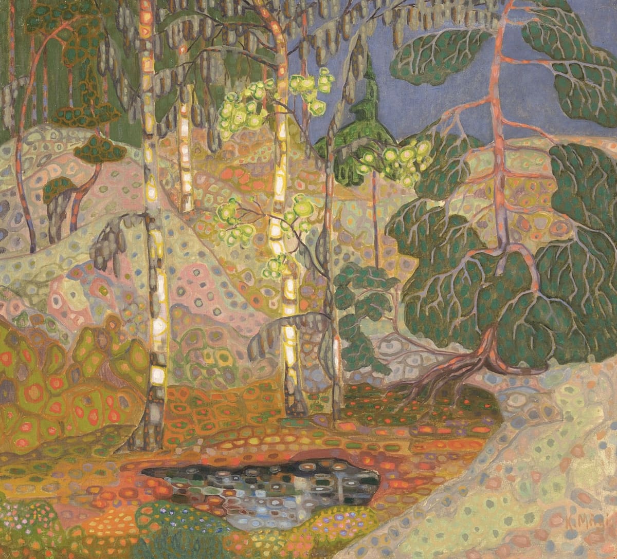
Norwegian Landscape: Bog Landscape by Konrad Mägi (1908-1910) Courtesy of the Art Museum of Estonia

  • Beside these were more realistic, less abstract landscapes, but still using a big blob pointillist style, such as the Norwegian lake at the top of this review.
  • And then, next door to all these stylised, sort-of-pointillist works, were some landscapes from Norway done in a completely different style, where instead of blobs, the paint has been applied in smooth brushstrokes, so the paintings appear much more traditionally figurative; such as Norwegian Landscape (Winter Landscape).

Room 2. Portraits

In 1912 Mägi returned to Tartu and, from spring 1913, began accepting portrait commissions for considerable sums of money, largely of wealthy women who were known to him through his cultural and political associations. Room 2 contains 17 of these generally large oil portraits. They showcase a stylised approach to the human face. They’re not unrecognisably distorted as in cubism, just simplified and done with deliberately unnaturalistic colouring. Mostly. But again, there’s a variety of styles. The ones I liked most had a hard angularity and used dark greens and blues to achieve an effect akin to German Expressionism.

Portrait of a Woman by Konrad Mägi (1918–1921) in Konrad Mägi @ Dulwich Picture Gallery

At the other end of the spectrum are some portraits of women whose cartoon, doe-eyed faces seem strangely at odds with the stylised backdrops, such as Portrait of Alvine Käppa from 1919.

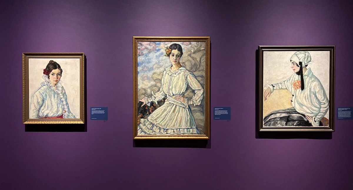
Installation view of Konrad Mägi at Dulwich Picture Gallery showing three female portraits (photo by the author)

Somewhere in the middle were maybe the most attractive ones, which combined realistic faces with stylised backgrounds, the outstanding example being another ‘Portrait of a Lady’, below. Note the use of green to indicate shadowing on the skin.

Portrait of a Lady by Konrad Mägi (1916–1917) in Konrad Mägi @ Dulwich Picture Gallery

Room 3. The Baltic

Room 3 contains 16 landscapes from Mägi’s extended stays on the Baltic coast during the summers of 1913 and 1914. The paintings depict the landscape around Saaremaa and Vilsandi and, according to the curators, represented an artistic breakthrough for Mägi. The paintings here are certainly more consistent in style.

As if to demonstrate this, the centrepiece is a rare series by this artist, a set of 6 paintings depicting the same view of the lighthouse at Vilsandi. Three of these show the exact same view at different times towards the end of the day, as the (ever-present) clouds turn deeper shades of pink. the more I looked, the more I liked these three linked works.

Installation view of Konrad Mägi at Dulwich Picture Gallery showing three views of the Vilsandi lighthouse at different times of day (photo by the author)

As to the others, two things struck me:

  1. Lightless Although they are seascapes, and the curators tell us the Estonian coast is flat and open, Mägi’s paintings of it convey very little sense of light. His skies are always full of clouds and the terrain is depicted in thick heavy shapes.
  2. Botany Which is connected to the other thing which is that, although the bits of land he includes are busy with shapes and colours, giving an impression of luxuriant growth – and although the curators tell us that Mägi had an enduring fascination with the unique botanical species of his landscape, including its flora and fauna – there is precious little detail. In the garlands painted by Michaelina Wautier, currently on show at the Royal Academy, I spent some time trying to identify every species of flower. No point trying to do that with Mägi’s coastal paintings which are liberal with elements but all done in his familiar, blobby, stylised manner. Can you identify the plants in this picture?

Vilsandi Motif by Konrad Mägi (1913-14) Courtesy of the Art Museum of Estonia

Room 4. Southern Estonia

The walls of the fourth and final room are painted deep purple and this is an appropriate background for the 11 landscapes on display here, which I found heavy and louring. (I’ve just looked up ‘louring’ to check I’m using it in the right sense. The dictionary defines it as meaning ‘a dark, gloomy, or threatening appearance, usually referring to overcast weather, or a forbidding atmosphere.’ Seems about right.)

The landscapes are from Southern Estonia, from the last decade of his life. Note how the ‘blobby’ technique I’ve mentioned so many times has largely disappeared. Instead the pain is applied more smoothly but several other things are new.

One: the natural elements of the composition (the trees, the bushes, the outline of the lake) are heavily defined in black. Everything has a strong black outline, something I personally, always warm to.

Two: the clouds, the clouds! Look at the swirling, moiling, dark and threatening clouds coming to getcha!

Three: taken together these features indicate how much the landscape is actually an expression of the artist’s inner turmoil. This is the room whose wall label informs us that, after a lifetime struggling against mental illness, in 1924 Mägi suffered some kind of mental collapse and had to be placed in an institution for his own protection. Does that knowledge affect how you feel about this picture?

Lake Kasaritsa by Konrad Mägi (1915-17) Courtesy of the Art Museum of Estonia

As a footnote, not all the 11 works in this final room are as dark and ominous. In fact a couple of them right at the very end work with a much lighter palette and use light square blocks to create a landscape, completely opposite to the heavy, blobby, organic style which dominated so many of his central works. The curators tell us that here, right at the end of his working life, he was experimenting with the kind of Futuro-Cubism which was being used by radical Soviet artists of the 1920s.

Installation view of Konrad Mägi at Dulwich Picture Gallery showing three of the landscapes in the fourth and final room – note the cloud-congested skies (photo by the author)


Related links

Related reviews

Selected Stories by Katherine Mansfield – 3

‘I feel as though I were living in a world of strange beings—do you?’
(Edna speaking for all of us, in ‘Something Childish but Very Natural’)

And years passed. Perhaps the war is long since over—there is no village outside at all—the streets are quiet under the grass. I have an idea this is the sort of thing one will do on the very last day of all—sit in an empty café and listen to a clock ticking until—.
(Vision of the end)

This is the third of three blog posts dealing with the Oxford University Press volume, ‘Selected Stories by Katherine Mansfield’. In posts one and two I summarised the stories (stories 1 to 15 in post one, 16 to 33 in post 2). In this third blog post I look at some themes and images which recur throughout the stories.

Skies

Mansfield likes skies. No matter where they’re set (New Zealand, London, Paris), and whether she’s among the posh upper classes or farm hands or the shabby genteel, all her stories include some reference to, some description of, the sky. After a while I looked out for the sky description in each story and came to wonder why they were so ubiquitous. Maybe Mansfield was always looking up to the sky and wishing to escape the dreary human scene. Or it’s a symbol of wishing to escape the fragility of her increasingly ill body into something eternal and transcendent.

All that day the heat was terrible. The wind blew close to the ground; it rooted among the tussock grass, slithered along the road, so that the white pumice dust swirled in our faces, settled and sifted over us and was like a dry-skin itching for growth on our bodies… Hundreds of larks shrilled; the sky was slate colour, and the sound of the larks reminded me of slate pencils scraping over its surface.

It was half-past two in the afternoon. The sun hung in the faded blue sky like a burning mirror, and away beyond the paddocks the blue mountains quivered and leapt like sea.
(Millie)

Although it was so brilliantly fine – the blue sky powdered with gold and great spots of light like white wine splashed over the Jardins Publiques – Miss Brill was glad that she had decided on her fur. The air was motionless, but when you opened your mouth there was just a faint chill, like a chill from a glass of iced water before you sip, and now and again a leaf came drifting–from nowhere, from the sky
(Miss Brill)

The train had flung behind the roofs and chimneys. They were swinging into the country, past little black woods and fading fields and pools of water shining under an apricot evening sky.

Behind the rotunda the slender trees with yellow leaves down drooping, and through them just a line of sea, and beyond the blue sky with gold-veined clouds.
(Miss Brill)

Out of the smudgy little window you could see an immense expanse of sad-looking sky, and whenever there were clouds they looked very worn, old clouds, frayed at the edges, with holes in them, or dark stains like tea.
(Ma Parker)

It had been raining all the morning, late summer rain, warm, heavy, quick, and now the sky was clear, except for a long tail of little clouds, like duckings, sailing over the forest.
(Mr and Mrs Dove)

When he looked up again there were fields, and beasts standing for shelter under the dark trees. A wide river, with naked children splashing in the shallows, glided into sight and was gone again. The sky shone pale, and one bird drifted high like a dark fleck in a jewel.
(Marriage à la Mode)

Posh people

Katherine was born into a socially prominent, upper-middle class New Zealand family. Distant relatives included novelists and painters. She was sent to an elite school. All this explains the confidently upper middle-class tone, settings and characters of many of her stories.

‘My word, Laura, you do look stunning!’ said Laurie. ‘What an absolutely topping hat!’
(The Garden Party)

But at the same time, this privileged world is subject to all kinds of underminings, velleities and subtleties. Although the incidents described appear, on the face of it, very straightforward, they are always subtly undermined by, inflected by… by what exactly? By the hidden depths of life, of sensibility, of meanings which are sometimes only hinted at or, in some of the most delirious stories, often don’t make sense.

Working class people

But in other stories she just as confidently captures the speech rhythms of the servant class. Something that interested me was how a servant in 1890s New Zealand (in, say, ‘Prelude’) sounds just like a servant sounds in Virginia Woolf 30 years later, or in Noel Coward’s plays which include working class characters (like Cavalcade or This Happy Breed). Did the working classes all across the white Empire have the same stock phraseology and rhythm? Did they all sound the same?

Here’s Mansfield impersonating the voice of Alice the serving girl. I’ve highlighted in bold the working class locutions.

Oh, Alice was wild. She wasn’t one to mind being told, but there was something in the way Miss Beryl had of speaking to her that she couldn’t stand. Oh, that she couldn’t. It made her curl up inside, as you might say, and she fair trembled.

Is this how the proles actually spoke? Or how they speak in books i.e. was it a convention? I suspect it is the phraseology and tone they used because it’s the same in all the talkies from the 1930s and ’40s. Unless that, also, is a convention?

Short sentences

Tackling Mansfield’s prose style is too massive a task for me. I’ll just register the importance of short sentences in (some of) her stories. On the whole her sentences are not long and incantatory like Conrad or compiled into long, repetitive paragraphs like Lawrence. Quite the opposite: they are mostly to-the-point and practical, sometimes deliberately curt.

An awkward little silence fell. Mrs Sheridan fidgeted with her cup.

Should she go back even now? No, too late. This was the house. It must be.

Not all the sentences are this short, of course. But it’s often these short sentences which anchor the texts. They are like rivets. Bolts. Nailing the fleeting perceptions down like canvas in a wind.

Like painting

Often Mansfield’s prose consists of individual lines which are like individual brushstrokes, like elements of a painting, and of a very post-impressionist painting at that. She takes realistic subjects but does them with wild colouring, as if by the German Expressionists or the French Fauves.

Here is just one paragraph from ‘An Indiscreet Journey’, which I’ve split up into its separate sentences so you can see how distinct and freestanding each sentence is, each one like a broad vivid brushstroke.

Through an open door I can see a kitchen, and the cook in a white coat breaking eggs into a bowl and tossing the shells into a corner.

The blue and red coats of the men who are eating hang upon the walls. Their short swords and belts are piled upon chairs.

Heavens! what a noise. The sunny air seemed all broken up and trembling with it.

A little boy, very pale, table to table, taking the orders, and poured me out a glass of purple coffee.

Ssssb, came from the eggs. They were in a pan.

The woman rushed from behind the counter and began to help the boy. Toute de suite, tout’ suite! she chirruped to the loud customers.

There came a clatter of plates and poppop of corks being drawn.

The purple coffee feels very Fauve, as do the blue and red and white coats. They remind me of the big broad vivid brushstrokes of the extravagantly anti-realist German Expressionists.

Self-Portrait with a Model by Ernst Ludwig Kirchner (1907)

There are many, many, many other descriptions where you notice the presence of colour. They’re generally bright primary colours, although this is partly a function of the limitation of the English language. English has hundreds of words or phrases for colours, but most writers use only a handful, only ten or so. Which is a bit boring. But Mansfield consistently embeds these ten or so colours in wonderfully vivid phraseology.

There was a lovely pink light over everything. He saw it glowing in the river, and the people walking towards him had pink faces and pink hands.

Sound effects

Note, also, in the extract I broke up into individual sentences, Mansfield’s sensitivity to sounds: Ssssb go the eggs, poppop go the corks. And the accumulated noise is so loud that it makes the air break up and tremble with it. So as well as colour, in all her stories Mansfield is very alert to sounds and noises.

The clock ticked to a soothing lilt, C’est cac’est ca. In the kitchen the waiting-boy was washing up. I heard the ghostly chatter of the dishes.

And the point of the following paragraph is the way it leads up to the onomatopoeic description of the train sound at the end.

Outside, stars shone between wispy clouds, and the moon fluttered like a candle flame over a pointed spire. The shadows of the dark plume-like trees waved on the white houses. Not a soul to be seen. No sound to be heard but the Hsh! Hsh! of a far-away train, like a big beast shuffling in its sleep.
(An Indiscreet Journey)

Same happens in this paragraph:

It had been nice in the Ladies’ Cabin. The stewardess was so kind and changed her money for her and tucked up her feet. She lay on one of the hard pink-sprigged couches and watched the other passengers, friendly and natural, pinning their hats to the bolsters, taking off their boots and skirts, opening dressing-cases and arranging mysterious rustling little packages, tying their heads up in veils before lying down. Thud, thud, thud, went the steady screw of the steamer.
(The Little Governess)

Transcribing sounds

She doesn’t just describe sounds but goes to some lengths to enact them, to directly transcribe them into language. As in the first of these sentences in ‘The Man without a Temperament’:

‘Hoo-e-zip-zoo-oo!’ sounded the lift. The iron cage clanged open. Light dragging steps sounded across the hall, coming towards him…

Or:

Over a bed of scarlet waxen flowers some big black insects ‘zoom-zoomed‘.

And as the man without a temperament comes across some old Italian women in his walk:

At a fountain ahead of him two old hags were beating linen. As he passed them they squatted back on their haunches, stared, and then their ‘A-hak-kak-kak!’ with the slap, slap, of the stone on the linen sounded after him.

And the sound of the landscape itself:

Ah-Aah!’ sounded the sleepy sea. And from the bush there came the sound of little streams flowing, quickly, lightly, slipping between the smooth stones, gushing into ferny basins and out again; and there was the splashing of big drops on large leaves, and something else–what was it?–a faint stirring and shaking, the snapping of a twig and then such silence that it seemed some one was listening.

For the duration of reading one of her stories, you become as sensitised to light, colour and sound as she evidently was, and it’s marvellous.

Pings

Mansfield likes the word ‘ping’. In ‘Mr and Mrs Dove’ the protagonist goes for a walk after the rain.

It had been raining all the morning, late summer rain, warm, heavy, quick, and now the sky was clear, except for a long tail of little clouds, like ducklings, sailing over the forest. There was just enough wind to shake the last drops off the trees; one warm star splashed on his hand. Ping!

In ‘Psychology’, the tense encounter between the passionate friends who are trying to ignore their physical attraction is expressed in pregnant silences during which inanimate objects make ironic noises, including the tell-tale ping:

The clock struck six merry little pings and the fire made a soft flutter.

Listen to these sounds in ‘The Daughters of the Colonel’:

The blinds were down, a cloth hung over the mirror, a sheet hid the bed; a huge fan of white paper filled the fireplace. Constantia timidly put out her hand; she almost expected a snowflake to fall. Josephine felt a queer tingling in her nose, as if her nose was freezing. Then a cab klop-klopped over the cobbles below, and the quiet seemed to shake into little pieces.

A perfect fountain of bubbling notes shook from the barrel-organ, round, bright notes, carelessly scattered.

Some little sparrows, young sparrows they sounded, chirped on the window-ledge. Yeep–eyeep–yeep. But Josephine felt they were not sparrows, not on the window-ledge. It was inside her, that queer little crying noise. Yeep–eyeep–yeep. Ah, what was it crying, so weak and forlorn?

In ‘An Indiscreet Journey’:

I ran down the echoing stairs—strange they sounded, like a piano flicked by a sleepy housemaid.

In ‘Prelude’:

She rolled herself up into a round but she did not go to sleep. From all over the house came the sound of steps. The house itself creaked and popped. Loud whispering voices came from downstairs. Once she heard Aunt Beryl’s rush of high laughter, and once she heard a loud trumpeting from Burnell blowing his nose.

And:

A blow-fly buzzed, a fan of whitey steam came out of the kettle, and the lid kept up a rattling jig as the water bubbled. The clock ticked in the warm air, slow and deliberate, like the click of an old woman’s knitting needle, and sometimes–for no reason at all, for there wasn’t any breeze–the blind swung out and back, tapping the window.

Mansfield’s world is alive with wonderful, subtle sounds.

Silence

Sound is often contrasted with absolute silence, to the intensification of both:

In waves, in clouds, in big round whirls the dust comes stinging, and with it little bits of straw and chaff and manure. There is a loud roaring sound from the trees in the gardens, and standing at the bottom of the road outside Mr. Bullen’s gate she can hear the sea sob: “Ah! . . . Ah! . . . Ah-h!” But Mr. Bullen’s drawing-room is as quiet as a cave.
(The Wind Blows)

Something similar in ‘At the Bay’:

Ah-Aah! sounded the sleepy sea. And from the bush there came the sound of little streams flowing, quickly, lightly, slipping between the smooth stones, gushing into ferny basins and out again; and there was the splashing of big drops on large leaves, and something else–what was it?–a faint stirring and shaking, the snapping of a twig and then such silence that it seemed some one was listening.

Voices

And human voices, of course, are included in this world of sounds, of strange sounds, of common sounds which have become strange, alien and intensified:

Her voice was quite calm, but it was not her voice any more. It was like the voice you might imagine coming out of a tiny, cold sea-shell swept high and dry at last by the salt tide…
(Je ne parle pas francais)

Their laughing voices charged with excitement beat against the glassed-in verandah like birds, and a strange saltish smell came from the basket.
(The Man without a Temperament)

Or the other, non-verbal sounds that people make:

Wheeling, tumbling, swooping, the laughter of the Honeymoon Couple dashed against the glass of the verandah.
(The Man without a Temperament)

At last [Fenella] was inside [her bedclothes], and while she lay there panting, there sounded from above a long, soft whispering, as though some one was gently, gently rustling among tissue paper to find something. It was grandma saying her prayers…
(The Voyage)

Smells

Once you become aware of it, you realise that all the senses are intensified in Mansfield’s stories. Along with vividly coloured sights and dramatic sounds go strongly flavoured smells.

From the corner by the gate there came the smell of swedes, a great stack of them, wet, rank coloured.

Frau Brechenmacher’s wedding reeks of beer. Cafés smell of cooked cabbage. Rooms are musty. Flowers have powerful aromas. Women’s hair smells of shampoo. Smell is maybe the most fragile sense and the one most overlooked in fiction but Mansfield is as alert to smells, scents and aromas as she is to the world of sounds.

She was softer than a bed and she had a nice smell—a smell that made you bury your head and breathe and breathe it.
(Pearl Button)

The café slowly filled. It grew very warm. Blue smoke mounted from the tables and hung about the haymaker’s hat in misty wreaths. There was a suffocating smell of onion soup and boots and damp cloth.
(An Indiscreet Journey)

I leaned over the table smelling the violets, until the little corporal’s hand closed over mine.
(An Indiscreet Journey)

But Kezia edged up to the storeman. He towered beside her big as a giant and he smelled of nuts and new wooden boxes.
(Prelude)

The drawing-room was full of sweet smelling, silky, rustling ladies and men in black with funny tails on their coats—like beetles.
(Sun and Moon)

How strong the jonquils smelled in the warm room.
(Bliss)

Her room, a Bloomsbury top-floor back, smelled of soot and face powder and the paper of fried potatoes she brought in for supper the night before.
(Picture)

It had been raining—the first real spring rain of the year had fallen—a bright spangle hung on everything, and the air smelled of buds and moist earth.
(Feuille d’Album)

He leaned towards her, and she smelled the warm, stinging scent of the orange peel.
(Dill Pickle)

He began to imagine a series of enchanting scenes which ended with his latest, most charming pupil putting her bare, scented arms round his neck, and covering him with her long, perfumed hair.
(Mr. Reginald Peacock’s Day)

God isn’t the ‘stinging scent’ of the orange peel brilliant? She had a Shakespearian ability for amazing perceptions expressed in astonishingly vivid phrases.

Personifications

Mansfield is restrained in her use of them but many of the stories have at least one telling instance of personification, when an object is given the quality of a person or being.

A shout from the card-players made him turn sharply, and crash! over went the bottle, spilling on the table, the floor—smash! to tinkling atoms. An amazed silence. Through it the drip-drip of the wine from the table onto the floor. It looked very strange dropping so slowly, as though the table were crying.
(An Indiscreet Journey)

She stared at Miss Moss, and the dirty dark red rose under the brim of her hat looked, somehow, as though it shared the blow with her, and was crushed, too.
(Pictures)

There was the great blind bed, with his coat flung across it like some headless man saying his prayers.

The train seemed glad to have left the station. With a long leap it sprang into the dark.
(The Little Governess)

The train began to slow down. The engine gave a long shrill whistle. They were coming to a town. Taller houses, pink and yellow, glided by, fast asleep behind their green eyelids, and guarded by the poplar trees that quivered in the blue air as if on tiptoes, listening.
(The Little Governess)

They sat outside the house in long chairs under coloured parasols. Only Bobby Kane lay on the turf at Isabel’s feet. It was dull, stifling; the day drooped like a flag.

‘Cyril says his father is still very fond of meringues, father dear.’
‘Eh?’ said Grandfather Pinner, curving his hand like a purple meringue-shell over one ear.

Pat the handy-man sprawled in his little room behind the kitchen. His sponge-bag, coat and trousers hung from the door-peg like a hanged man.

A little less dramatically:

Here and there on a rounded wood-pile, that was like the stalk of a huge black mushroom, there hung a lantern, but it seemed afraid to unfurl its timid, quivering light in all that blackness; it burned softly, as if for itself.

All the world comes alive around her, dancing, smelling, dropping, in vivid colours and a huge variety of subtle sounds.

Brilliant phrases

And then there are just scores and scores of brilliant phrasing you want to wrap up and carry around with you forever.

There was the gardener’s cottage, with the dark ilex-tree beside it. A wet, blue thumb of transparent smoke hung above the chimney. It didn’t look real.

Rain was falling, and with the rain it seemed the dark came too, spinning down like ashes. There was a cold bitter taste in the air, and the new-lighted lamps looked sad. Sad were the lights in the houses opposite. Dimly they burned as if regretting something.

Away we jolted and rattled like three little dice that life had decided to have a fling with.

Mansfield was a very great writer indeed, far greater, in my opinion, than Virginia Woolf whose stream-of-consciousness technique is highly advanced but whose actual phrase-making is often quite boring. Mansfield had an ability to wrap an endless number of brilliantly acute perceptions in staggeringly inventive new phrases, in paragraph after paragraph, that exceeds most of the writers I’ve ever read.


Credit

‘Selected Stories’ by Katherine Mansfield was published by Oxford University Press in 2002. I read the 2008 reissued edition.

Related links

Related reviews

Edvard Munch Portraits @ the National Portrait Gallery

Munch at the British Museum 2019

Six years ago the British Museum held a big exhibition of Edvard Munch’s prints, including the famous Scream. In my review of the exhibition I summarised the exhibition’s narrative of how Munch (1863 to 1944), when a youngish man, in the 1890s, was part of a hard-drinking, permissive Bohemian set in the capital of his native Norway, Oslo (then called Kristiana), and how the hedonistic free-love and hard drinking ethos of this world clashed with his strict Protestant rural upbringing to produce an often unbearable tension and angst in the young man. Not just unhappiness – intense mental distress. The British Museum show had numerous quotes from Munch’s journals and diary up on the walls all making the same point:

For as long as I can remember I have suffered from a deep feeling of anxiety which I have tried to express in my art. (1908)

I was walking along the road with two friends – the sun was setting – suddenly the sky turned blood red – I paused, feeling exhausted – and leaned on the fence – there was blood and tongues of fire above the blue-black fjord and the city – my friends walked on, and I stood there, trembling with anxiety – and I sensed an infinite scream passing through nature. (22 January 1892)

All art, like music, must be created with one’s lifeblood – Art is one’s lifeblood. (1890)

You get the picture, and a feel for the troubled mentality which produced not only The Scream but a host of other deeply haunting woodcuts – of vampire-like young women, of traumatised couples standing in front of lakes of bottomless meaning and forests of endless threat.

However, alongside the woodcuts and paintings with titles like Despair, Anxiety, Death, and so on, Munch throughout his life was an accomplished painter of portraits, of his family, his Bohemian friends, of society patrons, and of himself. In fact he produced hundreds of them.

Munch at the National Portrait Gallery 2025

This fine exhibition at the National Portrait Gallery brings together 40 of Munch’s portraits, ranging across 40 years of his long career, from the 1880s to the 1920s, for us to enjoy, savour, compare and contrast. It is the first such exhibition to focus on Munch’s portraits ever held in the UK and includes foreign loans never before seen in the UK.

A mixed bag

The main point to make at the start is the great variety of size and treatment over these 40 or so years – and the very variable quality. Munch’s star is obviously in the ascendant and the curators, and many of the media reviewers, make a big case for him being one of the twentieth century’s great portraitists. I just don’t think that’s true. It’s nearly true, there are a lot of good portraits here, including some portraits of writers which have long been classic – but there are a lot of poor paintings here as well; ones I thought were poorly executed, showed bad draughtsmanship, sketchy painting technique.

There are quite a few powerful, notable works, but just as many that I’d cross the road to avoid or wouldn’t look twice at in a general exhibition.

Stories

One other point. The gallery labels accompanying the portraits are excellent and full of interest. Very often exhibition labels fall back on woke clichés or very general descriptions of what you can already see for yourself, and can be exasperating or futile, accordingly.

However the picture captions here are uniformly excellent. Almost all of them move beyond a brief background of the image to give fascinating potted biographies of the subjects, and seeing as these come from a surprisingly broad range of figures, in Norway but also Germany where Munch spent a lot of time, all these potted biographies build up into a fascinating mosaic of the times. They range all the way from the biography of Munch’s father and sisters, via the various writers, artists and poets he knew in his merry Bohemian times, through to fascinating accounts of the physicians, industrialists and patrons he painted, and their lives and fates after he painted them.

Putting to one side the questionable merit of some of the paintings, these potted biographies bring to life a whole world of culture and patronage in north-central Europe which we in Britain, in thrall to a very Paris-based view of modern art, are almost completely ignorant of.

Layout

The exhibition is arranged thematically and chronologically, taking visitors on a four-part journey through Munch’s immediate family, bohemian artists and writers, his patrons and collectors, and finally his closest confidants, the so-called ‘Guardians’ who supported him in his later years. I’ll pick a key work from each section.

1. Family

The earliest paintings, from his early 20s, are small oil paintings of himself, his father and the aunt (Karen Bjølstad) who moved in after his mother died of tuberculosis when he was five (in 1868). I really liked the small portrait of his bearded father – Dr Christian Munch, a military doctor – lighting his pipe. They’re small, dark and inside and hark back to naturalist painting of the 1860s and 70s which he would swiftly work through and move beyond.

Quite quickly we move outside, though, to a much larger work like ‘Evening’ (1888). This, the caption tells us, depicts Munch’s sister, Laura, on a family holiday, just a year before she was permanently hospitalized with schizophrenia. The curators claim it captures her sense of alienation from her surroundings. Do you agree? Apparently in the centre of the painting was a standing figure but Munch painted over it in order to emphasise and increase the sense of distance between the soulful woman and the figures by the lake.

Evening by Edvard Munch (1888) © Museo Nacional Thyssen-Bornemisza

2. Bohemian friends

Munch left his family home to study art formally in the mid-1880s, becoming part of the bohemian scene in Kristiania. This was a network of internationally-connected artists and writers whose their ideals ran contrary to the strict religious principles of Munch’s upbringing. They advocated free love, atheism and women’s emancipation.

It was here that he developed a free-er more expressive way with paint which he called ‘soul art’, and which relied on the intensity of the relationship with the sitter as much as technical proficiency. In other words, his brushwork became looser. Leader of this set of freethinkers was the anarchist Hans Jæger whose portrait dominates this section and was chosen by the curators to promote the entire show. They comment on the cynical, confident pose of a man who knows he bosses his social group, comfortably slouched on a sofa in the Grand Café, Kristiana.

Hans Jaeger by Edvard Munch (1889) © Nasjonalmuseet for kunst, arkitektur og design, The Fine Art Collections. Photo: Nasjonalmuseet/Børre Høstland

Munch didn’t stay in Kristiana but travelled to Berlin where he had been invited to show. Here he met the Polish writer and dramatist Stanisław Przybyszewski whose 1894 monograph ‘Das Werk des Edvard Munch’ was the first publication to promote Munch internationally and to suggest the idea of the ‘Naked Soul’ as being fundamental to his work. Przybyszewski believed that society placed such a constraint on basic human instincts that it was the artist’s duty to compensate by giving free rein to unconscious impulses and desires – what he termed ‘the naked soul’.

The other strong work in this section is the portrait of lawyer Thor Lütken. Do you notice anything odd about this picture?

Thor Lütken by Edvard Munch (1892) Private Collection. Photo: Munchmuseet / Sidsel de Jong

The oddity is that, on close inspection, the lawyer’s left sleeve, along the bottom of the picture, contains a moonlit landscape inhabited by two mysterious figures, a man in black and a woman in white.

Detail of Thor Lütken by Edvard Munch (1892) Private Collection. Photo: Munchmuseet / Sidsel de Jong

Are they lovers or a symbolic portrayal of life and death, Death and The Maiden? Whatever the intention, it’s a pretty unconventional thing to do in a professional portrait but indicates the tremendous influence the 1890s movement of Symbolism had on Munch’s thinking.

Talking of Symbolism, the section includes a series of works which aren’t paintings but black-and-white lithographs. These depict some super-famous figures from the time, notably the playwrights Henrik Ibsen and August Strindberg, the French Symbolist poet Stephane Mallarmé, and the composer Frederick Delius who Munch met at the health resort of Wiesbaden, alongside group sketches of north European Bohemians in a number of cafes and bars.

The point is that for some of these portraits – notable Ibsen, Mallarmé and a striking portrait of himself – created a novel approach, presenting the sitters as disembodied heads floating in space. The detached floating head was a familiar motif in Symbolist art, signifying a split between the physical and spiritual self but hadn’t been used in such intimate and realistic portraits before.

The novel format does several things. In the portrait of Ibsen it emphasises the distance between the floating head and the busy life going on outside the window; in the wonderful portrait of Mallarmé, probably the most successful likeness in the show, it focuses you on the face and eyes so you feel you are just about to hear a pearl of wisdom from the witty old gent. According to the ever-interesting picture caption, Mallarmé was fascinated by the occult, which may explain the ghost-like feel of the portrait. And he said that the image reminded him of one of the images of Jesus on a holy shroud…

And in the self portrait with skeleton, the jet black background makes Munch’s head seem as if guillotined and floating in space, as in a bizarre dream.

3. Patrons and collectors

The third section of the exhibition examines Munch’s relationship with his patrons and collectors. By the early 20th century, Munch was one of the most exhibited artists in Europe. Returning to Berlin in 1902, he won the support of a group of wealthy and influential collectors, whose patronage further elevated his profile. It’s fascinating to learn that, in the curators’ words, ‘Many had Jewish heritage and held key professional and institutional positions in German society. They all shared an enthusiasm for the philosophy of Friedrich Nietzsche and his belief in the creative power of the individual’ – indeed the influence of Nietzsche’s insistence on the Superman overthrowing all society’s traditional values and creating his own, is mentioned in the commentary of quite a few works from this period. Also, disapproving moralists nowadays frequently associate Nietzsche with the strains of thought which led to the Nazis, so it’s striking to learn that quite so many Jewish figure were attracted by his ideas.

From 1902 to his breakdown in 1908, Munch began to take commissions from the rich and successful and this marked a turning point in his portrait style. Increasingly he painted in bright and bold colours to reflect the dynamism of his sitters. The outstanding work in this section is the super-striking portrait of German physicist Felix Auerbach, commissioned in 1906.

by Edvard Munch (1906) © Van Gogh Museum, Amsterdam (Vincent van Gogh Foundation)

In my opinion, you can see at least three things going on in this portrait. 1) The face and in particular the eyes address you really directly, with startling immediacy. Their clarity and figurative accuracy are comparable to the Mallarmé image’s eyes.

2) This immediacy distracts you from the fact that a lot of the secondary detail is no precise, is done using Munch’s trademark curves. Look at the hand holding the cigar: the fingers, the hand, the sleeve do not stand out with photographic realism from the background coat but instead are moulded with his trademark blurred curves. Instead of focusing on light and shadow to make the detail crisp, he prefers to go over the rounded outline of the hand again and again, in different colours, to give it an almost cartoon simplicity.

Lastly, of course 3) the bright red background. Maybe it’s an attempt at the actual wallpaper behind this rich patron when he painted him, but it feels more like an aesthetic statement. At first glance it made me think of the Fauves and Matisse who were just starting to do the same kind of thing in France but the wall caption tells me it’s a homage to Van Gogh’s use of bright and non-naturalistic colours. (n fact this painting now resides in the Van Gogh museum in Amsterdam.) It certainly feels like Munch felt free to create any kind of background he wants, and to use very strong vibrant colour in order to create an effect, in this case an extremely powerful and stirring effect.

The redness of the image reminded me of John Singer Sargent’s masterpiece, Dr Pozzi at Home (1881). Look at Sargent’s treatment of the hands, and indeed of the face. Pretty much none of the works in this exhibition demonstrate the draughtsmanship, the accuracy, or the painterly precision of Sargent.

In a very different mode, and much more reminiscent of his famous woodcut prints in its appreciation of feminine sensuality and its air of mystery, is The Brooch (1902), Munch’s lithograph of the Brixton-born violinist Eva Mudocci. As we’ve seen, Munch created a series of Symbolist ‘floating head’ portraits but almost all of them are of men. This portrait of Mudocci is a rare example of a woman depicted in this manner.

The Brooch (Eva Mudocci) by Edvard Munch (1902) © Private collection, courtesy Peder Lund

As usual the picture caption gives us a fascinating potted biography of the sitter and I couldn’t help laughing out loud when I read that ‘Eva Mudocci’ was actually born Evangeline Hope Muddock in Brixton.

These are the outstanding good works in this section, but there began to be ones I didn’t like or felt fell far short of a professional standard. There are three prints from a set of 16 commissioned by a Dr Linde of his wife and young children. These ought to be good and they’re nearly good, but when you look closely, you see that they’re not good. Look at this drawing of his four sons – all the faces are bodged and wonky. Sorry to be so literal minded, but compared to the draughtsmanship of Holbein or Sargent or Lawrence or numerous other painters, ancient and modern, Munch’s technique feels good, but not wow.

Breakdown

Ten years of heavy drinking, of numerous affairs and moving constantly from place to place took their toll and in 1908 Munch had a breakdown. He was admitted to a private nerve clinic in Copenhagen, run by Dr Daniel Jacobson and slowly, steadily made a full recovery, going on to become a virtual teetotaller.

When Jacobson requested a portrait, Munch chose to pose him in a powerful stance echoing Holbein’s iconic portraits of Henry VIII, painted in bright swirling colours as if engulfed by flames. The wall caption amusingly tells us that Jacobson hated the portrait.

Dr Daniel Jacobson by Edvard Munch (1908) © SMK, National Gallery of Denmark. SMK Photo/Jakob Skou-Hansen

This reproduction makes it look quite dark and more coherent than it is in the flesh. In the flesh it is enormous, larger than life size, and scrappy. You can clearly see the untouched canvas through the scrappy hurried brushstrokes. Now ordinarily I really like this kind of thing when it conveys a sense of dynamism, as in Degas, or experimentalism, as in Cézanne. But, sorry everyone, in Munch, for me, it just felt scrappy and half-hearted.

My opinion was exacerbated by the presence in this room of quite a few other middling to poor paintings, which had the effect of dragging the whole thing down. Take Olga and Rosa Meissner from 1908. I can see that Munch is moving into the new world of German Expressionism, in the breakthroughs of post-impressionism, anticipating the scrappy portraits of English artists like Dora Carrington or Vanessa Bell a decade later. But I don’t like it. The faces are poor and the painting style is scrappy and half-hearted.

There were quite a few paintings with this half-finished scrappy vibe in this section and even more in the fourth and final room.

4. The Guardians

Following his recovery at Dr Jacobson’s clinic, in 1909 Munch moved back home and settled permanently in Norway. In that year (1909) Norway had gained independence from its union with Sweden and Munch was hailed a national hero, having been knighted the previous year.

Munch’s recovery of his health and turning away from the ruinous ways of his Bohemian lifestyle were supported by a small group of new friends who he came to call his ‘Lifeguards’ or ‘Guardians’ – friends and supporters he found among writers, artists and patrons. These Lifeguards were so important to Munch that he refused to be parted from their portraits, which acted as talismanic substitutes for them when they weren’t around. So this last section of the exhibition brings together ten or so portraits of these people which, I’m afraid to say, I found almost uniformly ‘bad’.

In its press images the NPG supplies the two strongest pictures in the room, which are the full-length portrait of Jappe Nilssen and the one of Birgit Prestøe in ‘Seated Model on the Couch’ (1924). They do not supply any of the weaker ones, such as the double portrait of Käte and Hugo Perls, of painter Ludvig Karsten or writer Christian Gierløff.

Here’s the best image in the room, the portrait of Jappe Nilssen.

Jappe Nilssen by Edvard Munch (1909) © Munchmuseet. Photo: Munchmuseet / Juri Kobayashi

As you can see, it’s a powerful work, employing van Gogh-style slabs of primary colours to create a dynamic image – although the real source of its power is in the man’s four-square, virile pose. But it’s arguably the best image in the room, and not typical of almost all the others, which feel far weaker and less finished, in at least one case, literally so.

The only other work in the this section that I liked is a portrait of a regular sitter for Munch, Birgit Prestøe. He painted her many times between their meeting in 1924 and 1931.

Seated Model on the Couch (Birgit Prestøe) by Edvard Munch (1924) © Munchmuseet. Photo: Munchmuseet / Sidsel de Jong

I liked this image because, from a distance, it reminded me of the kind of mathematical modernism I really like – the post-cubist angularity of Futurism and Vorticism. But of course, it’s more by accident than design. When you go closer you see that not many of the lines are straight, most are in fact bent or curved or swirly, although I still like the random pools of colour, such as the dark orange on her shoulders and hip and knee.

And here are links to some of the much more characteristic, much less finished, much scrappier, and less pleasing works:

The Olsen, in my view, showcases all Munch’s weaknesses. The draughtsmanship of the face is poor, the arms are worse (at first glance, she looks like a thalydomide victim), the shadow looks like a pool of spilled dirty water.

The Christian Gierløff demonstrates the hold of what I early on came to think of as The Swirl on Munch’s technique, the way 1) the outlines of a figure’s body are echoed and repeated in multiple lines to create a kind of shadowy, faltering effect, and 2) the way the figure doesn’t stand out distinctly from the background, as people do in real life, but what background he can be bothered to paint in shapes itself around the foreground figure. This is most obvious in the rock of whatever it is behind Gierløff and on his right, whose contours entirely shape themselves around his figure, and the yellow line outlining the black which is presumably his shadow, and which curves round to a kind of golden loop on the ground at his feet, which to the schoolboy mind, suggests a puddle of urine.

Clearly Munch considers the backgrounds to his later portraits to be very secondary, to have a mostly decorative effect. Now whereas this works excellently in the striking and very finished portrait of Felix Auerbach, which is indoors, and whose backdrop hovers with pleasing ambiguity between a real wallpaper and pure abstraction – in my opinion this approach does not work when the figure is out of doors and so the background becomes more important, is necessarily more varied, we as animals want to understand the context and precise positioning of a fellow human, so I found Munch’s collapse into semi-abstract swirls and half-arsed shadows, frustrating and incomplete. They’re neither the realism of a Singer Sargent nor the purely decorative abstraction of a Matisse, but a muddy no-man’s-land in between.

Conclusion

The curators, and a surprising number of critics in the papers and magazines, try to persuade us that Munch was one of the great portrait artists of the 20th century. This excellent exhibition makes the strongest possible case for its cause, and is certainly very enjoyable for the biographical and historical facts to be found in all the picture captions – but, in my opinion, ultimately fails. Some of his paintings are excellent, the famous writer lithographs are classic – but, in my opinion, quite a few, especially of the later portraits, are badly drawn, scrappily painted, and the deployment of the swirly outlines which made his 1890s trauma works and the Symbolist portraits so powerful, has degenerated into a messy, irritating mannerism.

Here’s another work which features in the fourth room, a portrait of himself with friend, Torvald Strang.

It’s mildly interesting to learn from the wall caption that 1) the lawyer and barrister Torvald Stang had been a friend of Munch’s since the 1880s, often supporting him during difficult times. He was said to be an elegant man about town. And also to learn that 2) Munch had a strong liking for yellow and often used it as a background for his portraits.

But is this painting any good? Not really, no.

The promotional video


Related links

Related reviews

After Impressionism: Inventing Modern Art @ the National Gallery

This is a lavish and deeply enjoyable exhibition portraying the great explosion of creativity in West European painting which took place in the decades between the last Impressionist exhibition in 1886 and the outbreak of the First World War in 1914.

Critics then and now struggled to find a blanket term for the period, as Belinda Thompson explains in her excellent survey of the period, ‘The Post-Impressionists’. The term ‘post-impressionism’ persists because the only thing all these different artists had in common was that they were painting after the great Impressionist breakthrough of the 1860s and 1870s and were clearly influenced by it. Beyond that it’s difficult to generalise, except that they were all experimenting and innovating and following through on the countless possibilities inherent in the act of putting oil paint on canvas.

Mont Sainte-Victoire by Paul Cezanne (1902 to 1906) © Philadelphia Museum of Art

Structure

The exhibition structure is simple: it opens by celebrating the artists who have emerged, in retrospect, as the great gods of the period – Paul Cézanne, Vincent van Gogh, Paul Gauguin – and then examines the influence they had on the younger generations of artists, in the hotbed of modern art, Paris.

Where this exhibition strikes out and is distinctive from many surveys of the period is that it then makes a conscious effort to broaden its scope, geographically, with rooms or sections dedicated to other capital cities where exciting experimentation was taking place, namely Barcelona, Berlin, Brussels and Vienna. The curators point out that there was more cross-fertilisation than ever before due to the steadily increasing numbers of exhibitions and exhibiting societies, illustrated periodicals and commercial dealerships.

For once there isn’t a particularly strong central thread or thesis being propounded in the show, just a lot of wall labels describing art movements and groups and trends in all these different places, and then picture captions going into detail on individual works.

The show is, therefore, in effect, just a feast of fabulous post-impressionist masterpieces, and strolling through it is a quite wonderful, mind-blowing, eye-filling experience.

Specific movements are mentioned along the way (the Nabis, Symbolism, Die Brücke, the Fauves), in passing, but towards the end the show crystallises, as it were, presenting examples of the radical Modernism which supplanted what had come before in the form of works by Picasso, Matisse, and Mondrian.

What characterised post-impressionist art?

Impressionism began the movement away from traditional Salon art which a) depicted high historical or mythological subject matter or b) monumental nudes in c) an intensely figurative realistic manner. Instead the Impressionists were interested not in what was there, but in what we see, which is a different thing, trying to capture the shimmer and play of light.

The post-impressionists continued this departure from the conventional representation of the external world. In a host of different ways they developed non-naturalist visual languages, emphasising shape or pattern or colour which don’t exist in the real world. Some of them were interested in line and form, some became obsessed with colour, some with pattern bringing out the decorative potential of art, some focused on symbols and meanings. Once you walked away from the idea of figurative, realistic depiction of the ‘real world’ a thousand doors opened.

All this was helped by the swift development of photography, with many artists realising that their traditional role as makers of portraits, recorders of events, annotaters of landscapes was being superseded by the new technology. But this was entirely positive: it freed them up to explore the expressive potential of paint on flat surfaces in a thousand new ways.

Artists

With almost 100 works, many lent from institutions abroad and seen in London for the first time, the show features a host of big name artists like Paul Cezanne, Vincent Van Gogh, Edgar Degas, Pablo Picasso, Henri Matisse, Gustav Klimt, Käthe Kollwitz, Sonia Delaunay, Wassily Kandinsky, Piet Mondrian, Edvard Munch. It’s mostly paintings  but there’s a selection of ten or so sculptures carefully chosen to demonstrate innovation in that medium, too (notable sculptures by Rodin, Gauguin and Kollwitz).

I’m going to list the rooms, indicate what they contain i.e. which movements and artists, and then pick personal highlights.

Introduction

The introductory room contains just four works, a painting each by Pierre Puvis de Chavannes and Paul Cezanne, framed by two sculptures by Auguste Rodin (‘Monument to Balzac‘, 1898, and ‘Walking man‘, 1907). Cezanne’s ‘Mont Sainte-Victoire’ (1906) is obviously a greatest hit but after the recent Cezanne exhibitions at Tate Modern and the National Portrait Gallery I’m a bit Cézanned out. The Rodin pieces confirm my very strong dislike; I object to because of the lumbering clumsy size of his works and the crude, horrible unfinished nature. In terms of modern sculpture I like Epstein, Gill and Gaudier-Brzeska, small, smooth, beautiful lines and angles, the opposite of everything Rodin stands for.

Therefore I preferred the Puvis work, ‘The Sacred Grove’ from 1885, although this struck me as a very odd choice, because its idyllic classical setting, figurative approach, use of perspective etc seem completely contrary to everything which follows.

The Sacred Grove, Beloved of the Arts and the Muses by Pierre Puvis de Chavannes (1884) Art Institute of Chicago

Room 2: Cézanne, van Gogh, Degas, Gauguin

Greatest hits from some of Western art’s biggest names. Cezanne is represented by a classic version of The Bathers (1905) where he is transforming human figures, trees and landscape into geometric shapes, leaning rectangles of paint, the semi-abstract human figures having blank masks. You can clearly see the origins of Picasso and Braque’s cubism. A still life of a sugar bowl and apples, plus another of his numerous views of Mont Saint-Victoire.

There are 4 works by Van Gogh: ‘Snow-Covered Field with a Harrow (after Millet)‘ (1890) had the classic van Gogh wavy paint, as did ‘Sunset at Montmajour‘ and ‘Enclosed field with ploughman‘. But I found myself more drawn to ‘Houses in Saintes-Maries-de-la-mer’. Apparently the tight, constricted feel of the composition is a new thing in his style. It was painted in the south of France where the bright light made him realise he could exaggerate colour effects even more than he’d been doing previously.

Houses in Saintes-Maries-de-la-mer by Vincent van Gogh (1890)

An oddity I noticed is that the National Gallery itself owns some outstanding van Gogh masterpieces, such as the chair, and sunflowers and these aren’t in the exhibition. The only reason I can think of is that they’re part of the permanent collection which tourists quite possibly come to London to see and so the curators took the decision to exclude them from the exhibition and keep them on general display.

The caption to his ‘Woman from Arles’, a portrait of the owner of the Café de la Gare in Arles, raises an interesting point. Apparently, when they were sharing a house in the south of France, Gauguin and van Gogh had an ongoing argument about the nature of art: Gauguin argued that the artists is like a priest questing for the spiritual essence of a subject and therefore it was best to paint from memory, distance from the actual object freeing the artist to bring out the essential shapes and colours. Van Gogh, on the contrary, argued it is the artist’s sacred duty to paint what they see, as they see it.

No such scruples with the little selection of Degas works, the biggest example of which is the famous ‘Combing the Hair (Le Coiffure)’, an orgy of reds and oranges. It’s accompanied by a good example of his ballet dancers, ‘Dancers practicing in the foyer’. But my favourite piece was a small but exquisite piece, ‘Woman reading’ (1885).

Femme lisant by Edgar Degas (1883 to 1885)

It’s tightly focused, cropping the figure at the knee. Degas applied layers of pastel over a monotype print

Taken together this room makes a strong case for the dazzling impact these artists had both in Paris and elsewhere in Europe, with their reconsiderations of form, surface and space. The strokes are called ‘gestural’ because they convey the actual strokes by the artists as much as the object. Strong short dark lines make it look as if elements of the image have been stitched together. The use of bold pure colours and highly gestural strokes were very influential on later artists.

Then onto the Gauguin section. I was bowled over. Gauguin strikes me as less covered than Cezanne, van Gogh or Degas, maybe because he is the boldest, most radical, most muscular and controversial of them. He’s represented by a greatest hit, ‘Nevermore’, ‘The Wave’, ‘Fête Gloanec’, ‘The Wave’, ‘The Wine Harvest’ and his expressive ‘primitive’ carving in the circular shape of a totem, ‘The afternoon of a faun’. But it was the huge and amazing ‘Vision of the Sermon (Jacob Wrestling with the Angel)’ which bowled me over.

Vision of the Sermon (Jacob Wrestling with the Angel) by Paul Gauguin (1888) © National Galleries of Scotland, Edinburgh

As per the explanation on the van Gogh caption, you can see how Gauguin has taken real elements, such as peasant women from his native Brittany, a cow, a tree, but placed them in an abstract ‘symbolic’ landscape where the grass is bright orange and perspective is gestured at but mocked or transcended. And, contrary to all traditional rules, the nominal subject, the wrestling match, doesn’t take place at the front and centre of the painting, but is a strange, obscure, garbled struggle happening off in the middle distance.

Degas is more consistently sensually and visually pleasing, but Gauguin is bracing and weird. He is a godfather of the pictorial Symbolism which was a major strand of the 1890s with its concern for Big (if often nebulous) Ideas and a completely non-naturalistic treatment, both combining to convey a strong if indefinable emotion.

Room 3: Different paths

Side by side are placed dark, heavily outlined depictions of the city, and the tremendously light and airy works of the ‘divisionists’ or ‘pointillists’.

Part of the enjoyment of visiting art exhibitions is to test out my own tastes. Over the years my tastes have changed, and are also liable to vary from day to day depending on mood and circumstance (e.g. pressure of work). Something which appears to remain consistent is I am instantly drawn to works with strong outlines. This is part of the reason I like Gauguin over van Gogh and Degas over Cezanne.

So in this room I really liked the works by Emile Bernard and Louis Anquetin with their ‘intensified colour and flattened forms bounded by strong outlines’.

‘Avenue de Clichy: five o’clock in the evening’ by Louis Anquetin (1887)

The strong black lines defining figures or folds of clothes were described by some critics as cloisonné work. According to the curators it anticipates and to some extent influence Gauguin.

By contrast I found the works by pointillists Georges Seurat and Paul Signac pallid and limp. These were ‘Setting sun: sardine fishing’ and ‘Bertaud’s Pine’ by Signac, alongside ‘By the Mediterranean by Henri-Edmond Cross. I know they’re great works in their own right. I understand that they called themselves Neo-Impressionists because they saw themselves as applying ‘scientific’ rigour and analysis to the depiction of sunlight and shade. I appreciate that the pointillists were, surprisingly, associated with workers’ rights and socialism and thought of themselves as depicting a better lighter world for all. But it’s the dark urban night-time visions of Louis Anquetin which pull my daisy.

The Channel of Gravelines, Grand Fort-Philippe by Georges Seurat (1890) © National Gallery, London

Room 4:The Nabis

Beside them are two works showing the highly stylised approach of Toulouse Lautrec, ‘Tristan Bernard at the Vêlodrome Buffalo‘ and ‘The Reader‘. The room contains a partitioned-off section about the Nabis or ‘prophets’. According to Wikipedia, the Nabis were:

a group of young French artists active in Paris from 1888 until 1900, who played a large part in the transition from impressionism and academic art to abstract art, symbolism and the other early movements of modernism. They included Pierre Bonnard, Maurice Denis, Paul Ranson, Édouard Vuillard, Ker-Xavier Roussel, Félix Vallotton, Paul Sérusier and Auguste Cazalis.

The show includes what is commonly thought to be the first ‘Nabis’ painting, ‘Le Bois d’Amour à Pont-Aven or Le Talisman’ of 1888 by Paul Sérusier. You can see why it was widely felt to have pushed painting significantly beyond figurativism into an entirely new place where colour and pattern became the main aim of a painting. Serusier painted it under the supervision and direct encouragement of Gauguin at Pont-Aven in Brittany. This fact and the almost complete abstraction of the work itself had a dramatic impact on his friends back in Paris and helped crystallise the new movement.

‘Le Bois d’Amour à Pont-Aven or Le Talisman’ by Paul Sérusier (1888)

And so the show includes comparable works by other members of the Nabis, including ‘Island and village of Le Pecq‘ and ‘The evening wash by lamplight‘ by Maurice Denis. Nearby there’s a work by Pierre Bonnard, ‘Madame Claude Terrasse and her son Charles‘ (1893). I went to the Bonnard exhibition at Tate Modern back in 2019 and, eventually, overcome my initial dislike to sort of ‘get’ his messy way with colour and pattern but this specimen epitomised that lack of draughtsmanship which I find hard to overcome. Next to it are two pieces by Edouard Vuillard, ‘Figures in an interior: Music‘ (1896), ‘Lugny-Poe‘ (1891) and ‘Lady of Fashion‘ (1892), both of which highlight his interest in pattern and design over strict realism. No likee.

Room 5: New voices – Barcelona and Brussels

By my count there were 6 paintings from Barcelona and 5 from Brussels.

Barcelona

Barcelona is represented by works by Hermenglido Anglada-Camaras, Ramon Casas i Carbo, Santiago Rusiñol I Prats, Isidro Nonell i Monturio and Pablo Picasso. The exhibition goes heavy on the enormous painting by Casas i Carbo, ‘The Automobile’.

The Automobile by Ramón Casas i Carbó (about 1900) © Círculo del Liceo / photo Fotogasull

It’s imposingly big and has a long backstory. Casas, a leading figure in the Barcelona avant-garde, was commissioned to the series of 12 paintings for the private club, Círculo del Liceu in Barcelona, depicting modern musical life. In this one a woman dressed in modern (1900) clothes drives that amazing new invention, the automobile. Casas was one of the first in the city to own a motor car and, of course, the curators point out how ‘radical’ it was to depict a woman driving one. The link to ‘music’? She’s meant to be driving to or from a concert. You can see it in the background on the right. The bold simplicity of the design is said to represent ‘Catalan Modernism’ and to have impressed the young Picasso.

Picasso is represented by an early work, ‘The absinthe drinker‘ and a portrait of ‘Gustave Coquiot‘, Hermenglido Anglada-Camaras by ‘The White Peacock‘ (1904), Isidre Nonell by a tough naturalistic depiction of poverty titled ‘Hardship‘. But I particularly liked the portrait of Modesto Sanchez Ortiz by Santiago Rusiñol, not particularly radical or modernist but just very powerful. Ortiz’ eyes followed me round the room.

Brussels

As to Brussels, the curators tell us it was home to progressive exhibiting societies like The Twenty and The Free Aesthetic which fostered close links with the Paris avant-garde. The Twenty was an exhibition society founded in 1883 by 20 artists who wanted to break away from the conventional art establishment. It was in Brussels that van Gogh made his only sale during his lifetime. The five pieces felt very light and pointillist. They include the decorative and soothing ‘The Scheldt upstream from Antwerp‘ by Theo van Rysselberghe (1892), the political motive behind ‘The eve of the strike‘ by Jan Toorop (1889), and a strikingly pointillist work, ‘Going to church’ by Henry van de Velde (1892). As you can see, although pointillist in technique, it has a much darker, gloomier vibe than the sun-drenched works of Signac and Seurat.

Woman in front of the Church by Henry Van de Velde (1889)

Off in a corner is a single work by the outlier James Ensor, ‘Astonishment of the Mask Wouse‘ (1889). As you can see, Ensor’s art goes beyond satire into the weird and the grotesque.

Room 6: New voices – Vienna and Berlin

In both Vienna and Berlin at the start of the 20th century artists withdrew from the traditional art academies and salon exhibitions and set up breakaway organisations, the Secessions.

Vienna

Dominating the left side of the room are two huge portraits of women by Gustav Klimt in his trademark style, combining a highly realistic sensual face with a luscious depiction of stylised dress and fabric: ‘Hermine Gallia (1904) and ‘Adele Bloch-Bauer II‘ (1912). I loved Klimt when I first discovered him at school but move quickly on to prefer his disciple Egon Schiele and eventually found him too sweet and chocolate box. Also from Vienna is ‘The Artist’s Mother‘ by Broncia Koller-Pinell (1907).

Surprisingly, there are some works by Norwegian depressive Edvard Munch. Why? Because Munch actually exhibited and sold his works in Berlin. The works here show a healthy lack of interest in traditional perspective and preference for pattern and design, but aren’t particularly impressive: ‘Consul Christen Sandberg‘. More characteristic is ‘The death bed‘ (1896). I was interested to learn that Munch eventually had a complete nervous breakdown (in 1908) and that, when he returned to painting, it was in a far looser style and of relatively unemotional landscapes: ‘Cabbage field‘ (1915).

Berlin

I was surprised by this room because so many of the works seemed the opposite of ‘modern’ but surprisingly old fashioned. Thus the two works by Lovis Corinth are, maybe, a bit candid and honest about the female body but they are, nonetheless, female nudes in the time-honoured tradition, without a hint of the stylisation we’ve seen throughout the show up to this point: ‘Perseus and Andromeda‘ (1900).

Nana by Lovis Corinth (1911) St Louis Art Museum

There’s a portrait of historian and philosopher George Brandes by Max Liebermann (1901) and ‘Danae‘ (1895) where I really admired the frank peasant ugliness of the servant, and ‘Children by the Pond: The Garden in Godramstein‘ (1909) by Max Slevogt.

I was surprised by this entire room because it all seemed so reactionary and old fashioned. A glimmer of modernism was given by the sole piece by the great German artist Käthe Kollwitz, not a painting but a tightly conceived sculpture, ‘Pair of Lovers‘ from 1913 to 1915. I’m a huge fan.

Room 7: German Expressionism

The penultimate room is a small one tucked off to the side of the flow of big rooms but it came to me as a huge relief after the retro kitsch of the previous room, a sudden burst of vibrant colour and exciting non-conformity.

Why stick to traditional methods of compositions? Why not use blaring flagrant primary colours! Why bother to cover the whole canvas when leaving blank spots creates a sense of urgency and drama! Bang!!

Many of the works are by members of Die Brücke (The Bridge), a group of German expressionist artists formed in Dresden in 1905. Founding members were Fritz Bleyl, Erich Heckel, Ernst Ludwig Kirchner and Karl Schmidt-Rottluff. What they had in common was interest in primitivist art and expressing extreme emotion through high-keyed colours that were non-naturalistic. God, this is the dog’s bollocks, I thought, what a relief after the stodgy naturalism of the previous room!

Here are splendidly bold and unfettered works by Erich Heckel – ‘The house in Dangast‘ (1908) – and Karl Schmitt-Rottluf – ‘Break in the dyke‘) (1910). I loved Sonia Delaunay’s ‘Jeune Finlandaise’ (1907). In this small room experienced a physical sense of liberation.  This is the real McCoy.

Young Finnish woman by Sonia Delaunay (1907)

It’s significant that this painting captures Delauney on her journey towards pure abstraction which she would achieve a few year later. Part of the thrill of paintings like this is you can feel the future in them, ready to burst through. In the same vein is the National Gallery’s portrait of Charlotte Cuhrt by Max Pechstein (1910).

Two outliers are a portrait by Henri Rousseau (‘Joseph Brum’), whose ‘naive’ self-taught style became very popular in turn of the century Paris where ‘primitivism’ of all kinds was becoming fashionable.

And, off to one, side, the eerie and disturbing ‘Seated girl with a white shirt and standing nude girl’ by Paula Modersohn-Becker (1906).

8: New Terrains

Finally the exhibition closes with a big room drawing together strands which have emerged during the exhibition to date, and pointing forwards to the radical ruptures of Modernism.

Thus there’s a work by Wassily Kandinsky which is well on the way of his journey towards abstraction – ‘Bavarian Village with Field‘ (1908).

There are three paintings by Matisse, highlighting his move towards decoration, colour and pattern:

There are three little works by Piet Mondrian which neatly capture his progression from traditional figurativism in a realistic depiction of a tree by a river bank; to a half-way house, a tree painted in a style influenced by van Gogh’s broad brushstrokes; and finally onto pure abstraction:

In a similar spirit there are four Picassos which capture his progression from deliberate ‘primitivism’ of 1907 on to the invention of cubism in 1911:

But dominating the room is the enormous work ‘The Dance’ by André Derain. Derain was one of the group of Parisian artists who, in a review of a 1905 exhibition, were mockingly called ‘les Fauves’ (which simply means ‘the wild things’) by a Parisian critic and adopted the name as a badge of pride. Other works by Derain are included:

But it’s ‘The Dance’ which dominates the entire room and is your lasting, lingering visual image of it. Wild, high-toned colours, a cheerful disregard for perspective and, in this image in particular, a complete transition to fantasy, fairy-tale, exotic subject matter.

‘The Dance’ by André Derain (1906) Private Collection © ADAGP, Paris and DACS, London 2023

It’s funny but, although the curators started out by claiming there was a great explosion of styles and approaches from the late 1880s onwards, the works chosen for this final room suggest that all along there were in fact just two threads or streams or approaches.

For me the drab colouring and obsessive interest in volumes, hard-edged angles, facets and geometry found in the cubism of Picasso and Braque relates directly back to the exploration of volumes, forms, rectangles and blocks developed by Cézanne. Maybe we can call this the Analytic tradition and define it as stretching from (on one wing) the scientific approach of the Neo-Impressionists and, on the other, the pure, geometric abstraction of Mondrian.

Whereas the wild children’s drawing of brightly coloured figures dancing in the jungle obviously comes from a completely different place, clearly relates directly back to Gauguin’s symbolic exoticism. Maybe we could call this the Expressive tradition. Obviously, it incorporates, in Germany, the Bridge artists who we saw in the previous room, and includes the other Fauves, besides Derain.

Analytical versus expressive. Composition versus colour. Well, that’s the neat and simple pattern which struck me as I came to the end of this brilliant, exhilarating exhibition.


Related links

Related reviews

Nineteenth century France reviews

More National Gallery reviews

A Country Doctor and other stories by Franz Kafka (1917)

A Country Doctor is a collection of short stories written mostly in 1917 by Franz Kafka, and containing the story of the same name. It was published in 1919, the second collection of short stories published by the German publisher Kurt Wolff, following Contemplation of 1912.

The Contemplation pieces were very short, some of them less than a page long, and the stories here are of the same style, also very short and punchy and dazzling. Some have touches of humour but what characterises most of them is how weird, visionary or dreamlike they are.

1. The New Advocate

One page long. The new advocate is Alexander the Great’s old horse Bucephalus. With Alexander long dead and his great goal of reaching the gates of India now remote and impossible, yes, it probably makes sense for his favourite horse to take up a career in the law. After all, it’s a steady profession.

2. A Country Doctor

This really is a dream-like narrative: told in the first person the doctor is called to an emergency on a snowy night but can’t find a horse but then his groom finds two horses in the pigsty and attaches them to the cart and the horses race off before the doctor can warn or protect his housekeeper who he knows the groom wants to rape and watches run for the house and lock herself in but as the cart gallops off he hears the groom smashing the door down with an axe, the doctor arrives instantly (as in a dream) at the house of the sick man with his relatives gathered round and pronounces him perfectly fit, maybe overfull of coffee which his solicitous mother has given him, all the time worrying about the fate of Rosy the maid, the two horses push open the windows of the room and watch the doctor and a choir of local children gathers outside and sings a song about stripping the doctor and next thing he knows he is being stripped, held up then carried over to the sick man’s bed and thrown into it where he discovers the man has an enormous gaping bloody wound in his side which is infested with finger-sized worms and seems to attribute this to standing still in the woods and having been chopped at by men with axes as if he were a tree, then the doctor escapes from the bed, flees the house, throws his things onto the carriage and whips the horses to flee although they in fact plod off at the walking pace of an old man.

I’ll never come home at this rate. My flourishing practice is lost. A successor is robbing me, but to no avail, for he cannot replace me. In my house the disgusting groom is wreaking havoc. Rosa is his victim. I will not think it through. Naked, abandoned to the frost of this unhappy age, with an earthly carriage and unearthly horses, I drive around by myself, an old man. My fur coat hangs behind the wagon, but I cannot reach it, and no one from the nimble rabble of patients lifts a finger. Betrayed! Betrayed! Once one responds to a false alarm on the night bell, there’s no making it good again – not ever.

I wouldn’t be surprised if this was a literal transcription of an actual anxiety dream Kafka had had.

3. Up in the Gallery

A one-page description of attending the circus to see a lady in white and red come through the curtain and be lifted by the ringmaster onto a dappled grey horse and ride round the ring to tumultuous applause. But Kafka uses a technique he’s used in other stories, which is to open the entire description with a conditional phrase, making the whole thing seem provisional and dreamlike.

If some frail tubercular lady circus rider were to be driven in circles around and around the arena for months and months without interruption in front of a tireless public on a swaying horse by a merciless whip-wielding master of ceremonies, spinning on the horse, throwing kisses and swaying at the waist, and if this performance, amid the incessant roar of the orchestra and the ventilators, were to continue into the ever-expanding, grey future, accompanied by applause, which died down and then swelled up again, from hands which were really steam hammers, perhaps then a young visitor to the gallery might rush down the long stair case through all the levels, burst into the ring, and cry ‘Stop!’ through the fanfares of the constantly adjusting orchestra.

So it’s the gallery of a circus.

4. An Old Manuscript / A leaf from the past

Two and a bit pages. The narrator owns a shoemaker’s shop in some distant city from fable, from the same kind of fairy tale world as Kafka’s China. The nomads from the north have invaded and now control the city, which is a mystery since the frontier is so very far away (as in The Great Wall of China). They make free with the shoemaker’s stock, but they really infest the shop of the butcher opposite, and go mad when he brings to the shop a live bullock, which they promptly set about dismembering and eating live, with their bare hands and teeth. Occasionally you see the emperor at the windows of his palace but then, that can’t be right, he never leaves the inner gardens of the palace.

You can see how Kafka has reimagined China into his own image, a vast land which messengers can never cross, which has been inexplicably conquered by people no-one understands, whose leader has retreated to the innermost sanctums of his inaccessible palace…

5. At the door of the Law

This is a terrifying fable, barely two pages long, in which a man from the country arrives at the door of the law and asks the doorkeeper if he may enter. The doorkeeper says no, and the man spends the rest of his life camped out there, asking the doorkeeper repeatedly for permission to enter, until, in fact, he grows old and weak and, as he is on the verge of dying, the doorkeeper explains that this door was for the man alone, for him only, and now, as he expires, the doorkeeper will close it. He will never gain admission.

In its portrayal of the hopeless prostration of a victim-protagonist before implacable and unknowable higher powers , it is a two-page summary of the plots, or aims, of The Trial and especially The Castle.

6. Jackals and Arabs

Four pages. The narrator is a European camped in an oasis in the desert with some Arabs. they refer to him as master. It is a colonial situation. Austro-Hungary, despite being called an Empire, had no colonial territories so this is as much a fantasy projection as his stories about remote China or cowboys and Indians.

The story, such as it is, is that the jackals nosey up to the narrator and explain how much they want the Arabs to be cleared out of their land so it will be purified. Incongruously, they offer the narrator a pair of scissors (hanging from one of the jackals’ teeth). But at that moment an Arab appears and whips them back and recognises the scissors and says, ‘Oh yes, the jackals are always offering these to Europeans in the hope the European will use them to drive out or annihilate the Arabs (!)’

He drags over the corpse of a camel which has died in the night and the jackals start tearing it to bits, until the Arab starts whipping them. Both sides are trapped in a horrible hate-hate relationship.

7. A Visit to the Mine

The narrator is a miner. Some engineers have come to inspect his mine. That sounds like it ought to make sense, but it really doesn’t. Instead of giving any kind of account of what they do, the text simply lists each of the ten engineers, emphasising the way each one looks and behaves differently and is engaged on a different activity (exactly the format of the story titled Eleven Sons) then a concluding paragraph describes how they are all followed by an Attendant, formally dressed, inscrutable and superior.

8. The Next Village

This is a brilliant slice of…. of what? Fantasy? Dream prose? A sense of entropy and futility? Here’s the ‘story’ in its entirety.

My grandfather used to say: ‘Life is astoundingly short. To me, looking back over it, life seems so foreshortened that I scarcely understand, for instance, how a young man can decide to ride over to the next village without being afraid that – not to mention accidents – even the span of a normal happy life may fall far short of the time needed for such a journey.’

9. A Message from the Emperor

This is the one-page-long parable which is embedded in the longer story, The Great Wall of China about the emperor consigning a message to a messenger to bring to ‘you’ but how the vast and multitudinous challenges of even getting through the first courtyard of the imperial palace, let alone the second courtyard, let alone through the thronged streets of the capital means that the messenger will never arrive.

Placing the Next Village and the Message next to each other brings out their similarity, in fact the fundamental identity of the insight they deal with. It’s difficult to put into words what they’re saying – maybe you just have to ‘get’ it, but it feels like both of them are saying something very profound about human experience.

10. The Cares of a Family Man

Odradek is a weird creature which looks like a star-shaped spool of thread.

At first glance it looks like a flat star-shaped spool for thread, and indeed it does seem to have thread wound upon it; to be sure, they are only old, broken-off bits of thread, knotted and tangled together, of the most varied sorts and colours. But it is not only a spool, for a small wooden crossbar sticks out of the middle of the star, and another small rod is joined to that at a right angle. By means of this latter rod on one side and one of the points of the star on the other, the whole thing can stand upright as if on two legs.

The narrator tries to communicate with this creature and is troubled by him, most of all by the knowledge that Odradek will outlive him.

Am I to suppose, then, that he will always be rolling down the stairs, with ends of thread trailing after him, right before the feet of my children, and my children’s children? He does no harm to anyone that one can see; but the idea that he is likely to survive me I find almost painful.

11. Eleven Sons

The narrator lists his eleven sons and gives paragraph-long descriptions of all of them which start out positive and all end with the ways they disappoint him and fall short.

12. A Fratricide

This feels like the most ‘German Expressionist’ of the stories, because it describes the Expressionist subject par excellence which is a brutal murder. Schmar waits at a street corner on a moonlit night. Wese emerges from his work and walks down the street towards the fateful corner. What makes it so Expressionist is the way it is stagey, it could be played out on a stage with a crazy angular Expressionist set, for Mrs Wese stands at the door of her house further down the road waiting for her husband, while the private investigator Pallas, leans out of his window to get a better view of the scene.

Wese walks round the corner and right into Schmar who stabs him three times, twice in the throat and once in the belly, screaming at him, screaming about the joy of murder.

‘Done,’ says Schmar and pitches the knife, now superfluous blood-stained ballast, against the nearest house front. ‘The bliss of murder! The relief, the soaring ecstasy from the shedding of another’s blood!’

This irrational glee reminds me of any number of Expressionist painters (and writers and composers) with their mad murder lust; reminds me of the widespread topic in early Weimar Germany of the murder of women, and the utterly irrational way this was titled, by many artists, Murder, The Hope of Women.

13. A Dream

Two and a half pages in which Joseph K. (the protagonist of The Trial) has a dream. In it he arrives in a cemetery before a big mound of earth, two big men plonk a headstone down at the end of it and then another man, a roughly dressed ‘artist’ pops up, and, leaning uncomfortably over the mound, takes a pencil and begins writing words which become instantly deeply incised into the stone and burnished with gold, he writes HERE LIES but then becomes blocked, stuck, stymied and looks at Joseph K. in embarrassment, both of them unsure what to do next, until it comes to Joseph in a flash and he leans down and begins clawing through the earth which opens up to reveal a vault and he descends down into it as if by magic, turning till he is lying on his back and, looking up, watches the artist complete the inscription by writing his name and then –

He wakes up.

14. A Report to an Academy

The longest story at about ten pages, this is a spoof or parody of a presentation to a learnèd academy given by an ape who has transformed himself into a man. He describes how he was caught in the jungle by a hunting expedition, thrown into a cage on a ship and brought back across the sea and how he learned to be human from observing and copying the sailors. But that makes it sound too sensible. It is full of uncanny or strange details, for instance the thing which motivates him to transform is the layout of the cage which has iron bars on three sides but is bounded on the fourth by a crate. Something about this really upsets him and he repeats it again and again as if this was his prime motivation. Also he begins by imitating the lumbering walks of the rough sailors but there is satire in the fact that the decisive moment in his steps towards becoming a ‘man’ are when he learns to drink deep from a bottle of whiskey they give him.


Short and weird

Initially I based my definition of the ‘Kafkaesque’ on a deep immersion in the two novels The Trial and The Castle, which are long, long-winded, and focus on the nightmarishly impossible efforts of the young professional protagonists to understand the convoluted legal and bureaucratic processes administered by a vast hierarchy of officials, which they seem to have become embroiled in through no fault of their own.

Reading these stories makes me realise there is another entirely separate strand to Kafka’s output, which is the fantastical. If the characteristic quality of the novels is how long-winded they are, and how filled with immense, tortuous speeches about the inaccessibility of the Law and the Court then, on the whole, the leading feature of the stories is how short they are, how they manage to convey a whole hallucinatory scene, event or view of the world in a handful of, or even one, page.

Animals

Another striking element is the prominence of animals. The country doctor’s horses poke their heads through the windows to watch their master at work (that’s the detail from that story which really spoke to me, like the horse’s head in the paintings of Fuseli). More strikingly, Bucephalus the horse becomes a lawyer. Jackals talk to the narrator. And an ape addresses a learnèd academy. (And among his last short stories would be one about a giant mole and about an investigating dog.)

Two types

Broadly the stories can be divided in two types, the fables – which the reader understands straight away, which feel as immediate and accessible as Aesop’s fables – and the others, which are more troubling and perplexing.

Easy fables include Bucephalus becoming a lawyer, the message from the emperor, the nomads having conquered the city, and at the door of the law – these have the depth and resonance of ancient myths. The dream of Joseph K. falling into his grave is easily comprehensible as a dream-vision. These ones have a meaning and a point.

But what are we to make of the convoluted account of the country doctor? This also is a dream, I suppose but it is completely pointless, it amounts to a series of anxieties. Just as the account of the ape who became a man ought to resonate like an Edwardian science fiction story, but doesn’t: it’s more eccentric and odd than that, all the details seem off-kilter and troubling.

And then what to make of the two numeration stories, the list of eleven sons and ten engineers? These are not fables or dreams, they are something else again, something weirdly compelling. The page and a half about Odradek – is that a weird distorted comment on the relationship between fathers and sons? And the fratricide? That’s a rich slice of German murder Expressionism.

So there are more than two types. What a dazzling collection. What immense trouble and unease they convey.


Credit

A Country Doctor and other stories by Franz Kafka was published in German in 1919. The English translation by Willa and Edwin Muir was first published in 1935. , then by Penguin in 1953. All quotations are for the purposes of criticism and review.

Related links

These are links to the modern translations of these stories, some made by Ian Johnston and generously posted online for anyone to use, some from other sources.

Related reviews

Aftermath: Art in the wake of World War One @ Tate Britain

The First World War ended on 11 November 1918. To mark the end of the conflict Tate Britain has been hosting an extensive exhibition devoted to the aftermath of the war as it affected the art of the three main nations of Western Europe – Britain, France and Germany.

Thus there is nothing by artists from, say, Russia, Italy, Austria-Hungary, Turkey, Serbia, Bulgaria, nor from the white colonies, Canada, Australia, New Zealand, nor from America which entered the war in 1917. It is a Western European show of Western European art.

Paths of Glory (1917) by Christopher Richard Wynne Nevinson © IWM

Paths of Glory (1917) by Christopher Richard Wynne Nevinson © IWM

Masterpieces

The show includes a staggering number of masterpieces from the era, interspersed with fascinating works by much less-well-known artists.

For example, room one contains the Rock Drill by Jacob Epstein, possibly my favourite work of art anywhere, by anyone. For me this hard brooding metallic figure contains the secret of the 20th century, and of our technological age.

Torso in Metal from “The Rock Drill” (1913-14) by Jacob Epstein. Tate © The Estate of Jacob Epstein

Torso in Metal from The Rock Drill (1913 to 1914) by Jacob Epstein. Tate © The Estate of Jacob Epstein

Layout

The exhibition is in eight rooms which take you in broad chronological order:

  1. Images of battlefields and ruins, early movies, and memorabilia (helmets, medals, cigarette cases)
  2. The official War memorials of the three featured nations (statues, designs and paintings by conventional artists such as William Orpen and the sculptor Charles Sargeant Jagger)
  3. A room devoted to images of disfigured and maimed soldiers
  4. Dada and Surrealism i.e. the extreme irrationalist response to the war of Swiss, German and French artists – including signature works by George Grosz, Max Ernst, Kurt Schwitters
  5. A room of black and white prints showcasing series of lithographs and woodcuts made by Max Beckman, Käthe Kollwitz, Otto Dix and Georges Rouault
  6. The ‘return to order’ in a revival of nostalgic landscapes in works by Paul Nash and George Clausen, sculptures of sleek femininity by Eric Gill and Aristide Maillol, neo-classical portraiture by Meredith Frampton, and the revival of a strange post-war type of Christian faith in the work of Stanley Spencer and Winifred Knights
  7. Politics and pass-times – divided between gritty depictions of a newly politicised working class by socialist and communist artists, such as The International by Otto Griebel, and a rare opportunity to see an original ‘portfolio’ or pamphlet of lithographs by George Grosz – and on the other hand, depictions of the newly fashionable night-life, the craze for jazz dancing depicted in The Dance Club 1923 by William Patrick Roberts, cabaret clubs of the Weimar Republic, or the Folies Bergère as painted by English artist, Edward Burra
  8. The exhibition ends with brave new world visions of technology, machinery, skyscrapers, Russian constructivist images by El Lissitsky, the geometric paintings of Fernand Leger, and the sleek new design and architecture of the German Bauhaus school

1. Images of the battlefield

First impressionistic indications of the appalling nature of the war. A display case contains an original infantry helmet from each of the three featured nations, one French, one German and one British. Oil paintings of corpses in trenches or hanging on barbed wire. A rare black-and-white-film shot from an airship shows the devastation

2. Memorials

In terms of memorials I don’t think you can do better than Edwin Lutyens’s Cenotaph in Whitehall, arresting in its monolithic abstraction. But the show includes three large memorial sculptures by Charles Sergeant Jagger.

No Man's Land (1919-20) by Charles Sargeant Jagger

No Man’s Land (1919-20) by Charles Sargeant Jagger

3. The disfigured

The room of disfigured servicemen is hard to stay in. The grotesques of Otto Dix and Gorge Grosz are bearable because they have a cartoon savagery and exaggeration which defuses the horror. But the realistic depictions of men with their jaws shot away, half their faces missing, skin folding over where their eyes should be, and so on by artists like Heinrich Hoerle and Conrad Felixmuller, are almost impossible to look at.

Prostitute and Disabled War Veteran, Two Victims of Capitalism by Otto Dix (1923) © Estate of Otto Dix

Prostitute and Disabled War Veteran, Two Victims of Capitalism by Otto Dix (1923) © Estate of Otto Dix

4. Dada and Surrealism

The exhibition takes on a completely different tone when you enter the room of works by Dada and Surrealist artists – although the grotesques of the previous room make you realise how so much of Dada’s strategy of cutting up and collage, of rearranging anodyne images (especially from glossy optimistic magazines and adverts), to create incongruous and grotesque new images, is actually a very reasonable response to the grotesqueness of war and its dismemberments.

Here there are works by Kurt Schwitters, pioneer of cut up and paste art, as well as the stunning painting Celebes by early Surrealist Max Ernst.

Seeing a number of examples of post-war collage – works by Max Ernst, Kurt Schwitters, the English Surrealist Edward Burra and their peers like Hannah Hoch and Rudolf Schlichter all together – brings out the superiority of George Grosz.

It’s probably because I’m a longstanding fan but he seems to me to combine the best eye for design and caricature, with the best feel for how to create a collage of elements cut out from newspapers and magazines.

As well as a good selection of his biting political satires, there is an opportunity to see a reconstruction of the Dada-mannequin he created for the 1920 Berlin Dada exhibition.

Why be sensible? How could you be sensible and take any of the standards and values of the old order seriously? After what they had seen in the trenches? After that old order had brought about Armageddon?

The Petit-Bourgeois Philistine Heartfield Gone Wild. Electro-Mechanical Tatlin Sculpture (1920) by George Grosz © Estate of George Grosz, Princeton, N.J.

The Petit-Bourgeois Philistine Heartfield Gone Wild. Electro-Mechanical Tatlin Sculpture (1920) by George Grosz © Estate of George Grosz, Princeton, N.J.

5. Prints, lithographs, woodcuts

In the print portfolio room it is interesting to compare the style of the four featured artists: Max Beckman was too scratchy and scrappy and cluttered for my taste. The Georges Rouault images are harsh but use shading to create an eerie, gloomy depth, as if done with charcoal.

'Arise, you dead!' (War, plate 54) (1922-27) by Georges Rouault. Fondation Georges Rouault © ADAGCP, Paris and DACS, London

‘Arise, you dead!’ (War, plate 54) (1922 to 1927) by Georges Rouault. Fondation Georges Rouault © ADAGCP, Paris and DACS, London

By contrast Käthe Kollwitz’s series War is made from harsh, stark, pagan woodcuts, which exude a really primeval force. This set is a masterpiece. You can see the continuity from the harsh emotional extremism of pre-war German Expressionism, but here a widely used technique has found its perfect subject. Kollwitz is a great artist. Her images may be the most profound in the show.

The Survivors (1923) by Käthe Kollwitz

The Survivors (1923) by Käthe Kollwitz

6. The return to order

After the physical and metaphysical gloom of the print room, room six is large, well lit and full of images of sweetness and delight. In all kinds of ways the European art world experience a post-war ‘return to order’, a revival of neo-classical technique, in music as much as in painting. It had quite a few distinct strands.

Landscape

One strand was a return to painting idyllic landscapes, represented here by a haycart trundling down a lane by the pre-war artist George Clausen, and a similarly idyllic but more modern treatments of landscape by the brothers Paul and John Nash.

Woman

After the disfigurements of the war and the parade of grotesques in the previous galleries, this one contains a number of images of complete, undisfigured bodies, particularly female bodies, used as celebrations of beauty, fertility, of life. These include the big, primeval statue Humanity by Eric Gill, alongside a more realistic depiction of a naked woman, Venus with a Necklace by Aristide Maillol. After such horror, why not? Why not unashamed celebrations of peace, whole-bodiedness, beauty, youth, fertility – a new hope?

Venus with a Necklace by Aristide Maillol (cast 1930) © Tate

Venus with a Necklace by Aristide Maillol (cast 1930) © Tate

Interestingly, this room contains three or four works by Picasso, portraits of women or a family on a beach, done in a kind of revival of his rose period, with the figures now more full and rounded.

Neue Sachlichkeit

Another strand was the particularly German style known as ‘New Objectivity’ which I’ve written about extensively elsewhere, not least because it was itself sub-divided into a number of strands and styles.

It’s represented here by a signature work from the era, Christian Schad’s half-realistic, half-cartoonish, and wholly haunting self-portrait of 1927.

Self-Portrait (1927) by Christian Schad © Christian Schad Stiftung Aschaffenburg/VG Bild-Kunst, Bonn and DACS, London

Self-Portrait (1927) by Christian Schad © Christian Schad Stiftung Aschaffenburg/VG Bild-Kunst, Bonn and DACS, London

Christianity

Amazingly, after such a cataclysmic disaster, many artists retained their Christian faith, although it emerged in sometimes strange and eccentric new visions.

These are exemplified by the English artists Stanley Spencer, who is represented by one of the many paintings he made setting Christian stories in his native home town of Cookham. And also by the strange and eerie vision of Winifred Knights, here represented by her unsettling vision of the Flood.

The Deluge (1920) by Winifred Knights

The Deluge (1920) by Winifred Knights

Not so long ago I saw a whole load of Knights’ paintings at a retrospective at Dulwich Picture Gallery. Seeing it here makes you realise the link to the stark geometric modernism of someone like Paul Nash. But also to the deliberately naive style of Spencer. It is a kind of Christianity by floodlights.

Portraiture

Separate from these varieties of self-conscious modernism was an entire strand of neo-classical portraiture. A style which had observed and absorbed the entire Modernist revolution from Cezanne onwards, and then reverted to painting exquisitely demure neo-classical portraits, generally of demure and self-contained young women. Exemplified here by Meredith Frampton’s still, posed portrait of Margaret Kelsey.

Marguerite Kelsey by Meredith Frampton (1928) © Tate

Marguerite Kelsey by Meredith Frampton (1928) © Tate

Is this a portrait of refinement and sensibility? Or is there an eerie absence in it, a sense of vacuum? Does it have all the careful self-control of someone recovering from a nervous breakdown?

7. Politics and pastimes

Room seven juxtaposes images of The People, The International and the proletariat – with images of jazz bands and people getting drunk in nightclubs. Which is the real world? The International by the German communist painter Otto Griebel faces off against William Roberts modernist depiction of a jazz nightclub (heavily influenced, I’d have thought, by Wyndham Lewis’s pre-war Vorticism).

The Dance Club (1923) by William Roberts. Leeds Museums and Galleries © Estate of John David Roberts

The Dance Club (1923) by William Roberts. Leeds Museums and Galleries © Estate of John David Roberts

By now it felt as if the exhibition was turning into an overview of artistic trends of the 1920s. A number of the works were painted 10 or 12 years after the end of the war. When does an aftermath stop being an aftermath?

8. Brave new worlds

The last room is devoted to technocratic visions of the machine age. Russian constructivists, French futurists, some of the old Vorticists, all the Bauhaus artists, looked to a future of skyscrapers, chucking out Victorian ideas of design and taste and creating a new, fully twentieth century art, architecture and design.

Fernand Leger perfected a post-cubist style based on brightly coloured geometric shapes suggesting a new machine civilisation, and the exhibition includes footage from the experimental film he made, Ballet Mechanique with music by the fashionably machine-age composer George Antheil. The Russian constructivist El Lissitsky devised an entirely new visual language based on lines and fractured circles. Bauhaus teacher Oskar Schlemmer is represented by an abstract figurine. Oskar Nerlinger evolved from pencil sketches of the war to developing a distinctive style of constructivist illustration featuring stylised views of up to the minute architecture.

Radio Mast, Berlin (1929) by Oskar Nerlinger

Radio Mast, Berlin (1929) by Oskar Nerlinger

Now I like this kind of thing very much indeed but I feel we had wandered quite a long way from the First World War. Much of this last room struck me as having next to nothing to do with the war, or any war, instead being the confident new visual language of the hyper-modern 20s and 30s.

Wandering back through the rooms I realised the exhibition splits into two parts: rooms one to five are unambiguously about war, the horrors of war, trenches and barbed wire and corpses, moving onto war memorials and horrible images of mutilated soldiers, how those disfigurements were taken up into the distortions and fantasies of Dada and Surrealism and then extracted into a kind of quintessence of bleakness in the woodcuts of Kollwitz.

And then part two of the show, rooms 6, 7 and 8 show the extraordinary diversity of forms and style and approaches of post-war art, from nostalgic or semi-modernist landscape, through neo-classical if unnerving portraiture, Christianity by floodlight, from bitterly angry socialist realism to the frivolities of jazz bands and strip clubs, and then onto the Bauhaus and Constructivist embrace of new technologies (radio, fast cars, cruise liners) and new design and photographic languages.

Whether these latter rooms and their contents can be strictly speaking described as the ‘aftermath’ of the Great War is something you can happily spend the rest of the day debating with friends and family.

But there is no doubting that the exhibition brings together a ravishing selection of masterpieces, well-known and less well-known, to create a fascinating overview of the art of the Great War, of the immediate post-war period, and then the explosion of diverse visual styles which took place in the 1920s.

From the po-faced solemnity of:

To the Unknown British Soldier in France (1921-8) by William Orpen © IWM

To the Unknown British Soldier in France (1921-8) by William Orpen © IWM

to the compelling crankiness of:

'Daum' Marries her Pedantic Automaton 'George' in May 1920, John Heartfield is Very Glad of It (1920) by George Grosz © Estate of George Grosz, Princeton, N.J.

‘Daum’ Marries her Pedantic Automaton ‘George’ in May 1920, John Heartfield is Very Glad of It (1920) by George Grosz © Estate of George Grosz, Princeton, N.J.

From the earnest political commitment of:

Demonstration (1930) by Curt Querner. Staatliche Museen zu Berlin, Nationalgalerie © DACS

Demonstration (1930) by Curt Querner. Staatliche Museen zu Berlin, Nationalgalerie © DACS

to the vision of an all-metal brave new technocratic future:

Abstract Figure (1921) by Oskar Schlemmer

Abstract Figure (1921) by Oskar Schlemmer

The promotional video


Related links

Other blog posts about the Great War and its aftermath

Politics and soldiers

Art and design

More Tate Britain reviews

George Grosz: The Berlin Years by Ralph Jentsch (1997)

This big heavy paperback is the glossy catalogue to a comprehensive exhibition of Grosz’s work which was held in the Peggy Guggenheim Collection back in 1997. The long and detailed text was written by Ralph Jentsch, who is ‘managing director of the Grosz Estate, author of a number of catalogues and books on George Grosz, and a well-known expert in German Expressionism.’

It is a massive compendium of works by Grosz in all media – cartoons, caricatures, book illustrations, oil paintings, watercolours, sketches, drawings, collages and so on, not just from his mature years but starting with his earliest surviving sketches of cowboys and Indians and the heroes of boys’ own adventure stories which he loved as a lad.

There’s also plenty of evocative black-and-white photos of Grosz during the first 40 years of his life (1893 to 1933), featuring lots of semi-private shots of him messing about in his studio or playing the banjo – and also photos which give context to the story, from a typical German pub interior of the 1890s of the sort his father ran, to street scenes in Berlin, where he made the first half of his career.

In total there are 410 numbered works and photos in the main text, plus an additional 67 b&w photos in the 16-page potted biography at the end. It’s a visual feast, as they say, giving you a real sense of the visual universe he inhabited and the one he created.

(This book is the first volume of a two-volume and two-exhibition project – this one covers the Berlin years, the second one covers his time in exile in America, 1933-1959. Later, they were combined into one portmanteau book, link below.)

I’ve summarised Grosz’s life story in my review of his autobiography, A Small Yes and a Big No, no need to do it again. Instead, I’ll just mention half a dozen or so themes, issues or ideas which arise from a careful reading of this big book.

Transition from soft to hard lines

The first thirty or so pages include still life sketches Grosz did in conventional pencil or charcoal using multiple lines and hatching to create light and shade. These go alongside a consciously different style he developed for commercial caricatures, still very formal and multi-lined with an Art Nouveau feel. He had a different style again for the pictures he was hoping to use to start a career as a book designer.

Among the multitude of early sketches there are pub scenes, brawls in the street, and some gruesome (imaginary) murders. The point is – they’re all done in a much scribbled over, blurry, multi-line style.

What’s fascinating is to see how, during the war, he quickly and decisively changed his style to one of spare, scratchy single lines. Stylistically, it’s the decisive move: before – smudgy, obscure, feverishly drawn and overdrawn figures; after – scratchy, one-line figures, buildings, objects.

Evening in Motzstraße (1918)

Evening in Motzstraße (1918)

It’s fascinating to read his own account of how and why the change came about.

In order to attain a style that reproduced the hardness and insensitivity of my subjects, I studied the most direct expressions of art: I copied the folkloristic drawings in the urinals; they seemed to me the expression and most immediate rendering of strong emotions. I was also stimulated by the unequivocalness of children’s drawings. So I gradually reached my knife-hard style that I needed to draw what I saw. (Art in Danger, 1925)

I wonder if any other major artists, anywhere, ever, has credited their style as being derived from the drawings in public lavatories?

This is just one revealing quote from the many which Jentsch gives us from Grosz’s own autobiography, from the prefaces to the books, to the justificatory notes he prepared for each of his court cases, and to the countless letters he wrote to all his friends. We learn that Grosz wrote a vast correspondence to all his friends and acquaintances, kept copies of it all (which survive) and expected long and detailed replies in return – or else the friends were liable to get a none-too-polite reminder.

Grosz is a really fluent and enjoyable prose writer – his descriptions of holidays on the Baltic or the threatening atmosphere of Depression Berlin are a joy to read in their own right.

America

Jentsch’s quotes very liberally from Grosz’s autobiography (it is, after all, extremely jocular and readable) in bringing out Grosz’s obsession with America and its pop culture. As a boy he devoured James Fenimore Cooper’s Leatherstocking novels, as well as the pulp westerns of Karl May, the detective hero Nick Carter, and loved everything American.

Having just read John Willett’s two books about Weimar art and culture, I can see that Grosz’s enthusiasm was part of a much broader cultural trend: the Germans loved American culture. Not only was there jazz which took everyone by storm, but the radio and gramophone were American inventions and everyone round the world fell in love with Charlie Chaplin’s silent comedies.

Later, for the avant-garde designers and architects which Willett’s book describes, America remained the beacon of all things modern, particularly the staggering efficiency of its industry and design. Henry Ford’s many books were bestsellers in Germany, as were the innovations of Frederick Winslow Taylor’s time and motion and efficiency studies.

I always think the most incongruous fan of America in this milieu was the Marxist playwright Brecht, who wrote loads of poems about a fantasy America, devoted a play to Chicago gangsters, as well as setting a number of plays and oratorios there, such as his oratorio about Lindbergh’s famous solo flight across the Atlantic. American jazz, cars, fashions and technology all stood for the exciting and new, liberated from the dead hand of Old Europe and its defunct empires.

Towards the end of his Weimar career (and in the depths of the Great Depression) Grosz’s attitude towards America (like Brecht’s) had become a good deal more satirical and critical. Now he sees all mankind as blindly greedily chasing after the consumer capitalism which America has perfected and exported to the world. But although the attitude has hardened – it’s still America which is at the centre of his thoughts.

Dreams, romantically dispensed and advertised a thousand times over: comfortable living, bath-tub, sports, utility car, and at best a weekend with cocktails and beauty queen. America has shown the way, we’re following after – due to war somewhat behind – in our naturally slow way. Even in Marxist Russia, America is the model and ardently desired goal. The goal is: rational exploitation of all raw material sources so as to procure comfort for the little man on the basis of mass machine production. (quoted page 135)

Just one year later – 1933 – Grosz was himself in America, beginning the long struggle to make a new career, which is described in his autobiography and in the second of these two volumes.

Alas, several of Grosz’s biggest most colourful fantasias on American themes (from the end of the Great War and featuring cowboys with six-shooters, wizened old trappers, gold miners and saloon whores) were confiscated by the Nazis and have never been found, so we only know them from old photos.

Misanthropy

Boy, Grosz hated people, he always hated people, he really hated people. Jentsch’s book clarifies that Grosz never saw action during the Great War, he had a nervous breakdown before he reached the front and ended up back in Berlin making sketches, caricatures and paintings which expressed his virulent hatred for people, for men, and for Germany in particular, for the state which had committed its young men to this suicidal folly and which had wanted to force him into the meat grinder.

It was a combination of loathing Germany and obsessing about America which made him change his name from the original Georg Groβ to the Anglicised George Grosz (just as his close friend and collaborator Helmut Herzfeld changed his name to the Anglicised John Heartfield).

Grosz’s misanthropy makes a mockery of his so-called communist beliefs. He joined the German communist party the day it was set up in November 1918 and played a role in the 1918 Berlin revolution, signing a revolutionary declaration published by a collective of revolutionary artists. But after his trip to the USSR in 1922 (where he actually met Lenin), Grosz quickly lost any political faith and lapsed into a universal contempt for mankind.

Hatred for humanity drips from the hundreds and hundreds of drawings from this era, and from the watercolours in particular, which show a relentless parade of corrupt and ugly old men, apparently surrounded by grim, half-naked prostitutes.

Before sunrise (1922)

Before sunrise (1922)

As Grosz wrote to his friend J. B. Neuman:

My drawings will naturally stay true – they are fireproof. They will later be seen as Goya’s work [is]. They are not documents of the class struggle, but eternally living documents of human stupidity and brutality.

Red

In 1916 to 1918 Grosz went through a red phase, lots of paintings done almost entirely in shades of blazing red. The house is on fire, the city is going up in flames. It didn’t last too long, but while it did it was very, very red.

Metropolis (1917)

Metropolis (1917)

A painting like this displays a raft of his characteristics. The knife-hard outline styling of all the figures is well established. Humans are caricatures with hardly any attempt at naturalistic shading or modelling. Perspective has been thrown away in preference for a crazy vortex of planes which gives the sense of a crashing chaos of urban architecture. Women are more often than not half or completely naked, with a little pubic bush in sight just to ram home the point. Corruption, sex, seediness. Everywhere.

Nudes

Grosz did a surprising number of nude studies, almost all of them unflattering or verging on the grotesque.

More surprisingly, he did a large amount of pornographic sketches and drawings, pornographic in the sense that they show men and women very explicitly and enthusiastically engaging in sexual practices, his misanthropy coming over loud and clear in the fat ugliness of everyone involved.

But there’s also something haunted about portraying men and women again and again at the feverish, pleasure-filled but somehow empty, tragic and futile copulations which obsess humanity, and to what end.

The obsessive reworking of the same theme (he liked women bending over and displaying their big wobbly buttocks) give the sense of a man questing, searching, trying to find the answer to the reason – why? Why are we animals? Why do we behave like farmyard beasts? What is behind this absurd farce?

The sex drawings cross over with a set of disturbing sketches and paintings of a cartoon character called ‘John the slayer of women’, who was much in his thoughts in 1917 and 1918. He claimed the set was inspired by a notorious murder of the time – or was it just a misogynist way to let off steam and vent the huge amount of anger he had permanently burning inside?

John, The Lady Killer (1918)

John, The Lady Killer (1918)

Dada and collage

Grosz was a central figure in the Berlin branch of Dada which got going about 1918. He formed a close working partnership with the Herzfeld brothers who set up a publishing house for avant-garde work – the Malik-Verlag – where Grosz was able to publish a series of ‘albums’ of lithographs throughout the 1920s (nearly all of which were confiscated and banned by the authorities).

He collaborated with Helmut Herzfeld aka John Heartfield in the invention and development of photo-montage i.e. cutting out objective pictorial elements like photos or text or headlines from newspapers or magazines and pasting them into grotesque and satirical combinations.

Grosz considered the painting below as one of his most important, and it had pride of place at the Dada exhibition in June 1920.

You can see the way any idea of perspective has been completely abandoned in the name of a potentially endless collage of objects, images and planes. The collage element of newspaper cuttings and magazine images is made particularly obvious on the table. There is the characteristically bitter satire of the so-called ‘pillars’ of the establishment at the bottom. And there is a naked woman with boobs and the characteristic hint of pubic hair to the left of the main figure.

Apart from anything else, there’s a ‘Where’s Wally’ pleasure to be had in deciphering all the visual elements in these, the most cluttered works of his career.

Germany: A Winter's Tale (1918)

Germany: A Winter’s Tale (1918)

Watercolours

Grosz had a number of styles – or a number of ways of deploying his basic vision. Thus the book juxtaposes the intense oil paintings (above) with the just as savage watercolours, but the latter have a very different feel. Watercolour makes the images lighter and Grosz has a very stylish way of letting the colour leach and bleed around the central subjects, something not possible in oils.

Waltz dream (1918)

Waltz dream (1918)

The nipples and bush of a scantily-clad woman/prostitute are probably the most prominent visual element, but what I like is the variety and inventiveness of the colours and the way they are arranged in patches or facets. Surprisingly decorative, isn’t it?

De Chirico vistas and mannequins

In 1919 and 1920 Grosz experimented with a series of works which combined receding vistas of perfect multi-story buildings, as developed by the Italian painter Giorgio de Chirico, with the photo-montage technique he’d been developing with Heartfield.

The result is uncanny, weird and grotesque objects made out of material cut from newspapers and magazines. The final, unsettling element is the omission of faces from the human figures, their heads instead the blank ovals of the shop-window mannequins of the day.

Republican Automatons (1920)

Republican Automatons (1920)

In a completely different style from the raging, red fractured cityscapes, here Grosz presents man as a faceless robot, a characterless shop-window dummy in a soulless landscape of factories and houses, a heartless automaton made up of interchangeable parts (as Jentsch puts it, on page 122).

To ram the message home Grosz stopped signing these automaton paintings and had a stamp made which said GEORGE GROSZ CONSTRUIERT, emphasising their machine-like quality.

Portfolios and collections

Drawing can be an effective weapon against the brutal Middle Ages and stupidity of man of our time, provided that the hand is trained and the will is clear.

As early as 1916 Grosz had a plan for a vast three-volume collection of drawings to be titled The Ugliness of the Germans. In the event he managed to get published the First George Grosz Portfolio and The Little George Grosz Portfolio in small editions. As you can imagine, original copies of these are worth a fortune today.

One of the great virtues of Jentsch’s book is that it includes nearly all the drawings from all his major collections, including the later ones which caused such a scandal – Gott mit uns (1920), In the shade (1921), The Brigands (1922), Ecce Homo (1923), The Mirror of the Bourgeoisie (1925) The New Face of the Ruling Class (1930).

This allows you to see what all the fuss was about and judge for yourself. It also lets you see each of the series in the context of the others, building up a cumulative effect.

Jentsch goes into detail about each of the trials, giving dates and places where Grosz and his publishers were arraigned and their punishments on each occasion (fines and confiscations). He devotes quite a few pages to a chronology of one of the longest court cases in the history of the Weimar Republic, the prosecution of Grosz and his publisher Herzfeld for some of the illustrations created for a stage adaptation of the classic novel, The Good Soldier Svejk, which started in 1928 and went through four separate trials on into 1932.

Grosz really was a thorn in the side of respectable society and it’s worth buying the book for the portfolios alone, which in their spare directness brutally convey seething his seething anger at man’s inhumanity to man.

Lions and leopards feed their young from The Brigands (1922)

‘Lions and leopards feed their young’ from The Brigands (1922)

Grosz was lucky, very lucky to happen to be offered a job in New York in 1932, and to persuade his wife and children to join him early in 1933, just two weeks before Hitler came to power.

He’d been taking the mickey out of Hitler for over ten years. On the day of Hitler’s accession SA troops broke into both Grosz’s flat and Berlin studio. If he’d been there he would have been taken off for interrogation, torture, prison and probable death. Lucky man.

Siegfried Hitler by George Grosz (1922)

Siegfried Hitler by George Grosz (1922)

And he was right when he compared himself to Goya. To later ages, to our age, his drawings and paintings are comparable with Goya’s, as ‘eternally living documents of human stupidity and brutality’.


Related link

Related reviews

Surrealism by Michael Robinson (2005)

This is an almost square, thick, glossy art book (17.1 x 16.1 cm) whose 384 pages – after the brief foreword and introduction – contain nearly 200 colour reproductions of Surrealist works of art. Each work gets a 2-page spread, with the image on the right, the text giving the artist, title, medium and some interpretation, on the left. It’s kind of flip book of Surrealist painting, divided into four sections: Movement overview, Influences, Styles & techniques and Places.

The left-page analyses vary widely in quality, some telling you really insightful things, others little more than recaps of so-and-so’s career or an anecdote behind the picture. There is an obtrusive political correctness in many of them – Robinson is the kind of white man who has to make it quite clear he is on the side of feminists in their struggle against the patriarchy, and regrets the cultural misappropriation of colonial exploiters like Picasso, Matisse and the rest of those awful white men.

Here he is discussing Meret Oppenheim’s Occasional Table (1939):

Occasional table (1939) by Meret Oppenheim

Occasional table (1939) by Meret Oppenheim

In this work Meret Oppenheim continues with a number of Surrealist preoccupations, the most significant of which is the preconception of specific gender roles and stereotyping in a patriarchal society. At first this object may appear as an opulent or even decadent excess of Art Deco design for the bourgeois market, particularly in its use of gold leaf. Oppenheim is, in line with Dada and Surrealist ideals, commenting on bourgeois excesses, as well as on gender stereotypes.

Let’s just stop here and ask if you, the reader, can identify specifically how this work of art is tackling ‘the preconception of specific gender roles and stereotyping in a patriarchal society’. Spotted it? Good. Now, read on:

As a (male) viewer one is drawn to the legs to consider their shape before considering their functionality. There is an obvious parallel here with women being viewed in the same stereotypical manner. The viewer is also being denied access to the rest of the body, emphasised by the flatness and width of the table’s top. (p.224)

So, if I’m reading this correctly, Robinson is claiming that if you are struck by the fact that an ordinary-looking table is being supported by a pair of bird’s legs, this is not because it’s rather unusual and incongruous – in the deliberately disconcerting Surrealist/Dada fashion – it’s because you are always looking at women’s legs and sizing them up, because you are a misogynist member of a patriarchal society guilty of gender stereotyping. Unless you are a woman. In which case you just see a pair of bird’s legs.

Here is Robinson preparing to talk about a work by Wifredo Lam:

At the turn of the nineteenth century many modernists adopted and adapted ritualistic or totemic motifs from Africa, the Indian subcontinent and Oceania – in fact from most places that were European colonies. The use of these misappropriated motifs can be found in the so-called ‘primitive’ aesthetics of Paul Gauguin’s Post-Impressionism, the Cubism of Picasso and Georges Braque, much of German Expressionism and some of the Fauvism of Matisse. However, Surrealism differed in this regard thanks largely to the multi-ethnicity of its group and a genuine interest in anthropology. (p.184)

Will all those white European artists who ‘misappropriated’ motifs from non-European cultures please stay behind after school and write out one hundred times ‘Michael Robinson says I must only use subjects and motifs from European culture and not misappropriate motifs from any other source’. Naughty Picasso. Naughty Matisse.

Your use of non-European motifs is cultural misappropriation; my use of non-European motifs is valid because I have ‘a genuine interest in anthropology’.

Some notes

The sheer number and variety of art and artists in the book tell their own story about the Surrealists’ broad-spectrum dominance of the inter-war period.

First conclusion is there were so many of them – Paul Éluard, Benjamin Péret, René Crevel, Robert Desnos, Jacques Baron, Max Morise, Pierre Naville, Roger Vitrac, Gala Éluard, Max Ernst, Salvador Dalí, Luis Buñuel, Man Ray, Hans Arp, Georges Malkine, Michel Leiris, Georges Limbour, Antonin Artaud, Raymond Queneau, André Masson, Joan Miró, Marcel Duchamp, Jacques Prévert, and Yves Tanguy – just for starters.

Surrealism followed on from Dada, founded in 1916 in Switzerland as a really angry response to the pointless barbarity of the Great War.

By 1920 a lot of former Dadaists had gravitated to Paris and were experimenting with Freud-inspired ideas of accessing or depicting the unconscious via stream-of-consciousness prose or automatic writing. One of them, the bullish, domineering poet André Breton, decided the trouble with Dada was it had been too anarchic, chaotic, unfocused – which had led to its eventual collapse.

Breton decided to form a real movement, not just literary or artistic, but with social and political aims. This led in 1924 to the publication of the first of numerous Surrealist manifestos.

It was primarily a movement of writers – poets and novelists – not artists. Artists came later. Ironic, because now we are soaked in the artists’ imagery and I wonder if anyone reads the old surrealist prose works or could even name any.

And Surrealism was political, designed to undermine and overthrow the existing scheme of things, opposing traditional bourgeois values (kinder, küche, kirche), religion, the rational, the scientific – all the things which, it was claimed, had led Europe into the inferno of the Great War.

Breton conceived of Surrealism as a philosophy and a way of life, as rejecting the stifling repression of bourgeois society, setting free our deep inner selves. It wasn’t just teenage rebellion for its own sake. Breton and many of the others thought that Western society was really seriously crippled and doomed by its steadfast refusal to acknowledge the most vital part of the human being – the unconscious, source of all our creative imaginative urges, which can only be accessed via dreams and other specialised techniques.

Only if we can tap into our unused creativity, into our irrational minds, into the sensual part of our psyche, can we ever hope to change the repressed, uptight, bourgeois, scientific, technocratic society which is leading us to destruction.

You can see why this genuine commitment to radical social change led many Surrealists, as the 1920s turned into the Fascist 1930s, to declare themselves communists, and how this led to numerous splits and bitter quarrels among them.

In the sets of ‘rules for surrealists’ which Breton was prone to drawing up, he declared that surrealist writers and artists (and film-makers and photographers) could work in any medium whatsoever, depicting any subject whatsoever, with only one golden rule – it must come from inside, from the unconscious, from the free imagination untrammeled or restricted by conscious thought or tradition. You could use realistic figures and objects from the real world – but only in the service of the unconscious.

Of the scores of artists connected the movement, probably Dalí and Magritte created the most widely recognized images of Surrealism. Dalí joined the group in 1929 (after his brief abandonment of painting for film and photography) and played a crucial role in establishing a definitive visual style between 1930 and 1935.

Outliers

Assuming we’re all familiar with the usual suspects – Dali, Miro, Ernst, Arp, Magritte, Ray – one of the interesting facets of this book is how widely it casts the net, to include artists never part of the official movement but clearly influenced by it. I enjoyed the inclusion of English artists like Henry Moore, Paul Nash, Edward Wadsworth and, especially, Roland Penrose.

The real pleasure of the book was coming across quite a few artists I’d never heard of before:

Women surrealists

There were quite a few women surrealist artists and it was genuinely interesting to a) learn about them and their work, considered purely as artists b) to learn how many of them really were feminists, how they disliked the bullying male environment created by Breton, how many of them tried to develop an aesthetic which escaped male stereotyping and the sexualising of women’s bodies. From a crowded field I think Dorothea Tanning stood out for me.

Lee Miller was an important muse for many of the male Surrealists. She had an intense affair with the photographer Man Ray, who taught her photography as well as making her the subject of many of his greatest works. Later she married Roland Penrose, the English Surrealist painter. His painting, Bien vise, above, depicts her naked torso. But Miller also painted, created surrealist objects and took surreal photos in her own right (as well as her later, awesome, war photos).

Surrealism and gender

The gender issue with Surrealism strikes me as simple enough: all these men thought they had a duty to express the unconscious; the dominating master and ‘discoverer’ of the unconscious was a man, Sigmund Freud; Freud insisted that the unconscious was drenched in repressed sexuality (only later adding aggression and violence in the form of the Death Wish); which meant that this large and influential group of male artists felt it was their moral and artistic duty to be as frank as possible about sex and sexuality, to be as shocking and provocative as they could be; and so they saturated their works with erotic images and symbols; and, being men, these tended to be images of women, their own objects of desire.

And almost all the women, in one way or another, reacted against this use of women as sex objects, as objects of desire, in male painting, and tried to redress the balance by painting women fully dressed or in poses where they obviously dominate men or as girls on the cusp of adolescence (or abandoned figuration altogether to paint abstracts).

The really interesting biological-anthropological question is about the difference in ‘desire’ which this tends to bring out. Men paint women, but women paint women, too. Everyone seems to take ‘women’ as a fit subject for painting. Very few of the women artists paint pictures of big naked men or fixate on the penis in the same way that men paint countless breasts and vulvas. Why?

Broadly speaking, feminists from de Beauvoir onwards say that gender differences are entirely due to social conditioning; the vast majority of the population and all the biologists and evolutionists I’ve read point out that there are certain unavoidable differences in DNA, physiology and behaviour between males and females of almost every species: why should we be any different?

All that said, I’ve just flicked slowly through the nearly 200 images in this book and only a handful of paintings – about ten – actually depict realistic images of naked women (and some of those are by women, for example, Dorothea Tanning’s Birthday; among the men Paul Delvaux had the most persistent in (admittedly dreamy zombie) naked women, for example, The Sleeping Venus).

If you go looking for naked women to support this thesis, they are in fact surprisingly absent from the classic surrealist images (by Magritte, Dali, Ernst).

Surprise

I had no idea that Desmond Morris, author of the immensely popular Naked Ape/Manwatching books, was an official member of the Birmingham Surrealist group while still an undergraduate studying biology. This work, painted when he was just 21, is immediately pleasing, in colour, design and the formal symmetric arrangement. It also demonstrates the general rule that Surrealism, which set out to turn society upside down, ended up producing charming and delightful images which could safely hang on the walls of any investment banker or corporate lawyer. Art changes nothing.

Conclusion

This book is a useful collection of the classic Surrealist images, but its real value is as a stimulating introduction to a far wider range of less well-known artists.


Credit

Surrealism by Michael Robinson was published by Flametree Published in 2005.

Surrealism reviews