Brecht: fragments @ Raven Row

This is a fascinating and thought-provoking exhibition, in a lovely setting, I’m just kicking myself that I found out about it too late to see the theatrical performances (see below).

Raven Row

Raven Row is a secret treasure of a gallery tucked away in Spitalfields. It’s adapted from the domestic rooms of a tall thin eighteenth century building at the eastern end of Artillery Lane (nearest tube station Liverpool Street station). Raven Row is a charity committed to displaying art which is diverse and unusual, sometimes by established international artists, sometimes more out-of-the-way figures, united by having escaped the notice of the big name London art galleries. Their programme aims to be ‘improvisatory and undogmatic.’

This photo of the interior of one of the rooms immediately gives you a feel for how they’ve retained most of the original Georgian features and decoration.

Installation view of ‘brecht: fragments’ at Raven Row (photograph by Marcus J Leith)

Bertolt Brecht

Bertolt Brecht (1898 to 1956) has a claim to be the greatest German writer of the twentieth century, certainly the most famous. He had a first burst of fame when his musical, The Threepenny Opera, became a hit, and its signature tune, ‘Die Moritat von Mackie Messer’ was covered by American performers as ‘Mack the Knife’.

But it was after the Second World War when the radically innovative approach of his so-called ‘epic theatre’, as performed by his touring theatre company The Berliner Ensemble, revolutionised the possibilities of theatre. The spread of his technique was also helped by the fact that he wrote some of the great plays of the period such as ‘Mother Courage’, ‘The Chalk Circle’, ‘Galileo’ and many others.

But Brecht wasn’t just a world class playwright, he was also a noted poet, he wrote many essays in support of his theatre theory and, as this exhibition sets out to show, he could also be considered an artist of a particular type.

brecht: fragments

In the late 1930s Brecht came under attack from Soviet administrators of the new doctrine of Socialist Realism, most notably the powerful critic Gyorgy Lukács, who criticised him for using elitist, avant-garde techniques which were difficult for ‘the masses’ to understand. In one of his replies defending the use of modernist aesthetics for revolutionary communist purposes, Brecht mentions that, even though he was now in exile in Denmark, he was currently working on a surprising number of projects and goes on to mention 2 novels, a play and a book of poetry, not including the essay in which he describes all this (Aesthetics and Politics, Verso Books, 1977, p.70).

In other words, it was Brecht’s working practice throughout his career to be working on a multitude of projects, and to be surrounded by fragments of works in progress, across a range of genres and forms.

Found images

What this many-sided exhibition at Raven Row shows is how this concept, or category, of ‘fragments’ can be seen as not just a side effect of Brecht’s work-in-progress, but a fundamental principle which applies to them at every level. For, as this exhibition shows, Brecht was a compulsive collector of found images, often from newspapers and magazines. He pasted these into notebooks where he collected them by theme. He strewed his manuscripts with them where they obviously acted as inspiration or captured ideas, sometimes literal, sometimes tangential.

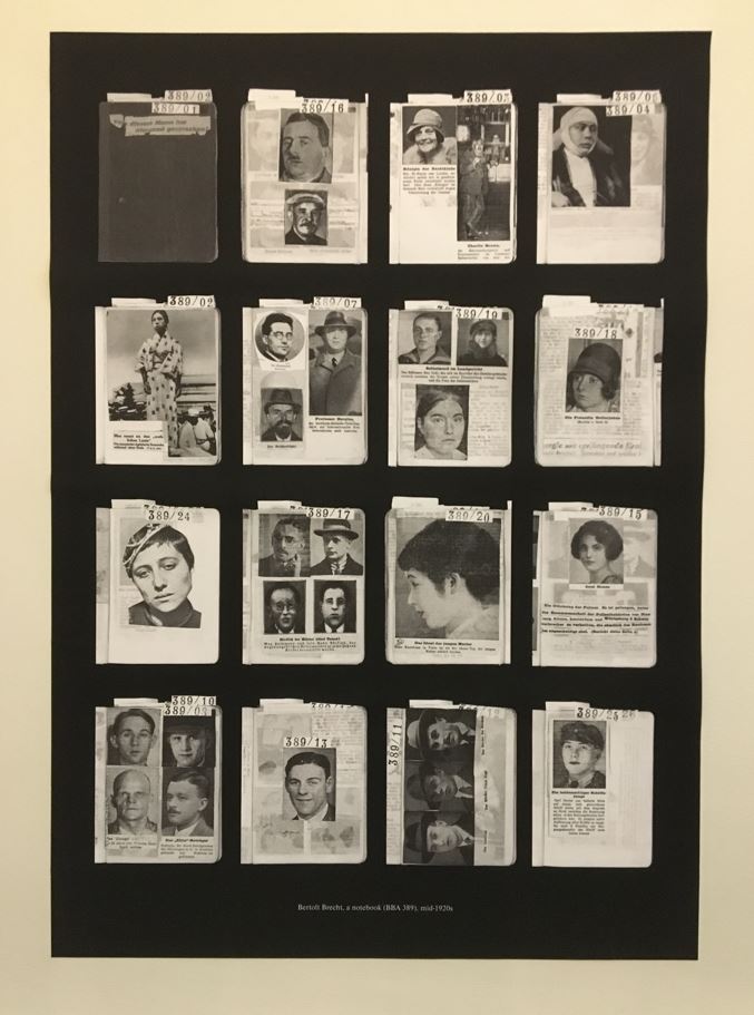
Installation view of ‘brecht: fragments’ at Raven Row showing a typical page from his notebook from the mid-1920s (photo by the author)

For example, why paste a postcard image by Pieter Breughel onto the front page of the manuscript of his great play ‘The Caucasian Chalk Circle’ except that it, in some sense, crystallised or captured the mood, or a mood, which the work was designed to present?

Installation view of ‘brecht: fragments’ at Raven Row showing the cover page of the manuscript of The Caucasian Chalk Circle, showing the cut and pasted letters and a postcard of a painting by Breughel (photo by the author)

Photomontage

Photos could be used in another way, to create photomontages, cutting out images from one context and pasting them into others, in the style of the radical photomontage artist John Heartfield. In actual fact, there isn’t much here in that style. For the most part, Brecht didn’t interfere with, cut and paste together, his images. They tended to go into his albums and notebooks and be pasted into play manuscripts unaltered. The artistry was in the initial selection.

The War Primer

Another use of news photos was when Brecht began collecting images during the Second World War and writing one four-line quatrains underneath them, producing what he came to call ‘photo-epigrams’. Over time this developed into a book which, after the war, came to be called the ‘War Primer’, containing 75 photo-epigrams.

A bunch of the original paste-ups for the book (actually created by Ruth Berlau, one of Brecht’s long-term collaborators) are hung across one wall. The quatrains, like most of Brecht’s poetry, consist of direct statement, unadorned by similes and metaphors, blunt and political. For example, under a photo of a bombardier in uniform inside a bomber:

You’re looking at a bastard, and a poor one!
‘I laugh at news of other men’s distress,
A corset salesman, formerly from Nürnberg,
A dealer now in death and wretchedness.’

Here’s an example, a striking magazine image of men in a steelworks which inspired Brecht to write the quatrain you can see, typed out, cut and pasted beneath it.

Paste-up for a page of War Primer (1940 to 1949) by Bertolt Brecht in collaboration with Ruth Berlau. Courtesy the Bertolt Brecht Archive, Akademie der Künste, Berlin (BBA 2096/38)

The quatrain for this one reads (in English translation):

‘What are you making, brothers?’ ‘A car of steel.
‘And what about these plates here, lying on the side?’
‘For shells that slice through sheer armoured walls.’
‘Why all this, brothers?’ ‘That we stay alive.’

Encyclopedia of gestures

Yet another use for images was that, heavily involved as he was in the staging of  his plays, he was very interested in the actors’ gestures. What happens if you get an actor to stand on a stage so? Or hold his arms just so? And now in this position? And now in that? How much can be achieved without words, without even action, just by posture and gesture? And then what happens if you add words to gestures, is it possible to make the words and gestures contradict each other or at least play off each other.

Dictatorial poses

Which explains why there’s a room of sheets from his numerous notebooks, which consists of newspaper photos of generally eminent men of the time (the obvious tyrants – Hitler, Mussolini and Stalin – with other lesser known politicians such as Daladier, Laval et al). Anyway, Brecht managed to get hold of photos them making speeches and it’s genuinely fascinating to study how they held themselves and what they did with their arms and hands. Thus prompted I adopted some of the poses of Hitler in full flow (hold two clenched fists up, palms towards you, in front of your chest – and instantly felt some of the coiled rage at the world. Elsewhere, Brecht picked up this improbable series of snaps of the Führer throwing a few shapes.

Installation view of ‘brecht: fragments’ at Raven Row showing the sheet of photos of Hitler posing and prancing (terrible photo by the author)

And, in the next glass case, copied a series of poses of Comrade Stalin addressing a meeting, which have him leaning forward and pointing an accusing finger, – and you immediately feel yourself dominating a room full of people petrified that there going to be the next one accused of some crime and hauled off to the gulag.

Installation view of ‘brecht: fragments’ at Raven Row showing the sheet of photos of Stalin, smiling, playing the affable good fellow, and pointing a finger at people he’s about to send to the gulag. Copy the poses for yourself and see how they make you feel (photo by the author)

Collaboration

Back to the plays, the wall labels tell us that it was Brecht’s common practice to be highly collaborative, to sit round a table with other writers, director, actors, to discuss parts and action and dialogue. Lines of dialogue or action were typed on strips of paper and often moved around in a process of continual shuffling and improvement.

Installation view of ‘brecht: fragments’ at Raven Row showing a typical Brecht manuscript showing how sections of dialogue were created as blocks before being moved around, all accompanied by a typical contemporary news photo (photo by the author)

Pictures for plays

Once you grasp the centrality of collaboration in Brecht’s practice then it makes perfect sense that so many of his manuscripts are not neatly typed out finished products, but highly fragmented texts made out of typed lines pasted onto notebook pages, often with lines of commentary scrawled around then and, as mentioned, often with a photo from a newspaper pasted in. Now you can see how the use of images like this 1) helps everyone involved understand the directly political context of a piece 2) captures the mood of discussions and decisions without needing to be put into words. ‘Yes, that’s it.’

Hence the examples here of work notebooks, and ‘finished’ manuscripts, which are festooned with cut out lines of dialogue or text, crystallised in newspaper photos.

Many scenes

In his conversations with Walter Benjamin, Brecht explained how he conceived of his plays less as made from ACTS, in the traditional way, but more as collections of lots of freestanding scenes. In the reply to Lukács mentioned above, he describes how the play he’s working on, describing life under the Nazis, consists of 27 short scenes with no overarching narrative arc. In other words, Brecht constructed many of his plays as if they were a series of snapshots.

Development and flux

Because another key part of Brecht’s practice is that the plays were never really finished. They always changed and developed in production as the actors and director discovered what worked, and from production to production as Brecht changed lines, or action or moved about the scenes. Narrative ideas, situations and segments of dialogue were subject to continuous cutting and rearrangement, often literally, using scissors and glue.

Recap

So from the smallest photo cut out from a magazine and pasted into a notebook, to the large scale of his three-hour-long plays, this sense of flux and fragments was foundational to Brecht’s conception of his works and his practice in assembling them.

The Brecht Archive

That’s probably enough to give you a feel for the exhibition and the light it sheds on the practice and process of Brecht’s imagination, and an indication of the kind of visual material you see (lots of pages from his notebooks and scrapbooks, lots of news and magazine photos from the 1930s, ’40s and ’50s).

Just a note that the entire thing hails from the Brecht Archive now, of course, housed in Berlin and this is the first time most of this (largely unknown) material has ever been shown in the UK. It is, as I hope I’ve indicated, a fascinating treasure trove of ideas, images, documentary background to not only Brecht’s numerous works, finished and unfinished, along with glimpses of the social history of the period (1930s to the early 1950s) all combined.

Performances

A major part of the exhibition was the theatrical performances which took place twice a day during most of its run. Because I only stumbled across this so late, like a fool I missed them. The idea was that twice a day a bunch of actors led visitors through the gallery spaces, performing dramatic fragments from four of Brecht’s unfinished plays from the 1920s, showing how montage and snapshot techniques played a crucial part in his conception of playwriting.

Unfinished

Because that’s another aspect of the show I’ve forgotten to mention, which was that not only a lot of his plays changed and evolved during production, but a sizeable number never even made it that far. In short, Brecht left behind lots and lots of unfinished works. So four of the galleries contain props and production notes, including photos and visual materials relating to four plays which were never completed, but are here summarised and explained, namely:

Performance 1: The Breadshop

A 1930 collaboration addressing issues of poverty and hunger after the Wall Street Crash, which eventually ran to 245 pages but was never completed or performed. For some reason the conception began to focus on the role of the Salvation Army (SA), with a surprising number of accompanying images and biographies of SA notables.

Installation view of ‘brecht: fragments’ at Raven Row showing the performance space for The Breadshop (note the production notes and accompanying photos pasted to the wall) (photo by the author)

Performance 2: The Flood

An unfinished draft for a radio play, written 1927 to 1928, about a man-made apocalypse, inspired by a hurricane which devastated Miami in 1926.

Performance 3: Fleischhacker

A collaboration with Elisabeth Hauptmann, worked on till 1931, this told the story of Jae Fleischhacker, a futures trader in Chicago, as he plays the wheat market. This is interwoven with the story of a ‘Family from the Savannah’, who move to Chicago to try their luck following crop failure in the wheat district.

Installation view of ‘brecht: fragments’ at Raven Row showing the performance space and props for the performance of Fleischhacker (photo by the author)

Performance 4: Fatzer

Title of a dramatic fragment that Brecht worked on intensively for four years, from 1926 to 1930, and returned to throughout his creative life. It tells the story of a four-man tank crew, led by Johann Fatzer,  who desert their post during the First World War. Amazingly, the manuscript ended up running to 500 pages but remained fragmented and unresolved and unperformable – until, that is, some scenes were reshaped and performed here, for this show.

Concluding scene from the performance of Fatzer in ‘brecht: fragments’ at Raven Row (2024) photograph by Anne Tetzlaff

Two films

And there are two films.

1. On a small TV monitor an experimental contemporary filming of a production of Mann ist Mann (Man Equals Man) from 1931. Set in British colonial India, the play concerns the brainwashing of an ordinary civilian, Galy Gay, into the perfect soldier. This film documents the 1931 production of the play at the Berlin State Theatre, for which Brecht was director, Peter Lorre played Galy Gay, and stage design was by Brecht’s long-time collaborator Caspar Neher. It was made using the experimental procedure of shooting film at a slowed rate of around one frame per second.

2. And in a darkened room, projected on a larger screen, are excerpts from the 1932 German feature film ‘Kuhle Wampe or Who Owns the World?’ about unemployment, homelessness and left-wing politics in the Weimar Republic. Brecht conceived and wrote the script, and directed the final debate scene, while the music was written by his long-term collaborator Hanns Eisler.

Gallery

Here’s the star performer of the era, Herr Adolf Hitler, cut out and pasted on the back of a manuscript page from ‘The Resistible Rise of Arturo Ui’. There are many photos of him, the most fascinating ones being the series depicting him in the full flood of his impassioned speeches.

Manuscript page from ‘The Resistible Rise of Arturo Ui’ (1941) courtesy the Bertolt Brecht

This one is a highly political photo showing Spanish peasants marching off to seize land owned by exploitative landlords.

From an album compiled by Brecht in the late-1940s, courtesy the Bertolt Brecht Archive, Akademie der Künste, Berlin (BBA 1198/058)

Here’s a vivid snapshot of Berlin men, the guy at the back giving it a particularly thuggish, threatening tone.

Image from research for Fatzer (1926 to 1930) by Bertolt Brecht. Courtesy the Bertolt Brecht Archive, Akademie der Künste, Berlin (BBA 0111/062)

The booklet

Usually galleries produce coffee-table catalogues to accompany their exhibitions, large-format, heavy books full of colour reproductions, which cost anything from £20 to £50.

Rather amazingly, the brecht: fragments exhibition at Raven Row is accompanied by an impressive 113-page pamphlet, consisting of five high quality essays by experts in the field, along with a chronology and bibliography, and it is COMPLETELY FREE. I can’t remember a comparably generous gesture by any gallery I’ve ever visited.

Envoi

One of the things that made Brecht such an interesting, innovative and powerful poet was his commitment to direct statement undeformed by the needs of scansion or rhyme. The power derives from the fundamental gestus, a word he coined to mean attitude or opinion but indicating more than that, evoking the pose and gestures of an actor onstage, a kind of mental image of how you would stand and move as you declaim the words. It’s a style epitomised by the plain but powerful final poem in the huge volume, ‘Poems 1913 to 1956’, edited by John Willett and Ralph Mannheim (1976):

And I always thought

And I always thought: the very simplest words
Must be enough. When I say what things are like
Everyone’s heart must be torn to shreds.
That you’ll go down if you don’t stand up for yourself
Surely you see that.

Although most of us disagree with his doctrinaire Marxism and foolish faith in Soviet communism, it’s hard not to be impressed by Brecht’s unflinching commitment to the victims of tyranny and exploitation everywhere, captured in so many of these photos, and in the texts and poems and fragments he derived from them.


Related links

Related reviews

Peter Kennard: Archive of Dissent @ the Whitechapel Gallery

‘Visual attempts to dissect the newspeak that bombards us’
(Peter Kennard in an article about his photomontages)

Chances are you’ve seen one or more of Peter Kennard’s iconic photomontages, particularly during his heyday in the 1980s when the reign of Mrs Thatcher provided the perfect background for his brand of aggressively radical, satirical photomontages, published in a wide variety of left-leaning magazines and newspapers.

‘Protest and Survive’ by Peter Kennard (1980) Tate: Purchased from the artist

Throughout Thatcher’s premiership, and fired by her close partnership with Rocking Ronnie Reagan, there was widespread paranoia on the Left that the world stood on the brink of a catastrophic nuclear war and Kennard’s witty, bleak, mashed-up montages provided a perfect accompaniment to the mood of anxiety among concerned activists everywhere.

‘Haywain with Cruise Missiles’ by Peter Kennard (1980) Tate: Purchased from the artist 2007 © Peter Kennard

Photomontage

Photomontage is the technique of cutting, arranging and gluing together photos (or parts of photos) to make a new image, sometimes with text similarly cut and pasted from newspapers or other sources. As a technique it’s always been associated with politics and satire, from its origins in the Weimar Republic of the 1920s and 30s and the great pioneer of political montages, John Heartfield.

The Meaning of the Hitler Salute: Little man asks for big gifts.

‘The Meaning of the Hitler Salute: Little man asks for big gifts’ by John Heartfield, October 1932

As a student activist in the 196os, Kennard found theoretical underpinnings for photomontage in the critical writings of Marxist thinkers like Walter Benjamin and Bertolt Brecht who promoted photomontage and collage (among other strategies) as ways of puncturing, subverting and questioning the smooth lies of capitalist discourse and bourgeois culture. Indeed, one of newspapers on show here is a Guardian Arts supplement from the 1990s featuring a long essay about Benjamin by James Wood and illustrated by a photomontage of him (Benjamin) by Kennard.

‘Walter Benjamin’ by Peter Kennard (1990) as featured in ‘Archive of Dissent: Peter Kennard’ at the Whitechapel Gallery

Kennard at the Whitechapel

This new exhibition of Kennard’s work includes lots of golden oldies from the 70s, 80s, and 90s, witty, savage, sometimes very bleak visual protests against a world run by rich Western corporations who, in what is probably his central theme, make obscene amounts of money by selling arms, weapons, bombs, guns to disgusting regimes which then use them to repress, murder, massacre their own and neighbouring populations. Champagne-swilling capitalists win – unarmed civilians, women and children lose.

‘Stop’ by Peter Kennard as featured in ‘Archive of Dissent: Peter Kennard’ at the Whitechapel Gallery

However, this exhibition is not by any means a retrospective or dwelling on the past. Two of the three rooms contain very up-to-date works, completed in 2023 or this year, which show Kennard expanding his range in new and interesting ways. Having pondered all this a bit, I think the best way to 1) indicate what the show actually contains and 2) to indicate how the new stuff differs and expands on the old, is simply to describe it room by room.

Room 1

Room 1 is named the Archive Room and contains four elements. First there’s a plain table on which are ten books, publications from Kennard’s career from coffee table blockbusters to smaller, postcard-sized works. You could grab a coffee from the cafe downstairs, sit and browse through these for an interesting half hour or so.

On a shelf round two walls are 17 copies of one of these books – @earth – open to 17 different images.

On another wall is a hinged rack (the kind you see in art gallery shops) of 42 posters of Kennard images ranging from 1979 to 2019, made from photolithography and silkscreen on card.

Lastly, there are piles and piles of newspapers – or at least that’s what I thought they were till I looked closely and realised they are specially printed broadsheet-sized, newspaper-style folded versions of his images, accompanied by smatterings of text, which are FREE and we are encouraged to take away with us.

Installation view of ‘Archive of Dissent: Peter Kennard’ at the Whitechapel Gallery, showing the reading table, copies of @earth open on the shelf and piles and piles of free papers (photo by the author)

Room 2

Barely a room, really just an extension of the same space, the second gallery contains three elements. There is a display case which bears the title ‘Worktop, 1966–2024’ and is, as the name suggests, a junk shop-style collection of the kinds of materials that Kennard collects – magazines, books, photos – plus all manner of equipment used to make the works, such as a tape measure, rulers, paints, knives and tools and so on.

The artist’s bric-a-brac at ‘Archive of Dissent: Peter Kennard’ at the Whitechapel Gallery (photo by the author)

Above the display case are four large framed works titled ‘Stocks’ from 1994. These are four copies of the Financial Times which have been subjected to a dramatic transformation, namely a gaunt, ravaged, black and white arm and hand tearing its way down through the neat columns of stock market prices, in a gesture which manages to convey terrible despair.

©Peter Kennard Newspaper 8 (1994) Carbon toner, oil, charcoal, pastel on newspaper, wood

‘Stock’ by Peter Kennard (1994) as featured in ‘Archive of Dissent: Peter Kennard’ at the Whitechapel Gallery

Opposite these a sort of alcove has been filled with 25 poster-sized blow-ups pf his images to create a little forest of placards, each attached to a wooden post themselves secured in red vices. This is his newest work, created specially for this exhibition, is titled ‘People’s University of the East End’, and there’s a story behind it.

It turns out that the three ‘galleries’ in which the show is held were once part of the former Whitechapel Library (1892 to 2005). At the turn of the twentieth century this was a free resource to the poor inhabitants of the area who would have read books, magazines and newspapers here. Back then it was nicknamed the ‘People’s University of the East End’, hence the title of this installation which, as the curators put it, ‘reflects on the capacity for learning, community and activism in public spaces.’

The exhibition, we learn, was conceived to echo and reflect on this idea of a library, a place where ideas are made available, promoted and circulate. Hence the inclusion of the word Archive in the title of the show, for it brings together not just the images themselves, but includes actual copies of the original newspapers and magazines and posters, as well as the more recent books, in which his images were first published and continue to circulate.

Installation view of ‘People’s University of the East End’ in ‘Archive of Dissent: Peter Kennard’ at the Whitechapel Gallery (photo by the author)

This little copse of placards is quite a neat idea, and contains up-to-date works such as the barbed-wire tree from the civil war in Syria (centre right) and the image of Julian Assange intercut with the American and British flags at the bottom right, but it didn’t pull my daisy, I’m not sure why. In the same way, the notion of the Archive certainly explains the bringing together of all these formats – posters, newspapers, and the vitrine showing his bric-a-brac – but doesn’t really come off, as an idea.

The best bit, I thought, were the shiny red vices supporting the posts, like a little army of red crabs. ‘Red vices’, hmm, that could have been a witty alternative title for the exhibition and the right-on causes Kennard has spent a lifetime supporting…

Anyway, themes from these first two spaces are picked up in the third, biggest and best room of the show.

Room 3: the installations

The first wall of the third and final room displays no fewer than 40 of his classic photomontages, ranging from a piece commenting on British Army brutality in Northern Ireland in 1973 to the Free Julian Assange piece I mentioned above, made in 2023, via one of my favourites, the very funny Maggie Regina from 1983.

Maggie Regina by Peter Kennard (1983) in ‘Archive of Dissent: Peter Kennard’ at the Whitechapel Gallery (photo by the author)

It’s an impressive selection from fifty years of mostly stark and upsetting imagery designed to provoke the viewer into thinking again about the forces of violence and exploitation which underlie our shiny Western world.

But the big thing here is the installations which I think are brilliant. There are four of them and, remember the copies of the Financial Times with the gaunt arm tearing through it in the previous room? – they all rely on newspapers as their central material.

1. Reading Room

The simplest is ‘Reading Room’. Picking up on the Whitechapel Library motif, these are four old two-sided wooden lecterns, the kind that turn-of-the-century readers would have read their newspapers on. Each of them hosts an original edition of a newspaper or magazine where a Kennard work originally appeared. Most of the 8 newspapers in question were copies of the Guardian, the exceptions being two copies of The Workers Press and a vintage copy of the New Musical Express.

Installation view of ‘Reading Room, 1997 to 2024,’ in ‘Archive of Dissent: Peter Kennard’ at the Whitechapel Gallery (photo by the author)

The classic black-and-white photomontages address these issues:

  • 1973 scientists involved in torture (The Workers Press)
  • 1974 British investment in apartheid South Africa (The Workers Press)
  • 1981 nuclear weapons, a skeleton morphing into an atom bomb (New Musical Express)
  • 1989 reunification of East and West Germany (Guardian)
  • 1990 the Whites Only policy of South African apartheid (Guardian)
  • 1990 profile of Walter Benjamin (Guardian)
  • 1991 Gulf War, the attempt to stop Saddam Hussein (Guardian)
  • 1991 a centrefold collection of photomontages (Guardian)

2. World Markets (1997 to 2024)

‘World Markets’ is a set of 16 broadsheet newspaper double-spreads, most if not all from Kennard’s favourite target, the Financial Times, on which he has projected faces intended, presumably, to represent The Poor and Exploited. The aim is to remind us that behind the wall of numbers which is the faster-then-ever, digitally automated stock market, are the lives of the poor and downtrodden who suffer from the ravages of global capitalism.

Installation view of ‘World Markets, 1997 to 2024,’ in ‘Archive of Dissent: Peter Kennard’ at the Whitechapel Gallery (photo by the author)

Both these are straightforward in manner and material. The last two installations represent something completely new because they use electric lights and projections.

3. Double Exposure, 2023

‘Double Exposure’ covers a whole wall. It consists of three rows of 12 Financial Times pages with lights projecting images of war and conflict and poverty onto them. It was made in collaboration with Nigel Brown and is large and imposing. Part of the overall visual impact comes from the complicated spaghetti of electric cabling hanging from each projection and spooling along the floor.

Installation view of ‘Double Exposure’ in ‘Archive of Dissent: Peter Kennard’ at the Whitechapel Gallery (photo by the author)

The dynamic nature of this installation i.e. the lights continually changing, is appealing. And the notion of this magic lantern show revealing the ‘truth’ behind the blank walls of stocks and shares prices on the FT pages is also sort of interesting.

Kennard’s dualistic worldview

‘Double Exposure’ really just brings out the fundamental concept which underlies all Kennard’s work which is that there are two levels of reality – the smooth, plausible, ‘common sense’ world we inhabit, defined and described and promoted in the hegemonic discourse of neo-liberal consumer capitalism, the world of perfect people smiling down at us from advertising hoardings in the streets, on the sides of buses, on the Tube, on TV on our social media, the world of newspapers and TV assuring us that our values and our way of life, our pensions and investments in mega-corporations, are the only rational, practical ways to run the world – and the other world, the Dark Side, where the huge profits which keep the corporations afloat which our pensions and savings are invested in, the world of ‘shiny happy people’ is sustained by the ruthless exploitation of the poor and powerless, of indigenous peoples around the world, of peasants and workers forced to sweat in terrible conditions in Indonesian sweatshops or be psychologically destroyed in China’s suicide factories, and where, above all, the West maintains its hegemonic control of the world’s economic and financial systems through the ruthless elimination of anyone who stands in its way via wars of conquest dressed up as ‘liberation’ or ‘freedom’ – as in the deep need to control the world’s oil supplies which underlay the West’s adventures in the Gulf War and then the Iraq War.

Kennard’s works represent this Two World Hypothesis, this duality, via works which are themselves dualistic or dichotomous, in which (in his classic works) images from two different value systems are made to crash into each other, the startlingness of the disjunction intended to wake us from our complacent slumber.

‘Thatcher Unmasked’ by Peter Kennard (1986) A/POLITICAL

You can see how this duality underlies all his work, from duality of ‘The Haywain with Cruise missiles’ (where the self-deceiving bourgeois dream of some Old Englande is punctured by the modern reality of England being a lunch pad for American nukes) through to the dual image of copies of the Financial Times which have been ripped by the gaunt arm of the global poor (‘Stocks’) or have projected onto them the faces of the global poor (‘World Markets’ and ‘Double Exposure’).

There are, of course, a number of problems with this approach and with the whole radical worldview which underlies it, of which three spring straight to mind.

1. What’s the alternative?

One is, What else do you suggest? Forty years ago I read Class War and Socialist Worker and the kind of publications Kennard’s works appeared in and fondly imagined that the (Western) world could be subjected to a socialist transformation, but the collapse of the Soviet Union and of all the regimes around the world which it supported took all the steam out of those (wildly impractical) hopes and into the vacuum rushed the two flavours of neoliberalism which have ruled the West ever since, the Hard Neoliberalism of the Conservatives and Republicans, of Reagan and Thatcher, or the Soft Neoliberalism of Bill Clinton and Tony Blair, which promised a fairer world and a middle way but still deregulated the financial sector leading to the 2008 crash and enthusiastically promoted the War on Terror and invasion of Iraq, trashing Blair’s reputation forever.

Photo-Op by kennardphillipps (2005) © kennardphillipps

Photo-Op by kennardphillipps (2005) © kennardphillipps

Right up to the present day, activists on the Left are still trying to devise a new economic and social theory on which to base their policies, an ideological vacuum you can clearly see in Keir Starmer’s Labour Party, which is just the British wing of the general bemusement of left-of-centre parties across the West.

Which explains why the Left has so enthusiastically embraced identity politics – it’s an excuse, it’s a fig leaf, it covers for their lack of an economic theory. Certainly feminism and black rights and refugees and Palestine are worthy causes, but in all the Western nations the Left and progressives and activists have clustered round these causes because they don’t know what to do about the economy any more – should we nationalise all the utilities, should the government create an industrial strategy and support native industries?

The Right has won everywhere because it has a clear strategy – reduce the state, privatise everything, neuter trade unions, leave all economic decisions to the market, cut taxes on the rich – which it implements everywhere with total consistency, and has ideological allies in all the media owned by the rich who stand to directly benefit from these policies.

I take the pint that Kennard’s work is satirical commentary and like satire through the ages is under no obligation to propose its own alternative agenda, and yet at some point, during this review of 50 years of political engagement, surely every visitor is going to ask, ‘OK – you hate this universe of exploitation and warmongering – what’s your alternative?’

2. The post-Cold War multipolar world

The second objection to Kennard’s worldview is that it is too western and too parochial. If Reagan and Thatcher deserved mocking in the 1980s how much more so did the totalitarian regimes in Soviet Russia and Communist China?

In this century 9/11 crystallised the threat from radical Islam, a completely new force which entered the world with the 1979 Iranian revolution but none of us were really aware of in the 1980s and 90s (except for those plucky mujahideen Sandy Gall was always reporting on for ITN) and despite the mounting rhythm of Islamic terror attacks.

The point is that the radical or Marxist critique of the West which Kennard’s works seem to embody – his relentless criticism of the British state and army, from Ulster to Basra, and British arms and weapons suppliers making fortunes from murder – has been trumped or eclipsed by forces which are demonstrably more evil and wicked – ISIS in Syria, the Taliban in Afghanistan – and the great arc of instability across North Africa, through the Middle East, Iran-Iraq, up into Syria, countries which were destabilised by the uprisings of the Arab Spring and the chaos, civil wars (Libya, Yemen, Syria) or renewed repression (Egypt) they left in their wake. And of course the horrific Hamas raid on Israel followed by the brutal war on Gaza, with the constant threat of a second front opening against Hizbollah in the Lebanon.

And if you throw in the very real threat to Eastern Europe presented by Putin’s invasion of the Ukraine and the ever-present anxiety about China’s threats to Taiwan, then get a world in which even the most radical Left are hard put to argue that it’s the West who are the biggest threat to peace or the most violent culture or the most repressive regimes.

It’s quite clear to everyone that, even if you want to excoriate Western arms companies and rapacious corporations who are, for example, continuing to supply arms for Israel’s murderous assault on Gaza, the overall values of the West need supporting against the very real enemies threatening it from all sides (including, of course, from within – Trump, Reform and the maniac right of the Conservative Party). As in France, the Left needs to present a united front against the Right which, as I mentioned above, succeeds time and time again because it knows what it wants, in a way the fractured Left all-too-often doesn’t.

In summary, mocking the American and British state, big corporations and warmongering leaders made a lot of sense in the Reagan-Thatcher 1980s, and again in the light of the Bush-Blair Iraq War of 2003 – but now, in 2024, doesn’t feel like an adequate response to a far more complicated, and threatening, world. The iniquity of British arms manufacturers continuing to supply Israel or the Syrian government, profiting from conflict in Yemen or Sudan, remains deplorable.

Union Mask by Peter Kennard (2007) Courtesy the artist

3. How ‘radical’ can any contemporary artist be?

The third objection would be the familiar one levelled at all artists no matter how ‘radical’ or ‘subversive’, which is that their works, across all channels and media, fit smoothly inside the capitalist consumer culture they claim to critique, so smoothly as to have, in practice, zero effect.

The Whitechapel Gallery has a shop which, as always, devotes a section to merchandise from the exhibitions of the moment, in this case books and posters and postcards by Peter Kennard all available at very competitive prices. All artists are as tightly enmeshed in the system they wish to undermine as the richest stockbroker or wickedest arms dealer.

You know the old Leftie joke, ‘If voting changed anything, they’d abolish it’ – same here: Kennard, Banksy, any other political artist you care to mention, don’t change anything at all, so much as provide a kind of backdrop for certain kinds of lives, images certain kinds of student zealots and ageing activists identify with and enjoy looking at.

The richest man I know loves all kinds of art, including ‘radical’ stuff like Kennard, loved political photos in the Elton John photo exhibition, coos as Yoni Shinkobare CBE’s deconstruction of imperial statues and why shouldn’t he? None of them threaten him or his ample investments in the slightest. They’re lifestyle accessories, they’re one more set of consumer items to be flicked through while waiting for a plane or by the pool or in a pokey room in Whitechapel.

The man who made them, Kennard, has to believe in The Cause and is as fiercely committed to making works skewering the evil arms trade as he was 50 years ago, and his consistency and commitment is admirable. But strolling round this exhibition inevitably raises the question whether work like this changes anything at all, even in the minds of visitors who, half an hour later, are browsing in the shop or wedged onto a busy tube train.

4. Boardroom (2023)

The last of the installations in the third room is ‘Boardroom’ which dates from last year. I really liked these works because they use rough, industrial, derelict materials, the kind of thing which always lights my candle. On three big salvaged boards are suspended sheets of (as usual) newsprint. Onto these have been printed anonymous portraits of everyday people, The People, the masses. And onto these are projected the logos of oil and arms companies, of Shell and BP, BAE Systems and many others of the same ilk, the point being, of course, that it’s ordinary people, especially in developing countries, who pay the price for the rapacious exploitation of oil (in the Middle East or Nigeria) and the disgustingly indiscriminate use of weaponry (Syria, Ukraine, Gaza).

Installation view of ‘Boardroom’ in ‘Archive of Dissent: Peter Kennard’ at the Whitechapel Gallery (photo by the author)

Arms and the artist

On reflection, maybe it’s his hatred of state violence which is Kennard’s most consistent subject, from the US bombing of Cambodia and North Vietnam, the British Army’s use of rubber bullets in Northern Ireland in the early 70s, the threat of nuclear apocalypse during the 1980s, the West’s use of devastating firepower against Iraq in 1991 and then again in 2003, and western arms companies continuing to profit from conflicts in Ukraine and Israel.

Maybe, rather than critiquing capitalism per se, it would be more accurate to say that Kennard has spent a lifetime excoriating the ruinous products of Western arms companies and the bellicose leaders who support and encourage the militaristic worldview.

‘Sub-Trump’ by Peter Kennard (2018) Courtesy of the artist and Richard Saltoun Gallery, London, Rome and New York

As an intellectual position, this hatred of companies who profit from selling instruments of death and destruction is more viable than thoughts about overthrowing the entire capitalist system. Who doesn’t agree that we should be feeding starving children rather than building nukes and subs and drones? Except that we live in a world with a Russia in it, where even if Vladimir Putin miraculously dies of a heart attack, chances are he would only be replaced by an even more aggressive Russian nationalist – and a world which also has an increasingly nationalist China in it – not to mention a belligerent Iran which was the main beneficiary of the foolish war in Iraq.

With the result that we live in a world where the defence ministers of every country in NATO are calling for more to be spent on defence budgets in readiness for a war with Russia. Is that wrong? Is Kennard saying European nations should be winding down their defence budgets and sending a signal of passivity to Putin?

You look at Kennard’s powerful images and installations, you are touched by the images of starving children and with one part of your mind you strongly sympathise with criticism of arms companies (and the entire ‘system’) which profits from making and selling weapons of death… and yet… another part of your mind wonders – ‘OK, I get it, arms companies are immoral and wicked… but what would your policy be towards Ukraine and Russia? What would you be advising NATO leaders? Do you think this is the moment to reduce our military capability even further?’

The moral outrage of the works excoriating the killing of the innocent and profiteering from death… clash with a realistic assessment of the warlike world we live in… and so left me, literally, in two minds about all of these works.

New media

Putting their subject matter to one side for a moment, Kennard was keen to emphasise that these latter works – the ones using lights and projections, ‘Double Exposure’ and ‘Boardroom’ – are an interesting new strategy of his, an attempt to deconstruct the whole process of photomontage, the artistic practice which made his name.

I think I understand what he thinks he’s getting at but I’m not sure it’s really true. If you use a narrow definition of photomontage i.e. juxtaposing photographs from different sources on a flat surface to make a new photo image, then yes. But if you use the broader definition I attempted above, of juxtaposing objects from two different value systems (faces of people from the developing world with the sleek markets pages of the Financial Times) then this is fundamentally the same approach, the same way to get an effect.

Putting the idea of ‘deconstruction’ to one side, I still liked these works the best: 1) because I like the industrial paraphernalia of salvaged wood, clips and metal brackets and cabling which they involve, and 2) because they are fresh and new, in technique and aim, when set beside the yellowing montages from the 1970s and ’80s. I found them the most interesting as overall objects or sculptures in the same way that I liked the red vices (novel) more than the protest placards (familiar).

Summary

As you can tell, I’m conflicted. I really liked the photomontages because, in their deliberately scrappy mashed-up appearance, they actually display great visual taste. They’re like classic punk visuals and are almost all impactful and effective images, cousins of the political cartoons from the period, distant relations, maybe, of the savage satire of Gerald Scarfe. Despite being made out of other people’s material, their harsh juxtapositions have an immediately recognisable visual identity, much as you can instantly recognise a Banksy work of graffiti.

And I liked the four installations, and the efforts he’s been making with wood and placards and lights etc to broaden out his practice.

And yet I couldn’t help feeling that, at some level, it all comes from a bygone age. Even his response to the most recent events like the terrible civil war in Syria or the jokey photomontages featuring Donald Trump… they’re good but they signify a style and approach which comes from another era and doesn’t (as I’ve tried to explain) really reflect the complexity of our time, the troubled 2020s.

‘Syria’ by Peter Kennard (2018) Courtesy of the artist and Richard Saltoun Gallery, London, Rome and New York

Or am I being too harsh? Is this a man who has been impressively true to his radical beliefs through half a century of political turmoil and social change, an unflinching critic of corporate greed and political mendacity? As he himself puts it:

‘My art erupts from outrage at the fact that the search for financial profit rules every nook and cranny of our society. Profit masks poverty, racism, war, climate catastrophe and on and on…’Archive of Dissent’ brings together fifty years of work that all attempt to express that anger by ripping through the mask by cutting, tearing, montaging and juxtaposing imagery that we are all bombarded with daily. It shows what lies behind the mask: the victims, the resistance, the human communality saying ‘no’ to corporate and state power. It rails at the waste of lives caused by the trillions spent on manufacturing weapons and the vast profits made by arms companies.’

Is it a good thing that he’s still making images which highlight the violent exploitation lying behind the sleek corporate reports, the environmental destruction which pays for BP bonuses, the murderous blowing up of innocent bodies which underlies the profits of the arms manufacturers named in ‘Boardroom’?

Or is it both at the same time? I was conflicted.

Recommendation

It’s not a big exhibition, it’s not a major exhibition. The first two rooms are small, the second one little more than an alcove. If you’re already a fan you should go in order to see the installations and new pieces, but if you’re not, I’d hesitate to recommend it. You don’t get a lot more of a visual hit than you do from surfing the images on his website.

On balance, I think the wall of images of poor people and babies’ faces projected onto copies of the FT which makes up ‘World Markets’ is worth seeing in the flesh, but as to the rest…well, I’ve given a detailed description of what you see, so you can make your own mind up.

The good old days: a copy of the New Musical Express from 1981 featuring a page-size photomontage by Kennard on the left and reviews of recent gigs by Echo and the Bunnymen and The Cure on the right, on show at ‘Archive of Dissent: Peter Kennard’ at the Whitechapel Gallery (photo by the author)


Related links

Related reviews

Deutsche Börse Photography Foundation Prize 2023 @ the Photographers’ Gallery

The Deutsche Börse Photography Foundation Prize is not an open competition which anyone can apply to, like the BP Portrait Award or the Royal Academy Summer exhibition. The exact opposite: the curators choose just four finalists from what they consider to have been the best photographic exhibitions staged by individual photographers, in Europe, in the previous 12 months. To be precise, the stated aim of the prize is to ‘reward artists and their projects considered to have made the most significant contribution to photography over the previous 12 months.’

Therefore, if you visit the Photographers’ Gallery in the next few weeks you will find four rooms, each devoted to an in-depth display of work by just four international shortlisted artists. In alphabetical order these are Bieke Depoorter, Samuel Fosso, Arthur Jafa and Frida Orupabo. The winner of the prize was announced on 11 May and got a tidy sum of £30,000 (the other three entrants got £5,000 each). Who was the lucky winner? I’ll tell you at the end of this review.

I’m going to address the photographers in the order you actually encounter them in the gallery, rather than alphabetically.

1. Frida Orupabo

Frida Orupabo (born 1986) is a Norwegian of Nigerian heritage i.e. Black. She began posting photo collages on Instagram in the mid-2010s, cutting and pasting together images of Black bodies using historical and archive material; then in 2017 she took her approach into the real world (i.e. not just on a screen), creating the large collages you see here. All this led up to the exhibition which brought her to the curators’ attention, which was titled ‘I’ve seen a million pictures of my face and still have no idea’, which was held at the Photomuseum Winterthur, Switzerland, February to May 2022.

Installation view of Frida Orupabo at the Photographers’ Gallery

I immediately liked the results – very big, frameless, freestanding works which are more like sculptures hanging on walls than traditional photos. As far as I could tell, none of them had titles. Orupabo’s being Black and being a woman i.e. pressing contemporary art’s two big buttons of race and gender, sends the curators into a tizzy of artspeak:

The sculptural collages and digital works of Frida Orupabo are multi-layered formations, exploring questions of race, sexuality and identity. Orupabo, a Norwegian Nigerian artist and sociologist, grounds her inquiry in her own experience of cultural belonging. Utilising visual material circulating online, spanning colonial-era photographs and ethnographic relics to contemporary imagery, Orupabo’s hand-wrought works re-arrange and re-make the archive. The resulting images take the shape of fragmented Black, mostly female-bodied, figures.

These figures, first dislocated, are reassembled layer by layer in a complex and poetic manoeuvre that simultaneously denounces one-dimensional depictions of Black lives. Her collaged cutouts hold our gaze and invite various readings of the stories and lives of the people depicted, many of whom are entirely absent from the archives. In this way Orupabo invites a consideration of how photography significantly contributes to the formation and perpetuation of colonial power relations and violence.

Turning by Frida Orupabo (2021) © Frida Orupabo Courtesy of the artist and Galerie Nordenhake, Berlin, Stockholm, Mexico City

Does photography ‘significantly contribute to the formation and perpetuation of colonial power relations and violence’? Isn’t that like saying books ‘significantly contribute to the formation and perpetuation of colonial power relations and violence’ or laws ‘significantly contribute to the formation and perpetuation of colonial power relations and violence’? Surely any technology can ‘significantly contribute to the formation and perpetuation of colonial power relations and violence’ if that’s how the people wielding it want to use it. Probably guns contributed quite a bit ‘to the formation and perpetuation of colonial power relations and violence’, probably quite a bit more than photography. In fact photographs of the atrocities carried out by the authorities in the Belgian Congo did as much to disgrace and discredit that authority, as the kind of photographs the curators have in mind, the kind used to measure and categorise the Indigenous peoples, did to define and control them. Photography is just a technology. I can be used for good or evil. Writing that ‘photography significantly contributes to the formation and perpetuation of colonial power relations and violence’ is just art school boilerplate, modish rhetoric, smart-sounding swank (definition: ‘behaviour, talk, or display intended to impress others).

Anyway, as so often, the curators’ obsession with the twin shibboleths of race and gender blind them to the specificity of the actual art in front of them. Two things struck me. One was the way the deliberate crudeness of the artefacts is intentional: heads are pasted onto bodies at anatomically impossible angles, a pair of legs are completely separated from a body. She is highlighting the utter dysjunctive effect of her collages, their complete artificiality, and that reminded me of Dada, of the deliberately unsmooth, jagged photocollages of George Grosz or John Heartfield from 100 years ago.

Installation view of Frida Orupabo at the Photographers’ Gallery

But something not at all hinted at in the curators’ commentary is the horror tropes. In the top photo you can see that the loosely female figures are, from left to right, 1) attended by two sort of flying rabbit demons; 2) sitting on a monster’s head; 3) is shaped like a mermaid; and 4) in the most striking image, is a human head cut and pasted onto the body of a bat. A whole lot of stuff is going on here, but what strikes me is the invocation of imagery of Gothic tales and horror stories; it’s the stuff of Goya nightmares. What? Why? In this respect she reminds me of the way Kara Walker’s silhouettes of Black people in ante-Bellum Deep South morph into nightmare, monster images.

Installation view of Frida Orupabo at the Photographers’ Gallery

Anyway, it was the sheer weirdness of these big collages which grabbed me, not their alleged commentary on colonialist this, that or the other, and so I’ll tell you straightaway that, for the uncanny unexpected weirdness of her images, Orupabo was my favourite of the four artists: I wanted her to win.

2. Bieke Depoorter

Bieke Depoorter was born in 1986 in Belgium. She was selected for this prize on the basis of a 2022 exhibition titled ‘A Chance Encounter’, staged at C/O Berlin from April to September 2022. The display here consists of two parts, titled ‘Michael’ and ‘Agata’. Apparently:

In ‘Agata’, a first meeting [with Agata Kay] in a Parisian strip-club in 2017 evolves with complex tension into an intricate, changing narrative. The project explores questions of collaboration, the limits of a creative friendship, performance, boundaries and authorship.

I couldn’t find ‘Agata’. Possibly it amounted to one framed photo of a pink room, and maybe a collage of movie posters on one wall, but these weren’t labelled so I wasn’t sure. Going back to reread the introductory wall label more carefully I realised that the subject of Depoorter’s photos, the stripper Agata, eventually asked Depoorter to suspend their relationship and asked that all record of the photos, conversations and letters involved in it be erased. Maybe the Agata project is the absence of any materials about the Agata project. OK. That has a pleasing 1970s conceptual art feel about it.

But the reason I wasn’t too sad about not finding ‘Agata’ is because it was completely dwarfed by the other project displayed here, ‘Michael’. This is an epic, dense, absorbing and deeply unsettling work.

in 2015 Depoorter met a middle-aged, confused man named Michael on the streets of Portland, Oregon, USA. They got talking and Michael took her to his apartment which turned out to be covered from floor to ceiling with scrapbook-style cut-outs from magazines, books, newspapers, school reports, journals and diaries and all manner of bric-abrac.

Michael at home, Portland, Oregon, May 2015 by Bieke Depoorter, © Bieke Depoorter/Magnum Photos. Courtesy the artist

As a result of this encounter Michael gave Depoorter three suitcases containing a trove of his personal items, sketchbooks and essays which she, for unexplained reasons, accepted. Then, presumably, she departed Portland, for the wall label explains that, at some point later on, she tried to contact him again and failed. When she flew back to Portland to find him she discovered his flat rented to someone else and  that Michael had vanished, leaving no trace.

At which point Depoorter commenced what appears to have been months if not years of effort to track him down, the start of an obsessive quest to find Michael and to understand his life. As far as the labels tell us, to this day she still hasn’t found him, but along the way she has created the two big things which this darkened room is filled with. One is the way all the walls are even more covered in detritus and scraps of every kind than Michael’s apartment was, the records and ephemera of her hunt which Depoorter has acquired over the past 6 or 7 years.

Installation view of Michael by Bieke Depoorter at the Photographers’ Gallery

Post-its festoon multiple layers of documents and diaries and journals and magazine photos and contact sheets. Arrows connect different pieces of evidence. It’s exactly like the room of the crazed serial killer which the cops eventually break into in all those American psycho movies. She calls it ‘The investigation room’ and what we see here is just a fragment of the materials she’s accumulated in her obsessive, endless search. She has supplemented Michael’s own collection of ephemera with her own. The two sets of detritus are intimately interwoven. But spooky though this is, it isn’t the main thing: the main thing is the film.

Installation view of ‘Michael’ by Bieke Depoorter at the Photographers’ Gallery

It’s a 31-minute-long film detailing Depoorter’s obsessive quest so far. There are no moving segments. It consists entirely of still photos, so it’s by way of being a slideshow of places she’s been to and people she’s interviewed as she delves deeper into Michael’s life and past, her words and those of the interviewees appearing as captions on the screen.

So, in the sequence I watched, Depoorter spoke to some people who were at high school with Michael, who described his intense upbringing by nice but weird Mormons. We see stills of Michael’s high school yearbook with jagged, uneven hand-written notes scrawled across it. It has lots of overtones of serial killer movie, except Michael is no killer, just an oddball Depoorter bumped into and became slowly obsessed with.

If all this sounds weird (and it definitely is) after just a few minutes I found the pace and determination of Depoorter’s narrative drawing me into the film. Michael may have been just an insignificant nobody and yet, in Depoorter’s powerful telling, the memories of childhood friends and schoolmates become weirdly compelling. I realised I was being drawn into Depoorter’s own obsession. It’s contagious!

The curators comment that this work interrogates:

the complex ethical relationship and boundaries…between the photographer and their subject [and] questions the role and responsibilities of the photographer, the possibility or impossibility of truth in representation and grapples with personal and professional boundaries.

No doubt. But something deeper and weirder was also at work here. I was quite relieved to break away from the film and step back out into the light airy gallery space.

3. Samuel Fosso

Samuel Fosso was born in 1962 in Kumba, Cameroon. He was selected for the prize on the basis his exhibition ‘Samuel Fosso’ at the Maison Européenne de la Photographie, Paris, from November 2021 to March 2022.

Since the mid-1970s Fosso has dedicated his artistic practice to self-portraits and performative photography. In vulgar language, he dresses up and photographs himself. At the tender age of 13 he set up a Studio Photo Nationale in Bangui, capital of the Central African Republic. Alongside commercial work, Fosso began a series of self-portraits, and has carried on to the present day, hence a nickname he picked up along the way, ‘the man of a thousand faces’.

Autoportrait by Samuel Fosso, from the series 70s Lifestyle (1976) © Samuel Fosso. Courtesy of the artist and JM Patras, Paris

More recently Fosso has created a series titled ‘African Spirits’ in which he dressed up as – and recreated famous photographs featuring – Black celebrities such as (the ones on display here) radical activist Angela Davis, Martin Luther King, Malcolm X, Haile Selassie and Tommie Smith, one of the African Americans who gave the Black Power clenched fist salute from the podium of the 1968 Olympics.

Installation view of ‘African Spirits’ by Samuel Fosso at the Photographers’ Gallery. Can you name all 6 of these famous Black figures?

According to the curators:

Playing the role of key historical figures and social archetypes in front of the camera, Fosso embodies a powerful way of existing in the world, and a vivid demonstration of photography’s role in the construction of myths.

There’s also a pair of huge colour photos of himself dressed as soldiers from the First and Second World Wars, tribute to the many African and Black soldiers who fought in those wars (see my blog post, Congolese soldiers in the world wars).

Compared to the previous two displays, photocollage sculptures and a weirdly compelling documentary film, Fosso’s exhibits – classic framed photographs – seemed, well, kind of obvious, kind of quaint.

4. Arthur Jafa

Arthur Jafa was born in 1960, Tupelo, Mississippi, USA. He is an artist and filmmaker. What is an American doing in an exhibition supposedly restricted to exhibitions in Europe?

Well, one answer is that art curators can’t stop themselves promoting the Great Yoonited States of America: after all, Depoorter’s  ‘Michael’ project is about an American and entirely set in America and half of Fosso’s African Spirits are American. And now we have an actual American photographer. Three out of the four displays are heavily or entirely American.

Why do British curators love American art?

What can you do against the endless tide of American art and artists being promoted by British art curators and adding to the vast sea of American culture which floods all our channels? If Britain’s art curators are so hell-bent on promoting American culture and American values at every opportunity, all I can do is register my feeble protest and point out that there are, in fact, other countries in the world apart from America. Quite a few, actually.

Why do we rarely or never hear about them? Because America is easy, that’s why. American art comes pre-packaged with 1) fluent, articulate artists who are great in interviews 2) innumerable American critics who bubble over with rhetoric about race and gender and 3) political and cultural ‘issues’ which we all already know too much about about because they flood our TV, radio, movies, documentaries, newsfeeds, twitter and all the other American-run social media.

When an American artist gives an interview saying they’re addressing issues of #metoo or Black Lives Matter,everybody immediately knows what they’re talking about and nods in concerned sympathy because we’ve already seen and heard and read hundreds and hundreds of news items and newspaper stories and magazine features and documentaries interviews and tweets about just these ‘issues’.

American art is like McDonalds art. It’s smooth, pre-packaged, ready to consume, processed, pre-masticated, baby food. Just add water and you’re good to go. Compare and contrast the problems you’d encounter with the language barrier and with explaining all the little-known historical and cultural references if you tried to stage an exhibition of contemporary, say, Indonesian or Peruvian art. But another African American artist yakking about slavery or the institutional racism of American society – piece of cake, child’s play, no brainer, no mental effort required, just the appropriate amount of liberal sympathy.

Arthur Jafa

Anyway, Jafa is here despite not being European because his exhibition, ‘Live Evil’, was shown at Arles in the South of France i.e. a European venue, from April to November 2022.

There’s a video of an extended interview with Jafa. He’s very angry about racism, in America, Europe, everywhere. In the bit I watched he quoted Malcolm X and the Black Panthers. In a modern art gallery you’re never far away from the 1960s. My eyes glazed over because I have heard scores of Black artists complaining about racism in America and read hundreds of articles about racism in America. Black Lives Matter posters hang in the windows of concerned students round where I live.

The stories of Uyghurs Muslims locked up and tortured in Xinjiang, of the people dying and displaced in Yemen or Syria, of the 920,000 Rohingya refugees from Myanmar living in the world’s largest refugee camp in Bangladesh, now as I write and you read? Are these packing the walls of the Barbican, Tate Modern, the Royal Academy, the Photographers’ Gallery? No. Silence. Nada. Their stories will never be told. They might as well not exist. But another American artist doing another show about how racist America is? Take your pick.

One last obvious point about the ubiquity of American artists: America is rich. It has the wealth to support a huge class of artists who, if they play their cards right, can become very wealthy, successful, appear in all the right magazines, and generally enjoy a great lifestyle. Makes me feel a bit sick when artists from the richest country in the world complain about their suffering and oppression. Go and live in Somalia, Sudan, Liberia, Afghanistan for a month then fly back to your air-conditioned studio in LA and tell me about the suffering of ‘your people’.

Anyway, according to the curators, Jafa’s work is another ‘extended meditation on the issues of race and the Black experience’. Just like Frida Orupabo’s display, then. I’d swear there are other ethnicities in the world apart from Black and White. There are quite a lot of Indians and not a few Chinese, for a start. But not in Curatorworld. Black, Black and more Black, preferably American Black, is the only experience, the only voice, the only art we are going to be shown. I’m not saying ‘the Black experience’ is not a thing to investigate. I’m just saying that maybe it’s not the only story in the entire world to be aware of, to listen to.

Anyway, to quote the curators:

Drawing from a rich collection of images, film footage and music, Arthur Jafa uncompromisingly articulates Black experience, providing us with an exercise in visual literacy, confronting us with a new Black aesthetic which avoids fixed hierarchies and linear storytelling

There are just six works in Jafa’s display, six very large photos. First, maybe a word of explanation about the tile. ‘Live Evil’ is the name of a Miles Davis album, released in 1971, a live recording of a concert performed in December 1970 in Washington DC. After the epoch-making ‘Bitches Brew’ of 1969, Miles was working with a large group of almost entirely electric instruments, producing a strange voodoo swamp sound, mashing up heavy funk grooves with Jimi Hendrix guitar, and his own trumpet heavily electronically distorted. During this period Miles cultivated a dark and brooding image. He revelled in the nickname ‘the Prince of Darkness’, in fact he released an album titled ‘The Prince of Darkness’ in 1971, same years as ‘Live Evil’. Anyway, ‘Live Evil’, which sounds like this:

Miles Davis (1926 to 1991) was without doubt one of the great musical artists, composers and performers of the twentieth century. In the show he is featured in a diptych (‘any object with two flat plates which form a pair’) alongside the godfather of the Delta Blues, acoustic guitarist and singer Robert Johnson (1911 to 1938), which looks like this:

Bloods II by Arthur Jafa (2020) © Arthur Jafa. Courtesy of the artist and Gladstone Gallery

Johnson died young leaving only 20 or so recordings behind which have, nonetheless, become legendary and inspired all the blues guitarists of the 1940s and since. Dying young, Johnson left a legend or urban myth about himself which is that, in order to play so amazingly, he had sold his soul to the Devil. This legend was fostered by tracks with titles like ‘Me and the Devil Blues’ or ‘Hellhound on my trail’:

So what does Jafa’s juxtaposition of these two Black musical icons tell us? Well for a start, they both made smoking look cool. To consider their music, although only about 40 years separate the photos (1930 to 1970) they seem musically and technologically galaxies apart. Then again, maybe they’re linked by the common thread of their devilish reputations, hellhounds and princes of darkness. Finally, maybe it’s simpler than that: Robert and Miles were both outstanding musicians, embodiments of Black excellence.

Across the room is another, bigger and more dramatic juxtaposition:

‘Mickey Mouse was a Scorpio’ by Arthur Jafa (2016) © Arthur Jafa. ). Courtesy the artist and Gavin Brown’s enterprise

On the face of it, this is a straight contrast between an image of innocence and one of scary threat. Yet some other visitors I got talking to explained to me that they’re both images of identity masquerade: apparently, the earliest iterations of Mickey were based on white entertainers who’d blacked up as minstrels; while the figure on the right is actually a white actor who has blacked up using scary voodoo imagery (I assume this photo was shot on a film set but I can’t find out which one. Do you know?). They’re both lies, or deceptions, or multi-layered images of Blackness. Is that it?

This article explains that Jafa’s work:

tackles the complexity of African-American cultural identity, as defined by an existential paradox that places the Black subject ‘in essential intimacy with death’, as Saidiya Hartman explains in Jafa’s documentary ‘Dreams are Colder than Death’ (2013).

The endlessness of American pop culture

I liked the clarity of these dyptychs and also the fact that they were much deeper than they first appeared to be. The trouble, though, with popular culture, especially American popular culture, is that it is endless. Like the Bible, you can find a passage or quotes to prove anything you want to. I can cut and paste Homer Simpson next to Superman and straightaway I’m making important statements about masculinity, or something. Given such a vast sea of pop ephemera it would be hard to splice together two random elements and not find yourself raising interesting cultural or semiotic issues.

American culture combines technological wizardry with super-refined commercial strategising. Look at the Marvel Comic Universe movies, which are spectacular viewing, rank as the highest-grossing film series of all time, having netted over $29.1 billion, and have a mental age of around 9.

And American artists are trapped within this culture, condemned to try and imbue meretricious trash with meaning – and Black American artists are doubly trapped, trapped in a sea of Americana from which they (apparently, if someone like Jafa is to be believed) feel profoundly alienated. So I understand Jafa when he says that Black American artists are they trying to create narratives of Blackness which will help them navigate the bottomless dumpster of American pop culture, and the complex matrix of racist laws, assumptions and culture. I assimilate this kind of message because I’ve heard it hundreds, maybe thousands of times. It comes pre-packaged and ready to consume.

Anyway, the puzzling thing about the Arthur Jafa display is that the use of these two sly juxtapositions is not his only trick – only two of the six items use it; the other four items are single images and far more varied, not to say troubling.

One is a treated image of the Black singer of a rock band (HR of Bad Brains) jumping about onstage, which left me cold, having spent too much of my teenage year paying attention to images of rock performers to be impressed by one more.

But in a completely different tone from everything else, one entire wall is taken up with an enormous photo of what appears to be a room somewhere in Rwanda, empty of people, but filled with washing lines (?) from which hang the clothes and rags of people hacked to pieces in the terrible genocide.

Installation view of Arthur Jafa at the Photographers’ Gallery

Is this part of ‘the Black experience’? Or the African experience? Or the human experience? It was certainly part of this generation of Rwandans’ experience. Does it directly impact anyone who wasn’t there? If so, why more so than the Armenian genocide or the Holocaust or – the most disastrous civil war in history, the Taiping Rebellion in China in which at least 20 million perished (which I’ve just been reading about at the new exhibition at the British Museum)? Or the Great Leap Forward, 1958 to 1962, in which anything up to 50 million Chinese starved to death? Or, during my lifetime, the killing fields of Pol Pot’s Kampuchea in which up to 2 million people, a quarter of the population, were murdered or starved to death, 1975 to 1978?

I carry the images and histories of all these atrocities in my head, which not only gives me a very dim view of human nature, but also appears to be where I differ from someone like Jafa, because I don’t categorise these atrocities by the skin colour of the victims. They’re all human to me, each one an individual who suffered more than I can imagine, died in misery and terror, mounting up to a vast weight of guilt on the conscience of mankind. The collected atrocities of mankind don’t respect colour or ethnicity, which is why I find the foregrounding or privileging of some massacres or genocides over others morally repugnant.

Anyway, back to Jafa. The last piece in his display is a partial sculpture, a kind of bas-relief hanging on the wall of the whip-scarred back of a Black slave, a very potent image of man’s grotesque inhumanity to man or the atrocities of the Atlantic Slave Trade.

Ex-Slave Gordon 1863 by Arthur Jafa (2017) © Arthur Jafa. Courtesy of the artist and Gladstone Gallery. Photo by the author

I get it, the Black slave trade was a very, very bad thing and generations of white exploiters captured, bought, transported and treated their African slaves with unbearable savagery and brutality. But I happen to have just finished reading Robert Hughes’s epic history of transportation to Australia, The Fatal Shore, and it is packed to overflowing with the unspeakably sadistic treatment meted out to the transported white convicts, especially in the penal colonies of Port Moresby and Norfolk Island. For even slight misdemeanours like looking at an overseer the wrong way, a convict could get three hundred lashes till bystanders could see their spine and ribs through the remains of their butchered back and the bystanders had to pick gobbets of raw human flesh off their clothes. Hughes repeats descriptions of British or Irish convicts who were whipped to death. So this, for me, is the image of a whipped human.

Most of human history is an abattoir. To limit notions of suffering and injustice to just one ethnicity or to one group or one class seems to me historically and morally questionable. It’s a form of boasting – my grievance is bigger than your grievance. It’s very much part of the grievance and victim culture which America has perfected and exported to the rest of the developed world.

But billions have suffered abominably, in every continent, at the hands of all races. The génocidaires in Rwanda weren’t white. The killers in Cambodia weren’t white. The people who implemented the Great Leap forward weren’t white. The murderers of 1.5 million Armenians weren’t white. The administrators of the gulags weren’t Western imperialists.

If these seem disproportionately enormous ideas for a photography exhibition that’s because Jafa is aiming to trigger big ideas about history. It’s just that I happen to be, maybe, more knowledgeable about the history of atrocity than the average gallery goer and so my frame of reference is wider, maybe, than he intends. Maybe it’s just me. I’ve read more widely about atrocities throughout history than is good for anyone, and so this powerful object triggers a wider, deeper historical response than he was, maybe, expecting.

I’m reading Emma Sky’s book about Iraq. She mentions General David Petraeus raising Thucydides’s Melian Dialogue in conversation. This was written about the siege of Melos in 416 BC, part of the wider the Peloponnesian War. When the Athenians finally took the city of Melos they executed the entire male population and enslaved all the women and children. My year of reading Roman history and literature drummed into me that slavery was a universal institution throughout the ancient world, that the civilisations of ancient Athens, Rome and Egypt entirely depended on it and that the huge slave population was subjected to terrible, awful lives of unending labour and liable to whipping, cutting, maiming and torture for the slightest infraction.

That’s what I know, that’s what an image like this triggers; not the suffering of one particular group, but the universal horror of human history.

Jafa summary

Anyway, back from these vast horizons to a small room in Soho containing half a dozen artworks by Arthur Jafa. The conclusion from this small display seems to be that Jafa has at least two modes of operation, one consisting of the canny juxtaposition of images from popular culture, an astute form of curating and darkling satire; the other mode, flat-out horrific memorials of ‘the Black experience’.

This latter is, as you can imagine, catnip to modern white curators, driven by the bottomless resource of white bourgeois guilt:

By placing one resonant cultural artefact next to another Jafa references and questions the universal and specific articulations of Black experience. Eschewing a linear narrative, Jafa organises his material through formal and affective associations, linking his images through visual resemblance or thematic resonance. In this way Jafa aspires to an art that harnesses ‘the power, beauty, and alienation of black music.’

That’s from the press release. On the introductory wall label the curators say:

Embracing slippage and dissonance Jafa creates art that is as fluid and multidimensional as Blackness itself.

‘…as fluid and multidimensional as Blackness itself.’ What I took from the four exhibits on show here is that ‘Blackness’ as an artistic, critical and curatorial concept is indeed so fluid and multidimensional that artists, critics and curators can say almost anything about it and sound convincing. It lends power and a sense of urgency and relevance to even the most anodyne exhibition. It adds the spice of the ‘radical’ to a medium which all curators are uneasily aware is overwhelmingly white and bourgeois. Along with Gender it is a power word and, more than that, a kind of ideological matrix or discursive machine, which will continue to generate works and words, art and discourse, with ever-proliferating effect, for the foreseeable future.

From one perspective, ‘the Black experience’ as an art category is not so much the product of Black people’s actual experiences (which I imagine are very varied and complex) as it is of the liberal guilt of the White art establishment.

Who won?

Who do you think should have won the prize? It was won by Samuel Fosso, ‘the man of a thousand faces’. Why? Shoair Mavlian, the (White, obvz) Director of The Photographers’ Gallery and Chair of the Jury said that Fosso’s:

‘sustained exploration of self-portraiture uses a traditional, studio-based approach steeped in history, while at the same time his work remains relevant and addresses contemporary political issues of today with humour and authenticity. His work has created an extraordinary platform for Black voices and artists throughout his career.’

It’s a difficult choice but I think I liked Frida Orupabo’s weird, Gothic photomontages more than Fosso’s dressing up; and, although I’ve just given him a hard time, actually the clarity and design of Arthur Jafa’s diptychs have stayed with me days later, but then that’s American art for you, as slick and efficient as a Spielberg movie.

Who would you have given the prize to?


Related links

Atrocity reviews

More Photographers’ Gallery reviews

An Alternative History of Photography: Works from the Solander Collection @ the Photographers Gallery

The Solander Collection

OK, so what is the Solander Collection? In its own words:

Dedicated to the enjoyment and understanding of photographic art in all its forms, the Solander Collection has a special emphasis on international traditions, under-represented and forgotten artists, ethnic diversity, and women. The aim of the collection is to broaden the understanding of photography as inclusive and democratic.

Nearly all works are vintage (made within a few years of the negative) and include many rarities and ‘firsts’. It is a working collection, intended to be shared through exhibitions and publications. The collection is based in Oregon and California and is available to view by appointment, when it is not on public view. (About the Solander Collection)

It’s named after the Solander Box, the cloth-covered black box that museums use to store flat works in.

This exhibition

This exhibition at the Photographers’ Gallery displays over 130 works from the Solander Collection. They’ve been selected to make visitors “look again at well-known works by major artists, alongside forgotten greats, regional champions and unknown artists”. Here are curators Graham Howe and Phillip Prodger explaining.

Keywords are:

“feminist photography…connections between things that don’t always get connected…more inclusive, more welcoming…never meant to be a chronology…pockets of thought, ways of seeing, ways of thinking of photography…you’re meant to feel how organic everything is and the connections that exist between different time periods…a wider view, a more diverse pluralistic approach to looking at photography…as rich and diverse and interesting as the people of the world…”

Does it match up?

Does this exhibition match up to these brave words about diversity and inclusiveness? Well, yes and no. On the No side:

Still chronological

Although the curators claim to be eschewing chronology, the exhibition is still very chronological in feel. It starts with works from the very dawn of photography in the 1840s, when people used photos as the basis for fine art and painted over prints, or used the camera lucida as an aid to drawing, or when subjects were chosen to match the subjects of fine art and sculpture, for example the striking male nude included here by Charles Nègre.

It starts with the usual early pioneers such as William Henry Fox Talbot, Julia Margaret Cameron, Roger Fenton and Eadweard Muybridge. And then moves slowly forward through the decades of the nineteenth century before arriving at the explosion of Modernism around the time of the Great War.

So this is all reassuringly chronological and follows the same timeline as umpteen other history of photography exhibitions I’ve been to. The very fact that the curators feel compelled to call the exhibition ‘An alternative history‘ indicates how far they are from throwing off the shackles of chronology and arranging works by some other method. Why not call it ‘Selection from the Solander Collection’ and arrange the pieces in a genuinely non-linear, themed, or free associative manner?

Still very American-centric

Of the 130 or so pieces I counted 24 by American photographers, or about a fifth. There are also a lot from Europe, obvz, and then only a handful each from China, Japan, a few each from some south American countries, and about a dozen in total from Africa. So it may be more geographically diverse than your standard history of photography, but not as diverse as the actual world, the real world out there beyond Galleryland. In the real world the top half dozen nations are currently ordered by population thus:

  1. China 1.5 billion
  2. India 1.4 billion
  3. Africa 1.3 billion
  4. America 335 million
  5. Indonesia 280 million
  6. Pakistan 240 million

So, to be strictly ‘representative’, there ought to be four times as many photos by Chinese, Indian or African photographers as Americans. Another statistic is that America makes up 4.25% of the total world population so to be utterly ‘representative’ exhibitions of global art like this ought to have that amount of representation – whereas, of course, it’s nothing like that. America, with the imperial reach of its technological and commercial supremacy, is still the single most represented country.

The fact that Americans think it is an impressive achievement to feature handfuls of photographers from other countries tells you just how deep-grained American parochialism and chauvinism is, and how slavish the obeisance of British art and culture gatekeepers to American culture is that they unquestioningly, enthusiastically go along with America’s ongoing dominance.

Obscure photographers?

Well, yes, up to a point but maybe a third of the 100 exhibits were by famous photographers – the Victorians ones I’ve mentioned above, plus ‘legends’ like Ansel Adams, Diane Arbus, Robert Frank, Man Ray, Edward Weston, Rodchenko, and the fairly well known African studio photographer, Malick Sidibé.

On the Yes side:

More nationalities

Yes, there are works from Poland, Uzbekistan, Mali, Cameroon, as well as East Germany, Australian, Chile, Jamaica, Mexico, Singapore, Ukraine – nations you rarely see represented in any Anglo art exhibition. It does feel as if more nationalities are represented, albeit in nothing like the proportions they ought to be.

More obscure works

There are a number of anonymous works (particularly from the early period), odd or unexpected works like the studies using native peoples of John William Lindt; and, in the later part of the show, quite a few photos from what feel like obscure and overlooked photographers, from the under-represented countries mentioned above, Poland, Mali and so on.

The Western Gaze

More important/significant/telling is the curators’ inability to escape Anglocentric or Western notions of beauty or quality or the notion of ‘interest’ which they mention in the video. On my trips to Muslim countries, in my engagement with Chinese or Indian or Japanese art, I’ve realised that many other regions of the world have traditions and definitions and canons of ‘art’ utterly different, alien from, the Christian, white western ones I was brought up in.

Feminist curators and critics go on rather a lot about ‘the male gaze’. The phrase often appears on wall labels of numerous exhibitions. But I’m not sure I’ve read so much about ‘the Western gaze’, the way all western people bring very Western values and aesthetics and judgements to bear on all the art forms – music, sculpture, photography – we encounter outside our culture. Often it’s not even clear whether it is art, as we understand it; or some part of what we’d categorise as religious artifacts or cultural traditions or traditional practices.

The mindset whereby we want to take objects from their original location and categorise and label them and put them behind glass cases in antiseptic museums and galleries, that’s quite a Western way of thinking, specific to certain locations and times in Europe then America, and not necessarily fund in other cultures. (Rooms 1 to 5 at the British Museum, the long wood-panneled room on the right of the big central atrium, are devoted to describing the invention of the Western tradition of collecting, categorising and displaying precious artefacts. Visually, it’s the least sexy part of the British Museum but conceptually, maybe the most important: it’s an exploration of the origins of the entire concept of The Museum and The Collection.

In my opinion the curators of this exhibition have obviously made an effort, and have included works from a few more countries than you might expect; but they have come nowhere near throwing off the shackles of the Western Gaze and Western aesthetics, and so barely engaged with other ways of seeing.

The narrowing effect of photography

Then again, when it comes to photography, this may be because the technology and the form themselves such Western creations. Cameras, film and all the rest of the paraphernalia were invented, developed and improved in the advanced industrial nations of Europe and America (and Japan), and exported to other countries.

Maybe photography itself is an imperialist form, colonising the minds of everyone who uses it, co-opting them into modes of observation, alienation, categorisation and detached gazing, which are intrinsically Western.

Maybe to pick up a camera (or a phone with a camera in it i.e. pretty much every smartphone in the world) is to adopt an entirely Western technology and take on Western blinkers. Maybe, on this reading, it’s impossible for photography to be truly ‘diverse’ because, even though the person taking the photograph may be from Jakarta or Kinshasa or Shanghai, or an aborigine or native American, as soon as they pick up a camera they are infected, taken over, co-opted, colonised by the Western controlling, objective, alienating way of seeing. Just a thought…

Commentaries

Arguably, the single most important thing about this exhibition is the commentaries. The Solander Collection maintains a network of contributors in countries around the world, photographers but also critics and writers, and well over half (not all) of the photos in the exhibition are accompanied by fairly long wall labels, four or five thick paragraphs long, short essays –giving detailed information about how each photo was made, the photographer, the subject matter and so on.

if you read all of these commentaries it makes progressing around the two rooms which host the exhibition quite a slow business.

Selected works

So what did I like or what stood out for me? I’ll make a personal selection i.e. create my own networks of connections through the very varied corpus or body of work they’ve selected. To give it some structure I’ll base it on topic or subject matter.

African studio photography

Several African studio photographers are represented including the famous Malick Sidibé from Mali. Apparently the golden age of studio photography in West Africa was during the 1960s and early 70s i.e. the decade following independence from colonial rule.

Studio photographers used the conventions inherited from the West (the very idea of a studio; deeper than that, the very idea of a photograph) but gave it a style and swing, matching the newfound confidence of young urban types dressing according to new Africanised forms of fashion.

I’ve selected a pic by the less well-known Michel Kameni (1935 to 2020) from Cameroon. Apparently his photos are that bit less flamboyant than Sidibé’s, which you can see in the exhibition where examples of each guy’s work are place side by side. This example uses technical tricks to create a mirror image of the same woman, momentarily appearing as her own twin. Thus it is more mysterious and strange than Sidibé’s generally cool and confident but straightforward portraiture. What is the woman looking at us thinking? She’s a kind of African Mona Lisa.

Double Portrait by Michel Kameni (1966) © Studio Kameni

Constructed photography

Oscar Gustave Rejlander (1813 to 1875) spent much of his own life in poverty and set out to document the lives of the poorest in society. But that’s not the most interesting thing here. The interesting thing is that this photo was constructed. Not just staged – as the girl in the foreground standing on a suspiciously clean street sweeping broom is – no, the entire backdrop, a waybill publicising an 1871 rally in Trafalgar Square against the match industry – was added to the photo of the girl. Or the photo of the girl was superimposed onto the background. Fascinating that right from the start photographs were subject to artificial intervention.

Match Girl, 1871 by Oscar Gustave Rejlander

Documentary photography

Meaning recording the lives and practices of ordinary people. Or as the Tate website puts it:

a style of photography that provides a straightforward and accurate representation of people, places, objects and events, and is often used in reportage.

This is an apparently simple documentary photograph taken by Emilio Amero (1901 to 1976) recording a moment in a wedding celebration in Mexico. But this is a carefully curated photograph so it has depths which become clearer the longer you look.

Obviously, the woman is beautiful with a beguiling spiritual beauty which becomes more entrancing the more you look. But her dress is wonderful too, particularly the concatenation of metal necklace, pendant and ear-rings. And the bracelets on her right wrist. How beautiful she looks! And then – this is all happening in the street, far different from an English wedding in a crabbed and constricted English church. This is happening outside and, you realise, there seem to be loads of people in the background, some milling about but a row of figures on the left sitting down. Are all of these people here just for her wedding? How wonderful and sociable! How communal and shared and happy it looks. Which makes the look of concentration and seriousness on the young bride’s face all the more sweet, touching, foreboding, intense and magical.

A Bride Dances by Emilio Amero (about 1937) © Estate of the Artist

Ethnographic photography

John William Lindt (1845 to 1926) was an interesting character (Wikipedia article). Born in Germany he travelled to Australia where he built a reputation as ‘a landscape and ethnographic photographer, early photojournalist, and portraitist’. This is one of 31 photos Lindt took of Gumbaynggirr and Bundjalung people in a book titled ‘Australian Aboriginals’ in 1874. There are all kinds of things going on in this charged image. Most obvious is the clash or tension between the staged background and props and the vivid presence of the woman and child. And cross-threading against that, the similarity to the great Christian image of the madonna and child which he’s posed them in.

The early photographers saw the technology as a way to copy, re-enact, reproduce the poses and subject matter of the fine arts, of the Old Masters of the European visual tradition. One of the most interesting things about photography is how long it took for its practitioners to realise it could represent the world in ways not limited to fine art precedents, it could depict the world as it is, and then the development by Modernist practitioners of realising photography was susceptible to techniques which broke with reality altogether to create forms unique to the technology, such as photomontage, solarisation and so on.

Young Woman with Sleeping Child, Clarence Valley (1870 to 1873) by John William Lindt

Feminist photography

The whole point of ‘feminist photography’ is it has many strands and many meanings. Here are two quotes which indicate what they have in common, namely the quest to overthrow gendered stereotypes and expectations.

Feminist photographers turned a medium used traditionally to reinforce gender norms into a powerful tool of transformation and emancipation, reimagining not only the possibilities of photographic self-expression, but also the kinds of subjects and environments thought to be deserving of aesthetic representation.
(Beyond the Male Gaze: Photography and Feminist Theory)

Photography became an important tool of second-wave feminism to critique the established visual conventions through which gender, sexual, racial, and class identities have been constructed.
(Women and photography)

This pair of photos by German photographer Annegret Soltau (b.1946) were made in 1975 and have no written commentary, leaving us free to interpret or make up our own meanings. I’d have thought the place to start is the way the myriad fine threads covering her face in the left-hand picture have been snapped in the one on the right. But it’s not as if this has been caused by her, for example, opening her eyes to symbolise awakening from her heteronormative slumber or opening her mouth to break the silence and express her truth etc. It’s less predictable than that. Something has snapped, but what has caused it, and what it means remain suggestive but mysterious.

Self by Annegret Soltau (1975). Diptych of gelatin silver prints © Annegret Soltau, courtesy Richard Saltoun Gallery

Glum photography

Not exactly a happy couple, but the main thing about this photograph is that it was hand coloured, which explains the bright but somehow aged and faded tone of the pink shawl and yellow blouse. In one way this image links to the studio photos of the Africans, Malick Sidibé and Michel Kameni, displayed on the wall opposite – but it also links to the painted photo of the maharajah with tiger (see below) raising interesting questions about tradition and continuity.

Portrait of a Couple 1970s by Ram Chand. Hand-coloured gelatin silver print © Ram Chand, courtesy Christophe Prebois

Happy photography

‘Laugh, and the world laughs with you.’ Hard not to find these girls’ innocent mirth infectious. People from sometime in the 1970s and yet you feel an immediate deep contact with them, they could be a couple of girls giggling in gallery right next to me. Photography can do that, make unnerving links with people you know are long dead in places and cultures which have long ago vanished. If you’re feeling robust this can be wonderfully life-enhancing, expanding your sense of humanity. If you’re feeling tragic, it can give you a bad case of Weltshchmerz and loss. Où sont the giggling girls of yesteryear?

Two girls in Kingston, Jamaica by Unknown, possibly Ernesto Bavastro (1870s to 1880s)

Historic photography

This is the first known photograph of a Chinese police unit, which began serving in Hong Kong shortly after its establishment as a British colony in 1841. The tut-tutting wall label reminds us that colonial police forces like this were strictly hierarchical, with British officers in charge, then Indians who could serve as sergeants or inspectors, then local, in this case Chinese people who could serve as constables or sergeants but weren’t allowed to rise higher.

This wasn’t a one-off by the photographer, Lai Fong (1839 to 1890). Lai “created a body of work that laid the foundation for the art of photography in China”. The wall label optimistically declares the Lai “offered a window into the pictorial traditions, history and social structures of the late Qing dynasty” but it’s not obvious that there’s anything particularly Chinese about this photo: the staging of the men and the draped curtains to either side strongly suggest the European, semi-classical visual conventions. This is what I meant, above, when I said that, possibly, photography is an intrinsically imperialist form. If Lai indeed did lay the foundations for photography in China he appeared to do so by importing entirely Western visual conventions.

A Group of Hong Kong Native Police, 1870s, by Lai Fong

Humorous photography

This piece by Austrian artist Valie Export (b.1940) is the biggest thing in the show and more or less the only one which made me laugh. I suppose it’s straight satire, 1970s satire on the identification of women with housework, using the cut-up collage techniques which people like George Grosz pioneered in the 1920s. Obviously it’s taking the mickey out of a thousand renaissance paintings which show a Madonna holding the Christ child, satirically replacing the baby with a hoover, symbol of 1970s women’s greatest care/oppression.

Expectation (1976) unique photomontage by Valie Export © Valie Export 2022

It is an example of photomontage which wasn’t that represented in the show. I can imagine a section of it could have been devoted to this technique, alongside works by Grosz or John Heartfield or other photomontageurs from other traditions making political/satirical points.

Or, at the same time or alternatively, it’s also possibly an example of ‘sculptural photography’ because the silhouetted 70s woman and hoover aren’t laid flat on the surface of the painting but are attached so as to be raised and physically distinct from the backdrop. Which is why the thing requires not a flat frame but more like a glass case to cater for the depth of the effect created.

Anyway, the classical painting in the background is Botticelli’s ‘Madonna of the Pomegranate’ (1487).

Modernist photography

Double exposure became a standard Modernist device. Mark Neven DuMont (1892 to 1959) was born in Germany but emigrated to England. His friend, the avant-garde painter and provocateur George Grosz, was a leading exponent of photomontage so the curators reckon that’s where DuMont got the idea to experiment with it himself. The wall label tells us that photomontage – using two or more camera negatives to create a composite image – is as old as photography; but the striking make-up of the female model and the geometric shape of the palm tree give it a very modernist, Art Deco feel.

Patricia by Mark Neven DuMont (1930s)

If modernist visual forms (sculpture, painting, drawing as well as photography) have one thing in common it’s a love of sharp lines and geometric shapes. In contrast with gauzy impressionism, gloomy symbolism or scratchy expressionism, modernism loves slick lines and sharp angles. Almost everything in this photograph by the Brazilian photographer German Lorca (1922 to 2021) is precise and geometric: from the tiny regular squares of the paving to the straight seams of the concrete wall behind the two figures; the neatly pressed seams of the two men’s suits to the super-precise outline of the shadows behind them thrown by the hot tropical sun. It’s part of the hyper-modern effect that we don’t see the men’s face, which are turned away or hidden behind a newspaper, thus increasing the sense that this sidewalk drama is not about people but about the lines and energies of the modern city.

Looking for a job by German Lorca (1948)

Motion photography

Eadweard Muybridge (1830 to 1904) is the famous pioneer of ‘motion photography’ which caught the imagination of artists and scientists around the (developed) world. In his studio he set up series of cameras in the same position or staggered along the course of the action he wanted to record, and then fired them off at intervals, experimenting with doing it closer or further apart.

The result was his famous sets of photos showing successive stages in dramatic actions. Once he’d nailed the technique he went mad and, between 1884 and 1886, produced 781 new sequences! The art of fencing is peculiarly suited to this process because it involves dramatic gestures and physical postures while the body itself doesn’t actually change position very much.

Fencing by Eadweard Muybridge (1887) collotype

Naked photography

Lots of women artists and photographers in the 1970s and 80s thought it was a radical and subversive act to take their clothes off and stage happenings or interventions or performances featuring themselves naked, and record themselves for posterity. No doubt this was a radical, subversive and so on gesture in Russian-controlled communist Poland back in 1980. Forty-three years later it looks like a naked young woman in heels confronting a woman cop. What’s not to love?

It is a little disappointing, then, to learn that this scene never took place, but that the piece is in fact a photomontage, combining a shot Ewa Partum (b.1945) took of herself nude in the studio, superimposed on a straightforward snap of a cop in the street.

Döppelgängers always fascinate us and so we are taken by the dualistic oppositions suggested here, between the naked and the clothed, between authority and submission, between the ‘authenticity’ of the artistic naked woman with nothing to hide and the overdress authority figure encumbered with all the rigmarole of legal and physical repression (radio, handcuffs, baton, gun?)

(I appreciate this photo could also come under ‘feminist photography’ or ‘political photography’. But I’m enjoying making up frivolous headings and my own connections.)

Self and policewoman by Ewa Partum (1980)

Nature photography

Possibly my favourite photo of the 130 on display. I myself have taken lots of photos of trees, flowers, plants, lichen on stones and so on, but trees are special. I think trees are talking to us but so slowly, so very slowly, that we can’t slow down enough to hear what they’re saying. And so we chop them down and burn them, over vast areas, and will end up burning the entire planet in the process. Tant pis.

Meanwhile, this is just one of many studies the American photographer Paul Strand (1890 to 1976) took of driftwood, showing a profound feel for the shapes and twists and knots and gnarls which are created by this most beautiful of life forms. Although hyper-naturalistic in feel, capturing every fibre of the gnarled old wood, Strand’s studies like this at the same time suggest flowing zoomorphic forms and, if you’ve smoked a little dope, are gateways almost into another world, enabling the viewer to immerse themselves in the non-human world around us. Entirely naturalistic they are also like meditative states of mind.

Driftwood, Gaspé, Quebec, 1928 by Paul Strand © Paul Strand Archive/ Aperture Foundation

Painted photography

Believe it or not this is a photo, taken about 1890 by an unknown photographer. It looks like a painting because the entire surface has been covered with a thick layer of pigment, so it is a painting: a photo-painting. Apparently this kind of embellishment or overwriting of a factual photographic base with an extravagantly idealised and Romantic backdrop and details was very common. It has a floridness we don’t associate with the European tradition and feels genuinely ‘other’.

This image links to the portrait of a couple from the 1970s shown above. Was this a distinctively Indian approach to photography? Did other cultures do the same kind of thing? Does it persist to this day? Be interesting to know more.

Maharaja with Tiger, possibly Duleep Singh, after a hunt (about 1890) vintage gelatin silver print with hand painting. Maker unknown (India)

Soviet photography

In the heyday of the 1920s and early 1930s Soviet artists made some of the boldest, most radical art of the century in the name of the new society they were building. Alexander Rodchenko (1891 to 1956) specialised in taking photos from experimental and unconventional angles. This was called rakurs in Russian. The most powerful, impactful of these is looking up at the subject from below. This conveys a string sense of dynamism and energy which, when combined or attached to an image of a youth, conveyed just the sense of forward-looking, visionary, striding-into-the-future energy which Stalin and his commissars wanted. As the commentator points out, it also makes the figure look monumental, a photographic equivalent of all those huge statues of working men and women striding boldly into the brave Soviet future which used to litter communist cityscapes.

Pioneer girl (1930) by Alexander Rodchenko

Street photography

Harold Cazneaux (1878 to 1953) became known for naturalistic studies of children, often taken outdoors. During and after the war there was an explosion of technical experimentation associated with modernism, plus a great surge in popular magazines which relied on evermore photos. Thus this photo was taken for a spread in The Home magazine. It’s what you could call soft modernism or popular modernism, in the sense that a) the focus is on the children’s faces, not the ostensible subject (the Punch and Judy show); b) it’s taken from a relatively low angle, a characteristic modernist trait, but not actually down on the ground. So it’s assimilated enough modernist tricks to be considered ‘modern’ and not rattle any cages.

Punch and Judy (1930) by Harold Cazneaux

The promotional video


Related links

More Photographers’ Gallery reviews

George Grosz: The Berlin Years by Ralph Jentsch (1997)

This big heavy paperback is the glossy catalogue to a comprehensive exhibition of Grosz’s work which was held in the Peggy Guggenheim Collection back in 1997. The long and detailed text was written by Ralph Jentsch, who is ‘managing director of the Grosz Estate, author of a number of catalogues and books on George Grosz, and a well-known expert in German Expressionism.’

It is a massive compendium of works by Grosz in all media – cartoons, caricatures, book illustrations, oil paintings, watercolours, sketches, drawings, collages and so on, not just from his mature years but starting with his earliest surviving sketches of cowboys and Indians and the heroes of boys’ own adventure stories which he loved as a lad.

There’s also plenty of evocative black-and-white photos of Grosz during the first 40 years of his life (1893 to 1933), featuring lots of semi-private shots of him messing about in his studio or playing the banjo – and also photos which give context to the story, from a typical German pub interior of the 1890s of the sort his father ran, to street scenes in Berlin, where he made the first half of his career.

In total there are 410 numbered works and photos in the main text, plus an additional 67 b&w photos in the 16-page potted biography at the end. It’s a visual feast, as they say, giving you a real sense of the visual universe he inhabited and the one he created.

(This book is the first volume of a two-volume and two-exhibition project – this one covers the Berlin years, the second one covers his time in exile in America, 1933-1959. Later, they were combined into one portmanteau book, link below.)

I’ve summarised Grosz’s life story in my review of his autobiography, A Small Yes and a Big No, no need to do it again. Instead, I’ll just mention half a dozen or so themes, issues or ideas which arise from a careful reading of this big book.

Transition from soft to hard lines

The first thirty or so pages include still life sketches Grosz did in conventional pencil or charcoal using multiple lines and hatching to create light and shade. These go alongside a consciously different style he developed for commercial caricatures, still very formal and multi-lined with an Art Nouveau feel. He had a different style again for the pictures he was hoping to use to start a career as a book designer.

Among the multitude of early sketches there are pub scenes, brawls in the street, and some gruesome (imaginary) murders. The point is – they’re all done in a much scribbled over, blurry, multi-line style.

What’s fascinating is to see how, during the war, he quickly and decisively changed his style to one of spare, scratchy single lines. Stylistically, it’s the decisive move: before – smudgy, obscure, feverishly drawn and overdrawn figures; after – scratchy, one-line figures, buildings, objects.

Evening in Motzstraße (1918)

Evening in Motzstraße (1918)

It’s fascinating to read his own account of how and why the change came about.

In order to attain a style that reproduced the hardness and insensitivity of my subjects, I studied the most direct expressions of art: I copied the folkloristic drawings in the urinals; they seemed to me the expression and most immediate rendering of strong emotions. I was also stimulated by the unequivocalness of children’s drawings. So I gradually reached my knife-hard style that I needed to draw what I saw. (Art in Danger, 1925)

I wonder if any other major artists, anywhere, ever, has credited their style as being derived from the drawings in public lavatories?

This is just one revealing quote from the many which Jentsch gives us from Grosz’s own autobiography, from the prefaces to the books, to the justificatory notes he prepared for each of his court cases, and to the countless letters he wrote to all his friends. We learn that Grosz wrote a vast correspondence to all his friends and acquaintances, kept copies of it all (which survive) and expected long and detailed replies in return – or else the friends were liable to get a none-too-polite reminder.

Grosz is a really fluent and enjoyable prose writer – his descriptions of holidays on the Baltic or the threatening atmosphere of Depression Berlin are a joy to read in their own right.

America

Jentsch’s quotes very liberally from Grosz’s autobiography (it is, after all, extremely jocular and readable) in bringing out Grosz’s obsession with America and its pop culture. As a boy he devoured James Fenimore Cooper’s Leatherstocking novels, as well as the pulp westerns of Karl May, the detective hero Nick Carter, and loved everything American.

Having just read John Willett’s two books about Weimar art and culture, I can see that Grosz’s enthusiasm was part of a much broader cultural trend: the Germans loved American culture. Not only was there jazz which took everyone by storm, but the radio and gramophone were American inventions and everyone round the world fell in love with Charlie Chaplin’s silent comedies.

Later, for the avant-garde designers and architects which Willett’s book describes, America remained the beacon of all things modern, particularly the staggering efficiency of its industry and design. Henry Ford’s many books were bestsellers in Germany, as were the innovations of Frederick Winslow Taylor’s time and motion and efficiency studies.

I always think the most incongruous fan of America in this milieu was the Marxist playwright Brecht, who wrote loads of poems about a fantasy America, devoted a play to Chicago gangsters, as well as setting a number of plays and oratorios there, such as his oratorio about Lindbergh’s famous solo flight across the Atlantic. American jazz, cars, fashions and technology all stood for the exciting and new, liberated from the dead hand of Old Europe and its defunct empires.

Towards the end of his Weimar career (and in the depths of the Great Depression) Grosz’s attitude towards America (like Brecht’s) had become a good deal more satirical and critical. Now he sees all mankind as blindly greedily chasing after the consumer capitalism which America has perfected and exported to the world. But although the attitude has hardened – it’s still America which is at the centre of his thoughts.

Dreams, romantically dispensed and advertised a thousand times over: comfortable living, bath-tub, sports, utility car, and at best a weekend with cocktails and beauty queen. America has shown the way, we’re following after – due to war somewhat behind – in our naturally slow way. Even in Marxist Russia, America is the model and ardently desired goal. The goal is: rational exploitation of all raw material sources so as to procure comfort for the little man on the basis of mass machine production. (quoted page 135)

Just one year later – 1933 – Grosz was himself in America, beginning the long struggle to make a new career, which is described in his autobiography and in the second of these two volumes.

Alas, several of Grosz’s biggest most colourful fantasias on American themes (from the end of the Great War and featuring cowboys with six-shooters, wizened old trappers, gold miners and saloon whores) were confiscated by the Nazis and have never been found, so we only know them from old photos.

Misanthropy

Boy, Grosz hated people, he always hated people, he really hated people. Jentsch’s book clarifies that Grosz never saw action during the Great War, he had a nervous breakdown before he reached the front and ended up back in Berlin making sketches, caricatures and paintings which expressed his virulent hatred for people, for men, and for Germany in particular, for the state which had committed its young men to this suicidal folly and which had wanted to force him into the meat grinder.

It was a combination of loathing Germany and obsessing about America which made him change his name from the original Georg Groβ to the Anglicised George Grosz (just as his close friend and collaborator Helmut Herzfeld changed his name to the Anglicised John Heartfield).

Grosz’s misanthropy makes a mockery of his so-called communist beliefs. He joined the German communist party the day it was set up in November 1918 and played a role in the 1918 Berlin revolution, signing a revolutionary declaration published by a collective of revolutionary artists. But after his trip to the USSR in 1922 (where he actually met Lenin), Grosz quickly lost any political faith and lapsed into a universal contempt for mankind.

Hatred for humanity drips from the hundreds and hundreds of drawings from this era, and from the watercolours in particular, which show a relentless parade of corrupt and ugly old men, apparently surrounded by grim, half-naked prostitutes.

Before sunrise (1922)

Before sunrise (1922)

As Grosz wrote to his friend J. B. Neuman:

My drawings will naturally stay true – they are fireproof. They will later be seen as Goya’s work [is]. They are not documents of the class struggle, but eternally living documents of human stupidity and brutality.

Red

In 1916 to 1918 Grosz went through a red phase, lots of paintings done almost entirely in shades of blazing red. The house is on fire, the city is going up in flames. It didn’t last too long, but while it did it was very, very red.

Metropolis (1917)

Metropolis (1917)

A painting like this displays a raft of his characteristics. The knife-hard outline styling of all the figures is well established. Humans are caricatures with hardly any attempt at naturalistic shading or modelling. Perspective has been thrown away in preference for a crazy vortex of planes which gives the sense of a crashing chaos of urban architecture. Women are more often than not half or completely naked, with a little pubic bush in sight just to ram home the point. Corruption, sex, seediness. Everywhere.

Nudes

Grosz did a surprising number of nude studies, almost all of them unflattering or verging on the grotesque.

More surprisingly, he did a large amount of pornographic sketches and drawings, pornographic in the sense that they show men and women very explicitly and enthusiastically engaging in sexual practices, his misanthropy coming over loud and clear in the fat ugliness of everyone involved.

But there’s also something haunted about portraying men and women again and again at the feverish, pleasure-filled but somehow empty, tragic and futile copulations which obsess humanity, and to what end.

The obsessive reworking of the same theme (he liked women bending over and displaying their big wobbly buttocks) give the sense of a man questing, searching, trying to find the answer to the reason – why? Why are we animals? Why do we behave like farmyard beasts? What is behind this absurd farce?

The sex drawings cross over with a set of disturbing sketches and paintings of a cartoon character called ‘John the slayer of women’, who was much in his thoughts in 1917 and 1918. He claimed the set was inspired by a notorious murder of the time – or was it just a misogynist way to let off steam and vent the huge amount of anger he had permanently burning inside?

John, The Lady Killer (1918)

John, The Lady Killer (1918)

Dada and collage

Grosz was a central figure in the Berlin branch of Dada which got going about 1918. He formed a close working partnership with the Herzfeld brothers who set up a publishing house for avant-garde work – the Malik-Verlag – where Grosz was able to publish a series of ‘albums’ of lithographs throughout the 1920s (nearly all of which were confiscated and banned by the authorities).

He collaborated with Helmut Herzfeld aka John Heartfield in the invention and development of photo-montage i.e. cutting out objective pictorial elements like photos or text or headlines from newspapers or magazines and pasting them into grotesque and satirical combinations.

Grosz considered the painting below as one of his most important, and it had pride of place at the Dada exhibition in June 1920.

You can see the way any idea of perspective has been completely abandoned in the name of a potentially endless collage of objects, images and planes. The collage element of newspaper cuttings and magazine images is made particularly obvious on the table. There is the characteristically bitter satire of the so-called ‘pillars’ of the establishment at the bottom. And there is a naked woman with boobs and the characteristic hint of pubic hair to the left of the main figure.

Apart from anything else, there’s a ‘Where’s Wally’ pleasure to be had in deciphering all the visual elements in these, the most cluttered works of his career.

Germany: A Winter's Tale (1918)

Germany: A Winter’s Tale (1918)

Watercolours

Grosz had a number of styles – or a number of ways of deploying his basic vision. Thus the book juxtaposes the intense oil paintings (above) with the just as savage watercolours, but the latter have a very different feel. Watercolour makes the images lighter and Grosz has a very stylish way of letting the colour leach and bleed around the central subjects, something not possible in oils.

Waltz dream (1918)

Waltz dream (1918)

The nipples and bush of a scantily-clad woman/prostitute are probably the most prominent visual element, but what I like is the variety and inventiveness of the colours and the way they are arranged in patches or facets. Surprisingly decorative, isn’t it?

De Chirico vistas and mannequins

In 1919 and 1920 Grosz experimented with a series of works which combined receding vistas of perfect multi-story buildings, as developed by the Italian painter Giorgio de Chirico, with the photo-montage technique he’d been developing with Heartfield.

The result is uncanny, weird and grotesque objects made out of material cut from newspapers and magazines. The final, unsettling element is the omission of faces from the human figures, their heads instead the blank ovals of the shop-window mannequins of the day.

Republican Automatons (1920)

Republican Automatons (1920)

In a completely different style from the raging, red fractured cityscapes, here Grosz presents man as a faceless robot, a characterless shop-window dummy in a soulless landscape of factories and houses, a heartless automaton made up of interchangeable parts (as Jentsch puts it, on page 122).

To ram the message home Grosz stopped signing these automaton paintings and had a stamp made which said GEORGE GROSZ CONSTRUIERT, emphasising their machine-like quality.

Portfolios and collections

Drawing can be an effective weapon against the brutal Middle Ages and stupidity of man of our time, provided that the hand is trained and the will is clear.

As early as 1916 Grosz had a plan for a vast three-volume collection of drawings to be titled The Ugliness of the Germans. In the event he managed to get published the First George Grosz Portfolio and The Little George Grosz Portfolio in small editions. As you can imagine, original copies of these are worth a fortune today.

One of the great virtues of Jentsch’s book is that it includes nearly all the drawings from all his major collections, including the later ones which caused such a scandal – Gott mit uns (1920), In the shade (1921), The Brigands (1922), Ecce Homo (1923), The Mirror of the Bourgeoisie (1925) The New Face of the Ruling Class (1930).

This allows you to see what all the fuss was about and judge for yourself. It also lets you see each of the series in the context of the others, building up a cumulative effect.

Jentsch goes into detail about each of the trials, giving dates and places where Grosz and his publishers were arraigned and their punishments on each occasion (fines and confiscations). He devotes quite a few pages to a chronology of one of the longest court cases in the history of the Weimar Republic, the prosecution of Grosz and his publisher Herzfeld for some of the illustrations created for a stage adaptation of the classic novel, The Good Soldier Svejk, which started in 1928 and went through four separate trials on into 1932.

Grosz really was a thorn in the side of respectable society and it’s worth buying the book for the portfolios alone, which in their spare directness brutally convey seething his seething anger at man’s inhumanity to man.

Lions and leopards feed their young from The Brigands (1922)

‘Lions and leopards feed their young’ from The Brigands (1922)

Grosz was lucky, very lucky to happen to be offered a job in New York in 1932, and to persuade his wife and children to join him early in 1933, just two weeks before Hitler came to power.

He’d been taking the mickey out of Hitler for over ten years. On the day of Hitler’s accession SA troops broke into both Grosz’s flat and Berlin studio. If he’d been there he would have been taken off for interrogation, torture, prison and probable death. Lucky man.

Siegfried Hitler by George Grosz (1922)

Siegfried Hitler by George Grosz (1922)

And he was right when he compared himself to Goya. To later ages, to our age, his drawings and paintings are comparable with Goya’s, as ‘eternally living documents of human stupidity and brutality’.


Related link

Related reviews

The New Objectivity

As I read through John Willett’s collection of imagery – photos, posters, plays, book design – from the Weimar Republic, The Weimar Years, I began to realise that I was confused about the precise meaning of the much-used phrase Neue Sachlichkeit, as it applies to the art of the period.

Key facts about Neue Sachlichkeit

1. The term Neue Sachlichkeit was first used by Gustav Friedrich Hartlaub as the title of an exhibition of art works he organised in Mannheim in 1925, which featured artists including Max Beckmann, Otto Dix, and George Grosz.

2. As to translating this phrase into English, the neue bit is easy, it just means ‘new’. Sachlichkeit is generally translated (by Wikipedia and Tate) as ‘objectivity’, although John Willett also translates it as ‘sobriety’ (hence the title of his book on the subject, The New Sobriety) or as ‘matter-of-factness’.

3. Gustav Hartlaub in his introduction to the 1925 exhibition, and then successive critics and journalists following him, used the phrase to describe the widespread rejection of Expressionism which characterised all the arts in the early 1920s. Pre-war Expressionism had stood for grand, utopian, mystical, world-shaking visions and had represented the artist as a seer and prophet. Neue Sachlichkeit rejected artistic pretension and utopian visions, calling for the artist to become socially committed and paint the world of hard facts as they actually appear in front of him.

The puzzle

So far so easy. What puzzled me, as I read Willett’s book, is how the following two paintings can be said to be part of the same visual movement.

The Eclipse of the Sun by George Grosz (1926)

The eclipse of the sun seems to me a bizarre and grotesque painting – headless dummies, prisoners in dungeons (at bottom right), the sun blotted out by a silver dollar, all done with a deliberately vertiginous perspective and lack of continuity between different planes

Compare and contrast with the cool realism of this portrait of the artist’s friend, done by the same artist, George Grosz, in the same year.

Portrait of Dr Felix J. Weil by George Grosz (1926)

Portrait of Dr Felix J. Weil by George Grosz (1926)

How can they be part of the same movement?

It turns out that New Objectivity in art can be broken down into at least three, and maybe four, distinct streams (the following is based on the Wikipedia article, cross-checked against Willett’s two books).

Types of New Objectivity in art

In his introduction to the 1925 New Objectivity exhibition, Hartlaub distinguished between a ‘left’ and a ‘right’ wing of new art.

On the left were the Verists, who ‘tear the objective form of the world of contemporary facts and represent current experience in its tempo and fevered temperature’. The Verists’ aggressive brand of realism emphasized the ugly and sordid. Their art was raw, provocative, and harshly satirical. So George Grosz and Otto Dix in their harshest moments are Verists.

As Wikipedia explains, the Verists developed Dada’s abandonment of any pictorial rules or artistic language into a ‘satirical hyperrealism’. Yes, I agree: this perfectly describes Grosz’s harshest paintings and the photo-montages he made with the bleak satirist John Heartfield.

Collage as a technique blends the subjective and the objective (e.g. objective newspaper or magazine text or photos stuck onto bizarrely subjective assemblages).

This sense of multiple realities, or that the work can go beyond reality to depict the madness behind it, certainly underpins a lot of Grosz, whose drawings and Verist paintings depict human beings as grotesque puppets or cartoons.

This classic Grosz painting, The Pillars of Society, is a good example. Note the deliberate abandonment of perspective, the collage-like inclusion of ‘objective’ elements like the newspapers and flag, and the obviously caricature approach to the human face.

The pillars of society by George Grosz (1926)

The Pillars of Society by George Grosz (1926)

So much for the Verists. Hartlaub then distinguished the Verists from artists on the right who, he called ‘Classicists’ – artists who ‘search more for the object of timeless ability to embody the external laws of existence in the artistic sphere.’

Compared to the Verists, the Classicists more clearly exemplify the ‘return to order’ that swept the arts throughout Europe soon after the war. Apparently, the Classicists included Georg Schrimpf, Alexander Kanoldt, Carlo Mense, Heinrich Maria Davringhausen, and Wilhelm Heise – none of whom I’d heard of.

But I can see how their look was inspired partly by traditional 19th-century art, but more by the so-called Italian ‘metaphysical painters’ (Giorgio de Chirico and Carlo Carrà) and, maybe, by the naive painter Henri Rousseau.

De Chirico is the man who painted umpteen paintings of cool, empty, rather sinister piazzas and featureless geometric architecture, just before the Great War, and who Breton tried to appropriate as a precursor of the Surrealists.

Piazza d'Italia by Giorgio de Chirico (1913)

Piazza d’Italia by Giorgio de Chirico (1913)

You can immediately see how calm, cool and detached de Chirico painting is, and why critics, starting with Hartlaub, have seen his influence in the super-detachment of the Neue Sachlichkeit artists who he called ‘the Classicists’. De Chirico’s images are simple and uncluttered, and the picture surface is smoothly finished. There is absolutely nothing like the collage mentality to be seen, no extraneous elements cut and pasted in at wacky angles, no grotesque figures.

Compare the cool feel of de Chirico with an early work by Anton Raederscheidt.

House No.9 by Anton Raederscheidt (1921)

House No.9 by Anton Raederscheidt (1921)

The style is cool and factual when compared with Grosz’s hyper-ventilating, collage hysteria. Sometimes, in the hands of other Classicist artists, this approach can be stylised, becoming a little cartoony – but it always remains calm and sensible, as in this attractive work by Georg Scholz.

Self-Portrait in front of an Advertising Column by Georg Scholz (1926)

Self-Portrait in front of an Advertising Column by Georg Scholz (1926)

Note the urban setting and the urban banality of the subject matter. The torn adverts on the pillar and a car showroom are miles away from the symbolic landscapes of the pre-war Expressionists, and the artist has deliberately portrayed himself as a banal bourgeois dressed in suit and tied and glasses and bowler hat. The strategy of depicting the modern world as it is, and fostering an image of utter conformity, reminds me of the Anglo-American poet T.S. Eliot with his bowler hat and respectable job in a bank.

There are lots of examples of these stylised and smoothly finished portraits in Willett’s book. Their smooth oil finish is completely at odds with the deliberately rough finish of many Expressionist works and with the crazy cutout collages Grosz and Heartfield were making during the late 1910s and early 1920s. Here’s a more obviously stylised example: note the de Chirico tenements in the background.

Self portrait by George Schrimpf (1919)

Self portrait by George Schrimpf (1919)

More often than not these ‘classical’ works are located in real world situations, featuring ordinary streets, cars and houses. Maybe they’re done in a simplified and stylised way but these works all accept the modern world, they aren’t pining for romantic landscapes.

And the ones Willett likes most depict practical men, business men, builders and designers, facing the world as it is and coming up with hard-headed, practical solutions.

Portrait of an architect by Wilhelm Schnarrenberger (1923)

Portrait of an architect by Wilhelm Schnarrenberger (1923)

Magic realism

But Verists and Classicists aren’t alone. There is a third category of Neue Sachlichkeit, which can be gathered under the term introduced at the time of the 1925 exhibition by co-organiser Franz Roh.

Roh called it ‘Magic Realism’, by which he meant not that it’s about magic and unicorns – the opposite: it declares that ‘the autonomy of the objective world around us was once more to be enjoyed; the wonder of matter that could crystallize into objects was to be seen anew.’ In other words, there’s something magical about just being, about the real world, when we really look at it. The real is magical.

Roh originally intended it as a descriptive term to cover all the artists of the time, but in practice it ended up being applied mostly to works of what you could describe as the dreamy end of Neue Sachlichkeit. Willett gives examples by Georg Schrimpf, Alexander Kanoldt and Carlo Mense. Many of these artists were from south Germany.

Girl with sheep by Georg Schrimpf (1923)

Girl with Sheep by Georg Schrimpf (1923)

As you might expect, the left-wing Willett doesn’t like this style, seeing it as a ‘compromise’ with the tough-minded, politically committed art which he prefers. Looking at this example, ‘compromise’ hardly seems the word: complete abandonment, or indifference to all politics, seems more accurate.

Willett claims that, because of its southern German provenance and its association with the Italian painters de Chirico and Carrà, Magical Realist art was ‘based on the new establishment art of Fascist Italy’ (p.81). For example, Willett calls Mense’s softer work ‘a sad concession to the new Italian art’ (p.127).

Portrait of a girl by Carlo Mense (1924)

Portrait of a girl by Carlo Mense (1924)

Well, maybe… Looks like a bland harmless portrait of a young woman to me.

Both the examples Willett gives are set in landscapes, and landscapes feature heavily in Magic Realism art (unlike the unrelentingly urban scenarios of Dix and Griosz). I’d like to share but can’t find on the internet the Mense painting which Willett includes in order to criticise – an idealised naked lady lying in a naive-style landscape.

Summary

So there you have it – the Neue Sachlichkeit in German art of the 1920s can be divided into three distinct strands:

  • Verism – the grotesque satires of Grosz and Dix
  • Classicism – cool, detached, highly finished works, often portraits, in a definite urban setting
  • Magic realism – dream-like, naive paintings, mostly of young women, often in idealised landscapes

Practical applications

Easy in theory, it’s not necessarily that simple to apply these distinctions in practice. For example, which of these three categories does this work by Grosz fall in? It’s not Dada-hysterical Verism, is it? Probably more ‘classical’, though a bit muscular and aggressive for that cool approach…

Max Schmeling the Boxer by George Grosz (1926)

To my surprise the Wikipedia article classifies Christian Schad as a Verist. I’d have thought his clinical precision and slick detachment make him a Classicist. Wouldn’t you say so, from the smooth soulful face of the central figure here? Is it the distorted faces of the women, the depictions of the women’s breasts and bottom, and the distortion of the woman on the right’s face which make this Verist?

Count St. Genois d'Anneaucourt by Christian Schad (1927)

Count St. Genois d’Anneaucourt by Christian Schad (1927)

And what, then, of this amazingly ‘classical’ painting by Schad of a medical operation? Surely it has next to nothing in common by any work by Grosz or Dix? With a poster of Stalin on the wall it could be a piece of 1930s Socialist Realism. How can both hysterical Grosz and lancet-precise Schad be ‘Verists’?

The Operation by Christian Schad (1929)

The Operation by Christian Schad (1929)

Provisional conclusions

From this little investigation I conclude that:

1. Neue Sachlichkeit painting is more complex than it appears. There are at least three strands of Neue Sachlichkeit – Verism, Classicism and Magical Realism – but Verism very much looks to me like it can be further sub-divided into satirical Verism (Grosz, Dix) and cool detached Verism (Schad).

2. Maybe a more pragmatic way of looking at it is to acknowledge that, within an over-arching return not only to figuratism and forms of realism, but to the idea of a painting as just a painting (unlike the multi-levelled ‘object’ pioneered by the cubists or the three-dimensional provocation engineered by Dada) which deserves to be brought to a high level of completion or ‘finish’ – within this great generational shift, there were in fact a variety of strands and strategies – some setting out to be deliberately grotesque and satirical, others to be cool and detached, some to paint eerily empty streets, others to depict the streets as crazy confusions of chaotic crowds, some to paint humans as crack-faced cyborgs, others to give the human face a calm and only slightly stylised appearance (Scholz and Schad), and others again drifting off altogether into faux naif landscapes littered with dreamy, cartoon ladies (Schrimpf and Mense) – and that artists of the period could move easily from one style to another.

I.e. within Neue Sachlichkeit, certain nameable strands are readily identifiable, but hundreds of artists working in the same Zeitgeist produced a varying profusion of results which often elude definition at all.

For example, from all the painters mentioned above, on the evidence of style alone, who do you think painted this picture?

Woman in a black dress (1926)

Woman in a black dress (1926)


Related reviews

Art and culture

History

The Weimar Years: A Culture Cut Short by John Willett (1984)

This is a large format Thames and Hudson paperback (27 cm by 23 cm) which is designed to foreground large black and white historic photos and images rather than text.

After a short 10-page introduction, almost the whole book consists of assemblies of original images from the avant-garde of the Weimar culture, with only a small amount of accompanying commentary. It is a visual history. Just to recap the main events, the period falls roughly into three parts:

  1. 1918-1923 Post-war economic and social chaos
  2. 1924-1929 Peace and stability
  3. 1929-1933 Wall Street crash prompts more economic and social chaos, leading to the appointment of Hitler chancellor in January 1933, at which point the republic ends

The three periods of the Weimar Republic

1. The First World War ended in November 1918. The Kaiser abdicated to be replaced by a civilian government. The two commanding generals Ludendorff and Hindenberg made sure that this civilian government signed the peace, thus allowing them forever afterwards to blame civilians for stabbing the army in the back. In the same month there were coups in Berlin, Munich and elsewhere to try and set up revolutionary councils and soldiers and workers, which is how the Bolshevik revolution started.

For the next three or four years the Communist International in Moscow held out high hopes that Germany would fall to communism and trigger a Europe-wide revolution. In the event all these insurrections were put down by Freikorps or locally organised militia. Right from the start the left-liberal government had to rely on the army to keep it in power, and this was to prove a fatal weakness.

In March 1920 some of the Freikorps tried to overthrow the Berlin government and the army did nothing; it was only a general strike and popular armed resistance which restored the government. In 1922 Freikorps elements murdered Walter Rathenau, the Republic’s Foreign Secretary who had negotiated a trade treaty with the USSR and was Jewish. This led to outbreaks of anti-republican and communist agitation in the streets.

The terms of the Treaty of Versailles, announced in summer 1919, caused great resentment. It blamed Germany entirely for the war, seized over 10% of Germany’s territory in the east (given to Poland) and west (Alsace-Lorraine returned to France), took away all Germany’s colonies and imposed a punishing reparations bill. In 1922 failure to keep up repayments led the French to send in troops to reoccupy the Ruhr industrial area.

The government replied by ordering a go-slow by German workers. This undermined an already weak economy and exacerbated inflation. Mid- and late-1923 saw the famous hyperinflation where a loaf of bread ended up costing a billion marks, where people carried bank notes around in wheelbarrows and eventually stopped using money at all. In November Hitler and his infant Nazi Party tried to mount a coup against the Bavarian government, in Munich, which was quickly quelled by the authorities.

2. The Americans drew up a plan devised by Charles G. Dawes to give Germany huge loans which it could use to invest in industry. Higher taxes from increased industrial productivity could be used to pay off the French (and the French could then pay off the huge war debts they’d run up with the Americans). The deal was finalised in the autumn of 1924.

The point is that as a result of the stabilisation of the currency and the confidence given to business by the certainty of American investment, the entire country underwent a great feeling of relief. Street fighting disappeared, strikes and industrial unrest diminished, the government could proceed with coherent economic policies. Leaders of the Soviet Union reluctantly abandoned the dream they’d been nurturing since 1919 that Germany would fall to communism. There were political ups and downs over the next five years but economic stability and increasing employment meant that extremist parties on both sides (Nazis, communists) lost support.

3. In October 1929 there was the Wall Street Crash. American banks withdrew all their loans in order to stay solvent and that included the loans to Germany. The German economy crashed, companies large and small went bust, and there was a phenomenal growth in unemployment. The effect was to revive the social unrest of the post-war period, to polarise political opinion and to encourage extremist parties to opt for street violence.

In the September 1930 Reichstag elections, the Nazis won 18% of the votes and became the second-largest party in the Reichstag after the Social Democrats. Hitler ran for President against the incumbent Hindenburg in March 1932, polling 30% in the first round and 37% in the second against Hindenburg’s 49% and 53%. By now the Nazi paramilitary wing, the Sturmabteilung, had 400,000 members and its running street battles with the SPD and Communist paramilitaries (who also fought each other) reduced some German cities to combat zones.

At the July 1932 Reichstag election the Nazis polled 37%, becoming the largest party in parliament by a wide margin. The Nazis and Communists between them had won 52% of the vote and a majority of seats. Since both parties opposed the established political system and neither would join or support any ministry, forming a majority government became impossible. The result was weak ministries forced to rule by decree.

During the second half of 1932 there was much behind the scenes manoeuvring. Chancellor von Papen, his successor Kurt von Schleicher and the nationalist press magnate Alfred Hugenberg, spent December and January in political intrigues that eventually persuaded President Hindenburg that it was safe to appoint Hitler as Reich Chancellor, at the head of a cabinet including only a minority of Nazi ministers – which he did on 30 January 1933. Hitler was Chancellor of Germany but still restricted by democratic forms.

The Reichstag fire on 27 February 1933 gave Hitler a pretext for suppressing his political opponents. The following day he persuaded the Reich’s President Hindenburg to issue the Reichstag Fire Decree, which suspended most civil liberties. On 23 March, the parliament passed the Enabling Act of 1933, which gave the cabinet the right to enact laws without the consent of parliament, in effect giving Hitler dictatorial powers.

Now possessing virtually absolute power, the Nazis established totalitarian control – they abolished labour unions, all other political parties and imprisoned their political opponents at the first, largely improvised concentration camps. The Nazi regime had begun.

The three periods of Weimar arts

1. The Expressionist years 1918-23

Before the war German art was dominated by Expressionism. This had two key elements: it was an art of personal expression; and this personal expression was influenced by current ideas about the spirit, about a great spiritual awakening, about a new world of art and culture about to be born etc, as a glance at the writings of Kandinsky or Franz Marc make clear. Paradoxically this highly personal view of the world could easily tip over into grand paranoia, fear, a sense of brooding catastrophe, anxiety, terror etc.

Unsurprisingly, it is these elements of the grotesque and nightmarish which artists felt and expressed during and immediately after the Great War. Thus the works made by artists like George Grosz or Bertolt Brecht in 1919 to 1923 can loosely be called Expressionist. Similarly the immediate post-war years in film were the high point of Expressionism, with horror films like The Cabinet of Dr. Caligari (1920) or Nosferatu (1922) famous for their jagged Expressionist sets.

Scene from The Cabinet of Dr. Caligari (1920)

Scene from The Cabinet of Dr. Caligari (1920)

Extreme emotion was exacerbated by disillusionment with the failure of the 1918 revolution by many of the artists involved in it such as Piscator, Brecht, Carl Zuckmayer, George Grosz. For the next few years their Expressionism was given extra bite by savagely satirical disillusionment, by the realisation that the SPD’s socialism was only skin deep and that the army would always step in to crush any revolt, any rebellion, any revolutionary forces. Hence the talismanic meaning, for years to come, of the murder in the streets by thuggish Freikorps of the two heroes of the Spartacist or communist party, Karl Liebknecht and Rosa Luxemburg on 15 January 1919.

Blood is the Best Sauce from the portfolio God with Us by George Grosz (1919)

Blood is the Best Sauce from the portfolio God with Us by George Grosz (1919)

The Bauhaus, a kind of bellwether for all these developments, was in its Expressionist phase. Although the director was Walter Gropius, the introductory course and much of the tone was set by the eccentric Johannes Itten, a believer in mystical Eastern religions, who imposed vegetarianism and breathing exercises on his students.

2. The high point – New Objectivity 1924-29

Around 1924, as the economy and political situation stabilised, the Expressionist wave in the arts was exhausted. Instead this is the golden era of the so-called Neue Sachlichkeit or New Objectivity. The term was coined by Gustav Friedrich Hartlaub as the title of an art exhibition staged in 1925 in Mannheim to showcase artists working in the new spirit, namely Max Beckmann, Otto Dix, and George Grosz. At the Bauhaus, the spiritualist Ittens was sacked and replaced by the tough-minded Hungarian émigré and polymath László Moholy-Nagy. Willett hesitates over the translation of Sachlichkeit – his 1978 book on the period prefers to translate it as ‘objectivity’. Here he suggests it means ‘matter-of-factness’ (p.81). It represented a completely new mood and approach. Hard edges and technology. Design for the machine age.

  • Instead of self-involvement – objectivity, interest in the social world, the masses.
  • Instead of art promoting the artist – artists sought collaboration, both among themselves (thus Grosz’s collaborations with John Heartfield on photomontages) and with the public (in the new forms of agit-prop or street theatre, often performed in factories and workplaces and calling for audience participation). From among hundreds of examples, Piscator’s 1929 production of A Merchant of Berlin had a set designed by Moholy-Nagy and music by Eisler.
The photojournalist Egon Erwin Kisch as depicted by photomontagist Otto Umbehr aka Umbo (1926)

The photojournalist Egon Erwin Kisch as depicted by photomontagist Otto Umbehr aka Umbo (1926)

  • Instead of vague romantic idealism – hard-headed practical engagement with the problems of the age. Hence a slew of movements with ‘time’ in the name Zeitoper, Zeitstück.
  • Instead of the ‘demented’ Expressionism of Caligari – the purposeful social criticism of All Quiet on the Western Front (1930).

Or, as the pioneering stage director Erwin Piscator said, in 1929:

In lieu of private themes we had generalisation, in lieu of what was special the typical, in lieu of accident causality. Decorativeness gave way to constructedness, Reason was put on a par with Emotion, while sensuality was replaced by didacticism and fantasy by documentary reality.

Scene from Hoppla wir Leben, directed by Erwin Piscator, Berlin, 1927

Scene from Hoppla wir Leben, directed by Erwin Piscator, Berlin, 1927

This is the period Willett loves. This is the heart of his enthusiasm. This is the moment Willett claims that artists, designers, architects, theatre and film directors in the Soviet Union and in Weimar Germany converged in a period of hyper-experimentalism, making massive breakthroughs in adapting their respective media to the demands and possibilities of the machine age. New media called for new ideas and the creation of photojournalism, documentary cinema, broadcasting, radio, and gramophone records. El Lissitsky and Rodchenko devised new styles of graphic design, magazine and poster layout. Eisenstein’s film Battleship Potemkin (1925) rejected the crazy fairy tale sets of Expressionism, and instead used thrilling new technical techniques like montage, shock close-ups, setting the camera at high angles to the action and so on to tell an entirely realistic, in fact brutally graphic tale of revolutionary insurrection.

Brutal close-up from the massacre of civilians scene of Battleship Potemkin (1925)

Brutal close-up from the massacre of civilians scene of The Battleship Potemkin (1925)

Crucial to Willett’s view is that there was a tremendous amount of cross-fertilisation between the avant-garde in Russia and in Germany, though that idea is explored much more in The New Sobriety – this book focuses exclusively on the German side of the equation.

In 1925 the Weimar government withdrew funding from the first Bauhaus, which accordingly moved to Dessau, into purpose-built modernist buildings designed by Gropius. The buildings remain classics of modernism to this day, and the new, industrially-focused school dispensed with the arty farty flummery of the Itten years and began designing all kinds of practical fixtures and fittings which would suit the modern, stripped-back architectural style. From this period date the famous tubular steel and leather chairs, along with sets of tables, chairs for factory canteens and so on. Practical, sober, industrial.

Bauhaus Building, Dessau on opening day, 4 December 1926

Bauhaus Building, Dessau on opening day, 4 December 1926

It is during these years that Willett feels the collective effort of creative people in all media took modernism to ‘a new level’ (a phrase he uses several times) and stood on the brink of creating an entirely new civilisation. Willett’s passion convinces you with an almost science fiction feeling that a completely new society was trembling on the brink of appearing.

This explains his contempt for the workaday, wishy-washy, luxury goods associated with Art Deco in France. For Willett French culture sold out, compromised and abandoned the quest for a truly new world. This was because the economic and social structure of French society (as of British society) had remained unchanged by the war so that aristocrats kept on buying Lalique jewellery and holidaying on the cote d’azur decorated by tame artists like Dufy or Derain. French culture was both a) more centralised in Paris only and b) still reliant on the patronage of the rich.

By contrast German society was turned upside down by the war and the intense political upheavals of the post-war. An important factor was the way the last aristocratic principalities became fully part of the German nation, often turning over art galleries, schools, theatres and opera houses to the new state. The (generally socialist) regional governments took over funding for the arts from aristocrats and often lent a sympathetic ear to avant-garde experiments.

Poster for the 1923 Bauhaus exhibition by Joost Schmidt

Poster for the 1923 Bauhaus exhibition by Joost Schmidt

While French designers created Art Deco ink stands adorned with scantily clad nymphs, Marcel Breuer at the Bauhaus designed a completely new typography for the German language, rejecting all capital letters and serif styles, as well as designing the famous leather chair. Gropius and colleagues designed entirely new style of council estates for workers at Stuttgart. Moholy-Nagy oversaw his students’ new designs for lamps and chairs and tables, while the Bauhaus wallpaper department devised coolly objective, undecorative wallpaper designs which still sell to this day.

The pioneering Bauhaus chair of tubular steel and leather

The pioneering Bauhaus chair of tubular steel and leather

While Paris was staging the arch neo-classical works of Stravinsky and Les Six, politically committed German composers like Kurt Weill and Hans Eisler were working with communist playwright Bertolt Brecht to write songs for a new kind of play designed to convey powerful communist propaganda messages, and these were staged in an entirely new style by the revolutionary director Erwin Piscator, using bare, undressed sets, with the lights exposed and projecting onto bare walls relevant bits of movie footage or headlines or facts and figures and graphs showing the economic situation. The composer Paul Hindemith became associated with the notion of Gebrauchmusik i.e. music that was socially useful and Eisler took this to mean propaganda music, marching songs and the like, which could be widely disseminated among Germany’s many community music groups.

Not all these innovations worked or were very popular, but it was an explosion of talent experimenting in all directions. As Willett emphasises, many of their innovations are still used today – stark, exposed, non-naturalistic sets in the theatre – street theatre – abrupt cuts and high angles in experimental film – and a lot of the language of architecture and design developed by the Bauhaus architects went onto become a truly International Style which dominated the 20th century.

In 1925:

  • the Bauhaus moved to Dessau
  • Eisenstein’s Battleship Potemkin (and Charlie Chaplin’s The Gold Rush)
  • Ernst May is given the opportunity to deploy socialist architecture in a grand rehousing scheme begun by Frankfurt council
  • in Mannheim the artistic exhibition Neue Sachlichkeit
  • Bertolt Brecht moves to Berlin
  • December, Alban Berg’s opera Wozzek has its premiere
  • elementare typographie, was an influential supplement of Typographic Notes, the journal of the Educational Association of German Book Printers in Leipzig. The supplement was laid out by Jan Tschichold using innovative principles he’d picked up on a visit to the Bauhaus and included contributions from Bauhaus staff such as Bayer, Lissitsky, Moholy-Nagy and so on
elementare typographie designed by Jan Tschichold (1925)

elementare typographie designed by Jan Tschichold (1925)

3. The final crisis 1929-33

All of which was cut short by the Wall Street Crash of 1929. Throughout 1930 the Germany economy went into a tailspin and unemployment climbed out of control. During these three years of mounting crisis, 1930, 31 and 32, many of the artists he’s discussed reached new heights of commitment, especially Brecht who produced a series of his most stingingly anti-capitalist works.

But Willett shows how a reaction had already set in in Russia where, from about 1928, the chilly winds of Stalin’s influence began to blow through the arts. The suicide of the famous communist poet Mayakovsky in 1930 is often heralded as a tipping point. In 1932 the official doctrine of Socialist Realism was proclaimed and experimentation in the arts came to a grinding halt, to be replaced by kitsch paintings of happy smiling workers and the beaming features of the Great Leader, Stalin.

For completely different reasons a similar chilling came over the avant-garde in Germany. In 1930 nationalists took control of the state government in Thuringia and secured the resignation of the Bauhaus’s overtly communist director Hannes Meyer (who had replaced Gropius in 1928). Meyer quit and went to Russia, taking with him a dozen or so of the most politically committed students. He was replaced by the noted architect Mies van der Rohe, who was given the job of depoliticising the Bauhaus, especially the radical students. He did his best but the Bauhaus was on the list of institutions the Nazis considered enemy, and in 1933 they secured its final closure.

Summary

This is a visually powerful portfolio to support Willett’s thesis that a new fully modernist civilisation trembled on the brink of realisation in the uniquely innovative and experimental artistic culture of the Weimar Republic. This is more accessible and makes its points more viscerally than the often very clotted New Objectivity book, but probably both should be read together, not least to make sense of the Soviet connection which is omitted here but explored in numbing detail in the other book.

In passing I noticed that there’s no humour whatsoever in this book. Nothing for children, no book illustrations or cartoons. A handful of political cartoons radiating bitter cynicism but, basically, not a laugh in sight.

The other absence is sex. In the popular view Weimar is associated with the ‘decadence’ of the Berlin cabaret, with openly lesbian and gay bars and vaudevilles. Willett is having none of it. His Weimar is a puritan republic of high-minded artists, designers and architects devoted to bringing into being a better world, a fairer world, a workers’ world. There is a one-page spread about a volume of short stories whose cover showed a man groping a fully dressed woman but this is included solely to tell the story of how it was censored by the Weimar authorities. Sex is a bourgeois indulgence which undermines the dedication of the committed worker and intellectual.

Once you start pondering this absence, you realise there is little or nothing in either of Willett’s books about fashion, haircuts, dresses, about style and accessories, about new types of car and motoring accessories (gloves, goggles, helmets), about cartoons, popular novels, detective stories (this was the decade of Agatha Christie and Dorothy L. Sayers). He mentions jazz, of course, but only as it inspired painters and German composers to include it as a theme in their serious works about social justice – not as a thing to relax and enjoy

Only by looking at other books about the same period and reading about the explosion of pastimes and leisure activities, of ways to have fun, does it dawn on you how very intense, very urban, very cerebral and very narrow Willett’s view is. His dream of a ‘new civilisation’ is just that, a dream.

Which also makes you realise how thin and brittle this layer of hyper-inventiveness in the arts turned out to be, how little it had spread, how little it had influenced or changed the minds or lives of the vast majority of the German population. When the crunch came, they followed Hitler, and acquiesced in the burning of the books, the banning of the plays, and the ridiculing of ‘degenerate art’.


Related links

Related reviews

Red Star Over Russia @ Tate Modern

David King

In the 1970s British designer David King was sent to Soviet Russia by the Sunday Times to find old photos of Leon Trotsky to accompany a feature. The feature never materialised but, rummaging about in the archives, King began to uncover the vast scale of the stacks of photos, magazine and newspaper articles, posters and propaganda sheets chronicling the early years of the Russian Revolution, which had been lost or forgotten.

He bought and borrowed what he could to bring back to Blighty, and then made further visits looking for more. It turned into a lifelong project. By his death in 2016 King had accumulated a collection of over 250,000 Russian Revolution-related objects which were bequeathed to Tate.

What better way to display the highlights of this vast collection than during the centenary year of the Bolshevik revolution, and so this exhibition opened on 8 November 2017, commemorating the outbreak of the revolution, to the precise month and day.

Entrance to Red Star over Russia at Tate Modern

Entrance to Red Star over Russia at Tate Modern

Red Star Over Russia

The exhibition displays some 150 photos and posters chronicling the years 1917 to the death of Stalin in 1953, showing the changing visual and design styles of the Soviet Union, from the radical experimental days of the early 1920s through to the dead hand of Socialist Realism imposed in the early 1930s. It continues on through the nationalist propaganda of the Great Patriotic War and into the era of ‘high Stalinism’ between 1945 and 1953, which saw the start of the Cold War as the Soviet Union consolidated its grip on occupied Eastern Europe and aided the Chinese Communist Party to its successful seizure of power in 1949.

In obvious ways this exhibition echoes and complements the huge show about the Russian Revolution which the Royal Academy staged earlier this year (although that show included many contemporary paintings and works of art; this show is almost entirely about photos and posters, magazines and prints).

Photos

The old black-and-white photos are doorways into a lost world. Here are Lenin, Trotsky, Stalin looking bulky in their greatcoats, their penetrating stares, their unremitting antagonism.

One sequence chronicles the famous series of photos of Stalin surrounded by Party functionaries who, one by one, were arrested and imprisoned during the 1930s and, one by one, were airbrushed out of the official photo, until only Stalin is pictured. This famous photo is the subject of King’s book The Commissar Vanishes.

Related photos show Lenin shouting from a podium with Trotsky leaning against it. After Trotsky was exiled in 1928, he also would be airbrushed out of this photo. In an adjoining room are ancient silent movies of Trotsky haranguing the crowd and the early Bolshevik leaders milling about the stand in Red Square.

Lenin harangues the crowd while Trotsky watches

The Terror began within a year of the Bolsheviks taking power. It came to dominate the entire society, as shown by newspaper photos which have been retouched to remove politicians as they are arrested and liquidated. There are even private photos whose owners have cut out the heads of ‘former people’ in terror lest they be found and the owners themselves arrested.

There are evocative photos of the revolutionary poet Mayakovsky, looking particularly stunning when he shaved his head and became a revolutionary firebrand, demanding that opera houses and all previous art be burned to the ground. The Russian Taliban.

The communist poet Vladimir Mayakovsky

The communist poet Vladimir Mayakovsky

I’m familiar with these photos but I’d never before seen the official photo of his body after he killed himself in 1930, disillusioned by the way the revolution was going. The exhibition includes a photo of him lying on a divan with a big red stain round his heart, where the bullet entered.

Similarly, there’s a powerful little set of photos showing Marshall Mikhail Tukhachevsky, the man responsible for radically reforming the Red Army, before himself falling foul of Stalin’s paranoia. Here he is looking proud in his military uniform. Here he is with his wife and little daughter. And then he was gone – arrested, tried and executed by a shot to the back of the head on 12 June 1937. The confession to treason wrung from him by torture still survives. It is spattered with his dried blood. Thus the Workers’ Paradise.

Tukhachevsky was not the only one. I was stunned to learn from a wall label that no fewer than 25,000 officers in the Red Army were arrested, executed and sent to labour camps between 1937 and 1941! What a paranoid idiot Stalin was.

When Nazi Germany invaded Russia on 22 June 1941 a headless, leaderless Red Army found itself forced right back to the walls of Moscow, Leningrad, Stalingrad. If they’d only launched the invasion six weeks earlier – as initially planned – the Nazis might have captured all three cities and the history of the world would have been very different. But ‘General Winter’ came to the aid of the Communist leadership, just as it had against Napoleon.

The exhibition shows how, when war broke out, official Soviet propaganda quietly dropped a lot of Bolshevik motifs and refocused attention on patriotic feelings for the Motherland. Now Stalin was rebranded ‘Leader of the Great Russian People’ and the war was christened ‘The Great Patriotic War’.

One of the six rooms in the exhibition deals solely with wartime propaganda, including posters warning people to be discreet and not give away secrets. It’s immediately noticeable how earnest and serious these were, compared with our own stylish and often humorous wartime posters on the same subject.

Don't Chatter! Gossiping Borders on Treason by Nina Vatolina (1941) The David King Collection at Tate

Don’t Chatter! Gossiping Borders on Treason by Nina Vatolina (1941) (The David King Collection at Tate)

Not unwise or foolish – Treason. And every Soviet citizen knew what would happen to them if they were suspected of Treason. The midnight arrest, the five-minute trial and then transport to some labour camp in Siberia. Russian authorities had to terrify their population to get anything done. By contrast, British authorities had to coax and laugh the population into better behaviour.

Posters

All this about the war is looking ahead. In fact the exhibition opens with a couple of rooms showcasing the fantastic explosion of creative talent which accompanied the early years of the revolution.

Progressive artists, writers, designers, journalists and so on threw themselves into the task of building a new, perfect, workers’ society. The very first room houses a big wall, painted communist red, and covered with vivid and inspiring revolutionary posters. Down with the bourgeoisie, Up the workers, Freedom for emancipated women, Strangle international capitalism, and so on.

Installation view of Red Star over Russia at Tate Modern

Installation view of Red Star over Russia at Tate Modern

Early photos show the workshops of idealistic artists creating poster art for a population which was, of course, largely illiterate and so benefited from big, bold images.

The sheer size of this illiterate working population also explains the development of ‘agitprop’ propaganda, conveyed through really simple-minded posters, books and comics, plays, pamphlets, the radically new medium of film and even – as photos here show – via steam trains festooned with Red propaganda pictures and bedecked with red flags.

These revolutionary trains were equipped with cinemas, exhibition carriages, mobile theatres and classrooms, and spread the message of Revolution and Freedom to remote regions all around the vast Russian landmass.

Above all, these young artists, fired by revolutionary idealism, found a new way to create extremely dynamic images, using exciting new approaches to photography and graphic design.

Photo-montage

The Cubists had experimented with collage as early as 1910, and members of the Dada movement (notably Max Ernst in Zurich and John Heartfield in Berlin) had also cut up and pasted together incongruous images from newspapers and magazines. But these had been semi-private experiments in the name of avant-garde fine art.

By contrast the immediate post-revolutionary years in Russia saw an explosive exploration of the potential ways photos can be composed, cut up and montaged together with new styles of design, layout, fonts and wording, to create dynamic and exciting images designed for a mass public.

A set of photos by the genius Alexander Rodchenko shows how vibrant and exciting black and white photos can be when they follow a handful of simple rules. They must be:

  • of extreme clarity
  • taken from above or below the subject
  • of subjects themselves dynamically geometrical in nature
  • use diagonals to cut right across the picture plane.
Tashkent 1933 (The David King Collection at Tate)

Tashkent 1933 (The David King Collection at Tate)

But how much more powerful these already dynamic images become if you cut and paste them into a montage, designed to be read from left to right and convey a raft of patriotic, revolutionary and inspiring subjects.

Photomontage from the Union of Soviet Socialist Republics: Catalogue of the Soviet Pavilion at the International Press Exhibition, Cologne 1928 by El Lissitzky and Sergei Senkin (The David King Collection at Tate)

Photomontage from the Union of Soviet Socialist Republics: Catalogue of the Soviet Pavilion at the International Press Exhibition, Cologne 1928 by El Lissitzky and Sergei Senkin (The David King Collection at Tate)

In fact a montage of just the ‘Great Leaders’ alone turns out to be tremendously powerful, helping to change their images into timeless icons (in a country with a 1,000 year-long history of revering timeless icons). But important to the composition is the presence of the masses, smiling, marching, teeming, liberated, which are cut and pasted into the spare spaces of the composition.

Raise Higher the Banner of Marx, Engels, Lenin and Stalin! (1933) by Gustav Klutsis. The David King Collection at Tate

Raise Higher the Banner of Marx, Engels, Lenin and Stalin! (1933) by Gustav Klutsis (The David King Collection at Tate)

(By the way, Klutsis, who made this banner and many other inspiring works like it, was executed in 1938.)

The exhibition includes a wonderful set of prints of purely abstract designs by the great Constructivist artist El Lissitzky – if I could, these would be the one item I’d want to take home from the exhibition. I love the energy of lines and angles and abstraction, and I’m a sucker for the use of text in pictures – so I love El Lissitzky.

Beat the Whites with the Red Wedge (1920) by El Lissitzy. The David King Collection at Tate

Beat the Whites with the Red Wedge (1920) by El Lissitzy (The David King Collection at Tate)

When you combine all these elements – striking photos and text montaged onto apparently abstract backgrounds made up of vivid colours broken by lines radiating energy – you come up with one of the really great design and visual breakthroughs of this period – the balanced and creative use of abstract design and photomontage to create images which are still inspirational today. Take Alexander Rodchenko’s most famous work:

'Books (Please)! In All Branches of Knowledge' (1924) by Rodchenko

Books (Please)! In All Branches of Knowledge (1924) by Alexander Rodchenko

Or this 1928 poster by Gustav Klutsis: photos montaged onto an abstract pattern of dynamic diagonal lines.

Moscow All-Union Olympiad (Spartakiada) (1928) by Gustav Klutsis. The David King Collection at Tate

Moscow All-Union Olympiad (Spartakiada) (1928) by Gustav Klutsis (The David King Collection at Tate)

This is why the decade or so of artistic production in Russia after 1917 is the subject of so many exhibitions and books, and returned to again and again – because it saw such an explosion of experimentation in the visual arts, in theatre and cinema and literature, as extremely creative minds in all these spheres completely rejected the aristocratic and bourgeois, self-centred art of the past and tried to devise new forms and styles and genres to convey their exciting news that a New World was at hand.

Although their particular revolution deteriorated into repression and Terror, nonetheless their experiments captured general truths about the twentieth century as a whole, inventing completely new ways to harness the mass media of cinema and photography, popular magazines and consumer products, which could be equally well applied to the mass societies of the capitalist world.

Which is why, although they were created in a communist climate, Rodchenko, El Lissitzky, Klutsis and scores of others invented visual styles and techniques which film-makers, playwrights and directors, fine artists and graphic designers in the decadent West and right around the world have mined and plundered for ideas and innovations ever since.

Deinekin and the 1937 Paris Exposition

Of course it didn’t last, as we all know. By 1928, the Soviet government felt strong enough to put a decisive end to all private enterprise (which had been grudgingly reintroduced under Lenin’s New Economic Plan in 1922). This ended the possibility of any kind of independent funding for the arts, which now came under the iron grip of the state. Although the term Socialist Realism wasn’t officially used until 1932, its ideas were beginning to triumph.

Any experimentalism in the arts was increasingly criticised by the party for being ‘formalist’, which meant too avant-garde and experimental to be understood by the masses. By 1934 it was decided that ALL art must be Socialist Realist in nature, meaning:

  1. Proletarian: art relevant to the workers and understandable to them.
  2. Typical: scenes of the everyday life of the people.
  3. Realistic: in the representational sense.
  4. Partisan: supportive of the aims of the State and the Party.

One room of the exhibition is devoted to the triumph of Socialist Realist art in the form of the USSR’s pavilion at the 1937 ‘International Exposition of Art and Technology in Modern Life’ held in Paris.

The pavilion was designed by Boris Iofan and dominated by a vast stainless steel sculpture by Vera Mukhina titled Worker and Collective Farm Woman

(There is a model of this building and the statue at the Victoria and Albert Museum’s current exhibition about opera; it appears in the section about Shostakovitch and music in Soviet Russia.)

These were to be the kind of heroic, larger-than-life, super-realistic, happy proletarian figures striding forward which were to become commonplace all over the Communist world, not only in Russia but in the conquered nations of Eastern Europe and in Communist China after 1949.

Inside, the pavilion was decorated with a vast mural by the painter Aleksandr Deineka, Stakhanovites, a tribute to Soviet workers (from all the Soviet republics) who had exceeded their work quotas and thus were Heroes of the Soviet Union.

Stakhanovites: A Study for the Esteemed People of the Soviets' Mural for the USSR Pavilion, 1937 International Exposition Paris by Aleksandr Deineka (1937) Perm State Art Gallery, Russia

Stakhanovites: A Study for the Esteemed People of the Soviets’ Mural for the USSR Pavilion, 1937 International Exposition Paris by Aleksandr Deineka (1937) Perm State Art Gallery, Russia

Eerily bad, isn’t it? Comparing this with the thrillingly avant-garde photo-montages of a decade earlier, I realised how the earlier work really does use diagonal lines to create a sense of striving, reaching, stretching movement and dynamism – Lenin is always leaning out from the podium, in Klutsis’ poster the red flags behind Marx et al are always slanting, anything by El Lissitzky or Rodchenko is at an angle.

Compare and contrast with the Socialist Realist painting above, which is totally square, flat, straight-on and consists of vertical lines at 90 degrees to the horizontal. I think this goes some way to explaining why – although it is intended to be a dynamic image of ideal, smiling communist people striding towards us – it in fact feels remote and unreal, more like a spooky dream than an inspiration.

When the Great Patriotic War broke out, with Nazi Germany’s invasion of 1941, there was something of a return to earlier, rousing propaganda, reviving dynamic diagonals to convey strife, effort, heroism.

Fascism - The Most Evil Enemy of Women. Everyone to the Struggle Against Fascism (1941) by Nina Vatolina. The David King Collection at Tate

Fascism: The Most Evil Enemy of Women. Everyone to the Struggle Against Fascism (1941) by Nina Vatolina (The David King Collection at Tate)

The Great Patriotic War

The last room contains a number of works dating from the Great Patriotic War, including the ‘Treason’ poster (above). The wall label explains how the communist state deliberately changed the focus from Revolution to Patriotism. And, after all, we have evidence from the time that plenty of people fought bravely for the Motherland who wouldn’t have lifted a finger for Stalin or the Communist Party.

The best work in this last room is the immensely historic photo of Red Army soldiers raising their flag over Hitler’s ruined Reichstag in conquered Berlin.

It is interesting to learn that this photo – beamed around the world – was carefully staged by the Soviet photographer Yevgeny Khaldei. Makes sense when you really look at it.

Also (since this is one of the main things I’ve taken from the exhibition, visually) that part of the secret of its appeal is that it is yet another dynamic diagonal.

Soviet soldiers raising the red flag over the Reichstag, May 1945 (Printed 1955) by Yevgeny Khaldei. The David King Collection at Tate

Soviet soldiers raising the red flag over the Reichstag, May 1945 (Printed 1955) by Yevgeny Khaldei (The David King Collection at Tate)

As interesting as the knowledge that the famous photo of U.S. Marines raising the flag on the summit of Iwo Jima was a more complicated affair than it at first appears – as brought out in the Clint Eastwood movie, Flags of Our Fathers. I wonder if any Russians have made a film about this ‘historic’ moment?

The promotional video

Russian revolution-related merchandise

Tate offers some 55 items of Russian Revolution merchandise to satisfy all your needs for decorative Bolshevikiana. I particularly liked the Death to World Imperialism posters and prints, a snip at £25.

The Red Star over Russia 2018 calendar was tempting, inciting you to smash international capitalism and strangle the worldwide bourgeoisie while you sip a frappuccino and work on your next powerpoint presentation.

Death to World Imperialism (1920) by Dmitrii Moor (1883 1946) The David King Collection at Tate

Death to World Imperialism (1920) by Dmitrii Moor (1883 1946) (The David King Collection at Tate)

And I was particularly delighted to see that Tate has arranged a Red Star over Russia wine-tasting evening so that you can:

‘Discover how the Russian Revolution in 1917 changed the wine world, and how the influential figures of this time redefined the styles and quality of wines in other regions of the world.’

Merchandising like this really rams home the message that ‘the revolution’ is as dead as the Dodo. It has been bottled and sold to the super-rich as a fashionable perfume.


Related links

Russia-related reviews

More Tate Modern reviews

Peter Kennard @ Imperial War Museum London

A five-room retrospective of the 50-year career of Peter Kennard, the English master of political photomontage. It’s free and on for another year, it is inventive and interesting – so no excuses for not checking it out.

Biography

Kennard’s career started in 1968 when he was a student and witnessed at first hand the violent confrontations between students and police of that year: here in the UK, in France and America, and behind the Iron Curtain in Czechoslovakia. He quickly established a fiercely left-wing, polemically accessible visual style based on cutting up and juxtaposing photographic, magazine-style images to create startling montages, which became familiar to readers of the Guardian newspaper or New Statesman magazine in the 1970s, and especially the 1980s.

©Peter Kennard Crushed Missile (1980) Original photomontage

Crushed Missile by Peter Kennard (1980) © Peter Kennard

The exhibition reveals Kennard’s artistic practice to be wide-ranging, including straight oil paintings, photomontage and sculptures. The show proceeds in roughly chronological order, establishing that, not only has he been a prolific creator of images for newsprint, magazines and posters, but conforms to the more traditional artistic practice of creating works grouped by theme or technique.

STOP (1968 to 1972)

Still a student reeling from the disorientating political violence of the 1960s, Kennard created a series named STOP. He wanted to produce a more immediate and approachable art and so, in this series, used a photographic enlarger to transfer photographic images to canvas, along with the accompanying ‘dirtying’ marks and blotches, as if the image is the result of a rough, crude, industrial process.

©Peter Kennard STOP 30, (1970) oil and canvas

STOP 30 by Peter Kennard (1970) © Peter Kennard

His whole approach is here in embryo: a left-wing, politicised image featuring the police/military, handling sleek shiny weapons – set against an image of the ‘victim’: women, the Irish, beaten-up protesters, the starving millions in the Third World.

It was the late 60s/early 70s, so the writings of Marxist playwright Bertolt Brecht were very fashionable, particularly his theory of the ‘alienation effect’ – that people must be moved by a work of art, but not in a lulling way that reinforces their ‘bourgeois’ sensibilities (such as the Impressionist works currently on display at the National Gallery); they must be able to see how the work is made, and made to realise that the entire ‘reality’ around them – in the papers and media, TV, adverts and movies – is as constructed, as smoothed and airbrushed as a pop star’s publicity pictures.

Reacting against this smoothness, the radical committed art work must foreground its own constructedness and thus show people that everything is constructed. That is part of the process of helping people to realise that society doesn’t need to be this way. This society is a construction and it could be constructed differently, more fairly and justly, without exploiters and exploited, without the grotesque inequalities in wealth and life experiences which capitalist society says, via every channel available, are sad and regrettable but, alas, unchangeable. It is not unchangeable. There are alternatives. We don’t have to live this way.

So the raggedyness of the montages and other works is part of the message.

The 1970s and 1980s

One room is devoted to maybe a hundred of his images – posters on stands and display cases showing scores of covers of New Statesmen magazine or special features in The Guardian, illustrated by Kennard. I recognised loads of them and realised his cut-out style was a dominant visual motif of the strife-torn 70s and then the violent and fearful 1980s.

©Peter Kennard Protect and Survive (1981) Photomontage on paper

Protect and Survive by Peter Kennard (1981) © Peter Kennard

I wished the display had separated out the 1970s and the 1980s. They were very different decades.

The 1970s were dominated by the power of the trades unions and the feebleness of successive governments, whether Labour led by Harold Wilson and Jim Callaghan or Conservative led by Ted Heath, in dealing with them or with the numerous economic shocks which played havoc with the British economy and society at large: namely, the 1973 Oil Crisis which led to the Three-Day-Week and the slow strangled death of the old heavy industries – coal and steel and car- and ship-building –which needed more and more state intervention to compete against younger international rivals.

But if the Left thought it had a strong case and was fighting a tough battle in the 1970s, it turned out to be as nothing compared to the 1980s, when America was led by two-term President Ronald Reagan and Britain rejoiced in the premiership of Mrs Thatcher (1979 to 1990).

Not only did Mrs T tackle the trades unions head on with punitive and restrictive legislation, but provoked and then won the bitter year-long Miners’ Strike (recently featured in Tate Britain’s Fighting History exhibition), hugely reduced state support for heavy industry, before stumbling across the money-making device of privatising government-owned industries.

Thatcher’s premiership was saved by the patriotic Falklands War and, along with her soul mate across the Atlantic, she engaged in strident and confrontational rhetoric directed at the Soviet Union, notoriously described by Reagan’s speech-writers as ‘the Evil Empire’. The deployment of cruise missiles carrying nuclear warheads to Greenham Common in Berkshire in 1982 led to an escalation in fear among ordinary people, and political activism on the Left against what seemed to many the real and present possibility that there might be some kind of a conflict, whether by accident or design, a Third World War, a nuclear holocaust which would wipe out humanity.

Kennard responded with numerous images which tackled all these issues head-on in vivid cutups and montages – missiles bursting forth from planet earth, from soldiers’ heads, from the bodies of starving Third World children, Mrs Thatcher cutting off life support to a baby, the earth devastated by an oil explosion, people being forced to eat money.

Among the many vibrant, compelling (and bitterly funny) images of the era is his montage of cruise missiles superimposed on Constable’s famous painting of rural idyll, The Haywain.

© Peter Kennard Haywain with Cruise Missiles (1981) Original Photomontage

Haywain with Cruise Missiles by Peter Kennard (1981) © Peter Kennard

Looking back, we can see that Mrs Thatcher represented the end of the old Left, as defined in the 1960s, which had dragged itself on across the violent, strife-torn 1970s. A rump fought on throughout the 1980s but against steeper and steeper odds, surviving the defection of the Social Democrats; and then the old ‘hard’ Left was marginalised into insignificance by the election of New Labour in 1997. New Labour was ‘new’ in that it had successfully jettisoned all the policies which made it unelectable throughout the 1980s, but which had also made Labour distinctive (unilateral nuclear disarmament, mass nationalisation of key industries, reinstatement of trade union rights etc).

Protest movements continue to this day, outraged by the West’s wars or the crimes of the bankers, but seem small-scale and ineffective compared to the permanent ongoing sense of crisis and fear, the mass strikes, the marches and street fighting with the police, which I remember from the 1980s.

That era was probably Kennard’s heyday and most prolific period, and this room – festooned with posters, newspaper and magazine covers, all sporting his harsh, brilliant images – brings it all back.

©Peter Kennard Warhead 1 (1981) Original photomontage

Warhead 1 by Peter Kennard (1981) © Peter Kennard

Newspaper (1994)

A series of cases containing real copies of financial newspapers, often the Financial Times, onto which Kennard has photocopied his own hand or arm, or those of an obviously emaciated Third World victim, clutching and clawing and tearing the paper. Reminding us of the realities of exploitation – generally far away in developing countries – which underpin our comfortable lifestyles in the West.

©Peter Kennard Newspaper 1 (1994) Carbon toner, oil, charcoal, pastel on newspaper, wood

Newspaper 1 by Peter Kennard (1994) © Peter Kennard

Reading Room (1997)

In the same room, a series of cases showing double spread broadsheet newspapers over which Kennard has drawn in charcoal, smudged and blurred, large and haunting faces of the poor and dispossessed.

The wall panel explains it stems in part from memories of going to Paddington library as a boy, where the papers were set up on tall wooden lecterns which helped lend them an aura of authority and permanence. Whereas, of course, the newspapers are man-made like anything else, and tell anything but the truth, generally retailing distracting garbage about celebrities or validating the behaviour of big business and politicians as if they know best, as if they are acting in our best interests…

Decoration (2002 to 2003)

Five of these very big portrait-shaped works open the show dramatically. They are digital prints worked over in oil. Inspired by the Gulf War they depict campaign medals and ribbons, the ribbons made from the tattered flags of the UK and US and the medals themselves icons of death and destruction, such as shattered bloody helmets, or the hooded body of an Iraqi ‘prisoner’.

© Peter Kennard Decoration 8 (2003-4) Oil and pigment on canvas

Decoration 8 by Peter Kennard (2003 to 2004) © Peter Kennard

Face (2002 to 2003)

It will be seen from Newspaper, Reading Room and Decoration that Kennard’s art incorporates a lot more than the photomontages which made him famous. Face is another departure, a series of medium size canvases, very dark, in which you can just about make out the lineaments of human faces, portraits almost buried in the gloom and – as with victims everywhere – eerily depicted without mouths.

Boardroom (2015)

The fifth and final room is small and comprises one work, the installation Boardroom, festooned with images and posters pinned to the wall and hanging from protruding supports, as well as the business cards or logos of the world’s great multinational corporations, while the handrail around the room is covered with ‘shocking’ statistics, designed to outrage us, galvanise us, inspire us to rise up and overthrow this wicked, militaristic and greedy society. (See photo at the end of this post)

Heartfield > Kennard > Banksy

Having studied 1930s politics and art at school then at university I was fairly familiar with the photomontages of John Heartfield, born Helmut Herzfeld, a radical artist active between the wars, an early member of the German communist party and the German branch of Dada, an extremely prolific creator of satirical photomontages.

The Meaning of the Hitler Salute: Little man asks for big gifts.

The Meaning of the Hitler Salute: Little man asks for big gifts by John Heartfield

Heartfield fled the Nazis in 1938 and returned to East Germany after the war. Interestingly, his Wikipedia article states:

In 1967, he visited Britain and began preparing a retrospective exhibition of his work, photomontages, which was subsequently completed by his widow Gertrud and the Academy of Arts, Berlin, and shown at the ICA in London in 1969. (Source: Wikipedia)

1969. Just the time Kennard was defining his own artistic practice and approach. Kennard has explained the way the ‘alienation effect’ of photomontage has a vividly political aim:

That sense of ripping into an image, unveiling a surface, going through that surface into an unrevealed truth, is at the core of photomontage. I sit in a room with the tools of my trade and try to pummel these pictures into revealing invisible connections.

There is a direct lineage. No Heartfield, no Kennard.

But various people have made a further connection between Kennard’s deliberately populist, accessible practice and the street, anti-art of Banksy – not only in ‘attitude’ but in actual visual style. The screaming face in STOP 30 looks exactly a piece of Banksy graffiti, as does the whole idea of making unexpected juxtapositions, like the rioter throwing flowers, designed to make you ‘think’.

Rioter throwing flowers by Banksy

Rioter throwing flowers by Banksy

And on the cover of the book of the Kennard exhibition, there is a quote from Banksy: ‘I take my hat off to you Sir.’

No Heartfield, no Kennard. No Kennard, no Banksy.

Conclusion

I was amused to exit an exhibition excoriating neo-liberal capitalist values… into the shop to be confronted by the ‘Peter Kennard range: poster £8, book £12.99, T shirt £18.’

It is as if we have to go into a special space to feel our outrage, an Outrage Chamber, to get very irate about the amount the US spends on weapons, the number of people living below the poverty line, the fact that the 85 richest people own as much as the poorest 3.5 billion people on the planet etc etc and all the other scarifying statistics which fill the Boardroom installation and the exhibition book – and then step out of the Outrage Chamber back into our real lives, where we dilly-dally, wondering whether to buy the book and the poster, whether our rather lefty nephew might like the t-shirt, or whether there’s time for a coffee at the nice new IWM café.

I am still digesting the argument of Gerard DeGroot’s popular history, The Seventies Unplugged which I read a few weeks ago. He argues that the political activities of all types of radical in that decade woefully overestimated the number of people who saw the world like them – i.e. as a swamp of corporate greed and political oppression requiring comprehensive overthrow – and lamentably underestimated the number of people who actively want an ordered, conventional society with a strong police force, the unions kept in their place, established social and cultural conventions, the possibility of getting a job, buying a house and a car, and the annual holiday in the sun. Most people want normal.

And looking at the nicely laid-out display of Kennard t-shirts and books and posters, all supposedly meant to prompt us towards revolt and rebellion, made me think that even radicals like things more or less the way they are: to camp out in front of banks or march through Whitehall, enjoy a bit of fisticuffs with the cops, and then home for a nice shower and an evening playing on their X-boxes or watching I’m a Celebrity, texting each other on their Samsung phones, posting photos of their radicalism on Facebook.

Kennard’s art is innovative, visually exciting and energising, consistently inventive and his lifelong commitment to a cause is impressive and moving, and his art may well have prompted revelation and politicisation in many of its viewers over the past 40 years, leading them to take up causes, to protest against nuclear weapons, to march against the Iraq War.

But the cruise missiles came to Greenham Common, regardless. Mrs Thatcher was elected three times, destroyed the unions, privatised industry, introduced market forces to the NHS, regardless. Ronald Reagan’s hair-raising rhetoric in the end forced the Soviet Union into bankruptcy, despite all his clever critics. Blair and Bush took us into the Iraq War, regardless of all the photos and t-shirts and posters and marches, despite millions protesting. Because many millions more acquiesced in it or actively supported it.

And who just won the election? The opponents of everything Kennard believes in.

© IWM Portrait of Peter Kennard 2015

Peter Kennard in his new installation The Boardroom, part of Peter Kennard: Unofficial War Artist, at Imperial War Museum London.


Related links

Reviews

More Imperial War Museum reviews