Martin Parr: A Fair Day @ the Photographers’ Gallery

Martin Parr bio

Martin Parr CBE (1952 to 2025) was a major English documentary photographer and photojournalist. He was well-known for photographic projects that take an anthropological and often unflattering look at aspects of modern life, in particular the foibles and embarrassments of English life, all recorded in unflinching, saturated colour.

In the 1980s Parr pioneered an entirely new approach to documentary photography. Until the 1970s ‘serious’ photography was mostly done in warm black and white and took an ostentatiously compassionate and humanistic approach to classically liberal topics – wars, political protest, poverty and so on. By striking contrast, in a series of projects starting in the early 1980s, Parr turned all this on its head. He took big, often brutally candid photos of the English working classes, their holiday spots and weekend hobbies, their crappy houses, sad flags and disgusting food, all in unflinchingly saturated colour. The images were made all the more brutal by his frequent use of flash, even in daylight.

New Brighton, England, 1983-85 © Martin Parr / Magnum Photos

Older photographers, raised in the worthy tradition of warmth and compassion were horrified, but it turned out that Parr had discovered, or invented, a completely new way of seeing the world, one which coincided with the crudity and brutalism of Mrs Thatcher’s ‘greed is good’ social revolution (remember Harry Enfield’s Loadsamoney character?).

Here’s a useful 10-minute overview of Parr’s life and career which explains how and why he had such an impact.

A Fair Day @ the Photographers’ Gallery

As such an important figure on British photography, Parr Parr had a long and fruitful relationship with the Photographers’ Gallery – he held over 15 exhibitions here, starting with ‘Hebden Bridge’ and ‘Beauty Spots’ back in 1977, and he served as an artist trustee from 2001 to 2007.

During Parr’s final illness he discussed with the Gallery subjects for a final exhibition and decided that he wanted to go back to the period before his breakthrough colour work, and present a relatively little-known body of work from Ireland.

Back in the early 1980s Parr’s wife got a job in Ireland, so he moved there with her and spent two years immersing himself in the popular culture of the place. The full title of the show is ‘A Fair Day: Photographs from the West of Ireland’, taken between 1981 and 1983. It was his last major project before he converted to colour.

The show is downstairs at the Photographers’ Gallery in the Print Room. All the pieces are signed silver gelatin prints which are now extremely rare which explains why they’re on sale at an average cost of £6,700. It also explains why there are just 16 photos on display. And you immediately notice three things about them:

1. They’re a lot smaller than his classic, big, colour prints.

2. They are all (as mentioned) in black and white.

3. More subtly, they hark back to the classic black-and-white documentary tradition. They feel carefully composed, they give their human subjects space, and radiate the kind of human warmth and compassion he was soon to move beyond.

County Leitrim, Manorhamilton, Lynotts Bar, 1983 by Martin Parr

The ‘fair days’ of the title refer to rural Irish fairs, occasions for communities to gather for trade, entertainment, religious observance – and so the photographs show cattle trading, horse fairs, folk musicians and dance halls.

We learn that, with characteristically dry humour, Parr undertook a mini-series of photos of Morris Minor cars which had been abandoned in the Irish countryside.

Installation view of Martin Parr: A Fair Day @ the Photographers’ Gallery showing three of his abandoned Morris Minor photos (photo by the author)

Not only is this a funny topic but the subjects are framed classically: from left to right in my photo above, you can see a) the whole of the car (and the entire family of ducks in the river in the foreground); b) the whole of the windscreen with the chickens carefully posed in the centre; and c) the whole car carefully framed within the context of the wider landscape. All three demonstrate careful framing, balance and symmetry – all hallmarks of the classic documentary traditions which Parr was shortly to abandon.

Compare and contrast the bright red car in the New Resort photo at the top of this review – for a start you don’t see all of the car, just the leading edge and bumper; and it intrudes as a jarring detail on the left, barging into the composition at an uncomfortable angle: so it couldn’t be more unlike these nicely framed and cosily humorous Irish motors. The two aesthetics are miles apart.

In this respect the least pleasing photo to look at, and the least representative of this set, is in another way the most interesting. It’s a gawky, clumsy-feeling, unarranged snap of pedestrians hurrying in the rain over a bridge or embankment on a grim and rainy day. The detail of the woman who seems to be using a cardboard box to protect her head rather than the umbrellas used by the other passersby could be taken as humorous and funny. But it’s really the use of flash to bring out the gawky uncomfortableness, the awkwardness of the image, which makes it stand out.

O’Connell Bridge, Dublin, Ireland, 1981 by Martin Parr

This isn’t a soft and sentimental, comfortable and reassuring image of strangers in the rain, such as we’ve seen many times in the photojournalism of the 30s, 40s or 50s, it isn’t a bucolic view of rural Ireland and its quaint inhabitants – it’s something new and harder, a more unforgiving image of harried city-dwellers.

It’s an earnest of the unforgiving honesty, turbocharged by his switch to colour, which was to be the rich vein Parr was to mine for the rest of his career.


Related links

Related reviews

Zofia Rydet: Sociological Record @ the Photographers’ Gallery

In 1978, when she was 67, Polish artist and photographer Zofia Rydet (1911 to 1997) set out to photograph the inside of every Polish household. She would approach a home unannounced, knock and introduce herself, and ask the people living there if they would like to take part in her project. The result was her ‘Sociological Record’ (Zapis socjologiczny), a monumental project and one of the most important achievements in 20th century Polish photography – and this is a big exhibition devoted to the best and most representative images taken from this treasury.

Installation view of ‘Zofia Rydet: Sociological Record’ @ the Photographers’ Gallery showing a wall-sized blow-up of one of her thousands of interior photos (photo by the author)

Aim and timeframe

When she started the project, Rydet was already an artist with a well-established reputation. The Record aimed to satisfy her interest in The Home as a metaphor for human life, in the ways domestic interiors reflect personal people’s aesthetic, religious or political views, but are also repositories of histories and values which were fast disappearing.

Work on the ‘Sociological Record’ would eventually span over 12 years from 1978 to 1990, becoming an increasing obsession for Rydet as she approached the end of her life. During these years she photographed people in their homes, at their doorsteps, building exteriors and landscapes. She also returned to the same houses several years after she first visited to document the transformation of rural Poland.

Zofia Rydet at work in ‘Zofia Rydet: Sociological Record’ @ the Photographers’ Gallery

Historical background

The creation of Zofia Rydet’s ‘Sociological Record’ coincided with a turbulent period in Poland. In 1978 the country was under communist rule and sinking into a deepening economic crisis. This was the backdrop to the rise of the independent trade union Solidarity (Solidarność), a wave of strikes, and the imposition of martial law in December 1981. A long decade of repression ensued, ended only as the Soviet Union began to collapse, triggering the fall of communist regimes across the bloc, and the first free Polish elections in 1989.

Plentiful negatives and rare prints

The Record includes over 20,000 negatives taken in more than 200 provinces of Poland and abroad. By the mid-1980s, Rydet’s drive to document her subjects left no time to spend in the darkroom so she left numerous boxes of negatives. This exhibition focuses on the relatively rare number of prints the artist made in her lifetime alongside books and personal letters.

Installation view of ‘Zofia Rydet: Sociological Record’ @ the Photographers’ Gallery showing one wall covered with 63 examples of Rydet’s thousands of interior photos (photo by the author)

Over time the Record grew into a multifaceted work and developed into a number of subcategories and independent series. These include: Women on Doorsteps; the Myth of Photography; Windows; Professions; Presence; The Infinity of Distant Roads and more.

Although the work does include residents in towns and cities, most of the photographs focused on rural areas where she witnessed traditional ways of life and folk culture fast disappearing, and it’s these simple, rural dwellings and people who look like peasants, living in grim conditions, who the Record records.

A typical interior from ‘Sociological Record’ © Zofia Rydet, courtesy of the Zofia Rydet Foundation

On the Road

Many of Rydet’s journeys were undertaken by bus and this location or situation, too, evolved into an independent series. She always photographed from the front seat, behind the driver, making sure to capture the reflection in the mirror. A couple of examples are on show.

She also developed a series of photographs of roads and road signs, some of which would be incorporated into a subcategory titled ‘The Infinity of Distant Roads’ (Nieskończoność dalekich dróg).

Installation view of ‘Zofia Rydet: Sociological Record’ @ the Photographers’ Gallery showing part of a video about Rydet on the right, and on the left, one of her haunting shots of an empty road sweeping across a wet and windy landscape (photo by the author)

Categories and themes

Women on Doorsteps

Women on Doorsteps, or Standing Women, is the most consistently visualised sub-series within the ‘Sociological Record’. The women of the household would often be the first to greet Rydet on her field trips and, as such, they made a great impression on her.

Installation view of ‘Zofia Rydet: Sociological Record’ @ the Photographers’ Gallery showing examples from the ‘Women in Doorways’ series (photo by the author)

Like the work of Boris Mikhailov in the gallery above, Rydet’s work gains immeasurably from being organised into sets. The consistent composition and framing of the ‘Women in Doorways’ series allows you to dwell on the individuality – the great variety in shapes and sizes – not only of the women but of the doorways. After a while I found the design and construction of the walls and doorways as, if not more, fascinating than the people.

Houses

From shooting a doorway it’s only a few steps backwards (literally), to taking photos of the whole house and so a new category was born. The majority are rural homes and outbuildings which have been, as you can see, beautifully staged against a vast wall-sized blow-up of a particularly striking example.

Installation view of ‘Zofia Rydet: Sociological Record’ @ the Photographers’ Gallery showing examples from the series ‘Houses’ (photo by the author)

She chose distinctive structures, often with traditional designs, recognising the limited time many of them had remaining, as many were being cleared and rebuilt following the death or departure of their owners.

People in interiors

The idea of documenting the interiors of homes came to Rydet from a visit to a Polish car factory in Jelcz. Speaking to journalist and photographer Krystyna Łyczywek, she said:

‘There one of the factory halls had been turned into cubicles, office rooms. And although they were identical, they differed greatly from one another, because the people working there decorated them with whatever they liked to look at. You name it, it was there!… Beautiful girls and holy pictures, jazz idols and photos of children, hunters’ trophies and rosaries… Each of these individuals left the mark of their personality. And that’s how it all began…’

When Rydet started the project in 1978, her working method became quickly established. She would walk around a local area, knock on strangers’ doors, and ask to come in and take pictures. Rarely refused, she would then pose people against a wall, using a wide-angle lens and a strong flash to capture details in the often poorly lit interiors. The sitters were asked not to smile, in part a reflection of the importance she attached to the work but presumably also to ensure a consistency of approach.

Installation view of ‘Zofia Rydet: Sociological Record’ @ the Photographers’ Gallery showing 6 of the 70 or so interior shots (photo by the author)

Rydet wrote of the Record:

‘It is meant to faithfully show a person in their everyday environment, among that sort of shell they create for themselves, which on one hand becomes more of their intimate and private surroundings – the interior – but which also reveals their psyche, sometimes saying more about them than they themselves could.’

The title ‘Sociological Record’ was coined by Rydet’s friend, art historian and critic Urszula Czartoryska. Although Rydet adopted it, she had some reservations about its abstract and ‘scientific’ character.

Windows

Obviously, as well as specific rooms (bedroom, living room), houses have a number of distinct elements such as doors and windows. Alongside other aspects, Rydet came to realise that windows perform an important function, in fact a host of functions:

– In the low light of rural cottage interiors, the kitchen table is often placed by the window, a central focus of family life, revolving around shared meals and food preparation, repairing household items, conversations, and more.

– The window is also an opening onto the neighbourhood, a vantage point where private space turned outward, towards what was communal and external.

– Windows and window sills can also serve a decorative function, displaying plants, religious icons, and family photographs. They offer a kind of intensification of the personality or character of the owners.

Installation view of ‘Zofia Rydet: Sociological Record’ @ the Photographers’ Gallery showing some of the Window shots (photo by the author)

The Myth of Photography

This is a meta move. After photographing a certain number of domestic interiors, Rydet realised that an important part of many people’s interiors is other photographs. Often these are rare and precious objects portraying family members, or the now-ancient occupants of the houses as beautiful young couples.

These were often a specifically Polish artefact, the traditional hand-painted wedding photographs known as monidła. In these cases, she would sometimes pose her sitters holding their own photographs or would prop the images up to enhance the composition.

An old couple with a ‘monidło’ of themselves on their wedding day, from ‘Sociological Record’ © Zofia Rydet, courtesy of the Zofia Rydet Foundation

As soon as you think about it, you realise that photographic images have been freely available, even to the poorest households, and people can choose any images to ornament their lives or express their personalities. Older people have images of Polish politicians or historical figures or writers…

An impressive array of portraits of Polish patriotic figures hanging from someone’s ceiling, from ‘Sociological Record’ © Zofia Rydet, courtesy of the Zofia Rydet Foundation

Whereas it’s very noticeable that younger people decorated their rooms with image of western pop and lifestyle images.

A young Police fan surrounded by posters of her idols, from ‘Sociological Record’ © Zofia Rydet, courtesy of the Zofia Rydet Foundation

Presence

Of course the images most prevalent in older people’s homes were religious, Christian, images of Christ, the Virgin Mary and, of course, the famous Polish Pope, Pope John Paul II, head of the Catholic church from October 1978 until his death in 2005. The Pope was not only an immensely important spiritual figure through the 1970s and 80s but also supported the country’s political aspirations for system change and liberation from Soviet influence.

So it was inevitable that images of the Pope appear in so many of the interiors that Rydent decided to create another sub-genre of them, titled ‘Presence’. There’s no mention anywhere of whether Rydet herself was a person of faith. Here, as in so many of the photos and categories, it feels like she is recording and taxonomising, with no value judgements, precisely with the detachment of a sociologist recording what they see.

Installation view of ‘Zofia Rydet: Sociological Record’ @ the Photographers’ Gallery showing photos of Pope John Paul II in people’s homes (photo by the author)

Professions

Rydet was fascinated by folk culture and disappearing ways of life. This series of people at work particularly focuses on small workshops, local crafts and services, village shops and so on, places which, like the rural houses she photographed, were undergoing rapid modernisation or being abandoned by farmers migrating to cities.

Professions shown here include a postman, an artist, a sign maker, a tailor and teacher. The curators compare them to the German photographer August Sander’s epic project to document the people of his nation between the wars, or the famous Photography Unit of the Farm Security Administration program during the Great Depression in the United States. Which begs the question, why was this type of encyclopedic sociological project undertaken in Germany and the States in the 1930s, but not until half a century later in Poland?

Installation view of ‘Zofia Rydet: Sociological Record’ @ the Photographers’ Gallery showing small traders in their places of work (photo by the author)

Epitaph

The ‘Epitaph’ series was created in 1980 during a return visit to the Biadacz family in Upper Silesia. Following her first visit, Rydet returned to discover the elderly couple she had photographed had recently died. And so she photographed their wedding portrait, found in the empty house, against various backdrops – domestic objects, the yard, the field, the graveyard.

Installation view of ‘Zofia Rydet: Sociological Record’ @ the Photographers’ Gallery showing 9 shots from the ‘Epitaph’ series

Rydet wrote:

‘Not only people vanish, but also everything that surrounded them. Only photography can stop time. Only photography has the power to overcome the spectre of death, and that is my unending struggle with death and transience.’

Is that true? Can only photography stop time? I doubt it. It’s more that photography gives us a heightened sense of time passed, of the passage of time. Also, I know this was done out of kindness but it’s hard for the jaded Londoner not to detect a surreal aspect to this idealised double portrait popping up in a variety of locations.

Video


Related links

Related reviews

Cecil Beaton’s Fashionable World @ the National Portrait Gallery

From the Sitwells to the Rolling Stones…

Introduction

Cecil Beaton (1904 to 1980) was a phenomenon. He made himself into the leading fashion photographer of his day, but that was far from being his only achievement: he was also a fashion illustrator, a painter, a writer of fashion essays and books (34 books in total), a social caricaturist, a serious wartime photographer, a costume and set designer for theatre and the movies, while all the time keeping one of the classic celebrity diaries of the century (at his death he left no fewer than 143 diaries which were published in 6 handsome volumes).

But the core of his achievement was the forty years he spent as a leading figure in fashion photography and that’s what this grand exhibition at the National Portrait Gallery focuses on. Aptly titled ‘Cecil Beaton’s Fashionable World’, it is the first exhibition to exclusively explore Beaton’s pioneering contributions to fashion photography.

It’s designed to be a landmark show, with some 250 items on display, mostly wonderful photos but also including Beaton’s:

  • drawings
  • illustrations
  • magazine covers
  • a youthful home movie he and friends made of fooling around
  • several painted portraits of him by artist friends
  • and, in display cases:
    • a handsome collection of first editions of 20 or so of his books
    • the actual Kodak camera he did his early work on
    • the Oscar he won for ‘My Fair Lady’

1920s and ’30s

After the Second World War Beaton spent more time doing set and stage design, and in America working in Hollywood. It’s from this period that date the many classic portraits of notable actors and artists and, in particular, of Hollywood stars from the 1950s and ’60s, which many of us are familiar with. These are regularly shown in exhibitions with titles like ‘Cecil Beaton: Portraits’ but that’s not what this one is about. This one really does focus on his fashion photography and related work (illustrations, covers, books) and so has lots of his photos for Vogue magazine from 1927 to 1937, depicting upper-middle class debutantes and society ladies in wonderfully elaborate outfits against ornately staged backdrops, none of whom we’ve heard of and will ever hear of again.

Princess Emeline De Broglie by Cecil Beaton (1928) Gelatin silver print, The Cecil Beaton Studio Archive, London

Thus the very first room hosts 16 very big silver gelatin prints which survive from the landmark exhibition of Beaton portraits which the National Portrait Gallery held back in 1968. The curators point out that it was the first such show accorded a living photographer and helped to cement his reputation as ‘the finest arbiter of taste of the twentieth century’. And these 16 big black-and-white portraits are, indeed, stunning in composition and execution. But what I’m saying is they’re all of people you and I have never heard of: society figures from the 1920s and ’30s who are long forgotten. For example:

  • Sita Devi, Princess Karam of Kapurthala, 1935
  • The Honourable Mrs Richard Norton (Jean Norton), late 1920s
  • Paula Gellibrand, the Marquesa de Casa Maury, 1928
  • Mrs Harrison Williams (Mona Williams), 1936
  • Hazel, Lady Lavery, late 1920s
  • Mrs Robert H. McAdoo (Lorraine McAdoo), 1934
  • Lady Sylvia Ashley, 1934
  • Mrs Allan Ryan, Junior (Janet Ryan), 1929
  • Doris, Viscountess Castlerosse, 1932

A few leading actors are included (the beautiful young Vivienne Leigh) but the Hollywood celebs, for the most part, come a lot later.

Installation view of ‘Cecil Beaton’s Fashionable World’ at the National Portrait Gallery showing three portraits from the first room recreating of the 1968 show: note the elaborate paper-cut roses on the wall, echoing Beaton’s classic floral backgrounds (photo by the author)

Beaton’s beginnings

After this introductory room of greatest hits from the 1920s, The show is laid out in a straightforward chronological order. It starts with Cecil being born the son of a prosperous timber merchant in Hampstead. He had two sisters (Nancy and Barbara aka ‘Baba’) who appear in his earliest photos, as well as photos of his mother, Etty. After prep and public school, he got a place at Cambridge, where he studied history, art and architecture but wasn’t very academically minded and put most of his energy into theatre and the Footlights Revue.

The early rooms contain photos of his two glamorous sisters, Cambridge friends and society contacts. These include a wonderful picture of the artist Rex Whistler posing as a character from a Watteau painting. We learn that this was one of a series of tableaux en fête champêtre (‘pictures from a country festival’), a homage to the stylised paintings of Lancret, Watteau and Fragonard held at Wilsford Manor, Stephen Tennant’s family home, which Cecil organised in the summer of 1927. Next to it is a large portrait of Stephen Tennant, brightest of the Bright Young Things.

Installation view of ‘Cecil Beaton’s Fashionable World’ at the National Portrait Gallery showing the big portrait of a young Stephen Tennant

It’s in this room that the home movie is showing. It was made at Weirbridge Cottage near Savay Farm, Denham, in Buckinghamshire, the country home of the Mosley family and featured Bright Young Things such as Teresa ‘Baby’ Jungman, Georgia Sitwell, John Strachey, and the ubiquitous Tennant.

The point is Beaton’s ambition and determination. His parents were affluent enough to send him to private school and Cambridge but the rest was up to him and so he became a networker of genius. He managed to be taken up by all the important cultural circles of the day, namely: 1) Lady Ottoline Morell, the famous hostess of artists and writers at her country house, Garsington Manor, 2) the Sitwells, led by the poetess Edith Sitwell.

Charming, clever, charismatic, ambitious, talented, Beaton made friends and contacts wherever he went and people were flattered to be photographed by him. So in this room are photos of Lady Ottoline and some of her circle, of Edith and her brothers Sacheverell and Osbert. He is quoted as saying he learned an immense amount about posh upper-class manners and taste from his stays at Sacheverell’s country house at Weston Hall, Northamptonshire. Study, copy, rise.

Originally taken for the larks, Beaton’s photographs of Tennant and his circle now have considerable historical value, being considered some of the best representations of the Bright Young People of the twenties and thirties.

What comes over from all these wonderful black-and-white shots is the extent to which modernist art had been assimilated into the culture, especially in the 1920s. The tranquil rural settings of the Watteau homages are the exceptions because most of the photos are highly stylised interiors, taken against often striking Art Deco backgrounds, which make the photos works of art in themselves, as in the striking polka dot backdrop for Princess Emeline De Broglie, above. Here’s an installation view showing half a dozen of his wonderfully stylised 1920s and ’30s portraits. Note the striking modernist backdrops, the lovely outfits and the dramatic poses.

Installation view of Cecil Beaton’s Fashionable World at the National Portrait Gallery

One modernist technique he used to dramatic effect was deploying multiple exposures. There are one or two examples here, although not the famous masterpiece, his portrait of Nancy Cunard.

Cecil’s self-creation

Part of Beaton’s ambition to get into the best social and artistic circles of the day was the drive to invent himself, to curate, mould and promote his own image. One result was that, over the years, a huge number of photos were taken of Beaton himself, a large number of artful self portraits but also portraits by other snappers, especially in his post-war celebrity period. The curators boast that the National Portrait Gallery alone holds 360 portraits of Beaton, by some of the most celebrated practitioners ranging from Man Ray to Richard Avedon, Dorothy Wilding to David Bailey, Henri Cartier-Bresson, Irving Penn and Arnold Newman. And so the exhibition includes photos of:

  • Cecil play-acting as King Cnut
  • Cecil outside the Excelsior Hotel, Venice
  • Cecil in Room 1806 at the Ambassador Hotel, New York
  • Cecil dressed up as the popular novelist Elinor Glyn
  • Cecil on the Menai Suspension Bridge
  • Cecil in RAF photographer’s uniform, the Western Desert
  • Cecil and Truman Capote in Tangier
  • Cecil and Audrey Hepburn on the set of My Fair Lady
  • Cecil looking grand in a cloak by the great American photographer Irving Penn in 1950

And many more.

Cecil’s stagings

I thought the single most important piece of information in the exhibition was the curators’ own observation that Beaton was never known as a highly skilled technical photographer. Instead, he focused on staging a compelling model or scene.

At school, university and after there’s plenty of evidence that he loved the theatre, loved staging plays and performances (the home movie, the Watteau series), loved not just acting in them but costume and set designing. Indeed, it was not just photography alone but his ability to make designs for the charity galas staged by fashionable London society, which boosted his reputation among the rich and titled. Here’s an installation view showing three of his photo portraits from a 1930s charity ball, which demonstrate just how elaborate these settings could be, almost dwarfing the human subjects. Note the mad profusion of flowers.

Installation view of ‘Cecil Beaton’s Fashionable World’ at the National Portrait Gallery (photo by the author)

Once this talent for dressing a set is explained you see it everywhere. We are told that Beaton owned a couple of trunks full of props and spent a lot of time dressing and arranging the set or backdrop before he got around to the person or model to be shot. In so many of the shots it’s the dress and costume the sitter is wearing (this is fashion, after all) that has a lot to do with it – but what made it so Beaton would be the elaborateness or artfulness of the backdrops.

And so this is what a lot of the photos here consist of: classic debutante and society shots from the ’20s and ’30s – tall, elegant ladies in stunningly beautiful dresses, against stylishly imaginative backdrops. Here’s a photo which demonstrates both his flair for self-presentation and an example of his elaborate and stylish backdrops, in a self-portrait from the 1930s. See what I mean by ornate and elaborate backdrops. And flowers. Lots of cut flowers.

Cecil Beaton (c.1935) The Cecil Beaton Studio Archive, London

The sources of Cecil’s style

Almost entirely self-taught, Beaton established a highly distinctive photographic style which combined 1) Edwardian stage portraiture, 2) hints of contemporary European surrealism, 3) the more modernist approach of the great American photographers of the era, all filtered through 4) a pointedly English sensibility. The more I looked the more this ‘English sensibility’ could be summarised as lots of flowers.

Once you’ve recognised these elements, you can see how the mix varied in different shots or periods. For example, the portraits of his arty friends (the BYTs, the Sitwells) use a European modernist sensibility, all Art Deco lines and geometric backdrops, whereas the debutante balls are all English roses (lots and lots of roses). When, in the 1950s, he did Hollywood film stars, there are a few staged settings but most are shot in a more American, democratic, unstaged way. The famous portraits of Elizabeth Taylor or Marilyn Monroe are all about capturing (supposedly) unstaged and natural moments.

Elizabeth Taylor by Cecil Beaton (1955) The Cecil Beaton Studio Archive, London

Reflecting on this, you realise that being invited to do the costume and set design for the Broadway musical, and then for the movie version, of ‘My Fair Lady’ was a dream come true for Beaton, because it is a costume drama, a period piece, set in his beloved Edwardian era, but heightened and stylised through a 20th century sensibility. The outfit and backdrop in the photo below, for instance. They have the feel and apparent shape of an Edwardian outfit, but the details of the dress design, and especially the receding square of the backdrop, owe more to the 1960s Op Art of Bridget Riley than the 1900s world of Edward Elgar.

Audrey Hepburn in costume for ‘My Fair Lady’ by Cecil Beaton (1963) The Cecil Beaton Archive, London

Beaton and British Vogue

Cecil managed to sell his first photo to British Vogue while still an undergraduate and signed a contract with them in 1927. For the next decade he worked as a staff photographer for Vogue and the core of the exhibition is lots of work from this period. This includes not just fashion shoots but illustrations and covers.

Regarding the illustrations, about half a dozen are on show here, all of them are good, and some of them are sublime. Obviously it’s fashion with its eternal body fascism, so all the women are immensely tall with unfeasibly long necks but, if you enter that world, those are the rules.

Installation view of ‘Cecil Beaton’s Fashionable World’ at the National Portrait Gallery showing one of Beaton’s many fashion drawings: note the extreme thinness and elongation of the models;  in fashion, everything changes and yet nothing changes

Vogue covers

More light is shed on Beaton’s strengths and weaknesses in the matter of magazine covers. You’d have expected the young genius to have supplemented his elaborate fashion shoots with umpteen cover shoots for Vogue but, surprisingly, no. Very few of his classic shots made it onto the cover of Vogue. This was, apparently, because he was too opinionated to submit to the requirements of art directors who needed to arrange images to have lots of text imposed over them. Cecil wouldn’t play ball. So surprisingly few covers.

Installation view of ‘Cecil Beaton’s Fashionable World’ showing the display case of holding some of his (relatively few) magazine covers (photo by the author)

Cecil’s antisemitism

Then disaster struck. In 1937, for reasons he could not immediately explain, as he put the finishing touches to a finely-detailed decorative border to a double-page illustration for Vogue, Beaton added in tiny writing an antisemitic slur – basically, he used the k word. Though almost microscopic, it did not go unnoticed. 130,000 copies of the early February 1938 edition were pulped as the magazine’s editors fielded a backlash from  advertisers who threatened a boycott. Condé Nast forced Beaton’s resignation from Vogue. Beaton’s humiliation was sudden and total. Then again, this is the world of fashion. Two years later, partially rehabilitated by the seriousness of his war photography (see below), Vogue rehired him.

The Royals

In 1939, much to his own surprise, Beaton was invited to Buckingham Palace to photograph Queen Elizabeth, wife of the reigning monarch, George VI. Only two years earlier he had potentially alienated the Royals by doing portraits of the two figures at the heart of the scandal which rocked the family, the 1936 Abdication Crisis, namely Edward Prince of Wales and the American divorcee he fell in love with, Wallis Simpson. His 1937 portraits of them are here and very impressive, too, especially Wallis in a striking black and white Schiaparelli jacket.

But despite having taken stylish photos of the Royals’ enemy, he was now invited into the heart of the establishment, to take photos of the loyal Royals, and this was to open up a whole new aspect of his career. Queen Elizabeth (who was to become the Queen Mother) was charming, her husband mild and unassuming, and he took various sets of them. But over the  next decade or more it was their daughter, the young Princess Elizabeth, who stole the show, who emerged from girlhood into young maturity and be captured in a series of photoshoots. Beaton was the official photographer for her coronation (2 June 1953), and captured the growth of her young family. There’s a great shot of her with the toddler Prince Charles.

Meanwhile, her sister, the more fashionable and flirtatious Princess Margaret, was also given the Beaton treatment, but in a more stylish and elegant manner than her more homely sister. Beaton’s long association with the Royals, during which he helped to mould their public image, has been the subject of more than one exhibition and numerous books.

War photographer

If Beaton’s reputation was dented by the antisemitism scandal, it was in part rehabilitated by the advent of war in September 1939. He was recruited into the Ministry of Information and tasked with creating propaganda photos. At first these focused on the Home Front, especially during the Battle of Britain (10 July until 31 October 1940) and the Blitz (7 September 1940 to 11 May 1941). This section of the show features a fashionably dressed young woman set against a completely bombed-out London building.

But the star of the section is the iconic photo Beaton took of 3-year-old Blitz victim Eileen Dunne recovering in hospital, clutching her beloved teddy bear. When the image was published, America had not yet joined the war, but images like this did much to create the climate of public opinion in the States favourable to lending Britain arms and materiel.

The Men Who Fly Planes by Cecil Beaton (1941) The Cecil Beaton Studio Archive, London

I haven’t really brought out Beaton’s work rate. You don’t become the leading fashion photographer of your age by accident. It took a lot of hard work, ambition and commitment, honing your craft, maintaining contacts and delivering the goods. And the point of mentioning this now is that when the war came, Beaton applied the same commitment and work rate to his war work. At first on the domestic subjects of the Blitz and air battle but, once it was possible, he travelled beyond Britain to other theatres of war, to document all aspects of the war effort: from the shipyards of Tyneside to the Middle East and then the Far East to record the war against Japan.

In total Beaton took some 7,000 photographs for the Ministry of Information covering all aspects of the Second World War, and produced an impressive ten books with titles like ‘History Under Fire’ and ‘Air of Glory’. Like so many other aspects of Beaton’s career this one, too, has been the subject of an exhibition, held, appropriately enough, at the Imperial War Museum.

So much so that I wondered: why is there a whole section devoted to Beaton’s war photography in an exhibition about fashion?

Two country homes: Ashcombe and Reddish

The exhibition takes another digression away from purely fashion shoots to devote a room to Beaton’s two homes. From 1930 to 1945, Beaton leased Ashcombe House in Wiltshire. It was a small, elegant house, undisturbed for years and Beaton lavished years of care, decorating and adorning it with tasteful theatricality, and it became a venue for hosting his many friends in the arts.

Unfortunately, when the lease expired in 1945 it couldn’t be renewed, so he was bereft for a few years. Then, in 1947, he discovered Reddish House, a ‘miniature Queen Anne jewel-box of a house’, set in a couple of acres of gardens, a few miles east of the village of Broad Chalke.

Here he transformed the interior, adding rooms on the eastern side, extending the parlour southwards, and introducing many new fittings. Once again, it became a venue for visitors, friends and celebrities, not least his sometime inamorata, Greta Garbo (the very improbable affair between Beaton and Garbo lasted from 1946 to 1960). Grand personages for a quiet English backwater. Beaton remained at the house until his death in 1980 and is buried in the parish church graveyard.

State and film design

In Britain, the end of the war saw a continuation of rationing and austerity. The most obvious change in Beaton’s world was the advent of colour photography. During the 1930s colour image making was a labour-intensive exercise and Beaton wasn’t fond of it. Technological advancements in colour reproduction had been led by The Condé Nast Publications at its state-of-the-art printing works outside New York so that Vogue was at the cutting edge. The curators claim that Beaton made some of his most
impressive fashion photographs in colour, usually within his trademark stylised format. Frankly, I’m not so sure.

The room of post-war colour photos seemed to me by far the weakest. His colour photos lack the style, precision and thrilling modernity of the black and white ones. I can think of no better way of saying it than that the subjects in the 1920s and ’30s black-and-white images look like flawless gods and legends whereas the people in his colour photos look like people, freckles and skin blemishes and all. Here’s one of his solo colour portraits from just after the war. Nicely staged and lit and everything, but… plain. Amazing dress, lovely little bouquets etc… But lacking any oomph.

At the Tuxedo Ball (Nancy Harris) by Cecil Beaton (1946) The Condé Nast Archive, New York

He’s a lot better when he can arrange his figures into the kind of idealised, stylised Edwardian drawing room ambience which became his post-war brand, as here, less close-up, more stylised. Like a set design.

Worldly Colour (Charles James evening dresses) by Cecil Beaton (1948) The Cecil Beaton Studio Archive

Designer for stage and screen

Possibly this is why his post-war career took a detour away from photography back towards his first love of the stage, costumes and theatrical design. Immediately after the war, in 1946, he designed sets, costumes and lighting for a 1946 revival of Lady Windermere’s Fan, in which he also acted. Eight years later, in 1956, he won plaudits for the costumes he designed for Alan Jay Lerner (lyricist and librettist) and Frederick Loewe (composer)’s musical play ‘My Fair Lady’. The association led to the invitation to be designer to the Lerner and Loewe film musical, ‘Gigi’, in 1958. And then, the climax of his career, to design costumes for the award-winning movie version of the play, ‘My Fair Lady’, released in 1964. Astonishingly, Beaton won an Academy Award for Best Costume Design for both these movies.

The last room in the exhibition is devoted to Beaton’s designs for and photos of the stars of ‘My Fair Lady’, not least a montage of shots of the incomparable Audrey Hepburn, along with a couple of the original star of the stage production, Rex Harrison, and the young actress who made the part onstage but was dropped in favour of Hepburn, Julie Andrews (note the roses).

Celebrities

As mentioned, before the war it’s mostly debutante and fashion photos of the 1920s and ’30s are of people we’ve never heard of (apart from the Royals). It’s after the war, when he went to work in America, that Beaton started shooting celebrity actors and performers in large numbers. Thus the exhibition includes memorable portraits of:

  • John Wayne
  • Gary Cooper
  • Fred Astaire
  • Katherine Hepburn
  • Buster Keaton
  • Johnny Weismuller
  • Marlon Brando
  • Yul Brynner
  • Joan Crawford
  • Elizabeth Taylor
  • Marilyn Monroe

Artists:

  • Salvador and Gala Dali
  • Lucien Freud
  • Francis Bacon

Comments

1. Absence of analysis

Exhibition curator Robin Muir is quoted as saying ‘Beaton’s impact spans the worlds of fashion, photography and design.’ OK. Why? How? Explain what lasting impact he had on 1) fashion, 2) photography, 3) design. What, exactly, were his, say, three major innovations in photography?

I was surprised at the lack of analysis of any of this. Blank assertion a-plenty – he was ‘one of the leading visionary forces of the British twentieth century’, he ‘made a lasting contribution to the artistic lives of New York, Paris and Hollywood’ and so on. Yes, but how exactly? In what way did he ‘mould the visual style between the wars’? Why exactly was he called ‘the King of Vogue’? What was it about his compositions or lighting, his arrangement of models and so on, that defined the age?

The wall captions overflow with names of all the sitters, who they were and who they married or divorced – there’s no end of celebrity tittle-tattle, so that much of the exhibition reads like a society gossip column from a hundred years ago:

Marjorie Seely Blossom (1890-1969) divided her time between New York, Palm Beach and Biarritz, where she cultivated a much-admired rose garden. In a letter to Beaton, Diana Vreeland praised Mrs Wilson as ‘the most divinely beautiful woman that ever was’.

Or:

Lady Mendl, the former Elsie de Wolfe (1865-1950), was married late in life and to the surprise of friends, to Sir Charles Mendl, press attaché at the British Embassy in Paris. They kept separate
residences but entertained together. An interior decorator of influence, Lady Mendl sits in the circular hall of her Paris home in a blue taffeta dress by Mainbocher. Beaton considered her ‘a woman of unquenchable vitality… a living factory of chic.’

There’s hundreds of miles of this stuff. But insights into the precise nature of Beaton’s innovations and discoveries, what his look consisted of and why it was so influential, or indeed an outline of the main developments in fashion during the 1920s and ’30s – disappointingly little.

2. Comparison with Lee Miller

It’s a happy coincidence that the Beaton exhibition (ends January 2026) is running in parallel with Tate Britain’s exhibition of another pioneering twentieth century photographer, Lee Miller (running until February 2026).

In a nutshell, I think Miller is incomparably the greater photographer and artist. While Beaton had a good eye as a photographer, Lee was a genius. Presumably the Beaton has been carefully curated to be the best of the best and so I was very surprised that quite a few of the photos were actually poor. Some seemed to fail the elementary test of being in focus. Many of the post-war colour images seemed to me clumsy and graceless.

Installation view of Cecil Beaton’s Fashionable World at the National Portrait Gallery showing four of Beaton’s colour photos from the 1940s

Many of the debutante photos and, of course, the Royal portraits, are nice. Nicely composed, chaste and demure, cascades of roses complementing billowing dresses etc. I take the point that the style he developed took a lot of effort and flair and so on but they are all, essentially, conservative, in subject matter (all those posh debutantes) and feel and style. Beaton adapted the feeblest British aftershocks of surrealism into his vision, tame and well mannered.

By contrast, Miller went to the heart of the Parisian avant-garde, tracking down and buttonholing Man Ray and forcing herself to become his collaborator and lover. With him she developed dazzling new ways of seeing and using photography (notably the famous solarising technique). The nudes she did in the studio with Man Ray invented new types of beauty, took the concept of the nude to new places. Her surrealist shots of Paris street scenes are inspired. Her war photography was inspired. She not only had a dazzlingly good eye but was brave in the face of actual combat in a way most of us can’t imagine.

For all that Beaton is photographed smiling and larking around, his humour comes over very little in his actual work, whereas Lee Miller’s quirky surreal take on the world comes over in scores of her images.

Maybe Beaton’s concoction from various elements of a sort of modernised Edwardian elegance for the ’20s, ’30s and ’40s was very influential in his day, in fact for a generation – but it is, all of it, tame and contained and good mannered. While Miller blew the lid off photography not once but several times, with the searing intensity of genius.

I know they come from different worlds and are doing different things. ‘Cecil Beaton’s Fashionable World’ is a very good, very interesting and very entertaining exhibition. But almost anything by Lee Miller blows it out of the water.


Related links

Related reviews

Andreas Gursky @ White Cube

White Cube is an extremely swish, commercial art gallery, with two branches in London, one each in New York, Paris and Seoul.

Currently showing at their Mason’s Yard gallery, just off Piccadilly, is a characteristically slick, antiseptic display of recent megaphotos by art photography superstar, Andreas Gursky. Let’s quote his Wikipedia article:

Born in Leipzig in 1955, Gursky is known for his large-scale colour photographs of architecture, landscapes and contemporary life—crowds, consumer goods and the infrastructures of global capitalism—combining methodical observation with digital construction to achieve an all-over, hyper-detailed image field. His works reach some of the highest prices in the art market. His photograph Rhein II was sold at Christie’s for $4,338,500 on 8 November 2011. At the time it was the most expensive photograph ever sold at auction, and it remains the most expensive photograph by a living photographer. (In 2022 it was overtaken by Man Ray’s surrealist masterpiece Le Violin d’Ingres, which sold for $12.4 million.)

All of which tends to confirm that modern art, before everything else, is about money. As Depeche Mode put it 42 years ago, ‘everything counts in large amounts’ and of few things is this more true than the billionaires’ investment category formerly known as ‘art’.

Here’s one of the pieces on display. This enormous image, over four years wide, is meant to be a lament for Germany’s endangered steel industry but maybe it could be retitled, ‘Multimillionaire artist sympathises with the working class’.

Glowing steel ingot in Thyssenkrupp, Duisburg, 2025 © Andreas Gursky / DACS 2025. Courtesy White Cube

In the main ground-floor gallery I counted 4 enormous photos and 1 merely large one.

  • Harry Styles on stage (enormous)
  • Eco camp in trees (enormous)
  • umbrellas under some kind of glass roof (enormous)
  • 5 people standing in front of coloured boards on the wall (very big)
  • toddler wearing a wolf t-shirt and wolf mask (large)

On the stairs towards the downstairs gallery, 2 large ones.

  • full moon through mackerel clouds (large)
  • woman holding a baby (large)

Downstairs in the lobby by the lifts, one massive one and 2 large.

  • abstract black and chrome (massive)
  • 2 of a woman creating a tower from Jenga bricks in a living room while wearing a cardboard box on her head (large)

In the main downstairs gallery 8 photos, 5 enormous and 3 merely large.

  • footpath up a mountain (enormous)
  • glacier curving between mountains (enormous)
  • slab of hot metal in a factory furnace (enormous)
  • modern curving office block (enormous)
  • wide shot of a long 1960s style apartment block (enormous)
  • gas cooker (large)
  • electric cooker (large)
  • towel in water (large)

Eighteen in total. Here’s the one depicting eco protestors who’d made a base in the woods.

Protestors in Lüzerath, 2023 © Andreas Gursky / DACS 2025. Courtesy White Cube

Little and large

The fundamental thing to note is the differences in size. With the merely big photos you have to lean in to see the detail; with the supersized ones you have to step back to take in the overall composition and, once you’ve assimilated the sheer scale and shape, then probably go back close-up to appreciate the details. Here’s the massive one in the lift lobby space downstairs. I’ve no idea what it depicts.

Komori by Andreas Gursky © Andreas Gursky / DACS 2025. Courtesy White Cube

Variety and similarity

The next thing to notice is the great variety of subject matter. A towel. A winding path up a mountain. A gas cooker. A modern office block. The moon through clouds. A woman in her front room.

It’s hard to avoid the sense of a very carefully, artfully staged randomness. A meticulous absence of themes or topics. Here’s the underwater towel. Gursky claims that someone dropped it in the bath and it made such a pretty image, with little bubbles of air escaping into the water, that he grabbed his camera and snapped it. A likely story! Nothing Gursky does is casual or contingent; everything is extensively (over)planned.

The underwater towel © Andreas Gursky / DACS 2025. Courtesy of the artist and White Cube

Maybe it was the austere and antiseptic setting of White Cube itself but, regardless of the ostensible subject matter, what all the images really conveyed to me was complete detachment. Clinical. It was like walking into an operating theatre of the imagination. Everything that enters Gursky’s field of composition is stripped of human feeling or overtone to become a kind of lesson or sermon. About what? Nothingness.

Installation view of Andreas Gursky @ White Cube showing (left) Harry Styles onstage and (right) the eco protest photo

And maybe not operating theatre. Maybe the lobby of a very expensive modern hotel, the kind which looks and feels identical, whether it’s in London, Paris, Beijing, Seoul. Completely spic and span antiseptic settings for vast, modern, soulless images, as transnational muzak plays in the background, oligarchs and oil sheikhs check in, as arms dealers and cartel bosses check take a coffee before their next business meeting.

Kunstakademie Düsseldorf

Between 1981 and 1987 Gursky studied at the Kunstakademie Düsseldorf, where he was a student of Bernd Becher. Bernd was one half of the influential husband and wife duo credited with founding the Düsseldorf school of photography, apparently the biggest art movement in Germany since Bauhaus. The Bechers encouraged their students to bring a detached, dispassionate perspective to documentary photography – with the aim of creating a dis-enchanted vision of post-war Germany’s industrial landscapes and architecture.

And I think the calculated detachment of his style would have suited those early industrial subjects, once. But now, 40 years later, it feels like an incredibly professional, digitally-enhanced emptiness. It has become a slick mannerism.

Installation view of Andreas Gursky @ White Cube showing the curving modern office building (left) next to a winding glacier (right)

In many ways this display of enormous works reminded me of the Gilbert and George exhibition of enormous works which I recently went to at the Hayward Gallery. Gursky is 70, Gilbert is 82, George is 83. Curators kid themselves this is still ‘subversive’ or ‘innovative’ art. No it isn’t. It’s old white guy art, now.

Commentary on individual works

Harry Styles

I’ve mentioned the enormous image of Harry Styles onstage, shot from behind and wearing a striking outfit made of what looks like Christmas tree tinsel (it is, in fact, an outfit designed by Gucci, natch) so that his enormous silhouette at first glance blends in with the vast sea of faces in front of him.

It’s only when you look closer that you realise that every face in the crowd is defined with digital precision in a way that a normal photo would be incapable of. This is due to the way they’re made. These enormous photos are not, in fact, one photograph but a whole set of photographs of the same subject taken from different angles and stitched together. The planning, photographing and stitching take a long time. On average, Gursky finishes just three o these megaphotos a year.

Also, when you’re really close up, it hits you how the thousands of members of the audience are super-real, over-finished. Suddenly I wondered whether the whole thing was done by AI – or might as well have been.

Wife

Apparently Gursky’s been experimenting with taking photos with an iPhone. Wow. Down with the kids. That explains the presence, among the megaphotos, of the half dozen much more modest, sensibly-sized works here. For example, the paired images of his wife at home adding a piece to a tower of Jenga blocks, with a cardboard box on her head.

Installation view of Andreas Gursky @ White Cube showing the two photos of his wife making a tower of Jenga bricks (photo by the author) © Andreas Gursky

The domestic scene is banal. The cardboard box feels limply surreal, the kind of surrealism which was revived in the 1960s. It feels very dated, very so what. To be blunt all the smaller images were very meh. Like the nice but so what photo of the full moon in a sky of mackerel clouds.

Installation view of Andreas Gursky @ White Cube showing a full moon in a sky of mackerel clouds (photo by the author) © Andreas Gursky

iPhone, schmy-phone. It feels like his metier is the striking megaphotos. He invented these and no-one does them as well as him. The smaller (still pretty large) works, in my opinion, undermined and weakened the impact of the megaphotos by their banality.

Paris apartment block

Montparnasse II by Andreas Gursky (2025) © Andreas Gursky / DACS 2025

This is an image of a 1960s apartment block in Paris. It has no fewer than with 1,122 windows. It was shot in winter, in a series of photographs of segments of the building shot from the hotel opposite then spliced together.

As I mentioned above, you have to step back and be quite a distance away to take in the scale and scope of the image. Then, when you move closer, you can see lots, hundreds, of details. The curators point out that many of the windows are open and you can see into hundreds of little lives. But what struck me is how unpeopled it is. There are, in fact, if you look closely, a dozen or so human beings pottering around the base of the building but they are irrelevant mannequins, tokens, like an architect’s models. The building and its environs have been dehumanised.

Same goes for the striking image of a steep rocky hillside which, you learn from the catalogue, is the Klausen Pass in the Swiss Alps. First you have to step back to take in the total composition. It’s only when you lean forwards that you realise that on the right-hand size there’s a narrow path winding up towards the rocky peak and, again, only if you look closer still do you realise there are hikers on it. Human beings, but reduced to near invisibility by the scale.

Klausen Pass II by Andreas Gursky (2025) © Andreas Gursky / DACS 2025

In the 3 or 4 images like this I felt that Gursky was depicting vast scales in which individual lives barely register and certainly don’t count.

Then and now

In the name of providing full information, I need to explain that a number of these images are returns to subjects he photographed some time ago.

Thus a stylishly blank antiseptic shot of a gas cooker, which was one of his first successful images back in 1980, has been redone using the same blank style but of an electric cooker hob.

The piece above is titled Klausen Pass II because it marks a return to the same location which he originally photographed in the 1980s.

Same with the huge sinuous glacier depicted four of five photos above, it’s a return to an Alpine glacier he first shot in 1993. The aim of reprising the landscape is to show the accelerating impact of climate change. Well OK but somehow his aesthetic of utter detachment makes it hard to care. And you wouldn’t have known or suspected this if you hadn’t read the accompanying catalogue and notes. It would just have been another huge landscape.

Comparison with Edward Burtyinski

In fact reading the catalogue section about documenting the effects of climate change jogged my memory and reminded me think of the awesome exhibition of almost equally supersized landscape photos by Edward Burtynski at the Saatchi Gallery. These are in a different class from Gursky’s because 1) they are genuinely polemical, systematically recording the devastation inflicted on landscapes around the world by all manner of 21st century over-farming, extraction and pollution; and 2) at the same time they are dazzlingly visually inventive, combining eco politics with a real feel for the abstract patterns to be seen in nature at scale. Here’s an example.

Salinas #2, Cádiz, Spain (2013) photo © Edward Burtynsky, courtesy Flowers Gallery, London

Now we’re motoring! In my view, the Burtynski displays a higher order of aesthetic creativity and taste than Gursky’s deliberately blank, numb, dull, affectless images.

Yoko graffito

In the alleyway out of Mason’s Yard someone has created a Banksy-style life-sized graffito depicting Yoko Ono by a ladder. For me, this had more life and humanity and visual interest than all the Gurskies put together.

Yoko Ono graffito on the way out of Mason’s Yard (photo by the author)

Conclusion

This exhibition is free. Go and see it. Make up your own mind. But I didn’t like it.


Related links

Related reviews

Nothing Lasts Forever by Peter Mitchell @ the Photographers’ Gallery

‘I photograph dying buildings.’
(Peter Mitchell)

Pioneer of documentary colour photography

Peter Mitchell is widely regarded as a path-breaking documentary photography who pioneered the use of colour in social photography in the 1970s and ’80s. His landmark show, ‘A New Refutation of the Viking 4 Space Mission’, staged at the Impressions Gallery in York in 1979, was the first colour photography show at a British photography gallery by a British photographer and strongly influenced other colour photographers working in the same field.

Mrs McArthy and her daughter, Sangley Road, Catford, London by Peter Mitchel (1975) © Peter Mitchell

Derelict Leeds

Born in Manchester in 1943, Mitchell’s family moved to London where he grew up and studied photography, which explains why some of the early photos on the show are from London – Catford, the Old Kent Road, the Horniman Museum. In 1972 he visited Leeds and ended up moving there. He arrived at a time when the city was badly rundown, with the old Victorian slums being torn down but also a lot of mid-20th century social housing falling into disrepair and needing to be demolished.

The result was a cityscape in distress, strewn with derelict and orphan buildings. Mitchell made his name developing a style of taking hundreds of vivid documentary snaps of these knackered old buildings – the last house in a terrace, houses next to Victorian factories, old pubs or grocery shops, boarded-up cinemas – and the mostly working class people who grimly hung on in them.

Max Babbin, Vulcan Street, Leeds by Peter Mitchell © Peter Mitchell

‘A New Refutation of the Viking 4 Space Mission’

In fact Mitchell’s images are a little more curated than this suggests. They are frequently gathered together into projects. I’ve mentioned his most famous one ‘A New Refutation of the Viking 4 Space Mission’, presented at the Impressions Gallery in York in 1979.

In the mid-1970s NASA’s Viking Lander 3 and 4 space probes had recently landed on Mars and sent back the first ever images of the red planet in all its staggering dullness. Mitchell had the bright idea of presenting his images of devastated Leeds as if they were images sent back to some alien planet from a space probe which had landed on earth. Hence the jokey frames to otherwise common-or-garden colour photos. These frames are ‘space charts’, black with white markings indicating degrees west or east, as if attached to highly technical survey diagrams. Here’s a video showing someone leafing through the book of the project where you can clearly see how each photo is embedded in quite obtrusive ‘space charts’.

The concept is quite entertaining for the first five minutes but hardly earth shattering and quite quickly you learn to ignore them and just enjoy his cracking photos.

‘Some Thing Means Everything to Somebody’

Another series, titled ‘Some Thing Means Everything to Somebody’, consists of a sequence of scarecrows. Mitchell explained that ‘Scarecrows have always been a feature of my childhood… I’ve purposefully chosen ones that have no face on them because I didn’t want people to laugh at them but imagine them as people.’

Scarecrow 28 by Peter Mitchell © Peter Mitchell

Ghost Train Man

Another series is devoted to Francis Gavan, the Ghost Train Man. This fellow created a home-made ghost train ride and toured it round the North in the later 197os.

Francis Gavan, Ghost Train Ride, Woodhouse Moor, Leeds, Spring by Peter Mitchell (1986) © Peter Mitchell

The little Ghost Ride section is jokily presented with a trio of children’s toy black rubber bats tacked to the wall above one of the ‘spooky’ images. In fact, as you can see, stripped of the humorous paraphernalia, this is another of his images of the perky but sad seediness of English life, which always seems exaggerated in the North.

Installation view of ‘Nothing Lasts Forever’ by Peter Mitchell at the Photographers’ Gallery showing the Ghost Ride photos (photo by the author)

Quarry Hill

And a separate room is devoted to his awesome series chronicling the demolition of the enormous Quarry Hill estate of flats. This had been a pioneer of modernist design when it was erected in the 1930s but, just 30 years later, had fallen into dereliction and so was slowly destroyed and pulled down, giving Mitchell hundreds of golden opportunities for ghostly shots of abandoned interiors, general views of the stricken buildings, random items left standing amid the detritus, and even a shot of the proud demolition team posing proudly in front of their rubbly handiwork.

Installation view of ‘Nothing Lasts Forever’ by Peter Mitchell at the Photographers’ Gallery showing some of the Quarry Hill photos (photo by the author)

The demolition took a surprising five years, and Mitchell’s project work on it didn’t come to fruition till he published his book on the subject, titled ‘Memento Mori: The Flats at Quarry Hill Leeds,’ in 1990.

Sense of humour

What I haven’t managed to convey so far is Mitchell’s sense of humour. There’s an alcove with some bric-a-brac from his career which also includes a video of an interview the gallery has done with him. In this he is disarmingly honest about his career and delivers funny stories with self-deprecating northern humour. And once you’re alerted to his sly humour it infects everything you see and you realise that a sly, dry northern sense of humour hovers over all these projects and colours every photo.

This is obvious in the conceits such as the whole Voyager 4 idea, and blatant in the children’s-rubber-bat vibe of the ghost rides. But once you’ve noted it, you realise there’s something humorous – a bit bleak, a bit nostalgic maybe but essentially droll – even about the urban destruction. The men and women standing in front of their old-fashioned shops or houses evoke thoughts of 1970s sitcoms like ‘Open All Hours’ or ‘The Last of The Summer Wine’, where even speaking with a northern accent is seen as comic.

For example there’s a classic Mitchell phot which is, on the face of it, another study in bleak and urban abandonment. It’s a shot of two frumpy middle-aged women standing in front of the utterly unglamorous blank brick wall which forms the backside of a cinema.

Two anonymous ladies, Tivoli Cinema, Acre Road from Sisson’s Lane, Leeds by Peter Mitchell (1976) © Peter Mitchell

So far, so urban wasteland. But in the caption underneath, Mitchell explains that he had the devil of a time trying to persuade these ladies to move. They’d bumped into each other and were having a nice natter and why should they move just so he could take his poncey photograph? My friend and I had a jolly couple of minutes ad libbing a sketch of two northern ladies who obstinately refuse to budge so some la-di-dah photographer can take a nice shot. ‘We like it here, don’t we Beryl?’ ‘Yes we meet up at this precise spot every Tuesday morning at 1o o’clock and no fancy photographer is going to budge us!’

Even the photos taken from Quarry Hill being demolished, admittedly many of the interiors of half-demolished flats genuinely are bleak and atmospheric – but the mood is lifted when you learn that Mitchell managed to line up the wrecking crew for a group portrait in front of their handiwork (Noel and his lads, 1978) but when he later sent them all copies of the photo, they complained that they came out too small.

Every photo has a caption and many of them give a droll and humorous spin on what ought to be bleak images of urban decay. Mitchell is more Alan Bennett than Ian Curtis.

Interview

Thoughts

In the interview Mitchell, in self-deprecating mode, happily concedes that his photos are, in one sense, all the same – they’re all done with the same classic, square, face-on approach to each building or object, eschewing fancy angles or perspectives, flashy treatment or distortion of the images or blurring – just straightforward, straight-on colour photos such as you or I might take.

And yet what an eye! Image after image after image is full of juice and meaning. There’s an extraordinary number of ‘hits’, almost all of the photos ‘work’, and you’d be happy to own loads of them.

‘Memento Mori’, ‘Nothing Lasts Forever’ – his subject is the transience of human life but of a particular type – the lives of small people, of little people, of the ordinary people who run local stores and the chippy down the road. There’s no middle class, bourgeois or comfortably-off people in any of the pictures.

Mitchell’s photos come charged with a double nostalgia: first for a bygone era, a pie and a pint and Morecambe and Wise on the telly. And then the poignancy triggered by so much destruction and demolition, so many homes with all their experiences and memories turned to dust. Was it really necessary to tear so much down? And has what was put in its place really turned out to be an improvement?

The Kitson House telephone, Quarry Hill Flats by Peter Mitchell (1978) © Peter Mitchell

Promo video


Related links

Related reviews

Fragile Beauty: Photographs from the Sir Elton John and David Furnish Collection @ the Victoria and Albert Museum

Introduction

Sir Elton John began collecting photographs in 1991 and his collection is now regarded as one of the leading private photography collections in the world, distinguished by its exceptional quality and remarkable range and depth. It contains over 7,000 fine art photographs and its full formal title is The Sir Elton John and David Furnish Photography Collection.

This exhibition showcases a selection from the collection of over 300 rare prints from 140 photographers. As such, it is the Victoria and Albert Museum’s largest ever photography exhibition.

This exhibition complements the 2016 exhibition, The Radical Eye: Modernist Photography from the Sir Elton John Collection staged at Tate Modern. Roughly speaking that exhibition covered the pre-war, Modernist aspects of their huge collection, whereas this exhibition covers the period from 1950 to the present day.

The show includes an impressive roster of leading photographers to tell the story of postwar and contemporary photography, and includes celebrated works by Robert Mapplethorpe, Nan Goldin, Cindy Sherman, William Eggleston, Diane Arbus, Sally Mann, Zanele Muholi, Ai Weiwei, Carrie Mae Weems and many, many others.

Exhibition structure

The exhibition is arranged in the following themes. I’m cutting and pasting the curators’ wall labels (and highlighting them in italics) to give you a good feel for the show and the themes it covers. Then I list some of the most striking images, ones which have stayed with me for the few days since I visited, but only some – there were plenty more in each section.

At the end of this review is a gallery showing all the images we’re allowed to show to promote the exhibition.

1. Fashion

This section charts the evolution of fashion photography from the glamour of post-war Parisian couture to the globalism of contemporary clothing. During the 1950s, a fresh dynamism took over the magazines. Studio backdrops were swapped for city skylines, as in the work of Frances McLaughlin-Gill or Frank Horvat. Following the Swinging Sixties, revolutionary designers stepped onto the scene with daring looks prompting more provocative fashion imagery. Today’s photographers document the ever-changing culture of streetwear, celebrating self-made garments and individual expression.

I’m not very sympathetic to fashion but this small room contained some absolutely iconic images.

  • Richard Avedon – Dovima with Elephants, 1955
  • Helmut Newton – Elsa Peretti as Bunny, New York (on terrace of her apartment, costume by Halston), 1975
  • Richard Avedon’s shot of Nastassja Kinski draped with a huge snake, 1981
  • Herb Ritts – Versace Dress, 1990
  • Tina Barney – The Limo, 2006

Versace Dress (Back View), El Mirage, 1990 by Herb Ritts © Herb Ritts Foundation. Courtesy of Fahey Klein Gallery, Los Angeles

2. Stars of Stage, Screen and Studio

From giants of the silver screen to celebrated musicians and artists, iconic figures have long intrigued Elton John and David Furnish. Passionate about cinema, they have acquired images of actors such as Marlon Brando and Elizabeth Taylor whose glamour and showmanship epitomised Hollywood’s Golden Age. Frank Sinatra and Doris Day, who both succeeded in musical and movie careers, are pictured here at the height of their fame.

Portraits of rock, folk, jazz and blues performers, on stage and behind the scenes, honour the artistry
of musicians who revolutionised their industry. They include the Queen of Soul, Aretha Franklin, and the King of Rock ‘n’ Roll, Elvis Presley. John is particularly fascinated by those who suffered for their art and the collection contains multiple images of jazz trumpeter Chet Baker and Hollywood star Marilyn Monroe. In other pictures, we see portraits of painters and photographers whose life and work continue to inspire John and Furnish today.

  • Bob Willoughby – Billie Holiday, Singing at the Tiffany Club, Los Angeles, 1951
  • John Florea – Doris Day, 1952
  • Sid Avery:
    • James Dean, Close-Up with a Bolex Camera on the Set of Giant, 1955
    • Elizabeth Taylor Sunning Herself on the Set of Giant, Marfa, Texas, 1955
    • Marlon Brando with Bongo Drums in the Den of his Beverly Hills Home, 1955
  • Lew Allen – Elvis Presley Kiss, Cleveland Arena Concert, 23 November 1956
  • William Claxton:
    • Dinah Washington, Los Angeles, 1959
    • Mahalia Jackson, Chicago, 1960
    • Ray Charles with a Raelette, Hollywood, 1959
    • Duke Ellington, Hollywood, 1959
  • Herman Leonard – Chet Baker, New York City, 1956

Chet Baker, New York City, 1956 by Herman Leonard © Herman Leonard Photography, LLC

  • Richard Avedon – Bob Dylan, 132nd Street and FDR Drive, Harlem, New York City, 4 November 1963
  • Robert Freeman – The Beatles’ Boots, 1964
  • Richard Avedon – the Beatles, 1967
  • Lee Friedlander – Aretha Franklin, 1968
  • Terry O’Neill – Frank Sinatra in Miami Beach, 1968
  • Norman Seeff – Joni Mitchell, Los Angeles, 1976
  • Michael Halsband – Andy Warhol and Jean-Michel Basquiat #143, New York City, 10 July 1985
  • Irving Penn – The Hand of Miles Davis, 1986

To be honest, the exhibition could have stopped here because this blitz of famous musicians, movie stars and artists triggered a flood of memories of music and films and emotions. Impossible not to love the iconic images of, say, Mitchell and Monroe, the iconic shot of a very young Dylan etc. The boxing photo of Warhol and Basquiat is fabulous. But my standout piece in the room was Irving Penn’s three shots of Miles Davis’s hand. Four fingers which produced 40 years of unbelievably varied and powerful music.

3. Desire

Fabulous photos of gorgeous hunky beautiful young men in various states of dress and undress, so young and full of life and male beauty. So nice to see the male willy shot candidly and overtly, as just another part of the human body, sometimes a detail of a larger portrait, sometimes singled out for close-up scrutiny as by Mapplethorpe.

The photographs in this section reveal a desire for the male form, from subtle studio portraiture of the
1950s to more explicit exposure in contemporary works. As a celebration of the collection’s numerous
homoerotic pictures, once viewed as provocative or even scandalous, they elevate to the public realm
what previously remained hidden. Some photographers take an autobiographical approach to documenting their communities.

For artists such as Robert Mapplethorpe and Peter Hujar, who came to prominence in the early years of the gay rights movement, their intention was to shatter oppressive stereotypes and revel in their queerness. From the mid-1980s, the AIDS epidemic fuelled an urgency to visualise a community that had long been forced into the shadows. The statuesque male body in the pictures of Herb Ritts and Pierre et Gilles became a camp counterpoint to the relentless hostility of mainstream media.

  • Herbert List – Young men under Reed Roof, Torremolinos, Andalucía, Spain, 1951
  • Tamotsu Yatō – From the series Young Samurai: Bodybuilders of Japan, mid-1960s
  • Sunil Gupta – Untitled #21, from the series Christopher Street, 1976
  • Robert Mapplethorpe:
    • Patrice, 1977
    • Jack Walls, 1982
  • Tom Bianchi: his Fire island series [a series of photographs celebrating gay joy at a time when homosexuality was under attack in Reagan’s America]:
    • Untitled, 368, Fire Island Pines, 1975–83
    • Untitled, 780, Fire Island Pines, 1975–83

Untitled, 368, Fire Island Pines, 1975 to 1983 by Tom Bianchi © Tom Bianchi, courtesy of Fahey Klein Gallery, Los Angeles

  • Andy Warhol:
    • Self-Portrait, 1980
    • Self-Portrait in Drag, 1981
  • Herb Ritts – Fred with Tires, Hollywood, 1984
  • Gilbert & George – Naked Body, 1991
  • Pierre et Gilles – Life Saver, Shane, Sydney, 1995

4. Reportage

Elton John and David Furnish have a passion for photojournalism, actively searching out many famous examples of the genre. This selection begins with photographs from the Civil Rights era of the 1960s, a formative period for John. The images depict a heroic battle against discrimination as American youth mobilised to end racial segregation in the South. The freedom struggle took many forms and, against the background of the US bombing of Vietnam, it became more militant as the decade wore on. This was also an era of political assassinations, as seen in the portraits of leaders whose time was cut violently short.

Two other areas of reportage have a deep personal and public resonance for John and Furnish: the AIDS activism of the late 1980s and the terrorist attacks of 11 September 2001. The couple continue to collect photojournalism today, drawing connections between past and present.

America again. And the 1960s again.

Black Americans. New York City. 1962 by Bruce Davidson © Bruce Davidson Magnum Photos

It’s the decade curators and pop culture fans are drawn back to again and again and again like a dog to its sick. Martin Luther King, Civil Rights, the Freedom March, Malcolm X, Black Power, Vietnam protests, JFK, Bobby Kennedy being assassinated – all your old favourites are here. We’re only lacking Woodstock, Altamont and Jim Morrison poncing around on stage and we’d have the complete I-Spy Book of 60s clichés. Nothing from anywhere else in the world. The 1960s only happened in America.

Malcolm X, Chicago, Illinois, USA, 1962 by Eve Arnold © Eve Arnold/Magnum Photos

As did the Reagan 1980s and AIDS activism, the first Gulf War, 9/11, blah blah blah. America America America. There is a little flurry of abroad in the next section, with one photo from the endless civil war in Syria, another from the current conflict in Ukraine, and the bizarre assassination of the Russiabn ambassador to Turkey. But these rare exceptions only foreground the rule that this is a exhibition of (almost entirely) images from America.

  • Garry Winogrand – John F. Kennedy, Democratic National Convention, Los Angeles, 1960
  • Eve Arnold – Malcolm X, Chicago, Illinois, USA, 1962
  • René Burri – Che Guevara, Havana, Cuba, 1963
  • Danny Lyon:
    • Segregated Drinking Fountains in the County Courthouse, Albany, Georgia, USA, August 1963
    • Demonstration at an ‘All-white’ Swimming Pool, Cairo, Illinois, USA, 1962
  • Stephen Somerstein – Coretta Scott King and Husband Dr. Martin Luther King, Jr., on Platform in front of Alabama State House, Smiling at the Crowd of 25,000 Marchers at Conclusion of 1965 Selma to Montgomery, Alabama Civil Rights March, 25 March 1965
  • John Dominis – American Track and Field Athletes Tommie Smith and John Carlos, First and Third Place Winners in the 200 Meter Race, Protest with the Black Power Salute, Mexico City, 1968
  • Boris Yaro – The Shooting of Robert F. Kennedy, Los Angeles, 1968
  • John Filo – The Grieving Student at Kent State University, 4 May 1970
  • Pirkle Jones:
    • Black Panther demonstration in front of the Alameda County Court House, Oakland, California, during Huey Newton’s trial, 30 July 1968
    • Black Panthers from Sacramento, Free Huey Rally, Bobby Hutton Memorial Park, Oakland, CA, 25 August 1968

The caption to the Black Panther photos made me smile. The curators write:

The Panthers consciously projected a militant ethos and relied on supportive photographers and filmmakers to promote this image. The strategy proved highly successful, terrifying mainstream America and resulting in extensive harassment and criminalisation of the Party by the FBI.

You can feel their righteous identification with these fearless activists for Black rights. And then you turn the corner and are confronted by a wall of photos of 9/11 and instantly reflect, ‘Well, I can think of another organisation which “projected a militant ethos” and “relied on supportive photographers and filmmakers” (and social media experts) for its impact, which “terrified mainstream America and resulted in criminalisation by the FBI” – al-Qaeda. Black Panthers – the right kind of terrifying mainstream America; al-Qaeda, not so much.

Let me be absolutely clear that I am in no way mocking what happened on 9/11, I am as appalled as anyone at what happened, and am awed by the bravery of the New York emergency services. I am  gently mocking art gallery curators who, here as everywhere, like to flirt with radical chic and sympathise with ‘revolutionary’ movements, as long as are from long ago and no longer present the slightest threat to the current state of bourgeois society, one of whose typical embodiments is…the art gallery.

There are half a dozen or so heart-wrenching photos of 9/11 which really bring home the dazed horror of the day.

  • Richard Drew – The Falling Man, 11 September 2001
  • Jeff Mermelstein from the series Ground Zero, 11 September 2001
    • Fireman with Tears, 2001
    • Statue, 2001
    • Tree and Skeleton of Tower Two, 2001
    • Red Cube, 2001
  • Ryan McGinley – Sam (Ground Zero), 11 September 2001

5. The American Scene

I laughed out loud when, after being dazzled by American music, movie and art stars, then bombarded with a comprehensive recap of the 1960s in America, you walk round the corner into the next section  to discover that it is all about…America!

American photography resonates strongly in the collection, including images by many of the most influential artists of the post-war period. Robert Frank, Diane Arbus, William Eggleston and Lewis Baltz feature prominently, all iconoclasts who broke with established practice to produce a less than idealised vision of the country. Subjects range from the anonymity of the urban environment to historically charged landscapes in the rural South. The road trip, the haphazard expansion of the American West, and the extraordinary glimpsed within the everyday are potent recurring themes.

Having lived in Atlanta for three decades, Elton John has collected many important works from the American South, including photographs by Henry Clay Anderson, Alec Soth and Sally Mann. Uncomfortable histories are not ignored. The USA is pictured unsparingly through the camera lens.

  • Roy DeCarava – Catsup bottles, table and coat, 1952
  • Saul Leiter:
    • Canopy, 1958
    • Snow, 1970
  • Lee Friedlander:
    • Newark, New Jersey, 1962
    • Florida, 1963
    • New Orleans, 1968
  • William Eggleston:
    • Near Minter City and Glendora, Mississippi, about 1972
    • Greenwood, Mississippi, about 1973
    • Memphis, Tennessee, 1971
    • Untitled (Coca-Cola and Peaches! Sign), 1973
    • Sumner, Mississippi, Cassidy Bayou in Background, 1971
  • Stephen Shore, from Uncommon Places:
    • Holden Street, North Adams, Massachusetts, 13 July 1974
    • Graig Nettles, Fort Lauderdale, Florida, 1 March 1978
    • US 10, Post Falls, Idaho, 25 August 1974
    • El Paso Street, El Paso, Texas, 5 July 1975
  • Alec Soth – The Farm, Angola State Prison, Angola, LA, 2002

The Farm, Angola State Prison, Angola, LA 2002 by Alec Soth © Alec Soth and Weinstein Hammons Gallery

There is a small sequence devoted to the great Diane Arbus, great, excellent, if rather predictable but, yet again, here we are, back in the 1960s, in New York. Where we were in the previous section. And the section before that. And the section before that.

  • Identical twins, Roselle, N.J. 1966
  • Transvestite couple at a dance, N.Y.C. 1961
  • Exasperated boy with a toy hand grenade, N.Y.C. 1963

6. Fragile Beauty

Two photographers are of immense significance to Elton John and David Furnish: Nan Goldin and Robert Mapplethorpe. Both escaped the strictures of their suburban upbringing for the bohemian subcultures of New York City during the 1970s. For both Goldin and Mapplethorpe, photography was intensely personal, a way to keep things real. They strove to create an intimate portrait of their generation, representing the lives of alternative and queer-identified communities that had long been stigmatised by mainstream America. Other images speak to human vulnerability and the creativity of transgression. Mary Ellen Mark, Larry Clark and Ryan McGinley are drawn to young people on the fringes of society, presenting classic images of rebellion. Transgender star, Candy Darling, lies dying in her hospital bed. Philip-Lorca diCorcia stages portraits of male prostitutes on the streets of Los Angeles. For John and Furnish, these and similar photographs suggest the fragility that lies at the heart of the human condition.

‘The human condition’? Or the American condition? Or, even more limited, just the New York condition?

Self Portrait, 1985 by Robert Mapplethorpe © Robert Mapplethorpe Foundation. Used by permission

  • Richard Avedon – Andy Warhol and Members of the Factory, 30 October 1969
  • Peter Hujar – transgender actress Candy Darling [an Andy Warhol superstar and a muse of The Velvet Underground] on her Deathbed, 1974
  • Larry Clark – from the series Tulsa, 1963 to 1971
  • Ryan McGinley:
    • Raina (Falling Bridge), 2005
    • Dakota Hair, 2004
    • Drive in, 2005
    • Self Portrait (Lip Tattoo), 2005
  • Alec Soth – Nan’s Bed, Brooklyn, New York, 2018

Robert Mapplethorpe features in most of the other sections but this section contains the biggest sample of his work. The curators explain why:

The collection includes many photographs by Robert Mapplethorpe, relished by John and Furnish for their masculine beauty. This selection reveals the artist’s embrace of neoclassicism, as seen in the images of marble busts or chillingly beautiful flower arrangements. But the transgressive Mapplethorpe is also present, including his haunting last self-portrait holding a death’s-head cane. Aged just 42, wheelchair-bound and succumbing to AIDS-related illnesses, Mapplethorpe nonetheless created an enduring statement of human vitality.

  • Self Portrait, 1985
  • Italian Devil, 1988
  • Calla Lily, 1988
  • Double Jack in The Pulpit, 1988
  • Poppy, 1988
  • Self Portrait, 1988
  • Apollo, 1988

Poppy, 1988 by Robert Mapplethorpe © Robert Mapplethorpe Foundation. Used by permission

Nan Goldin – ‘Thanksgiving’

As the curators write:

Nan Goldin’s photography holds a very special place in the collection. Thanksgiving spans a quarter of a century from Goldin’s youth in Boston to intimate snapshots of her bohemian circle in New York City. The installation acts as a shrine to friends and lovers – some now deceased – and as a memorial of their love for one another. For John and Furnish, seeing Thanksgiving was a revelation and they immediately identified with the shared joy and vulnerability the artwork conveys.

And:

A 149-image series, shown in its entirety in the exhibition, ‘Thanksgiving’ documents events from 1973 to 1999 and depicts some of the most intimate and emotional moments in Goldin and her community’s lives, from the euphoric to the sensual to the distressing. Displayed floor to ceiling, the photographs become an intense homage both to the friendships that survived those twenty-six years, and to those friends she has lost.

Exhibitions often talk about immersive experiences but this genuinely is one. They’ve created a space (not really a room since the walls don’t reach to the floor, more a square space created by four walls suspended from the ceiling) which are absolutely covered with scrappy, spontaneous-feeling photos of Goldin’s extended circle of friends over many years. Suffice to say that these people lived in amazing squalor, mess and degradation in what look like a series of squats, skinny half-dressed, in all kinds of casual poses, at parties, at home, in unmade beds. I found it fascinating to enter and completely surrounded by so many powerful images of Bohemian poverty and squalor. The woman I visited with felt so desperately sad for these woeful looking waifs and strays that the total immersion in their squalid lifestyle made her want to cry and she had to exit the rather claustrophobic space. Either way, it’s a powerful experience.

Nan Goldin, Jimmy Paulette and Taboo! In the Bathroom, 1991 Nan Goldin © Nan Goldin. Courtesy of Nan Goldin and Gagosian

7. Constructed Images

Since the late 1970s, advances in printing technology have enabled photographs to become bigger, bolder and more closely integrated with the worlds of fashion, film and advertising. The theatricality and playfulness of these works resonate with Elton John and David Furnish who understand the skill required to create visual spectacle.

Constructed images allow photographers to articulate different identities and more challenging narratives. Whether grappling with politics, presenting personal histories or investigating the nature of photography, these pictures often invite us to question our perceptions. Artists such as Mickalene Thomas and Lalla Essaydi stage scenes to explore the performative nature of femininity, sometimes even casting themselves in the lead role as in the work of Cindy Sherman. Others in this section create physical interventions, collaging, cropping, smashing and manipulating the picture surface. These experimental works offer endless possibilities for telling stories through the lens.

By this point of the exhibition we had been exposed to maybe 200 striking, vivid, moving, historic, glamorous and evocative photographs by a wide range of modern masters. I’d have been quite happy for it to have ended with Robert and Nan’s New York mementoes. But there’s still a lot more still to process.

I don’t know whether the quality fell off or I was just exhausted. There seemed to be fewer striking images in this section, and the notion of constructed images justified some very contrived pieces such as Yasumasa Morimura’s jokey recreation of the famous portrait of Albert Einstein sticking his tongue out, but redone as pastiche. In a similar vein – pastiche and parody – is Cindy Sherman’s famous sequence of herself posing as various Hollywood stereotypes. America. New York. Hollywood.

Sherman was the subject of an exhibition at the National Portrait Gallery.

Untitled Film Still #17, 1978 by Cindy Sherman © Cindy Sherman, courtesy of the artist and Hauser & Wirth Gallery

There are more non-Americans in this section, including works by Japanese and German photographers.

  • Hiro (Yasuhiro Wakabayashi) – Shinjuku Station, Tokyo, Japan, 1962
  • Andreas Gursky – Pyongyang II, 2007, a vast panorama capturing the Arirang Mass Games in
    Pyongyang: I’ve been staggered by Gursky’s huge images of vast scenes in other settings, notably at the Hayward Galley exhibition devoted to him, but here this one-off image felt cramped and failed to impact

But America still dominates, typified by a big work by Alex Prager (Crowd #1 (Stan Douglas) from 2010). The Prager was a good example of the approach thoroughly covered in the exhibition devoted to her at the Photographers’ Gallery.

There are three big colour photos by David LaChapelle, depictions of rather laboured visual jokes:

  • Leonardo DiCaprio: Illusion of Levitation, Hollywood, 1995
  • Tupac Shakur: Becoming Clean, Los Angeles, 1996
  • Elton John: Egg On His Face, New York, 1999

Elton John: Egg On His Face, New York, 1999 by David LaChapelle © David LaChapelle

Crying men by Sam Taylor-Johnson

Another sequence, to set beside Mapplethorpe’s flowers and the powerful Nan Goldin installation, was a series by film-maker Sam Taylor-Johnson called ‘Crying Men‘ (2004). Now it would have been something if she had asked ordinary men to express their feelings, just regular guys, especially from Taylor-Johnson’s own country, England (she was born in Croydon). But that would be to mistake the entire ethos of John and Furnish’s collection and of this exhibition, which, as I’ve mentioned, is characterised by – indeed stricken by – glamour and stardust.

And so Sam Taylor-Johnson asked ‘some of Hollywood’s greatest male talents’, including Hayden Christensen, Benicio del Toro, Philip Seymour Hoffman, Laurence Fishburne, Michael Gambon, Robin Williams and Daniel Craig, to act tearful, and snapped the results.

The seven big colour photos cover a wall and you can play the game of who is the most convincing cryer. For me it was Daniel Craig, who looked genuinely distraught, followed by Robin Williams, our reading of the latter influenced by knowledge of his sad end.

Crying Men (Laurence Fishburne), 2002 by Sam Taylor-Johnson © Sam Taylor-Johnson

The photos in this section were big in a way nothing up to his point had been. New digital technology and print capacity has allowed photographs to become ever-larger, with mixed results. There was a big striking image of an orange fabric forming an abstract sculpture in a landscape – K9 (2018) by Eamonn Doyle – which is, the label tells us, part of a series keening for his dead mother. But in the midst of so much parody, pastiche, burlesque and play-acting, it was hard to take it seriously. I mean it was difficult to switch gear from admiring artifice and contrivance to registering something which actually seemed to be serious.

It was also noticeable that for the first time many of the photos in this section are not from America. Photographers from China, Japan, South Africa, Zimbabwe, Ireland, Germany and Morocco are featured.

8. Towards Abstraction

Drawn to the challenge of pushing at the boundaries of image-making, Elton John and David Furnish have built a significant collection of abstract photography. Abstraction enables artists to exploit the malleability of their medium, offering a way of propelling the image beyond ordinary appearances. It provides a means of exploring the creative scope of camera processes, expanding our understanding of what a photograph might be.

John and Furnish collect works that move along a continuum of form, hovering between the delineation of objects and pure abstraction. The selection here investigates a range of techniques, including colour photograms by Adam Fuss, and black and white cameraless photographs by James Welling and Alison Rossiter. Other images reveal the sublime architecture of New York City or extend an artistic obsession with the body as a site of visual experiment.

  • Richard Caldicott:
    • Untitled #59, 1998
    • Untitled #169, 2000
    • Untitled #63, 1998
  • Thomas Ruff – Nudes vo18, 2002
  • Alison Rossiter – Gevaert Gevarto 48K, exact expiration date unknown, ca. 1960s, processed 2013 (#17), 2013
  • Ray K. Metzker – Nude Composite, 1966
  • Wolfgang Tillmans – Super Collider #3, 2001

Tillmans was the subject of a big exhibition at Tate Modern.

There’s a work by Hiroshi Sugimoto who was the focus of a wonderful exhibition at the Hayward Gallery. Niko Luoma makes abstract versions of well-known artworks, in this case a well-known painting by David Hockney – ‘Self-Titled Adaptation of A Bigger Splash (1967), 2019’, which was interesting but not compelling.

Most striking, for simple biographical reasons, was the big photogram portraits of John and Furnish’s children, taken by Adam Fuss:

To create his photograms, Adam Fuss lays a piece of unexposed photographic paper at the bottom of a shallow pool of warm water. A parent briefly places their baby in the pool, and a burst of flashlight captures its shape on the paper. The result is a unique portrait silhouetted against a golden light. Here, John and Furnish’s two children, Zachary and Elijah, have been immortalised in a baptism by  photography.

Zachary, 2011 by Adam Fuss © Adam Fuss. Courtesy of the artist and Fraenkel Gallery San Francisco

9. Collecting Now

Elton John and David Furnish continue to acquire photography, adding regularly to their holdings. New purchases keep collectors sharp, incrementally shifting the shape and meaning of the whole collection. The latest acquisitions featured here embody themes that resonate throughout the exhibition, of the intense vulnerability that underpins creativity, of the essential fragility of existence. The couple continue to explore multiple, complex sensibilities in their passion for photography. Fragile beauty is the filament that binds it all together.

The last space is brief, with only half a dozen bang up-to-date works:

  • Thomas Struth – X-ray Telescope, CAST, CERN, Ferney-Voltaire, 2021
  • Zanele Muholi – Labo I, Torino, Italy, 2019
  • Trevor Paglen – Bloom (#a5808a), 2020
  • An-My Lê – Fragment IX: Jefferson Davis Monument, Homeland Security Storage, New Orleans, Louisiana, 2017, from the series Silent General, 2015–present
  • Wardell Milan – Here the mysterious host – raised in the South, now based in the North curates a
    gathering of friends seeking sanctuary, 2020
  • Tyler Mitchell – Simply Fragile, 2022

Simply Fragile, 2022 by Tyler Mitchell © Tyler Mitchell. Courtesy of the artist

The last image, and the one which gives the show its title, is, of course, of an American in America shot by an American. Right to the very end this is a huge, dazzling exhibition of American people, American settings, American issues.

In praise of Elton John

I have nothing but respect for Elton John. I first saw him live in Hyde Park in 1976 where he performed his hit single with Kiki Dee, ‘Don’t Go Breaking My Heart’. He’s a brilliant performer and has had an astonishing career, turning out evergreen pop hits decade after decade.

I also admire the tremendous resilience John showed in the face of the vicious British tabloid press, which hounded him in the 70s and 80s, meretriciously attacking every aspect of his private life, his homosexuality, his substance addictions, his ill-fated first marriage and so on. He is a hero for facing down and surviving the jackals of the British media, and all the other attacks he’s had to endure, not just surviving but triumphing, as recorded in his defiant song ‘I’m still standing’.

Also I admire and respect the work he’s done for charity, especially AIDS charities, as well as the way he’s carried the torch for gay and queer identity through really hard years of persecution in the 1970s and 80s. I think he is an immensely admirable man and I wish him, his husband David, and their two children (I mention them because they feature in the show) nothing but the best.

Criticisms

American cultural imperialism

But oh America, America, and yet again America. More Americana, more American history, more American singers and performers, more Hollywood stars, American glamour and American squalor, American landscapes and American cities, yet another exhibition in London by Americans about America. Yet another example of London art curators’ shameless obeisance to American cultural imperialism.

And the 1960s, again! Dylan and the Beatles and Andy Warhol and Black Power and Robert Kennedy and Vietnam, good grief, yet again these tired, hackneyed images.

I’m afraid the famous photo of the woman wailing over the body of one of the students shot in the infamous Kent State massacre (‘The Grieving Student at Kent State University, 4 May 1970 by John Filo) didn’t trigger distress at the event so much as distress at being caught in the same tired loop of news footage from the 1960s.

By the time I got to the reportage room I was becoming sick of America and all its over-publicised travails. It’s the exhibition equivalent of Groundhog Day, trapped in endless corridors of American art by American artists agonising about bloody America.

I love Elton John and everything he stands for, and he and Furnish have obviously amassed a mind-boggling collection of photographs – but the combination of his stage-struck obsession with music and movie stars, with the New York art and fashion world, and a very New York-centred view of gay and queer identity, dominate the show’s aesthetic from start to finish and ultimately came to feel so very narrow, so very limited.

By contrast, I recommend you visit the Photographers’ Gallery in Soho, where you pay just £8 to see the exhibitions (currently, Ernest Cole from South Africa and Graciela Iturbide from Mexico) or can pop downstairs to the Print Sales Room for FREE, and soak up a continually changing roster of photographers from all round the world, whose work is often strange and unsettling and funny and genuinely original in ways most of the works on display here, in my view, rarely are. I’m just too over-familiar with American culture and, to most intents and purposes, heartily sick of it.

Ryan McGinley

This is the photo, by Ryan McGinley, which has been used for the exhibition webpage, poster, and merchandise.

Dakota Hair, 2004 by Ryan McGinley © Ryan McGinley Studios

McGinley crops up in several of the sections:

Ryan McGinley caught the attention of New York’s art scene with his raw documentation of himself and his friends on the City’s Lower East Side. From 1999, he photographed every visitor to his apartment, resulting in more than 10,000 Polaroids, each labelled with a date and name. The Polaroids covered his bedroom walls, acting as a backdrop for this intimate sex scene.

And:

Ryan McGinley garnered attention as a photographer of street culture, hanging out with skateboarders, graffiti artists and indie musicians. [In Sam (Ground Zero), 11 September 2001] his friend Sam cycles through the ash and debris at Ground Zero on the day of the terrorist attack on the World Trade Center. It suggests the desire to investigate an event that would come to define the experience of a generation.

And, regarding this Dakota Hair image:

In the summers of 2004 and 2005, Ryan McGinley left New York City for a series of road trips, driving with teams of models and assistants across the USA. Although carefully planned and produced, the resulting photographs maintain the sense of youthful freedom and spontaneity for which McGinley became  famous. As he put it in 2007, his images envisage, ‘a world that doesn’t exist. A fantasy. Freedom is real. There are no rules. The life I wish I was living’.

American photographers taking American photographs of American people in American cities or American landscapes living out American dreams of glamour, adventure or squalor, trapped inside American culture and the American mindset. It was a relief to exit the exhibition into a gallery full of wonderful works from other countries, times and places, because countries other than America do, in fact, exist.


Related links

  • Fragile Beauty continues at the Victoria and Albert Museum until 5 January 2025

More V&A reviews

Extraction/Abstraction by Edward Burtynsky @ the Saatchi Gallery

This is an epic, awesome exhibition, maybe the best exhibition currently on in London, certainly the most visually stunning one I’ve been to this year. It is not just a ‘photography exhibition’ but a display of masterpieces by a photographer of genius.

Typically awesome aerial photograph of Thjorsá River #1, Iceland (2012) photo © Edward Burtynsky. Courtesy Flowers Gallery, London

Largest ever Burtynsky exhibition

It is the largest exhibition ever mounted of the work of world-renowned photographic artist, Edward Burtynsky. Born in Canada in 1955, Burtynsky has spent over 40 years documenting the generally ruinous impact of human industry around the planet, in series of projects focused on environment-changing human activities such as mining, oil production, agriculture and so on.

Nickel Tailings #34, Sudbury, Ontario, Canada (1996) photo © Edward Burtynsky. Courtesy Flowers Gallery, London

It’s a big exhibition in every sense. They’ve brought together 94 of Burtynsky’s large-format photographs and the thing to grasp is that his photos are not just big, they’re massive, huge, enormous. You can only fit so many of these monsters into one space so the show is spread across 6 big galleries over two floors.

Uralkali Potash Mine #1, Berezniki, Russia (2017) photo © Edward Burtynsky. Courtesy Flowers Gallery, London

In addition to the 80 or so enormous digital prints there are 13 high-resolution murals i.e. photos blown up to cover entire walls, which overawe you with their scale and then draw you in to study the incredibly fine digital detailing.

Example of a wall-size ‘mural’ photo at ‘Burtynsky: Extraction/Abstraction’ giving a sense of the size of the ‘mural’ photos. Photo © Justin Piperger (2024) Image courtesy of the Saatchi Gallery, London

Factual captions

Each photo comes with a fact-packed wall label which explains the human activity we’re looking at. Often curatorial wall labels are barely worth reading or contain tiresome lectures from the curators about the tired old subjects of race or gender. By complete contrast, the wall labels in this exhibition are head and shoulders above the usual ruck because every one tells a fascinating story and gives you the hard facts without moralising. The facts are enough.

So, for example, the piece below is an aerial photo taken just outside the Atlantic port city of Cadiz in south-west Spain. The city is surrounded by salt marshes which once brought prosperity to the region by making it a major producer of sea salt. Snaking through the salt marshes are streams of turquoise sea water. Around these are a complex series of ridges which divide the marshes into ‘fields’ where salt can be harvested, some of which date from 1,200 BC. At the start of the 20th century some 160 artisanal sea salt producers worked these salt pans, now it’s down to just a handful.

Salinas #2, Cádiz, Spain (2013) photo © Edward Burtynsky. Courtesy Flowers Gallery, London

Extraction and the environment

It is a highly environmentalist exhibition (where environmentalist is defined as ‘concerned with or advocating the protection of the environment.’) Almost all the pieces show the catastrophic impact of human activity on the natural world, each image accompanied by fascinating, often profoundly dismaying information. Because every exhibition needs organising principles, the pictures, and so the accompanying information captions, are divided into themes, being:

  • Agriculture
  • Extraction
  • Manufacturing and infrastructure
  • Waste

The facts described in the picture captions are often mind-boggling. For example, there’s a photo of a vast array of plastic greenhouses in Ziway, Ethiopia, which covers an enormous 450 hectares in total. Up to 4 million roses are cut and shipped each day from here, almost all destined for the European market, where unknowing consumers buy bunches of Ethiopian-grown roses for their impressionable partners, both heedless of the enormous environmental cost behind every one of them.

Or take the wall label introducing the gallery devoted to Agriculture. This tells us that there are over 8 billion people on the planet and we all need to eat, preferably several meals a day. Approximately 75% of the global population eats meat, which corresponds to roughly 23 billion animals kept as livestock. Adding up all the people, livestock and, of course, pets, global agriculture must feed over 31 billion hungry creatures every day.

Creating enough agricultural land to cater to this vast, relentless need is the cause of endless environmental catastrophe:

  • mass cutting down of ancient forests
  • devastation of biodiversity
  • depletion of one-off resources such as aquifers
  • leaching of toxic pesticides and fertilisers into the water supplies
  • constant emission of greenhouse gases at every step of production, processing and transport

Abstraction

So far, so environmentalist. But there’s another whole layer to the exhibition and to Burtynsky’s practice, which is indicated in the exhibition title (Extraction/Abstraction) and underpins much of his work. This is that, from the early days of his career he came to realise that large-scale photographs of landscapes, taken from high vantage points like mountains or from helicopters or drones, often look very like the abstract art produced by the various movements of abstract art in the twentieth century, from Paul Klee teaching at the Bauhaus in the 1920s to Jackson Pollock getting drunk in New Jersey in the 1950s.

Installation view of ‘Burtynsky: Extraction/Abstraction’ showing two works which look like mid-20th century abstract paintings but are in fact 21st century aerial photos of the Texas panhandle. Photo by the author

The curators have some characteristically clear and intelligent things to say about this:

Abstract art emerged in the early twentieth century as a radical break with the old ways of making pictures. Rather than depicting recognisable figures, objects or landscapes, abstract painting explores form, texture and colour for their own sakes.

Over the same period industrial agriculture, mass production, surface mining and the internal combustion engine also emerged, changing our way of life forever. Today technology is rapidly propelling us into the future in every sector…

While modern artists invented new expressive and emotional languages, modern engineers, technicians and industrialists were developing a new reality, divorced from the ancient ways of being, alien to the natural world and wholly unsustainable.

Among the appealing elements of Burtynsky’s thrilling photos is his invocation of and toying with the conventions of abstract art. Many of his photos can be appreciated for their abstract beauty first, before we delve further into the ruined landscapes and human toil which lies behind them.

And it’s true. Look at the photos I’ve included so far in this review and you can see how the vivid, colourful landscapes often approach or fully appear as abstract designs. To be honest, this turns out to be more true of the first floor of works, less true of the second floor which depicts more ‘realistic’ scenes, such as vast waste mountains in Nigeria, the world’s biggest dump of used tyres in America, dehumanisingly vast factories in China and Bangladesh, and so on.

So this abstract aspect is not to be found in all of his works, but the abstract qualities which are to the fore in the early rooms continue to haunt the later, more realistic works, appearing round their edges so to speak, hinting at the deeper, unexpressed patterns and subtle regularities which emerge from the chaos of human activity.

Oil Bunkering #9, Niger Delta, Nigeria (2016) Photo © Edward Burtynsky. Courtesy Flowers Gallery, London

‘In the Wake of Progress’

In between the two floors of big stunning photographs, on a mezzanine floor, is a large room which has been blacked out in order to host what the curators call an augmented reality (AR) experience but you and I might think of as an old-fashioned film, the gimmick being that it is divided into three separate screens alongside each other, sometimes depicting the same subject, sometimes showing different angles of the same thing, sometimes changing and moving on before the other two screens can catch up, a dynamic triptych. It is a musical and rhythmic way of presenting moving images.

Installation view of ‘In the Wake of Progress’ showing on three screens at ‘Burtynsky: Extraction/Abstraction’ showing the viewing room for ‘In the Wake of Progress’. Photo © Justin Piperger (2024) Image courtesy of the Saatchi Gallery, London

The film is titled ‘In the Wake of Progress’ and, as the name suggests, shows the vast wake of destruction and dehumanisation left by the unstoppable exploitation of the planet’s natural resources. Unusually for me, I sat and watched the entire half-hour thing through in its entirety. It is an absolutely stunning, commentary-free, wordless series of beautifully shot sequences depicting the same kinds of scenes we’ve seen in the photos, devastation, waste and pollution everywhere.

It starts with four or five minutes of a static shot in an unspoiled northern forest (as captured in the photo above), all moss-covered trees and hovering insects, calming the viewer and lulling us into a false sense of security (it was actually shot in a place called Avatar Grove on Vancouver island, British Columbia, Canada).

But then the destruction commences, with shots of forests much like this being logged and reduced to muddy bare hillsides; vast numbers of logs being floated downriver to huge lumber yards; and on to open cast mining; dynamiting rocks in quarries; oil spills rainbowing rivers; vast dumps of rusting oil cans, plastic phones, used tyres; terrifyingly huge inhuman factories; oil production; vast megacities criss-crossed by urban freeways choked with traffic – a bombardment of images of human destructiveness.

The promotional material makes much of the fact that the film and music were created with the help of ‘legendary’ Canadian music producer Bob Ezrin. I thought this phrasing was a tad counter-productive and made it sound like a self-congratulatory speech at the Oscars (‘And now ladies and gentleman,  the one and only, the legendary music producer, Boooob Ezrin!‘). The wall label also explains that the haunting wordless vocals which thread through the soundtrack are by ‘award-winning Cree Métis artist iskwē’, which is interesting enough, I suppose.

But the single most obvious thing about ‘In the Wake of Progress’ is how very similar it is, in visual themes and in even the repetitive, arpeggio-heavy soundtrack, to the great 1982 film Koyaanisqatsi, by ‘legendary’ director Godfrey Reggio, with music by ‘legendary’ minimalist composer Philip Glass. All it needed was the slow-motion sequence of Las Vegas casino workers and it would have become virtually the same film.

My point is nothing about plagiarism or anything like that, in fact I have two points. 1) What the similarity of both films suggest is that if you set off with the aim of depicting mankind’s destruction of the natural world, you’re going to end up shooting the same kinds of sequences (open cast mining, oil production, hyper-highways in mega-cities) i.e. there will be an inevitable sameyness about films like this because they are covering the same subject.

Secondly 2) the two films were produced and released exactly forty years apart (1982, 2022). Me and my like-minded liberal friends were obsessed with Koyaanisqatsi – I went to see it in the cinema at least five times when it came out. Being young, we thought immensely powerful cultural products like this would change the world and bring its rulers to their senses. Now, being old, I know that’s never going to happen. Films like this are nice to look at, trigger strong emotions, and change absolutely nothing.

Burtynsky the technological innovator

For photography buffs there’s a section of the show devoted to listing and explaining Burtynsky’s technical innovations. It turns out that he has not only adapted to the huge changes which have taken place in the technical side of photography over the past 40 years (the arrival of digital technology revolutionising everything) but has often been at the forefront of that innovation – working with the technical teams who accompany him on his projects to develop engineering and design solutions to the challenges of creating such huge photos, often taken from a great height.

This latter fact (height) explains the presence of not one but several drones in the display case, along with interesting explanations of how his engineers have changed and adapted them to fly stably and horizontally, while carrying ever-more powerful digital cameras.

Installation view of ‘Burtynsky: Extraction/Abstraction’ showing the display case of cameras and drones used by Burtynsky over the years. Photo © Justin Piperger (2024) Image courtesy of the Saatchi Gallery, London

In the photo above, on the wall on the right you can see a timeline of Burtynsky’s projects, starting with the earliest while he was still at Ryerson Polytechnic (1979 to 1981) and then listing each of his major projects and publications, year by year, with a paragraph or so detailing what technical innovations he brought to each of them.

Self overcoming

Years ago I read half a dozen books by the German philosopher Friedrich Nietzsche. I wouldn’t pretend to be any kind of expert but my understanding is that a fundamental principle of Nietzsche’s philosophy is the notion of ‘self overcoming’. It’s the idea that in order to become who you want to be, you first need to overcome who you are. In order to realise your full potential, you must consciously conquer the aspects of your character and mind which limit and hold you back.

So far, so much like a Californian self-help video. Where Nietzsche pushes on is in holding the view that most of us are held back from a full understanding of the world we live in by a whole network of conventional thinking, commonplace morality, sentimental attitudes, wishful thinking, moral cowardice and intellectual weakness. In a thousand ways we hide from the truth of who we are and what we are doing.

Nietzsche said we should face the truth about ourselves and embrace it no matter how negative and destructive it may appear. Only by embracing the totality of our real natures can we live in truth.

Well, OK, then. All the facts indicate that we are destroying the planet, wrecking every ecosystem we’ve ever encountered and exterminating our fellow life forms at an unprecedented rate – and, following Nietzsche, I think we should embrace the fact. We should fully admit to being world killers and planet destroyers. We should own it and admit to being the nature-hating, species-exterminating, habitat-trashing creatures that all the evidence suggests we are.

In my opinion most people, especially in the pampered West, live in complete denial about what monsters the human race are – as my recent reviews of modern African or Middle Eastern history show time and time again, or the situation in Ukraine or Gaza demonstrate beyond dispute – we are planet-destroying locusts but locusts with machine guns and nukes, committed to the devastation of the planet and the mass killing of our own species.

I would rather it isn’t so, but it is so and any attempt to deal with the situation must start by acknowledging this truth. This position explains why, for me, the only weak point in the exhibition was where Burtynsky, disappointingly, joined in with the chorus of trite truisms, the sentimental bromides, and the wilful optimism of the wishy-washy liberal who still has hope:

‘I have spent over 40 years bearing witness to how modern civilization has dramatically transformed our planet. At this time, the awareness of these issues presented by my large format images has never felt more urgent… I hope the exhibition experience will continue to provide inflection points for diverse conversations on these issues and move us all to a place of positive action.’

‘Diverse conversations’ – does he really think ‘diverse conversations’, at dinner parties, down the pub or on social media, even at high-level gatherings like the COP conferences, are going to make a blind bit of difference to anything, because they absolutely aren’t and it’s disappointing that an artist who’s made such original art out of the disaster, still holds such weakly conventional opinions about it.

‘Add your thoughts to the conversation’

In the spirit of sentimental optimism which I’ve just explained why I despise, the exhibition contains two big blackboards with cups of white chalk sticks, and encourages us to write uplifting messages on the boards and ‘add your thoughts to the conversation’. Examples included: ‘Turn your phone off now’, ‘It’s easy to be green,’ ‘Be nice to the environment’ and other such gift card slogans. True to my blunt Nietzschean approach, I wrote ‘Exterminate all the brutes’.

To anybody who doesn’t get the reference, these are the words scrawled at the end of the high-minded missionary pamphlet written by the deranged colonial ivory agent, Kurtz, in Joseph Conrad’s novella ‘Heart of Darkness’. I wrote it in a spirit of Swiftian satire, for in the novel Kurtz has been driven completely mad by the sub-human savagery he encountered in the heart of the Congo, which he has assimilated and then taken to a whole new level of nihilistic destructiveness. He started out with the highest aims of bringing ‘civilisation’ to the heart of Africa and ended up with a mad vision of killing every one of the local people.

Everything I’ve read about the Congo backs up Kurtz’s feelings about the human race. If in any doubt you should make a study the Rwanda genocide and its aftermath in the two Congo wars and the Great War of Africa, which, even after the loss of up to 5 million lives, in eastern Congo lingers on to this day. And what lay behind this series of disasters? Greed to rape Congo of its natural resources.

First it was white Europeans enslaving, mutilating and massacring Africans in order to extract Congo’s vast rubber production; but then it was Africans looting, impoverishing, massacring and murdering each other in order to loot Congo’s other, mineral, resources. The colours of the skin and the names of the rulers (Leopold, Lumumba, Mobutu, Kabila), the ideologies they used to justify themselves (Christianity, communism, pan-Africanism, capitalism), all changed with the passing decades, but one constant remained the same: the murderous, nature-killing intensity of human greed. Vast wars were fought, immense human suffering caused, and large areas of the country ravaged by man’s endless quest for the blood diamonds, copper, gold and the rare metals which the world needs to carry on its course of untrammeled consumption.

Which is why bromides like ‘Save Earth, Save Life!’, ‘Protect Our Planet, Preserve Our Future’ and ‘There is no planet B’ seem to me wholly inadequate to capture the brutal truth of the world we live in, the terrible violence man deals out to man every day (and worse to unprotected women and children), the appalling misery endured by the slaves who produce the components of our luxury goods, the daily murder of tens of millions of dumb animals so we can eat them, and the relentless degradation of every ecosystem on the planet.

Hence the saeva indignatio of my crayoned comment, scrawled across the blackboard in the same way that Kurtz, driven mad by seeing into the complete darkness of the human heart, ended his utopian pamphlet with the most nihilistic comment he could conceive of – ‘Exterminate all the brutes’ – a comment less on the natives of Congo than on the shallow, inadequate Christian ‘civilisation’ he was meant to be representing.

(The phrase saeva indignatio popped into my memory at this point and prompted me to look it up. It is Latin for ‘savage indignation’ and is a phrase used in the Latin epitaph of the great 18th century satirist Jonathan Swift, to denote his ‘intense feeling of contemptuous anger at human folly’.

So that’s what I wrote on the blackboard of this powerful, terrifying exhibition, and why – the last words of a deranged idealist, quoted to express my ‘intense feeling of contemptuous anger at human folly’.)

The merch irony

A last point about those exhibition blackboards: the way children, or those with a childlike understanding of the world, had covered them with infant-school slogans like ‘End consumerism’ and ‘Just stop buying stuff’ meant I couldn’t help laughing out loud when this breath-taking exhibition shunted me out, at the end, into the huge, clean and well-stocked Saatchi Gallery shop, a big room overflowing with classy merchandise and shiny products.

Here, as at all art exhibitions, you can find a range of posters and postcards and bags and books relating to the exhibition, which all lead up to a collectable box set of stylishly produced Burtynksy books and memorabilia. This will set back the well-heeled art fan a tidy £15,000.

As I reeled from the cognitive dissonance between everything I’d just been seeing and reading, between all those high-minded ‘green’ sentiments on the blackboards, and this riot of unashamed consumerism – a posh couple sauntered by and stopped at the pile of exhibition catalogues (a snip at £38). ‘Oh my God,’ gushed the young lady, flicking through the pictures of ruination made beautiful, ‘this would make such a fabulous coffee table book!’

And there, in a nutshell, you have it. Middle-class people queuing up to buy postcards, t-shirts, tote bags, fridge magnets, mobiles, videos and earnest books all advocating the end of the consumerism. Swift would be looking on, nodding and chuckling.

Thoughts

This is an awesome, amazing, must-see exhibition for at least four reasons:

1) Every single photo is a masterpiece. Each one of them is breath-takingly beautiful.

2) Each photo is accompanied by short but hugely informative wall captions which are all fascinating in their own right but also build up into an astonishingly encyclopedic overview of all types of human activity around the planet – hugely interesting and mercifully devoid of the moralistic hectoring you are subjected to at so many other exhibitions.

3) It is about the most important subject on earth, which is the way we humans are destroying it.

4) Unlike most art films, ‘In the Wake of Progress’, is a powerful, thrilling, devastating, hopeless, exhilarating watch.

I emerged reeling. I wanted to shake someone’s hand for organising such an overwhelming experience and bow down before Burtynsky’s awesome genius. ‘Extraction/Abstraction’ is quite brilliant.

Our hero at work on location in Belridge, California, site of hundreds of small oil wells (2003) Photo by Noah Weinzweig, courtesy of the Studio of Edward Burtynsky


Related links

Environment-related reviews

Exhibitions

Books

Deutsche Börse Photography Foundation Prize 2023 @ the Photographers’ Gallery

The Deutsche Börse Photography Foundation Prize is not an open competition which anyone can apply to, like the BP Portrait Award or the Royal Academy Summer exhibition. The exact opposite: the curators choose just four finalists from what they consider to have been the best photographic exhibitions staged by individual photographers, in Europe, in the previous 12 months. To be precise, the stated aim of the prize is to ‘reward artists and their projects considered to have made the most significant contribution to photography over the previous 12 months.’

Therefore, if you visit the Photographers’ Gallery in the next few weeks you will find four rooms, each devoted to an in-depth display of work by just four international shortlisted artists. In alphabetical order these are Bieke Depoorter, Samuel Fosso, Arthur Jafa and Frida Orupabo. The winner of the prize was announced on 11 May and got a tidy sum of £30,000 (the other three entrants got £5,000 each). Who was the lucky winner? I’ll tell you at the end of this review.

I’m going to address the photographers in the order you actually encounter them in the gallery, rather than alphabetically.

1. Frida Orupabo

Frida Orupabo (born 1986) is a Norwegian of Nigerian heritage i.e. Black. She began posting photo collages on Instagram in the mid-2010s, cutting and pasting together images of Black bodies using historical and archive material; then in 2017 she took her approach into the real world (i.e. not just on a screen), creating the large collages you see here. All this led up to the exhibition which brought her to the curators’ attention, which was titled ‘I’ve seen a million pictures of my face and still have no idea’, which was held at the Photomuseum Winterthur, Switzerland, February to May 2022.

Installation view of Frida Orupabo at the Photographers’ Gallery

I immediately liked the results – very big, frameless, freestanding works which are more like sculptures hanging on walls than traditional photos. As far as I could tell, none of them had titles. Orupabo’s being Black and being a woman i.e. pressing contemporary art’s two big buttons of race and gender, sends the curators into a tizzy of artspeak:

The sculptural collages and digital works of Frida Orupabo are multi-layered formations, exploring questions of race, sexuality and identity. Orupabo, a Norwegian Nigerian artist and sociologist, grounds her inquiry in her own experience of cultural belonging. Utilising visual material circulating online, spanning colonial-era photographs and ethnographic relics to contemporary imagery, Orupabo’s hand-wrought works re-arrange and re-make the archive. The resulting images take the shape of fragmented Black, mostly female-bodied, figures.

These figures, first dislocated, are reassembled layer by layer in a complex and poetic manoeuvre that simultaneously denounces one-dimensional depictions of Black lives. Her collaged cutouts hold our gaze and invite various readings of the stories and lives of the people depicted, many of whom are entirely absent from the archives. In this way Orupabo invites a consideration of how photography significantly contributes to the formation and perpetuation of colonial power relations and violence.

Turning by Frida Orupabo (2021) © Frida Orupabo Courtesy of the artist and Galerie Nordenhake, Berlin, Stockholm, Mexico City

Does photography ‘significantly contribute to the formation and perpetuation of colonial power relations and violence’? Isn’t that like saying books ‘significantly contribute to the formation and perpetuation of colonial power relations and violence’ or laws ‘significantly contribute to the formation and perpetuation of colonial power relations and violence’? Surely any technology can ‘significantly contribute to the formation and perpetuation of colonial power relations and violence’ if that’s how the people wielding it want to use it. Probably guns contributed quite a bit ‘to the formation and perpetuation of colonial power relations and violence’, probably quite a bit more than photography. In fact photographs of the atrocities carried out by the authorities in the Belgian Congo did as much to disgrace and discredit that authority, as the kind of photographs the curators have in mind, the kind used to measure and categorise the Indigenous peoples, did to define and control them. Photography is just a technology. I can be used for good or evil. Writing that ‘photography significantly contributes to the formation and perpetuation of colonial power relations and violence’ is just art school boilerplate, modish rhetoric, smart-sounding swank (definition: ‘behaviour, talk, or display intended to impress others).

Anyway, as so often, the curators’ obsession with the twin shibboleths of race and gender blind them to the specificity of the actual art in front of them. Two things struck me. One was the way the deliberate crudeness of the artefacts is intentional: heads are pasted onto bodies at anatomically impossible angles, a pair of legs are completely separated from a body. She is highlighting the utter dysjunctive effect of her collages, their complete artificiality, and that reminded me of Dada, of the deliberately unsmooth, jagged photocollages of George Grosz or John Heartfield from 100 years ago.

Installation view of Frida Orupabo at the Photographers’ Gallery

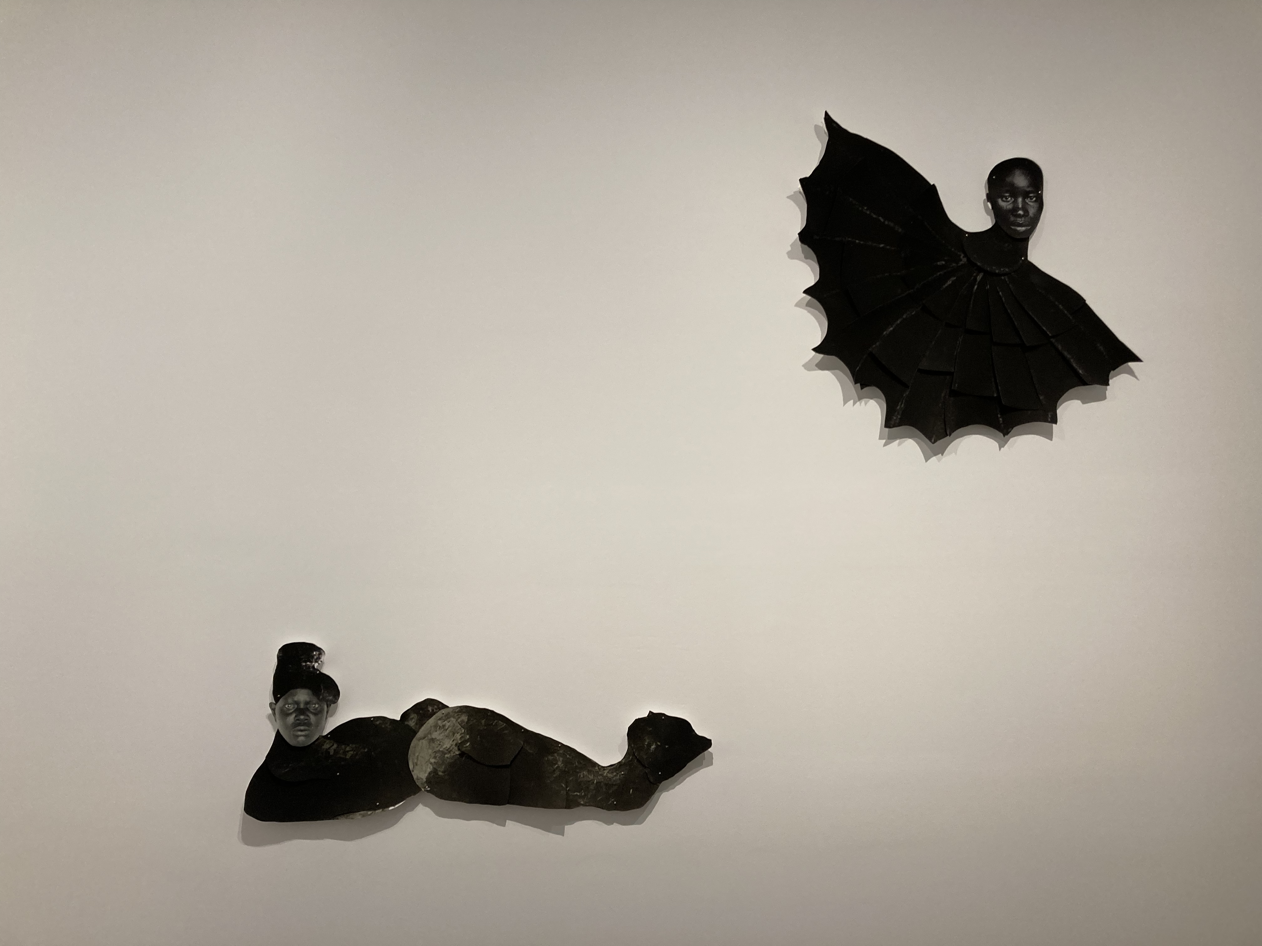
But something not at all hinted at in the curators’ commentary is the horror tropes. In the top photo you can see that the loosely female figures are, from left to right, 1) attended by two sort of flying rabbit demons; 2) sitting on a monster’s head; 3) is shaped like a mermaid; and 4) in the most striking image, is a human head cut and pasted onto the body of a bat. A whole lot of stuff is going on here, but what strikes me is the invocation of imagery of Gothic tales and horror stories; it’s the stuff of Goya nightmares. What? Why? In this respect she reminds me of the way Kara Walker’s silhouettes of Black people in ante-Bellum Deep South morph into nightmare, monster images.

Installation view of Frida Orupabo at the Photographers’ Gallery

Anyway, it was the sheer weirdness of these big collages which grabbed me, not their alleged commentary on colonialist this, that or the other, and so I’ll tell you straightaway that, for the uncanny unexpected weirdness of her images, Orupabo was my favourite of the four artists: I wanted her to win.

2. Bieke Depoorter

Bieke Depoorter was born in 1986 in Belgium. She was selected for this prize on the basis of a 2022 exhibition titled ‘A Chance Encounter’, staged at C/O Berlin from April to September 2022. The display here consists of two parts, titled ‘Michael’ and ‘Agata’. Apparently:

In ‘Agata’, a first meeting [with Agata Kay] in a Parisian strip-club in 2017 evolves with complex tension into an intricate, changing narrative. The project explores questions of collaboration, the limits of a creative friendship, performance, boundaries and authorship.

I couldn’t find ‘Agata’. Possibly it amounted to one framed photo of a pink room, and maybe a collage of movie posters on one wall, but these weren’t labelled so I wasn’t sure. Going back to reread the introductory wall label more carefully I realised that the subject of Depoorter’s photos, the stripper Agata, eventually asked Depoorter to suspend their relationship and asked that all record of the photos, conversations and letters involved in it be erased. Maybe the Agata project is the absence of any materials about the Agata project. OK. That has a pleasing 1970s conceptual art feel about it.

But the reason I wasn’t too sad about not finding ‘Agata’ is because it was completely dwarfed by the other project displayed here, ‘Michael’. This is an epic, dense, absorbing and deeply unsettling work.

in 2015 Depoorter met a middle-aged, confused man named Michael on the streets of Portland, Oregon, USA. They got talking and Michael took her to his apartment which turned out to be covered from floor to ceiling with scrapbook-style cut-outs from magazines, books, newspapers, school reports, journals and diaries and all manner of bric-abrac.

Michael at home, Portland, Oregon, May 2015 by Bieke Depoorter, © Bieke Depoorter/Magnum Photos. Courtesy the artist

As a result of this encounter Michael gave Depoorter three suitcases containing a trove of his personal items, sketchbooks and essays which she, for unexplained reasons, accepted. Then, presumably, she departed Portland, for the wall label explains that, at some point later on, she tried to contact him again and failed. When she flew back to Portland to find him she discovered his flat rented to someone else and  that Michael had vanished, leaving no trace.

At which point Depoorter commenced what appears to have been months if not years of effort to track him down, the start of an obsessive quest to find Michael and to understand his life. As far as the labels tell us, to this day she still hasn’t found him, but along the way she has created the two big things which this darkened room is filled with. One is the way all the walls are even more covered in detritus and scraps of every kind than Michael’s apartment was, the records and ephemera of her hunt which Depoorter has acquired over the past 6 or 7 years.

Installation view of Michael by Bieke Depoorter at the Photographers’ Gallery

Post-its festoon multiple layers of documents and diaries and journals and magazine photos and contact sheets. Arrows connect different pieces of evidence. It’s exactly like the room of the crazed serial killer which the cops eventually break into in all those American psycho movies. She calls it ‘The investigation room’ and what we see here is just a fragment of the materials she’s accumulated in her obsessive, endless search. She has supplemented Michael’s own collection of ephemera with her own. The two sets of detritus are intimately interwoven. But spooky though this is, it isn’t the main thing: the main thing is the film.

Installation view of ‘Michael’ by Bieke Depoorter at the Photographers’ Gallery

It’s a 31-minute-long film detailing Depoorter’s obsessive quest so far. There are no moving segments. It consists entirely of still photos, so it’s by way of being a slideshow of places she’s been to and people she’s interviewed as she delves deeper into Michael’s life and past, her words and those of the interviewees appearing as captions on the screen.

So, in the sequence I watched, Depoorter spoke to some people who were at high school with Michael, who described his intense upbringing by nice but weird Mormons. We see stills of Michael’s high school yearbook with jagged, uneven hand-written notes scrawled across it. It has lots of overtones of serial killer movie, except Michael is no killer, just an oddball Depoorter bumped into and became slowly obsessed with.

If all this sounds weird (and it definitely is) after just a few minutes I found the pace and determination of Depoorter’s narrative drawing me into the film. Michael may have been just an insignificant nobody and yet, in Depoorter’s powerful telling, the memories of childhood friends and schoolmates become weirdly compelling. I realised I was being drawn into Depoorter’s own obsession. It’s contagious!

The curators comment that this work interrogates:

the complex ethical relationship and boundaries…between the photographer and their subject [and] questions the role and responsibilities of the photographer, the possibility or impossibility of truth in representation and grapples with personal and professional boundaries.

No doubt. But something deeper and weirder was also at work here. I was quite relieved to break away from the film and step back out into the light airy gallery space.

3. Samuel Fosso

Samuel Fosso was born in 1962 in Kumba, Cameroon. He was selected for the prize on the basis his exhibition ‘Samuel Fosso’ at the Maison Européenne de la Photographie, Paris, from November 2021 to March 2022.

Since the mid-1970s Fosso has dedicated his artistic practice to self-portraits and performative photography. In vulgar language, he dresses up and photographs himself. At the tender age of 13 he set up a Studio Photo Nationale in Bangui, capital of the Central African Republic. Alongside commercial work, Fosso began a series of self-portraits, and has carried on to the present day, hence a nickname he picked up along the way, ‘the man of a thousand faces’.

Autoportrait by Samuel Fosso, from the series 70s Lifestyle (1976) © Samuel Fosso. Courtesy of the artist and JM Patras, Paris

More recently Fosso has created a series titled ‘African Spirits’ in which he dressed up as – and recreated famous photographs featuring – Black celebrities such as (the ones on display here) radical activist Angela Davis, Martin Luther King, Malcolm X, Haile Selassie and Tommie Smith, one of the African Americans who gave the Black Power clenched fist salute from the podium of the 1968 Olympics.

Installation view of ‘African Spirits’ by Samuel Fosso at the Photographers’ Gallery. Can you name all 6 of these famous Black figures?

According to the curators:

Playing the role of key historical figures and social archetypes in front of the camera, Fosso embodies a powerful way of existing in the world, and a vivid demonstration of photography’s role in the construction of myths.

There’s also a pair of huge colour photos of himself dressed as soldiers from the First and Second World Wars, tribute to the many African and Black soldiers who fought in those wars (see my blog post, Congolese soldiers in the world wars).

Compared to the previous two displays, photocollage sculptures and a weirdly compelling documentary film, Fosso’s exhibits – classic framed photographs – seemed, well, kind of obvious, kind of quaint.

4. Arthur Jafa

Arthur Jafa was born in 1960, Tupelo, Mississippi, USA. He is an artist and filmmaker. What is an American doing in an exhibition supposedly restricted to exhibitions in Europe?

Well, one answer is that art curators can’t stop themselves promoting the Great Yoonited States of America: after all, Depoorter’s  ‘Michael’ project is about an American and entirely set in America and half of Fosso’s African Spirits are American. And now we have an actual American photographer. Three out of the four displays are heavily or entirely American.

Why do British curators love American art?

What can you do against the endless tide of American art and artists being promoted by British art curators and adding to the vast sea of American culture which floods all our channels? If Britain’s art curators are so hell-bent on promoting American culture and American values at every opportunity, all I can do is register my feeble protest and point out that there are, in fact, other countries in the world apart from America. Quite a few, actually.

Why do we rarely or never hear about them? Because America is easy, that’s why. American art comes pre-packaged with 1) fluent, articulate artists who are great in interviews 2) innumerable American critics who bubble over with rhetoric about race and gender and 3) political and cultural ‘issues’ which we all already know too much about about because they flood our TV, radio, movies, documentaries, newsfeeds, twitter and all the other American-run social media.

When an American artist gives an interview saying they’re addressing issues of #metoo or Black Lives Matter,everybody immediately knows what they’re talking about and nods in concerned sympathy because we’ve already seen and heard and read hundreds and hundreds of news items and newspaper stories and magazine features and documentaries interviews and tweets about just these ‘issues’.

American art is like McDonalds art. It’s smooth, pre-packaged, ready to consume, processed, pre-masticated, baby food. Just add water and you’re good to go. Compare and contrast the problems you’d encounter with the language barrier and with explaining all the little-known historical and cultural references if you tried to stage an exhibition of contemporary, say, Indonesian or Peruvian art. But another African American artist yakking about slavery or the institutional racism of American society – piece of cake, child’s play, no brainer, no mental effort required, just the appropriate amount of liberal sympathy.

Arthur Jafa

Anyway, Jafa is here despite not being European because his exhibition, ‘Live Evil’, was shown at Arles in the South of France i.e. a European venue, from April to November 2022.

There’s a video of an extended interview with Jafa. He’s very angry about racism, in America, Europe, everywhere. In the bit I watched he quoted Malcolm X and the Black Panthers. In a modern art gallery you’re never far away from the 1960s. My eyes glazed over because I have heard scores of Black artists complaining about racism in America and read hundreds of articles about racism in America. Black Lives Matter posters hang in the windows of concerned students round where I live.

The stories of Uyghurs Muslims locked up and tortured in Xinjiang, of the people dying and displaced in Yemen or Syria, of the 920,000 Rohingya refugees from Myanmar living in the world’s largest refugee camp in Bangladesh, now as I write and you read? Are these packing the walls of the Barbican, Tate Modern, the Royal Academy, the Photographers’ Gallery? No. Silence. Nada. Their stories will never be told. They might as well not exist. But another American artist doing another show about how racist America is? Take your pick.

One last obvious point about the ubiquity of American artists: America is rich. It has the wealth to support a huge class of artists who, if they play their cards right, can become very wealthy, successful, appear in all the right magazines, and generally enjoy a great lifestyle. Makes me feel a bit sick when artists from the richest country in the world complain about their suffering and oppression. Go and live in Somalia, Sudan, Liberia, Afghanistan for a month then fly back to your air-conditioned studio in LA and tell me about the suffering of ‘your people’.

Anyway, according to the curators, Jafa’s work is another ‘extended meditation on the issues of race and the Black experience’. Just like Frida Orupabo’s display, then. I’d swear there are other ethnicities in the world apart from Black and White. There are quite a lot of Indians and not a few Chinese, for a start. But not in Curatorworld. Black, Black and more Black, preferably American Black, is the only experience, the only voice, the only art we are going to be shown. I’m not saying ‘the Black experience’ is not a thing to investigate. I’m just saying that maybe it’s not the only story in the entire world to be aware of, to listen to.

Anyway, to quote the curators:

Drawing from a rich collection of images, film footage and music, Arthur Jafa uncompromisingly articulates Black experience, providing us with an exercise in visual literacy, confronting us with a new Black aesthetic which avoids fixed hierarchies and linear storytelling

There are just six works in Jafa’s display, six very large photos. First, maybe a word of explanation about the tile. ‘Live Evil’ is the name of a Miles Davis album, released in 1971, a live recording of a concert performed in December 1970 in Washington DC. After the epoch-making ‘Bitches Brew’ of 1969, Miles was working with a large group of almost entirely electric instruments, producing a strange voodoo swamp sound, mashing up heavy funk grooves with Jimi Hendrix guitar, and his own trumpet heavily electronically distorted. During this period Miles cultivated a dark and brooding image. He revelled in the nickname ‘the Prince of Darkness’, in fact he released an album titled ‘The Prince of Darkness’ in 1971, same years as ‘Live Evil’. Anyway, ‘Live Evil’, which sounds like this:

Miles Davis (1926 to 1991) was without doubt one of the great musical artists, composers and performers of the twentieth century. In the show he is featured in a diptych (‘any object with two flat plates which form a pair’) alongside the godfather of the Delta Blues, acoustic guitarist and singer Robert Johnson (1911 to 1938), which looks like this:

Bloods II by Arthur Jafa (2020) © Arthur Jafa. Courtesy of the artist and Gladstone Gallery

Johnson died young leaving only 20 or so recordings behind which have, nonetheless, become legendary and inspired all the blues guitarists of the 1940s and since. Dying young, Johnson left a legend or urban myth about himself which is that, in order to play so amazingly, he had sold his soul to the Devil. This legend was fostered by tracks with titles like ‘Me and the Devil Blues’ or ‘Hellhound on my trail’:

So what does Jafa’s juxtaposition of these two Black musical icons tell us? Well for a start, they both made smoking look cool. To consider their music, although only about 40 years separate the photos (1930 to 1970) they seem musically and technologically galaxies apart. Then again, maybe they’re linked by the common thread of their devilish reputations, hellhounds and princes of darkness. Finally, maybe it’s simpler than that: Robert and Miles were both outstanding musicians, embodiments of Black excellence.

Across the room is another, bigger and more dramatic juxtaposition:

‘Mickey Mouse was a Scorpio’ by Arthur Jafa (2016) © Arthur Jafa. ). Courtesy the artist and Gavin Brown’s enterprise

On the face of it, this is a straight contrast between an image of innocence and one of scary threat. Yet some other visitors I got talking to explained to me that they’re both images of identity masquerade: apparently, the earliest iterations of Mickey were based on white entertainers who’d blacked up as minstrels; while the figure on the right is actually a white actor who has blacked up using scary voodoo imagery (I assume this photo was shot on a film set but I can’t find out which one. Do you know?). They’re both lies, or deceptions, or multi-layered images of Blackness. Is that it?

This article explains that Jafa’s work:

tackles the complexity of African-American cultural identity, as defined by an existential paradox that places the Black subject ‘in essential intimacy with death’, as Saidiya Hartman explains in Jafa’s documentary ‘Dreams are Colder than Death’ (2013).

The endlessness of American pop culture

I liked the clarity of these dyptychs and also the fact that they were much deeper than they first appeared to be. The trouble, though, with popular culture, especially American popular culture, is that it is endless. Like the Bible, you can find a passage or quotes to prove anything you want to. I can cut and paste Homer Simpson next to Superman and straightaway I’m making important statements about masculinity, or something. Given such a vast sea of pop ephemera it would be hard to splice together two random elements and not find yourself raising interesting cultural or semiotic issues.

American culture combines technological wizardry with super-refined commercial strategising. Look at the Marvel Comic Universe movies, which are spectacular viewing, rank as the highest-grossing film series of all time, having netted over $29.1 billion, and have a mental age of around 9.

And American artists are trapped within this culture, condemned to try and imbue meretricious trash with meaning – and Black American artists are doubly trapped, trapped in a sea of Americana from which they (apparently, if someone like Jafa is to be believed) feel profoundly alienated. So I understand Jafa when he says that Black American artists are they trying to create narratives of Blackness which will help them navigate the bottomless dumpster of American pop culture, and the complex matrix of racist laws, assumptions and culture. I assimilate this kind of message because I’ve heard it hundreds, maybe thousands of times. It comes pre-packaged and ready to consume.

Anyway, the puzzling thing about the Arthur Jafa display is that the use of these two sly juxtapositions is not his only trick – only two of the six items use it; the other four items are single images and far more varied, not to say troubling.

One is a treated image of the Black singer of a rock band (HR of Bad Brains) jumping about onstage, which left me cold, having spent too much of my teenage year paying attention to images of rock performers to be impressed by one more.

But in a completely different tone from everything else, one entire wall is taken up with an enormous photo of what appears to be a room somewhere in Rwanda, empty of people, but filled with washing lines (?) from which hang the clothes and rags of people hacked to pieces in the terrible genocide.

Installation view of Arthur Jafa at the Photographers’ Gallery

Is this part of ‘the Black experience’? Or the African experience? Or the human experience? It was certainly part of this generation of Rwandans’ experience. Does it directly impact anyone who wasn’t there? If so, why more so than the Armenian genocide or the Holocaust or – the most disastrous civil war in history, the Taiping Rebellion in China in which at least 20 million perished (which I’ve just been reading about at the new exhibition at the British Museum)? Or the Great Leap Forward, 1958 to 1962, in which anything up to 50 million Chinese starved to death? Or, during my lifetime, the killing fields of Pol Pot’s Kampuchea in which up to 2 million people, a quarter of the population, were murdered or starved to death, 1975 to 1978?

I carry the images and histories of all these atrocities in my head, which not only gives me a very dim view of human nature, but also appears to be where I differ from someone like Jafa, because I don’t categorise these atrocities by the skin colour of the victims. They’re all human to me, each one an individual who suffered more than I can imagine, died in misery and terror, mounting up to a vast weight of guilt on the conscience of mankind. The collected atrocities of mankind don’t respect colour or ethnicity, which is why I find the foregrounding or privileging of some massacres or genocides over others morally repugnant.

Anyway, back to Jafa. The last piece in his display is a partial sculpture, a kind of bas-relief hanging on the wall of the whip-scarred back of a Black slave, a very potent image of man’s grotesque inhumanity to man or the atrocities of the Atlantic Slave Trade.

Ex-Slave Gordon 1863 by Arthur Jafa (2017) © Arthur Jafa. Courtesy of the artist and Gladstone Gallery. Photo by the author

I get it, the Black slave trade was a very, very bad thing and generations of white exploiters captured, bought, transported and treated their African slaves with unbearable savagery and brutality. But I happen to have just finished reading Robert Hughes’s epic history of transportation to Australia, The Fatal Shore, and it is packed to overflowing with the unspeakably sadistic treatment meted out to the transported white convicts, especially in the penal colonies of Port Moresby and Norfolk Island. For even slight misdemeanours like looking at an overseer the wrong way, a convict could get three hundred lashes till bystanders could see their spine and ribs through the remains of their butchered back and the bystanders had to pick gobbets of raw human flesh off their clothes. Hughes repeats descriptions of British or Irish convicts who were whipped to death. So this, for me, is the image of a whipped human.

Most of human history is an abattoir. To limit notions of suffering and injustice to just one ethnicity or to one group or one class seems to me historically and morally questionable. It’s a form of boasting – my grievance is bigger than your grievance. It’s very much part of the grievance and victim culture which America has perfected and exported to the rest of the developed world.

But billions have suffered abominably, in every continent, at the hands of all races. The génocidaires in Rwanda weren’t white. The killers in Cambodia weren’t white. The people who implemented the Great Leap forward weren’t white. The murderers of 1.5 million Armenians weren’t white. The administrators of the gulags weren’t Western imperialists.

If these seem disproportionately enormous ideas for a photography exhibition that’s because Jafa is aiming to trigger big ideas about history. It’s just that I happen to be, maybe, more knowledgeable about the history of atrocity than the average gallery goer and so my frame of reference is wider, maybe, than he intends. Maybe it’s just me. I’ve read more widely about atrocities throughout history than is good for anyone, and so this powerful object triggers a wider, deeper historical response than he was, maybe, expecting.

I’m reading Emma Sky’s book about Iraq. She mentions General David Petraeus raising Thucydides’s Melian Dialogue in conversation. This was written about the siege of Melos in 416 BC, part of the wider the Peloponnesian War. When the Athenians finally took the city of Melos they executed the entire male population and enslaved all the women and children. My year of reading Roman history and literature drummed into me that slavery was a universal institution throughout the ancient world, that the civilisations of ancient Athens, Rome and Egypt entirely depended on it and that the huge slave population was subjected to terrible, awful lives of unending labour and liable to whipping, cutting, maiming and torture for the slightest infraction.

That’s what I know, that’s what an image like this triggers; not the suffering of one particular group, but the universal horror of human history.

Jafa summary

Anyway, back from these vast horizons to a small room in Soho containing half a dozen artworks by Arthur Jafa. The conclusion from this small display seems to be that Jafa has at least two modes of operation, one consisting of the canny juxtaposition of images from popular culture, an astute form of curating and darkling satire; the other mode, flat-out horrific memorials of ‘the Black experience’.

This latter is, as you can imagine, catnip to modern white curators, driven by the bottomless resource of white bourgeois guilt:

By placing one resonant cultural artefact next to another Jafa references and questions the universal and specific articulations of Black experience. Eschewing a linear narrative, Jafa organises his material through formal and affective associations, linking his images through visual resemblance or thematic resonance. In this way Jafa aspires to an art that harnesses ‘the power, beauty, and alienation of black music.’

That’s from the press release. On the introductory wall label the curators say:

Embracing slippage and dissonance Jafa creates art that is as fluid and multidimensional as Blackness itself.

‘…as fluid and multidimensional as Blackness itself.’ What I took from the four exhibits on show here is that ‘Blackness’ as an artistic, critical and curatorial concept is indeed so fluid and multidimensional that artists, critics and curators can say almost anything about it and sound convincing. It lends power and a sense of urgency and relevance to even the most anodyne exhibition. It adds the spice of the ‘radical’ to a medium which all curators are uneasily aware is overwhelmingly white and bourgeois. Along with Gender it is a power word and, more than that, a kind of ideological matrix or discursive machine, which will continue to generate works and words, art and discourse, with ever-proliferating effect, for the foreseeable future.

From one perspective, ‘the Black experience’ as an art category is not so much the product of Black people’s actual experiences (which I imagine are very varied and complex) as it is of the liberal guilt of the White art establishment.

Who won?

Who do you think should have won the prize? It was won by Samuel Fosso, ‘the man of a thousand faces’. Why? Shoair Mavlian, the (White, obvz) Director of The Photographers’ Gallery and Chair of the Jury said that Fosso’s:

‘sustained exploration of self-portraiture uses a traditional, studio-based approach steeped in history, while at the same time his work remains relevant and addresses contemporary political issues of today with humour and authenticity. His work has created an extraordinary platform for Black voices and artists throughout his career.’

It’s a difficult choice but I think I liked Frida Orupabo’s weird, Gothic photomontages more than Fosso’s dressing up; and, although I’ve just given him a hard time, actually the clarity and design of Arthur Jafa’s diptychs have stayed with me days later, but then that’s American art for you, as slick and efficient as a Spielberg movie.

Who would you have given the prize to?


Related links

Atrocity reviews

More Photographers’ Gallery reviews