Rewiring ideas of glamour and gender roles, Linder’s artworks engage in vibrant and powerful take-downs of male-oriented consumer culture.
(The official view)

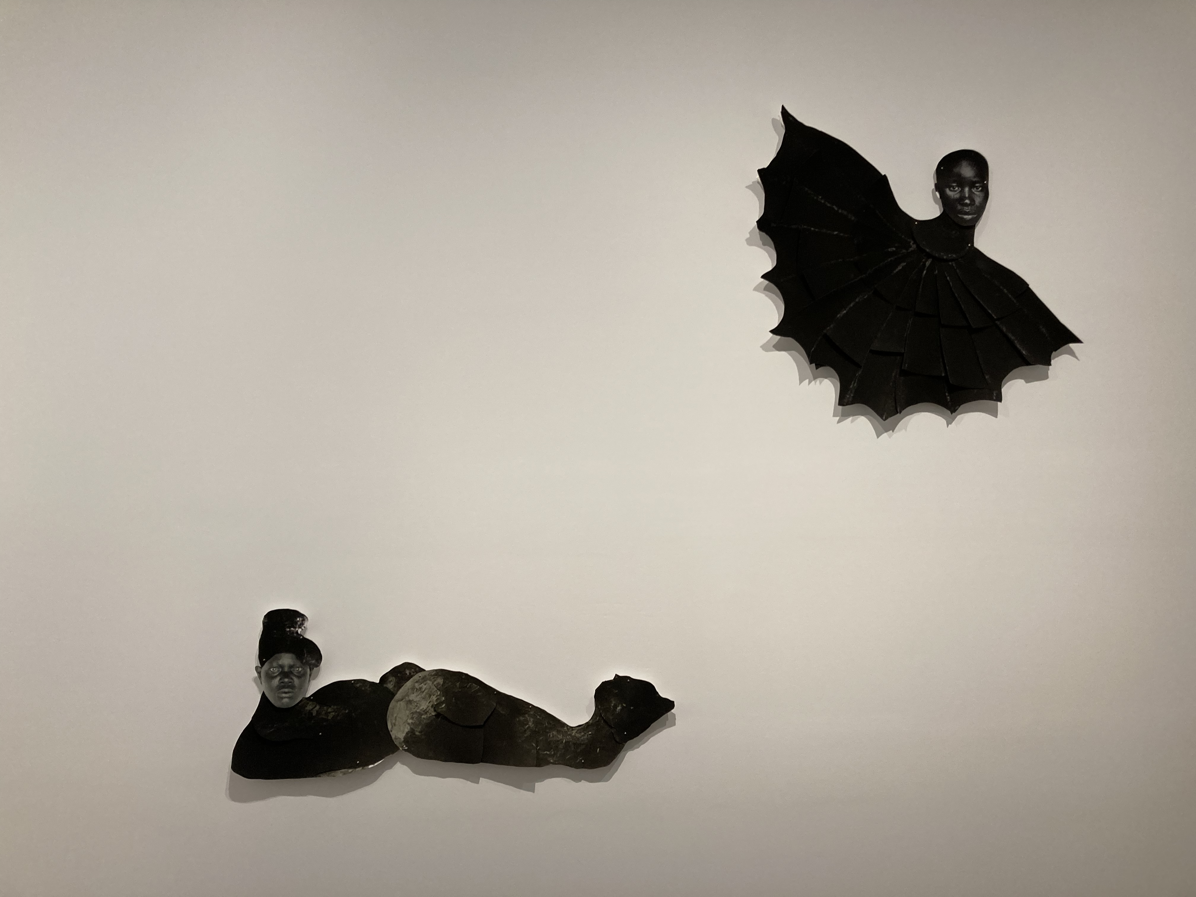
Principle of Totality (Version I) by Linder (2012) detail © Linder
Linder and Mickalene
A word of explanation. The Hayward Gallery is currently hosting two exhibitions, one of the radical British feminist artist Linder, one of the radical Black queer American feminist artist, Mickalene Thomas. When I got there I mistakenly thought they shared the same main gallery space, with Mickalene downstairs and Linder upstairs. This was my mistake. Although you buy a joint ticket to both of them, the two exhibitions are completely distinct and you enter them by different doors. The Mickalene is situated in the Hayward’s main gallery with its huge rooms, while you enter the Linder by a different entrance into a series of smaller, more intimate rooms along the ground floor. This is a review of the Linder show. I’ve written a separate review of the Mickalene Thomas show.
Linder: Danger Came Smiling
It was 1976 and Linda Sterling, born in Liverpool in 1954, was coming to the end of her graphic design course at Manchester Polytechnic (now Manchester Metropolitan University) just as the pop culture storm of punk rock exploded like a bomb. It started in London with the Sex Pistols who were invited by founder members of the Buzzcocks, Howard Devoto and Pete Shelly, to come and play the Manchester Lesser Free Trade Hall. This they did, on a famous occasion, on June 4, 1976.
This gig is considered one of the most influential concerts of all time. Everybody who went on to become a name in the northern branch of punk claimed to have been there and had their ideas about not only music, but style and art, blown wide open. These included not only Buzzcock founders Devoto and Shelley but Morrissey (the Smiths) and the founding members of Joy Division.
Sterling was an instant adopter of the new, home-made, razor blade, torn t-shirts and aggressive attitude of the new movement, which chimed perfectly with her own style of satirical photomontage which she’d been developing on her course. Moving in the inner circles of the Manchester art-punk scene she was invited to create posters and flyers for Buzzcocks gigs and then the cover art of the band’s first single, Orgasm Addict. Here’s the song, with cobbled-together live footage.
And here’s Sterling’s iconic cover for the single.

Cover of Orgasm Addict by Linda Sterling
Notice anything? Yes, it’s a naked woman, one of the ‘depictions of nudity and images of a sexual nature’ which the Hayward thoughtfully warned us against. But it’s a naked woman who has had smiles from some glamour magazine tactfully pasted over her nipples and her head replaced by an iron.
You immediately realise that 1) this is what the professionals call photomontage and 2) it is a bitingly satirical feminist comment.
And this one image captures the artist’s entire style and worldview. By combining the sexy body with an everyday household appliance, Sterling is satirising contemporary stereotypes of women, whether the objectifying soft porn which was dominant in the 1970s or anodyne pictures of housewives in floral pinnies smiling at their husbands which filled a thousand Good Housekeeping-type magazines. And all using just a pile of glamour magazines, a ‘medical grade scalpel’ and some glue.
Here she is explaining her thinking.
‘At this point, men’s magazines were either DIY, cars or porn. Women’s magazines were fashion or domestic stuff. So, guess the common denominator – the female body. I took the female form from both sets of magazines and made these peculiar jigsaws highlighting these various cultural monstrosities that I felt there were at the time.’
It’s the same ‘Fuck off, sexist pigs’ attitude which drove Jill Posener to write her brilliant graffiti on the era’s sexist adverts, which were featured at Tate Britain’s Women in Revolt! exhibition.

Saw his head off by Jill Posener (1981)
Early on Sterling asked to be known by an art name or moniker, Linder, a slight adjustment to her given name. That’s how she’s referred to throughout the exhibition and how I’ll refer to her from now on.
Ludus
And inspired by all the boys getting up on stage, she set up her own punk band, Ludus, which ended up lasting for six years (1978 to 1984), playing numerous gigs, releasing half a dozen singles and two albums. They were produced by Linder’s boyfriend of the time, Howard Devoto who left The Buzzcocks to set up the much more art school band Magazine and, apparently, they influenced singer Morrissey, later of The Smiths, who remains one of the group’s most vocal fans.
Their most notorious moment came on 5 November 1982 when the band played the Haçienda club in Manchester and Linder came onstage wearing in a dress made from raw meat. Here’s their first album.
Notice the spare, black-and-white artwork? Linder did that. And can you spot the glossy lips and teeth cut out from a fashion magazine, same kind of lipstick smile as in the Buzzcocks’ cover, and in the Principle of Totality montage at the top of this review. Recurring motifs.
Feminist rebellion
Anyway, that, in a nutshell, is Linder’s brand. Take howlingly clichéd (and dated) images of women– either housewives or ‘glamour’ models – and subject them to photomontage transformation in the name of radical thingummy in order to subvert the blah blah. All very feminist rebellion, but also very funny, consistently signalling what curators call her ‘outrageous sense of humour’. And, in quite a few of them, surreally beautiful.
For nearly 50 years she’s been ploughing more or less the same furrow. There are forays into other forms. Three of the rooms have large installations. There’s a series of documentary photos of gay nightclubs from the early years. There’s some massive colour photos she did of herself and a friend covered in multi-coloured gloop from more recently. There are display cases (or ‘vitrines’) showing her early work on punk record covers. So there’s some variety, yes. But the core of this exhibition is four moderate-sized rooms containing about 80 A4-sized works in anonymous frames, almost all of them black and white photomontages.

Installation view of Linder: Danger Came Smiling @ the Hayward Gallery. Photo by the author
Room 1. Grammar (35 works)
As you walk into Room 1 you are struck by a couple of big pieces before you get to the much smaller works on the walls. These are the massive blow-up of the artist (above) and hiding behind it, an installation of five mannequin heads adorned with BDSM masks hanging from the ceiling against a backdrop of gauze curtains. One of the visitor assistants told me the mannequin heads were part of her final year show at Manchester Poly though the wall labels didn’t confirm this. No doubt it’s meant to subvert something or other but this kind of thing is available at any branch of Victoria’s Secret or Lovehoney, crops up in kinky movies or is even mentioned and joked about in TV shows these days. Any sexy-shocking impact long ago vanished. Now the sensory vibe they give off is calm and peaceful.

On the walls are several series of satirical photomontages. Unfortunately for the purposes of identification, most of them are labelled ‘Untitled’. One series that is named is ‘Pretty Girls’ from 1977.

Pretty Girl 1 by Linder (1977)
As the curators explain:
Cyborg-like, with consumer products for heads, the ‘pretty girls’ in this series are the same woman, who has been photographed performing classic ‘pin-up’ poses in a simple domestic scene. The eroticised coffee pot, electric fire, record player and other items masking the model’s face remind us of how sexual desire is manipulated by advertising and redirected towards consumption. Masking the model’s facial expressions, these montaged elements remove any semblance of individuality and expose how the pornographic figure is likewise presented as a passive consumer object.
And:
Inspired by recent feminist writings, Linder’s work from the [late 1970s and ’80s] undermined traditional gendered associations of domesticity, romance and desire. Using a surgical scalpel, Linder cut out images of female bodies found in women’s magazines, romantic novels and soft pornography, and recombined them in photomontages that derail the usually dominant role of the male gaze in consumer culture, subverting it with satirical effect.
‘Derailing the male gaze.’ ‘Subverting consumer culture.’ Where have we heard these phrases before? In scores and scores of other feminist exhibitions, in fact in pretty much every exhibition by a woman artist I’ve ever been to, which is why my brain glazes over when I read them. They have become as meaningless as Boris Johnson promising to level up the country or Rachel Reeves promising to kick start economic growth or Donald Trump promising to make America great again. Yeah, right.
Feminism, especially dated white feminism like this, is one more jargon, one more discourse among so many competing for our attention in the endless mediascape, in the vast public Imaginary, in the sea of discourses which long ago reached saturation point, and now reproduce themselves endlessly in a place beyond satire or meaning.
If it’s never occurred to you before that women’s bodies in our consumer capitalist culture are used to sell things, that glamour magazines and pornography exploit women’s bodies, that a vast amount of the public imagery of women objectifies, sexualises and submits women to the dictates of the male gaze, then this show will come as a terrible shock to you.
If, on the other hand, you grew up with, or have been exposed to, the feminist critique of society for decades, then your main reaction will be exasperated boredom with the wall captions and their repetitive claims that this arts subverts, derails and interrogates anything at all.
Instead, in my view, Linder’s works are primarily justified by their style and humour. Lots of them made me smile. In a world hurtling towards destruction that is an important achievement. Far more important than repeating tired old political slogans, no matter how relevant they remain today (because they will be relevant forever, and so eventually become threadbare and completely ineffective). Whereas waspish humour and stylish design endures and pleases. This one made me laugh out loud.

Untitled by Linder (1977). Collection of Paul Stolper, London
To be fair this is probably the crudest, most explicit image in the show. The reversioning of gay porn photos are fairly naughty, but most of the other images are much more low-key and inoffensive than this.
White feminism
Incidentally, in case you think I made up the phrase ‘white feminism’, I didn’t, I’m citing a well-known concept in feminist theory.
Small
After the vast scale of the Mickalene Thomas work next door, you can’t help being struck by the relatively small scale of almost all the pieces (bar the three installations and a couple of images blown up to wall size). Why so small? Linder herself addresses the issue.
‘I often ponder the most minimal interruption that I can create to totally change the meaning of the original image. It’s non-monumental, intimate work made deliberately to draw the viewer in closer.’
So it’s a conscious decision to exercise her disconcerting cutting and pasting on an ‘intimate’ scale. It forces you to lean in and notice the details. It’s not quite the art of the miniature but some of the finer detailing is getting there.
Vitrine
Here’s one of the glass cases displaying her design work during the Ludus period along with photos of the band performing.

Vitrine showing art work for, and photos of, Ludus. Photo by the author
Room 2. Glamour (34 works)
Each of the rooms is assigned a one-word title, which is then explained in the wall label. Thus Glamour:
In the 18th century, to ‘cast a glamour’ meant to cast a spell of enchantment. Growing up in the northwest of England in the 1950s and 1960s, Linder was drawn to the ‘incredibly glamorous Liverpool women’ around her. Although their dress code of ‘lipstick and a bullet bra’ didn’t align with the aesthetics of feminist empowerment, their glamorous transformation of gender and social class had a subversive power.
You know the office cliché, ‘When everything’s a priority, then nothing’s a priority’. Well, when everything is subversive, nothing is subversive. The fact that all contemporary art is routinely described as ‘subversive’ goes a long way to explaining why it has no effect whatsoever.
This room contains her photographs of working class drag clubs in 1970s Manchester, small, black and white. And portraits capturing her own physical transformation through bodybuilding in the early 1980s. There’s a screen hanging from the ceiling on which is projected a film of her working out at the gym, rather dark and grainy. Maybe a woman working out at the gym is subverting something.
More interestingly, ‘glamour’ is also the euphemistic term coined by British pornographer Harrison Marks in the late 1950s to describe a certain kind of relatively restrained soft porn magazine. So there are sets of humorous photomontages where Linder’s taken classic ‘glamour’ shots and pasted on household appliances etc. The curators claim that these reveal ‘the misogynistic portrayal of women as passive objects of male pleasure’, as if anyone seeing a soft porn magazine wasn’t capable of working that out for themselves.
In Linder’s hands, these photographs are transformed with an empowered glamour of their own.
The ‘Magnitudes of Performance’ series applies the same technique to gay pornographic photographs from the 1970s, pasting over rude photos of men with advertising images of expensive watches, taps and furniture. these are predominantly funny but I can see that there is an interest in playing with the ‘erotic charge’ of these photos i.e. by stopping them being straightforward gay porn, seeing just how much deformation the images can stand and still have an erotic aura.
Across time, queer identities and their meanings shift, and so too does the reading of these erotically charged works.
This feels like the kind of thing the Surrealists were doing in the 1930s, most famously Salvador Dali, taking very sexy images and deforming and weirding them to invent a new type of erotic charge, maybe.
There’s a wall of selfies of the artist, in striking early ’80s styling interspersed with meaningful texts.

Installation view of Linder: Danger Came Smiling @ the Hayward Gallery. Photo by the author
There’s a series titled ‘Sordide Sentimentale’ which involve her holding, embracing, standing next to etc what looks like a styrofoam mannequin or part of one. Note the classic styling and framing which have a strong 1930s vibe, and which along with the slightly sepia colouring of the print, remind me of Man Ray.

Installation view of Linder: Danger Came Smiling @ the Hayward Gallery. Photo by the author
This is emphasised by the Art and Industry series which pastes onto athletic bodies taken from a folio published in Germany in 1939 images of industrial objects taken from art historian Herbert Read’s book, ‘Art and Industry: The Principles of Industrial Design’ from 1934. The juxtaposition of idealised bodies with sleek industrial products evokes (and undermines?) imagery associated with the fascist aesthetics of 1930s Germany.
Room 3. Seduction (26)
The next room has more small photomontages but is dominated by huge colour photos of herself and a friend covered in multicoloured gloop, and a big multi-fabric sculpture in the middle of the room.

Installation view of Linder: Danger Came Smiling @ the Hayward Gallery showing ‘Ritual Action of the Ancestors’ (2011). Photo by the author
Apparently:
Inspired by her discovery of a fetish magazine dedicated to the practice of ‘sploshing’, in which people are covered in food and everyday household substances, this series of photographs documents Linder and a friend as they smear their bodies with food and liquids. With mouths open in ambivalent expressions of pleasure or disgust, their sticky embrace blurs the boundaries between the self and other.
It often feels like art curators have to shoehorn gender and queerness into every aspect of every exhibition. They are beyond buzzwords, they are the sine qua non of contemporary art, they are as ubiquitous as gravity. It often feels like no contemporary art at all can be without its queer aspect or interpretation. Thus these swirling paint works:
In a series of photographs, which call to mind the messy, fetish practice of ‘sploshing,’ Linder and a friend are covered in the kind of liquid food that can be spoonfed. Brightly coloured, it transforms them into living paintings, queering the legacy of machismo Abstract Expressionism via the kitchen.
Do those gloop paintings ‘queer the legacy of machismo Abstract Expressionism’ for you?
Back on a small scale there’s a series of montages where she’s taken her standard glamour model base and pasted big flowers onto them. As a keen gardener I liked these a lot, funny and floral. The most vivid example is in the form of a lightbox i.e. on the surface of a box containing a light which illuminate the image, titled ‘The Goddess Who Lives in the Mind’ from as recently as 2020.

Installation view of Linder: Danger Came Smiling @ the Hayward Gallery showing ‘The Goddess Who Lives in the Mind’ (2020). Photo by the author
One of my favourite series is titled ‘Post-mortem’ and takes photographs of women from the book ‘Barron of the Ballet’ (1950) and splices them with b&w images of dissected marine specimens. These really feel like photomontages from the 1930s, the kind of thing Eileen Agar did.

Installation view of Linder: Danger Came Smiling @ the Hayward Gallery showing some of the ‘Post Mortem’ series. Photo by the author
Room 4. Cut (21)
In filmmaking, ‘cut’ marks the end of a shot or a scene. The term is taken from the physical cut made to celluloid film as it is spliced together in the editing room; a process not unlike Linder’s approach to working with printed images. For Linder the cut is a transformational act. By severing images from their original contexts she makes cuts in time, revealing links between the past and present.
In recent years Linder has, apparently, been exploring classic myths and fairy stories, notably the Cinderella story. The works in this room are far more complicated than previous images, with a multiplicity of coloured images elaborately interwoven, for example The Pool of Life.

Installation view of Linder: Danger Came Smiling @ the Hayward Gallery showing ‘The Pool of Life’ (2021). Photo by Mark Blower. Courtesy the artist and the Hayward Gallery
Of this image the curators write:
‘The Pool of Life’ is a repository for the diverse motifs Linder has used across decades of her work, including lips, eyes, flowers and animals. She describes the work as a love letter to her home city, especially the women and the queer communities that shaped her identity and visual language. The work is named after psychoanalyst Carl Jung’s 1927 essay of the same title, including a stirring dream in which it was revealed to him that Liverpool – a city he had never visited, nor ever would – was the centre of the universe, through which all lifeblood flowed.
Unexpectedly there’s a series of photomontages starting with photos of the stone busts of Roman leaders or emperors onto which have been pasted random and bizarre elements. But the room is dominated by another installation. These three figures are titled ‘The Ultimate Form’ from 2013. They are in fact ballet costumes designed by Richard Nicoll.

Installation view of Linder: Danger Came Smiling @ the Hayward Gallery showing ‘The Ultimate Form’ (2013). Photo by the author
The curators:
These three costumes – The Groom, The Bride, The Youth – were worn by characters in Linder’s 2013 ballet, ‘The Ultimate Form’. Linder created the work with choreographer Kenneth Tindall from Northern Ballet and fashion designer Richard Nicoll. Inspired by Barbara Hepworth’s sculpture ‘The Family of Man’ (1970), the work signified a shift in Linder’s role from performer to orchestrator. In these costumes, fabric, texture and pattern are used to create, as Nicoll commented, ‘a surreal sense of visual trickery,’ which Linder saw as an extension of the body and of the collaging of the self in real-time.
Summary
Linder is in her 70s now and this is her first London retrospective, so I suppose it’s about bloody time. Writing this review has made me realise there was in fact more diversity and range in the show than I picked up when I was there.
Although the curators make the usual claims for her subverting the patriarchy and overthrowing societal norms and queering the thingummy, I think this kind of discourse – the wall labels – have the very negative effect of making it seems if she’s just been doing the same old thing for fifty years. They narrow everything down to the same old issues around gender and identity. You can see why my (gay) friend Andrew has given up reading the wall labels at exhibitions. He just concentrates on what you can see.
And when you do that – look without reading – you realise that there’s more variety here than the harping on about gender suggests. Putting the big installations and the wall-sized photos to one side for a moment, you could see all the cut & paste works as an exploration of what’s possible within the genre of photomontage.
Pasting household appliances on the heads of glamour models, taking cheesy 1960s images of happy couples and pasting cookers and hoovers on them, yes that has the polemical humour of many feminist artists of the time, such as Jill Posener who I mentioned at the start.
But pasting lovely colour flowers over the bums and willies of men from gay porn magazines, is obviously taking it somewhere else. That’s not subverting the patriarchy, that’s exploring a different kind of effect. The curators, as always, want to restrict it to gender and queerness, but if you can escape from their narrow interpretation and really look at these works, you can see something else is going on, something strange which will mean different things to different viewers.
And the ones I liked the best, the sea creature ones – taking her standard b&w glamour photos but combining them with marine animals, shells and so on – that has definitely become a Surrealist move, which is more about the borders between the human and animal worlds than gender or sex.
And the bigger, much more colourful and complicated images in the final room, which are named after myths and fairy tales, they have departed altogether from feminist polemic into something much more interesting about history, culture and imagery.

Installation view of Linder: Danger Came Smiling @ the Hayward Gallery showing ‘The Bardo of Dharmata’ (2024). Poor quality photo by the author
‘The Bardo of Dharmata’ is bang up to date, from just last year, inventive and fun but at the same time it feels deeply nostalgic. The colour tones of presumably an old 1960s celebrity magazine, combines with the equally dated-looking photos of porcelain statuettes (?) of parrots to feel deeply dated and nostalgic.
Maybe the entire form of photomontage, the genre itself, is starting to feel old, dating (as I’ve indicated) to the collage mentality of Dada and Surrealism, back to the 1930s or ’20s, with Linder’s most forceful work in the form dating from the ’70s and ’80s.
Even the polemically feminist montages, all those glamour models with irons on their heads, deep down don’t subvert anything but trigger nostalgia for a simpler, more confident era, when you really could subvert public imagery.
Advice
So my advice is ignore the wall labels and respond to each image, picture, painting and installation as openly as possible. You’ll still get the feminist hit the early works clearly aim for but I’m just suggesting that, as she explores her chosen medium (the small and intimate photomontage) she uncovers a load of other aesthetic effects which are harder to name and categorise and should be enjoyed for their own indeterminate and strange impacts.
Related links
- Linder: Danger Came Smiling continues at the Hayward Gallery until 5 May 2025
- Linder Sterling Wikipedia article
- Ever Heard of Linder Sterling?
- A Woman With a Scalpel