
Six footers
In 1818 at the age of 42, the well-established English landscape painter John Constable made a conscious decision to start painting bigger works and so began the first of what became known as his ‘six footers’.
The first one, ‘The White Horse’, exhibited in 1820, was so successful that Constable was elected an Associate of the Royal Academy on the strength of it, so he knew he was on to a good thing. The ‘Hay Wain’ was the third in the series. Constable painted it under pressure to make the deadline for submissions to the Royal Academy’s 1821 exhibition and, maybe surprisingly, it was painted entirely at his home in London. But he was able to do this because of the countless sketches and previous paintings he’d made of the same location and setting.

The Hay Wain by John Constable (1821) © The National Gallery, London
Constable knew this place so well because his father, Golding Constable, owned it. Golding was a wealthy mill owner and corn merchant so John had grown up surrounded by the appurtenances of the trade and knowing exactly what went into growing, harvesting and processing wheat. The house on the left of the picture belonged to Willy Lott, a tenant farmer, but behind the painter, behind us as we look at the painting, stood Flatford Mill which belonged to Constable’s father. Both stood on the east bank of the River Stour which, at this point, forms the border between Essex and Suffolk.

Map showing location of the buildings in Constables paintings of Flatford Mill and Willy Lott’s cottage
The Hay Wain, like much of Constable’s best work, came to symbolise a certain type of innocent rural scene, eventually becoming iconic of an innocent way of life which industrialising Victorian Britain knew it was losing.
The bicentenary connection
The National Gallery was founded in 2024 so this is its bicentenary year. It’s using the occasion to re-explore favourite items in the collection. It was around Van Gogh’s much-loved painting of sunflowers that the gallery created the brilliant Van Gogh: Poets and Lovers show which you must go and see.
In a similar way, they’ve used the opportunity to take John Constable’s super-famous painting The Hay Wain (1821), and make it the centrepiece of an exhibition in its own right. The bicentenary connection comes in because 1824 was the year when The Hay Wain was displayed at the Paris Salon to great acclaim and was awarded a gold medal, which Constable received from the French King, Charles X, in person.
The medal is here, on display, and is just part of this fascinating and FREE exhibition at the National Gallery, which brings together 50 or so paintings, sketches, drawings, models, contemporary and modern cartoons, photomontages as well as the artist’s own palette (!) to place this super well-known and well-loved image in its full artistic, political, cultural, geographical, agricultural and biographical context. It’s full of beautiful, relaxing rural paintings and fascinating facts.
Political context
To begin with, the socio-political context of the 1810s is dealt with in a fairly small section. At the end of the Napoleonic Wars, after the victory at Waterloo on 18 June 1815, the British Army was rapidly demobilised, with no provision or thought for hundreds of thousands of demobbed men dumped back in their rural communities.
In the same year the Tory administration passed the first of many Corn Laws. These blocked the import of cheap corn from abroad, thus creating a monopoly for British wheat-growers i.e. the landowning aristocracy. But while it guaranteed these landowners a good price for their product it raised the price of bread and related foodstuffs very sharply for ordinary people, leading to hunger and hardship.
Since the landowning class was in the majority in the House of Commons and dominated the House of Lords, it was a very naked form of class war: a few thousand aristocratic landowners arranged the law and economy to their immense benefit and to the starvation of millions of rural workers and the increasing urban proletariat. The corn laws weren’t abolished until 1846 and only after a generation of protests, agitation, riots and criticism.
This cruel and oppressive law doesn’t have much traction in the exhibition. It is dramatised in four or so contemporary political cartoons, by the likes of James Gillray and Joseph Rowlandson. The fiercest is this one by Charles Williams and titled ‘Political Balance’ (1816).

Political balance, An unexpected inspection, or A Good Old Master Taking a Peep Into the State of Things Himself by Charles Williams (1816) © British Museum
The only contemporary artists who spoke out against exploitation, poverty and despoliation of the countryside was the great William Blake but none of his political work is included here, just a couple of tiny illustrations from the Songs of Innocence and Experience.
Interesting though all this is to those of us with a taste for history, none of this rural poverty or agitation is visible in any of the actual paintings by Constable or Gainsborough, Turner or Mulready, Stubbs or Combes which are included here. The subject is raised by the curators only to be quietly forgotten.
The Hay Wain’s radicalness
Landscape painting
At the time in Britain, landscape painting was still considered an ‘inferior’ genre compared to history painting. Among other goals, Constable was determined to raise its prestige and this was part of his motivation for creating the six footers.
‘En plein air’
The Hay Wain was painted in the artist’s London studio over five months in preparation for the Royal Academy annual exhibition which Constable had entered numerous times before. He painted it from several preliminary sketches, probably created ‘en plein air’, a revolutionary approach for the period which Constable eagerly adopted in his quest to represent ‘truth to nature’. It was considered revolutionary in other ways.
Brown
The exhibition includes works by slightly earlier painters including George Stubbs and especially Thomas Gainsborough to show what the traditional approach looks like. In this Gainsborough painting the dominant hue is brown and the play of light is suggested by lighter and darker shades of the relevant colour.
Smooth
Above all the brushwork is invisible and the surface of the painting is flat and smooth.

Cornard Wood, near Sudbury, Suffolk by Thomas Gainsborough (1748)
The Stubbs painting, like the Gainsborough, is dominated by brown, and is as smooth as a horse’s bottom, all slick and shiny surface. Go up close, peer right into the painting, and its surface is as smooth as a piece of porcelain.

Reapers by George Stubbs (1785) © Tate
By contrast 1) Constable boldly used a much brighter shade of green but 2) much more noticeable is his looser, expressive handling of the paint with noticeable brushstrokes which you can see even from a distance. When you go up close you can see countless details which completely lack the consummate finish of a Gainsborough or Stubbs, loads of places where the paint gestures at what it is depicting.
He used a range of marks, surfaces and textures to reflect the variety that he saw in nature and to add to the mood of the painting. He used a palette knife and brushes to create expressive surfaces which are surprisingly varied – scuffed and scored and smeared, lumpy or rasped across the canvas, with small ripples and waves, surfs of impasto. The closer you get, the more varied and dramatic you realise the paintwork is.

Detail of the Hay Wain by John Constable showing the washerwoman by Willy Lott’s cottage (photo by the author)
Smooth when he wants to be
What makes this really striking is that, when he wanted to be, Constable could easily be as smooth as his predecessors. The exhibition includes two paintings of the view from the first floor of his family home which, the curators tell us, he made shortly after the death of his beloved mother, Ann.

Golding Constables Kitchen Garden by John Constable (July 1815) © Ipswich Borough Council Collections: Colchester + Ipswich Museum Service
It’s a quietly beautiful picture in its own right. It has deep biographical resonance not only because of the poignant dating of it, but also because it shows, in the foreground, the garden which was his mother’s pride and joy. But, for our current purposes, the chief thing about it is that the finish is immaculately smooth. If you go right up and peer closely, and from the side, you can see how smooth and finished the paintwork is, completely unlike the ridged and rasped and sprawling brushstrokes of The Hay Wain. He could do it when he wanted to. Not doing it was a very conscious statement of artistic intent.
Constable snow
I was mighty pleased with myself for noticing and then becoming obsessed with Constable’s use of white paint to create a kind of silvery chrome effect all over the Hay Wain. The more you look, the more you see it, not just highlighting the water but iridescent along the tops of the wain itself, dusting spars of wood and brickwork, suggesting the flickering light across the landscape and its reflection off multiple surfaces.

Detail of the Hay Wain showing the silver highlighting
However, I was deflated to read in the curators’ labels that this liberal use of flecks of white paint to represent the sparkling or reflection of sunlight, was noticed and criticised at the time, some smart aleck nicknaming it ‘Constable’s snow’.
Alongside the visible brushwork, the rasps of paint on canvas, and the ridges of paint, this silvery snow was used in the general criticism that Constable’s paintings were unfinished. Constable, of course, considered the plein air approach, the loose brushstrokes and the use of silver slicks of sunlight central to his aim of creating a realistic effect of being there and seeing the landscape, of conveying the shimmering, ever-changing light and shade effects of a real English day, with its everchanging drama of clouds and light.
Clouds
Constable was particularly interested in the study of clouds. The exhibition includes numerous paintings, sketches and drawings he made of cloudscapes. A man named Alexander Cozens wrote a book titled ‘A New Method of Assisting the Invention in Drawing Original Compositions of Landscape’ which included different types of cloud shape and the exhibition includes some of the 20 drawings he made from the book as well as oil sketches.
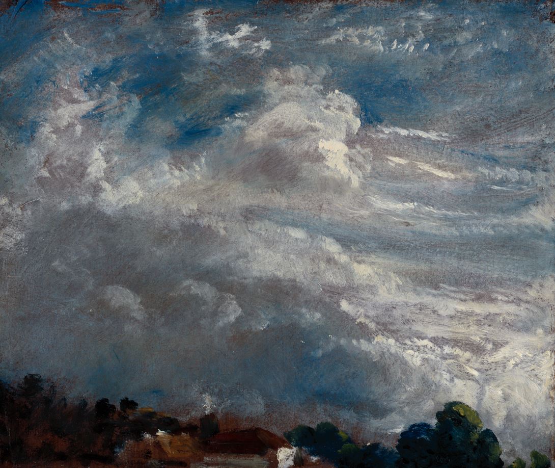
Cloud Study: Horizon of Trees, 27 September 1821 by John Constable © Royal Academy of Arts, London; photographer: John Hammond
What Salisbury tells us
The show includes the splendid ‘Salisbury Cathedral from the Bishop’s Ground’ (1823) and it is a deep pleasure to sit on the bench in front of it and just drink it in. What sumptuous, sensual beauty of composition, colour and light.

Salisbury Cathedral from the Bishops Ground by John Constable (1823) © V&A Images / Victoria and Albert Museum, London
Slowly several points emerge, namely around the use of light and shade and clouds. The dark cloud rising from behind the cathedral gives the composition a sense of drama (it’s interesting to learn that the Bishop of Salisbury actively didn’t like this dark cloud).
It also indicates the kind of day it is, one of those days when the sun comes in and out between clouds, and this explains the radiance of the cathedral facade: it’s one of those moments when the sun comes out from between clouds and makes whatever it shines on appear radiant. Once you notice this, you realise it also applies to the meadow in front of the cathedral, up to and including the cow, whereas the field and trees further towards the viewer are still in shadow.
With this in mind, if we go back to the Hay Wain, I suggest part of its popularity is down to its use of cloud and light as design features. On the face of it, it’s a painting of a cart in a pond but if you focus just on the play of light, and light on clouds, several things become obvious.
The Hay Wain by John Constable (1821) © The National Gallery, London
The spiral
In the West we read from top left to right. I suggest that one of the reasons the painting feels so satisfactory and pleasing is the way its design plays to this deep way of ‘reading’ visual elements. So if you start at the top left the cloud is very dark which leads your eye to the right, towards the nice light cloud, and your eye continues on round and down into the meadow which stretches off into the distance and is dappled with sunlight, before swinging down into the water and round to the cart in the pond.
So my suggestion is that we don’t just perceive it as a complex composition and pick out details at random but enjoy this sense of sweep and progression.

Comparing the sketch
A bit more evidence for this us supplied by the full-sized sketch of the Hay Wain which the exhibition also includes. Comparing the sketch and the finished painting suggest quite a few points from which I’d emphasise two.

Full-scale study for The Hay Wain by John Constable (about 1821) © V&A Images / Victoria and Albert Museum, London
1. Brown and green
Remember the idea that older landscape artists used a tastefully subdued palette of brown when painting outdoors? Well, the sketch clearly shows that this is how Constable began, using a far more sombre, brown and rather lifeless palette. Comparing the sketch and the finished painting shows how powerful adding in the vibrant shades of green transforms the finished product. They bring it to life; they make it zing with life, foliage, fertility.
The Hay Wain by John Constable (1821) © The National Gallery, London
2. Decluttering the composition
But back to the issue of composition, look at the one big, obvious difference between the sketch and the finished work. The figure of a horse and rider between the dog and the cart has been deleted. Why? Because including it crystallises the dog and cart from being light and almost random elements into becoming a strong central ensemble which dominates the picture. With it in your eye tends to go straight to it and you get distracted into peering closer to make out the precise nature of the figure on a horse (in fact, you have to peer quite closely to realise it’s a horse at all). And all this supersedes or obliterates the sweeping curve, the spiral I’ve described above.
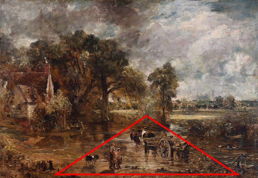
Full-scale study for The Hay Wain by John Constable (about 1821) with added triangle © V&A Images / Victoria and Albert Museum, London
Keep it in and the eye goes straight to these central figures and tries to identify them / make them out, making you tend to overlook the wider composition. Remove it and your eye is freed to step back, to take in the larger compositional sweep, from dark cloud to light, round and down to the meadow, and only slowly and leisurely coming round to the cart. The picture becomes lighter and airier. It breathes.
History of an icon
It’s interesting to learn that John Ruskin, the godfather of mid-Victorian art criticism, really disliked Constable and helped depress his reputation for a generation. It was only later in the nineteenth century that Constable’s reputation bounced back and has remained high ever since.
The curators claim a major aim of the exhibition was to chronicle the rise of Constable from the kind of criticism he received in his lifetime and the active dislike of cultural arbiters in the mid-nineteenth century his current unassailable position as one of Britain’s classic painters. This is a fine ambition so it’s regrettable that the exhibition doesn’t really achieve it.
There are a few wall labels explaining that this or that painting was given to the National Gallery by supporters or, in one case, by his daughter, in this or that year, as if that tells us very much and that’s about it.
There’s a glaring absence of any explanation of what changed in aesthetic theory, in the practice of art, in social attitudes to the landscape, in artistic taste through the middle and later Victorian era to explain Constable’s rise and canonisation. I’d really like to have read this but didn’t see it anywhere.
So in the opening section there’s a 1920s black-and-white photo of Willy Lott’s cottage and we are told that it was extensively restored in the 1920s after a revival of interest in Constable’s paintings – but not why there was a revival of interest in Constable’s paintings. What was sufficiently different in the 1920s from the 1880s or 1860s to spark the investment? What changed and why?
Spoofs and parodies
To end on a lighter note, right at the start of the show, while they’re telling us how The Hay Wain has become an iconic image of the English countryside, the curators include half a dozen examples of how it’s been parodied and pastiched, used in cartoons and adverts for railways (‘Explore Constable country!’).
A striking one is this use of The Hay Wain in a 1929 cartoon bewailing the despoliation of the English countryside by cars and advertising hoardings. People tend to think this is a modern problem but here’s proof that it goes back at least a hundred years!

‘Had Constable lived today’ cartoon in the Daily Express, 2 March 1929, created by the Campaign for the Protection of Rural England © CPRE
There’s the satirical anti-war photomontage by radical anti-war artist Peter Kennard.
More up to date is this photomontage by Cold War Steve, where he’s cut and pasted leading political figures from 2019 into the scene. I like the truck full of dead washing machines but the killer detail is the image of Wayne Rooney riding a jet ski just to its left, so the joke is that this version of the picture should be titled ‘Hey, Wayne!’

The Hay Wain by Cold War Steve (2019) © Cold War Steve
Related links
- Discover Constable and The Hay Wain continues at the National Gallery until 2 February 2025
- Cold War Steve’s website


