Pesellino: A Renaissance Master Revealed @ the National Gallery

The Renaissance artist Fancesco Pesellino (about 1422 to 1457) was successful and famous in his day. Whether producing commissions for Florence’s ruling Medici family or working collaboratively with leading artists of the Italian Renaissance, Pesellino’s talents were hugely sought after during his lifetime.

However, Pesellino died young and this, combined with the difficulty of attributing works (many have been attributed to collaborators or to his grandfather, who had the same name) has meant that his legacy has been largely overlooked, making him ‘one of the greatest Renaissance painters that few people have heard of’.

This FREE exhibition at the National Gallery aims to rectify this neglect. It brings together 20 or so of Pesellino’s works across a range of media, including altarpieces, chest decorations, sketches and illuminations.

Central to the exhibition (all held in just one dazzling room) are two masterpieces from the National Gallery collection: the Pistoia Trinity altarpiece (1455 to 1460), and the newly restored ‘Stories of David’ cassone panels (about 1445 to 1455).

The Pistoia Santa Trinità Altarpiece by Francesco Pesellino, Fra Filippo Lippo and Workshop (1455 to 1460) © The National Gallery, London. Royal Collection Trust / © His Majesty King Charles III 2022

The curators write:

The ‘Pistoia Trinity Altarpiece’ is one of only two large-scale altarpieces Pesellino is known to have produced. Left unfinished at his death, it was completed in the workshop of Filippo Lippi, for whom Pesellino had completed a predella for the Novitiate chapel in Santa Croce 15 years earlier and who added the predella, or base. This is the earliest pala (an altarpiece with a single main panel) in the National Gallery.

The altarpiece is an ambitious depiction of the Trinity, the Christian doctrine of one God in three persons, the Father, Son and Holy Spirit (represented as a dove). Pesellino designed and partly painted the main panel. In the 18th century, the altarpiece was sawn up to make independent paintings for sale. Individual pieces arrived in Britain incrementally and were later acquired and reassembled by the National Gallery. The lower right section is a modern reconstruction.

Biography

Francesco di Stefano was born into a family of painters in Florence in about 1422. ‘Pesellino’ is a diminutive of his grandfather’s nickname, Pesello (‘the pea’). His grandfather was a specialist in banners and festive ephemera who taught him the rudiments of painting. Pesellino likely received further training from leading masters in the city. Early in his career, Pesellino often worked in collaboration, both with established painters on major commissions and on smaller projects alongside his peers. By his late twenties he was already undertaking commissions for high-ranking clergy and Florence’s ruling elite.

Pesellino devised lucrative profit-making schemes in partnerships with fellow artists and set his sights
on becoming a specialist in painting altarpieces. The exhibition includes templates of popular subjects he created for other artists to copy, such as the Madonna and child.

His ambitions were cut short in the hot summer of 1457, when Florence was ravaged by plague. He died leaving his most ambitious work to date, the Pistoia Trinity altarpiece, unfinished. It was eventually completed by his elder contemporary and one-time collaborator, Fra Filippo Lippi.

Narrative paintings

The show emphasises Pesellino’s skill at narrative or storytelling in paint. His range is indicated by some of the painting titles (the first four are scenes painted at the base of the Pistoia Santa Trinità Altarpiece, above):

  • Saint Mamas in Prison thrown to the Lions*
  • The Beheading of Saint James the Great*
  • Saint Zeno exorcising the Daughter of the Emperor Gallienus*
  • Saint Jerome and the Lion*
  • The Stigmatism of Saint Francis and Miracle of the Black Leg
  • A Miracle of Saint Silvester

Obviously, most of these paintings are religious in tenor, depicting scenes from the Old Testament, New Testament or Legends of the Saints. An example of the legend category is the striking painting of ‘King Melchior Sailing to the Holy Land’.

King Melchior Sailing to the Holy Land by Francesco Pesellino (1445 to 1450) © Sterling and Francine Clark Art Institute, Williamstown, Massachusetts

The curators explain:

A fleet of vessels carrying colourfully dressed crews navigates an impossibly short stretch of water, the shorelines dotted with walled cities. The seascape is fantastical, but with carefully observed naturalistic details like the foamy spray around the boats and pink undersides of the clouds at sunrise. Enthroned at the stern of the largest ship, Melchior travels to pay homage to the new-born Jesus, bringing a casket of gold. The panel was part of a series Pesellino made in collaboration with other artists. Some of the faces reveal the hand of another painter.

Three things struck me about this painting. One was the childlike clumsiness and lack of perspective. The main ship is much too huge for the tiny bit of sea it’s wedged into, the little rowboat in front of it looks silly, the dog at bottom right is poorly done, the tiny monk hiding in the rock at the bottom is a bit absurd.

Second was the extraordinary simplicity of the landscape: the rocks at the bottom and bottom right, the headlands and hill further up, are ridiculously simplified; they look like the polystyrene rocks from an episode of Star Trek.

But what really his me is how bright and vivid the colours are. The red and yellow striped awnings over the stern of each ship look like children’s sweet wrappers. Almost everyone’s clothes are painted in super-vivid shades of blue, green and red. The whole affect is almost day-glo.

Compare and contrast with a work which has a completely different feel, a diptych (two paintings in adjacent frames) of The Annunciation.

Diptych: The Annunciation by Francesco Pesellino (about 1450 to 1455) The Courtauld, London. Photo by the author

This feels completely different from the Melchior painting: the perspective is accurate and effectively conveys the sense of the colonnade on the left and room on the right. And the realistic depiction of the folds of the angel’s and the virgin’s cloaks. But above all the subtle use of shading, on the cloaks and on the walls (e.g. behind the virgin) give it a completely different feel from the Melchior. It feels warm and intimate and sophisticated.

Illuminations

Off to one side and easy to miss is a set of three beautiful illuminations Pesellino made for a book.

Three illuminations from the De Bellum Poenicum of Silius Italicus by Francesco Pesellino (1447) being: Allegory of Carthage, Mars in a Chariot and Nicholaus V Pontifex-Maximus, courtesy of the State Hermitage Museum St Petersburg, the Biblioteca Marciana Venice, and the State Hermitage Museum, respectively

As the curators explain:

A milestone in Pesellino’s career was the illuminated manuscript he made for Pope Nicholas V. He again worked in collaboration, this time with the established miniaturist Zanobi Strozzi, a fellow Florentine. The partnership was probably a calculated means of advancing his reputation. Together they produced a lavish volume of the Roman poet Silius Italicus’s epic about the Second Punic War (218 to 201 BCE).

Pesellino’s full-page illuminations show allegorical figures, ancient generals, the Roman god Mars and a portrait of Pope Nicholas himself. With their exuberant colour and animated drawing, these miniatures embody his aptitude for grandeur and dynamism on a small scale. They also indicate the heights that Pesellino had reached by the age of just 25. Whether commissioned by Nicholas himself, or perhaps given to him by a member of the Florentine elite, the volume was apparently a successful calling card. Pesellino subsequently received further commissions from the papal court.

Restoration of David

The Pistoia Santa Trinità Altarpiece is the biggest thing in the show – it is huge and dominates the whole room – but it’s not really the centrepiece. That role falls to the two wide, narrow panels depicting the ‘Stories of David.’ In fact, from what I can make out, it’s the recent completion of conservation work on the panels which provided the peg for this whole display.

The Story of David and Goliath: panel 1 by Francesco Pesellino (about 1445 to 1455) © The National Gallery, London

To quote Wikipedia: ‘A cassone or marriage chest is a rich and showy Italian type of chest, which may be inlaid or carved, prepared with gesso ground then painted and gilded.’

Pesellino created two of these cassoni and both are given the full treatment here. They are displayed next to each other along with picture labels which explain the origin and purpose of the paintings, and then identify individual people and elements in each painting.

The panels illustrate the Old Testament story of David and Goliath. The first panel shows three successive episodes in the same frame, something which takes a moment to get used to. Over on the left young David is leaning over to select a stone for his sling. Just right of centre, right of the prancing white horse, he is shooting the sling at big Goliath who dominates the right-hand side. And then in the centre, just below the prancing white horse, is depicted David gruesomely sawing Goliath’s head off.

The second panel shows the triumphant procession of David, accompanied by a boisterous entourage, bearing Goliath’s head back to his local town where he is greeted by elders and a clutch of toothsome young ladies (far right).

The Story of David and Goliath: panel 2 by Francesco Pesellino (about 1445 to 1455) © The National Gallery, London

There are hundreds of talking points but four things stood out for me.

1) How incredibly packed and dense they are, huge crowds, scores of people and animals in all kinds of poses. Their arrangements have dramatic and psychological impact. For example, silly though it sounds, I really liked the scene on the right of panel 2 where half a dozen fresh-faced young men are being welcomed back to the town by a group of lovely young women. They both, young men and women, look so happy, so young and fresh and full of life. It gave me a moment of pure loveliness.

2) As the commentary points out, Pesellino very obviously tested his technical abilities by depicting, especially animals, in unusual poses; hence several horses with their bottoms towards us (for example, next to the fallen Goliath in panel 1) and the dogs facing away from us in panel 2.

3) As regular readers of my blog know I rather dislike the Italian Renaissance. This is based primarily on the feeling the drought-ridden, barren rocky backdrops give me, bereft of plants, flowers or life. I much prefer the contemporaneous art of the Northern Renaissance. A good example of this sterile barrenness is the simple-minded ‘landscape’ of the Melchior painting. By complete contrast, these panels show in great detail the grass everyone is treading on, and that it is sprinkled with flowers. It has the lovely feel for nature I associate with more northern paintings. For this reason alone I loved it.

4) Lastly, the gold! An extraordinary amount of the picture has been painstakingly gilded with gold leaf. Off to one side of the panels is a TV monitor showing a 4-minute video which is hugely instructive. Silent, using close-ups and written captions, it takes you into the secrets which were revealed during the panels’ extensive restoration work. Above everything they showcase the ubiquity in every part of the paintings of gold leaf – X-ray photography shows that about a third of the images is golden. But the video also showcases the astonishing attention to detail given to every feather, every head-dress and countless pieces of armour.  I was dazzled by the use of splashes of tiny dots which create a shimmering highlight on the golden sections.

Pesellino carefully applied gold and silver leaf, sometimes in tiny pieces, to describe items as small as horse shoes. These details were then burnished, incised, punched and sometimes glazed to create shimmering effects.

The display cases feature magnifying glasses to help you pick out the thousand and one details and marvel at the intricacy of the metalwork. Amazing.

Detail from The Story of David and Goliath: panel 2 by Francesco Pesellino. Note 1) the dogs done from an odd perspective 2) young men and women on the right and 3) intricately worked gold everywhere © The National Gallery, London

It’s 50 years since the David panels were displayed side by side like this and it’s a marvel and a delight. They emphatically demonstrate ‘the depth and breadth of Pesellino’s talents as a painter of complex narratives, ceremonial splendour, animals and intricate detail,’ just as the curators claim.

Thoughts

I wasn’t expecting to enjoy loads of religious paintings very much but was entranced. The annunciation and the illuminations are lovely, but I got really absorbed in the David panels, especially after watching the video which opened my eyes to the gilding technique and the amazing detailing throughout. The more you look, the more you see.

Giorgio Vasari, the Renaissance artist and biographer, included Pesellino in his Lives of Artists, writing that, ‘From what we know of him, if he had lived longer, he would have achieved much more than he did’. One of art history’s great might-have-beens.


Related links

More National Gallery reviews

An Alternative History of Photography: Works from the Solander Collection @ the Photographers Gallery

The Solander Collection

OK, so what is the Solander Collection? In its own words:

Dedicated to the enjoyment and understanding of photographic art in all its forms, the Solander Collection has a special emphasis on international traditions, under-represented and forgotten artists, ethnic diversity, and women. The aim of the collection is to broaden the understanding of photography as inclusive and democratic.

Nearly all works are vintage (made within a few years of the negative) and include many rarities and ‘firsts’. It is a working collection, intended to be shared through exhibitions and publications. The collection is based in Oregon and California and is available to view by appointment, when it is not on public view. (About the Solander Collection)

It’s named after the Solander Box, the cloth-covered black box that museums use to store flat works in.

This exhibition

This exhibition at the Photographers’ Gallery displays over 130 works from the Solander Collection. They’ve been selected to make visitors “look again at well-known works by major artists, alongside forgotten greats, regional champions and unknown artists”. Here are curators Graham Howe and Phillip Prodger explaining.

Keywords are:

“feminist photography…connections between things that don’t always get connected…more inclusive, more welcoming…never meant to be a chronology…pockets of thought, ways of seeing, ways of thinking of photography…you’re meant to feel how organic everything is and the connections that exist between different time periods…a wider view, a more diverse pluralistic approach to looking at photography…as rich and diverse and interesting as the people of the world…”

Does it match up?

Does this exhibition match up to these brave words about diversity and inclusiveness? Well, yes and no. On the No side:

Still chronological

Although the curators claim to be eschewing chronology, the exhibition is still very chronological in feel. It starts with works from the very dawn of photography in the 1840s, when people used photos as the basis for fine art and painted over prints, or used the camera lucida as an aid to drawing, or when subjects were chosen to match the subjects of fine art and sculpture, for example the striking male nude included here by Charles Nègre.

It starts with the usual early pioneers such as William Henry Fox Talbot, Julia Margaret Cameron, Roger Fenton and Eadweard Muybridge. And then moves slowly forward through the decades of the nineteenth century before arriving at the explosion of Modernism around the time of the Great War.

So this is all reassuringly chronological and follows the same timeline as umpteen other history of photography exhibitions I’ve been to. The very fact that the curators feel compelled to call the exhibition ‘An alternative history‘ indicates how far they are from throwing off the shackles of chronology and arranging works by some other method. Why not call it ‘Selection from the Solander Collection’ and arrange the pieces in a genuinely non-linear, themed, or free associative manner?

Still very American-centric

Of the 130 or so pieces I counted 24 by American photographers, or about a fifth. There are also a lot from Europe, obvz, and then only a handful each from China, Japan, a few each from some south American countries, and about a dozen in total from Africa. So it may be more geographically diverse than your standard history of photography, but not as diverse as the actual world, the real world out there beyond Galleryland. In the real world the top half dozen nations are currently ordered by population thus:

  1. China 1.5 billion
  2. India 1.4 billion
  3. Africa 1.3 billion
  4. America 335 million
  5. Indonesia 280 million
  6. Pakistan 240 million

So, to be strictly ‘representative’, there ought to be four times as many photos by Chinese, Indian or African photographers as Americans. Another statistic is that America makes up 4.25% of the total world population so to be utterly ‘representative’ exhibitions of global art like this ought to have that amount of representation – whereas, of course, it’s nothing like that. America, with the imperial reach of its technological and commercial supremacy, is still the single most represented country.

The fact that Americans think it is an impressive achievement to feature handfuls of photographers from other countries tells you just how deep-grained American parochialism and chauvinism is, and how slavish the obeisance of British art and culture gatekeepers to American culture is that they unquestioningly, enthusiastically go along with America’s ongoing dominance.

Obscure photographers?

Well, yes, up to a point but maybe a third of the 100 exhibits were by famous photographers – the Victorians ones I’ve mentioned above, plus ‘legends’ like Ansel Adams, Diane Arbus, Robert Frank, Man Ray, Edward Weston, Rodchenko, and the fairly well known African studio photographer, Malick Sidibé.

On the Yes side:

More nationalities

Yes, there are works from Poland, Uzbekistan, Mali, Cameroon, as well as East Germany, Australian, Chile, Jamaica, Mexico, Singapore, Ukraine – nations you rarely see represented in any Anglo art exhibition. It does feel as if more nationalities are represented, albeit in nothing like the proportions they ought to be.

More obscure works

There are a number of anonymous works (particularly from the early period), odd or unexpected works like the studies using native peoples of John William Lindt; and, in the later part of the show, quite a few photos from what feel like obscure and overlooked photographers, from the under-represented countries mentioned above, Poland, Mali and so on.

The Western Gaze

More important/significant/telling is the curators’ inability to escape Anglocentric or Western notions of beauty or quality or the notion of ‘interest’ which they mention in the video. On my trips to Muslim countries, in my engagement with Chinese or Indian or Japanese art, I’ve realised that many other regions of the world have traditions and definitions and canons of ‘art’ utterly different, alien from, the Christian, white western ones I was brought up in.

Feminist curators and critics go on rather a lot about ‘the male gaze’. The phrase often appears on wall labels of numerous exhibitions. But I’m not sure I’ve read so much about ‘the Western gaze’, the way all western people bring very Western values and aesthetics and judgements to bear on all the art forms – music, sculpture, photography – we encounter outside our culture. Often it’s not even clear whether it is art, as we understand it; or some part of what we’d categorise as religious artifacts or cultural traditions or traditional practices.

The mindset whereby we want to take objects from their original location and categorise and label them and put them behind glass cases in antiseptic museums and galleries, that’s quite a Western way of thinking, specific to certain locations and times in Europe then America, and not necessarily fund in other cultures. (Rooms 1 to 5 at the British Museum, the long wood-panneled room on the right of the big central atrium, are devoted to describing the invention of the Western tradition of collecting, categorising and displaying precious artefacts. Visually, it’s the least sexy part of the British Museum but conceptually, maybe the most important: it’s an exploration of the origins of the entire concept of The Museum and The Collection.

In my opinion the curators of this exhibition have obviously made an effort, and have included works from a few more countries than you might expect; but they have come nowhere near throwing off the shackles of the Western Gaze and Western aesthetics, and so barely engaged with other ways of seeing.

The narrowing effect of photography

Then again, when it comes to photography, this may be because the technology and the form themselves such Western creations. Cameras, film and all the rest of the paraphernalia were invented, developed and improved in the advanced industrial nations of Europe and America (and Japan), and exported to other countries.

Maybe photography itself is an imperialist form, colonising the minds of everyone who uses it, co-opting them into modes of observation, alienation, categorisation and detached gazing, which are intrinsically Western.

Maybe to pick up a camera (or a phone with a camera in it i.e. pretty much every smartphone in the world) is to adopt an entirely Western technology and take on Western blinkers. Maybe, on this reading, it’s impossible for photography to be truly ‘diverse’ because, even though the person taking the photograph may be from Jakarta or Kinshasa or Shanghai, or an aborigine or native American, as soon as they pick up a camera they are infected, taken over, co-opted, colonised by the Western controlling, objective, alienating way of seeing. Just a thought…

Commentaries

Arguably, the single most important thing about this exhibition is the commentaries. The Solander Collection maintains a network of contributors in countries around the world, photographers but also critics and writers, and well over half (not all) of the photos in the exhibition are accompanied by fairly long wall labels, four or five thick paragraphs long, short essays –giving detailed information about how each photo was made, the photographer, the subject matter and so on.

if you read all of these commentaries it makes progressing around the two rooms which host the exhibition quite a slow business.

Selected works

So what did I like or what stood out for me? I’ll make a personal selection i.e. create my own networks of connections through the very varied corpus or body of work they’ve selected. To give it some structure I’ll base it on topic or subject matter.

African studio photography

Several African studio photographers are represented including the famous Malick Sidibé from Mali. Apparently the golden age of studio photography in West Africa was during the 1960s and early 70s i.e. the decade following independence from colonial rule.

Studio photographers used the conventions inherited from the West (the very idea of a studio; deeper than that, the very idea of a photograph) but gave it a style and swing, matching the newfound confidence of young urban types dressing according to new Africanised forms of fashion.

I’ve selected a pic by the less well-known Michel Kameni (1935 to 2020) from Cameroon. Apparently his photos are that bit less flamboyant than Sidibé’s, which you can see in the exhibition where examples of each guy’s work are place side by side. This example uses technical tricks to create a mirror image of the same woman, momentarily appearing as her own twin. Thus it is more mysterious and strange than Sidibé’s generally cool and confident but straightforward portraiture. What is the woman looking at us thinking? She’s a kind of African Mona Lisa.

Double Portrait by Michel Kameni (1966) © Studio Kameni

Constructed photography

Oscar Gustave Rejlander (1813 to 1875) spent much of his own life in poverty and set out to document the lives of the poorest in society. But that’s not the most interesting thing here. The interesting thing is that this photo was constructed. Not just staged – as the girl in the foreground standing on a suspiciously clean street sweeping broom is – no, the entire backdrop, a waybill publicising an 1871 rally in Trafalgar Square against the match industry – was added to the photo of the girl. Or the photo of the girl was superimposed onto the background. Fascinating that right from the start photographs were subject to artificial intervention.

Match Girl, 1871 by Oscar Gustave Rejlander

Documentary photography

Meaning recording the lives and practices of ordinary people. Or as the Tate website puts it:

a style of photography that provides a straightforward and accurate representation of people, places, objects and events, and is often used in reportage.

This is an apparently simple documentary photograph taken by Emilio Amero (1901 to 1976) recording a moment in a wedding celebration in Mexico. But this is a carefully curated photograph so it has depths which become clearer the longer you look.

Obviously, the woman is beautiful with a beguiling spiritual beauty which becomes more entrancing the more you look. But her dress is wonderful too, particularly the concatenation of metal necklace, pendant and ear-rings. And the bracelets on her right wrist. How beautiful she looks! And then – this is all happening in the street, far different from an English wedding in a crabbed and constricted English church. This is happening outside and, you realise, there seem to be loads of people in the background, some milling about but a row of figures on the left sitting down. Are all of these people here just for her wedding? How wonderful and sociable! How communal and shared and happy it looks. Which makes the look of concentration and seriousness on the young bride’s face all the more sweet, touching, foreboding, intense and magical.

A Bride Dances by Emilio Amero (about 1937) © Estate of the Artist

Ethnographic photography

John William Lindt (1845 to 1926) was an interesting character (Wikipedia article). Born in Germany he travelled to Australia where he built a reputation as ‘a landscape and ethnographic photographer, early photojournalist, and portraitist’. This is one of 31 photos Lindt took of Gumbaynggirr and Bundjalung people in a book titled ‘Australian Aboriginals’ in 1874. There are all kinds of things going on in this charged image. Most obvious is the clash or tension between the staged background and props and the vivid presence of the woman and child. And cross-threading against that, the similarity to the great Christian image of the madonna and child which he’s posed them in.

The early photographers saw the technology as a way to copy, re-enact, reproduce the poses and subject matter of the fine arts, of the Old Masters of the European visual tradition. One of the most interesting things about photography is how long it took for its practitioners to realise it could represent the world in ways not limited to fine art precedents, it could depict the world as it is, and then the development by Modernist practitioners of realising photography was susceptible to techniques which broke with reality altogether to create forms unique to the technology, such as photomontage, solarisation and so on.

Young Woman with Sleeping Child, Clarence Valley (1870 to 1873) by John William Lindt

Feminist photography

The whole point of ‘feminist photography’ is it has many strands and many meanings. Here are two quotes which indicate what they have in common, namely the quest to overthrow gendered stereotypes and expectations.

Feminist photographers turned a medium used traditionally to reinforce gender norms into a powerful tool of transformation and emancipation, reimagining not only the possibilities of photographic self-expression, but also the kinds of subjects and environments thought to be deserving of aesthetic representation.
(Beyond the Male Gaze: Photography and Feminist Theory)

Photography became an important tool of second-wave feminism to critique the established visual conventions through which gender, sexual, racial, and class identities have been constructed.
(Women and photography)

This pair of photos by German photographer Annegret Soltau (b.1946) were made in 1975 and have no written commentary, leaving us free to interpret or make up our own meanings. I’d have thought the place to start is the way the myriad fine threads covering her face in the left-hand picture have been snapped in the one on the right. But it’s not as if this has been caused by her, for example, opening her eyes to symbolise awakening from her heteronormative slumber or opening her mouth to break the silence and express her truth etc. It’s less predictable than that. Something has snapped, but what has caused it, and what it means remain suggestive but mysterious.

Self by Annegret Soltau (1975). Diptych of gelatin silver prints © Annegret Soltau, courtesy Richard Saltoun Gallery

Glum photography

Not exactly a happy couple, but the main thing about this photograph is that it was hand coloured, which explains the bright but somehow aged and faded tone of the pink shawl and yellow blouse. In one way this image links to the studio photos of the Africans, Malick Sidibé and Michel Kameni, displayed on the wall opposite – but it also links to the painted photo of the maharajah with tiger (see below) raising interesting questions about tradition and continuity.

Portrait of a Couple 1970s by Ram Chand. Hand-coloured gelatin silver print © Ram Chand, courtesy Christophe Prebois

Happy photography

‘Laugh, and the world laughs with you.’ Hard not to find these girls’ innocent mirth infectious. People from sometime in the 1970s and yet you feel an immediate deep contact with them, they could be a couple of girls giggling in gallery right next to me. Photography can do that, make unnerving links with people you know are long dead in places and cultures which have long ago vanished. If you’re feeling robust this can be wonderfully life-enhancing, expanding your sense of humanity. If you’re feeling tragic, it can give you a bad case of Weltshchmerz and loss. Où sont the giggling girls of yesteryear?

Two girls in Kingston, Jamaica by Unknown, possibly Ernesto Bavastro (1870s to 1880s)

Historic photography

This is the first known photograph of a Chinese police unit, which began serving in Hong Kong shortly after its establishment as a British colony in 1841. The tut-tutting wall label reminds us that colonial police forces like this were strictly hierarchical, with British officers in charge, then Indians who could serve as sergeants or inspectors, then local, in this case Chinese people who could serve as constables or sergeants but weren’t allowed to rise higher.

This wasn’t a one-off by the photographer, Lai Fong (1839 to 1890). Lai “created a body of work that laid the foundation for the art of photography in China”. The wall label optimistically declares the Lai “offered a window into the pictorial traditions, history and social structures of the late Qing dynasty” but it’s not obvious that there’s anything particularly Chinese about this photo: the staging of the men and the draped curtains to either side strongly suggest the European, semi-classical visual conventions. This is what I meant, above, when I said that, possibly, photography is an intrinsically imperialist form. If Lai indeed did lay the foundations for photography in China he appeared to do so by importing entirely Western visual conventions.

A Group of Hong Kong Native Police, 1870s, by Lai Fong

Humorous photography

This piece by Austrian artist Valie Export (b.1940) is the biggest thing in the show and more or less the only one which made me laugh. I suppose it’s straight satire, 1970s satire on the identification of women with housework, using the cut-up collage techniques which people like George Grosz pioneered in the 1920s. Obviously it’s taking the mickey out of a thousand renaissance paintings which show a Madonna holding the Christ child, satirically replacing the baby with a hoover, symbol of 1970s women’s greatest care/oppression.

Expectation (1976) unique photomontage by Valie Export © Valie Export 2022

It is an example of photomontage which wasn’t that represented in the show. I can imagine a section of it could have been devoted to this technique, alongside works by Grosz or John Heartfield or other photomontageurs from other traditions making political/satirical points.

Or, at the same time or alternatively, it’s also possibly an example of ‘sculptural photography’ because the silhouetted 70s woman and hoover aren’t laid flat on the surface of the painting but are attached so as to be raised and physically distinct from the backdrop. Which is why the thing requires not a flat frame but more like a glass case to cater for the depth of the effect created.

Anyway, the classical painting in the background is Botticelli’s ‘Madonna of the Pomegranate’ (1487).

Modernist photography

Double exposure became a standard Modernist device. Mark Neven DuMont (1892 to 1959) was born in Germany but emigrated to England. His friend, the avant-garde painter and provocateur George Grosz, was a leading exponent of photomontage so the curators reckon that’s where DuMont got the idea to experiment with it himself. The wall label tells us that photomontage – using two or more camera negatives to create a composite image – is as old as photography; but the striking make-up of the female model and the geometric shape of the palm tree give it a very modernist, Art Deco feel.

Patricia by Mark Neven DuMont (1930s)

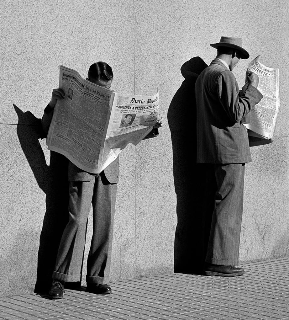
If modernist visual forms (sculpture, painting, drawing as well as photography) have one thing in common it’s a love of sharp lines and geometric shapes. In contrast with gauzy impressionism, gloomy symbolism or scratchy expressionism, modernism loves slick lines and sharp angles. Almost everything in this photograph by the Brazilian photographer German Lorca (1922 to 2021) is precise and geometric: from the tiny regular squares of the paving to the straight seams of the concrete wall behind the two figures; the neatly pressed seams of the two men’s suits to the super-precise outline of the shadows behind them thrown by the hot tropical sun. It’s part of the hyper-modern effect that we don’t see the men’s face, which are turned away or hidden behind a newspaper, thus increasing the sense that this sidewalk drama is not about people but about the lines and energies of the modern city.

Looking for a job by German Lorca (1948)

Motion photography

Eadweard Muybridge (1830 to 1904) is the famous pioneer of ‘motion photography’ which caught the imagination of artists and scientists around the (developed) world. In his studio he set up series of cameras in the same position or staggered along the course of the action he wanted to record, and then fired them off at intervals, experimenting with doing it closer or further apart.

The result was his famous sets of photos showing successive stages in dramatic actions. Once he’d nailed the technique he went mad and, between 1884 and 1886, produced 781 new sequences! The art of fencing is peculiarly suited to this process because it involves dramatic gestures and physical postures while the body itself doesn’t actually change position very much.

Fencing by Eadweard Muybridge (1887) collotype

Naked photography

Lots of women artists and photographers in the 1970s and 80s thought it was a radical and subversive act to take their clothes off and stage happenings or interventions or performances featuring themselves naked, and record themselves for posterity. No doubt this was a radical, subversive and so on gesture in Russian-controlled communist Poland back in 1980. Forty-three years later it looks like a naked young woman in heels confronting a woman cop. What’s not to love?

It is a little disappointing, then, to learn that this scene never took place, but that the piece is in fact a photomontage, combining a shot Ewa Partum (b.1945) took of herself nude in the studio, superimposed on a straightforward snap of a cop in the street.

Döppelgängers always fascinate us and so we are taken by the dualistic oppositions suggested here, between the naked and the clothed, between authority and submission, between the ‘authenticity’ of the artistic naked woman with nothing to hide and the overdress authority figure encumbered with all the rigmarole of legal and physical repression (radio, handcuffs, baton, gun?)

(I appreciate this photo could also come under ‘feminist photography’ or ‘political photography’. But I’m enjoying making up frivolous headings and my own connections.)

Self and policewoman by Ewa Partum (1980)

Nature photography

Possibly my favourite photo of the 130 on display. I myself have taken lots of photos of trees, flowers, plants, lichen on stones and so on, but trees are special. I think trees are talking to us but so slowly, so very slowly, that we can’t slow down enough to hear what they’re saying. And so we chop them down and burn them, over vast areas, and will end up burning the entire planet in the process. Tant pis.

Meanwhile, this is just one of many studies the American photographer Paul Strand (1890 to 1976) took of driftwood, showing a profound feel for the shapes and twists and knots and gnarls which are created by this most beautiful of life forms. Although hyper-naturalistic in feel, capturing every fibre of the gnarled old wood, Strand’s studies like this at the same time suggest flowing zoomorphic forms and, if you’ve smoked a little dope, are gateways almost into another world, enabling the viewer to immerse themselves in the non-human world around us. Entirely naturalistic they are also like meditative states of mind.

Driftwood, Gaspé, Quebec, 1928 by Paul Strand © Paul Strand Archive/ Aperture Foundation

Painted photography

Believe it or not this is a photo, taken about 1890 by an unknown photographer. It looks like a painting because the entire surface has been covered with a thick layer of pigment, so it is a painting: a photo-painting. Apparently this kind of embellishment or overwriting of a factual photographic base with an extravagantly idealised and Romantic backdrop and details was very common. It has a floridness we don’t associate with the European tradition and feels genuinely ‘other’.

This image links to the portrait of a couple from the 1970s shown above. Was this a distinctively Indian approach to photography? Did other cultures do the same kind of thing? Does it persist to this day? Be interesting to know more.

Maharaja with Tiger, possibly Duleep Singh, after a hunt (about 1890) vintage gelatin silver print with hand painting. Maker unknown (India)

Soviet photography

In the heyday of the 1920s and early 1930s Soviet artists made some of the boldest, most radical art of the century in the name of the new society they were building. Alexander Rodchenko (1891 to 1956) specialised in taking photos from experimental and unconventional angles. This was called rakurs in Russian. The most powerful, impactful of these is looking up at the subject from below. This conveys a string sense of dynamism and energy which, when combined or attached to an image of a youth, conveyed just the sense of forward-looking, visionary, striding-into-the-future energy which Stalin and his commissars wanted. As the commentator points out, it also makes the figure look monumental, a photographic equivalent of all those huge statues of working men and women striding boldly into the brave Soviet future which used to litter communist cityscapes.

Pioneer girl (1930) by Alexander Rodchenko

Street photography

Harold Cazneaux (1878 to 1953) became known for naturalistic studies of children, often taken outdoors. During and after the war there was an explosion of technical experimentation associated with modernism, plus a great surge in popular magazines which relied on evermore photos. Thus this photo was taken for a spread in The Home magazine. It’s what you could call soft modernism or popular modernism, in the sense that a) the focus is on the children’s faces, not the ostensible subject (the Punch and Judy show); b) it’s taken from a relatively low angle, a characteristic modernist trait, but not actually down on the ground. So it’s assimilated enough modernist tricks to be considered ‘modern’ and not rattle any cages.

Punch and Judy (1930) by Harold Cazneaux

The promotional video


Related links

More Photographers’ Gallery reviews

Cindy Sherman @ the National Portrait Gallery

According to the press release, Cindy Sherman is widely regarded as one of the world’s leading contemporary artists. This is a massive retrospective of Sherman’s entire career, from the mid-1970s to the present day. It includes over 190 works from international public and private collections, some of them never seen in public before, some of them reunited after decades apart.

What is Sherman famous for? For dressing up as fictional characters and types, and taking photos of herself.

She stumbled across the idea as an art student in the mid-1970s and – in an impressive example of an artist hitting a style, establishing a brand, and then sticking to it through thick and thin – she has followed the same practice for the past 45 years.

Untitled Film Still #21 by Cindy Sherman (1978) Courtesy of the artist and Metro Pictures, New York

Chronological order

The exhibition is arranged in a straightforward chronological order allowing you to see how Sherman’s art has evolved and developed from the mid-1970s to today. It opens with rarely exhibited photographs and films created while she was still an art student at the State University College at Buffalo from 1972 to 1976.

One early set, from 1976, is titled Unhappy Hooker where Sherman depicts herself as a prostitute waiting for a client.

In Murder Mystery (also 1976) she made a series of black-and-white photos of herself, in each one dressed up in the outfit of a character from a fictional murder mystery play (which she herself wrote) – the butler, the waitress, the rich old lady, the detective etc. Note the stereotyping of the characters.

In November 1976, shortly after she graduated from art school, Sherman created a series titled Cover Girl, in which she takes the covers of five fashion or ‘women’s’ magazines (CosmopolitanVogue, Family Circle, Redbook and Mademoiselle), and transposes her own face (generally pulling a yucky, silly expression) onto the face of the glamour model on the cover. Each work accomplishes the transformation from sensible to satirical in three images, and the five sets of three images are displayed here together for the first time since that heady summer of 76!

In Line-Up (1977) made just after she graduated and just before she moved to New York City, there are thirty-five black and white photos, in each of which Sherman appears, on her own, dressed in costume with make-up, playing thirty-five different characters.

So right from the beginning we can see the patterns emerging in Sherman’s work which will hold true for the rest of her career:

  1. She works in projects or series, all addressing a particular theme or taking a similar approach
  2. All the photos are of herself. There is never anyone else in the photos. But she is always ‘in character’, playing a role.
  3. None of her photos has ever had a title. They are all called Untitled and then given a number. Thus the final photo in the exhibition is named Untitled #549. (They may have brackets added after the number indicating the particular series the image belongs to.) One of the intentions of this is to ‘universalize the particular’, and leave the images open to the widest possible range of interpretations by the viewer.

Untitled Film Stills

Her breakthrough piece was Untitled Film Stills. Building on the previous series but going one big aesthetic step further, Untitled Film Stills is a series of 70 black-and-white photos which Sherman started creating soon after she arrived in New York City in 1977, and which, when they were exhibited, made her reputation. They are also – to give away the plot – in my opinion, by far and away the best thing in the exhibition.

They’re fairly small, portrait-shaped prints, about 18 inches high by a foot wide. In each of them Sherman dresses and poses as a completely different character. So that’s 70 female characters going about their business in the big bad city. Each of the figures is caught in different setting, in apartments, out on the street, in a suburban garden, several appear to be set in a swimming pool.

If there’s a consistent ‘look’ to the photos it derives from 1950s and 60s Hollywood – from film noir, B-movies and, maybe, from European art-house films. Some could be papparazzi shots of unknown celebs. The most obvious vibe they emit is a sense of suppressed anxiety or, in some of the long lens photos of blurred figures, a sense of mystery. Though all that makes them sounds too dark and indoors-y. Many of the best ones are outdoors or in full sunlight.

Untitled Film Still #7 by Cindy Sherman (1978) Courtesy of the artist and Metro Pictures, New York

A number of things make them great. As compositions, they are all top quality, imaginatively posed, full of detail and interest.

But the really obvious thing is how dramatic they are. They are like stills from a wider drama. You feel the presence of other people just out of the shot, who are about to walk in and say or do something, or else have just left the frame after saying something explosive. They suggest all kinds of possible backstories – who where what why how? – and prompt an incredibly rich response in the viewer, making you imagine all kinds of films and stories and plots of which these are decisive moments and fragments. Each one is like a short story in itself.

The Untitled Film Stills are given a room to themselves early on in the show and – in my humble opinion – it is by far the best room, the one I came back to at the end, once I’d reviewed the entire exhibition, and sat on the bench conveniently provided for visitors, and let my eye wander over the images and my mind – not exactly work out a complete story for each image – but respond to the mood and vibe and possibilities contained in each one.

This idea, of a kind of photo pregnant with meaning, struck me as a wonderful achievement. And doing them as a set hugely contributes to the cumulative effect, creating the sense of an entire world set in this one but, because of the demonstrably false and made-up actor Cindy Sherman featuring centre stage in each photo, both this world and vividly artificial, fake and created.

Bigger

From this point onwards, the remaining eight or so rooms show three things happening to Sherman’s work over the succeeding decades:

  1. the photos go from black and white to colour
  2. they get bigger and bigger until, soon they are four or five foor tall, in the work from the 1990s they are horribly, oppressively huge and, in the final room, have become photo-murals covering entire walls
  3. and, as a result, I felt that – as the photos became more technically adroit in colour and saturation, and evermore grandiose in size – the viewer, and the viewer’s imagination, gets progressively more and more squeezed out of the photos and, eventually, instead of leaning forward and entering her imaginative world, I felt I was cowering backwards and being harangued

Later series

Each of the remaining rooms hangs samples from Sherman’s major series, namely:

Rear Screen Projections (1980 to 1981)

The first series she made in colour, the Rear Screen Projections are also noticeably larger than the Film Stills, about five times bigger. The camera is closer up to her face, which is more subtly made-up to create different characters. The commentary says this greater close-up creates more psychological depth, but I felt there was more imaginative depth in the Untitled Film Stills.

Centrefolds (1981)

In the new larger size, and in the new full colour, Centrefolds are cast in a wide, landscape format which is deliberately reminiscent of the centrefolds of men’s magazines i.e. soft porn. But instead of scantily-clad women arranged to titillate ‘the male gaze’, Sherman’s personas look ill at ease and troubled, women in trouble or some kind of extreme situation. Though referencing magazine culture, some of the images very clearly derive from the aesthetic of film posters or the kind of dramatic stills used to promote movies.

Untitled #92 by Cindy Sherman (1981) Courtesy of the artist and Metro Pictures, New York

Pink Robes (1982)

A series of big colour photos in which Sherman dresses as an artist’s or photographer’s model, who wraps herself in a pink robe between shots. So the idea is these are off-the-cuff casual moments in a photographer’s studio, with Sherman posing as the bored model.

For the first time in these photos Sherman stares directly at the camera, which led some critics to get over-excited about how we were ‘seeing the real Cindy Sherman for the first time’! This strikes me as taking a strikingly naive view of what constitutes ‘reality’.

Fashion (1983)

In 1983 Sherman was commissioned by New York boutique owner Dianne Benson to produce advertising images to promote clothes designed by Jean Paul Gaultier. Sherman responded with photos of herself – in different personas – wearing the clothes alright, but in characters which are obviously abject and neurotic. This was intended as a satirical critique of the shallow superficiality of the fashion world.

The trouble is you cannot satirise fashion. There’s nothing you can say about the frivolity and shallowness of the fashion world which the inhabitants of the fashion world are not completely aware of, but still love. Thus the client loved the photos, so new, so original daaahling.

Vogue Paris (1984)

Sherman received another fashion commission from a French fashion house to provide photos for a shoot for Vogue Paris. She created images of herself made-up to be the models, again wearing the designer clothes alright, but again shooting them in a subversive style, making her look deliberately gawky, clumsy and unhappy. The client loved them. And a glance at her Wikipedia article shows that she has had a long and extensive engagement with the world of fashion, receiving numerous further commissions, designing jewellery and other accessories etc. ‘There’s nothing you can say about the frivolity and shallowness of the fashion world which…’

Fairy Tales (1985)

In this series Sherman dresses up as ‘types’ from fairy tales, in enormous colour photos, heavily made-up to create some really aggressive, scary images. The lighting is (inevitably) more dark and in most of these shots, the settings looking like the forests and gravelly soil of the Germanic Grimm stories – a visual departure for Sherman most of whose photos – you realise – have been set in city streets or urban interiors. In some of them the Sherman personas looking like they’re undergoing real physical ordeals.

Untitled #153 by Cindy Sherman (1985) Courtesy of the artist and Metro Pictures, New York

History Portraits (1988 to 1990)

the fairy tale series represents a conscious departure from the urban setting of most of her photos hitherto,

At the end of the 1980s Sherman took a conscious break from dissecting / analysing / subverting contemporary culture and immersed herself in the world of Old Master paintings, including a trip to Rome to see the real thing.

The result was a series of thirty elaborately staged, huge, richly coloured photos in which Sherman appears in a range of costumes and uses prosthetic noses, breasts and other accessories to drastically change her appearance and parody the appearance of male and female royalty and aristocrats, even a madonna and child.

Untitled Film Still #216 by Cindy Sherman, 1989. Courtesy of the artist and Metro Pictures, New York

I didn’t like these at all. I thought they were a bad joke in poor taste. I thought they showed a complete lack of empathy with the Middle Ages, Renaissance or Old Master painting. You can’t really dress them up as a feminist ‘reclamation’ of the images as – unusually – half the images are of Sherman dressing up as late medieval men.

Sex Pictures (1992)

In a room by themselves – with a warning that it contains ‘adult content’ – is a set of huge, garishly coloured and disturbing photos of what look like plastic mannequins, cut up and reassembled to emphasise their (generally female) genitals, which – presumably – were specially created for these photos. The general aim is to produce disturbingly transgressive rewrites of porn tropes, and the handful of massive images here certainly are disgusting, showing cobbled-together bits and pieces of fake plastic human bodies, featuring not only vulvas but anuses, penises made of plastic, in one image a string of sausage-like turds proceeding from what looks like a vulva.

As far as I can see, these are the only series in which she does not appear. A very great deal has been written about these pictures, by critics who, apparently, do not understand what pornography is or who it is for. By which I mean they imagine that disassembling the human body into surreal conglomerates of chopped up pieces will act as a once and for all, decisive ‘subversion’ and undermining of the male gaze and pornographic imagery.

How pitifully, it seems to me, they underestimate the baseness of human nature, and woefully underestimate the ubiquitous power of pornography. A few repellent art photos change nothing, nothing at all.

Office Killer (1997)

In the later 1990s Sherman got involved in making films, directing an art movie titled Office Killer released in 1997. One critic called it ‘sadly inept’, others ‘crude’ and ‘laugh-free’. Having produced and directed TV myself, I know there is a world of difference between taking one inspired photo and creating a plausible and effective series of moving shots.

Clowns (2003 to 2004)

Sherman dresses up as a variety of clown types. Obviously all looking miserable and forlorn. The sad reality behind the clown strikes me as being one of the more exhausted, clichéd tropes of all time.

Society Portraits (2008)

A series satirising rich women in high society. The ageing female characters created in these huge colour photos are all using make-up and cosmetics to try and mask the ageing process and, failing in that, emphasise their wealth via fashionable dresses, expensive accessories and to-die-for houses.

Untitled #466 by Cindy Sherman (2008) Courtesy of the artist and Metro Pictures, New York

Presumably these are meaningful if you in any way read about, or are aware of, rich American society ladies – from magazines and high society and gossip columns in newspapers, or from the publicity surrounding fashion houses, or at the openings of new operas or plays or art exhibitions at the Met or New York’s fashionable art galleries. Not engaging with any of this content or people, I saw them less as satire than fictionalised portraits of a social type I’ve been aware of for decades – the swank American millionaire wife – who has been lampooned and satirised for ages, going back to the so-called Gilded Age (1870s to 1900) and before.

Balenciaga (2008)

Balenciaga is a luxury fashion house, originally from Spain. Echoing her repeated engagement with the world of fashion, and mixing it with the ageing heroines of Society Portraits, Sherman created a series of six enormous, colour digital photos of herself playing the character of an ageing fashion doyenne, a bit like Patsy from Absolutely Fabulous. Like I say, this is maybe hilarious or relevant if you give a damn about the world of high fashion or rich-bitch society women – but I don’t.

Untitled #462 by Cindy Sherman (2008) Courtesy of the artist and Metro Pictures, New York

Chanel (2012)

Sherman was then commissioned by the perfumier Chanel to record some of their dresses and outfits. Sherman chose to create her biggest works to date, a set of absolutely enormous, wall-sized photos depicting more-than-life-sized women standing alone in enormous landscapes. On closer inspection these landscapes appear to have been either painted in, or digitally altered to have a painterly feel. The landscapes were from both Iceland and the isle of Capri, and I found them, artistically, the most interesting part of the compositions.

Flappers (2016 to 2018)

Sherman dresses up as flappers from the 1920s.

Untitled #574 by Cindy Sherman (2016) Courtesy of the artist and Metro Pictures, New York

For completists

If you are a Sherman completist then I can imagine you will be thrilled by the digital version on display here of A Cindy Book, a private album of family photographs that Sherman began compiling when she was eight or nine-years-old, which has never been seen before, and which reveals an early fascination with her own changing appearance.

Similarly, one whole room (in fact it’s the ‘transition’ space between the galleries at the front and the galleries at the back of the building) has been given over to a recreation of Sherman’s studio in New York, with wall-sized photos of her bookshelves, posters and collections of photos torn from glamour magazines and pinned to the wall, and shelves and cupboards full of masks and make-up and prosthetic attachments – all designed to provide ‘an unprecedented insight into the artist’s working processes.’

During the recent big exhibition at the NPG of photos by Martin Parr (which I found much more interesting and fun than Sherman) this space was converted into a working model of a transport caff which actually sold hot tea and cake. It would be funny if, for every exhibition they hold in these galleries, the National Portrait Gallery created a themed eaterie. A Giacometti pizzeria would have been good – imagine how thin the crusts would have been! Or a Cézanne café, with French peasants smoking pipes and playing cards, and a view of Mont Saint Victoire in the distance…

Thoughts

First of all, it is a striking achievement to have made a career out of what is basically one idea.

This is because Sherman has been able to come up with a succession of subjects and topics to each of which she can apply her distinctive, dressing-up approach and each of which are susceptible to rich and stimulating critical interpretation.

Then there’s the quality of the photographs themselves. The wall labels don’t go into as much detail about this as I’d like, but you get the impression that, as digital photography has evolved over the past forty years, Sherman has kept well abreast of all the developments and been able to incorporate each new wave of technology into her trademark concept. The sheer size of prints which modern digital photography enables, with pinpoint focus at every part of the image, becoming the most obvious one, as the exhibition progresses.

To keep mining the same vein and consistently coming up with apparently new and innovative variations on more or less the same theme deserves respect, especially in the shark pool which is the New York art scene.

However, at about this point questions of personal taste begin to intrude. All of the series certainly contained at least several highly impactful and striking photographs. And, unlike me, readers of this post may well like the fairy tale or Old Master or Flapper photos more than the earlier ones. Different people will have different responses.

All I can say is that, as the exhibition advanced through the decades and series, I was less and less engaged and attracted, and slowly became repelled by the sheer size and garish colouring of some of the photos. Way before the porn room I was actively shrinking from these big, shouty images, and I had certainly had enough by the end, and was relieved when I got to the final room with its overpowering wall-sized murals of vague landscapes with a modern woman plonked in front of them. Phew. Duty done, I could stroll back to the early room and enjoy again the marvelous Untitled Film Stills.

As well as feeling more and more repelled by the images, I also quickly disliked the ideas and subjects. Satirising the world of New York fashion, while making a lot of money from working within the world of New York fashion, just struck me as hypocritical and typically… American. If you are American, an American artist or photographer or film-maker, it appears to be very difficult to escape from the vast money-making machine which is American culture.

When it came to the society photos, taking the mickey out of vain, rich, wrinkly old American millionairesses is something I grew up watching the great Alan Whicker do on his TV documentaries back in the 1970s. It just seemed such a very…. old idea.

And lampooning Old Master paintings seemed to me a rather pointless thing to do, particularly when it’s done in such a grim and humourless way. Strapping on a fake plastic boob and spending hours dressing up to look like a madonna and child seemed a peculiarly futile exercise. If you’re going to mock them at least be funny, in the manner of Monty Python or the Horrible Histories. Just pointing out that the real-life kings and queens of that time were probably not as smooth-skinned and luminously handsome as their portraitists depicted them strikes me as being, well, not the most original or interesting idea.

The notes to the porn room made the point for me that her photos heavily referenced the disturbing sexualised mannequins the Surrealist sculptor Hans Bellmer was making back in the 1930s. Well, quite.

The curators suggest that Sherman’s work has never been more relevant than here and now, in the age of the selfie and the internet and Instagram and social media – but I disagree.

Watching my teenage kids and their friends has shown me that all my ideas about images and how they should and shouldn’t be used, assessed and consumed, belong in the Stone Age. The speed and sophistication of modern teenagers’ attitudes to movies, TV shows, stills, photos, ads and selfies is light years ahead of the kind of mainstream, dad culture represented by this exhibition.

For this exhibition – like most of the exhibitions I go to – was mostly populated by mums and dads, mostly filled, as usual, with grey-haired, older, white people, the majority of them women. No doubt some of the visitors have done courses in Critical Theory and Feminist Studies and are conversant with the numberless theories of gender and identity and performance which have been generated over the past fifty years, all of which can be liberally applied to Sherman’s work.

But a) Cindy Sherman’s basic idea – dressing up as ‘characters’ contemporary or historical or from fairy tales, and photographing herself – seems so old-fashioned, so pre-digital, as to be sweet and naive.

And b) I didn’t really believe anything I read in the wall labels about gender and identity and subverting this or that stereotype. In most of the photos she looks like a woman. When she was a young woman, she looks like a young woman, sometimes dressed and posed as a noticeably attractive young woman, pink towel about to fall off her lissom body as in a Kenny Everett sketch.

As she’s grown older, Sherman’s subjects have changed and, for example, the series of photos depicting fictional American women using cosmetics to appear younger than they are… well… that’s actually what millions of ageing American women do, isn’t it? I didn’t see that it was subverting any stereotypes. On the contrary, I thought almost all of her images reinforced the stereotypes so actively produced and disseminated by the mainstream American bubblegum culture which she so constantly refers to (all those compositions which look like scenes from movies) or which she has herself, personally, contributed to (all those fashion shoots).

For me the Untitled Film Stills series was the best series. It was the most modest in aim and so, somehow, the most effective. It had the most mystery and each one of the shots created an imaginative space for the viewer to inhabit and populate as they wished.

You may well disagree and find her later work funny or disturbing or inspiring or bitingly satirical, and I can see how different people – old and young, gay and straight, men or women – might get very different things from her work.

The one thing which is unquestionably true is that this is as definitive and complete an overview of a figure many critics refer to as ‘one of the most important and influential artists of our time’ (the Observer) as we are likely to see in our lifetimes.

So if you want to find out for yourself whether you like some, all, or none of Cindy Sherman’s work, you should definitely go along and check it out for yourself.

Video

This short video by Divento.com gives a good feel for the variety and layout of the exhibition.


Related links

National Portrait Gallery reviews

Photography reviews