Radical Harmony Helene Kröller-Müller’s Neo-Impressionists @ the National Gallery

This is a marvellous, informative, inspiring and illuminating exhibition. There are two interweaving aspects, threads or storylines which can be summed up by the questions:

  1. Who was Helene Kröller-Müller?
  2. What was Neo-Impressionism?

Who was Helene Kröller-Müller?

Helene Kröller-Müller (1869–1939) was one of the early 20th-century’s greatest art collectors. Born in Germany, she was the third child of Emilie Neese and the wealthy industrialist Wilhelm Müller, the founder of Wm H. Müller & Co, a trading company in iron and steel. As a child she was precociously intelligent and was given the best education money could buy.

In 1888 i.e. aged 19, she married the husband chosen for her by her father, one of his managers Anton Kröller, a Dutchman (and as you can see, she chose to amalgamate her maiden name with his), and the couple moved to Rotterdam where he was the Müller & Co branch manager. Just one year later, in 1889, Helene’s father died suddenly and Anton became director of the entire company at the tender age of 27. As his wife, Helene overnight became one of the richest women in the Netherlands.

Helene Kröller-Müller © Kröller-Müller Museum

To begin with Helene concentrated on bearing and raising the couple’s four children. But in 1906 she began (along with her eldest child) to study art under painter Henk Bremmer. Given her fortune, he suggested she not only study but begin collecting artworks. Thus began the process which was to lead to her amassing one of the greatest collections of modern art ever created.

Far ahead of her time, she was one of the first to recognise the genius of van Gogh and eventually owning 90 of his paintings.

But from 1912 she began accumulating what would grow into the greatest single collection of Neo-Impressionist art anywhere, often purchasing directly from the artists.

In 1913, in the tradition of philanthropic multimillionaires, she decided to make her collection available to the public and commissioned the building of a modern art gallery by Belgian Neo-Impressionist turned architect Henry van de Velde (1863 to 1957). With its top-lit, white-walled galleries and later, its white picture frames, the gallery set a new tone and became influential in its own right.

The Kröller-Müller Museum opened in parkland near Otterlo in 1938, a year before Helene’s death. By then, her collection numbered around 11,500 works. And you can still visit it today.

This lovely exhibition features 50 or so Neo-Impressionist paintings from the Kröller-Müller Museum along with some from the National gallery and other UK collections and some from private collections to make up one of the largest exhibitions of Neo-Impressionist painting ever seen in the UK.

What is Neo-Impressionism?

The internet tells us that:

Neo-Impressionism is a style of painting, pioneered by Georges Seurat, that uses a scientific approach to colour by applying small, distinct dots of pure colour to the canvas. These dots are intended to blend in the viewer’s eye when seen from a distance, creating more vibrant and luminous effects than traditional mixing methods. The technique was quickly adopted by a surprising number of other artists, notably a member of the previous generation, the impressionist Camille Pissarro. The technique is often referred to as pointillism.

1. Colour

Seurat’s innovative painting technique had its roots in the well- established theory that opposing colours on the colour wheel – yellow and violet, orange and blue, red and green – make each other appear more vivid when juxtaposed. And at the start the exhibition features a classic colour wheel of the kind Seurat would have been familiar with to demonstrate the theory.

Through experiment and research into scientific and optical theory, Seurat determined that even greater luminosity could be achieved if pure colours remained unmixed and were applied in small touches placed side by side – the dots or points in French that led Neo-Impressionism to be popularly known as Pointillism.

Collioure, the Belltower, Opus 164 by Paul Signac (1887) © Collection Kröller-Müller Museum, Otterlo, the Netherlands. Photographer: Rik Klein Gotink

2. Structure

But this exhibition emphasises that, just as important as colour and dots, was its insistence on form and structure and line.

Neo-Impressionism rejected the spontaneity of Impressionism in favour of a more methodical and formal structure.

The Neo-Impressionists aimed to produce pictures that transcended reality, creating radically simplified compositions that captured the essence of what they aimed to depict, attaining harmony through colour and geometry.

Adopters of neo-impressionism

The movement was introduced to the public in 1886 when Georges Seurat exhibited his work ‘A Sunday on La Grande Jatte‘ at what was to prove the final Impressionist exhibition. If the exhibition heralded the end of Impressionism it heralded the genesis of Neo-Impressionism which was to become one of the first modern pan-European art movements

I knew that a very early adopter of Seurat’s method, who went on to popularise and create masterpieces using it, was Paul Signac (1863 to 1935). Signac worked out that the careful juxtaposition of separate dots of pure colour would fuse in the eye, making the surface of the canvas appear to shimmer and realising how the effect was ideally suited to capturing glowing light in landscape.

But the exhibition also includes works by many others who quickly adopted Seurat’s invention. The artists included in the exhibition are:

  • Georges Seurat
  • Paul Signac
  • Henri-Edmond Cross
  • Anna Boch
  • Maximilien Luce
  • Théo van Rysselberghe
  • Camille Pissarro
  • Jan Toorop
  • Lucien Pissarro
  • Henry van de Velde
  • Georges Lemmen
  • Johan Thorn Prikker

There is also one stunning work by Vincent van Gogh (see below), who was interested in the movement and made his own experiments in juxtaposing dashes of pure colour, but was completely different in his approach – as far from the scientific precision of Seurat and Signac as imaginable.

International spread

One of the early converts, Théo van Rysselberghe (1862 to 1926), invited members of the group to exhibit at the avant-garde artistic society Les XX (The Twenty) in Brussels, prompting the international dissemination of neo-impressionism. Hence the exhibition includes works by French, Belgian and Dutch artists.

Negative criticism

As usual, the critics hated it. One critic declared it was the end of painting as we know it in the sense of finished images with invisible brushstrokes (there’s always one).

Another, subtler, criticism, was that the technique lent itself very well to open air landscapes, especially good at capturing the sense of spacious light you experience by the sea, but was unable to depict the human figure as acutely as traditional painting.

Luminous

The many examples here show that the technique does indeed lend itself to landscapes and especially seascapes. The first and last (seventh) room, each contain half a dozen or more luminous landscapes, which definitely demonstrate the Signac ‘shimmer’, conveying a wonderful sense of light and air, with a popular subject being the Brittany coast.

The Channel of Gravelines, Grand Fort-Philippe by Georges Seurat (1890) © The National Gallery, London

You can see in this painting that the Neo-Impressionists often extended the use of the dot technique beyond the subject itself to decorate the edges of their paintings and even the frames.

Political ideals and ironies

Many of these artists held radical political views. They were anarchists or utopian communists (something which attracted the much older impressionist, Camille Pissarro, who was also an anarchist sympathiser, to support and champion them). Thus the exhibition devotes a room to their supposedly political works.

These are depictions of the lives and landscapes of people perceived to be of the exploited classes, be they rural labourers or urban workers. Most of these are in a pleasingly bucolic setting so have a Thomas Hardy feel. Some are more realistic and evoke Emile Zola’s more gritty Naturalism, like the pair of paintings by Jan Toorop which depict a peasant family preparing for a strike and then (in painting 2) carrying the body of the husband who looks like he’d been killed in the police violence which accompanied the strike.

Morning (after the Strike) by Jan Toorop (1888-90) © Collection Kröller-Müller Museum, Otterlo, the Netherlands. Photographer: Rik Klein Gotink

Anarchists championed the ideal of ‘harmony in autonomy’ in which non-exploitative self-government and harmony with nature were fundamental principles. The artists directly associated political harmony with the harmony they were seeking through their sophisticated colour experiments. Harmony in art was the direct corollary of the harmony in politics which they sought.

The most striking work in this room is also the most ironic. This is The Iron Foundry painted by Maximilien Luce quite late in the movement’s history, in 1899. If you go up close you can see the careful, scientific application of the famous dots. But if you step back, obviously what you see are two things: 1) the dynamic composition, with striking contrast between the areas of darkness and the bright red-white coming off the furnace; and, equally important for the Neo-Impressionists, 2) the lines or patterns created by the men’s leaning or bending figures. Line, outline, angles and composition are as important an element of Neo-Impressionism as the dots.

The Iron Foundry by Maximilien Luce (1899) © Collection Kröller-Müller Museum, Otterlo, the Netherlands. Photographer: Rik Klein Gotink

What’s ironic is the way all these artists railed against big business’s capitalist exploitation of the workers and yet these works were eagerly snapped up by the fabulously wealthy wife of… just such a rich capitalist 🙂 To quote the curators:

Kröller-Müller bought this picture directly from Luce in 1922 and it was without any apparent sense of irony that for many years it hung in the office of her husband, Anton Kröller, who ran the family’s iron ore and shipping business.

Portraits

On the face of it Neo-Impressionist theory militated against the whole concept of individual portraits. The traditional expectation that a portrait should capture a specific likeness lay at odds with the Neo-Impressionist principle that harmony in art should be achieved through a generalised distillation of form.

But it didn’t stop them trying and producing numerous very striking portraits. Théo van Rysselberghe, in particular, made a living from commissions to paint the wealthy, progressively-minded supporters of the new art, and the group’s portraits document the group’s highly cultured and politically engaged patrons, families and friends.

By far the most striking is Théo van Rysselberghe’s full-length portrait of his wife, the writer Maria Monnom standing in their fashionable home.

Portrait de Maria Van Rysselberghe-Monnom by Théo Van Rysselberghe (1892) © Collection Kröller-Müller Museum, Otterlo, the Netherlands

Interestingly, the work drew criticism from fellow members. Despite the picture’s shimmering surface of dots, Van Rysselberghe’s reliance on local (natural) colours, such as the orange of Maria’s dress, led Signac to later criticise his friend’s lack of adherence to the rigours of Neo-Impressionist theory.

Drawings

The portraits room includes striking paintings like the woman in orange and a woman seated at a piano but it also contains a couple of marvellous drawings. These are interesting for showing that the technique worked perfectly well without any colour at all. Here’s a quite dazzling portrait of Jan Toorop by Georges Lemmen done using conté crayons.

Jan Toorop by Georges Lemmen (1886) © Museum de Fundatie, Zwolle en Heino/ Wijhe the Netherlands

Caricature

But the portrait room also crystallised a feeling I had, that all this focus on lines and digging below the visible reality to find the ideal forms, created what I began to think of as simplified, almost cartoonish outlines of people, a noticeable tendency towards caricature in which settings, people and faces are simplified and exaggerated.

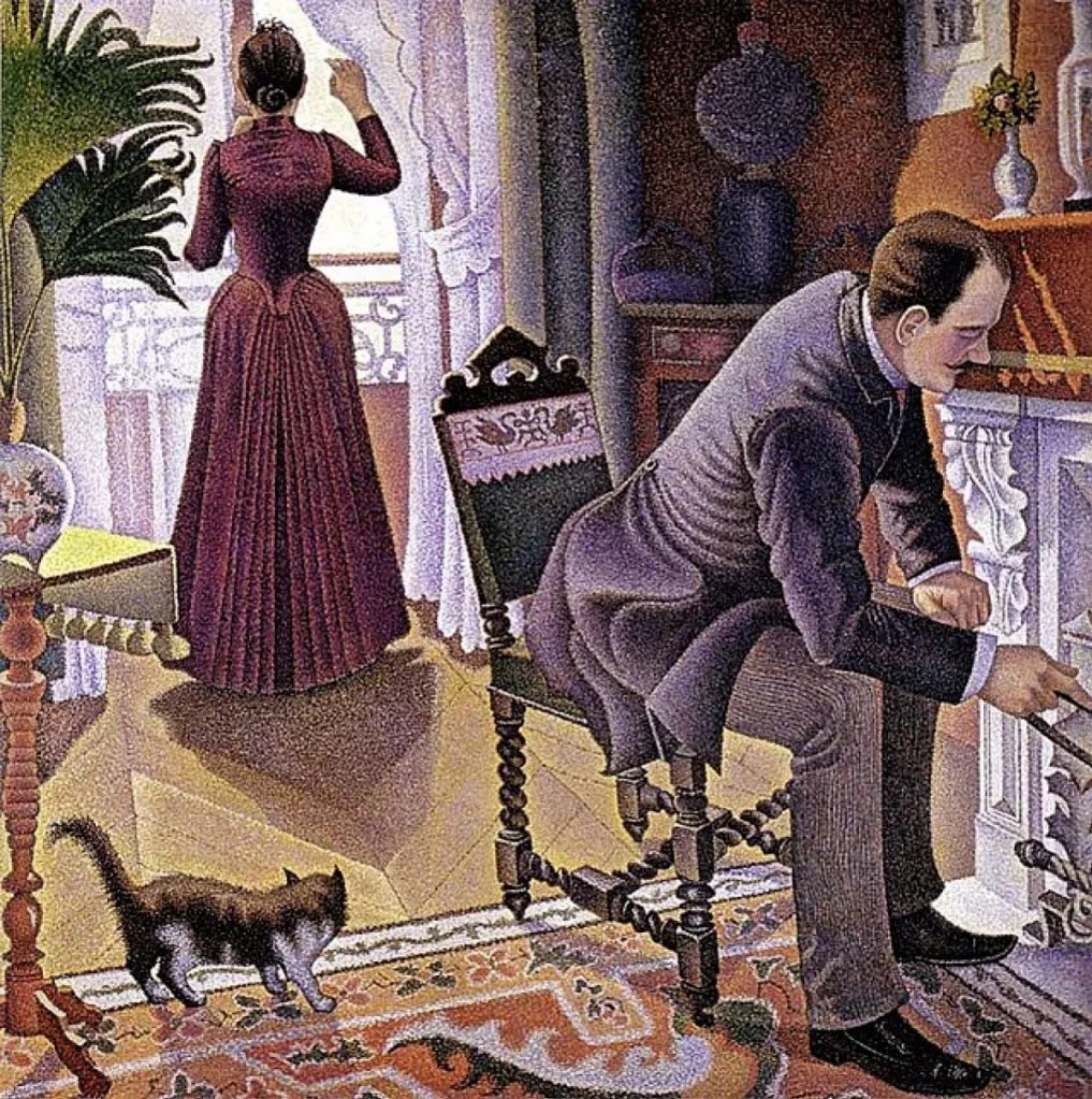
You can maybe see this tendency in the progression of two paintings by Signac in the room which is ostensibly about the painters’ depictions of bourgeois life. Here’s the first one, The Dining Room, completed in 1887.

The dining room, Opus 152 by Paul Signac (1886/1887) © Collection Kröller-Müller Museum, Otterlo, the Netherlands

The curators inform us that Signac used his own grandfather, mother and the family housekeeper as models for this work, and that the piece is a satire on the stifling atmosphere of the typical middle-class suburban household, pointing out how each figure appears entirely self-absorbed, no to say stifled.

This is all true but I’d add that surely the painting also brings out the tendency within the technique of Neo-Impressionism to conceive of humans as forms, as collections of lines and shapes? A tendency which leads them to seem like self-contained, autonomous units which have no interaction – monads, mannequins. And that many of these images have a heavy tendency towards caricature.

All of which is even more true of its sequel, Sunday, completed in 1890. The dot technique is immaculate. And Signac has included in the composition many more firm, defined outlines. But surely this proves my point, that the more defined these lines and form become, the more cartoon-like the overall image.

A Sunday, Opus 201 (1888–90) by Paul Signac. Private collection

Chahut

This tendency comes to a climax in the biggest painting on display here, given more or less its own room and space, the enormous ‘Chahut’ by Seurat from 1890.

Le Chahut by Georges Seurat (1889-90) © Collection Kröller-Müller Museum, Otterlo, the Netherlands

The curators have a lot to say about this, for example that it was one of what he called his toiles de luttes meaning ‘battle canvases’. In other words it was intended to be a provocative rallying cry to his movement, a manifesto pictures. In addition, it is intended to be socially subversive or an attack on late-Victorian sexual morality, in that it depicts the ‘chahut’ or ‘can-can’– then the most risqué dance performed in Parisian café-concerts.

All this is no doubt true but surely the obvious thing about this painting is that it’s a cartoon. It’s left reality far behind in order to become something like an illustration in the funny papers. Surely Seurat’s obsession with form and pattern, instead of taking us towards some deeper spiritual reality, in fact takes us away from reality altogether into a realm of caricature and comic illustrations?

(I’ve just visited the Courtauld Gallery where I saw another egregious example of this tendency, Seurat’s Young Woman Powdering Herself from 1890. This is a comical picture, isn’t it? Surely you can’t possibly take it seriously.)

Ladies on lawns

‘Chahut’ is given centre stage in the exhibition but it is in almost all ways an anomaly, an exception. The next room in the show, the one about depicting the bourgeois world, is far more characteristic. As well as the two Signac interiors I’ve mentioned, there are more classically open-air Neo-Impressionist works. The largest and maybe most representative is ‘In July, Before Noon’ by Théo van Rysselberghe, from the same year as Signac’s cartoon music hall.

In July, before Noon, 1890 by Théo van Rysselberghe © Collection Kröller-Müller Museum, Otterlo, the Netherlands

The strengths and weaknesses of the style are obvious. It is superb at conveying not only the detailed light and shade of a sunny day out of doors in July but there is something about the women’s postures which is oddly formalistic and detached. The woman passing by at the back looks like a robot.

I thought I recognised it and, after some rummaging, confirmed that this image was used for the cover of an Oxford University Press edition of Anton Chekhov’s plays. It perfectly captures the late nineteenth century indolence of middle class ladies, arranged in vast folds of fabric and quietly going about their embroidery or needlework in a sunny French garden. Inside they may be seething with the frustrations of characters from Chekhov or Ibsen, but here, on the surface, all is luminous calm.

Neo-Impressionism and van Gogh

As I mentioned, the show includes one splendid van Gogh painting, ‘The Sower’ from June 1888. We know from his letters than van Gogh was interested by the Neo-Impressionists’ experiments with colour and form but he was never a member of the group, not close. ‘The Sower’ is here partly because, alongside the Neo-Impressionists, Kröller-Müller collected van Goghs. And partly to demonstrate the similarities and differences between them.

The Sower by Vincent van Gogh (June 1888) © Collection Kröller-Müller Museum, Otterlo, the Netherlands. Photographer: Rik Klein Gotink

The similarity lies in the radical simplification of the subject in order to focus on vibrant colour contrasts. Van Gogh juxtaposes all kinds of colours not seen together in nature (for example the insistent blue of the turned soil the sower is scattering his seed onto) in order to create his effects.

The difference is in two aspects of approach. The Neo-Impressionists took a calm, detached, almost scientific approach to their work, whereas all eye-witnesses describe van Gogh attacking his canvases in a fever of inspiration. And whereas the Neo-Impressionists famously used dots or dot-like dashes of pain, van Gogh notoriously squeezed out entire worms of paint onto his brush and applied them with slapdash inspiration. Which explains why the Neo-Impressionists’ canvases are almost flat while van Gogh’s canvases are thickly encrusted with gloops and whorls of paint whipping up from the surface like waves on a stormy sea.

Here’s a close-up of pointillist technique from George Lemmen’s Factories on the Thames from 1892.

Detail from ‘Factories on the Thames’ by George Lemmen (1892) (photo by the author)

And a close-up of van Gogh’s Sower.

Detail from The Sower by Vincent van Gogh (photo by the author)

Spot the difference.

Legacy

Google AI tells me that:

Neo-Impressionism’s legacy lies in its scientific approach to colour and form, which heavily influenced later movements like Fauvism, Cubism, Futurism, and Abstract Expressionism. By using optical science, the movement pioneered a new awareness of colour and laid the groundwork for modernist approaches to the flatness of the canvas and simplified geometric forms. This theoretical language and systematic technique offered a new foundation for artists, bridging the gap between Impressionism and the more radical movements of the 20th century.

Seurat at the Courtauld

If you like Seurat, you might be interested to know that the Courtauld Gallery will be hosting an exhibition about Seurat’s coast painting from February next year.


Related links

Related reviews

After Impressionism: Inventing Modern Art @ the National Gallery

This is a lavish and deeply enjoyable exhibition portraying the great explosion of creativity in West European painting which took place in the decades between the last Impressionist exhibition in 1886 and the outbreak of the First World War in 1914.

Critics then and now struggled to find a blanket term for the period, as Belinda Thompson explains in her excellent survey of the period, ‘The Post-Impressionists’. The term ‘post-impressionism’ persists because the only thing all these different artists had in common was that they were painting after the great Impressionist breakthrough of the 1860s and 1870s and were clearly influenced by it. Beyond that it’s difficult to generalise, except that they were all experimenting and innovating and following through on the countless possibilities inherent in the act of putting oil paint on canvas.

Mont Sainte-Victoire by Paul Cezanne (1902 to 1906) © Philadelphia Museum of Art

Structure

The exhibition structure is simple: it opens by celebrating the artists who have emerged, in retrospect, as the great gods of the period – Paul Cézanne, Vincent van Gogh, Paul Gauguin – and then examines the influence they had on the younger generations of artists, in the hotbed of modern art, Paris.

Where this exhibition strikes out and is distinctive from many surveys of the period is that it then makes a conscious effort to broaden its scope, geographically, with rooms or sections dedicated to other capital cities where exciting experimentation was taking place, namely Barcelona, Berlin, Brussels and Vienna. The curators point out that there was more cross-fertilisation than ever before due to the steadily increasing numbers of exhibitions and exhibiting societies, illustrated periodicals and commercial dealerships.

For once there isn’t a particularly strong central thread or thesis being propounded in the show, just a lot of wall labels describing art movements and groups and trends in all these different places, and then picture captions going into detail on individual works.

The show is, therefore, in effect, just a feast of fabulous post-impressionist masterpieces, and strolling through it is a quite wonderful, mind-blowing, eye-filling experience.

Specific movements are mentioned along the way (the Nabis, Symbolism, Die Brücke, the Fauves), in passing, but towards the end the show crystallises, as it were, presenting examples of the radical Modernism which supplanted what had come before in the form of works by Picasso, Matisse, and Mondrian.

What characterised post-impressionist art?

Impressionism began the movement away from traditional Salon art which a) depicted high historical or mythological subject matter or b) monumental nudes in c) an intensely figurative realistic manner. Instead the Impressionists were interested not in what was there, but in what we see, which is a different thing, trying to capture the shimmer and play of light.

The post-impressionists continued this departure from the conventional representation of the external world. In a host of different ways they developed non-naturalist visual languages, emphasising shape or pattern or colour which don’t exist in the real world. Some of them were interested in line and form, some became obsessed with colour, some with pattern bringing out the decorative potential of art, some focused on symbols and meanings. Once you walked away from the idea of figurative, realistic depiction of the ‘real world’ a thousand doors opened.

All this was helped by the swift development of photography, with many artists realising that their traditional role as makers of portraits, recorders of events, annotaters of landscapes was being superseded by the new technology. But this was entirely positive: it freed them up to explore the expressive potential of paint on flat surfaces in a thousand new ways.

Artists

With almost 100 works, many lent from institutions abroad and seen in London for the first time, the show features a host of big name artists like Paul Cezanne, Vincent Van Gogh, Edgar Degas, Pablo Picasso, Henri Matisse, Gustav Klimt, Käthe Kollwitz, Sonia Delaunay, Wassily Kandinsky, Piet Mondrian, Edvard Munch. It’s mostly paintings  but there’s a selection of ten or so sculptures carefully chosen to demonstrate innovation in that medium, too (notable sculptures by Rodin, Gauguin and Kollwitz).

I’m going to list the rooms, indicate what they contain i.e. which movements and artists, and then pick personal highlights.

Introduction

The introductory room contains just four works, a painting each by Pierre Puvis de Chavannes and Paul Cezanne, framed by two sculptures by Auguste Rodin (‘Monument to Balzac‘, 1898, and ‘Walking man‘, 1907). Cezanne’s ‘Mont Sainte-Victoire’ (1906) is obviously a greatest hit but after the recent Cezanne exhibitions at Tate Modern and the National Portrait Gallery I’m a bit Cézanned out. The Rodin pieces confirm my very strong dislike; I object to because of the lumbering clumsy size of his works and the crude, horrible unfinished nature. In terms of modern sculpture I like Epstein, Gill and Gaudier-Brzeska, small, smooth, beautiful lines and angles, the opposite of everything Rodin stands for.

Therefore I preferred the Puvis work, ‘The Sacred Grove’ from 1885, although this struck me as a very odd choice, because its idyllic classical setting, figurative approach, use of perspective etc seem completely contrary to everything which follows.

The Sacred Grove, Beloved of the Arts and the Muses by Pierre Puvis de Chavannes (1884) Art Institute of Chicago

Room 2: Cézanne, van Gogh, Degas, Gauguin

Greatest hits from some of Western art’s biggest names. Cezanne is represented by a classic version of The Bathers (1905) where he is transforming human figures, trees and landscape into geometric shapes, leaning rectangles of paint, the semi-abstract human figures having blank masks. You can clearly see the origins of Picasso and Braque’s cubism. A still life of a sugar bowl and apples, plus another of his numerous views of Mont Saint-Victoire.

There are 4 works by Van Gogh: ‘Snow-Covered Field with a Harrow (after Millet)‘ (1890) had the classic van Gogh wavy paint, as did ‘Sunset at Montmajour‘ and ‘Enclosed field with ploughman‘. But I found myself more drawn to ‘Houses in Saintes-Maries-de-la-mer’. Apparently the tight, constricted feel of the composition is a new thing in his style. It was painted in the south of France where the bright light made him realise he could exaggerate colour effects even more than he’d been doing previously.

Houses in Saintes-Maries-de-la-mer by Vincent van Gogh (1890)

An oddity I noticed is that the National Gallery itself owns some outstanding van Gogh masterpieces, such as the chair, and sunflowers and these aren’t in the exhibition. The only reason I can think of is that they’re part of the permanent collection which tourists quite possibly come to London to see and so the curators took the decision to exclude them from the exhibition and keep them on general display.

The caption to his ‘Woman from Arles’, a portrait of the owner of the Café de la Gare in Arles, raises an interesting point. Apparently, when they were sharing a house in the south of France, Gauguin and van Gogh had an ongoing argument about the nature of art: Gauguin argued that the artists is like a priest questing for the spiritual essence of a subject and therefore it was best to paint from memory, distance from the actual object freeing the artist to bring out the essential shapes and colours. Van Gogh, on the contrary, argued it is the artist’s sacred duty to paint what they see, as they see it.

No such scruples with the little selection of Degas works, the biggest example of which is the famous ‘Combing the Hair (Le Coiffure)’, an orgy of reds and oranges. It’s accompanied by a good example of his ballet dancers, ‘Dancers practicing in the foyer’. But my favourite piece was a small but exquisite piece, ‘Woman reading’ (1885).

Femme lisant by Edgar Degas (1883 to 1885)

It’s tightly focused, cropping the figure at the knee. Degas applied layers of pastel over a monotype print

Taken together this room makes a strong case for the dazzling impact these artists had both in Paris and elsewhere in Europe, with their reconsiderations of form, surface and space. The strokes are called ‘gestural’ because they convey the actual strokes by the artists as much as the object. Strong short dark lines make it look as if elements of the image have been stitched together. The use of bold pure colours and highly gestural strokes were very influential on later artists.

Then onto the Gauguin section. I was bowled over. Gauguin strikes me as less covered than Cezanne, van Gogh or Degas, maybe because he is the boldest, most radical, most muscular and controversial of them. He’s represented by a greatest hit, ‘Nevermore’, ‘The Wave’, ‘Fête Gloanec’, ‘The Wave’, ‘The Wine Harvest’ and his expressive ‘primitive’ carving in the circular shape of a totem, ‘The afternoon of a faun’. But it was the huge and amazing ‘Vision of the Sermon (Jacob Wrestling with the Angel)’ which bowled me over.

Vision of the Sermon (Jacob Wrestling with the Angel) by Paul Gauguin (1888) © National Galleries of Scotland, Edinburgh

As per the explanation on the van Gogh caption, you can see how Gauguin has taken real elements, such as peasant women from his native Brittany, a cow, a tree, but placed them in an abstract ‘symbolic’ landscape where the grass is bright orange and perspective is gestured at but mocked or transcended. And, contrary to all traditional rules, the nominal subject, the wrestling match, doesn’t take place at the front and centre of the painting, but is a strange, obscure, garbled struggle happening off in the middle distance.

Degas is more consistently sensually and visually pleasing, but Gauguin is bracing and weird. He is a godfather of the pictorial Symbolism which was a major strand of the 1890s with its concern for Big (if often nebulous) Ideas and a completely non-naturalistic treatment, both combining to convey a strong if indefinable emotion.

Room 3: Different paths

Side by side are placed dark, heavily outlined depictions of the city, and the tremendously light and airy works of the ‘divisionists’ or ‘pointillists’.

Part of the enjoyment of visiting art exhibitions is to test out my own tastes. Over the years my tastes have changed, and are also liable to vary from day to day depending on mood and circumstance (e.g. pressure of work). Something which appears to remain consistent is I am instantly drawn to works with strong outlines. This is part of the reason I like Gauguin over van Gogh and Degas over Cezanne.

So in this room I really liked the works by Emile Bernard and Louis Anquetin with their ‘intensified colour and flattened forms bounded by strong outlines’.

‘Avenue de Clichy: five o’clock in the evening’ by Louis Anquetin (1887)

The strong black lines defining figures or folds of clothes were described by some critics as cloisonné work. According to the curators it anticipates and to some extent influence Gauguin.

By contrast I found the works by pointillists Georges Seurat and Paul Signac pallid and limp. These were ‘Setting sun: sardine fishing’ and ‘Bertaud’s Pine’ by Signac, alongside ‘By the Mediterranean by Henri-Edmond Cross. I know they’re great works in their own right. I understand that they called themselves Neo-Impressionists because they saw themselves as applying ‘scientific’ rigour and analysis to the depiction of sunlight and shade. I appreciate that the pointillists were, surprisingly, associated with workers’ rights and socialism and thought of themselves as depicting a better lighter world for all. But it’s the dark urban night-time visions of Louis Anquetin which pull my daisy.

The Channel of Gravelines, Grand Fort-Philippe by Georges Seurat (1890) © National Gallery, London

Room 4:The Nabis

Beside them are two works showing the highly stylised approach of Toulouse Lautrec, ‘Tristan Bernard at the Vêlodrome Buffalo‘ and ‘The Reader‘. The room contains a partitioned-off section about the Nabis or ‘prophets’. According to Wikipedia, the Nabis were:

a group of young French artists active in Paris from 1888 until 1900, who played a large part in the transition from impressionism and academic art to abstract art, symbolism and the other early movements of modernism. They included Pierre Bonnard, Maurice Denis, Paul Ranson, Édouard Vuillard, Ker-Xavier Roussel, Félix Vallotton, Paul Sérusier and Auguste Cazalis.

The show includes what is commonly thought to be the first ‘Nabis’ painting, ‘Le Bois d’Amour à Pont-Aven or Le Talisman’ of 1888 by Paul Sérusier. You can see why it was widely felt to have pushed painting significantly beyond figurativism into an entirely new place where colour and pattern became the main aim of a painting. Serusier painted it under the supervision and direct encouragement of Gauguin at Pont-Aven in Brittany. This fact and the almost complete abstraction of the work itself had a dramatic impact on his friends back in Paris and helped crystallise the new movement.

‘Le Bois d’Amour à Pont-Aven or Le Talisman’ by Paul Sérusier (1888)

And so the show includes comparable works by other members of the Nabis, including ‘Island and village of Le Pecq‘ and ‘The evening wash by lamplight‘ by Maurice Denis. Nearby there’s a work by Pierre Bonnard, ‘Madame Claude Terrasse and her son Charles‘ (1893). I went to the Bonnard exhibition at Tate Modern back in 2019 and, eventually, overcome my initial dislike to sort of ‘get’ his messy way with colour and pattern but this specimen epitomised that lack of draughtsmanship which I find hard to overcome. Next to it are two pieces by Edouard Vuillard, ‘Figures in an interior: Music‘ (1896), ‘Lugny-Poe‘ (1891) and ‘Lady of Fashion‘ (1892), both of which highlight his interest in pattern and design over strict realism. No likee.

Room 5: New voices – Barcelona and Brussels

By my count there were 6 paintings from Barcelona and 5 from Brussels.

Barcelona

Barcelona is represented by works by Hermenglido Anglada-Camaras, Ramon Casas i Carbo, Santiago Rusiñol I Prats, Isidro Nonell i Monturio and Pablo Picasso. The exhibition goes heavy on the enormous painting by Casas i Carbo, ‘The Automobile’.

The Automobile by Ramón Casas i Carbó (about 1900) © Círculo del Liceo / photo Fotogasull

It’s imposingly big and has a long backstory. Casas, a leading figure in the Barcelona avant-garde, was commissioned to the series of 12 paintings for the private club, Círculo del Liceu in Barcelona, depicting modern musical life. In this one a woman dressed in modern (1900) clothes drives that amazing new invention, the automobile. Casas was one of the first in the city to own a motor car and, of course, the curators point out how ‘radical’ it was to depict a woman driving one. The link to ‘music’? She’s meant to be driving to or from a concert. You can see it in the background on the right. The bold simplicity of the design is said to represent ‘Catalan Modernism’ and to have impressed the young Picasso.

Picasso is represented by an early work, ‘The absinthe drinker‘ and a portrait of ‘Gustave Coquiot‘, Hermenglido Anglada-Camaras by ‘The White Peacock‘ (1904), Isidre Nonell by a tough naturalistic depiction of poverty titled ‘Hardship‘. But I particularly liked the portrait of Modesto Sanchez Ortiz by Santiago Rusiñol, not particularly radical or modernist but just very powerful. Ortiz’ eyes followed me round the room.

Brussels

As to Brussels, the curators tell us it was home to progressive exhibiting societies like The Twenty and The Free Aesthetic which fostered close links with the Paris avant-garde. The Twenty was an exhibition society founded in 1883 by 20 artists who wanted to break away from the conventional art establishment. It was in Brussels that van Gogh made his only sale during his lifetime. The five pieces felt very light and pointillist. They include the decorative and soothing ‘The Scheldt upstream from Antwerp‘ by Theo van Rysselberghe (1892), the political motive behind ‘The eve of the strike‘ by Jan Toorop (1889), and a strikingly pointillist work, ‘Going to church’ by Henry van de Velde (1892). As you can see, although pointillist in technique, it has a much darker, gloomier vibe than the sun-drenched works of Signac and Seurat.

Woman in front of the Church by Henry Van de Velde (1889)

Off in a corner is a single work by the outlier James Ensor, ‘Astonishment of the Mask Wouse‘ (1889). As you can see, Ensor’s art goes beyond satire into the weird and the grotesque.

Room 6: New voices – Vienna and Berlin

In both Vienna and Berlin at the start of the 20th century artists withdrew from the traditional art academies and salon exhibitions and set up breakaway organisations, the Secessions.

Vienna

Dominating the left side of the room are two huge portraits of women by Gustav Klimt in his trademark style, combining a highly realistic sensual face with a luscious depiction of stylised dress and fabric: ‘Hermine Gallia (1904) and ‘Adele Bloch-Bauer II‘ (1912). I loved Klimt when I first discovered him at school but move quickly on to prefer his disciple Egon Schiele and eventually found him too sweet and chocolate box. Also from Vienna is ‘The Artist’s Mother‘ by Broncia Koller-Pinell (1907).

Surprisingly, there are some works by Norwegian depressive Edvard Munch. Why? Because Munch actually exhibited and sold his works in Berlin. The works here show a healthy lack of interest in traditional perspective and preference for pattern and design, but aren’t particularly impressive: ‘Consul Christen Sandberg‘. More characteristic is ‘The death bed‘ (1896). I was interested to learn that Munch eventually had a complete nervous breakdown (in 1908) and that, when he returned to painting, it was in a far looser style and of relatively unemotional landscapes: ‘Cabbage field‘ (1915).

Berlin

I was surprised by this room because so many of the works seemed the opposite of ‘modern’ but surprisingly old fashioned. Thus the two works by Lovis Corinth are, maybe, a bit candid and honest about the female body but they are, nonetheless, female nudes in the time-honoured tradition, without a hint of the stylisation we’ve seen throughout the show up to this point: ‘Perseus and Andromeda‘ (1900).

Nana by Lovis Corinth (1911) St Louis Art Museum

There’s a portrait of historian and philosopher George Brandes by Max Liebermann (1901) and ‘Danae‘ (1895) where I really admired the frank peasant ugliness of the servant, and ‘Children by the Pond: The Garden in Godramstein‘ (1909) by Max Slevogt.

I was surprised by this entire room because it all seemed so reactionary and old fashioned. A glimmer of modernism was given by the sole piece by the great German artist Käthe Kollwitz, not a painting but a tightly conceived sculpture, ‘Pair of Lovers‘ from 1913 to 1915. I’m a huge fan.

Room 7: German Expressionism

The penultimate room is a small one tucked off to the side of the flow of big rooms but it came to me as a huge relief after the retro kitsch of the previous room, a sudden burst of vibrant colour and exciting non-conformity.

Why stick to traditional methods of compositions? Why not use blaring flagrant primary colours! Why bother to cover the whole canvas when leaving blank spots creates a sense of urgency and drama! Bang!!

Many of the works are by members of Die Brücke (The Bridge), a group of German expressionist artists formed in Dresden in 1905. Founding members were Fritz Bleyl, Erich Heckel, Ernst Ludwig Kirchner and Karl Schmidt-Rottluff. What they had in common was interest in primitivist art and expressing extreme emotion through high-keyed colours that were non-naturalistic. God, this is the dog’s bollocks, I thought, what a relief after the stodgy naturalism of the previous room!

Here are splendidly bold and unfettered works by Erich Heckel – ‘The house in Dangast‘ (1908) – and Karl Schmitt-Rottluf – ‘Break in the dyke‘) (1910). I loved Sonia Delaunay’s ‘Jeune Finlandaise’ (1907). In this small room experienced a physical sense of liberation.  This is the real McCoy.

Young Finnish woman by Sonia Delaunay (1907)

It’s significant that this painting captures Delauney on her journey towards pure abstraction which she would achieve a few year later. Part of the thrill of paintings like this is you can feel the future in them, ready to burst through. In the same vein is the National Gallery’s portrait of Charlotte Cuhrt by Max Pechstein (1910).

Two outliers are a portrait by Henri Rousseau (‘Joseph Brum’), whose ‘naive’ self-taught style became very popular in turn of the century Paris where ‘primitivism’ of all kinds was becoming fashionable.

And, off to one, side, the eerie and disturbing ‘Seated girl with a white shirt and standing nude girl’ by Paula Modersohn-Becker (1906).

8: New Terrains

Finally the exhibition closes with a big room drawing together strands which have emerged during the exhibition to date, and pointing forwards to the radical ruptures of Modernism.

Thus there’s a work by Wassily Kandinsky which is well on the way of his journey towards abstraction – ‘Bavarian Village with Field‘ (1908).

There are three paintings by Matisse, highlighting his move towards decoration, colour and pattern:

There are three little works by Piet Mondrian which neatly capture his progression from traditional figurativism in a realistic depiction of a tree by a river bank; to a half-way house, a tree painted in a style influenced by van Gogh’s broad brushstrokes; and finally onto pure abstraction:

In a similar spirit there are four Picassos which capture his progression from deliberate ‘primitivism’ of 1907 on to the invention of cubism in 1911:

But dominating the room is the enormous work ‘The Dance’ by André Derain. Derain was one of the group of Parisian artists who, in a review of a 1905 exhibition, were mockingly called ‘les Fauves’ (which simply means ‘the wild things’) by a Parisian critic and adopted the name as a badge of pride. Other works by Derain are included:

But it’s ‘The Dance’ which dominates the entire room and is your lasting, lingering visual image of it. Wild, high-toned colours, a cheerful disregard for perspective and, in this image in particular, a complete transition to fantasy, fairy-tale, exotic subject matter.

‘The Dance’ by André Derain (1906) Private Collection © ADAGP, Paris and DACS, London 2023

It’s funny but, although the curators started out by claiming there was a great explosion of styles and approaches from the late 1880s onwards, the works chosen for this final room suggest that all along there were in fact just two threads or streams or approaches.

For me the drab colouring and obsessive interest in volumes, hard-edged angles, facets and geometry found in the cubism of Picasso and Braque relates directly back to the exploration of volumes, forms, rectangles and blocks developed by Cézanne. Maybe we can call this the Analytic tradition and define it as stretching from (on one wing) the scientific approach of the Neo-Impressionists and, on the other, the pure, geometric abstraction of Mondrian.

Whereas the wild children’s drawing of brightly coloured figures dancing in the jungle obviously comes from a completely different place, clearly relates directly back to Gauguin’s symbolic exoticism. Maybe we could call this the Expressive tradition. Obviously, it incorporates, in Germany, the Bridge artists who we saw in the previous room, and includes the other Fauves, besides Derain.

Analytical versus expressive. Composition versus colour. Well, that’s the neat and simple pattern which struck me as I came to the end of this brilliant, exhilarating exhibition.


Related links

Related reviews

Nineteenth century France reviews

More National Gallery reviews

Art Nouveau by Alastair Duncan (1994)

This is one of the extensive ‘World of Art’ series published by Thames and Hudson. On the plus side the texts in this series are always readable and authoritative. On the down side, most of the illustrations are in black and white, and very small. It’s a series in which to read about art and art movements, but not necessarily to enjoy the actual art.

A revolt against Victorian mass production

Duncan emphasises that Art Nouveau wasn’t a style, it was a movement. What he means is that around 1890 a whole generation of designers, illustrators, craftsmen, architects and artisans right across Europe revolted against the heavy hand of mass-produced industrial products, dull designs and routine architecture, and against the Victorian home filled with a horrible mish-mash of clutter and bric-a-brac from all styles and periods – and determined to produce something fresh and new, and integrated in style and look.

He attributes the revolt against mass-produced, machine-made, shoddy tat, and the call to return to the values of hand-crafted, beautiful objects, created in a unified style – to William Morris, who emerges as one of the most influential men in the history of Western Art. Right across Europe, designers, artisans, ceramicists, decorators, fabric-makers and so on took up his Art and Crafts ideas with a passion.

The ubiquity of the impulse and its Europe-wide provenance is reflected in the bewildering variety of names given to it.

In Austria it is known as Secessionsstil after Wiener Secession; in Spanish Modernismo; in Catalan Modernisme; in Czech Secese; in Danish Skønvirke or Jugendstil; in German Jugendstil, Art Nouveau or Reformstil; in Hungarian Szecesszió; in Italian Art Nouveau, Stile Liberty or Stile floreale; in Norwegian Jugendstil; in Polish Secesja; in Slovak Secesia; in Russian Модерн (Modern); and in Swedish Jugend.

The name Art Nouveau simply comes from the Maison de l’Art Nouveau (House of the New Art), a gallery opened in 1895 by the Franco-German art dealer Siegfried Bing to publicise and sell objects made in the ‘new style’, such as the ground-breaking new jewelry by René Lalique. The interior was designed by Henry van de Velde and the American, Louis Comfort Tiffany, supplied the stained glass. The gallery became the place for rich and fashionable Parisians to buy objects in the ‘new look’.

A few years later the art critic turned entrepreneur, Julius Meier-Graefe, who had founded the Jugendstil (Art Nouveau) magazine Dekorative Kunst in 1897, opened La Maison Moderne, a gallery that showcased Art Nouveau works in Paris in 1898. These two boutiques led the fashion.

Elements of Art Nouveau

Although Duncan goes into immense detail about the regional variations in the style, I looked in vain for a really definitive verbal description of the characteristic Art Nouveau ‘look’, so recognisable when seen, so hard to put into words.

So I drew up a list of common features. Art Nouveau consists of linear simplicity, but the lines are always curvilinear, with tall sinuous curves explicitly or implicitly based on the stems of flowers – the word ‘tendrils’ recurs, and ‘stems’. The ‘eyes’ in the tails of peacocks became an obsessive motif. 

Chair by Arthur Heygate Mackmurdo (1883)

Chair by Arthur Heygate Mackmurdo (1883)

The slender, parallel black lines in Mackmurdo’s pioneering chair design (above) anticipate Aubrey Beardsley’s illustrations from the 1890s (below). The Beardsley drawing below actually features a peacock as the source of the peacock-feather head-dress worn by Salome and the luxurious long arabesque lines ending in stylised versions of peacock ‘eyes’.

Illustration for Salome by Aubrey Beardsley (1894)

Illustration for Salome by Aubrey Beardsley (1894)

As an example in a different medium, take this Peacock vase produced by the undisputed master of Art Nouveau design in glass and glassware, the American Louis Comfort Tiffany. He had signed an exclusive contract with Bing and via Bing’s boutique became the latest thing in glassware.

Peacock vase by Louis Comfort Tiffany (1896)

Peacock vase by Louis Comfort Tiffany (1896)

Japonisme was important. The fashion for Japanese style derives from the treaty signed between the Japanese and American governments in 1854 which opened up the country for trade after centuries of self-imposed isolation. World fairs held in the 1860s and 70s included more and more Japanese products, but it was the delicacy, the deliberate flatness and decorative design of Japanese woodcuts by the likes of Hiroshige and Hokusai which influenced European artists and designers.

Blossoming Plum Tree with Full Moon by Ando Hiroshige

Blossoming Plum Tree with Full Moon by Ando Hiroshige

Slender, tall, undulating, curving lines with a flower motif underpin the most famous aspects of the style. New at the time, just looking at something like this makes you feel how heavy it would be and how…. dated. The kind of thing you see in junk shops, tarnished and striking but totally out of place in a modern home.

French Art Nouveau glass and bronze table lamp by Emile Gallé

French Art Nouveau glass and bronze table lamp by Emile Gallé

The Glasgow School which flourished from the 1890s was dominated by The Four, comprising the painter and glass artist Margaret MacDonald, architect and designer Charles Rennie Mackintosh, MacDonald’s sister Frances and Herbert MacNair. The Four defined the Glasgow Style’s fusion of influences including the Celtic Revival, the Arts and Crafts Movement, and Japonisme. Among their works were the wall decorations for the Glasgow Tea Rooms, which highlight the movement’s interest in tall, elongated figures, in slender, elegant curved lines, in highly stylised flower imagery, and in simplified human features (‘ghost-like visions of attenuated young women’, p.50, ‘attenuated virgin maidens’, p.71). Note the heavy heads of hair of the maidens in this painting, similar to the hair in Beardsley, ornate and heavy like flower-heads.

The Wassail (1900) by Charles Rennie Mackintosh

The Wassail (1900) by Charles Rennie Mackintosh

In Paris the most famous Art Nouveau artifacts to be seen today are Hector Guimard’s entrances to a number of Métro stations. Note the curves, the flower and plant motifs in the ironwork – and also the wonderful lettering.

Hector Guimard's Art Nouveau entrance to the Abbesses station of the Paris Métro

Hector Guimard’s Art Nouveau entrance to the Abbesses station of the Paris Métro

There was never an Art Nouveau school of painting. Art Nouveau was a way of thinking about design, not fine art. That said, many painters shared Art Nouveau themes such as: the simplification of form, the flattening of space, the evocative powers of an undulating line and an affinity for the decorative elements of symbolism.

Duncan singles out Gauguin’s technique of flattening the subject into areas of raw colour divided by strong black lines, before going on to describe the work of his devotees, the self-styled Nabis painters of Paris, and then goes on to namecheck Odilon Redon, Jan Toorop, Burne-Jones, Gustave Moreau and Ferdinand Khnopff – pretty much the same roll call of artists I’ve just worked through in two books about Symbolism.

He ends with Gustav Klimt, the nearest thing to a real Art Nouveau painter, for his use of surface decoration, flowing curves and rich ornamentation, ephemeral beauty, and symbolic female imagery tinged with decadence.

Adele Bloch-Bauer by Gustav Klimt (1907)

Adele Bloch-Bauer by Gustav Klimt (1907)

Art Nouveau was more at home in commercial posters than in painting. The big names are the pioneer Jules Chéret, who produced some 1,000 posters in the 1880s, Henri Toulouse-Lautrec who produced 32 highly distinctive posters in the 1890s, Théophile-Alexandre Steinlein (who I know from Sue Roe’s book In Montmartre was one of Picasso’s favourite artists) and the great Alphonse Mucha.

Michael Gibson’s big book of Symbolism has an interesting section on Mucha which contains several black-and-white photos Mucha took of his female models, placed next to the resulting finished posters. What is immediately obvious is how Mucha made the poster girls not only prettier than the models they were based on – more simple, sweet and innocent – but also more curvilinear – shoulders or arms which are more or less straight in the photos life were given curves and contours to soften them.

In this poster note the elaborate framing of the central image, which echoes the curvilinear and plant-like design of the ironwork in the Guimard Metro entrance, above.

Poster Advertising 'Lefevre-Utile' Biscuits by Alphonse Mucha (1896)

Poster Advertising ‘Lefevre-Utile’ Biscuits by Alphonse Mucha (1896)

If flowery maidens were much in evidence in Mucha’s posters, naked young ladies swarmed across Art Nouveau sculpture. New techniques of manufacture and an interest in new materials, especially combinations of metals with glass or wood or marble or ivory or shell, led to an explosion in objets d’art which featured lithe, elongated nymphs with perfect bodies and rose-tipped breasts.

The book includes examples of nymph-adorned table lamps, electric lamps, inkwells, candle holders, dishes, candelabra, vases, wall brackets, tobacco jars and clocks.

Obsession and Dream, gilt bronze candelabra by Maurice Bouval (1898)

Obsession and Dream, gilt bronze candelabra by Maurice Bouval (1898)

Architects built buildings in the new style all across Europe. Something I noticed many of them had in common was a kind of semi-circular arch above the windows, often ballooning out wider than the window itself. Plus the inevitable fantastical, slender curved lines of the cast iron balcony.

Villino Broggi-Caraceni, Florence by Giovanni Michelazzi (1911)

Villino Broggi-Caraceni, Florence by Giovanni Michelazzi (1911)

It’s a zoomorphic look which finds its climax in the genuinely weird Casa Batlló in Barcelona designed by the great but eccentric Antoni Gaudí in 1904, a building which is evolving into a living organism, made up of biomorphic surfaces and undulating forms.

Casa Batllo, Barcelona by Gaudi (1904)

Casa Batllo, Barcelona by Gaudi (1904)

The decline of Art Nouveau

A key aspect of Art Nouveau is how brief it was. Its high point was the Paris World Fair in 1900, where Siegfried Bing displayed a series of ensemble rooms created by his three top designers, Colonna, de Feure and Gaillard, showing how every element in a modern room could be tailored to the new look. The Fair featured the glassware of Tiffany and the jewellery of Lalique, which were at their peak of popularity.

By 1905 it was all over. Meier-Graefe closed his shop in 1903, as sales fell off. Bing closed his gallery in 1904 and died the next year. The Belgian Art Nouveau, La Libre Esthétique, had dissolved by 1904. Morris died in 1896, Beardsley in 1898, Whistler the great devotee of Japonisme in 1903, Émile Gallé the leading Art Nouveau glass-maker in 1904. Mucha, the great Belle Époque posterist, returned to his native Czechoslovakia in 1910.

It had all seemed so new and exciting in 1895 – but seemed old and boring by 1905. One Mucha poster looks sensational – twenty begin to look predictable. In furniture, lamps, wallpapers, art and architecture, ‘the look’ began to seem tired, not least because (ironically) these lines and motifs had themselves been absorbed into the consumer capitalist machine, copied and mass produced in huge numbers of inferior versions, and in such quantities that the market was flooded. The rich, who set the pace, were looking for new thrills.

Looking back on it from a century later, Art Nouveau – which saw itself as reacting against Victorian clutter and tastelessness – itself seems merely a variation on the same over-stuffed world. Photos of Art Nouveau interiors – a revolution to their contemporaries – now look just as wooden, dark and cluttered as their immediate predecessors.

Art Nouveau dining room at the Casa Requena

Art Nouveau dining room at the Casa Requena (1905)

It’s only with De Stijl, Russian Constructivism and the emergence of the Bauhaus after the Great War, that we feel we are in an entirely new century of open, uncluttered space and modern streamlined furniture.

Key phrases

In trying to nail down what Art Nouveau really means, I noted down tell-tale phrases Duncan uses about architecture, interiors, furnishing, lamps and lights and so on:

  • serpentine configurations… abstracted plant gyrations… curves and fancies… curvilinearity… elaborate and complex ornament… sculpted decoration… integrated design… lavish mouldings and sculpted decoration… the use of nature, specifically the flower and its components… flair for the bizarre… floriform…

And two new terms struck me:

  • Femme-fleur – The dream-maiden with long strands of hair resembling vegetation tendrils, often intertwined with marine-like plant-forms, found in Art Nouveau designs.
  • Femme-libellule – dragonfly lady or damsel.
Femme Libellule by René Lalique (1898)

Femme Libellule by René Lalique (1898)


Related links

Symbolist Art by Edward Lucie-Smith (1972)

Symbolist art does not depict nature as it actually exists, but brings together various impressions received by the mind of the artist, to create a new and different world, governed by its own subjective mood. (Symbolist Art, page 151)

Although this book is 45 years-old, I picked it out in a second-hand bookshop deliberately to compare and contrast with Michael Gibson’s more recent account of Symbolism (1995). Gibson’s massive book is packed with brilliant full-colour reproductions but, as I read it, I did increasingly find myself wondering where ‘Symbolism’ ended and where the simply fantastic or morbid or sensationalist began. So I read this book to further explore whether Symbolism was really a movement in a narrow definable way or is just the word given to a kind of mood or feeling of other-worldliness apparent in a huge range of artists between about 1880 and 1910.

The World of Art series

Symbolist Art is a typical product of Thames and Hudson’s renowned ‘World of Art series’ in that, although there are 185 illustrations, only 24 of them are in colour. So you’re not buying it for the pictures, which can be better seen, in full colour, in numerous other books (or online); you’re buying it for the text.

Edward Lucie-Smith

Lucie-Smith was born in 1933 and is still alive (aged 84). Public school, Oxford, the RAF during the war, then freelance poet, art critic, essayist, author and curator, he has written over 100 books. His book comes over as significantly more learned and informative than Gibson’s.

Symbolism in Renaissance painting

He starts with a history of symbols in art starting way back in the Renaissance. Renaissance art is packed with symbols – classical gods and goddesses are accompanied by their attributes, kings and queens are shown in allegorical paintings accompanied by war or peace or the triumph of the arts and so on.

To get the most out of Renaissance art you have to have a good eye for its religious, political and cultural symbolism. For example, spot the symbolism in this masterpiece by Rubens.

(In this picture the portrait of Marie de’ Medici – daughter of the Grandduke of Tuscany – is being presented to Henry IV, the king of France, and her future husband. The gods of marriage and love – Hymen and Amor (Cupid), to the left and right – hover in mid-air. From up in heaven the king and queen of the gods, Jupiter and Juno, look down in approval. Jupiter’s symbol, the eagle of war, clutching lightning bolts in his talons, is literally being squeezed out of the picture, to the left, while Juno’s symbols, the peacocks of love and peace strut (the male) and look down at the scene of love (the female). A pink ribbon symbolising their marriage binds them together. The chariot the peahen sits in bears a gold relief on the front showing Cupid standing on/triumphing over (another) eagle, and holding a garland (symbol of marriage). Behind Henry stands the personification of France, wearing French blue silk embroidered with gold fleur-de-lys (the coat of arms of the French monarchy). She is reassuring Henry that it is a good match for the nation. The burning town in the distance and the dark clouds to the left of the picture, beneath the eagle, symbolise War, as do the helmet and shield at the foot of the painting. These must all be abandoned so that Henry can concentrate on the lighter, feminine arts of peace, subtly emphasised by the light source for the whole scene coming from the right, the side of the Future, peace and harmony.)

Lucie-Smith makes a useful distinction between ‘closed’ and ‘open’ symbolism.

Open symbolism

The use of publicly available and traditional imagery. All of the symbolism in the Rubens picture is ‘open’ in the sense that any educated person could spot it.

Closed symbolism

Refers to ‘secret’ knowledge, available only to ‘initiates’. Renaissance and post-Renaissance art features numerous painters who included closed symbolism in their works: some has been investigated and explicated by later scholars; some remains obscure to this day.

Watteau

In other words, symbolism in its broadest sense, as a strategy or technique, is absolutely intrinsic to the Western artistic tradition. What Lucie-Smith brings out is the strand of artists over the past few hundred years who brought something extra to the idea: who incorporated open symbolism or straightforward allegory (where x stands for y; where, for example, an hourglass stands for ‘Time’), but something else as well.

He takes an example from the wonderful Jean-Antoine Watteau (1684 to 1721). On the face of it Watteau was painting fashionable fête galantes for the French aristocracy, scenes of dressing up and carefree flirtations in an idealised classical setting, thus:

Yet (apart from the fabulous rhythmic compositions, the draughtsmanship of the figures, the wonderful use of colour) what makes Watteau ‘magical’ is the sense he achieves of a deeper meaning which somehow diffuses a mysterious influence around itself. According to Lucie-Smith, Watteau:

had already abandoned conventional allegory in favour of a use of symbolism which was more pervasive, more powerful and more mysterious. (p.21)

Something else is conveyed above and beyond the ostensible subject and its overt symbolism. Somehow it achieves a sense of mystery.

The Romantic roots of Symbolism

There follows a chapter about Romanticism, a movement which I, personally, find boring, maybe because I’ve read too much about it and seen too many times the same old paintings by Fuseli (The Nightmare), Goya (The sleep of reason produces monsters) or Caspar David Friedrich (The Cross in the mountains).

Lucie-Smith’s purpose is to show that ‘Romanticism’ is (quite obviously) the godfather to modern Symbolism: in its use of obscure but meaningful images, nightmares and dreams, scary women and looming monsters; in its use of pseudo-religious imagery which has lost its literal meaning but acquired a spooky, Gothic, purely imaginative resonance.

Victorian symbolists

The next chapter looks at symbolist currents in British art during the 19th century, starting with the self-taught mythomane, William Blake. It then moves on to consider the group of artists who claimed to be his followers and called themselves ‘the Ancients’, including Edward Calvert and the wonderful Samuel Palmer, with his strange visionary depictions of rural Kent (Coming from Evening Church).

Then we arrive at the Pre-Raphaelites. Lucie-Smith identifies Dante Gabriel Rossetti as the most ‘symbolist’ of these young idealistic painters, not least because his technique was quite limited. Rossetti wasn’t very good at perspective or realistic settings and so his mature paintings often have a vague, misty background which helps to emphasise the ‘timeless other-worldliness’ of the main subject (generally cupid-lipped, horse-necked ‘stunners’ [as the lads used to call them] as in Astarte Syriaca).

Astarte Syriaca by Dante Gabriel Rossetti (1877)

Astarte Syriaca by Dante Gabriel Rossetti (1877)

Burne-Jones and Watts

Lucie-Smith credits Edward Burne-Jones (1833 to 1898) with developing the medieval and dream-like elements of Pre-Raphaelitism to their fullest extent and in so doing creating a stream of late works devoted to expressionless women moving through heavily meaningful landscapes.

The Golden Stairs by Sir Edward Burne-Jones (1880)

Burne-Jones exhibited at the Paris Universal Exhibition in 1889, where he won a first-class medal. (Intriguing to think the Impressionists were almost entirely excluded from this show and forced to mount an exhibition at the nearby Café Volpini – as described in in Belinda Thompson’s book about the Post-Impressionists.)

French symbolist artists were well aware of Burne-Jones’s work. But the most overtly ‘symbolist’ of the late Victorian artists was George Frederick Watts. He was quite clear about his intentions and his own words give quite a good summary of the symbolist impulse:

I paint ideas, not things. I paint primarily because I have something to say, and since the gift of eloquent language has been denied me, I use painting; my intention is not so much to paint pictures which shall please the eye, as to suggest great thoughts which shall speak to the imagination and to the heart and arouse all that is best and noblest in humanity. (quoted page 47)

His many contemporary fans and supporters considered Watts a ‘seer’ and suggested his work be hung in a temple not a gallery (an ambition which sort of came true with the dedication of his final home and studio in the village of Compton, Surrey, to his work, a venue you can now visit – the Watts Gallery).

The dweller of the innermost by Watts (1886)

The dweller of the innermost by Watts (1886)

‘The dweller of the innermost’ is obviously someone important, and something very meaningful is going on in this painting – but who? and what?

Symbolism

All this background is covered in the first 50 pages of this 220-page book in order to get us to the Symbolist movement proper.

Symbolism in the narrow sense was a literary movement, embodied in the poetry of Paul Verlaine and Stéphane Mallarmé in the 1870s and 1880s. They used real-world images but set in shimmering, vague and allusive contexts. By the late 1880s this kind of literary worldview overlapped strongly with a revival of a so-called ‘decadent’ style, in both writing and painting. It was largely to distinguish between the two outlooks that the minor poet Jean Moréas in 1886 wrote the essay which introduced the term ‘symbolist’ and ‘symbolism’.

According to Moréas, both symbolism and decadence turned away from the oppressive mundaneness of the everyday bourgeois world, but whereas the symbolists emphasized dreams and ideals, the Decadents cultivated heavily ornamented or hermetic styles and morbid subject matter.

Lucie-Smith asserts that the first phase of symbolism lasted from Moréas’s 1886 essay until he himself rejected the name in 1891. Its central figure was the poet Mallarmé. Lucie-Smith lists the qualities of Mallarmé’s poetry, and points out how they can also be found in the symbolist painters of the day:

  • deliberate ambiguity
  • hermeticism (i.e. the poems are closed to easy interpretation)
  • use of the symbol as catalyst i.e. to prompt a reaction in the soul of the beholder
  • the idea that art exists in a world separate and apart from the everyday one
  • synthesis not analysis i.e. while the Impressionists analysed light and its effects, the symbolists brought together elements of the real world – from tradition, myth and legends – into strange and new combinations or syntheses

An important element of synthesis was not only the unexpected combination of real-world elements, but the notion that all the arts could and should borrow from each other. Symbolism always hovered around the idea of a ‘total work of art’ which combines music, dance, art, even smells and touches. Everyone in the 1880s was entranced by Wagner’s massive operas which aspired to just this condition of being Gesamtkunstwerks or ‘total works of art’. The idea was very powerful and lingered through to the First World War – the Russian composer Scriabin composed works deliberately designed to evoke colourful visual fantasias and artists like Wassily Kandinsky in the 1900s developed theories about the closeness of painting and music.

Here’s a Symbolist depiction of the hero of one of Wagner’s massive operas, the pure and holy knight Parsifal.

Parsifal by Jean Delville (1890)

Gustave Moreau (1826 to 1898)

Moreau is the painter most associated with the first phase of Symbolism. He developed an ornate jewel-studded style of treating subjects from the Bible or classical legend.

Jupiter and Semele by Gustave Moreau (1895)

Jupiter and Semele by Gustave Moreau (1895)

Reviewing the Salon of 1880, the novelist Joris-Karl Huysmans singled out Moreau’s work for being mysterious and disturbing. Four years later, in his classic novel A Rebours, which describes a decadent aristocrat who retires to his country house to cultivate sensual pleasures and experiences, Huysmans singled out Moreau as the patron painter of his decadent lifestyle, using a lexicon of late-19th century decadent terms: Moreau’s art is ‘disquieting…sinister…sorrowful symbols of superhuman perversities’ and so on.

Of his own painting Jupiter and Semele, Moreau wrote:

‘It is an ascent towards superior spheres, a rising up of superior beings towards the Divine – terrestrial death and apotheosis in Immortality. The great Mystery completes itself, the whole of nature is impregnated with the ideal and the divine, everything is transformed.’ (quoted page 66)

That gives you a strong sense of Symbolist rhetoric.

Odilon Redon (1840 to 1916)

Huysmans also includes Redon in his short list of artists favoured by his decadent hero, Jean des Esseintes. Redon seems to me by far the more symbolist painter of the two, and the polar opposite of Moreau. Whereas Moreau paints relatively conventional mythical subjects in a super-detail-encrusted fashion, Redon strips away all detail to portray the subject in a genuinely mysterious and allusive simplicity.

The Cyclops by Odilon Redon (1914)

Redon wrote of his own work:

The sense of mystery is a matter of being all the time amid the equivocal, in double and triple aspects, and hints of aspects (images within images), forms which are coming to birth according to the state of mind of the observer. (quoted page 76)

Pierre Puvis de Chavannes (1824 to 1898)

Puvis wanted to revive the academic tradition, and his compositions of figures in landscapes in one way hearken back to the posed landscapes of Nicolas Poussin (1594 to 1661). But he did so in a strange dreamlike way which pointed forward, towards the semi-abstraction of Cézanne. He wrote to a friend that he preferred low skies, solitary plains, bad weather – a temperament which resulted in melancholy and often mysterious paintings.

The Dream by Puvis de Chavannes (1883)

I don’t like Puvis because of what I take to be his rather ropey draughtsmanship – his figures seem angular and uncomfortable, especially the faces.

Eugène Carrière (1849 to 1906)

Lucie-Smith doesn’t like Carrière much because he developed one subject – family members, especially mother and baby – and painted them over and over again, in a very distinctive way, as if seen through a thick brown mist. I can see how this would quickly grow tiresome, but in brief selections Carriere comes over as a powerful element of the symbolist scene.

At about this point in the book it struck me that a quick way of distinguishing between post-Impressionist and Symbolist painters is that the former were experimenting with ways of depicting reality, whereas the latter are experimenting with ways to try and depict what lies behind reality. Of the former, contemporary critics asked, ‘What is it meant to be depicting?’, of the latter they would ask, ‘I can see what it’s depicting – but what does it mean?’

Paul Gauguin and the Pont-Aven school

Gauguin the post-Impressionist is included? Yes, because in the several summers he spent painting at Pont-Aven in Brittany, Gauguin attracted young disciples who both inspired him to become more abstract and ‘primitive’, and who then went back to Paris to spread his influence.

The young Paul Sérusier organised a group of like-minded young artists at the private art school of Rodolphe Julian, which included Pierre Bonnard, Édouard Vuillard, and Maurice Denis, and christened them the ‘Nabis’ (Hebrew for ‘prophets’). Without really intending to, Gauguin found himself being lauded as a ‘prophet’ to the Symbolists. When he set off for the Pacific he was given a going-away party by the Symbolists, presided over by the symbolist poet par excellence, Mallarmé himself. Here’s a work from Gauguin’s South Sea period.

Contes barbares by Pau Gauguin (1902)

Lucie-Smith says it is symbolist work because it has mystery, ambiguity and is clearly an invitation to seek some deeper meaning lying beneath the surface. Well, yes… I find several works by other Nabis more convincingly symbolist:

Lucie-Smith devotes a chapter to the Salon of the Rose+Cross founded by Joséphin Péladan in 1892, which held a series of six exhibitions from 1892 to 1897 at which they invited Symbolist painters to exhibit. Featured artists included Arnold Böcklin, Fernand Khnopff, Ferdinand Hodler, Jan Toorop, Gaetano Previati, Jean Delville, Carlos Schwabe and Charles Filiger.

The Salon combined rituals and ideas from Medieval Rosicrucianism with elements of Kabbala and other aspects of esoteric lore. Charming and distracting though much of this arcane knowledge may be to devotees, it is also, at bottom, a profoundly useless waste of time and intellect. However, the Salon of the Rose+Cross’s practical impact was to bring together and promote a wide range of painters who shared the symbolist mindset:

More impressive are Soul of the Forest by Edgar Maxence (1898) and:

Orpheus by Jean Delville (1893)

Orpheus by Jean Delville (1893)

Aubrey Beardsley (1872 to 1898)

An illustrator who created line drawings in black ink, Beardley’s big breakthrough came in 1894 when Oscar Wilde’s play, Salome, was published in a version with Beardsley’s woodcuts and caused a succès de scandale. Well aware of fashionable taste, Beardsley tackled favourite Symbolist themes like the medieval dreamworld of King Arthur, the femme fatale, Wagner’s operas, and pretty risqué pornography, as in his illustrations to the classic play, Lysistrata. Beardsley’s clarity of line and hard-edged arabesques make him one of the founders of Art Nouveau.

Salome by Aubrey Beardsley (1894)

Symbolists in other countries

This summary only takes us up to half way through the book which starts to risk – like Gibson’s book – turning into simply a list of fairly relevant painters, with a paragraph or so on each.

Part of this is because Symbolism was so thoroughly international a style, with offshoots all across Europe. Lucie-Smith makes the point that it was a little like the Mannerism of the end of the 16th century – the product of a unified and homogenous culture, and of a social and artistic élite determined to emphasise the gap between itself – with all its sensitivity and refinement – and the ghastly mob, with its crude newspapers and penny-dreadful entertainments.

Later chapters describe the Symbolist artists of America, Holland (Jan Toorop, Johan Thorn Prikker), Russia (Diaghilev, Bakst and the World of Art circle), Italy (Giovanni Segantini, Gaetano Previati), Czechoslovakia (Franz Kupka), Germany-Switzerland (Arnold Böckin, Max Klinger, Otto Greiner, Alfred Kubin, Ferdinand Hodler, Franz von Stuck).

The kiss of the Sphinx by Franz von Stuck (1895)

The kiss of the Sphinx by Franz von Stuck (1895)

I particularly liked:

The books ends with extended sections devoted to James Ensor, Edvard Munch (who Lucie-Smith considers the most avant-garde painter working anywhere in the mid-1890s) and Gustav Klimt.

Modernists who had symbolist phases

Like Gibson, Lucie-Smith points out that a number of the great Modernists first passed through identifiable symbolist phases before finding their final styles.

Two great examples are Wassily Kandinsky, whose pre-abstract paintings are admittedly influenced by Fauve and Divisionist techniques as well but also, Lucie-Smith points out, depict undeniably Arthurian and medieval subject matter, and so qualify for the symbolist team.

The other is Piet Mondrian, the Dutchman nowadays known for his black-lined grids of white squares and rectangles, enlivened with the occasional yellow or red exception. But before he perfected the style that made him famous (about 1914), Mondrian had gone through a florid Symbolist period in the 1910s – in fact he was a keen theosophist (member of a spiritual movement akin to Rosicrucianism).

In a final, surprise move, Lucie-Smith makes a claim for Picasso, no less, to have gone through a Symbolist phase, before becoming the father of modern art.

He quotes Evocation, which does look remarkably like something by Odilon Redon (Picasso was only 19 at the time) and whose subject is a characteristically fin-de-siecle one of suicide and death. Or take Life, which uses a handful of meaningful figures to address this rather large topic, not unlike the confessional approach of Edvard Munch just a few years earlier.

Life by Pablo Picasso (1903)

Life by Pablo Picasso (1903)

Finale

As with Michael Gibson’s book, I felt that Lucie-Smith pulled in so many outriders and fringe symbolists that he eventually watered down the core vision and essence of Symbolism.

Beardsley? Gauguin? Whistler? Ye-e-e-s… but no. Beardsley is an illustrator who anticipates Art Nouveau design. Gauguin is a post-Impressionist. Whistler is a type of decadent Impressionist with little or no interest in ‘religion’ or ‘the beyond’…

But that is the difficulty with the Symbolism as an -ism, it is extremely broad and covers themes, topics, ideas which spilled over from earlier movements, spilled over from contemporary movements, which touched artists (and illustrators and designers) of all types and genres. At its broadest, it was the spirit of the age. All we can say with complete certainty is that the Great War utterly destroyed it, and ushered in a new, anti-spiritual age, in literature, poetry, music and the visual arts.

And, turning back to the immense and beautifully illustrated Gibson coffee-table book, I’d say that if you were only going to own one of these books, Gibson’s is the one: Lucie-Smith’s text is scholarly, intelligent and informative but Gibson’s illustrations are to die for.


Related links

Symbolism by Michael Gibson (1995)

The most striking characteristic of Symbolist artists is their withdrawal into the realm of the imagination. It is the solitude of the dreamer, of one who, marooned on a desert island, tells stories to himself. It is the solipsistic solitude of one who is sure of nothing outside himself.
(Symbolism, page 35)

This is an enormous coffee-table book, some 31.5 cm tall and 25 cm wide. The hardback version I borrowed from the library would break your toes if you dropped it.

Its 227 pages of text contain a cornucopia of richly-coloured reproductions of symbolist paintings, famous and obscure, from right across the continent, with separate chapters focusing on France, Great Britain, Belgium, the Netherlands, Germany, Scandinavia, the Slavic countries, the Mediterranean countries and so on.

The main body of the text is followed by eight pages giving potted biographies of the key symbolist artists, and a handy table of illustrations. All of this textual paraphernalia, as well as the end-covers and the incidental page, are lavishly decorated with the evocative line drawings of Aubrey Beardsley.

It is a beautiful book to have and hold and flip through and relish.

Symbolism was a literary movement

So what is Symbolism? A big question which has stymied many art historians. Gibson approaches the problem from a number of angles. For a start, Symbolism (rather like Surrealism) was a literary movement before it was an artistic one. The Symbolist manifesto published in 1886 was written by a poet, Jean Moréas, and was built around analysis of the poets of the day, not the artists, versifiers such as Paul Verlaine (1844 to 1896) or Stéphane Mallarmé (1842 to 1898). In this article Moréas suggested that these writers were aiming ‘to clothe The Idea in perceptible form.’ In looking for ways to illustrate this point he mentioned the similar aim in several contemporary artists, most notably Gustave Moreau.

OK, but what idea? Well, there were eventually hundreds of symbolist painters and the problem is that pretty much every one of them had a different ‘idea’.

Symbolism against the modern world

Gibson takes a different tack, not wasting ink trying to define the elusive ideal and instead offers a sociological explanation. What almost all the symbolist artists had in common was a rejection of the scientific rationalism and the industrial pragmatism of the age (the late nineteenth century). The social and industrial trends of the time were represented by a writer like Émile Zola, who embraced the modern age in all its dirt and squalor and poverty and drunkenness, developing an approach he called ‘Naturalism’, minutely detailed and carefully documented fictions about life as it really was in late-nineteenth century France, among seamstresses, coalminers, prostitutes and the like. Zola approached his work like a scientific experiment: he thought that, if his books revealed the true state of things, this would enable legislators to improve society and the human lot.

In a similar spirit the influential philosopher Auguste Comte (1798 to 1857) preached a social philosophy called ‘Positivism’, which thought that humanity could use scientific and technological advances to create a new society – a technocratic and utopian ideal which found its fullest expression in the English-speaking world in the scientific utopias of H.G. Wells.

Symbolists hated all this. They thought it was killing off all the mystery and imagination in life. They turned their backs on factories and trams and went in search of the strange, the obscure, the irrational, the mysterious, the barely articulatable.

Symbolism a legacy of lapsed Catholicism

Gibson makes the profound point that symbolism mainly flourished in a) Catholic countries b) that had been transformed by industrialisation. If you had only one of these two factors, no dice. Thus the strongly Catholic countries of the Mediterranean (Spain or Italy) were unaffected because they hadn’t suffered the upheavals of widespread industrialisation. Britain was mostly unaffected because, although blighted by industrialisation, it was not a Catholic country. Combining the two criteria explains why symbolism flourished in the northern Catholic regions of heavily industrialised France, Germany and Belgium.

Gibson explains how the Industrial Revolution, coming later to these countries than to pioneering Britain, seriously disrupted the age-old beliefs, traditions and customs of Roman Catholicism. In particular, huge numbers of the peasant population left the land and flocked to the cities, to become a new industrial proletariat (or fled Europe altogether, emigrating to the United States). In the second half of the nineteenth century Europe saw social disruption and upheaval on an unprecedented scale.

Urban intellectuals in Catholic countries felt that the age-old sense of community and tradition embodied by continent-wide Catholicism had been ruptured and broken. Many lost their faith in the face of such huge social changes, or as a result of the intellectual impact of Darwinism, or the visible triumph of science and technology. But they regretted what they’d lost.

Take ‘The Great Upheaval’ by Henry de Groux (1893). Gibson reads this confusingly cluttered painting as representing the disruption of traditional values in a society undergoing rapid change: note the broken crucifix in the centre-right of the composition.

The Great Upheaval by Henry de Groux (1893)

Symbolism, then, represents the mood right across northern Europe of artists and intellectuals for whom traditional Catholicism had died, but who still dreamed of transcendental values, of a realm of mysteries and hints from ‘the beyond’. As Gibson eloquently puts it, Symbolism is:

the negative imprint of a bygone age rich in symbols, and the expression of yearning and grief at the loss of an increasingly idealised past. (p.24)

Hence the widespread movement among intellectuals to set up clubs, new religious ‘orders’, hermetic societies, cabbalistic cults, to turn to spiritualism, clairvoyance, and a wide range of fin-de-siècle voodoo.

Portrait of Péladan by Alexandre Séon (1891)

Péladan was one of the founders of the mystical Salon de la Rose+Cross which aimed to support Symbolist art. He changed his name to Sâr (or ‘Magus’) Mérodak.

Mention of voodoo prompts the thought that, up till now I’ve made it sound like harmless replacement for lost religious certainties. I haven’t brought out the widespread sense of anxiety and nightmarish fear which also dominates much of Symbolist art, as in this brilliantly terrifying image by the Belgian painter Léon Spilliaert.

Vertigo, magic staircase (1908) by Léon Spilliaert

Symbolism and the femme fatale

There’s a lot of threat in Symbolist paintings. In Monet women innocently walk through fields with parasols, in Renoir women are laughing dancing in sunlit gardens. But in Symbolist paintings women tend to be depicted as extremes, either as muses dreaming of another world or as sexually threatening and voracious demons.

Salome (1909) by Julius Klinger

The Biblical story of Salome who persuades King Herod to have John the Baptist beheaded, haunts the fin-de-siecle era. Wilde wrote a play about it, Strauss an opera, and there are scores of paintings. In most of them Salome represents the femme fatale, the woman who uses her sexual attraction to lure men into dangerous or fatal situations. Dr Freud of Vienna would have said the real terror lying hidden in these paintings was the male castration complex. Surely the idea was never made more explicit than in this painting by Julius Klinger which shows Salome carrying – not the traditional head of John – but a severed set of testicles and penis dripping blood, along with the blood-red knife with which she has just cut severed them.

Why this anxiety? Why, above all, did it present itself in sexual form?

Maybe because Symbolist artists were almost all men (there were several successful women Impressionists –Morisot, Cassat – but no female Symbolists that I can see), and that they were dedicated to exploring the irrational aspects of human nature – and not much is more irrational than people’s sex lives, fantasies, desires and anxieties.

And so these men, psyched up to explore the strange, the fantastical, the edgy the socially taboo – ended up projecting onto the blank canvas of ‘woman’ a florid range of their own longings and fears. The ‘irrational’ is not the friend of feminism. Here is ‘Sin’ (1893) by Franz von Stuck.

‘Sin’ by Franz von Stuck (1893)

The smooth white skin and pink nipples and her mild smile of the alluring half-naked woman almost distract you from the enormous snake draped round her neck, resting on her right boob, and ready to bite off your… your what? (‘Paging Dr Freud’, as they used to say in Hollywood screwball comedies.) A very Catholic image since, after all, the basis of Catholicism is the snake tempting Eve who in turn tempted Adam into the Fall. In this image, Snake and Woman once again tempt the (male) viewer. Anxious male artist speaks to anxious male viewer.

Symbolism and death

If Symbolist art often portrays Woman (with a capital W) as femme fatale, it just as often betrays anxieties about Death (with a capital D). But Death not as most of us will experience it (hooked up to beeping machines in a soulless hospital ward), Death instead encountered like a seductive figure in a folk tale, often handsome and alluring, often female, even sexy.

Not many images in this genre outdo ‘The Tomb of Arnold Bocklin’ by Ferdinand Keller for shimmering morbid atmosphere.

The Tomb of Arnold Bocklin by Ferdinand Keller (1902)

Symbolism and decadence

Fin-de-siècle art is often identified with ‘Decadence’, the cult of etiolated aristocrats reclining on velvet divans in an atmosphere heavy with incense and debauchery, as epitomised in the classic novel, Against Nature by J-K Huysmans.

Gibson sheds light on this, too, by saying the Decadence wasn’t fuelled so much by a sense of decline, as by a resolute opposition to the doctrine of Progress, a subtly different idea. This artistically aristocratic sensibility refused to kow-tow to the vulgar jingoism and gimcrack technical advances of the age (telegraphs, telephones, electric lights, early cinema – how ghastly), remaining nostalgic for the imagined superiority of its ancestors in an imaginary, pre-scientific age.

There are always servants in Decadent literature. From a sociological point of view that is one of their most important features. In fact servants feature in the most famous and much-quoted line from the ‘decadent’ symbolic drama Axël by the French writer Auguste Villiers de l’Isle-Adam, where a typically aloof aristocrat drawls:

‘As to living, our servants will do that for us.’

The Salon de la Rose+Croix

In 1891 the Symbolist Salon de la Rose+Croix published a manifesto in which they declared that Symbolist artists were forbidden to practice historical, patriotic and military painting, all representations of contemporary life, portrait painting, rural scenes, seascapes, orientalism, ‘all animals either domestic or connected with sport’, flowers or fruit. On the plus side, they welcomed mystic ecstasy, the Catholic ideal, and any work based on legend, myth, allegory or dream (p.56). It’s an accurate enough snapshot of the Symbolist mentality.

This sensibility locks itself away from the world, cloistered (a Catholic image) in an ivory tower, waking only at night (Symbolism is as fascinated by night, by shades of darkness, as Impressionism is by sunlight and daytime: yin and yang).

Rejecting science, the exoteric (obvious) and everyday banality, Symbolism retreats into esoteric studies of the past, into alchemy, into the artificial recreation of medieval ‘orders’ (the more artificial, the more delicious), into mesmeric incantations about sin and death and damnation (overlooking the rather more mundane positive elements of Catholicism – charity, good works and so on).

The vast range of Symbolism

The great success of this book is in bringing together a really vast range of works from right across Europe to show how this mood, this urge, this wish for another, stranger, irrational world, took so many weird and wonderful forms, in the paintings of hundreds of European artists.

And it also investigates the shifting borders of Symbolism, where the impulse to ‘clothe the Idea’ shaded off into other schools or movements, be it post-Impressionist abstraction, Expressionist Angst, Art Nouveau decorativeness, or just into something weird, unique and one-off.

The more I read on and the more examples I saw, the more I began to wonder in particular about the border between Symbolism and ‘the Fantastic’. Despite Gibson’s inclusivity, some of the paintings reproduced here look more like illustrations for fantasy novels than grand gestures towards a solemn mystery world. It’s a tricky business, trying to navigate through such a varied plethora of images.

Here, from the hundreds on offer, are the paintings which stood out for me:

Symbolists against nature

Numerous symbolist writers and artists argued that the world of art is radically separate from the so-called ‘real world’. They thought that the Impressionists (who they heartily disliked) were simply striving for a better type of naturalism. Symbolists, on the contrary, wanted next to nothing to do with the yukky real world. As Gibson puts it:

No longer was nature to be studied in the attempt to decipher its divine message. Instead, the artist sought subjects uncanny enough to emancipate imagination from the familiar world and give a voice to neurosis, a form to anxiety, a face, unsettling as it might be to the profoundest dreams. And not the dreams of an individual, but of the community as a whole, the dreams of a culture whose structure was riddled with subterranean fissures. (p.27)

Symbolists found the idea of the total autonomy of the work of art

No following of nature, then, but, in various manifestos, essays, poems and paintings, the Symbolists claimed the total autonomy of art, accountable to no-one but the artist and the imagination of their reader or viewer. Gibson argues that these claims for the complete autonomy of art lie at the root, provide the foundation of, all the later movements of Modernism. Maybe.

Symbolism ended by the Great War

What is certain is that the strange other-worlds of Symbolism came to a grinding halt with the Great War, which tore apart the community of Europe more violently than the Industrial Revolution. The movements which emerged just before and during it – the avant-garde cubists, the violent Futurists, the absurdist Dadaists – all tended to despise wishy-washy spiritualism, all guff about another world. In one way or another they embraced the realities, and excitements, and absurdities, of this one.

Nonetheless, the irrational mood and the imperative to reject the business-like bourgeois world, was revived by the Surrealists (founded in 1924) and it’s easy to identify a continuity of fantastical imagery from the later symbolists through to the Surrealists.

But the Surrealists’ great secret wasn’t other-worldly, it was other-mindly. Their worldview wasn’t underpinned by lapsed Catholic notions of the divine and the demonic. The Surrealists were students of Freud who thought that if they brought the creatures of the unconscious out into the open – via automatic writings and artfully arranged bizarre imagery – they would somehow liberate the world, or at least themselves, from bourgeois constraints.

So much for the theory: but in practice some of the art from the 1920s, and even 1930s, is not that distinguishable from the weirder visions of the 1880s and 1890s.

The conservatism of Symbolism

Reading steadily through the book made me have a thought which Gibson doesn’t articulate, which is that almost all of this art was oddly conservative in technique.

It is overwhelmingly realistic and figurative, in that it portrays human beings (or angels of death or satanic women or whatever), generally painted in a very traditional academic way. There are (as the Rose+Croix wanted) on the whole no landscapes, still lives or history scenes featuring crowds. Instead you get one or two people caught in moments of sombre meaningfulness, but depicted with all the completeness of finish of the most traditional Salon painting.

Hardly any of it is experimental in technique. Not much of it invokes the scattered brush work of a Monet or the unfinished sketchiness of a Degas or the interest in geometric forms of a Cézanne. Nothing in the book is as artistically outrageous as the colour-slashed paintings of the Fauves, of Derain or Vlaminck.

In other words, this art of the strange and the other-worldly comes over as peculiarly conservative. I guess that chimes with the way the belief almost all these artists shared in some kind of otherworld, some meaning or presence deeper than our everyday existence, was profoundly conservative, a nostalgic hearkening back to an imagined era of intellectual and spiritual completeness.

The twentieth century was to blow away both these things – both the belief in some vaporous, misty otherworld, and the traditional 19th century naturalist style which (on the whole) had been used to convey it. Cars and planes, tanks and bombs, were to obliterate the worlds of both tranquil lily ponds and midnight fantasias.


Related reviews