Wayne Thiebaud: American Still Life @ the Courtauld Gallery

‘The laureate of the lunch counter.’

I know. Another American artist. And a very old one. The curators tell us that American painter Wayne Thiebaud had his big stylistic breakthrough back in 1961.

Still, according to the Courtauld, Wayne Thiebaud is ‘one of the most original American artists of the 20th century’, ‘one of the major figures of 20th-century American art’ and ‘ one of America’s most beloved artists’, although it’s a little hard to believe from this relatively small (21 paintings, two rooms) but beautifully presented exhibition.

Everyday Americana

Basically Thiebaud’s schtick, his brand, was realising that everyday objects of mid-century American life – bubble gum dispensers, fruit machines, cake counters in diners – could be painted with the same seriousness as the countless vases, flowers, plates of fish and so on painted by the Old Masters of the European tradition – still lifers from Chardin to Cezanne. Why not? As he put it, in a quote you come across several times in the wall labels, ‘Each era produces its own still life.’

In the mid-1950s Wayne was painting displays of food such as you see in delicatessens or butchers shops but, as the first couple of examples in this exhibition demonstrate, in a blurred and murky style which feels like it owes a lot to Francis Bacon and other Holocaust-haunted existentialist painters.

Meat Counter by Wayne Thiebaud (1956) The Kondos Collection

Then he had a Eureka moment. According to the curators:

In 1956 Thiebaud travelled to New York to meet the avant-garde artists working there. Willem de Kooning was especially inspirational and encouraged him to find his own voice and subjects as a modern painter. Back in Sacramento [Thiebaud’s home town], he began painting commonplace objects of American life, largely from memory, and soon crystallised his unique approach, isolating his richly painted subjects against spare backgrounds.

Thiebaud’s big breakthrough was to lighten up and get happy, to paint his subjects 1) with more clarity, accuracy and precision 2) against clean white backgrounds, in order to make them stand out more, in order to make them feel more like exhibits.

Pie Rows by Wayne Thiebaud (1961) Collection of the Wayne Thiebaud Foundation © Wayne Thiebaud/VAGA at ARS, NY and DACS, London 2025. Image: Wayne Thiebaud Foundation

1961 is the key date because it was in that year that he took this body of modern still lifes to New York looking for a gallery to show them.

Having been rejected by almost all of them his last stop was at a gallery run by a young dealer, Allan Stone. Stone understood what he was doing and took him on. The following year, Thiebaud staged his first solo show at the Allan Stone Gallery, which was an overnight success, propelling him into the limelight. Important collectors and institutions, including the Museum of Modern Art, purchased works and the exhibition sold out. His career was set.

Five Hot Dogs by Wayne Thiebaud (1961) Private Collection © Wayne Thiebaud/VAGA at ARS, NY and DACS, London 2025. Image credit: John Janca

Thiebaud’s roots in graphic design

For me the key fact about Thiebaud’s art is that he began his working life as an illustrator and commercial art director. The curators tell us:

Thiebaud lived and worked almost his entire long life in Sacramento, California, and was a longstanding teacher at nearby University of California, Davis. In the 1940s and 1950s, before becoming a painter, he worked as an illustrator, cartoonist and art director, including a summer spent in the animation department of Walt Disney Studios and a role as a graphic designer for the US army as part of his military service during the Second World War.

So he spent years and years honing the ability to present commercial products to best possible advantage. This, it strikes me, has two consequences:

1) At some point he realised: all the effort and creativity devoted to designing adverts and promotions, why not transfer it into the realm of ‘high art’, ‘serious’ art? In a sense his career amounts to making that transfer, that move, from arranging everyday products for commercial photoshoots to arranging everyday products to be painted in a serious, fine art style.

2) It gave him a tremendous ‘eye’. Being a graphic designer means understanding the energy and impact of images within a frame, how to position them, how to create visual effects. Although he was not aiming for advert-level flashiness, nevertheless that eye for a product, a strong fundamental sense of design, underlies all his work.

Three Machines by Wayne Thiebaud (1963) Fine Arts Museums of San Francisco © Wayne Thiebaud/VAGA at ARS, NY and DACS, London 2025. Image: Photograph by Randy Dodson, courtesy of the Fine Arts Museums of San Francisco

Thiebaud and Pop Art

In the same year as his solo show at the Allan Stone Gallery, 1962, Thiebaud (born 1920) was included in two historic shows that established the Pop Art movement, alongside other artists of his generation like Andy Warhol (born 1928) and Roy Lichtenstein (born 1923).

Now on the face of it Thiebaud has the classic profile of a Pop artist: 1) a background in commercial design (like Warhol), 2) a belief in taking the everyday bric-a-brac of American consumer life as a subject for fine art, and 3) a predilection for presenting the objects in a sterile, formalised way, like exhibits. I.e. there are no people in them, there’s nobody serving behind his counters, there’s no crowds in the cake shop, there’s no-one pumping the fruit machines, all his objects are painted as if they’re exhibits in a sterile museum context.

BUT Thiebaud never considered himself part of the movement and the thing which sets him apart is this: most Pop Art rejoices in reproducing its objects on flat canvas, prints or silk screens, flat and slick and clean. By sharp contrast, Thiebaud’s work is painterly almost to the point of exaggeration. What this means is that he laid his paint on with a trowel. One of the main things about going to this gallery rather than just flicking through the images online is that online reproductions make them look and flat and clean whereas in the flesh you immediately realise that all the paintings are made of thick layers of paint laid on very heavily, with the brushstrokes big and heavy and deliberately visible.

Also, to emphasise the effect, instead of self-effacing matt paint, he used high shine gloss paint which, under gallery lighting, really brings out the swirl and contours of his brushstrokes. To be honest, after the first half dozen paintings of cakes, cake counters and cake displays, my mind began to glaze over a little. I found it more interesting to go really close up to the paintings and savour the thick, heavy, super-visible brushstrokes, that’s where the interest seemed to me. I took a number of close-ups to try and capture the effect. Note the thick heavy gloopy brushstrokes and the shiny gloss paint in this one.

Detail of cake by Wayne Thiebaud (photo by the author)

And the raw messiness of the paintwork in this one.

Detail of Cakes by Wayne Thiebaud (1963) (photo by the author)

This is what the critics mean by ‘painterliness’. They mean the deliberate application of the paint so as to leave each brushstroke and the squeezed out ridges between strokes as visible as possible. And it is this deliberate drawing attention to the paintedness of the works which distinguishes him from the cool, ironic and flat surfaces of all the other Pop artists.

Thiebaud and Abstract Expressionism

One last point. Remember how Thiebaud went to New York in 1956? Pop Art didn’t exist then. The dominant art movement was Abstract Expressionism, epitomised by the splat paintings of Jackson Pollock, all highly visible drips and dribbles. And the artist who encouraged him most was Willem de Kooning, a leading light of the Abstract Expressionist movement.

So you could say that Thiebaud’s achievement was to take an Abstract Expressionist sensibility and apply it to Pop Art subject matter.

Thiebaud’s limited subject matter

The curators make a deal out of how Thiebaud realised the everyday objects of American life were worthy of a high art, fine art, classical treatment, the modern-day equivalent of the great still lives of the European tradition, and they reel off a list of his subject matter: ‘quintessential modern American subjects’ such as cream cakes and meringue pies, hot dogs, candy counters, gumball dispensers and pinball machines.

Yes, but it turns out that these subjects fairly quickly pall. Seen one painting of slices of thick gooey iced cakes on a shop counter and, well, it quickly feels like you’ve seen them all. A moment’s thought makes you realise, that if you take the phrase seriously, we are absolutely surrounded by ‘everyday objects’: phones, cookers, fridge and freezers, pots and pans, tables, chairs, sofas, TVs and that’s just in the home, before you get to streets and cars and buses and taxis and advertising hoardings and street signs, phone boxes and letter boxes and so on, and that’s before you get to the huge variety of buildings you see in an urban environment. Cigarette packets. Chewing gum packets. Newspapers.

Some of this was depicted by the Pop artists or American artists of urban life but none of it is in Thiebaud, along with the other really glaring absence in his work, which is of any people. Looking round each of the two rooms it feels like a very, very restricted, self-imposed restriction of subjects. Here’s a complete list of the 21 paintings in the show:

  1. Meat counter (1956-9)
  2. Pinball machine (1956)
  3. Penny machines (1961)
  4. Cold cereal (1961)
  5. Candy counter (1962)
  6. Caged pie (1962)
  7. Pie rows (1961)
  8. Five hot dogs (1961)
  9. Cup of coffee (1961)
  10. Three cones (1964)
  11. Pie counter (1963)
  12. Boston cremes (1962)
  13. Delicatessen counter (1962)
  14. Delicatessen counter (1963)
  15. Candy counter (1969)
  16. Peppermint counter (1963)
  17. Cakes (1963)
  18. Three machines (gumball machines) (1963)
  19. Yo-yos (1963)
  20. Four pinball machines (1962)
  21. Jackpot machine (1962)

As you can see from the number of counters in this list, the smart-alec critic who called Thiebaud the ‘laureate of the lunch counter’ was actually being very accurate.

Mind you, maybe it’s an artificial uniformity created by the curators. One of the wall labels from a late-60s work (Candy counter, 1969) tells us that by the end of the decade ‘Thiebaud’s work extended beyond still life and, during his long career, he was also famed for his figure paintings and cityscapes.’

Ah. OK. None of that is here. Shame. It would probably be optimal to see the cake works in the broader context of the figures and cityscapes, in other words to have a really extensive retrospective of his career. But the gallery visitor can only judge by what is presented by the curators.

Candy Counter by Wayne Thiebaud (1969) Private Collection © Wayne Thiebaud/VAGA at ARS, NY and DACS, London 2025

American graffiti

Nostalgia. Despite all the burning political issues of the day – the Cold War, the spectre of nuclear war, Civil Rights issues and many more – America was in fact enjoying an economic boom. The 1950s saw affluence spread among the middle classes. Thiebaud’s gloopy still lives, especially the many thickly decorated cakes, convey a sense of this new post-war abundance. A kid in the Depression-era 1930s, for young Wayne all these brightly coloured cakes and candies represented boyish joy and freedom.

Now we know that all these cakes and candies have contributed to an epidemic of obesity and heart disease across the western world. Speaking as a man on a low cholesterol diet, I came to feel surfeited and then a little sickened by the sight of all this sugary poison. We know too much.

But looking at these cake counters and fruit machines and gum machines now, and pondering their provenance from the early 1960s, before (for example) the Vietnam War ruined everything, they also feel like exercises in boyish nostalgia, reminiscent of the candy-coloured nostalgia of a movie like George Lucas’s ‘American Graffiti’.

Comparison with Manet

The curators recommend that we compare and contrast Thiebaud’s arrays of treats with an older work in the Courtauld Collection, Edouard Manet’s A Bar at the Folies-Bergère, a painting Thiebaud greatly admired. If you look away from the dominant figure of the barmaid, you realise that this, too, is a depiction of a counter of treats. They’re mainly alcoholic ones in beautifully rendered bottles but seeing it through Thiebaud’s eyes made me notice for the first time the little pile of mandarin oranges in their shiny glass bowl. Yes, you can see the continuity of interests.

A Bar at the Folies-Bergère by Édouard Manet (1882) The Courtauld, London (Samuel Courtauld Trust) © The Courtauld

The most obvious difference is that, whereas the Manet is densely populated with the crowd at a popular bar and features the (rather gawky) interaction between the customer and a barmaid, the Thiebaud paintings on display here contain no human beings at all, not a trace, not in any of them.

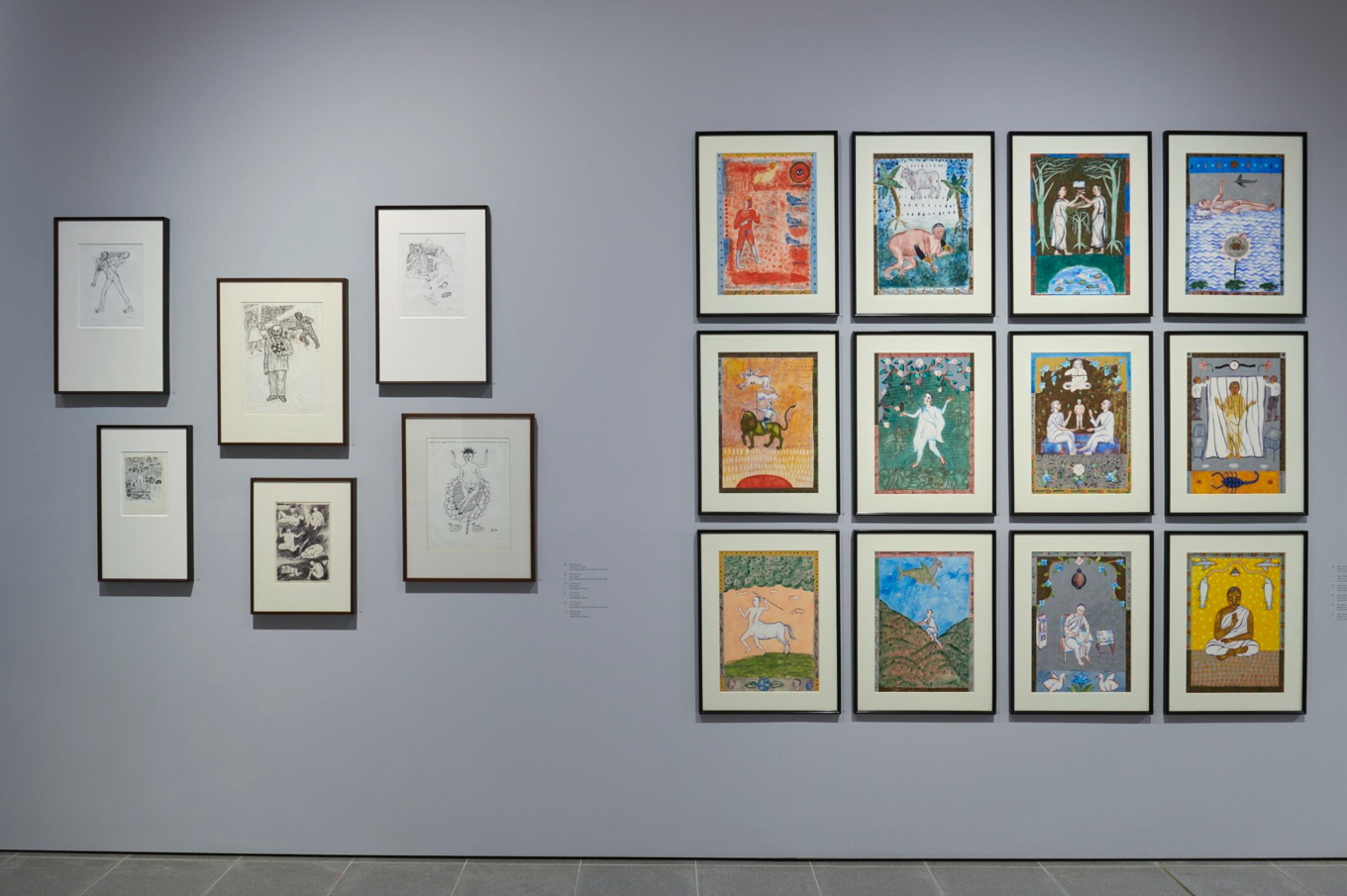
Drawings and etchings

There are actually two exhibitions. The one of Thiebaud’s paintings is up in the third floor. A floor below (and easy to miss because of its small doorway) the small gallery devoted to drawings hosts a display of 17 prints and etchings Thiebaud made in the same period (the 1960s). It’s mostly black-and-white prints although four of them have been hand coloured. The display focuses on a portfolio of 17 prints which were published in a 1965 edition titled ‘Delights’.

Two obvious contrasts with the often fairly large paintings in the main display. 1) They’re small, generally A4 size or smaller. 2) They’re flat. They have none of the glossy, gloopy, brushstroke-dominated surface of the paintings. Instead they feel flat and chaste and restrained. Tidy. Sweet (in two senses, given the cakey subject matter).

But they’re almost all of the same very limited topics. Cakes and more cakes, mostly black and white, a few coloured in. An exciting exception is the plate of bacon and eggs.

I sort of liked them, or respected the craftsmanship. In their rather scratchy, sketchy approach they reminded me of the early drawings of David Hockney, which I don’t like very much. The one I liked most was the least characteristic because it was made using graphite i.e. had the warmth and shading of a charcoal drawing, the kind of thing I am more drawn to. It’s a depiction of salt and pepper shakers on a café table. I can’t find it anywhere online so here’s my terrible photo of it.

Installation view of Untitled (Sugar, salt and pepper) by Wayne Thiebaud @ the Courtauld Gallery (photo by the author)

For Thiebaud completists, there’s a display case containing a first edition of Delights, with a list of all the prints it contained, alongside a display of his etching tools.

Display case containing a first edition of ‘Delights’ alongside Wayne Thiebaud’s etching equipment: note his magnifying glasses at centre back @ the Courtauld Gallery (photo by the author)


Related links

Related reviews

Arpita Singh: Remembering @ Serpentine North

There are two Serpentine galleries, one north of the bridge over the lake, one south of it.

Currently on show at Serpentine North is the first solo exhibition ever to be held outside India by the Indian woman artist Arpita Singh (born 1937). Here’s her Wikipedia entry:

From the show’s posters and publicity material I didn’t think I’d like it and initially I didn’t – but slowly, slowly I changed my mind and eventually came round to finding it an interesting, memorable and even haunting show.

A show of two halves

For me there was one big fact about the exhibition: the Serpentine North Gallery is a converted armoury with a perimeter corridor running round three sides of a square with big white walls suitable for hanging big works. In the middle, two distinct passages or long narrow rooms run between the two opposite sides of the square. These darker spaces retain the original dark brickwork and are suitable for hanging smaller works. I learned from a gallery assistant that the staff refer to the white outer corridor, as The Perimeter, and the two cut-through passages as The Powders.

Entrances to the two powder rooms from the main perimeter corridor. Compare the large oil painting in the perimeter with the set of much smaller works just visible on the wall in the first powder room. At ‘Arpita Singh, Remembering’ at Serpentine North © Photo: Jo Underhill. Courtesy Arpita Singh and Serpentine

The Perimeter: big oil paintings

So, as with other shows, the Perimeter hosts a series of big works, unglazed oil paintings which span Singh’s long career, from the 1960s to the present day, evolving from the big, through extra large, to the final handful of works which are Enormous.

I can confidently say that I didn’t like any of these. I reacted badly to what I took to be the badness of the draughtsmanship, the busy-ness of the compositions which overflow with loads of inconsequential details without any focus, teeming with cartoon-simple human figures and cars or airplanes or buildings or other objects which a 7-year-old might be ashamed of painting – all depicted amid the choppy seas effect of the impasto i.e. unattractive ridges and whirls of thick oil paint.

One of the very big, very cluttered oil paintings at ‘Arpita Singh, Remembering’ at Serpentine North © Photo: Jo Underhill. Courtesy Arpita Singh and Serpentine

And they felt very alien. They felt like they come from a completely alien tradition, one which cares nothing for all the Western achievements of perspective and depth and pictorial realism – in preference for a highly stylised notion of what a painting is, which comes closer to a depthless, perspectiveless, shapeless clutter of human figures, maps, roads, buildings, all out of perspective and filling every available inch of the space as a child would do.

My Lollipop City: Gemini Rising by Arpita Singh (2005) Vadehra Art Gallery © Arpita Singh

The Powders: smaller acrylics

BUT… Big but… when I went into the ‘powders’, the two smaller, more intimate spaces, something happened. I began to like the works here and, given time and sympathy, ended up really liking many of them. Why?

Smaller

Well, they’re all a lot smaller than the monsters in the Perimeter. I can’t quite put into words why this felt important but somehow they were easier to relate to.

Sets

They often come in sets or series, like the series of her reworking of the 12 signs of the Zodiac, and when seen like this her apparently random, childlike imagery becomes more accessible and more likeable, when seen in recurring settings.

Installation view of ‘Arpita Singh: Remembering’ at Serpentine North showing a set of pen and ink drawings on the left, and the 12 acrylic versions of the Zodiac on the right © Photo by Jo Underhill. Courtesy Arpita Singh and Serpentine

Acrylic

A really important reason was the significant difference in psychovisual impact between the big heavily layered oil paintings and the far more muted acrylic and watercolour works. The latter are not only smaller but the lack of surface agitation found in the oil paintings somehow made them seem a lot more calm and civilised. Less hysterical maybe, more serene.

Fewer human figures

And this lack of surface busy-ness, greater calmness, allows you to savour and enjoy the figures more. Some of the larger ones still have lots of figures in but many don’t. In many of them the figures are fewer, bigger and so more impactful, more interesting.

Mysterious

And a lot more beguiling. In the huge oil paintings so much is going on that it’s hard to care. In these smaller, more intimate acrylics and watercolours there’s more time to ponder the compositions and wonder what’s going on.

Influences

The curators tell us that Singh’s art draws on Bengali folk art and Indian stories, interwoven with experiences of social upheaval and global conflict, and that her style is a mashup of Surrealism, figuration, abstraction and Indian Court paintings. And it’s true, at various points all these can be seen: the first few big oil paintings are flat smooth Surreal depictions of random symbols that might have been by the Surrealist Leonora Carrington, while in one of the Powders there are early pen and black ink drawings which might have been by Paul Klee. And the flatness and decorativeness of the images, with a lack of concern for perspective reminded me of the Mughal-era courtly Indian paintings you can see at the Victoria and Albert Museum.

Urban settings

Except that these aren’t in any sense courtly figures. The opposite, they feel like men and women from very modern urban environments, people trapped within or struggling against their environments. In many of them the city seems to be represented by a kind of simple version of an A to Z or city map, showing various roads, all forking and branching out behind the human figures. Some of these lines are blue and so might represent a river (?).

One of the best of these urban alienation images shows what seems to be the same figure of a woman dressed in a black burqa, bent over in various postures of struggling to battle her way through a city represented by what looks like images of a skyscraper (rows of rectangular windows) which has been torn into pieces and scattered around the surface.

Reviewing all this made me think there’s something of Franz Kafka in Singh’s depiction of the city as a challenge, puzzle and maze.

Technology

Onto these child’s-style views of cities are often pasted images of modern technology. Two which recur are cars or taxis stuffed with her primitive figures, or airplanes flying in her childlike sky.

Lesser Myth by Arpita Singh (2006) Courtesy of Vadehra Family Collection © Arpita Singh

Naked women

Arpita Singh is, of course, a feminist, and the two feminist curators of the exhibition (Tamsin Hong and Liz Stumpf) point out that:

Since the 1990s, Singh has increasingly explored themes of motherhood, the aging female form, feminine sensuality, vulnerability, and violence, demonstrating the impact of relationships and external events on the emotional and psychological landscape of the artist. Her works are intimate portrayals of domestic and inner life but are equally concerned with the experiences of women navigating the outside world.

This, I think, is true but what I came to actively like was the way she portrays women; was the way her drastically unwestern eye or style extends to the way she portrays women. It turns out that the rather childlike, gawky style, which doesn’t give a damn about western realism, means that her images of women capture something completely other, different. Western iconography of women is so dominated by the Christian church for 1,000 years and then by the male gaze for the last 500 years, that it’s all but impossible for any depiction of women to escape its clutches. But Singh’s women do. Escape, I mean.

They are obviously ‘adult’ in the sense that they are often naked or wearing diaphanous outfits and she goes to some lengths to depict the women’s vulva, labia etc. In western hands this might be unavoidably graphic and problematic. But somehow, in Singh’s childlike, non-western iconography, it begins to say something else. Something about women’s privacy, integrity, distinctiveness. It’s not salacious. It doesn’t sexualise women in any way. It just emphasises that women are.

A Feminine Tale by Arpita Singh (1995) Courtesy of Taimur Hassan Collection © Arpita Singh, Photo by Justin Piperger

There’s a linked set of images of women pulling transparent saris or fabrics round their bodies which are nothing like the stately dressed aristocratic ladies of Bengali court painting but… but somehow, they bespeak an entirely modern, late 20th century reality of women’s lives and independence. It’s hard to put into words but the more I saw of these, the more I felt like I was entering a really, genuinely, alien and alternative artistic world.

Threatening men

One of the woman wrapping herself in a sari has half a dozen much smaller male figures pulling it down or pinning it down around her and you can feel her resistance to this male… what? Something. Power. Oppression. And you can feel this atmosphere of resistance throughout.

Or take this dense painting. Note the familiar recurring motifs. There’s lots of text all over the work. The women figures are by no stretch of the imagination in any way created for the male gaze but instead express something important but inscrutable about women’s independence. The green line, is it the tendril of some plant? The orange cloth behind the women, is it a curtain or spread of some kind or a sort of map, a sort of tangled A to Z.

Buy Two, Get Two Free by Arpita Singh (2007) Private Collection © Arpita Singh

So the men with the binoculars, are they peeping Toms, are they looking through windows to get a glimpse of scantily clad women? In which case the birds at the top, are they vultures? In which case do the vultures ‘symbolise’ the men, picking over the scraps of women’s bodies chopped up by binocular vision, picking over scraps, exploiters and parasites? Or is the iconography more complex than that? And what do the two trees or bushes with orange heads have to with anything?

Resisting interpretation

This brings us to one of Singh’s strongest points which is that she is not programmatic. Lots of the works have words in, lots of words, mostly in English (why? why not in Bengali or any other Indian language?) as the three images above indicate. ‘Fun Fun Everyone’ are the biggest words visible in ‘Lesser Myth’ amid what seem to be newspaper fragments cut out and collaged together. But what does it really mean? And why are there nine lionesses in the picture? And why is a naked woman riding one of them? And what are the two men in suits at the bottom talking about? And why are there two half-dressed men crammed into one of her characteristically dinky cars? And why is the man in the couple at the top holding a pistol over the woman’s shoulders and why is her arm bent up to support it? And why are there lots of red rose bushes everywhere (or are they hibiscus or some other bright bush native to India which I’m completely ignorant of)?

The pleasure of mystery

It is actively enjoyable not to know the answers to these questions. The more of her acrylic and watercolour work I looked at, the more beguiled I became. All that writing feels as if she has something very important to say and yet all the texts tempt and tease and then veer away, turning out to be more elliptical and obscure than they first appear. And this is very enjoyable.

And there are lots of them. The exhibition features a rather staggering 165 works. I hope I’ve conveyed my journey to you, from initial dislike and scepticism, through slow understanding, and letting the works teach me how to see them, until I felt I had, to some extent, entered her world, a world really very far removed from my own culture and experiences. And that’s what art can do, so well.


Related links

Related reviews

Van Gogh: Poets and Lovers @ the National Gallery

Obviously this is an absolutely fabulous, to-die-for, once-in-a-century exhibition, 61 works showcasing van Gogh’s genius, half a dozen of them super-world famous classics (Self portrait, Starry Night over the Rhône, Sunflowers, Van Gogh’s Chair), many of them about as thrilling an encounter with a work of art as you could possibly imagine.

Self-Portrait by Vincent Van Gogh (1889) Image Courtesy National Gallery of Art, Washington

Surprisingly, this is the first van Gogh exhibition ever staged at the National Gallery; it’s been timed to commemorate a century since the Gallery bought the famous Sunflower and Chair paintings. But, as NG Director Gabriele Finaldi put it, a centenary isn’t enough – ‘every exhibition needs to have an idea, a concept’ and this one is no exception. It is very much a show with a thesis or argument to make, which it maintains across its six big exhibition rooms (which are):

  • Room 1 Introduction
  • Room 2 The Garden: Poetic Interpretations
  • Room 3 The Yellow House: An Artist’s Home
  • Room 4 Montmajour: A Series
  • Room 5 Decoration
  • Room 6 Variations on a Theme

And the thesis which holds it all together? Rather than summarise I’ll let the curators explain in their own words:

In February 1888, the Dutch artist Vincent van Gogh (1853 to 1890) went to live and work in the South of France. Over the next two years, in both Arles and Saint-Rémyde-Provence, he created an extraordinary and innovative body of work in which he transformed the people and places he encountered in life. Parks, landscapes and corners of nature became highly expressive, idealised spaces full of literary and poetic references. Similarly, Van Gogh chose individuals from his new surroundings to create portraits of symbolic types, such as The Poet or The Lover.

The careful planning behind Van Gogh’s art extended to creating works in groups or series, and to thinking about how these might be displayed both at his home in Arles and for exhibition in Paris. By gathering a selection of his most famous and beloved creations – and showing them alongside his carefully developed works on paper, a less familiar Van Gogh emerges: an intellectual artist of lucid intention, deliberation and great ambition.

So the curators raise and address about five themes (the ones I’ve put in bold, plus one more which emerges later):

1. Painting archetypes

So this is why the introductory room has just three paintings in it, all of which have the kind of generic, typical titles the curators are talking about, being The Lover, The Poet and the Poet’s Garden. And, indeed, why the entire show is titled ‘Van Gogh: Poets and Lovers’.

In later rooms we see many more paintings of The Garden, along with image of the beautiful Woman of Arles and The Peasant. The idea is to impress us that van Gogh was seeking for archetypes behind the everyday.

2. Literary references and poetic effects

On the walls are quotes from van Gogh’s letters which have been selected to show how he invoked poets and writers as he thought about his painting. Thus the park at Arles is said to be worthy of Dante or Petrarch while, later on (in the room full of landscape drawings) he says the countryside of Montmajour outside Arles strongly reminds him of a favourite Émile Zola novel, ‘The Sin of Abbé Mouret’. Wherever possible, the curators quote Vincent referring to literature or reflecting how views, scenes and people remind him of literary types.

3. Drawing

Room 4 is devoted to showing six amazing drawings. Drawings, being quicker and easier, are more given to being conceived as sets or series than paintings, which are often unique one-off works. As the curators put it:

Van Gogh marvelled at the landscapes surrounding Arles, some of which put him in mind of places mentioned in his favourite novels. Among the most evocative were the grounds surrounding the ruined 12th century Montmajour Abbey, a well-known landmark north of Arles. After making a number of drawings of Montmajour in May 1888, he returned in July to create a series of large-scale works on paper. These remarkable drawings depict a hybrid place; at once the result of meticulous observation and the artist’s imagination.

According to the curators it was during van Gogh’s 2-year sojourn that he realised for the first time that he could really draw, as opposed to paint, and the drawings here show him revelling in that discovery.

Landscape near the Abbey of Montmajour by Vincent van Gogh (1888) © Rijksmuseum, Amsterdam

4. Series

In Room 2 we see quite a few paintings on the theme of the garden, specifically 1) the public gardens at Arles and 2) the garden at the hospital of Saint-Paul de Mausole at Saint-Rémy-de-Provence where he admitted himself in May 1889 after a series of mental breakdowns in the preceding months.

Later on, the last room – Room 6: Variations on a theme – shows how he worked on series or sets depicting variations on several themes, notably 1) the Arles woman, 2) views of the mountains and 3) most brilliantly of all, an amazing series of paintings of wild, writhing olive groves.

Olive trees with the Alpilles in the Background by Vincent Van Gogh (1889) © The Museum of Modern Art, New York/Scala, Florence

5. Displaying his work

Finally, the idea that van Gogh put a lot of thought into how he wanted his work displayed. This is based on what he did with the house he rented in Arles.

Initially Van Gogh only used the Yellow House, which he rented in early May 1888, as a studio because it needed both renovation and furniture. By September he moved in and had bold plans to turn the modest house into an ‘artist’s home’ and a communal ‘studio of the South’ in which his artist friends from Paris could join him to work. He devised a decoration for the house that included his major paintings. This then evolved into carefully conceived ideas about how to present his
art to the public.

So, again, the curators are are at pains to overhaul the image of van Gogh as a kind of naive or mad genius, instead bringing out the sophisticated, calculating, planning and designing part of his personality. A lot of the evidence for this is based on the famous painting of his bedroom.

The Bedroom by Vincent van Gogh (1889) © The Art Institute of Chicago

All very casual, you might think, but the curators bring out van Gogh’s conscious effort to hang and display his works in a deliberate way to create an effect and so describe the 6 paintings you can see hanging in this picture, what they meant to the artist, and why he arranged them the way he did.

6. In the studio

Not mentioned in the curators’ initial survey, as the show progresses another theme emerges, which is Van Gogh’s work painting in the studio, composing scenes from memory.

It came as a surprise to learn that when he was a patient in the asylum he was given a room as a studio to paint in. Some of the paintings in The Garden part of the show (Room 2) depict the view from this ‘studio’ out over the asylum gardens, but we also learn that – in line with the curators’ emphasis on the artifice and intentionality of his work – a number of paintings were painted entirely in the studio, from memory and imagination, as he mixed and matched elements from the real world to achieve a creative and ‘poetic’ effect.

A small example is how in the classic ‘Starry Night over the Rhône’ can Gogh added in the constellation of stars in the sky and the lovers walking in the foreground, to create the poetic effect.

Starry Night over the Rhône by Vincent van Gogh (1888) Photo © Musée d’Orsay, Dist. RMN-Grand Palais / Patrice Schmidt

Larger-scale inventions included adding trees to the garden views of the asylum, along with female figures (which we know are fictional because no women were allowed into the asylum).

And, in the last room, we see many more examples of this invention: landscapes where he added in mountain backdrops to fields or groves which didn’t, in reality, have them. And learn that, lastly, the fabulous rhythmic elements in the paintings of olive trees which cover the last wall in the show, were products of the studio i.e. depicting trees and landscape which he’d certainly seen, but reconfiguring their shapes and layout to create the swirling rhythm he was seeking (see below).

Drawings

I’ve mentioned drawing several times. I think about a dozen of the 61 works are drawings and they serve a number of purposes:

One, they are preparatory studies. Vincent drew and sketched a scene before he painted it to work out his composition and treatment. This applies to the several drawings of the garden at the asylum which he made before he painted the scene.

2) Sometimes he made a drawing after he’d made the painting. These were drawings he sent to his brother Theo as quick guides to paintings he had just made and was describing.

3) Lastly, as indicated above, he realised that he could make series of drawings with a thematic unity, that drawing was a new and distinct medium separate from oil painting. Hence, as I’ve mentioned, the room here devoted to the six brilliant Monmajour drawings.

What you get from the drawings (apart from their intrinsic beauty) is a sense of how his pictures are built up from different types of markings. There are lots of the arrays of dashes and hatching, blizzards of centimetre-long rectangular marks, in sets or groups which you see in the paintings. But there are also dots, intense patches of cross-hatching. If I were a teacher I’d ask my pupils to count how many different types of hatching, shading, stippling and so on he uses in this drawing.

The Rock of Montmajour with Pine Trees by Vincent van Gogh (1888) Van Gogh Museum, Amsterdam

In this respect the drawings are like x-rays of the paintings. In the paintings you can see the same technique at work but the paint is ‘joined up’ to cover the whole canvas, creating a kind of continuous sea of marks and ridges. In the drawings the marks remain isolated, more distinct, much clearer. In this sense the drawings are much more conventional but still radiate the Vincent intensity.

And it’s fascinating to learn that all the drawings were done with reed-pens and quills that he carved and made himself.

Impasto

Impasto is the Italian word used as a technical term in painting and meaning ‘the process or technique of laying on paint or pigment thickly so that it stands out from a surface’ – and, my God! van Gogh is a genius at it.

All the reproductions in this review are useless. They make the paintings seem flat and slick whereas, in the flesh, they are tormented with whorls and ridges of paint applied as with a trowel, building up landscapes of paint across the surface which work with or against the landscapes of the composition. Here a close-up of leaves on an autumnal tree.

Detail of The Public Garden, Arles, by Vincent van Gogh (1888) (photo by the author)

Seeing them so close up, seeing the great ridges of impassioned paint, is like being swept up in a maelstrom of emotions.

Detail of Starry Night over the Rhône by Vincent van Gogh (1888) (photo by the author)

The tiles on the floor of the famous picture of his chair seem to be melting and reforming, rising and rippling from the surface.

Detail of van Gogh’s Chair by Vincent van Gogh (1888) © The National Gallery, London (photo by the author)

In some his technique goes way over the edge, leaving realistic depiction far behind in the really heavy, clotted effect seen in the frankly bizarre ‘The Green Vineyard’.

Detail of The Green Vineyard by Vincent van Gogh (1888) (photo by the author)

This felt like an experiment which he took as far as he could in a particular direction, although there are one or two others of the same murky heaviness. And yet in the same painting, he uses the same technique to create a bird-haunted sky with spectacular results. You feel as you’re entering another universe.

Detail of The Green Vineyard by Vincent van Gogh (1888) (photo by the author)

Maybe simply because it was hung at head height so that my eyes were exactly level with it, but I found that in the painting of his bedroom it wasn’t the table or chairs or paintings hanging on the wall, but the wooden floor which I became more and more mesmerised by, transfixed by.

Detail of The Bedroom by Vincent van Gogh (1889) photo by the author)

Amazing! It’s like a modern abstract painting, a delirious adventure of industrial green and scrappy pink, sculpted into abstract patterns. It feels like the paint has not been applied but has been scraped away to reveal another world beyond, as if we’re peering through a dirty windowpane into a different reality.

Genius

It’s not very often you find yourself in the presence of real genius but in painting after painting, and before some of the drawings, you feel yourself in the presence of a mighty power, a primal energy, a supernatural ability to carve and sculpt blotches and pads of primary colours so as to create great swirling images overflowing with life and energy. I was spellbound, I was overcome, I kept going back to the ones I really liked, it was like drinking sweet wine or strong liqueurs, drinking at the fountainhead, fuelling my eyes and soul.

More masterpieces

Van Gogh’s chair (in which, as I’ve said, it was the floor tiles which got me).

Van Gogh’s Chair by Vincent van Gogh (1888) © The National Gallery, London

The exhibition for the first time brings together two paintings of sunflowers, the one the National Gallery owns hung alongside the one owned by the Philadelphia Museum of Art, reuniting them for the first time since they were painted.

Sunflowers by Vincent van Gogh (1888) © The National Gallery, London

Another example of the vivid depictions of an olive grove which hang side by side in the last room, creating a tremendous impression.

Olive Grove by Vincent van Gogh (1889) © Photo: Gothenburg Museum of Art / Hossein Sehatlou

And an example of maybe his quieter more domestic style, one among several still lives and studies of flowers, in this case a vase of oleanders but still done with his vibrant use of dramatic colour contrast and, when you look close, great swirls of impasto paint.

Oleanders by Vincent van Gogh (1888) © The Metropolitan Museum of Art, New York

The promotional video

This is the best exhibition in London for years, outclassing everything else. Go along and be rhapsodised and bewitched by works of unique genius and intensity.


Related links

Related reviews