Haegue Yang: Leap Year @ the Hayward Gallery

‘Leap Year’ is the first major UK survey of female South Korean artist, Haegue Yang, ‘one of the world’s most pioneering artists’. It covers her work from 1995 to the present day and includes three major new commissions and several new productions.

It’s a fun show, big, bright, bold, inventive, combining all kinds of materials to make sculptures large and small, collages, hangings, videos and even a ‘sensorial installation.’ Some are more immediately appealing than others, some you get straightaway, some require a bit of reading up about the traditional crafts or media she is invoking, quoting or combining. So you notice something new each time you go round. I did the tour three times. The central elements of her work are:

1. Sculptures: It’s almost all sculpture – there are actually quite a few collages, lots of prints and maybe 6 or 7 videos, but it’s the big sculptures and installations which strike you first and foremost.

2. Materials: Yang’s sculptures are made from a wide variety of materials. Her works often feature a variety of household and industrial objects including drying racks, light bulbs, metal-plated bells, nylon pom-poms, hand-knitted yarn and hanji (Korean paper).

3. Multicultural: It is extremely multicultural. Yang includes traditions and folklore from her homeland, Korea, but also magpies themes, ideas, craft and fabric practices and traditions from all round the world. (Half way through the show we hear about her interest in her interest in paper cutting traditions from other cultures including wycinanki from Poland, amate by the Otomi people of the Americas, and pabalat from the Philippines).

The exhibition is arranged into five thematic zones. To be honest my own experience of it cut across the formal zone ideas. I experienced it more as ‘rooms’, each with a particular vibe and highlights, so that’s how I’ll describe them in what follows.

Room 1

You enter through a curtain of blue and silver stainless-steel bells suspended from a characteristic Korean wooden porch structure. This is ‘Sonic Droplets in Gradation – Water Veil’ (2024), part of Yang’s ongoing Sonic Sculptures series. Visitors are invited to walk through a curtain of blue and silver stainless-steel bells which trigger ‘sonic reverberations’. This is one of the three installations created for this exhibition.

Installation view of Haegue Yang: Leap Year at the Hayward Gallery showing the bead curtain you have to walk through to enter (photo by the author)

What hits you in the first room is two obvious elements:

Installation view of Haegue Yang: Leap Year at the Hayward Gallery showing ‘Non-Indépliables, nues’ (photo by the author)

1) the huge collage on the far wall on the left, which is titled ‘Drip Drop Blob Dance – Trustworthy #228’, from 2013

and 2) the way the space is filled with a variety of plastic clothes horses, stacked across each other and festooned with lights. These are ‘Non-Indépliables, nues’, composed of drying racks, light bulbs, cables, zip ties and terminal strips. The idea is that these everyday domestic objects have been transformed into ‘expressive sculptural beings’ that perform delicate balancing acts or complex acrobatic poses. The French title ‘non-indépliable’ translates as ‘non-unfoldable’.

Once you’ve explored the impact of both these works, you come down to a smaller scale and realise there are some chairs for you to sit on and watch slides being projected on the wall. This is ‘Dehors’ (2006), two slide projectors projecting two sets of 81 colour slides in a loop.

Room 2

You go up the ramp (on the right in the photo above) into the second room or space which is arguably the best, certainly the one that’s used in all the posters and promotional material. The salient elements are:

  1. a set of spectacularly large and colourful abstract sculptures
  2. which are joined by geometric shapes, spirals, checkerboards, dots and fragmented lines drawn onto the floor – these are, apparently, inspired by meteorological charts
  3. and on the wall a series of big black and white collages using striking, humorous black and white photos

Here’s a wide view of the two most vivid sculptures with some of the amusing collages in the background. The two sculptures are, left to right, ‘The Randing Intermediate – Earth Alienage Rising Sporing’ and ‘The Randing Intermediate – Sea Alienage Fanned-Out Bang’. Great names, aren’t they, as preposterous as the objects themselves.

Installation view of Haegue Yang: Leap Year at the Hayward Gallery showing ‘The Randing Intermediates’ in the foreground and ‘Eclectic Totemic’ on the walls (photo by Mark Blower)

They are, apparently, made from naturally dyed rattan and were created in collaboration with local artisans in the Philippines using the basic weaving technique called randing, where a single wicker is woven onto a sculptural frame. The colourful zoomorphic shapes are said to resemble sea creatures or spores although they reminded me of the fantastical fossilised creatures from the Burgess Shale which Stephen Jay Gould describes in his book ‘Wonderful Life‘. When you look closer you can see they are topped with artificial plants, making them feel even more bizarre.

And here’s the same room from the other side, showing not only another sculpture and collage but also one of the half dozen geometric sculptures with neon lights hanging from the ceiling. The floor sculpture made from panels with differently patterned tinsel across them is ‘Sonic Dress Vehicle – Hulky Head’ from 2018. I think the orange one with neon hanging from the ceiling is titled ‘Stacked Corners – Ventilating Orange and Blue Square’ from 2022. Note how the basic element is a set of Venetian blinds which have been coloured orange and blue. We’ll be hearing a lot more about Venetian blinds.

Installation view of Haegue Yang: Leap Year at the Hayward Gallery showing ‘Sonic Dress Vehicle – Hulky Head’ and ‘Stacked Corners – Ventilating Orange and Blue Square’ (photo by the author)

Room 3

Then you go downstairs and into a room filled with these guys. They’re great. Not as multi-coloured as the ‘The Randing Intermediates’, to me they had more of an African vibe, the two on the right looking like the thatching from tribal huts. Although the one I thought most African is in fact titled ‘Chinese bride’. Completely wrong. Oh well.

Installation view of Haegue Yang: Leap Year at the Hayward Gallery showing ‘The Intermediates – Dancing in Woven Masks’ (photo by the author)

In fact they’re titled ‘The Intermediates – Dancing in Woven Masks’ from 2015. A propos of Yang’s use of disparate materials, these guys are made of:

Artificial straw, powder-coated steel frame, powdercoated mesh, casters, plastic raffia string, jute twine, cotton twine, knitting yarn, cord, folkloric tricolour band, root carving, artificial plants, gourds, Korean bridal crowns, artificial feathers, artificial seaweed, barnacles, abalone shells, sea shells, conch shells, metal basket, palm tree basket, coconut basket, wood perches, bird toys, trumpet, rubber object, Indian bells, bells, metal chain, split rings.

And they blend various motifs from traditional Korean cultural rituals, dances and festivals. As to what they mean, like all Yang’s works, like everything in the exhibition, there is no real guide or instruction on what to think or how to interpret them. There they are. Make of them what you will.

On a partition to the right of the Intermediates is a set of coloured paper collages, subtly made using Korean paper folding techniques.

Beyond the partition is another space, probably part of the same ‘zone’, whose walls are lined with works which, as you can see, combine woodwork and fabric decoration with 2D images, the whole design obviously referencing East Asian architecture and design. These are examples of the series ‘Mesmerizing Mesh’ (2021 to the present) collages which reference ‘sacred and ritualistic paper objects related to shamanism and folk or pagan traditions’. The wooden shrine-like or ‘enshrinement’ was inspired by the shamanistic home altars of the Hmong people from South East Asia.

Installation view of Haegue Yang: Leap Year at the Hayward Gallery showing pieces from the ‘Mesmerizing Mesh’ series (photo by the author)

In the middle of the room is another dramatic sculptural ensemble with a powerful mashup of zoomorphic shapes and metal household objects. The round one in the foreground is ‘The Intermediate – Psychic Turbine Vents Ball’ (2017), the one on the left ‘Dry Spell at Villeperdue’ (2016), the one with the gold curtain strands is ‘Sonic Fabric over Brass Plated Web’ (2015).

Installation view of Haegue Yang: Leap Year at the Hayward Gallery, showing ‘The Intermediate – Psychic Turbine Vents Ball’, ‘Dry Spell at Villeperdue’ and ‘Sonic Fabric over Brass Plated Web’ (photo by the author)

There’s more, a video, little sculpture cone and ball made of what look like blue Christmas tree baubles, a large black and white abstract drawing, there’s always more, each time I visited a room I saw new things I hadn’t noticed first time round.

Room 4

In this room are some works on the wall, a series of her careful Lacquer Paintings but, again, you are struck by the big sculpture or, more properly, installation. After the brilliantly imagined sculptures of the previous couple of rooms, this is big but felt a bit underwhelming. On the left, partitioned off by a low rope, is an assembly of small tables and chairs, moveable fans, fenced off with a low rope fence. Beyond it you can see an assembly made of a wooden pallet, packages and beer crates. I think the whole ensemble is titled ‘Storage space’.

According to the curators, Storage space ‘conceived during a precarious and nomadic phase of her life when she was unable to afford to hire storage space for her artworks’. Usually I like sculptures made from industrial objects very much – having worked in a number of factories and warehouses I have a more than usual connection with them, I can imagine humping and lifting them, they give me a physical response, but not here. As you can see, they might have autobiographical significance for the artist but they’re not a patch on the spectacular abstract shapes in the previous couple of rooms.

Installation view of Haegue Yang: Leap Year at the Hayward Gallery showing ‘Storage space’ (photo by the author)

Room 5

Then you go up the stairs to the next space. This is devoted to a massive work made of sets of Venetian blinds. Coloured lights are projected through them which create a rippling dappling effect on the wall. This is one of the new commissions, ‘Star-Crossed Rendezvous after Yun’ (2024). This work features ascending layers of Venetian blinds in varying formations and colours that guide visitors through the space, alongside two breathing stage lights and a historic musical score.

Installation view of Haegue Yang: Leap Year at the Hayward Gallery showing ‘Star-Crossed Rendezvous after Yun’ (photo by the author)

It is ‘after Yun’ in a reference to the late Korean composer and political dissident Isang Yun (1917 to 1995). The work was inspired by Yun’s Double Concerto (1977), a classic of plinky-plonky avant-gardeism which sounds like this.

Unfortunately, when I was visiting, first thing in the morning, the music was not playing which was a big shame. The raw sparse music in the big white space filtered by flickering blinds would have been an intriguing experience.

The view

At the end of this space is a long wide window, part of the Hayward building, which looks out over Waterloo Bridge. Yang has filled the space beyond the window with water in which are inserted tiny toy windmills, 100 of them apparently. But the obvious thing is the reflection of the sky. Very chill, as my kids would say. It’s titled ‘Windy Terrace Beyond Reach’ and is, of course, specific to this site.

Installation view of Haegue Yang: Leap Year at the Hayward Gallery showing ‘Windy Terrace Beyond Reach’ (photo by the author)

Off to one side there’s a small periscope. The viewing part of it, where you put your eye, is really low, only a few feet off the ground, so either we’re meant to kneel down to look through it, or it is (thoughtfully) for children.

Room 6

This room is the largest and busiest. A lot is going on but your initial feel is that it involves a lot more Venetian blinds. Wide expanses of blinds hanging from the ceiling divide it into different zones with different things going on. According to the curators ‘Yang is drawn to Venetian blinds for their obliqueness, semi-transparent quality, and their capacity to divide and configure a space’, which you may or may not agree with as you walk round.

Installation view of Haegue Yang: Leap Year at the Hayward Gallery showing ‘Recollection of Sadong 30 – Version London’ (photo by the author)

I found it a bit hard to follow or understand, so I’ll quote the curators at length. The entre installation is titled ‘Recollection of Sadong 30 – Version London’ and is another of the installations which have been created especially for this show. It consists of: digital slideshow, digital colour print, corrugated roof, origami objects, fairy lights, light bulbs, plant, fan, plastic stools.

In 2006, Yang staged her first solo exhibition in Korea in her grandparent’s former home in Incheon, a city to the west of Seoul, using the address as the project’s title. She made the crumbling house accessible and carefully placed origami, light bulbs on stands, a dressed drying rack, frozen water bottles and an electric fan in the rooms. These objects later became recurrent motifs in her work. ‘Recollection of Sadong 30 – Version London’ is an attempt to recall this moment through recreations of some of the original objects, architectural elements and projections that provoke the visitor’s own experiences and sentiments around this seminal work.

So now you know. Among the units on the floor there are some heaters and, somewhere, some humidifiers. I think the aim is to walk into a sensory zone which makes you feel what it’s like to be in humid tropical Seoul rather than chilly windy London. Bolstering this effect are a number of videos Yang shot in Seoul of what looks like pretty straightforward street life and maybe even her backyard, with chairs arranged for you to sit and watch, as you can see in the photo above.

Each of the spaces, so carefully partitioned by hanging Venetian blinds, contains a different set of objects, videos or photos. Some contain what look like air conditioner units but made from blinds, illuminated with coloured lights. These no doubt have a resonant meaning but, strolling round them, felt a bit meh, particularly by comparison with the vivid works we saw downstairs.

Installation view of Haegue Yang: Leap Year at the Hayward Gallery showing part of ‘Recollection of Sadong 30 – Version London’ (photo by the author)

One of the most accessible pieces is a panel of blown-up black-and-white photos with fairy lights strewn across the floor in front of them. Photography is, after all, the easiest and most accessible of the arts, conveying countless more times information and atmosphere than any of the other random objects scattered across the floorspace.

Installation view of Haegue Yang: Leap Year at the Hayward Gallery showing part of ‘Recollection of Sadong 30 – Version London’ (photo by the author)

Venetian sinks

The last element I’ll note is that, off to one side of the main space, were a couple of stainless steel kitchen sinks which had been hung on the wall with (yet more) Venetian blinds hung over them and a bit of coloured lighting. I liked these for their strong surreal vibe. They are titled, with Yang’s characteristic fondness for long names, ‘Twelve Pyeongchang-gil Moisture – #AP MJ134’ and ‘Seven Dircksenstraße Moisture – #AP ZL10164’.

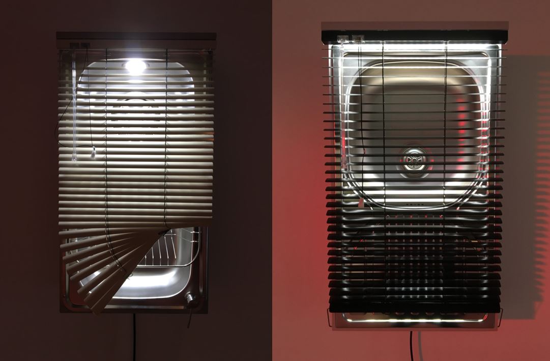
Installation view of Haegue Yang: Leap Year at the Hayward Gallery showing ‘Twelve Pyeongchang-gil Moisture – #AP MJ134’ and ‘Seven Dircksenstraße Moisture – #AP ZL10164’ (photo by the author)

Thoughts

I liked it, some bits more than others, but there’s a very wide range of types and sizes and forms of work here. The blockbuster sculptures are the obvious show stoppers but once you’ve taken them in, enjoyed walking round and marvelling at them, on the second go round I noticed a lot of quieter, subtler works on paper – collages and prints – which require a different sort of attention. Plus the half dozen or so videos, if you have the patience.

Installation view of Haegue Yang: Leap Year at the Hayward Gallery (photo by the author)

It’s not going to rock your world like the Van Gogh exhibition at the National Gallery or overawe you with Masters of Art like the Michelangelo and Leonardo show at the Royal Academy, but it’s light and fun and intriguing and pleasing in a way neither of those are, and an insight into the look and feel of bang up-to-date, international contemporary art. Give it a go.


Related link

Related reviews

Michael Craig-Martin @ the Royal Academy

What happens if a style of art is so accessible as to become almost transparent? That you can look at it and process and understand everything there is to see, with no hesitation or resistance? Where there are no barriers whatsoever to understanding the work, no hidden meaning to uncover, no secrets to decode, where what you see is exactly what you get?

Untitled (corkscrew) by Michael Craig-Martin (2014) © Michael Craig-Martin. Photo: Mike Bruce. Image courtesy of Gagosian

This is one of the questions raised by this massive and hugely enjoyable retrospective of the career of super-successful and instantly recognisable artist, Sir Michael Craig-Martin. As you can see by these examples, at a crucial turning point in the 1980s Craig-Martin stumbled across the fact that there was mileage in depicting common-or-garden everyday objects in the style of a Tintin cartoon i.e. with clear strong outlines, with no shading or inflection on the object itself, set against a pure plain background with no attempt at perspective or depth, with both object and background painted in single strong plain colours. What would happen then?

Common History: Conference by Michael Craig-Martin (1999) Courtesy Gagosian © Michael Craig-Martin. Image courtesy of Gagosian

Turns out what happens is that we realise we are surrounded everywhere we go – from waking in a bedroom, to pottering round the house, to commuting to an office – by objects so humdrum and everyday that nobody really pays attention to them. So why not make them stars of their own paintings?

Craig-Martin spent the first 20 years or more in the States and you can see the debt to Andy Warhol’s depiction of iconic consumer products like the Campbell’s soup cans or Coca Cola bottles in two ways: one is to consider the object in the abstract, devoid of setting and background, like a kind of designer’s diagram. The second is to bring out the genius of their design, by depicting them in such a pure form, concentrating just on lines and outlines, as to bring out the purity and clarity, the design intelligence which has gone into so many of the man-made things which surround us.

Craig-Martin’s paintings make everyday objects thrilling and so make everyday life thrilling.

Starting at the beginning

Born in 1941 (so he’s now 83) Craig-Martin attended art schools in Paris, America and London before starting to create works in the mid to late 1960s, hence the curators’ claim that this represents a summary of a 60-year-long career. Although he’s overwhelmingly known for the object paintings he has in fact worked in sculpture, installation, painting, drawing, printmaking and digital media, creating works that fuse elements of pop, minimalism and conceptual art.

Examples of all these media and approaches are here in what amounts to the largest and most comprehensive exhibition of Craig-Martin’s work ever held in the UK.

The show has a very straightforward chronological structure so room 1 displays his earliest works. They are heavily conceptual in that late-1960s way, in a way which reminded me of Yoko Ono i.e. you have to read the wall label to understand the concept the objects in front of you are fulfilling.

But you also notice that, right from the start, he was interested only in ready-made everyday objects like buckets, milk bottles and clipboards. For example ‘On the table’ which inverts your expectation that a table should be supported by four legs, whereas here it is supported by the objects which are on the table. But the real point is the everyday nature of the table, buckets and rope.

‘On the Table’ by Michael Craig-Martin (1970) Collection Irish Museum of Modern Art © Michael Craig-Martin. Image courtesy of Gagosian

I particularly liked ‘On the Shelf’ for the dramatic sense of jeopardy it creates, the visual cleverness of making the different amounts of water in each bottle create a continuous horizon line, but also because they’re Unigate milk bottles, which I remember from my boyhood.

Installation view of Michael Craig-Martin at the Royal Academy showing ‘On the shelf’ (1970) (photo by the author)

Other conceptual gags

I think of conceptual art as gags: what’s the joke, what’s the trick, what’s the gimmick, what’s the concept?  Apparently by the mid-1970s he felt he’d reached a dead end with the purely conceptual pieces and so reverted to drawing and painting on flat surfaces but using tricks or gags.

Thus a series of ‘Pictures within Pictures’. By inserting paintings found in London flea markets into the  top-left corner of blank canvases, he recontextualised the paintings in a way that ‘completely changed their meaning without changing them at all’.

In 1975 Craig-Martin began a series of ‘drawings’ in white neon, including ‘Reading Light’. His neon works were the first in which he drew rather than used real objects. As with his earliest pieces, the forms he used were primarily objects of daily use.

Installation view of Michael Craig-Martin at the Royal Academy showing ‘Reading light’ (1970) (photo by the author)

To quote the curators:

As part of his exploration of the basic elements of painting, Craig-Martin returned to the use of readymades by using Venetian blinds for this series. The artist’s use of these objects plays with considerations of colour, form, light and space, with their rectilinear shapes and solid colours suggesting a proximity to Abstract Expressionist colour-field painting. They also offer a metaphor for painting itself, framing a window onto the world.

Installation view of Michael Craig-Martin at the Royal Academy showing ‘Venetian blinds’ (1976) (photo by the author)

The invention of outlines

The curators:

In a 1978 landmark exhibition held at the Rowan Gallery, London, Craig-Martin debuted his large-scale wall drawings. Influenced by Marcel Duchamp’s use of prefabricated objects and Andy Warhol’s focus on pop culture, Craig-Martin continued to incorporate recognisable manufactured items that were, in his words, “more famous than famous. So famous that you don’t even notice them.”

He began producing drawings of ubiquitous items, using crepe tape on transparent acetate or drafting film, which were then projected and traced on the wall, again using tape. Through his choice of media, Craig-Martin sought to remove the artist’s ‘hand’ so as to reflect the impersonal character of mass-produced objects.

Installation view of Michael Craig-Martin at the Royal Academy showing ‘Reading with globe’ (1980), made from black tape attached to the bare wall (photo by the author)

This method also enabled him to layer several drawings of objects, leading to complex compositions. Craig-Martin chose a three-quarter view, showing each object slightly from above to emphasise its three-dimensionality.

In the early 1980s Craig-Martin began turning his drawings into wall-mounted sculptures, using thin metal rods. The linear simplicity of these drawings and sculptures became his hallmark and the foundation of his work to this day.

Installation view of Michael Craig-Martin at the Royal Academy showing ‘Seafood’ (1980) (photo by the author)

Eliminating style, creating a style

The curators:

Craig-Martin ‘draws’ with a particular type of crepe tape invented in the 1960s for electronic circuitry. As with his wall drawings, it allows Craig-Martin to achieve his ideal of making the works ‘styleless’, eliminating all trace of the artist’s ‘hand’. Ironically, in attempting to make his work style-free he has created a style that is immediately recognisable as his own.

The big room

All this is by way of explanation and foreplay before you walk into the enormous third room of the exhibition and are overwhelmed by the wall painted a solid Craig-Martin-ish green on which are hung ten ginormous works of his mature, object outline and plain colour paintings.

Installation view of the big green room in Michael Craig-Martin at the Royal Academy (photo by the author)

Beginning with two vibrantly coloured installations in 1993 and 1994, Craig-Martin’s output came to be dominated by site-specific painted installations. By the second half of the 1990s, he brought what these projects taught him to the more traditional medium of paint, which has remained at the heart of his  practice ever since.

The artist’s use of the computer from the early 1990s marked a creative turning point for him. It freed him to alter his drawings’ size and scale dramatically and gave access to an infinite range of colours. By the mid-2000s, as the world shifted from analogue to digital, he introduced depictions of laptops, mobile phones and memory sticks into his images, showing them from the front rather than from an angle.

Around that time, Craig-Martin moved from painting on canvas to using aluminium panels, the smooth surface allowing him to create flatter drawings and more even areas of colour.

Installation view of two paintings in the big green room in Michael Craig-Martin at the Royal Academy (photo by the author)

In around 2000, Craig-Martin began painting crowded groups of objects, packed in ambiguous spaces. Here, objects are placed so close together that the background disappears. The use of non-naturalistic colours and changes in scale disrupt our sense of familiarity with each object and invites the viewer, as Craig-Martin explains, “to pass that first stage of recognition to some kind of second step of actually looking, to consider how things exist in conjunction with each other”.

A classic example being ‘Eye of the storm’ on the left here, painted in 2003 (next to ‘Sharpener’, 2002).

Installation view of two paintings in the big green room in Michael Craig-Martin at the Royal Academy showing ‘Cassette’ (2002), ‘Eye of the storm’ (2003) and ‘Sharpener’ (2002) (photo by the author)

Variations on a theme

OK, so you’ve invented a striking, instantly identifiable look and brand which can be applied to more or less every domestic man-made object in the world. You could spend the rest of your life turning out thousands of these. Or you could play with what you’ve discovered and experiment with different approaches. And so:

Alphabet paintings

In the early 2000s, Craig-Martin embarked on a series of works in which he explored the relationship between text and image. He developed a ‘visual alphabet’ in which every letter was linked to an object, albeit with no apparent connection. For example, an umbrella represented the letter A, while a wine glass represented B and so on.

Word paintings

In the ‘Word Paintings’ gigantic letters spell out abstract concepts, such as ‘art’ or ‘death. They  are then overlaid with the drawings of the objects that correspond to each letter.

Installation view of ‘Death’ by Michael Craig-Martin at the Royal Academy (photo by the author)

In this spirit is ‘Painting’ from 2010 in which the letters are painting in bold capitals while the ghostly outline of his characteristic objects (handcuffs, coke can, safety pin) hover transparently over them.

In these paintings, the letters are filled with solid colour while the objects are outlines. This juxtaposition invites us to contemplate the relationship between abstract concepts and tangible things in our lives.

Untitled (painting) by Michael Craig-Martin (2010) Courtesy Gagosian © Michael Craig-Martin. Photo: Dave Morgan. Image courtesy of Gagosian

Sex, death, love, painting – to be honest, I found these themes or topics pretty banal. Then again, maybe that’s the point. The point is there’s almost nothing behind these works, there are no hidden meanings and when Craig-Martin and the curators talk about ‘eternal themes’ they really mean the most obvious, clichéd themes imaginable. Maybe there banality and obviousness is deliberate.

The only ones with a bit of wit were a series of three paintings making an image rhyme with the word depicted – so a portrait of a pair of pliers with the word LIARS written over the top,  a picture of a glove with the word LOVE. I found these just that little bit more interesting than ones with just ART or DEATH painted on them.

Installation view Michael Craig-Martin at the Royal Academy showing ‘Liars/pliers’ and ‘Love/glove’ on the left, with the more boring ‘Art’ on the right (photo by the author)

Riddle paintings

Craig-Martin creates playful visual puns by connecting a word and an object through rhyme. The so-called ‘Split Paintings’ invite the viewer to imagine a connection between two different objects that have been cut in half and placed alongside one another.

Installation view of two split paintings, being ‘Sardine tin/ handcuff’ and ‘Watch/sandal’, both from 2007, by Michael Craig-Martin at the Royal Academy (photo by the author)

Referencing modern art

Still want more variations? OK. Let’s apply this hugely distinctive outlines-and-bold-colours approach to classics of Western art. And so enormous Craig-Martin remixes of classics such as Édouard Manet’s ‘A Bar at the Folies-Bergère’, ‘Olympia’ and ‘Déjeuner sur l’herbe’, Georges Seurat’s ‘Bathers at Asnières’ and Diego Velázquez’s Las Meninas.

Installation view of Michael Craig-Martin at the Royal Academy showing Craig-Martin’s version of Édouard Manet’s ‘A Bar at the Folies-Bergère’, made in 2023 (photo by the author)

Two thoughts: 1) Craig-Martin has cannily chosen paintings which are themselves very strong in outlining and lack the swirl and confusion of thousands of other subjects. They’re half way to being Craig-Martinesque before he gives them the treatment.

Installation view of Michael Craig-Martin at the Royal Academy showing Craig-Martin’s version of Georges Seurat’s ‘Bathers at Asnières’, made in 2023 (photo by the author)

2) These interested me as being more or less the only works in the show which I actively didn’t like. It’s not spoofing old classics that’s the problem… it took a while for me to realise it’s because they feature people. At a stroke I realised absolutely every other image in the show is inanimate. Even when he does flowers, a bit later on, they are cut flowers, as you’d find them arranged in a vase. For some reason (for me, at any rate) Craig-Martined people just don’t work.

For inanimate household objects, his approach brings out unexpected beauty, especially of the design and outline of these goods, adding, amplifying, making them bigger and rather wonderful. When applied to people it has the opposite affect, of flattening them and so of draining them of meaning.

Doing Duchamp

As we’ve mentioned a number of times, right from the start of his career Craig-Martin has been interested in domestic objects which can also be seen as ‘ready-mades’. Ready-made was a term invented by Marcel Duchamp way back before the First World War for his habit of finding intriguing looking objects and simply placing them in art displays and calling them art. The most famous is the white porcelain urinal but there were others, wine racks and bicycle seats and whatnot.

Here, near the end of the show, are a set of works paying hommage to Duchamp and to his other inspiration, Andy Warhol, him of the soup cans and coke bottles. Both predecessors in finding immense beauty in carefully designed but mass produced everyday objects.

And so there’s a little set of works pastiching the design of Duchamp’s famous late work ‘the bride stripped bare’. I don’t think this adds very much to the original. More fun is a set of split prints this time small enough to fit into one group.

In these he’s chosen a set of iconic chair designs to go at the bottom of each print, accompanied by a classic piece of modern sculpture at the top. It’s a Where’s Wally challenge – can you identify the iconic objects in the top of each section? Top left are the bricks by Carl André, then a mobile by Alexander Calder, a ready-made wine rack by Marcel Duchamp then… it’s over to you!

Installation view of Michael Craig-Martin at the Royal Academy showing ‘Art and Design’ (2012) (photo by the author)

Interestingly:

Of all the objects the artist has drawn, Craig-Martin considers chairs to be the most varied in terms of design, material and execution. He says, ‘the role of designers is to invent; the role of artists is to
observe.’

And what a brilliant observer he is, in his own highly stylised, totally accessible and yet inimitable way.

Installation view of Michael Craig-Martin at the Royal Academy showing ‘Watch fragment’ (2015), ‘Zoom 2’ (2024), ‘Percussion’ (2022), ‘Strings’ (2022) (photo by the author)

Cosmos

From this big red room we walk into a big darkened room hosting Craig-Martin’s first fully immersive digital work of art. It uses more than 300 images of objects the artist has made over the past 45 years, making it a fitting work for a retrospective. The animated video has been developed with Daniel Jackson and the accompanying soundscape with Benji Fox. This is a very enjoyable experience, and the room was full of young people sitting and lying around and oohing and aahing at the pretty pictures and the varied modern ambient soundtrack. As was I.

Central Hall site-specific

Craig-Martin started creating room installations in 1993. The Royal Academy’s Central Hall has four big arched doorways and over each of them he has created an entertaining trademark image beautifully and amusingly mapping onto the arches. Very stylish, very amusing.

Installation view of Michael Craig-Martin at the Royal Academy showing the ‘headphones’ round one of the archways in the Central Hall (photo by the author)

Merch

Obviously there’s a load of merchandise in the shop, ranging from the stylish catalogue to a world of postcards, posters, tote bags and whatnot. But my eye was caught by these polished steel reliefs, titled (go on, guess) ‘Umbrella’ and ‘Book’ both designed and produced this year in a limited edition of 40. You can buy them to attach to your wall and impress visitors and guess how much? £5,400 each including VAT. Bargain. There’s your family Christmas presents solved 🙂

Metal

In the courtyard

Before you enter the show and after you emerge, a little dazed from all this dayglo brightness, in the courtyard to the Royal Academy stands a group of what the curators call ‘monumental sculptures by your man. Except they’re not monumental, are they? They’re actually the opposite of everything the word ‘monument’ suggests. They’re made in steel and painted with his trademark basic colours and were made this year, specially for this show. Designed to pose among and Instagram or Tiktok or Facebook yourself. What fun. What larks. Is this the most innocent art ever?

‘Umbrella’ and ‘Safety pin’ by Michael Craig-Martin in the Royal Academy courtyard (photo by the author)


Related links

Related reviews