Klimt / Schiele @ the Royal Academy

This exhibition is much more varied and interesting than the Royal Academy’s promotional material suggests. The main poster shows two female nudes with prominent nipples and, of the eight images further down the page, all but one are nudes, leading you to expect a festival of bottoms and boobs.

There certainly are plenty of nudes in the show, but there’s considerably more to it than that, and it’s the fuller, broader context which makes it so interesting and rewarding.

The pretext

Both Gustav Klimt (born July 1862) and Egon Schiele (born June 1890) died in 1918, Klimt 27 years older and much the more famous and successful figure, having developed a style which combined beautiful draughtsmanship with a fin-de-siecle and semi-symbolist fondness for placing his human figures within two-dimensional sheaths of glittering colours, most famously in 1908’s The Kiss. (Be warned: there is nothing this finished and this glamorous in this exhibition.)

The Kiss by Gustav Klimt (1908)

The Kiss by Gustav Klimt (1908)

Schiele was much under the older man’s influence throughout the 1900s (they first met in 1907) until around May 1910, when he himself realised he had broken through to find his own voice and style – basically Klimt unplugged, the same addiction to the human figure, to sensuous depictions of nudes, but with a ferociously modern, twisted, angular, abrasive sensuality.

To some extent, as the gallery notes make clear, this was the sensuality of poverty. Whereas Klimt ran a successful studio which won public commissions – painting complex ceiling schemes for grand buildings of Vienna’s Ringstraße, did a series of commissions for Vienna’s high society ladies and was married to Austrian fashion designer Emilie Louise Flöge who ran a successful fashion business, and so had access to all manner of sumptuous fabrics, in the latest designs, for his drawings and paintings – Schiele was barely 20 when he hit his stride, and lived in poorly furnished flats with a succession of ‘companions’, most of them even poorer than him, which is why so many of his women are wearing basic kit, stockings, a blouse, and not much else.

To mark the coincidental centenary of their deaths the Royal Academy has arranged to borrow 100 or so portraits, allegories, landscapes and erotic nudes by Klimt and Schiele from the Albertina Museum in Vienna, allowing visitors an amazing opportunity to see these powerful, skilled and stimulating works.

Six rooms

The exhibition is upstairs in the Sackler Wing of the Academy, and is divided into six rooms.

Room 1. Photos, early sketches and the Secession

Photos of Klimt as a middle aged man, in his trademark blue smock, early and very Victorian realist drawings. Next to early photos of Schiele adopting one of his art school poses.

Egon Schiele in Front of the painting ‘Shrines in the Forest’ (1915) by Johannes Fischer

Egon Schiele in Front of the painting ‘Shrines in the Forest’ (1915) by Johannes Fischer

This rooms explains Klimt’s rise to dominance of the Vienna art scene and his leadership of the ‘Secession’ of new young artists set up in 1897. There’s a Secession poster which Klimt designed, with a graceful image of Athena in 1903, next to the bitingly Expressionist picture of the selection board around a table which Schiele created for the 1918 Secession exhibition, after Klimt’s death.

Room 2. Klimt’s drawing process

This room is devoted to several sets or series of drawings Klimt made for grand allegorical projects. In 1894 he was commissioned to create three paintings to decorate the ceiling of the Great Hall of the University of Vienna and chose the subject of Philosophy, Medicine, and Jurisprudence. On display are a series of preparatory drawings for ‘Medicine’ which he conceived as a naked woman floating in space, feet towards us.

In 1902, Klimt finished the Beethoven Frieze for the Fourteenth Vienna Secessionist exhibition, and there are a number of sketches here for female figures. And several preparatory sketches for his 1905 oil painting, Three Ages of Woman, including a strikingly drawn naked middle-aged woman.

Standing older woman in profile (study for three Ages of Woman) by Gustav Klimt (1905)

Standing older woman in profile (study for three Ages of Woman) by Gustav Klimt (1905)

The most obvious thing about all the pieces in this room is none of them are coloured: they are literally just pencil drawings on paper. They allow you to examine and admire Klimt’s technique, and to understand better his interest in the surfaces and folds of the dresses his figures (almost all women) are wearing. But they lack all the exquisite finish and colour and golden luxuriance of his paintings.

It is, therefore, quite a shock and a pleasure to walk into the next room, which is packed with Egon Schiele’s vibrant colourful paintings.

Room 3. Schiele’s drawing process

You immediately notice that all the drawings in this room are coloured, very carefully and fully coloured. And I noticed that the strong angular outlines of Schiele’s figures are emphasised by often being drawn in black crayon as opposed to weak pencil. As if this wasn’t enough some of the most striking figures are outlined with a rough swathe of white gouache, which really makes them leap off the page. Exemplified in this nude.

Female Nude (1910) by Egon Schiele

Female Nude (1910) by Egon Schiele

Female nude also epitomises other Schiele traits:

  • the angularity of the anatomy – look at the painfully pointed hip and shoulderbone
  • the uncomfortableness of the pose – what’s happened to her right arm?
  • the attention to the hand which is long and heavily jointed, looking like a four-legged spider crawling up her side
  • the unashamed bluntness of the loins with their pubic hair
  • and the use of colour not so much to describe as to highlight and bring out the composition

The guide makes a central point:

Schiele frequently used watercolour and gouache in his works on paper, but rarely to create three dimensional modelling. Colour is employed expressively or as a graphic compositional device, similar to Klimt’s division of decorative surface pattern in his paintings.

Not all, but a number of the Klimt sketches in the previous room sketched in the face and body shape merely in order to allow him to create the characteristic series of whorls and geometric shapes across the fabric of women’s skirts and dress which obviously fascinated him. By contrast Schiele’s colours don’t even and smooth out, but create dramatic highlights which leap out of the image.

Not only is the shock of walking into this room like watching colour TV after black and white – it is also by far the most varied in subject matter.

Thus Schiele was arrested in April 1912 when a thirteen-year-old girl who had sought protection in the house he shared with his unmarried partner and model Wally Neuzil, was tracked down by her irate father. He was arrested on charges of seduction and abduction and ended up spending 24 days in Neulenbach prison before the case was dismissed. The exhibition displays five of the drawings and paintings he made during this brief incarceration, one is a full-body self-portrait, but four are of the interior of the prison and his cell. I liked the one of a chair with some handkerchiefs and a green scarf (?) draped over it.

Beside these were two striking and dynamic architectural studies of houses, showing how well Schiele’s strong black lines bring out the architectonics of anything, be it body or building. Alongside these a set of landscapes. I never knew Schiele painted landscapes, they tend to be eclipsed by the explicit nudes.

Field landscape (Kreuzberg near Krumau) 1910 by Egon Schiele

Field landscape (Kreuzberg near Krumau) 1910 by Egon Schiele

This reproduction doesn’t bring out how bright and vivid the greens of the field are. And next to these landscapes was a set of three drawings of chrysanthemums. Again, I had forgotten that Schiele made many flower studies.

White chrysanthemum by Egon Schiele (1910)

White chrysanthemum by Egon Schiele (1910)

Klimt may, for all I know, be the finer artist of the two, but in this exhibition, in this selection of their works hanging side by side, Schiele comes over as vastly more colourful, inventive, varied and dynamic.

Room 4. Klimt portraits

By the 1890s Klimt was a sought-after portrait painter for society ladies. He made his rich women appear tall, statuesque, elegant, often with fashionable dresses buttoned right up to the chin, and a carefully styled bouffant haircut. In the ten or so pencil drawings and sketches for portraits presented here, Klimt is obviously interested in the overall shape and, in some of them, the potential of the dresses to be turned into his trademark fantasias of geometric shapes and mosaics. This approach is exemplified in this study for the sumptuous portrait he eventually painted of Frau Fritza Riedler. Note the absence of eyes. it is the patterns and shapes of the dress which take up most of the space, with just enough outline of face to make it human.

Study for a painting of Fritza Riedler by Gustav Klimt (1904)

Study for a painting of Fritza Riedler by Gustav Klimt (1904)

The curators have artfully hung this eyeless sketch next to a penetrating study by Schiele of his younger sister, Gerti Schiele. You immediately see the difference: the brim of the hat and the ruff around her chest are confidently sketched in, but the rest of the body, for example her right arm, just tapers away. Schiele’s real interest is obviously in the intense black eyes of the sitter, which are staring right out at you.

They are hung right next to each other and looking from one to the other you realise that The Klimt is a design, whereas the Schiele is an intensely felt portrait.

Gerti Schiele by Egon Schiele (1911)

Gerti Schiele by Egon Schiele (1911)

Maybe the difference can be explained in terms of tradecraft – the Klimt sketches were never to be intended to be anything more than preparations, try-outs for what would be the very labour-intensive process of creating finished luxury paintings. By contrast, the Schieles are what they are, not many of them are preparations for paintings, they are pencil, crayon, gouache and watercolour works in their own right.

Maybe there’s a sociological explanation: Klimt could afford to make numerous preparations of expensive works for rich clients; Schiele never became that financially successful, so most of his portraits are of people he knew, models, lovers, friends and family, so they come out of more intimate and close relationships. Maybe that explains why almost all the Schiele knock you for six.

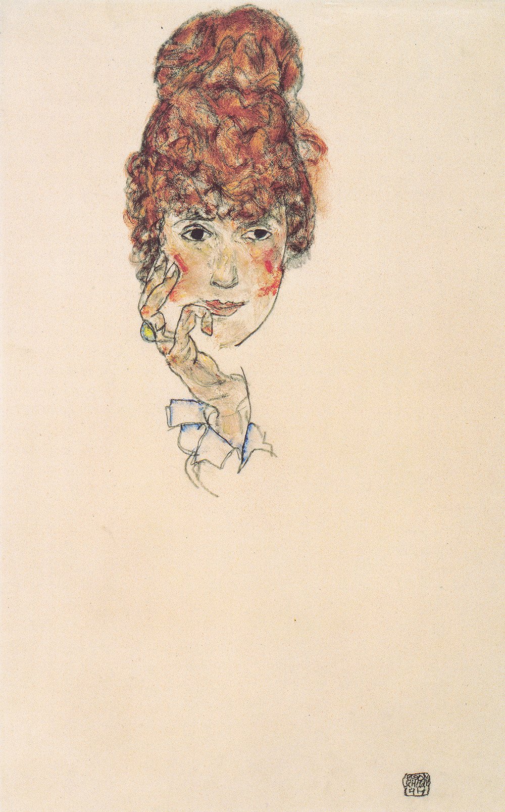
Room 5. Schiele portraits

This is really rammed home in the room devoted to Schiele portraits which, once again, demonstrates his versatility. There are one or two nudes but the emphasis is on his ability to capture the features and character of perfectly respectable, fully dressed citizens of Vienna. There’s a little set of portraits of middle-class men like Heinrich Benesch, the railway inspector who became an important collector of Schiele’s work.

One wall displays a set of portraits of his family, including touching portraits of his sister, his mother and his father-in-law. Set amid these is a staggeringly evocative face of his wife, Edith Harms, who he married in 1914. The guide tells us a bit of gossip about their marriage, namely that nice, middle-class Edith insisted Schiele cut off all contact with his working class mistress and muse, Wally Neuzil. Seems cruel. Needs must. But what remains of Edith is Schiele’s staggeringly evocative portraits of her, like the one featured here. A face, hair, a hand – and an entire personality is before us. It is a staggering testimony to what art can do.

Edith Schiele by Egon Schiele (1917)Edith Schiele by Egon Schiele (1917)

Edith Schiele by Egon Schiele (1917)

Yet another aspect of Schiele’s vision is displayed across two walls of this room – his numerous, inventive and varied self-portraits. Klimt never did a self portrait in his life, Schiele did hundreds. Maybe, again, partly out of poverty. But mostly because, whereas the Symbolist, fin-de-siecle art of the 1890s reached beyond itself to some secret realm trembling on the brink of revelation, the Expressionist art of the 1910s explored the self, and the fracturing of the self, into anguished fragments.

It’s an oddity or irony of the German Expressionists that so many of them considered themselves spiritual leaders, heralding a great spiritual awakening of humanity – and yet, to us, so many of their paintings look hard, heavy and anguished. Same here, with Schiele – the commentary tells us that he identified with Francis of Assissi, wrote about the artist being a spiritual leader, gave his self-portraits titles like ‘redemption’ – and yet to us they seem to anticipate the acute and anguished self-consciousness of the twentieth century, which didn’t decline after Schiele’s death, but achieved new heights of neurotic panic after the Holocaust, the atom bombs and the spread of nihilism and existentialism across mid-century Europe.

It is that tormented self-consciousness which Schiele’s countless experimental self-portraits seem to communicate to us today, not songs about birds.

Nude Self-Portrait, Squatting (1916) by Egon Schiele. Pencil and gouache on packing paper. The Albertina Museum, Vienna

Nude Self-Portrait, Squatting (1916) by Egon Schiele. Pencil and gouache on packing paper. The Albertina Museum, Vienna

By no means all of these self-portraits are nude; the one above is the most naked and explicit. In many others he’s wearing clothes but posing in one of his characteristically agonised, ungainly stylised positions. This angularity prepares us for the last room.

Room 6. Erotic nudes

Bang! the room explodes with some of the most erotic paintings and drawings ever made. They are erotic because they are so candid. You feel like you are in the room, with a good-looking young woman who is happy to share her body with you, no shame, no false modesty, no recriminations. For me, at any rate, it’s this spirit of complete, unashamed, naked complicity which makes them emotionally or psychologically powerful.

Seated Female Nude, Elbows Resting on Right Knee (1914) by Egon Schiele. Graphite and gouache on Japan paper. The Albertina Museum, Vienna

Seated Female Nude, Elbows Resting on Right Knee (1914) by Egon Schiele. Graphite and gouache on Japan paper. The Albertina Museum, Vienna

But having looked carefully at all the works which precede them it is also possible to set aside their erotic charge altogether and consider them as compositions. In this respect the most successful of them vividly bring together features we’ve already noted:

  • the stylised pose, deliberately not classical, not a nude woman carefully standing so as to conceal her loins, but a real woman squatting, lying back with her legs open, gazing at the viewer, completely unembarrassed
  • the angularity of the anatomy – note the weirdly pointed hips, the visible ribs, the jagged angles around the shoulder, the accurate depiction of the lines made by the tendons of the inner thigh just next to the pubic hair, the pointed chin – the human figure as sharp angles
  • the use of colour not to describe naturalistically, but as expressive highlighting – much earlier Klimt had coloured the nipples of his nude paintings, but they were set amid an entire composition of gleaming rich colours: Schiele repeatedly uses the trick of painting the labia, nipples and lips a bright orange colour, on one level highlighting the erogenous zones, but on another making the figures almost into painted puppets, marionettes, an unsettling ambiguity

Note, also, the use of the colour green. By her breast, and armpit, and under her eyes and, the more you look at it, the more you see that Schiele has used that very unhuman colour, green, just touches and flecks of it, which… which do what, exactly? They make this woman’s body look a bit more emaciated than it already is: but the sparingness with which it’s used also makes you look closer, lean in, get drawn in.

Once I started looking, I noticed a very fleeting use of green in many of the nudes, creating just a hint of a kind of heightened, floodlit, hyper-vividness. There’s even green in the self-portrait wearing a yellow waistcoat. I’ve read scores of articles about Schiele and nudes and pornography and the male gaze and so on. It would be interesting to read just one good article about his very sophisticated use of colour.

Schiele’s nudes, hundreds of them, were notorious in his day and now are widely known and admired. I had no idea that Klimt did quite so many nudes and that, in their way, they are more sexually explicit. The wall opposite Schiele’s green-flecked nudes is covered with the detailed pencil drawings Klimt made of nubile young women naked and very blatantly masturbating.

In 1907 Klimt provided fifteen avowedly erotic drawings for a luxury edition of the Roman classic, Lucian’s dialogue of the courtesans. The title of one drawing – shown in the original pencil version and then as an illustration in a copy of the book which is on display here – says it all: Woman reclining with leg raised. She is lying on her back on a bed with one leg pulled up and back by her left arm while she is masturbating with her right hand. Art doesn’t come much more explicit than this. Although even when he’s being as rude as an artist possibly can be, it’s amusing that Klimt can’t stop himself drifting off to think about the decorative spots and patterns on the fabric she’s lying on (her dress? a blanket?)

Reclining nude with leg raised by Gustav Klimt (1907)

Reclining nude with leg raised by Gustav Klimt (1907)

The commentary suggests that, because Klimt’s nude women have their eyes closed they are somehow passive victims of the male gaze, whereas Schiele’s explicit female nudes generally have their eyes open and are often looking straight at the viewer – and so are therefore empowered, have agency etc – an issue of vital concern to female art curators.

I don’t think it’s quite that simple: it’s certainly not that a consistent rule, because some Klimt women have their eyes open and some Schiele women have theirs closed.

In my opinion the scholars are over-explaining something which is more obvious: not only Schiele’s female nudes but the male nudes and most of the fully-dressed portraits as well, are simply more powerfully drawn and more vividly coloured than any of the Klimt drawings on show here.

Klimt’s masturbating women may have their eyes closed, but more importantly (for me, anyway) – although they are just as explicit, in fact in the way they are actively masturbating, they are more explicit than the Schiele – nonetheless, they are drawn with much finer and paler lines, lines which almost fade away into nothingness, as the left leg of the model, above, dwindles from the heft of her buttock and hip down to a small foot which is merely an outline.

In other words, in my opinion, it is not the model, the human being depicted – it is Klimt’s technique or style which is passive and mute. As pencil drawings, the Klimt nudes in this final room are probably better, more accurate draughtsmanship, than the Schiele. But the Schiele erotic nudes, with their strong black outlines, weird angularities, piercing black eyes, and coloured highlights, are incomparably the more powerful and bracing works of art.

Video introduction to Schiele

By Tim Marlow, Artistic Director of the Royal Academy.

//player.vimeo.com/video/298238498


Related links

More Royal Academy reviews

100 Figures: The Unseen Art of Quentin Blake @ the House of Illustration

Quentin Blake was the moving force behind the campaign to create a gallery dedicated solely to the art of illustration, which resulted in the House of Illustration being opened in 2014.

For this reason the third and smallest of the gallery spaces in the House of Illustration is always dedicated to a small, rotating display of some aspect of Blake’s work – for example the charming exhibition of his black-and-white pen drawings inspired by Valentine’s Day, which was on display back in the spring.

However, for this exhibition Blake takes over the main gallery as well, for a major retrospective of his large, non-illustrative art in oil paints, pastels and watercolour spanning 50 years. Because – it turns out – alongside the book and other illustrations which have made his name and career, Blake never stopped being fascinated by, and painting, the human figure, mainly for his own pleasure, as this show makes abundantly clear.

Most of the works have never been seen before and I found them stunning. It’s a small, intimate space, the House of Illustration, and I felt it perfectly proportioned to bring out the intimate and often sensuous nature of these paintings.

The exhibition is hung in chronological order and the wall labels give copious insights into Blake’s working life, from his earliest years as a student in the 1950s through to the 1990s.

Room one

Room 1 explains that after finishing university Blake went back to live with his parents in Kent, commuting up to London for life studies classes once or twice a week. He tells us that he made great efforts to use shading to record the volume, balance and stance of the figures. But he also got into the habit of completing the life study and then, turning away from the model, drawing what he could remember – the essential features, as it were.

The twenty or so early pen, ink and wash drawings from the early 1960s are all of nude women in various poses, in arty studios, accompanied by potted plants, easels, chairs and sofas and, in quite a few, by birds. Uncanny to see many of Blake’s later visual motifs appearing so early.

Untitled by Quentin Blake

Untitled by Quentin Blake

What comes over is the slightly scrappy or scratchy sensuousness of many of them. Naked women lying back, leaning forward, themselves painting or sketching, thinking, posing – their full creamy thighs often the most physically realised part of the image, the quickly-drawn, pointy faces a kind of counterpoint to the smoothness of the thighs – and the little pouting breasts a sort of scratchy afterthought.

Main room

When you move along to the main gallery, you are suddenly confronted by works from the 1960s. Blake had moved into his own flat in London, and now had hardboard and canvas to work on.

The change is astonishing. While the subject is still female nudes, the treatment is wild and splotchy. He now worked with commercial house painters’ brushes and you can see it in these large paintings, covered with thick sprawls and daubs of industrial paint. They are vivid and powerful but remind me a bit too much of Frank Auerbach and the other School of Mud artists, one of the few groups of artists I actively dislike.

Untitled by Quentin Blake

Untitled by Quentin Blake

Also in this room are smaller scale drawings of female nudes, done in with thick charcoal, with more blurring and heavy shading, than in the room of earlier work. Giving a much more full-bodied and rich visual impression.

Installation view of 100 Figures: The Unseen Art of Quentin Blake at the House of Illustration

Installation view of 100 Figures: The Unseen Art of Quentin Blake at the House of Illustration. Photo by the author

The long gallery

It’s the next room, the long room in the main gallery, which really took my breath away. On all four walls and then on both sides of a central stand, are forty or so oil paints (and some pencil and wash works) from the 1970s and 80s.

As Blake explains in the very illuminating video which is shown in an alcove off to one side, illustrations are tied to a narrative and Blake has proved himself a master of illustrating a wide variety of stories.

But in this, his private work, he was able to experiment with – basically the same motif, a nude woman – in countless forms and variations, in particular experimenting with scale (some of the paintings are enormous) and, above all, experimenting with colour.

First you sketch out your human figure lying, sitting or reclining. But what happens if you paint her legs blue and her chest yellow? What happens if you use variations on one tone throughout?

Installation view of 100 Figures: The Unseen Art of Quentin Blake at the House of Illustration

Installation view of 100 Figures: The Unseen Art of Quentin Blake at the House of Illustration. Photo by Paul Grover

What happens, as he mentions in the video, if the outline all flows in one direction but then you deliberately paint bars of colour across those lines, at odds with the flow? What kind of visual and emotional responses do you get?

The answer is, in the best of them, a very strong, dynamic visual impact.

Untitled (1988) by Quentin Blake

Untitled (1988) by Quentin Blake

The results of this restless experimentation are stunning. Not all of them are great, but I found it genuinely difficult to tear myself away from a handful of what I thought were masterpieces. I wandered round the exhibition and then came back to stand in front of them again.

There are yellow figures, and orange figures (thoughtfully arranged together along the south wall, as per two illustrations above), deep mud-brown figures (in the first, Auerbach, room) – but it was in this big gallery that I was blown away by a handful of enormous nudes done in deep, dark midnight blue.

Untitled by Quentin Blake

Untitled by Quentin Blake

Reproduction can’t convey how huge and powerful this painting is in the flesh. Looming over the viewer, I thought it depicts a naked human figure turning and running, though the friend I went with thought it was a woman sitting in one of those groovy 1970s hanging chairs.

What do you think?

In my reading I am blown away by the a) dynamism of the pose and b) the incredible use of colour, the deep blacks and blues of the background and figure, strangely highlighted by fleeting splotches of white and green and red. What a fantastically powerful, intuitive use of raw primal colours.

Third room

The third and final room of the main gallery contains a display of work from the 1980s and 90s in which Blake brings together his different approaches to painting and to drawing. The works in this room combine line drawing with colour washes in watercolour and pastel.

They are much mellower than the oil paintings, but still full of interesting experiments with colour and the emotional impact of colour. I was very taken by a sketched nude coloured entirely in yellow, and others coloured solely by variations of turquoise.

What happens if..? What if you colour it so…? What effect does a wash of yellow along the back have…?

It’s humorous and piquant to see him handle and experiment with colour so confidently, so blithely, these watercolours are light and airy..

Two pen and watercolours by Quentin Blake

Two pen and watercolours by Quentin Blake. Photo by the author

Big blues

But it was the Big Blue Oils that had taken possession of my soul. I strolled round the small space again – sat and watched the video again, admired the early sketches again… but found myself being pulled back into the big room to stand in front of the handful of huge, midnight blue paintings – which just took me to a completely different place.

Untitled by Quentin Blake

Untitled by Quentin Blake

Summary

Starting gently with early drawings which remind you of his lovely illustrations, 100 Figures: The Unseen Art of Quentin Blake then takes you on a thrilling journey into the possibilities of painting – via the thick impasto sludge of the early 60s, on towards the light yellow watercolours of the 1990s, with side dishes of thick charcoal drawings – but it is the middle years and the middle room which seemed to me to have struck a perfect balance – heavy blue oils, but handled with a lightness and vibrancy and confidence with colour which dazzle.

And which take you to a place of almost visionary intensity – wholly unexpected from the master of the airy, humorous children’s drawings which we all know and love.

What a revelation!


Related links

Also currently on at the House of Illustration

More House of Illustration reviews

Modigliani by Doris Krystof (1996)

Taschen Publishing specialise in medium-sized art books (23 cm tall x 18.5 cm wide). They’re all originally written in German, this one was translated into English by Christina Rathgeber. I picked it up for a fiver in some art shop years ago, and dusted it off and reread it to coincide with visiting the big Modigliani exhibition at Tate Modern.

The text is eminently readable and it has 88 good quality colour reproductions, not just of paintings and sculptures by the man himself but of works by contemporaries like Picasso, Kirchner and Brancusi, as well as classic nudes by Titian and Giorgione, quoted to compare and contrast with Modigliani’s famous nude paintings.

It is a real visual treat just slowly flipping through the pictures and soaking them up.

Biography

The outline of Modigliani’s life is clear enough. Born in 1884 to an arty Jewish family in northern Italy (his mother translated poetry, wrote essays and book reviews), his creative tendencies were encouraged so that by age 14 he was studying at the art academy in Livorno. He studied from books and attended a life drawing class; he visited Rome and Florence and Venice where he revelled in the Old Masters. He attended the Venice Biennale of 1903 and stayed there two years.

By which point it was time to move on and he headed for the Mecca of modern artists, Paris, arriving in 1906. Quite quickly he made important friends, not least the Spaniard Picasso and the Romanian sculptor Brancusi. For the next few years he experimented with a number of styles, from Cézanne (who had died in 1906 and quickly had several exhibitions devoted to his late work) to Edvard Munch, who impressed everyone with the work displayed at the Salon d’Automne of 1908 – although he avoided the main new movement of the day, Fauvism (given its name in 1905 and which flourished for the next few years).

Similarly, Modigliani was well aware of, but avoided, the arrival of Cubism in 1908, pioneered by Picasso and Braque, which swept up many lesser talents. Instead, he pursued his core interest of depicting the human form using outlines of graceful arabesques.

From about 1909 to 1912 Modigliani devoted himself entirely to sculpture, heavily influenced by the new taste for ‘primitive’ art from Africa and Oceania which became modish from around 1905, and by his friendship with the modernist sculptor, Brancusi.

Although some of his sculptures are obviously influenced by (copies) of African fetish masks which were becoming popular in artistic circles, Modigliani was just as obsessed by the idea of the caryatid, the statue of a woman bearing the weight of a building which had been developed in ancient Greece. He produced scores of sketches and variations on this crouching, hunched-up, female shape.

Eventually Modigliani gave up sculpting, maybe because the dust was bad for his chronic tuberculosis, but his painting style was now purified of the earlier variety and experimentalism – the faces in particular from now on were all variations on the elongated, oval shape with schematic, one-line features (eyes, eyelids and mouth all drawn with a crisp elegant line) which he had perfected in the sculptures and in the numerous preparatory sketches he made for them.

He continued to paint a wide variety of portraits of friends, lovers, fellow artists, collectors and patrons, and in the middle of the Great War began to paint a series of nudes. These differ from the portraits in being really simplified – the skin tone is generally a consistent warm orange colour, and the facial features are purified down to a handful of lines. They sold well – what’s not to like?

Towards the end of the War, Modigliani was advised to head south by his dealer and set up shop in Nice, along with his mistress, Jeanne Hébuterne, mother of his daughter. Here he painted lots more portraits, but in a noticeably lighter style, and of ordinary people – instead of the rich and famous of Paris’s art world – of peasants, hotel cleaners, and even of children. These, along with the nudes, became his most popular images.

By 1919 he was back in Paris, and the final portraits of his mistress and patrons show a further tendency to elongate both the neck and the face even more, making each person even more of an abstract collection of lines and colours.

Modigliani died after a long decline in his health on 24 June 1920. Soon afterwards friends and acquaintances, lovers and patrons began writing their memoirs, and quite quickly the myth grew up of the handsome, charming Wunderkind artist, who endured great poverty in his undying devotion to his art. And his paintings began to sell.

The works

Early paintings

Having seen a lot of the ‘greatest hits’ at the Tate Modern exhibition, I was taken by the more out-of-the-way works included in this book, especially of the early works before he’d perfected the Modigliani ‘look’.

Sketches

From early on he developed a hyper-simplified line, which comes over in nude sketches and then very much in the sketches he made from African artefacts in the Louvre and the Museum of Ethnography.

Sculptures

He took up sculpture in 1909, nobody knows why. Perhaps because he had always revered the sculptural legacy of his native Italy, perhaps because his paintings weren’t selling, perhaps because he moved to a bigger workspace in Montparnasse, perhaps because he met Constantin Brancusi in 19090 and was hugely influenced by him. Or all of the above.

Brancusi (b.1876) had perfected a smooth highly stylised way of working in stone which anticipates Art Deco.

Modigliani’s sculptures are of two types, a squat square type, which could fit at the top of a column –

And the much-better known, highly elongated, ‘primitive’ mask like heads. Although the politically correct like to raise the issue of ‘cultural appropriation’ and the way so many of the avant-garde artists of the 1900s looked to sculptures from Africa or Oceania, the book points out that there are also strong European origins for this look, in the stunningly abstract heads carved in the Cycladic islands of Greece thousands of years BC.

Apparently he conceived of the sculptures, these stone heads, as all being together in one place, creating a kind of temple of beauty. This may partly explain their thematic unity, that they were designed to be displayed and seen as an ensemble.

Nudes

Krystof makes a simple but effective point that it’s not so much in the sculptures but in the sketches for the sculptures, and especially in the sketches of caryatids, that we see Modigliani really simplifying his technique, perfecting a way of depicting the human body entirely made up of simple, one-line, shallow curves – no sketching, and repeated lines or cross-hatching – just one pure line to create the body’s outline, another to distinguish to the two legs, meeting another curve which creates the loins, two simple curves, maybe a bit pointed, to indicate the breasts, a curve for the mouth, a long narrow triangle for the nose, two almonds for eyes – in many ways a child’s eye view of the human body.

She also makes the good point that these curves are consciously not like the focus on blocks and squares and diagonals and geometric shapes of the suddenly fashionable Cubists. It is in pursuit of shallow curves that Modigliani is at odds with the art of his own times, a one-off.

And so to the female nudes which make up about 10% of his output – about 30 nudes in total – and in their simple outlines, as well as their very simple orange flesh colouring, present a kind of cartoon simplicity and pleasingness.

He began painting them in 1916, helped by the important patronage of dealer and friend Léopold Zborowski, who lent the artist use of his apartment, supplied models and painting materials, and paid him between fifteen and twenty francs each day for his work.

The simple graceful outlines, the soft orange skin and pink nipples, the simplified facial features, and the tonal unity of the paintings (compare and contrast with the violent garish colouring of the Fauves) makes Modigliani’s nudes understandably popular even among opponents of modern art.

Krystof also takes some time to explain another reason for their sense of familiarity, the reason they seem so assimilable. It’s because the poses are often based on established classics of Western art.

Quite systematic copying or borrowing or pastiching, isn’t it?

Krystof makes another, subtler, point. In all the classic paintings above you can see the entire body – you, the viewer, are standing some way away. By contrast, all of the Modigliani nudes are cropped, at least part of the arms or legs are out of the frame – as if you were really close up to the model, not so much contemplating them as about to fall over them. Immediacy.

Portraits

But the 20 or so nudes mark a sort of apricot-coloured interlude in Modigiliani’s core activity during his final years, which was the obsessive painting of hundreds of portraits.

Krystof divides them into two categories – one of friends, lovers, patrons, fellow artists and named individuals – the other category of scores of anonymous models, peasants and children.

They are all rougher and harsher, in design and finish, than the nudes.

To get at the essence of the Modigliani approach, Krystof compares his portrait of Jean Cocteau with a portrait done at exactly the same time and place by Moise Kisling.

The immediate and obvious conclusion is the huge amount of clutter Modigliani has chucked out – the window, shutters, table, vase, stove, chair, dog and rug are all not there – and the way he has zoomed in to focus on the top half of the body to create an image which is much simpler, sparer and more intense.

Hence Krystof’s suggestion that Modigliani developed in his portraits ‘the art of omission’ (p.53)

The same technique – cropping sitters at the bust and showing no interest in the details of the backdrop – characterises many of the portraits, which are more varied and interesting than the nudes.

Flight south

In the spring of 1918 the Germans began a final offensive. Planes and Zeppelins bombed Paris and many feared the city would fall. Up to a million people fled the capital, including Modigliani and his mistress / common-law wife, Jeanne Hébuterne, who gave birth to their daughter in 1918. The young family spent over a year in Nice and Cagnes-sur-Mer, where Modigliani painted more feverishly and intensely than ever before.

The light of the South of France lightened his palette and the texture of the paint he used, the paint is thinner. Also the local people he got to model for him lack the specificity of the Paris portraits, becoming more generic – which may account for their later popularity.

Jeanne Hébuterne

Modigliani painted at least 25 portraits of the mother of his children. Photographs of her make her look absolutely stunning, in fact she has something of the long-tressed, full-lipped beauty beloved of the pre-Raphaelites.

In his last paintings of her, the neck and face are more elongated than ever, the background painted in with lighter sketchier colours than previously.

Conclusion

This is a really handy book, containing not only nearly 90 beautiful full-colour illustrations which give you an immediate and comprehensive feel for Modigliani’s unique style, but also a more thoughtful and insightful text by Doris Krystof, than is usual for Taschen books.

Possibly my favourite portrait comes right at the end of the book, one of the few Modigliani portraits which has even a hint of feeling and emotion, in this case a self-contained, winsome sadness.


Related links

Sargent: The Watercolours @ Dulwich Picture Gallery

This is the first UK show in nearly 100 years devoted to the watercolours of the Anglo-American artist, John Singer Sargent (1856 to 1925).

Sargent biography

Sargent was American, born to a successful Philadelphia eye surgeon, who quit his trade to live a peripatetic life travelling round the beauty spots of Europe, with wife and a growing brood of children. Sargent’s parents encouraged his artistic tendencies and supported his decision to train as an artist in Paris in the 1870s. Here he learned precise draughtsmanship and a sumptuous way with oils, though he was also attracted to the new fashion for painting in the open air which came to be called Impressionism.

In Paris Sargent painted a number of successful portraits before moving to London in the mid-1880s where he quickly established a lucrative practice as a portrait painter to the upper classes. Sargent produced some 900 oil paintings, many of them masterpieces of style and grace, as demonstrated by the recent awe-inspiring exhibition of John Singer Sargent portraits at the National Portrait Gallery.

But throughout his life he continued to paint watercolours for his own pleasure and, once his London practice was secure, from the 1890s onwards, took a regular extended summer holiday, travelling all over the most picturesque parts of Europe and painting painting painting wherever he went.

The Lady with the Umbrella (1911) by John Singer Sargent. Museu de Montserrat. Image © Dani Rovira

The Lady with the Umbrella (1911) by John Singer Sargent. Museu de Montserrat. Image © Dani Rovira

The exhibition

This beautiful exhibition brings together a selection of some 80 of the estimated 2,000 watercolours which Sargent produced. Away from the pressurised world of his London studio and expensive commissions, the watercolours depict a relaxed and sunny world of picturesque locations – Venice, the Alps – a world of colourful locals in Italy or Spain, and of leisure ladies lounging with parasols.

It is the world of wealthy, confident Yankee ex-pats depicted in the novels of Henry James and Edith Wharton, a gracious world untroubled by rumours of war, where the moneyed could travel easily and stylishly from hotel to hotel in Venice, Rome, Bologna, Corfu, maybe down into Spain, and, after a good breakfast, set out one’s easel, pin up the cartridge paper, moisten the brushes, adjust one’s straw hat, fix the brollies in place, and then start sketching with light confident pencil strokes before moving on to start building up washes of colour.

Sargent painting a watercolour in the Simplon Pass (c. 1910-11) Sargent Archive, Museum of Fine Arts, Boston

Sargent painting a watercolour in the Simplon Pass (c. 1910 to 1911) Sargent Archive, Museum of Fine Arts, Boston

Architecture

Many of the watercolours give the impression of being deliberately unfinished, accentuating their light and airy effect. In fact one of the four headings into which the exhibition is divided is ‘Fragments’, although it is intended to have a different meaning. The curators use it to draw attention to the way Sargent is deliberately experimental in the way he frames and focuses many of the watercolours, cropping the subject, viewing it from unusual angles. Sargent’s oil portraits had to be pretty conventional, showing the key parts of the body of the sitter in a well-defined and well-decorated space – take one of my favourites, the staggering Ena and Betty, Daughters of Asher and Mrs Wertheimer in Tate Britain.

By contrast, in many of the watercolours Sargent deliberately focuses on details, cropping and cutting off, zooming in on unexpected aspects. This is particularly true of the depiction of buildings which dominate the first few rooms. He is interested not in the whole thing but of significant details and aspects, which he renders luminous with his amazing technique.

Rome: An Architectural Study (c. 1906-7) by John Singer Sargent. Museums & Galleries, City of Bradford MDC

Rome: An Architectural Study (c. 1906 to 1907) by John Singer Sargent. Museums & Galleries, City of Bradford MDC

The curators point out the influence of photography which by the turn of the century had pioneered all kinds of ways of cropping and focusing. I love draughtsmanship and all lines, firm clear lines, so something in me warmed to all of the architectural paintings. Venice is the prime location for these, many of them ‘taken’ from low on the waterline, providing a gondola’s-eye view of the famous crumbling palazzos and churches. a) It’s a question of angle but b) also of the play of light on water.

Light on water is a perpetual challenge to a painter and water is a secret thread which connects many of the works here of ostensibly different subjects – portraits, landscapes, cityscapes and so on. There are lots of boats in harbours. Or streams in the mountains. Or lakes. His depiction of Palma harbour is an amazing attempt to capture the really dazzling, blinding white light of the Mediterranean midsummer noon, shimmering on the blue water.

Palma, Majorca (1908) by John Singer Sargent © Fitzwilliam Museum, Cambridge

Palma, Majorca (1908) by John Singer Sargent © Fitzwilliam Museum, Cambridge

Of the six rooms here one is devoted to the subject of ‘Cities’, but in fact of the 13 paintings in the room, 11 are of Venice. Venice Venice Venice. Light on water, on aging stone, the detail of columns and porticos, friezes and balustrades. There are several rather touristy paintings of gondoliers punting their boats along canals, the spume of the waves highlighted with white impasto.

But there are plenty more of buildings, stone catching the reflections of water, and a moment’s reflection suggests that Venice combined the two great subjects, very classical monumental architecture, and shimmering surfaces of water.

The Church of Santa Maria della Salute, Venice (c. 1904-9) by John Singer Sargent © Calouste Gulbenkian Foundation, Lisbon. Photo: Catarina Gomes Ferreira

The Church of Santa Maria della Salute, Venice (c. 1904 to 1909) by John Singer Sargent © Calouste Gulbenkian Foundation, Lisbon. Photo: Catarina Gomes Ferreira

One of my favourites was this dazzling depiction of a grand baroque statue in Bologna: it demonstrates several characteristics – it is cropped (you can’t see either the top of the statue which apparently is a huge statue of Neptune, or the sides of the bowl) – it shows fascination with light on different surfaces, specifically the aged stone walling, the bronze statues and a slender line of acquamarine water – it is somehow both monumental and light and airy – and the casual pink washes give the sense of the background architecture with a wonderful casualness. It is often the bravura confidence of the backgrounds as much as anything which fills you with a sense of respect and awe at his ability.

The Fountain, Bologna (c. 1906) by John Singer Sargent. Private Collection

The Fountain, Bologna (c. 1906) by John Singer Sargent. Private Collection

Boats

Not everything is genius, however. I found the exhibition a mixed bag, with several startlingly brilliant images in each room, but also a fair amount of average or so-so works. Maybe this is because the standard of all of them is so high that you just accept it and quickly take it for granted.

In the earlier rooms I surprised myself by not liking so much his depictions of boats. I can’t quite put my finger on it but I think I want my lines to be firmer and straighter, to bring out the toughness of lines to be found in rigging, the geometric complexity and angularity. There were several showing ships in a dry dock and one of some mill machinery (The Mill, Arras), but, for me, they lacked the rigour of the modernism which was to take the world by storm a generation later, when art found a language for machinery in modernist painting and social realist photography. Sargent’s ships are too soft for me.

Italian sailing Vessels at Anchor (c. 1904-07) by John Singer Sargent © Ashmolean Museum, University of Oxford

Italian sailing Vessels at Anchor (c. 1904 to 1907) by John Singer Sargent © Ashmolean Museum, University of Oxford

Some of the scenes of classic tourist destinations had a touristy tweeness; they are the kind of painting you actually find on sale in the streets of Venice, being hawked by street vendors. Depicting sweet peaceful scenes but lacking any oomph.

Loggia, View at the Generalife (c. 1912) by John Singer Sargent. Aberdeen Art Gallery & Museums Collections

Loggia, View at the Generalife (c. 1912) by John Singer Sargent. Aberdeen Art Gallery & Museums Collections

Landscapes

I thought the landscapes were his weakest works. Sargent developed a routine summer itinerary from the late 1890s through to the start of the Great War: each vacation began with a spell in the Alps, then on to Venice, Rome, Bologna, maybe to Corfu. He visited Spain several times and even went on a Middle Eastern tour, as research for a historical mural he was painting back in the States. Everywhere he went, painting painting painting.

A Glacier Stream in the Alps (c. 1909-11) by John Singer Sargent. Laing Art Gallery, Newcastle-upon-Tyne/Bridgeman Images

A Glacier Stream in the Alps (c. 1909 to 1911) by John Singer Sargent. Laing Art Gallery, Newcastle-upon-Tyne/Bridgeman Images

If you Google ‘John Singer Sargent landscape‘ you can surf through hundreds of images, many of them stunning. But some of the ones on display here were, I thought, weak. The Glacier stream (above) highlights some of those weaknesses – the perspective seems out, none of the details, of rock or water, are very convincing, and the human figure is worse. It was just as well the show included some of the weaker works: it made you realise Sargent wasn’t a god, he had his off days like other people.

That said, one of the best works in the show was a quiet but absorbing study of stones by a stream. It may not look much reproduced on a screen, but the closer you looked the more uncannily brilliant it became, you could touch each individual rock, feel the soggy sand bordering the stream. The brown blotches of heather in the background seemed perfectly judged. If I had a million pounds, I’d buy this one.

Bed of a Torrent (c. 1904) by John Singer Sargent. Royal Watercolour Society, London. Image © Justin Piperger

Bed of a Torrent (c. 1904) by John Singer Sargent. Royal Watercolour Society, London. Image © Justin Piperger

People

The final room is devoted to watercolours with people in them and there is a wide variety of settings. There are Bedouins in Arabia, gondoliers in Venice, Spanish street singers (this latter I find rather disturbing).

Blind Musicians (1912) by John Singer Sargent. Aberdeen Art Gallery & Museums Collections

Blind Musicians (1912) by John Singer Sargent. Aberdeen Art Gallery & Museums Collections

There are ladies in billowing skirts lounging by streams, a kind of quintessence of ease and relaxation.

A Turkish Woman by a Stream (c. 1907) by John Singer Sargent © Victoria and Albert Museum, London

A Turkish Woman by a Stream (c. 1907) by John Singer Sargent © Victoria and Albert Museum, London

There’s a number of so-so studies of male nudes, smudgy faces and black loins. Again, if you Google ‘John Singer Sargent nudes‘ you can see scores of marvelous charcoal and pencil studies of males nudes online. The male nude watercolours on display here aren’t so good.

What did stand out for me was a trio of genius watercolours. One was of his sister, Emily. She was a painter in her own right. There’s a small display case of photos of the man himself, with friends, and of Emily and she looks a very starchy character, dressed in dense Victorian black. She travelled everywhere with a ‘companion’, a Miss Eliza Wedgwood, and there is a stunningly good watercolour depicting Emily painting, paintbrush in mouth, while spinsterish Miss Wedgwood looks off to the side. The character in Eliza’s face is wonderful; and the calm companionableness of the pair is like a novel in paint.

There are several depictions of soldiers. Sargent spent the early years of the Great War back in the States, but was recruited to become an official British war artist at the request of the Prime Minister himself. In the landscape room there are so-so depictions of ammunition dumps which don’t really have much to them, certainly none of the sketches compares to his studied masterpiece, Gassed (1919), they’re not meant to. But there are a couple of studies of soldiers from a Highland regiment, wearing kilts, at rest.

Highlanders Resting at the Front (1918) by John Singer Sargent © Fitzwilliam Museum, Cambridge

Highlanders Resting at the Front (1918) by John Singer Sargent © Fitzwilliam Museum, Cambridge

But the one I would like to own is this fantastic study of two soldiers pinching apples in an orchard. The light on the main figure’s helmet, and on the back of his jacket and top of his kilt, is to die for.

Last of this trio was a ravishing study of a man lying naked on a bed.

This is a stunningly relaxed and liberated, redolent of holidays anywhere hot, the big wooden bedsteads, the sharp tan lines on the body, the rumpled white sheets, the cigarette casually held. And, after I’d looked at it for a while, I came to admire the nose – the use of pink and cream to model the sheeny shiny nose of someone who’s been out in the sun, it’s just one of thousands of stunning details throughout the exhibition which Sargent’s amazing eye and staggering technique capture and record forever.

Conclusion

80 out of 2,000, that’s 4% of his total output of watercolours. A surf of the internet indicates the riches among the other 96%, but these are here, now, and available to view in the flesh in Dulwich.

Close up, you can see the texture of the cartridge paper, see the skimming pencil lines he sketched out first, capturing the essence of shapes, buildings, people, rocks – and then marvel at the confidence with which he applied colour washes and highlights to create, at their best, almost magical effects, stunningly evocative and atmospheric works.

A Street in Spain (c. 1880) by John Singer Sargent © Ashmolean Museum, University of Oxford

A Street in Spain (c. 1880) by John Singer Sargent © Ashmolean Museum, University of Oxford

The video


Related links

More Dulwich Picture Gallery reviews