Edwin Austin Abbey: By the Dawn’s Early Light @ the National Gallery

At any one time the National Gallery in London has a number of exhibitions on, some of them big blockbusters with hefty admission fees. but they also have smaller, more niche displays of individual paintings or artists, which are FREE.

Currently, in Room 1 (up the staircase of the original grand entrance, next to the shop) they’ve got just such a display, of a set of related works, the mural and wall decorations created for the Pennsylvania State Capitol building by the now little-known American artist Edwin Austin Abbey.

Compositional study for ‘The Spirit of Light’ lunette in the rotunda of the Pennsylvania State Capitol at Harrisburg (1902 to 1908) by Edwin Austin Abbey. Yale University Art Gallery, Edwin Austin Abbey Memorial Collection

Edwin Austin Abbey (1852 to 1911)

Edwin Austin Abbey was born in Philadelphia, Pennsylvania in 1852. He was of the same generation as John Singer Sargent (1856 to 1925) and in fact Sargent made an attractive portrait of Abbey in chalk and charcoal, which is included in this little show.

Chalk and charcoal portrait of Edwin Austen Abbey by John Singer Sargent at the National Gallery (Yale University Art Gallery, New Haven, Connecticut, Edwin Austin Abbey Memorial Collection)

Murals

The reason Abbey is not as well known as Sargent is that he worked in completely different and less accessible fields. He started his career as a pen-and-ink illustrator of Shakespeare’s plays before turning to easel and in particular mural painting. His first mural commission, begun in 1890, was a cycle for the Boston Public Library on the medieval legend of Galahad’s quest for the Holy Grail.

Meanwhile, in his home state of Pennsylvania, in February 1897 the State Capitol building in Harrisburg was destroyed by a major fire. State officials set about commissioning a modern architect to build a new building on a grand, imposing scale. As the building works proceeded they also decided the building needed grand murals to decorate the interior.

Abbey, as a local boy and with an established track record of doing this kind of thing (in Boston) was a shoo-in and in 1902 he was appointed to paint its vast programme of allegorical and historical murals. And a few aspects of this grand plan are the subject of this exhibition.

Specifically, what we have here in this display is copies of 1) The Apotheosis of Pennsylvania, which was created for the front of the chamber, 2) preparatory studies for a number of lunettes, and 3) a massive circular image, The Hours, which went on its ceiling. I’ll deal with them in this order.

1. The Apotheosis of Pennsylvania

The largest mural Abbey created for the Capitol stands behind the Speaker’s rostrum. It is 35 feet tall and depicts 28 notable Pennsylvanians arranged around allegorical figures representing the state’s history, ideals, and achievements.

Compositional study for ‘The Apotheosis of Pennsylvania’ mural in the House of Representatives Chamber of the Pennsylvania State Capitol at Harrisburg (1902–1911) by Edwin Austin Abbey. Yale University Art Gallery, Edwin Austin Abbey Memorial Collection

As these are murals i.e. fixed in place, the originals are not on display here. Instead the exhibition features a compositional study, in effect a preparatory draft, of the finished work. The curators provide not only the study but a handy guide to key figures, see below.

Guide to key figures in Compositional study for ‘The Apotheosis of Pennsylvania’ mural in the Pennsylvania State Capitol by Edwin Austin Abbey.

They are:

  1. Genius of the State of Pennsylvania
  2. Sir Walter Raleigh (1552-1618) English explorer, writer and statesman
  3. Daniel Boone (1734-1820) American frontiersman
  4. William Penn (1644-1718) Founder of the Province of Pennsylvania
  5. Benjamin Franklin (1706-1790) A Founding Father of the United States
  6. Robert Morris (1734-1806) A Founding Father of the United States

Not only this, but the show includes two full-length preparatory sketches in pastel Abbey did for his figures, namely of Raleigh and Boone. These are impressively realistic in that lovely, almost tangible late-nineteenth century way. Abbey was obviously a phenomenal draftsman.

My wife, more interested in fabrics than history, was impressed by the attention he paid to the characters’ costumes. In fact the wall label accompanying them contains the rather astounding information that, among his other work, Abbey worked as a costume designer for stage plays in London theatres.

Study for the figure of Sir Walter Raleigh in ‘The Apotheosis of Pennsylvania’ mural in the House of Representatives Chamber of the Pennsylvania State Capitol at Harrisburg by Edwin Austin Abbey (about 1907)

2. Studies for lunettes

Speaking of impressive figures studies, the show includes several more for images which were painted into the lunettes of the dome. What is a lunette. It is ‘a crescent or half-moon shaped architectural feature, often a window or decorative panel in a vaulted ceiling or above a door’.

There are lovely, sumptuous, incredibly realistic studies of 1) an extremely muscular topless man (for the figure of Vulcan), 2) of half a dozen white-dressed female figures dancing, for a lunette titled ‘The Spirit of Light’, and 3) a powerful sketch of male steel workers with hammers raised to strike the red hot steel, for the ‘The Spirit of Vulcan, Genius of the Workers in Iron and Steel’ lunette.

Study for ‘The Spirit of Vulcan, Genius of the Workers’ in in the House of Representatives Chamber of the Pennsylvania State Capitol at Harrisburg by Edwin Austin Abbey (about 1907)

The curators tell us that Abbey travelled to Tyneside in 1905 in preparation for his Harrisburg commission. The figures demonstrate the orchestrated effort required to shape metal with hammers at an anvil with perfectly timed, successive blows. Why steel? Because steel production was central to the wealth of Pennsylvania in the early 20th century. Why Tyneside? Because Abbey spent a lot of time in England in the 1890s and 1900s.

3. The Hours

Lastly, to the massive object which dominates the room, a half-scale study or ‘maquette’ for the ceiling mural, ‘The Hours’, which is a striking 12 feet in diameter.

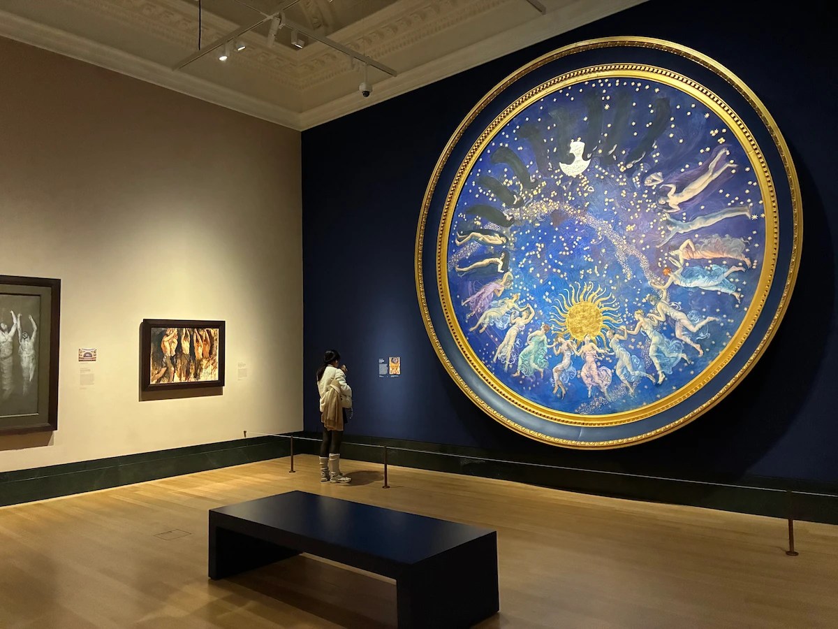
Installation view of ‘Edwin Austin Abbey: By the Dawn’s Early Light’ at the National Gallery, London, showing a preparatory study for the enormous mural, ‘The Hours’ (right) and preparatory sketches for lunettes (left) (photo by the author)

It’s an artistic depiction of the sky imagined over the course of 24 hours, hence the blue background, and images of the moon (at the top) and sun (at the bottom). Around the central axis dance 24 female figures clad in late-Victorian arty dresses, arranged so that they appear to be dancing.

At the top, at dead of night, the figures are blacked out. As they represent the dawning day they become partly visible, until (at the bottom) they are in the bright and highly coloured dress of full day before (as they dance up the left-hand side) they grow paler and increasingly eclipsed by the darkness to which they will return.

Half-scale study for ‘The Hours’ in the Pennsylvania State Capitol by Edwin Austin Abbey (1909 to 1911) (photo by the author)

I’m going to note two things about it:

1. Eurhythmics

One is the beauty of the individual figures themselves. Their faces are only sketchily finished so your attention is on the rhythm of their dancing figures, the variety of their poses and the flow of their light dresses around their bodies. If the anatomy doesn’t completely satisfy the pedantic observer, the effect of rhythm and progression is very effective.

Detail of the half-scale study for ‘The Hours’ in the Pennsylvania State Capitol by Edwin Austin Abbey (1909 to 1911) (photo by the author)

The curators tell us that the loose style of the 24 female figures echoes the innovations of dancers like Isadora Duncan in Abbey’s own time. Their movement is ‘eurythmic’ (flowing and harmonious), a new idea in the early 20th century.

2. Zodiac signs

Second thing is the Zodiac. Oddly this isn’t mentioned in any of the wall labels, and is only apparent when you go right up close to the image and really study it, but dimly sketched behind the dancing figures are the 12 signs of the Zodiac, Aries, Taurus, Gemini, Cancer, Leo, Virgo, Libra, Scorpio, Sagittarius and so on – to be precise, the animals (or human) figures which symbolise the signs. Even once you’ve realised they’re there, they’re quite hard to make out and add a pleasing ‘Where’s Wally’ dimension to your visit. Wife and I spent five minutes trying to identify them all. See if you can spot the image of the ram signifying Aries in this close-up? Pretty easy. Many of the others, a lot less so…

The finished result

The exhibition includes a photo of the murals in situ in the Capitol building, which gives you an adequate enough impression of their context.

The Hours and The Apotheosis of Pennsylvania in situ in the House of Representatives Chamber at the Pennsylvania State Capitol, Harrisburg © Robert Benson Photography

Isn’t it grand? All that gilt ornamentation! But to be honest, in this day and age, I was a bit disappointed that they didn’t have a video of them. Surely it wouldn’t be too much to have made a video panning round the room and examining the ceiling, end wall and lunettes in more detail and in digital quality.

Conclusion

Very enjoyable. Abbey’s draughtsmanship is inspiringly beautiful. Arguably ‘The Hours’ roundel, enormous though it is, is less effective, less memorable, than the individual studies. But this is a very civilised way to spend an hour or so, and it’s FREE.


Related links

Related reviews

Flaming June @ the Royal Academy

Well, this was disappointing. ‘Flaming June’ is one of the most important and famous works by Frederic, Lord Leighton (1830 to 1896) President of the Royal Academy from 1878 to 1896. It was originally exhibited at the Royal Academy in 1895. However, due to the vagaries of the art market it has for some time been owned by the Museo de Arte de Ponce, in Puerto Rico of all places.

Now, for a whole year, it is on an extended loan back to the Academy where it was first exhibited, by one of its most famous luminaries, almost 128 years ago. Here she is, flaming away:

Flaming June by Frederic Leighton (1895) Museo de Arte de Ponce. Luis A. Ferré Foundation, Inc.

The curators promise that ‘Flaming June’ is being shown alongside other popular works from the RA Collection, including:

  • other works by Leighton
  • works by his contemporaries
  • works which inspired him (including Michaelangelo’s Taddei Tondo)
  • works which he in turn influenced

Which fired me up to expect an orgy of masterpieces, not least by Leighton’s fellow Olympians who specialised in diaphanously dressed Roman and Greek ladies draped over marble benches playing ancient lyres or scattered with rose petals. Critics often describe it as late-Victorian soft porn.

Well, apart from June herself, there’s absolutely none of that here and the display is a big disappointment.

Confusing

For a start it’s been put on in the Collections Gallery, which already hosts a couple of absolutely vast Renaissance murals and some hefty Renaissance statues which dwarf the Leighton and confused me about where the Leighton display ended and the works on permanent display started. Off to one side, on the way to the small temporary exhibition room, was Michelangelo’s ‘Taddei Tondo’. This is the only carving by Michelangelo in the UK and was part of the RA Collection during Leighton’s presidency so… is it part of this display or not?

No good paintings

Second, there are none of the large sensual depictions of the ancient world I was looking forward to, none. Instead there are only two other paintings:

1. A crappy portrait of Leighton by G.F. Watt which has none of the lightness and wonder of June.

2. A less well-known work by fellow Olympian, Lawrence Alma-Tadema, ‘The Way to the Temple‘ (1882) which – bizarrely and perversely given that the whole point of ‘Flaming June’ is the combination of shimmering sea and Mediterranean light and female sensuality – is a picture of a woman hiding in the shadows of ancient buildings while, in a narrow sliver, you can see a few people in some ancient procession marching by in the sunlight. Yes the redness of her pre-Raphaelite hair and shawl, yes the detail of the bronze brazier, the architectural reliefs in the background and so on – but really, could they possibly have selected a less appropriate work to compare June with? The wall label make the most tenuous connection imaginable by pointing out that the female figure in this painting is holding…what? Can you see what she’s holding? It’s a votive statue – so the curators are able to shoehorn this inappropriate work into their overarching theme of sculpture and painting and sculpture in painting.

So the ‘paintings by contemporaries’ turn out to be a bit rubbish.

Sculpture versus painting

Instead, all there really is to look at is some pretty technical, art school stuff about the contrast between sculpture and painting, illustrated with drab, black-and-white preparatory sketches.

The first wall label tells us that the debate about which art form was superior goes back to Leonardo and Michelangelo. It then goes on to explain Leighton’s process, which was to make sketches on paper with squares on, trying out this or that composition, until he had it right and was then able to transfer the small (A4 size) sketch up to the much larger scale of the finished painting (in Flaming June’s case, 47 inches by 47 inches).

There’s a sketch and a model made to model the figures in his painting The Garden of the Hesperides. As you can see, the figure on the left is wearing pretty much the same colour dress as June and is also sculpted to have a great haunch of thigh.

There are some small dark sketches he made in preparation for his painting Perseus and Andromeda (1891), these are the ones on squared paper. God if only they’d been able to include the finished paintings of Hesperides and Perseus what a different feel the display would have had!

The Sluggard

Oh yes, on the way in to the Collections Room they’ve placed an impressive sculpture by Leighton, The Sluggard, dominating the entrance and, I suppose, announcing the curator’s theme of ‘sculpture versus painting’ or ‘how Leighton incorporated sculpture into painting’. I’d say this was worth going to see except that it belongs just a mile or two up the road at Tate where it’s regularly on public display, so not much of a treat either.

The Sluggard by Leighton

There’s another sculpture, the ‘reduced’ i.e. preliminary version of ‘Athlete struggling with a python.’ I think we can safely say that this lacks the scale and finish of the final version and so contributes, somehow, to the second-hand, shabby feel of the whole display, as if they couldn’t afford the real thing. A Tescos exhibition.

Academic

Frankly, this would all have been better in an academic textbook where it could have been more fully explained with more examples and more discussion. Instead: June herself, two inferior paintings from the period, a good Leighton sculpture, half a dozen sketches, some preparatory masques, and that’s your lot.

Some learnings

Well, at least there’s a bench to plonk yourself down on in front of ‘Flaming June’ and give it a damn good looking at. Some points emerge:

The sea Fool that I am, I hadn’t, from the hundreds of reproductions I’ve seen, quite realised that the  horizontal band just above her head is a view over the shimmering sea, with the vast sun just out of sight.

The foot For some reason I’d never really noticed the model’s left foot poking out at you from under her right knee; it’s there in all the reproductions but somehow, in the flesh, appeared more prominent.

The body This foot had the effect of transforming the image which I had previously considered as an almost abstract design – with the line of the neck and head almost aligned with that of the enormous slab-like thigh to create a sort of abstract pattern – anyway the foot brought out the reality of the human model more than reproductions do, and I began to connect up all her limbs, the right hand hooked into the left arm etc.

Happy accident Now, given how the curators go on about Leighton’s worship of Michelangelo and the entire display makes a big deal of sculpture I was expecting the model’s striking pose to be the result of detailed study of the arcana of Michelangelo’s sketches or sculpture etc etc; instead, the wall label informs us that the entire pose, in all its famous combination of hugeness and sensual abandonment, was completely accidental – according to Leighton the model curled up and went to sleep in that pose and he thought Eureka!

Sculpture and painting The point of including The Sluggard is to demonstrate Leighton’s terrific fluency with both painting and sculpture and how experiments with posing the human body in one medium influenced the other. The rather more obvious point is that, like June, it’s an image of tremendous sensuality, caught in a moment of relaxed intimacy and quite unlike the heroic Greek and Roman statues it derives from. The ‘expressive dynamism’ of figures like this led Leighton and friends to be labelled as the New Sculpture Movement.

Michelangelo The one useful thing the curators say about Michelangelo is pointing out that the great sculptor became fascinated with seeing how much he could convey in very compacted compositions and cite the compact, almost circular composition of Leda and the Swan as an example. As soon as you see this, you realise its influence on Leighton’s composition of June. And go on to realise that the composition is the opposite of The Sluggard. Whereas The Sluggard is thin and vertical, is long, is about height and stretch – June is all about monumental compaction and compression.

Embarrassing

If I was the head of the Puerto Rican gallery which loaned ‘Flaming June’, the Museo de Arte de Ponce, and flew over with my assistants to see what the world famous Royal Academy had done with their priceless painting, I’d have been furious. And seen from this perspective, I think this shabby, half-arsed display is an embarrassment.


Related links

Related reviews

BEYOND THE STREETS LONDON @ the Saatchi Gallery

This is a huge, vast, awe-inspiring, ginormous exhibition, full of riches and surprises and fun. The Saatchi Gallery is housed in a grand and spacious building just off the King’s Road. It has three floors of exhibition space (ground, 1st and second floors), some of its rooms are huge, plus little side-rooms, nooks and crannies, corridors and the stairwells you go up to move between floors.

Every inch of this space, all the rooms and all the walls are covered with wild and vivid examples of the exhibitions subject, for this is a huge, comprehensive exhibition of Street Art and Graffiti. Wow, is it big! Wow, is there a lot, a huge amount, to take in! It aims to be the most comprehensive exhibition of graffiti and street art ever held in the UK and surely it is.

The Cosmic Cavern by Kenny Scharf – a dayglo party installation, inspired by the night-clubs and discos of the 1980s in BEYOND THE STREETS LONDON at the Saatchi Gallery

To give a quick sense of the scale, here’s a list of some of the participating artists:

10Foot, AIKO, Alicia McCarthy, André Saraiva, BÄST, Beastie Boys, Beezer, Bert Krak, BLADE, BLONDIE, Bob Gruen, Brassaï, Broken Fingaz, C. R. Stecyk III, CES, Charlie Ahearn, Chaz Bojórquez, Chris FREEDOM Pape, Christopher Stead, Conor Harrington, CORNBREAD, Craig Costello, CRASH, DABSMYLA, Dash Snow, DAZE, DELTA, DONDI, Duncan Weston, Dr. REVOLT, Eric HAZE, Escif, Estevan Oriol, Fab 5 Freddy, FAILE, Felipe Pantone, FUME, FUTURA2000, Glen E. Friedman, GOLDIE, Gordon Matta-Clark, Gregory Rick, Guerrilla Girls, Gus Coral, Henry Chalfant, HuskMitNavn, IMON BOY, Jaimie D’Cruz, Jamie Reid, Janette Beckman, Jason REVOK, Jenny Holzer, Joe Conzo, John Ahearn & Rigoberto Torres, José Parlá, KATSU, KAWS, KC ORTIZ, Keith Haring, Kenny Scharf, KING MOB, LADY PINK, Lawrence Watson, Lisa Kahane, Malcolm McLaren, Maripol, Martin Jones, Martha Cooper, Maya Hayuk, Michael Holman, Michael Lawrence, Mister CARTOON, MODE 2, Ozzie Juarez, Pablo Allison, Pat Phillips, Paul Insect, POSE, PRIDE, PRIEST, Richard Colman, RISK, Robert 3D Del Naja, Roger Perry, Shepard Fairey, SHOE, Sophie Bramly, STASH, Stephen ESPO Powers, Stickymonger, SWOON, TAKI 183, Toby Mott, TOX, Tim Conlon, Timothy Curtis, Tish Murtha, Todd James, VHILS , ZEPHYR.

Site-specific mural by selected group of participating artists in BEYOND THE STREETS LONDON at the Saatchi Gallery

Room after room is packed with paintings, artefacts, sculptures, installations. There are standard gallery rooms with paintings hanging discreetly on the wall but there’s also some vivid installations, namely a mock-up of a 1980s record shop whose walls are plastered with old posters, complete with racks holding real LPs you can browse through.

Interior of Trash records, including interactive record player, t-shirts, skateboards, and a multitude of youth culture ephemera in BEYOND THE STREETS LONDON at the Saatchi Gallery

There’s a life-sized shop full of colourful clutter and bric-a-brac. There’s a corridor lined with black and red graffiti, which is illuminated in pinky-red light, giving you a full visual experience as you walk through it. One of the best bits is a room covered with dense black-and-white patterns giving you pleasantly zig-zaggy optical illusions, in the middle of which are some stands with squiggly over-coloured zoomorphic swirl sculptures. All pleasantly weird and wonderful and disorientating. Some toddlers in it at the same time as me loved it.

Into the New Realm with Felipe Pantone: installation in BEYOND THE STREETS LONDON at the Saatchi Gallery

There are 13 rooms in all and each one is given a theme, within which what seem like floods of artists are explained and displayed.

The exhibition sets out to give a historical account of the genesis and development of modern graffiti sometime in the 1960s and from then on twines the development of graffiti in basically two places, London and America, specifically Los Angeles.

Accompanying the explanation of the development of street art was a lot about contemporary music, which also came in two essential flavours. First of all there’s what I thought was a surprising amount about English punk, with several walls made up of fabulously retro old posters for scores of punk bands.

There’s a lot about the Clash who in 1980 left sleepy London town for America where they entered into all kinds of collaborations with US hip-hop and rap bands. The show includes FUTURA2000’s legendary 30-foot-long painting, made on stage with The Clash during a performance.

There’s a passage devoted to Don Letts, film director, disc jockey and musician, collaborator with the Clash among many other groups. To my surprise a whole section is devoted to bad boy impresario, Malcolm McLaren. There’s a series of photos depicting the mutations of his shop on the Kings Road, Sex, which morphed into Seditionaries and several other incarnations, and then to his post-punk attempts to stay ahead of the trend by moving to America and exploiting the new sound of hip-hop.

Wall-sized photo of Malcolm McLaren and the arted-up boogie box he’s carrying in a display case in BEYOND THE STREETS LONDON at the Saatchi Gallery

And then of course, there is hip-hop itself, with several galleries devoted to massive photos of key bands such as Public Enemy, NWA and many more rappers and DJs with colourful confrontational soubriquets, juxtaposed with the graffiti and street artists who inspired or were inspired by them.

Classic photo of Public Enemy by Glen E. Friedman in BEYOND THE STREETS LONDON at the Saatchi Gallery

I found the jumping between black American culture in the 1980s and essentially white punk culture from the late 1970s quite confusing, but in a fun, disorientating kind of way. London, punk, tower blocks and concrete subways, the Clash, Mrs Thatcher and so on, I immediately get, relate to and remember. Life in some American ghetto, bling and baseball caps, and the complex social legacy of the civil rights movement or Black Power, a lot less so. In fact, not really at all.

I guess there are two ways to approach such a funfair, such a festival of art, such an overwhelm-ment of paintings, installations, set-ups and so on: one is to read the sensible wall labels, which attempt to give a coherent account of the birth and growth of street art, and go slowly mad with the level of detail. The other is just to stroll around and react to the scores and scores of vivid, vibrant setups and displays. Here’s the cluttered shop of bric-a-brac I mentioned. What has it got to do with graffiti, what is it trying to do? To be honest, I don’t know, but I loved it.

Puppet Workshop ‘Rubbish Stuff’ by Paul Insect in BEYOND THE STREETS LONDON at the Saatchi Gallery

So far I’ve given the impression it’s mad and cluttered and busy, and some of the rooms or spaces definitely are. But others are the complete opposite, big traditional gallery spaces with sensible wood floors, white walls and all kinds of works hung on them.

Some are sets of paintings on wood (or concrete) because one of the things that comes over is that, among the 100+ artists on display, some began as street artists but have been going for 30 years or more and have evolved a more studied conventional practice. Hence a very conventional display which looks like this:

Installation view of BEYOND THE STREETS LONDON at the Saatchi Gallery

In other places, works have been sprayed directly onto the gallery walls by contemporary artists.

Wall art by Kenny Scharf, created specially for BEYOND THE STREETS LONDON at the Saatchi Gallery

Running the entire height of one of the big stairwells is what amounts to a dense wallpaper made up of hundreds and hundreds of photos of New York subways trains entirely covered with classic urban graffiti. There’s a room devoted to the work of Lawrence Watson (born 1963) who worked his way up through the New Musical Express and The Face, during which he was commissioned to do a photojournalism on the New York hip-hop school and took classic snaps of artists like Run-DMC, LL Cool J and Public Enemy.

Lawrence Watson installation featuring contact sheets and a performance video of one of the many hip-hop acts he photographed, at BEYOND THE STREETS LONDON at the Saatchi Gallery

There’s what you could call a busy but essentially orderly displays, such as this one of brightly coloured rectangles with catchy images or logos.

Site-specific poster installation LONDINIUM 2023 by C.R. Stecyk III in BEYOND THE STREETS LONDON at the Saatchi Gallery

Then there’s politics because young people are constantly rebelling, bless them, before they grow up, get married, get a mortgage and kids and vote for people like Boris Johnson or Dominic Raab.

I warmed to the rebel imagery of the English punk strand of things, and especially liked a huge long wall covered in posters for punk bands and gigs in the late 70s, mixed up with posters execrating Maggie Thatcher and weathered old copies of the magazine Class War, which I used to get when I was a student, mainly for the hilarious covers, like the satirical covers of Private Eye, only with added venom. Ah, the Miners Strike, the Battle of Orgreave, bombs in Northern Ireland, Exocets over the Falklands, those were the days, eh?

Part of the punk poster collage in BEYOND THE STREETS LONDON at the Saatchi Gallery

Some definitions

1. Graffiti

Graffiti is a name-based, usually illegal art work which can range from simple tag signatures to elaborate, multi-coloured designs.

Graffiti is probably as old as civilisation i.e. cities. We have graffiti from ancient Rome (displayed at the British Museum’s Nero exhibition). Modern-day graffiti arose in 1967 in New York and Philadelphia as a form based on repetition of the artist’s name or tag, embellished and stylised. Graffiti movements or communities arose round the increasingly popular. Generally, you gained respect the more daring and illegal your work.

Untitled by ZEPHYR, a venerable graffiti artist who’s been ‘working’ for over 50 years, in BEYOND THE STREETS LONDON at the Saatchi Gallery

2. Street art

Street art is usually illegal work that falls outside the scope of ‘graffiti’, for example, image-based posters, stickers, stencils and installations. In a modern art context, street art dates from as recently as 2000 when a critical mass of artists, many of them originally graffiti-ists, crystallised the practice and attracted attention from curators and art scholars.

3. Murals

Murals are large-scale wall art, whether legal or illegal.

Exhibition contents

Let me try to give a more structured overview of this huge, unwieldy phantasmagoria by, basically, copying the press release.

The curators’ stated aim is to zero in on exceptional moments in the history of street art. These include the emergence of punk, the birth of hip-hop (celebrating its 50th anniversary, happy birthday, chaps) and street culture’s growing influence in fashion and film.

What comes over just from that preliminary introduction is that the exhibition is nowhere near complete. These are just a tiny fraction of works from an art form or movement which was spontaneous, undisciplined and often ephemeral by its nature. It’s a tiny selection of what could arguably be seen as the only really global universal art form, found as much in urban centres in Latin America, Africa, Russia, China, the Far East, as on the mean streets of Brixton or Philadelphia.

‘Toy Alley.. after the Murder’ installation by PRIEST in BEYOND THE STREETS LONDON at the Saatchi Gallery

Anyway, the exhibition is divided into what the curators call ‘chapters’.

1. Vandal

First thing you see on entering the gallery is a graffiti-filled installation of what looks like a teenager’s bedroom, ‘The Vandal’s Bedroom’ by American artist Todd James, presumably to establish several themes: predominantly that this whole worldview is by and for youth, angry sullen teenagers and students or – in America more than England, I suspect – black kids from ghettos who felt outside all existing norms and social structures. The other theme being mess, it’s a mock-up of the bedroom of the messiest teenager in history, covered in posters and magazines and rubbish and sci-fi paperbacks but mostly festooned with scrawls and tags and ‘toons. Looked like my son’s bedroom on a good day.

Vandals Bedroom by Todd James in BEYOND THE STREETS LONDON at the Saatchi Gallery

2. Music and art converge

The socio-political turmoil of the late 1970s and 80s, where the decline of cities met artistic resistance, a shift which was felt in both the US and UK. Youth culture responded by painting graffiti on walls and public transport, creating art that reflected and reimagined the times in an explosion of expression on the streets. It was about identity in the face of oppression, self-awareness, and self-discovery in a moment of a depleted economic outlook.

3. Dream galleries

A selection of American and European originators, photo documentarians and cultural icons who helped contextualize and spread graffiti culture around the world. In André Saraiva’s Dream series, there is a visual articulation of how graffiti, street art, hip-hop, punk, fashion and break-dancing all sprung from the late 1970s and early 1980s into the 90s and today, and became a hybrid celebration of underground culture.

Featured artists also include Mister CARTOON, known for his tattooing and Los Angeles murals; a Beastie Boys installation featuring fashion and ephemera from the band’s prolific history; and LADY PINK’s feminist murals, illustrations and paintings.

Feminist mural by LADY PINK, an Ecuador-born artists who started painting New York subway trains aged 15, in BEYOND THE STREETS LONDON at the Saatchi Gallery

4. Legends

Hosts icons such as legendary NYC artist, Eric HAZE, a torch bearer for generations to come; a new large-scale painting by abstract expressionist artist José Parlá; advertisement posters by KAWS; and ephemera by Keith Haring, one of the most popular street artists of the 1980s.

5. Blockbusters

Works commissioned specifically for this exhibition by graffiti trailblazers Shepard Fairey, LA-based activist, and FAILE, a Brooklyn-based artistic duo taking over the streets of NYC since the late 90s.

6. Larger Than Life

A site-specific installation by LA-based icon Kenny Scharf, the largest version to date of his immersive and interactive installation Cosmic Cavern, consisting of Day-Glo paintings, ephemera, and reused materials found in the streets of LA (see first photo in this review). Also the signature puppet characters made from recycled materials by Paul Insect, one of London’s original street art pioneers.

7. Timeline

A deep dive into street culture history through archival photography, ephemera and fashion to examine the cross-pollination of influences across music, fashion and film. Includes a large wall vinyl by feminist collective Guerrilla Girls.

8. Art with conscience

Works by hip-hop pioneer Fab 5 Freddy.

9. Consideration into innovation

Lisbon-based artist, VHILS, who repurposes waste and found materials to reimagine city walls.

Doors by Portuguese artist VHILS , in BEYOND THE STREETS LONDON at the Saatchi Gallery

10. The Next Phase

The final ‘chapter’ is titled ‘The Next Phase’ and contains new op-art works by Valencia-based artist Felipe Pantone, whose high-contrast, geometric patterns challenge perspective, creating a distinctive digital age aesthetic.

Summary

It’s huge, and there’s loads of wall labels which are on two levels: high-level ones introducing each room and giving overviews of particular moments, themes and places (New York and London, but plenty of others); and then more specific labels zeroing in to give the biographies of the scores and scores of artists featured and descriptions of specific works. If you studied all of them you’d be here all day. It’s a feast of colour, creativity and information.

Rules and respect

The visitor handout includes 6 rules we visitors should comply with, for example ‘Respect the artworks’ and ‘Do not touch them’ etc. Rule 4 is ‘Do not sticker or tag the gallery’. Now I entirely understand why they say that – it is a very nice clean gallery, staffed by nice clean visitor assistants who are extremely helpful. Still, I couldn’t help finding it funny that an exhibition all about the wild, anarchic, street culture of the 70s and 80s is held in such an atmosphere of politeness and respect and silence, in beautifully maintained and utterly sterile white spaces.

Selection of works from the Afterlife Series by CRASH (2022) in BEYOND THE STREETS LONDON at the Saatchi Gallery

Where’s Basquiat?

I was surprised there was no mention of New York’s most famous graffiti artist, the devastatingly brilliant, cool and beautiful Jean-Michel Basquiat (1960 to 1988), subject of a brilliant exhibition at the Barbican.


Related links

Related reviews

More exhibitions

Diego Rivera: The Detroit Murals and the Nightmare of War controversy

This blog post accompanies my review of Diego Rivera: The Detroit Industry Murals by Linda Bank Downs (1999). It really is a beautifully produced book, giving the reader access to loads of preparatory sketches and cartoons made by Mexican muralist Diego Rivera before he painted the vast murals depicting the Ford motor factory at Detroit onto the walls of the Detroit Institute of Arts in 1932. It features photos of the great man in action (and catching sneaky kisses from his wife, Frida Kahlo) and a detailed analysis of each of the 27 murals’ design and meaning.

This post is a note about the epilogue to the main story of the murals, in which the book’s author, Linda Bank Downs, describes the fascinating incident of the political controversy which suddenly engulfed the murals almost 20 years after they were painted.

The Nightmare of War and Dream of Peace

Rivera had been expelled from the Mexican Communist Party in 1929, following a visit to Moscow during which he criticised Stalin’s leadership (he began the Detroit murals 3 years later). For the next twenty years he remained, rather pathetically, desperate to be readmitted to the party.

In 1952 twenty long years later, years which had seen the disastrous Second World War bring death and upheaval to every part of the globe, Rivera was commissioned to paint a portable mural for a Mexican art exhibition in Paris. He chose as his subject The Nightmare of War and Dream of Peace. Now, the Korean War had broken out in 1950 and was still ongoing. The communist North Koreans were backed by Stalin and were soon lent troops from China, which had only just come under the rule of the Chinese Communist Party led by Mao Tse-Tung. The portable mural Rivera created caused an international scandal.

Rivera’s mural is not only packed with detail but is, in fact, a painting within a painting. It is a mural of a mural. On a wall in some Mexican city is painted the political mural but, if you look closely, you can see that this mural ends three quarters of the way to the right, it ends along with the wall it’s painted on. Beyond the end of the building we can see a panoramic view of the modern Mexican city, with its bustling traffic, high rise buildings and billboards. And after a moment, you realise that all the figures along the front (including a portrait of his wife, Frida) are standing or walking in front of the wall with the actual mural on it.

The Nightmare of War and Dream of Peace by Diego Rivera (1952)

The Nightmare of War and Dream of Peace by Diego Rivera (1952)

These figures standing in front of the mural are being moved along the pavement from right to left. They are being handed copies of the Stockholm Appeal by a man in a black suit at far right, by Rivera’s wife, Frida Kahlo in her wheelchair, by the central figure of the worker with his back to us, who acts as the dynamic fulcrum of the action, and on the left by the two chaps standing behind a makeshift table, who are persuading citizens – be they peasants or smart-suited urban types – to add their names to the petition.

So what was this Stockholm Appeal which is at the centre of the painting? The Stockholm Appeal was a short, simple text, launched in 1950, which called for an absolute ban on nuclear weapons. The appeal was launched by the French Communist physicist Frédéric Joliot-Curie, and the petition gathered a supposed 273,470,566 signatures. Joliot-Curie is depicted to the left of the central worker, facing us, wearing a black beret and a yellow tie.

Behind this bustling scene of street-level politics is the mural itself. This depicts, at top left, Uncle Joe Stalin and Chairman Mao offering a peace treaty to the Western powers – France personified as a woman wearing a sky blue dress and a liberty cap, pugnacious John Bull standing behind her, resting a hand with knuckle dusters on the globe which stands between them, and a white-top-hatted Uncle Sam behind them both.

The two-thirds of the mural to the right depict the horrors of war. Against the backdrop of a vast atomic mushroom cloud, steel-helmeted soldiers are 1) crucifying 2) shooting by firing squad and 3) whipping the victims of war, peasants with Asian faces.

The Korean War

The point is that Rivera painted this mural at the height of the Cold War and two years into the bitter Korean War (1950 to 1953). The Korean War began when communist North Korean forces invaded South Korea, with no warning or pretext. They pushed the unprepared South Koreans and their handful of peacetime American allies right back to the south-east of the peninsula and very nearly conquered it all.

Until the hero of the war in the Pacific, American General MacArthur, launched a daring amphibious landing half way up the peninsula, not far from the southern capital of Seoul, threatening to cut the North’s supply lines and take them in the rear. The victorious allies forced the North right back up to the original border between the countries, and then pushed them back up towards Korea’s border with China.

It was at this point that Mao Tse-Tung’s Communist China – which had only ‘fallen’ to the communists as recently as 1950 – sent huge numbers of Chinese Red Army cadres to reinforce the North Koreans, while the Americans, leading a supposedly United Nations force, reinforced its armies – and so the war settled down to a brutal war of attrition.

Rivera wasn’t wrong in depicting a world brought to the brink of nuclear war. When the Chinese joined the war and pushed the allied forces right back to the middle of the peninsula, MacArthur seriously suggested to President Harry Truman that they launch a nuclear attack on Chinese cities. He was promptly sacked, but that’s how close to a nuclear war the world came.

Controversy in Detroit

OK so how does any of this affect the Detroit murals which Rivera painted 20 years previously? For the simple reason that Rivera depicts as heroes of peace the two brutal communist dictators, Stalin and Mao, which the USA was at war with, against whose armies American boys were fighting and dying – and this depiction inflamed American public, political and artistic opinion against him.

Rivera was vilified in the right-wing and liberal press, by artists and politicians alike. The McCarthyite hearings of the House Un-American Activities Committee were just about to start, with their hounding of anyone suspected of even the slightest left-wing leanings and in this mood of war fever and patriotic paranoia, it’s no surprise that voices were raised criticising the largest example of Rivera’s work in America – the Detroit murals. Why, asked patriots and anti-communists, was Detroit promoting the work of a war-mongering commie?

Detroit’s city council took up the cry, and one councilor, Eugene Van Antwerp, called for the murals to be whitewashed over. However, the director of the Detroit Institute of Arts, Edgar Richardson, to his great credit, stood his ground. He argued that the murals were great works of art and an obvious tribute to the capitalist inventiveness and industriousness of America, which were in no way affected by the changing political beliefs of their creator.

Richardson had a massive sign painted and hung up outside the institute, which read:

Rivera’s politics and his publicity-seeking are detestable.
But let’s get the record straight on what he did here.
He came from Mexico to Detroit, thought our mass production industries and our technology wonderful and very exciting, painted them as one of the great achievements of the twentieth century.
This came just after the debunking twenties when our own artists and writers had found nothing worthwhile in America and worst of all in America was the Middle West.
Rivera saw and painted the significance of Detroit as a world city.
If we are proud of this city’s achievements, we should be proud of these paintings, and not lose our heads over what Rivera is doing in Mexico today.

Given the local and national pressure he was under, this is an eloquent and canny defence, appealing not to vague principles of artistic freedom, but to his reader’s patriotism and civil pride. The politicians insisted that there be a public consultation about the work’s future but, in the event, Richardson only received a handful of letters and the protest, such as it was, fizzled out.

Rivera and the Communist Party

If we return to the big art expo in Paris which he’d painted the Nightmare for, the organisers of the Mexico stand pleaded with Rivera to change his depiction of the Russian and Chinese dictators. When he refused, they decided not to exhibit the painting. This prompted the Mexican Communist Party to express righteous indignation, propagandise about ‘freedom of expression’ and to hold a public viewing of the mural, attended by numerous communist officials, writers and fellow travellers.

Sadly for Diego, none of this helped his almost obsessive attempts to rejoin the Party. In the same year, his fourth application to rejoin was rejected. In 1953 Rivera sent the mural – which was always designed to travel – to China where it subsequently disappeared and has never been seen again. How fitting it would be if it was destroyed by radical students in the Cultural Revolution of the 1960s!

In 1954 Kahlo, now very ill, committed suicide. Rivera made her funeral into a Communist Party demonstration, and his fifth application for readmission to the Mexican Communist Party of Mexico was finally accepted. Three years later Rivera himself died.

Diego Rivera and Frida Kahlo in front of the unfinished mural, The Nightmare of War and the Dream of Peace (1952) Photo by Juan Guzmán

Frida Kahlo (in wheelchair, left) and Diego Rivera and (standing on the right) in front of the unfinished mural, The Nightmare of War and the Dream of Peace (1952) Photo by Juan Guzmán

How long ago all these Cold War concerns seem. The world was an incomparably more dangerous place in 1952 than it is now, as mention of the Korean War going to the brink of nuclear disaster indicates.


Related links

Related reviews

The Murals of Diego Rivera by Desmond Rochfort (1987)

Diego Rivera:

  • painted murals from 1921 to 1957
  • painted literally hundreds of mural panels
  • covered more wall space with murals than anyone else in history

Whether you like the murals comes down to a couple of questions:

  1. do you like the rejection of almost all 20th century artistic sophistication in favour of a deliberately figurative, almost cartoon-like style?
  2. do you respond to the composition and layout and design of specific murals?
  3. do you like the political or ideological message of the murals?

The message

As to point 3 – the message – I take it that Rivera’s repeated themes that the Aztecs had a fine civilization until the killer Cortes massacred them all, that Mexican peasants are noble and pure but are tyrannised and brutalised by their Hispanic masters, and that unemployed striking workers are being beaten up by the police while the spoilt rich bourgeoisie swigs cocktails in evening dress – so that the workers must take up arms and stage a revolution to overthrow the regime – I take it none of these ideas come as news to anyone any more, or that anyone gets very excited about murals with titles like ‘This is how the proletarian revolution will be’.

The Arsenal by Diego Rivera (1928)

The Arsenal by Diego Rivera (1928)

Given the thousands of paintings, murals and statues of Marx, Engels, Lenin and Stalin which festooned every space across the Soviet Union and eastern Europe for 70 years until its collapse in 1990… I take it no-one is excited by the image of Marx et al in a mural any more.

The opposite: all of Diego’s murals evoke a deep nostalgia for the long-lost period of the 1920s and 1930s when artists and poets and playwrights were all solidly left-wing, joined the Communist Party, made plays and poems and paintings and posters extolling the noble proletariat, confident that history was about to topple in their direction. How wonderfully certain they must have been.

Thinking about it, Rivera is very like Otto Dix, George Grosz and the other Weimar artists who used cartoons and caricature to express their seething anger at social injustice in the style which became known as The New Sobriety.

The only difference from them is in Rivera’s additional twin themes of colonisation and race. George Grosz didn’t have to go back to the era of the Reformation (1517) to explain 1920s Germany, but Rivera did have to go back to the Spanish conquistadors (1519) to explain 1920s Mexico.

The history of Mexico

Grosz didn’t feel compelled to draw a history of Germany; there were already countless histories of Germany; he was only interested in the corrupt and unfair present.

But Rivera did feel compelled to draw a history of Mexico, in fact he drew it again and again, because the meaning of Mexican history was still very fiercely contested in his age. After you get beyond the same kind of nostalgia for a simpler, more polarised and more politically charged artistic world that you get when you read Brecht or listen to Kurt Weill – after the purely proletarian concerns fade away – it is the multiracial and ethnographic aspects of Rivera’s imagery which sticks out.

The Ancient World by Diego Rivera (1935)

The Aztec World on the west wall of the National Palace of Mexico by Diego Rivera (1929)

After the initial burst of invention in the 1920s, what this book rather brings home is the repetitiveness of the imagery. Or, if a scholar argued that the actual images and compositions are amazingly diverse – maybe what I mean is the repetitiveness of the problem.

And the problem is – the meaning of Mexico. Where did it come from? Who are the Mexicans? What does it mean to be the joint heir of both the cruel Aztecs and the bloody conquistadors? When both sides very obviously had their shortcomings, which ones do you choose as your ancestors? Where is Justice? What – as Lenin said – is to be done?

The Ministry of Education murals 1922 to 1928

Rivera’s first project was the biggest of his career, painting the walls of the galleries surrounding the two big courtyards of the Ministry of Education, which he renamed the Court of Labour and the Court of Fiesta. It took from 1923 to 1928 and by the end he’d created 235 panels or 1,585 square metres of murals.

At the same time he began a commission to paint a converted chapel at the new Universidad Autonoma de Chapingo. The earliest Education Ministry ones, like the entire Chapingo set, ones have a really primitive didactic feel. There are relatively few figures, carrying out archetypal actions set against a brown background. The influence of the early Renaissance is really visible: the bent figures of the mourning women entirely wrapped in their cloaks reminds me of Giotto.

'The Blood of the Martyrs' from the Chapel at Chapingo by Diego Rivera (1926)

‘The Blood of the Martyrs’ from the Chapel at Chapingo by Diego Rivera (1926)

In both sets of murals you immediately see that his central achievement was to heave the entire concept of mural painting from its religious origins – and even from the heavily ‘symbolic’ imagery used by some secular, monumental muralists at the end of the 19th century – and to consciously, deliberately and powerfully, turn it into the depiction of an entire nation, of Mexico – through portrayals of its geographic regions, of its favourite fiestas and festivals, of its industry and agriculture, using compositions packed with people, characters, caricatures, satire and sentiment.

To me many of them have a medieval interest in crowds. They remind me of Chaucer’s Canterbury Tales in their enjoyment of the variety and quirkiness of life – not forgetting that Chaucer’s variety also included bitter social satire, sentimental religiosity, and unquestioning praise of the medieval knightly code.

In just the same way Rivera features:

  • crowd scenes, whose pleasure derives from the sheer profusion of humanity, as in the village scenes of Brueghel
  • crudely bitter but still amusing social satire
  • revolutionary sentimentality – for example where a poor whipped peon is wrapped in a shroud or a fallen comrade is buried and the viewer is meant to choke back a sob of emotion
  • and throughout many of the murals runs unfettered praise for men draped in bandoliers and holding guns – revolutionaries, freedom fighters, guarantors of the Revolution etc.

The joy of crowds

The Day of The Dead - The Minitry of Education (Court of the Fiestas) by Diego Rivera (1924)

‘The Day of The Dead’ from The Ministry of Education (Court of the Fiestas) by Diego Rivera (1924)

The mass, the throng, the diversity of life – like Breughel.

Political satire

The Wall Street Banquet form the Ministry of Education (Court of the Fiestas) by Diego Rivera (1926)

‘The Wall Street Banquet’ from the Ministry of Education (Court of the Fiestas) by Diego Rivera (1926)

The rich are sat at table not to eat, but to read off a tickertape telling them the value of their stocks and shares. The bluntness of the idea and the grotesqueness of the faces remind me of George Grosz and other Weimar satirists who had been doing the same thing for eight years or more, just not on walls.

The noble poor

We are meant to compare and contrast the filthy rich with the noble poor, the liberated peasants, who live with simplicity and dignity. Eating what they grow themselves. For, as Zapata repeatedly said: the land belongs to he who tills it… and the fruits thereof.

Children. The elderly. All under the governance of the wise man, who is himself beholden to the female principle of the fruit of the soil, as worked by peasants (to the left) under the watchful gaze of a Party commissar (to the right).

'Our Bread from the Ministry of Education (Court of the Fiestas) by Diego Rivera (1928)

‘Our Bread’ from the Ministry of Education (Court of the Fiestas) by Diego Rivera (1928)

War is wrong

War is always wrong unless, of course, it’s your war, fighting for your cause.

Fighting in the imperialist war was, according to the Bolsheviks, foolishness. Not because there should be peace. But because workers of all lands should unite together to exterminate the bourgeoisie and other class enemies right across Europe, right around the world. A creed which certainly did lead to guerrilla and civil wars across Europe, Asia, Africa and the Americas, for much of the 20th century.

'In the Trenches' at the Ministry of Education by Diego Rivera (1924-28)

‘In the Trenches’ at the Ministry of Education by Diego Rivera (1924-28)

Off to America

It is ironic that, as soon as Rivera had become famous as a bitingly anti-capitalist, communist artist, he was taken up by… super-capitalist, mega-rich Americans.

The Yankees invited him to do murals at the San Francisco Stock Exchange (1930-31) and Art Institute (1931), at the Ford motor works in Detroit (1932), and then at the Rockefeller Centre in New York (1933). At the same time as Diego was the subject of the Museum of Modern Art’s second ever one-artist retrospective.

God, how simply fabulous the super-rich New Yorkers and their wives in their diamonds and furs look as they arrived for the opening night party! How simply adorable the fire-breathing Communist Mexican turned out to be! And so witty! And did you talk to his simply delightful wife!

Just to make this point quite clear, the mural Rivera painted in San Francisco adorns the stairs leading up from the Stock Exchange itself to the Stock Exchange’s private luncheon club. The word ‘elitist’ is thrown around a lot by left-wing critics, but could a location be more restricted and elite?

But it was the murals he made in Detroit which Rivera himself considered the best he ever made. He was intensely professional about preparing the space, researching the engineering and technology of car manufacture, and then creating compositions which are awesome in scale, packed with detail, but so cunningly composed as to create a beautiful sense of rhythm and flow.

Crucially for the patron Edsel Ford, and the Art Institute which hosts them, and for admiring visitors generally, there is next to no political content in them whatsoever. They simply show men at work in modern factories, hymns to the marvel of modern technology.

North Wall at the Detroit Institute for Arts by Diego Rivera (1933)

North Wall at the Detroit Institute for Arts by Diego Rivera (1933)

The Detroit murals were followed by a falling-out with the owners of the Rockefeller Building who had commissioned a big mural in the lobby of their swanky new Manhattan skyscraper but cancelled it when Rivera insisted on painting in the face of Lenin.

With no other commissions in view, Diego reluctantly returned to Mexico in 1934 where he fell out with the government and devoted the rest of the decade to easel painting and political activism.

He only returned to mural painting in 1940 with the immense panorama of ‘Pan-American unity’ painted in America again, for the Golden Gate International Exposition in San Francisco.

I think what this book shows is that far from showing ‘Mexico’ any clear political way ahead (there wasn’t, after all, anything like a Communist revolution in Mexico. In fact precisely the opposite, the bourgeois class consolidated its permanent grip on power by inventing a ‘big tent’ political party during the 1930s – the Institutional Revolutionary Party – designed to incorporate all political factions and classes and thus make elections and political parties unnecessary, and the PRI went on to rule Mexico without interruption until the year 2000) Rivera’s work really brings out and dramatises

  1. its history to date (along with the more garish aspects of the contemporary situation – rich versus poor – town versus country – peasant versus landowner – Marx versus Henry Ford)
  2. puts ordinary Mexicans, the peasants and farmers and soldiers and workers and priests and landowners and urban passersby – all of them – up on the wall to be seen and recognised as Mexican

I think this explains why modern, post-political, post-communist scholarly commentary prefers to dwell on what it calls issues of ‘identity’ rather than the more blatantly communist elements in Diego’s work. It’s safer.

Mexico as a maze

Looking at Rivera’s densely packed and colourful later works, from the 1940s and 1950s, makes you realise that Rivera certainly created a strong visual identity for his country and countrymen in the 1920s and 1930s – but then remained trapped in the maze of that Mexican history and, above all, snagged on the horns of that Mexican dilemma: are we European or Indian? Aztec primitivists or scientific rationalists? Workers or bosses? Mestizos or criollos?

To some extent you could argue that the very packed-out nature of his great interlocking mural of Mexican history which decorates the stairwells of the National Palace in Mexico City – the way Aztecs and conquistadors, knights and peasants, the contemporary Mexican government and the heroes of the 1910 revolution, are all combined in the same image – captures the overwhelming, confusing and directionless nature of Mexican history.

As this book admits, Rivera’s history pictures present ‘a history shorn of many of the qualifications and complexities associated with the historical transformation of Mexico’ (p.59). In other words, a historical fantasy.

History of Mexico mural in the main stairwell of the National Palace by Diego Rivera (1929-35)

History of Mexico mural in the main stairwell of the National Palace, by Diego Rivera (1929-35)

There’s a great deal of ‘Where’s Wally’-type pleasure to be had from identifying different groups of characters in these vast paintings – and figuring out who they are and how they fit into the national story.

Rivera and his contemporaries, supported by some critics, often explained his socially conscious murals as the modern equivalent of Christian iconography. Just as the frescos of the Renaissance depicted key moments in the story of Christ and illuminated key ideas in Christian theology for an illiterate audience so, they argued, Rivera’s murals were designed as visual guides to the illiterate Mexican peasant and prole, explaining key moments of Mexican history, showing Karl Marx with his arm stretched out pointing towards a better future.

But to the casual observer, his vast panoramas of Mexican history (like the one shown above) just look like a mess. A confusing and perplexing gallimaufrey of historical events and figures all thrown together into an almost indecipherable crowd.

They become, if you like, charming illustrations for an already-educated bourgeoisie. you have to be already very well educated to understand what is going on in his murals.

Hence his wild success with –not just Americans – but the very richest of the richest Americans. He wasn’t feted by John Steinbeck and Dorothea Lange – the socially conscious artists – in New York. He was adulated by the Rockefellers and the Guggenheims and the Astors.

Maybe it’s a simplistic thought, but it seems to me that the more sophisticated and complex Riviera’s murals became, the more they became popcorn, bubblegum cartoons, full of fascinating detail, but lacking the anger and energy of his earliest works.

Pan American Unity by Diego Rivera (1940)

Pan American Unity by Diego Rivera (1940)

Pure against impure

To dig a little deeper, comparing the background and enactment of the Mexico City murals against the American ones, and reading up about Rivera’s wild enthusiasm for America, the conclusion I draw is that – he liked America because it was so psychologically untroubled.

I know there had been forty years of rocky industrial relations since the 1890s, and a march of unemployed workers ended in shooting only weeks before Rivera arrived in Detroit to paint his mural there. But the Americans Rivera met were all full of national self-confidence, self-belief, untroubled by doubts. This was the exact opposite of the deeply troubled intellectual class in Mexico.

And, in my opinion, the reason for this is that the white Americans he met had essentially exterminated the native peoples in order to own the land and country. Nothing held them back. They were creating the American Dream free and untrammelled by negative thoughts or anxieties. As far as they were concerned it was a big empty space, ripe for the taking.

Whereas Mexico had been, and was still, held back by massive guilt for its colonial oppression, for the extermination of an obviously highly cultured civilisation. And Mexican intellectuals could never forget this fact because the majority of the Mexican population was mestizo or mixed race, in your face wherever you went, and almost all condemned to grotesque rural poverty.

The central problem of Mexican society –the land question – was an ongoing problem inherited from the Spanish, the systematic semi-slavery of the vast majority of the population of illiterate forced labourers, mostly descended from the original tribal peoples.

America didn’t have that problem, having very effectively exterminated its native peoples and not intermarried with them. Instead, Rivera met nothing but rich, confident, exuberant representatives of a boundlessly confident Master Race, carried along by the knowledge that they led the world in science and technology.

In other words, Rivera was a pioneering example of the Post-Colonial Predicament which trapped and challenged thousands of writers and artists, and tens of millions of subject peoples around the world, for much of the 20th century.

I think it’s this which makes Rivera truly revolutionary: not the slogans and pictures of Marx, but the fact that he struggled all his life to make sense of the mixed heritage of coloniser and colonised, struggling to reconcile two completely different histories, traditions, languages and ethnic identities. And if he didn’t really, in the end, succeed, it was an honourable failure and nonetheless produced a lifetime of wonderful, inspiring and fascinating public art.

The book

This is a large-format art book, containing just 104 pages, of which:

  • seven present a thorough chronology of Mexican history from Independence (1811) to the end of the reforming Cárdenas presidency in 1940, with many evocative black-and-white photos
  • one page carries a poem by Pablo Neruda
  • two pages of Bibliography
  • four of notes

Which leaves 81 pages of text, illustrated with about 30 contemporary black-and-white photos and 120 plates of the murals, of which 37 are in colour.

I found the text heavy going. It was written in 1987, which is a long time ago and people back then, especially academics in the humanities, still put a lot of faith in international communism. The text completely lacks the dry style, lively humour and interesting psycho-sexual speculation which makes Patrick Marnham’s biography of Rivera so enjoyable and thought-provoking.

A lot of the photos aren’t that great, and the black and white plates are quite small.

The book gives generous quotes from contemporaries, especially the other muralists of the day such as David Alfaro Siqueiros, and a highlight is the vitriolic attack which Siqueiros launched on Rivera in the mid-1930s, accusing Diego of selling out and becoming a bourgeois painter.

There is a lot of small detail, about minor murals missed by Marnham’s biography, and a number of sidebars pleasantly go off on a tangent from the main narrative with what are in effect little articles explaining all aspects of Mexican culture, which are diverting and often very interesting.


Related links

Mexico reviews

America after the Fall: Painting in the 1930s edited by Judith Barter (2017)

This is the book accompanying the exhibition at the Royal Academy of 45 or so oil paintings from the 1930s designed to give you an overview of the many different, competing and clashing visions of American art during that troubled decade, what the foreword, rather surprisingly describes as ‘aesthetically, perhaps the most fertile decade of the twentieth century.’

It significantly expands your knowledge and understanding of the period by including illustrations of many more paintings than are in the show, along with comparison art works from contemporary and Old Master Europe, as well as photos, sketches, architects plans and related visual information.

The book is structured around five long essays by experts in the period, each of which is fascinating and informative in equal measure (the writers being Judith A. Barter, Sarah Kelly Oehler, Annelise K. Madsen, Sarah L. Burns and Teresa A. Carbone). I picked it up for £15, a snip considering the high quality of the reproductions and the intelligence of the commentary and analysis.

Regionalism versus modernism

The squabble between the Regionalists and the New York-based modernists is only mentioned for a minute or so on the exhibition audioguide, but spills across several of the essays here. This allows you to understand its history, main participants, the arguments on either side, to weigh their merits, as well as considering the whole thing’s relevance to the present day.

Regionalism championed the depiction of realistic scenes of rural and small-town America primarily in the Midwest and Deep South. It was popular and populist. It defined itself against the modernism imported from Europe by New York-based artists, despite the fact that the trio of artists who became most associated with Regionalism – Grant Wood, Thomas Hart Benton and John Steuart Curry – had all made at least one study visit to Europe and were well aware of developments there.

Regionalism is itself subsumed under a broader term – the American Scene – which also covers ‘Social realism’ paintings, also realistic and figurative in nature, but more committed to the world of urban work than the predominantly rural Regionalist ethos. If it’s about small town life it’s American regionalism; if it’s a realistic work about the city, about industrial workers, and especially if it emphasises class consciousness, then it’s American Social Realism.

The most famous example of Regionalism is Grant Wood’s American Gothic, which depicts in a minutely detailed style reminiscent of early Flemish painters, a romantically unromantic vision of the gaunt, upright honest Mid-Western farmer. In the same spirit, though softer edged, is his Daughters of the Revolution (1932), its unflatteringness easy to confuse with a type of realism. Others of his rural pictures shown here are more gently bucolic:

The most fervent regionalist was Thomas Hart Benton. In the exhibition he’s represented by paintings of rural, especially Southern, life depicted with a distinctive wriggly serpentine style.

  • Cradling wheat by Thomas Hart Benton (1938) Note the wriggly lines in the clouds, the clothes, the distant hill.

But the book adds hugely to our understanding by expanding on his activities as a muralist, works which, by definition, can’t be shown in travelling art exhibitions. The New Deal administration, via its huge Public Works of Art Project, helped fund and commission a vast range of public art for public spaces – city halls, post offices, railway stations – across America. Over 4,000 murals in public buildings were commissioned from a huge range of artists in 1934 and 1935. Benton was a leader in the field, producing works like America Today for New York’s New School for Social Research, The Social History of the State of Missouri and The Cultural & Industrial Progress of Indiana for the 1933 Chicago World’s Fair. In these he combines his sinewy, sinuous way with the human body with a kind of muscular social realist style to portray a fascinating cross-section of American activity and enterprise.

Benton not only painted, he engaged in a fierce polemic with a leader of the New York modernists, Stuart Davis, decrying modernism as effeminate, chaotic, elitist and un-American. You can see why his Mid-Western sponsors and many left-wing-minded artists and writers (some influenced by the new dogma of Socialist Realism emanating from the Soviet Union) would support his easily accessible, heroic depictions of the working man and woman, as the real America.

But of course they were up against New York, with its sheer size (with a population of 7 million, by far the largest US city) and its entrenched, articulate and well-publicised intellectual and artistic sets, such as the circle around critic and photographer, Alfred Stieglitz (which included the artists Charles Demuth, Arthur Dove, Marsden Hartley, John Marin and Georgia O’Keeffe) or George L.K. Morris and the American Abstract Artists group.

It was the modernist painter Stuart Davis who ended up defending cosmopolitan modernism against Benton’s Regionalism, in a series of lectures, pamphlets, articles and a few bad-tempered personal encounters – attacking Regionalism as populist, demagogic, conservative even reactionary in form, naive, simple-minded and so on. He was even involved in a petition drawn up by New York art students to have one of Benton’s murals destroyed, because of its alleged stereotyping of African Americans. They hated each other.

Above all, the New York modernists thought Regionalism was holding America back, restraining and imprisoning American art and thought in a utopian fantasy of the past. It was provincial in the worst sense of the word, because it limited American culture to fantasies of a fast-disappearing rural reality while the entire world was urbanising and the great capitals – Paris, London, Rome, Berlin – were developing dazzling new techniques, styles and methods which it would be fatal to ignore.

Why go backwards when the rest of the world was hurtling into the new, they argued. America, above all other countries, should throw off the past and embrace the future.

There are several ways to think about this:

1. On purely personal terms, which do you enjoy most – now? To be honest, I like Grant Wood’s cartoony works and am impressed by Benton’s murals, idealised and muscular representatives of the spirit of the age. Whereas I like the overall impact of Davis’s work – extraordinarily bright and jazzy – but don’t respond to any individual work of his as strongly.

2. In terms of the debate, who do you think was right, at the time? Again, I’m inclined to think the American Scene artists depicted the country and its cultural and political moment better than Davis and the other wannabe modernists. They were right for their time. The Public Works of Art Project wanted art for the broadest mass of the public, which would reflect their local area, their local history, which would provide a unifying focus for thousands of communities across the States. Over 4,000 murals in public buildings were commissioned from a huge range of artists in 1934 and 1935. It seems unlikely that a thousand variations on Davis’s watered-down Paris abstractions could have done that.

3. Who won? With the benefit of hindsight we know that Regionalism had nowhere to go: as America became more fully industrialised during the Second World War, it became more urbanised and rural life became more and more remote from most Americans. The Regionalist artists proved incapable of developing their style: even at the time it was acknowledged to be a romanticised, idealised vision which was actually far removed from the brutal reality of the Dustbowl droughts which were afflicting the southern states. (Captured in one bleak and almost science fiction painting here, Our American Farms (1936) by Joe Jones.) Regionalism proved to be in every way a dead end.

4. Also, in the new atmosphere of the Cold War, the Social Realism of much American Scene art came to look suspiciously like the same kind of thing being churned out by the Soviet Union and her satellites. When the House Un-American Activities Committee got round to investigating artists in the 1950s, it was the Social Realists they accused of being dangerous subversives: in total some 350 artists were accused by the committee of being communists or harbouring unhealthy left-wing tendencies. In the event, the Abstract Expressionism of Jackson Pollock et al was to take the art world by storm at the end of the 1940s and, with government help, transform American aesthetics. Regionalism became an isolated backwater in the history of art.

5. However, studying the debate in some detail throws up surprising insights into our present situation, where a demagogic president has been elected on a platform of appealing to ordinary folk, especially the working class disenfranchised by globalisation, and railing against Big City corruption and cosmopolitanism. There is unemployment – 4.7% (though nothing approaching Depression-era figures, which at their worst had 30% of the workforce without jobs). There’s disillusion with the conventional parties and a rise in racism and xenophobia. Powerful reminders that so many of a country’s political or social issues never really go away but are reborn in each generation in new disguises.

The above is a partial summary of the first of the five essays in the volume. The other four:

  • Transatlantic Expressions
  • 1930s Modernism and the use of history
  • Painting the American wasteland
  • Bodies for the 1930s

are just as in-depth and illuminating, adding to our understanding of a host of other artists of the time.

These include lesser known figures like Marsden Hartley, Arthur Dover, Charles Green Shaw, Millard Sheets, Doris Lee, Helen Lundeberg, Walt Kuhn, Ivan Albright, Peter Blume, Alice Neel, Paul Cadmus, Archibald Motley, Philip Evergood, Reginald Marsh, Paul Sample – as well as, for me, the standout artist of the era – the great Georgia O’Keeffe, with her triumphant marriage of the distinctive New Mexico landscape with an unsettling modernist sensibility.

Cow's Skull with Calico Roses (1931) by Georgia O'Keeffe. Photo Alfred Stieglitz Collection. The Art Institute of Chicago / (c) Georgia O'Keeffe Museum / DACS 2016

Cow’s Skull with Calico Roses (1931) by Georgia O’Keeffe. Photo Alfred Stieglitz Collection. The Art Institute of Chicago / (c) Georgia O’Keeffe Museum / DACS 2016

New names

Presumably familiar to any student of American art, the following were artists who I first learned about at the exhibition and who then especially benefited from the longer treatment and further illustrations provided in this book:

Charles Sheeler

Represented in the show by his wonderful linear depiction of the River Rouge Ford Motor factory – American landscape (1930) – Sheeler is explored in further detail in the book. Not only did he produce these wonderful linear, monumental evocations of pure architecture, but also took many modernist photographs of industrial buildings, interiors and machines. Just my kind of thing.

But Sheeler is also one of the beneficiaries of the well-known phenomenon that some art works which are easy to overlook in the flesh, look much better in reproduction, in book form. Thus the exhibition – divided into 8 or 9 themes – has one devoted to interiors, generally depicting old-fashioned styles and furnishings, and it would be easy to overlook Sheeler’s item in the set, Home Sweet Home. But the book reproduces it in big and lovely colour detail and highlights the continuity between the fascination with geometry and lines evinced in his well-known industrial photos and paintings, and his more recherche interest in traditional fabrics, Shaker furniture and so on, which combine in this quiet but mesmeric interior.

Aaron Douglas

Represented by one work in the show, the impressive mural Aspiration, in the show, the book gives a lot more about his life and work – and searching the internet reveals a brilliantly dazzling talent. Douglas uses a kind of Art Deco silhouette-based style, flooded by geometric washes of pastel colours, to depict an amazingly bold, explicit overview of the African American story, from Africans in Africa dancing and celebrating, their capture into slavery, transport across the seas, to African Americans throwing off their shackles and then Ayn Rand-style monuments of them contributing to the building of the modern (1930s) city with its outline of soaring skyscrapers.

Conclusion

This is a genuinely interesting book, not just about American art but about a pivotal moment in American history. By the end you are ready to believe the claim made at the start (several times) that the 1930s was ‘the most artistically creative and important period of the twentieth century’ (p.24).


Related links

Reviews of other American art exhibitions

Reviews of books about America

Reviews of other Royal Academy exhibitions