

Self-portrait/Nursing, 2004 © Catherine Opie, courtesy Regen Projects, Los Angeles; Lehmann Maupin, New York, Hong Kong, London, and Seoul; Thomas Dane Gallery
This is a self portrait by Catherine Opie. Born in 1961, Opie is a lesbian and one of America’s leading fine art photographers. For forty years she’s been creating photographic projects concerned with community and identity in the USA. Now the National Portrait Gallery is staging the first major museum exhibition of her work in the UK.
Half way round the show I came across a phrase which offers a handy entry to Opie’s oeuvre: a wall label refers to ‘the politics of visibility’. This was a new phrase for me, so I looked it up:
The politics of visibility is the strategic management, contestation, and control of who and what is seen, heard, or recognized within public, media, and digital spaces. It acts as a form of power that shapes social identities, recognizes marginalized groups, or enforces surveillance and exclusion.
The idea is that the community Opie belongs to – the queer or gay or lesbian community – has historically been unrepresented in Western art, photography, or just mainstream media, and so she has devoted her career to redressing this imbalance, to making her people seen, giving visibility to her community.
According to one online biography, Opie at an early age discovered the work of photographer Lewis Hine, who documented the plight of child labourers at the turn of the 20th century. Inspired by Hine’s images, she requested a camera for her ninth birthday and was given a Kodak Instamatic by her parents. She immediately began photographing her family and neighbourhood and, in a sense, has never stopped.
And hence the title of the exhibition: To Be Seen. As to this self portrait, Opie depicts herself breast-feeding her son Oliver. Her real, scarred and tattooed body proudly reclaims motherhood from depictions of pious devotion, represented through the Madonna and Child. It’s also, let’s face it, an assertion of pride in being big, heavy, as the Yanks say. I think it works in both ways, asserts two kinds of pride. It is, I think, a beautiful image of love and care and tenderness. In many ways it’s the best image in the exhibition, candid, open, unembarrassed and loving.
Projects
Being and Having (1991)
Her first major work, ‘Being and Having’ consists of 13 closely cropped portraits of Opie (as her alter ego, ‘Bo’) and her ‘leather dyke community enacting their moustachioed masculine alter-egos’. They were, apparently, inspired by court painter Hans Holbein. It was her first major artwork setting out to challenge a binary approach to gender identity. Opie says: ‘Being and Having stares right back at you – we’re women occupying a masculine space.’
Self portrait as Bo

Bo, 1994 © Catherine Opie, courtesy Regen Projects, Los Angeles; Lehmann Maupin, New York, Hong Kong, London, and Seoul; Thomas Dane Gallery
A ‘leather dyke community enacting their moustachioed masculine alter-egos’

Installation view of the exhibition Catherine Opie: To Be Seen at the National Portrait Gallery. Photo copyright © David Parry
Portraits (1993–97)
Portraits depicts her friends in the lesbian and gay community in Los Angeles, mixing traditional portrait photography with less traditional subjects.

Divinity Fudge, 1997 © Catherine Opie, courtesy Regen Projects, Los Angeles; Lehmann Maupin, New York, Hong Kong, London, and Seoul; Thomas Dane Gallery
Domestic (1995–98)
In the mid-1990s Opie embarked on an American road trip, traveling 9,000 miles over three and a half months to photograph lesbian couples and families in their homes. ‘Domestic’ was a response to the seminal exhibition ‘Pleasures and Terrors of Domestic Comfort’ at MoMA in 1991, curated by Peter Galassi. In ‘Domestic’ Opie wanted to represent her community, which was absent from the MoMA show. Using an 8 × 10 large format camera, ‘Domestic’ was Opie’s response to the absence of Queer lives in visual representations of home life.

Flipper, Tanya, Chloe & Harriet, San Francisco, California, 1995 ©Catherine Opie, courtesy Regen Projects, Los Angeles; Lehmann Maupin, New York, Hong Kong, London, and Seoul
Surfers (2003)
‘Surfers’ depicts the California surfing subculture. Rather than showing them riding waves, Opie portrays her surfers emerging from the sea looking unglamorously wet and cold and dazed – surprisingly British, in fact.
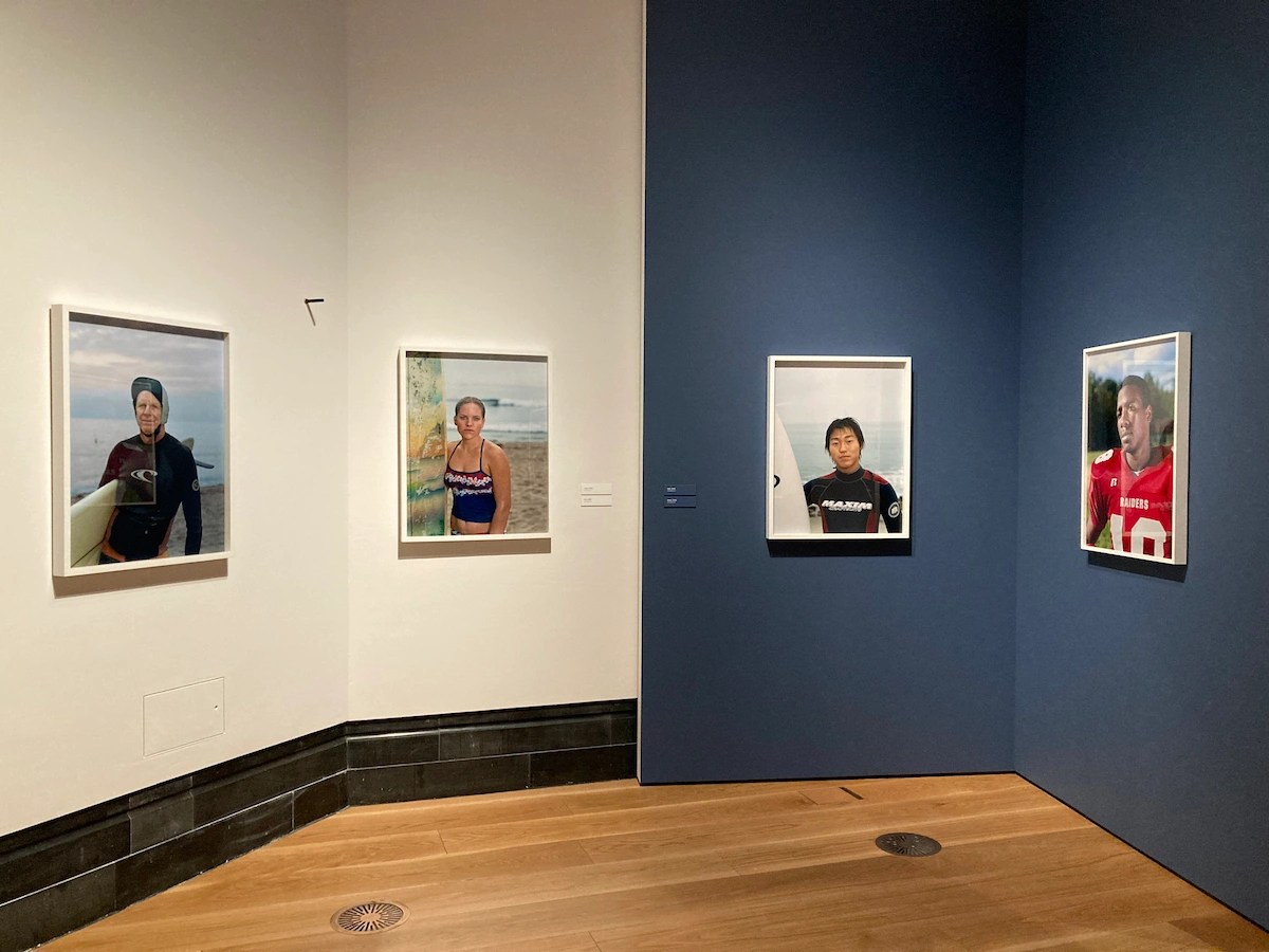
Installation view of Catherine Opie: To Be Seen @ the National Portrait Gallery, showing some of the ‘Surfing’ portraits’ (photo by the author)
In and Around home (2004)
In the early 2000s, Opie explored her Los Angeles neighbourhood and the domestic setting of her home. ‘Oliver in a Tutu’ from the series ‘In and Around Home’ depicts her son in a pink tutu in the kitchen doing laundry. This domestic scene is aligned with Opie’s politics of visibility against the backdrop of the continued homophobia within American culture at the time during the Bush era.

Oliver in a Tutu, 2004 © Catherine Opie, courtesy Regen Projects, Los Angeles; Lehmann Maupin, New York, Hong Kong, London, and Seoul; Thomas Dane Gallery
Doesn’t he look like a sweetheart! What a lovely image of everyday domestic happiness.
Children (2004)
For ‘Children’ Opie returned to the studio and to her signature highly focused portraits, this time of children set against bright solid colour backdrops.

Installation view of Catherine Opie: To Be Seen @ the National Portrait Gallery, showing some of the ‘Children portraits’ (photo by the author)
High School Football (2007-09)
From 2007 to 2009 Opie’s continued her exploration of the American landscape through the specificity of identity as it is played out on high school football fields. Opie made portraits of high school football players across several US states, vulnerable portraits of the young men counter stereotypes of athletic masculinity at a time when the US was engaged in a war with Iraq and Afghanistan.
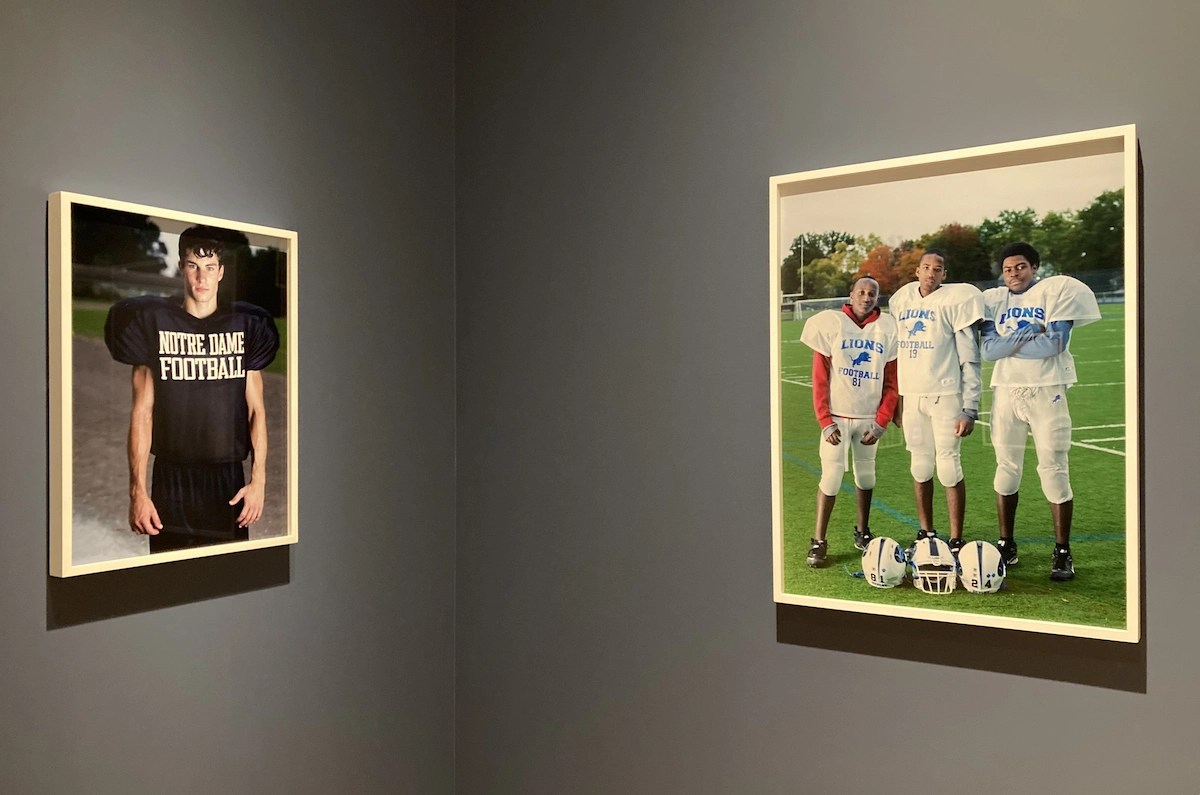
Installation view of Catherine Opie: To Be Seen @ the National Portrait Gallery, showing some of the ‘American football’ portraits (photo by the author)
Do these images subvert, interrogate or deconstruct masculinity? Ask the marines steaming towards the Gulf of Hormuz.
Girlfriends (2010)
A series of black-and-white portraits (1989-1999) which were first exhibited in 2010), the series continues Opie’s longstanding examination of the history of photography and her community in a different format.
Studio Portraits (2012–2018)
In the 2010s Opie used theatrical lighting against a black velvet backdrop to illuminate masterly and striking portraits. Allegorical elements allude to the political and spiritual concerns of art. They evoke Renaissance and Baroque painting, presenting her subjects in allegorical poses in front of black backgrounds, which remove the individuals from any sense of time or place.

Installation view of Catherine Opie: To Be Seen @ the National Portrait Gallery, showing some of the Baroque Studio Portraits (2012–2018) (photo by the author)
These portraits are characterized by highly staged, theatrical lighting against a black background, intended to create a painterly, intimate, and often allegorical quality. I haven’t mentioned that the exhibition space has been unusually designed into box-shaped rooms and corridors with, as here, the wall colour chosen to offset the images.
Walls, Windows and Blood (2023)
Opie’s photograph of Pope Francis, diminutive at his Vatican window amid the ‘constructed architecture of power’, is drawn from a body of work entitled ‘Walls, Windows and Blood’ (2023), made during a pandemic-era residency at the American Academy in Rome. The title of this portrait of the former head of the Catholic Church is a reference to the delayed papal acknowledgement of the deaths of Canada’s First Nation’s children under the church’s administration. It’s part of a small selection of images from larger locations which includes shots from President Obama’s inauguration, a Boy Scout Jubilee, and others.

Installation view of Catherine Opie: To Be Seen @ the National Portrait Gallery, showing some of the photos she took at the inauguration of President Obama on 20 January 2009 (photo by the author)
Comments
When you read the press material, the online promotion and the wall labels, you are given the impression that Opie is a radical political figure. But when you stroll from photo to photo you come to realise nothing could be further from the truth. Everything is very quiet and homely. Photos of friends, of her house and child, of other children, images of young surfers and football players, documentary images of the Obama inauguration or a handful of other mass events (a Boy Scouts Jubilee, some festival).
The more it went on, the blander it felt. The set of lesbians with moustaches is funny in a 1990s kind of way. The half dozen local children are sweet. The surfers look very wet. The footballers look fit. The friends posing against black backgrounds look very stagey.
But few if any of the images really stood out for me. Compare and contrast the vividly seedy colour photographs of the recently deceased Martin Parr to see what unnerving commentary colour photography is capable of. If you strip away the excited queer rhetoric, most of the Opie images seemed to me, well, OK, proficient enough, quite nice, meh.
In the end I thought the opening image of her breastfeeding her son was the one really standout image, and the one which had the most ‘political’, emotional and visual impact.
Related links
- Catherine Opie: To Be Seen continues at the National Portrait Gallery until 31 May 2026
- Catherine Opie at the Thomas Dane Gallery


