Dot Plots in R

The “dot plots in R” typically refers to two distinct types of visualizations: (i) Cleveland dot plots (for comparing categories) and (ii) Stacked (Wilkinson) dot plots (for showing distributions). A dot plot is a graphical representation that breaks the range of data into many small equal-width intervals and counts the number of observations in each interval. The interval count is superimposed on the number line at the interval midpoint as a series of dots (stacked if repeated), usually one for each observation. For $mpg$ from the $mtcars$ dataset, the intervals are centered at integer values, so the display gives the number of observations at each distinct observed head breadth.

Dot Plots in R Language using Base and ggplot2 Packages

Plotting Dot Plot using R Base Graphics

The following code may be used to draw a dot plot using R Base Graphics

attach(mtcars)
par(mfrow = c(3, 1))
# Dot Plot 1
stripchart(mpg, main = "Miles per Gallon", xlab = "mpg")

# Dot Plot 2
stripchart(mpg, method = "stack", cex = 2, 
           main = "Miles Per Gallon (with Stack Method)")

# Dot Plot 3
stripchart(mpg, method = "jitter", cex = 2, frame.plot = FALSE, 
           main = "Mile Per Gallon (with no frame & Jitter Method")
Dot Plot Using R Base Package

Plotting a Dot Plot using the ggplot Package

The following code may be used to draw dot plots in R using the ggplot2 package:

library(ggplot2)
library(gridExtra)

# Dot Plot 1
p1 <- ggplot(mpg, aes(x = mpg))
p1 <- p1 + geom_dotplot(binwidth = 2)
p1 <- p1 + labs(title = "Miles per Gallon")
p1 <- p1 + xlab("MPG")

# Dot Plot 2
p2 <- ggplot(mpg, aes(x = mpg))
p2 <- p2 + geom_dotplot(binwidth = 2, stackdir = "center")
p2 <- p2 + labs(title = "Miles per Gallon (stackdire = center")
p2 <- p2 + xlab("MPG")

# Dot Plot 3
p3 <- ggplot(mpg, aex(x = mpg))
p3 <- p3 + geom_dotplot(binwidth = 2, stackdir = "centerwhole")
p3 <- p3 + labs(title = "Miles per Gallon (stackdir = centerwhole)")
p3 <- p3 + xlab("MPG")

grid.arrange(grobs = list(p1, p2, p3), ncol =1)
dot plots in R using ggplot2 package

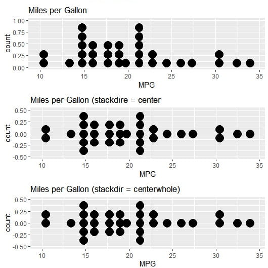
Adjust Binwidth: You can manually set the binwidth parameter to change the size of the bins the dots fall into. This helps adjust the granularity of the visualization.

Dot Plots in R Group by a Categorical Variable

One can use a categorical variable, such as cyl (number of cylinders), to group the dots and display the distribution for each group. The cyl variable needs to be converted to a factor first for proper display. The code is

ggplot(mtcars, aes(x = mpg, fill = factor(cyl))) + # Map 'cyl' to fill aesthetic
  geom_dotplot(binwidth = 1.5) +
  labs(fill = "Cylinders") # Add a label to the legend
Dot plots in R

Key Advantages of Dot Plots in R

  1. Transparency: They show raw data, revealing gaps, clusters, and outliers that summary plots obscure.
  2. Small Sample Size Clarity: Unlike boxplots, they don’t hide sample size or become misleading with n < 10.
  3. Quantitative Comparisons: Cleveland dot plots are superior to bar charts for comparing many categories because they use position (not bar length), reducing visual clutter.
  4. Flexibility: With R packages (ggplot2, ggbeeswarm, ggdist), you can layer uncertainty intervals, trend lines, and faceting to handle complex datasets.

Frequently Asked Questions about Dot Plots in R

How to add mean and median lines to a dot plot in R

First, we need summary statistics (stat_summary()) that will be overlaid on individual points.

ggplot(iris, aes(x = Species, y = Sepal.Length)) +
  geom_dotplot(binaxis = "y", stackdir = "center", 
               dotsize = 0.6, alpha = 0.5) +
  stat_summary(fun = mean, geom = "point", 
               shape = 18, size = 4, color = "red") +
  stat_summary(fun = median, geom = "point", 
               shape = 15, size = 3, color = "blue") +
  labs(title = "Red = Mean, Blue = Median")

How to create a Horizontal (Cleveland) Dot Plot in R?

One can compare many categories where vertical space is limited. One needs to swap the $x$ and $y$ axes and use coord_flip() to flip the horizontal geometry.

# Method 1: Flip coordinates
ggplot(mtcars, aes(x = reorder(rownames(mtcars), mpg), y = mpg)) +
  geom_point(size = 2) +
  coord_flip() +
  labs(x = "Car Model", y = "MPG", title = "Car Fuel Efficiency Ranking")

# Method 2: Direct horizontal with reorder
ggplot(mtcars, aes(x = mpg, y = reorder(rownames(mtcars), mpg))) +
  geom_point(size = 2, color = "steelblue") +
  labs(x = "MPG", y = "", title = "Horizontal Dot Plot")

How to color dots by a third variable?

One can use an additional dimension (such as color by transmission type) and map a variable to fill or color aesthetic.

# Color by transmission (am = 0 automatic, 1 manual)
ggplot(mtcars, aes(x = factor(cyl), y = mpg, fill = factor(am))) +
  geom_dotplot(binaxis = "y", stackdir = "center", 
               dotsize = 0.7, alpha = 0.7) +
  scale_fill_manual(values = c("lightblue", "orange"), 
                    labels = c("Automatic", "Manual")) +
  labs(fill = "Transmission")

How to handle missing data in Dot plots?

NA values cause errors or gaps in the plot. One can remove NAs or handle missing values explicitly.

# Check for missing values
sum(is.na(airquality$Ozone))

# Option 1: Remove NAs
airquality_clean <- na.omit(airquality)

ggplot(airquality_clean, aes(x = factor(Month), y = Ozone)) +
  geom_dotplot(binaxis = "y", stackdir = "center")

# Option 2: Use na.rm in geom
ggplot(airquality, aes(x = factor(Month), y = Ozone)) +
  geom_dotplot(binaxis = "y", stackdir = "center", na.rm = TRUE)

How to add a boxplot behind a dot plot?

Suppose you want to show both the distribution summary and raw data. The layer geom_boxplot() first and then geom_dotplot() with transparency.

ggplot(iris, aes(x = Species, y = Sepal.Length)) +
  geom_boxplot(width = 0.3, alpha = 0.5, outlier.shape = NA) +
  geom_dotplot(binaxis = "y", stackdir = "center", 
               dotsize = 0.5, alpha = 0.6, fill = "steelblue") +
  labs(title = "Boxplot + Dot Plot Combination")
Dot Plots in R with Box Plot

How to adjust the dot size and spacing in dot plots?

Dots are too big or too small; one can adjust them using dotsize, binwidth, and stackratio.

# Control dot appearance
ggplot(mtcars, aes(x = factor(cyl), y = mpg)) +
  geom_dotplot(binaxis = "y", 
               stackdir = "center",
               dotsize = 0.4,      # Dot size (smaller = less overlap)
               binwidth = 1.5,      # Controls grouping sensitivity
               stackratio = 0.8)    # Space between stacked dots

How to create faceted dot plots (multiple panels)?

To compare subgroups across categories, use facet_wrap() or facet_grid().

# Facet by transmission type
ggplot(mtcars, aes(x = factor(cyl), y = mpg)) +
  geom_dotplot(binaxis = "y", stackdir = "center", dotsize = 0.6) +
  facet_wrap(~ am, labeller = labeller(am = c(`0` = "Automatic", `1` = "Manual"))) +
  labs(title = "MPG Distribution by Cylinders and Transmission")

Python Pandas Data Frame MCQs 17

Test your skills with this 20-question Python Pandas Data Frame MCQs Quiz. Master data filtering, handling duplicates, using methods like apply, loc, and isin, and learn essential data manipulation best practices. Let us start with the Python Pandas Data Frame MCQs now.

Online MCQs about Pandas Data Frame in Python Programming Language

1. Which of the following methods would you use to get the first 5 rows of a DataFrame in Pandas?


2. Which method in pandas is used to reset the index of a DataFrame to a standard numeric index?


3. Which code would you use to identify the columns in a DataFrame named df that have the same values in duplicate rows?


4. After identifying duplicates, which statement accurately verifies if they were successfully removed?


5. Which of the following statements accurately describes the nsmallest and nlargest methods in pandas?


6. How can you filter rows in a DataFrame to include only those with non-null values in the ’email’ column?


7. What is the purpose of the pop method in pandas?


8. What code would you use to identify the number of duplicate rows in a DataFrame named df?


9. What is the benefit of using the ‘isin’ method over traditional boolean series in Pandas?


10. The following line of code selects the columns under which headers from the dataframe df?

y = df[['Artist','Length','Genre']]


11. How can you replace values in a pandas DataFrame?


12. When using the apply method in pandas to apply a custom function to each row in a DataFrame, which axis should you specify?


13. Which of the following are ways to filter a DataFrame to only include rows where the column ‘age’ has values between 20 and 30?


14. Which of the following are best practices when using the loc accessor in pandas?


15. What are the correct ways to filter a DataFrame to only include rows where the ‘sales’ column is between 100 and 200?


16. Which of the following methods can be used to filter a Pandas DataFrame based on logical conditions?


17. What is the best practice to avoid warnings from pandas when overwriting values in a DataFrame?


18. How can you customize the number of rows or columns to be extracted using the sample method in pandas?


19. What is the output of the following code segment of the data frame df?

df.head(5)


20. What are some advantages of converting a column to a category type in Pandas?


Question 1 of 20

Online Python Pandas Data Frame MCQs Test with Answers

Online Python Pandas Data Frame MCQs with Answers

  • What is the output of the following code segment of the data frame df? df.head(5)
  • The following line of code selects the columns under which headers from the dataframe df? y = df[[‘Artist’,’Length’,’Genre’]]
  • Which of the following are ways to filter a DataFrame to only include rows where the column ‘age’ has values between 20 and 30?
  • When using the apply method in pandas to apply a custom function to each row in a DataFrame, which axis should you specify?
  • Which of the following methods would you use to get the first 5 rows of a DataFrame in Pandas?
  • What code would you use to identify the number of duplicate rows in a DataFrame named df?
  • Which code would you use to identify the columns in a DataFrame named df that have the same values in duplicate rows?
  • After identifying duplicates, which statement accurately verifies if they were successfully removed?
  • What are the correct ways to filter a DataFrame to only include rows where the ‘sales’ column is between 100 and 200?
  • Which of the following methods can be used to filter a Pandas DataFrame based on logical conditions?
  • What is the benefit of using the ‘isin’ method over traditional Boolean series in Pandas?
  • How can you filter rows in a DataFrame to include only those with non-null values in the ’email’ column?
  • How can you customize the number of rows or columns to be extracted using the sample method in pandas?
  • Which of the following are best practices when using the loc accessor in pandas?
  • What is the purpose of the pop method in pandas?
  • Which of the following statements accurately describes the nsmallest and nlargest methods in pandas?
  • What is the best practice to avoid warnings from pandas when overwriting values in a DataFrame?
  • How can you replace values in a pandas DataFrame?
  • Which method in pandas is used to reset the index of a DataFrame to a standard numeric index?
  • What are some advantages of converting a column to a category type in Pandas?

Deep Learning Quizzes

R Graphics Devices

Learn everything about R graphics devices—types, default behavior, and best choices for saving high-quality plots. Discover key functions like abline() for adding reference lines and hovplot() in the HH package for effect analysis. This R Graphics Devices guide covers multiple methods to save graphs (PNG, PDF, SVG) and answers FAQs for R users. Perfect for beginners and experts on RFAQs.com!

What are R Graphics Devices?

The R graphics devices are interfaces or engines that handle the rendering and output of graphical plots and charts. These R graphics devices determine where and how visualizations are displayed: whether on-screen or saved to a file (e.g., PNG, PDF, SVG).

What are the Types of R Graphics Devices?

R Language supports multiple graphics devices, and is divided into two main categories:

On-Screen (Interactive) Devices

These display plots in an interactive window:

  • windows(): Default on Windows (opens a new graphics window).
  • quartz(): Default on macOS.
  • X11(): Default on Linux/Unix.
  • RStudioGD(): The device used in RStudio’s “Plots” pane.

File-Based (Non-Interactive) Devices

These save plots to files in various formats:

  • win.metafile(): (Windows only) – Windows Metafile vector format.
  • pdf(): Saves plots as PDF (vector format, scalable).
  • png() / jpeg() / tiff(): Raster image formats (pixel-based).
  • svg() / cairo_svg(): Vector-based SVG format (scalable).
  • bmp(): Bitmap image format.
  • postscript(): EPS/PS vector format (older standard).
R Graphics Devices

What is the default behaviour of R Graphics Devices?

  • If no device is open, R automatically opens an on-screen device (e.g., RStudioGD in RStudio).
  • If you call a plotting function (like plot(). It sends output to the currently active device.

Which R Graphics Devices Should One Use?

  • For interactive viewing: Default on-screen device (e.g., RStudio’s plot pane)
  • For high-quality, scalable graphics (publications): pdf(), svg()
  • For web/online use: png(), jpeg()

How many methods are there to save graphs in R?

In R, there are multiple methods to save graphs, depending on whether one is using Base R, ggplot2, or other plotting systems

  1. Using Base R Graphics Devices: The most common approach is to use graphics devices to save plots to files (such as pdf(), png(), jpeg(), tiff(), bmp(), svg(), postscript(), win.metafile()). The already completed plot on-screen can be saved without re-running the code.
  2. Using ggplot2: The ggplot2 is a preferred modern method to save plots. It automatically detects format from the extension (.png, .pdf, .svg, etc.), allows adjusting DPI (resolution) and dimensions easily, and works seamlessly with ggplot2 objects.
  3. Using RStudio’s GUI: RStudio displays the plot in the ‘Plots Pane’.
  4. Using grid and lattice Graphics: The grid-based plots (including lattice) can be saved using a graphics device.
  5. Using Cairo: For High-Quality Anti-Aliased Graphics: For better quality (such as for publications), use the Cairo package.
MethodBest ForCode Example
pdf(), png(), etc.Base R plotspdf("plot.pdf"); plot(); dev.off()
dev.copy()Quick saves after plottingdev.copy(png, "plot.png"); dev.off()
ggsave()ggplot2 plotsggsave("plot.png", p)
RStudio GUI ExportManual savingNo code (click “Export”)
Cairo packageHigh-quality exportsCairoPNG("plot.png")

What is the use of abline() function?

The abline() function in R is used to add straight lines (horizontal, vertical, or regression) to an existing plot. It is a versatile function that helps in enhancing data visualizations by adding reference lines, trendlines, or custom lines.

What are the Key uses of abline()?

  1. Add Horizontal or Vertical Lines
  2. Add Regression Lines (Best-Fit Lines)
  3. Add Lines with Custom Slopes and Intercepts
  4. Add Grid Lines or Axes

Describe the Arguments in abline()

ArgumentPurposeExample
hY-value for horizontal lineabline(h = 5)
vX-value for vertical lineabline(v = 3)
aIntercept (y at x=0)abline(a = 1, b = 2)
bSlopeabline(a = 1, b = 2)
regLinear model objectabline(lm(y ~ x))
colLine colorabline(col = "red")
ltyLine type (1=solid, 2=dashed, etc.)abline(lty = 2)
lwdLine width (thickness)abline(lwd = 2)

What is hovplot() in HH Package?

The hovplot() function is part of the HH package in the R language, which is designed for statistical analysis and visualization, particularly for ANOVA and regression diagnostics. The hovplot() function specifically creates “Half-Normal Plots with Overlaid Simulation”, a graphical tool used to assess the significance of effects in experimental designs (e.g., factorial experiments).

Try Development Economics MCQs Test

R Graphics Devices