There are various charts and Graphs in Python for data visualization. Seaborn and Matplotlib are two popular Python libraries for graphing in Python. Before plotting in Python, one needs to import the libraries. Since we have to use the data frame for this article and we are also interested in plotting some useful graphs, we will import the following libraries:
Table of Contents
Libraries Required for Charts and Graphs in Python
import numpy as np
import pandas as pd

import matplotlib.pyplot as plt
import seaborn as sns
from scipy import stats
In this article, we will use the iris data to visualize different features. For this purpose, let us import the library and the iris data set as follows:
from vega_datasets import data
iris = data.iris()
iris.head()

Drawing Boxplot in Python
One can draw a boxplot in Python using the boxplot() function from the seaborn library.
sns.boxplot( y = iris['sepalLength'], data=iris)

The above boxplot is for all observations in the “sepalLength” variable. Suppose you are interested in visualizing the sepalLength for each iris species. For this purpose, you need to use the hue argument. For example:
sns.boxplot(x = iris['species'], y = iris['sepalLength'], data=iris, hue=iris['species'])
The above code will produce the following graph.

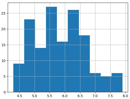
Draw Histogram in Python
One can draw a histogram in Python using the hist() function.
iris['sepalLength'].hist()
The following example draws histograms on a single plot. Three variables from a normal distribution are generated and plotted in different colours.
x1 = np.random.randn(10000) * 0.5
x2 = np.random.randn(10000) * 1.5 + 3
x3 = np.random.randn(10000)

plt.hist([x1, x2, x3], bins = 150,
         label = ['Mean=0, SD=0.5', 'Mean=3, SD=1.5', 'SDN'],
         color = ["b", "green", "magenta"]
                  )
plt.xlabel('Value')
plt.ylabel('Frequency')
plt.legend()
plt.show()
Draw Pie Charts in Python
One can easily draw Pie charts in Python by using the pie() function. The following is simple and self-explanatory code to draw a Pie chart in Python. The Python code below draws the relative sales from four different regions, namely, region A, B, C, and D.
groups = ['A', 'B', 'C', 'D']
sales = [50, 63, 29, 45]
plt.pie(sales, labels = groups, autopct='%.1f%%')
plt.show()

Clustered/ Stacked Bar Graph in Python
One can easily draw bar graphs, clustered, and stacked bar plots in Python. Since there are three varieties of iris flowers, and there are four features (variables) “sepalLength”, “petalLength”, “sepalWidth”, and “petalWidth”. We can plot the clustered or stacked bar plot in Python.
Groups = ['setosa', 'versicolor', 'virginica']
x = np.arange(3)

plt.bar(x-.2, iris['sepalLength'].groupby(iris.species).mean(), width=.2)
plt.bar(x+.2, iris['petalLength'].groupby(iris.species).mean(), width=.2)
plt.bar(x+0, iris['sepalWidth'].groupby(iris.species).mean(), width=.2)
plt.bar(x+.4, iris['petalWidth'].groupby(iris.species).mean(), width=.2)

plt.xticks (x, Groups)
plt.xlabel('Species')
plt.ylabel('Average Sepal Length')
plt.legend(['Sepal Length', 'Petal Length', 'Sepal Width', 'Petal Width'])
plt.show()
Since a small quantity is added or subtracted in the x-axis, we get the clustered bar graph. We addition or subtraction of values in the x-axis is removed, we will get a stacked bar plot. The updated code for the stacked bar plot is given below:
Groups = ['setosa', 'versicolor', 'virginica']
x = np.arange(3)

plt.bar(x, iris['sepalLength'].groupby(iris.species).mean(), width=.4)
plt.bar(x, iris['petalLength'].groupby(iris.species).mean(), width=.4)
plt.bar(x, iris['sepalWidth'].groupby(iris.species).mean(), width=.4)
plt.bar(x, iris['petalWidth'].groupby(iris.species).mean(), width=.4)

plt.xticks (x, Groups)
plt.xlabel('Species')
plt.ylabel('Average Sepal Length')
plt.legend(['Sepal Length', 'Petal Length', 'Sepal Width', 'Petal Width'])
plt.show()

Mean Plot or Barplot in Python
The barplot() function from the seaborn library can be used to draw the mean bar plots. For example,
sns.barplot(data=iris, x="species", y="sepalLength")

plt.show()

Note that one can compute the average values for each variety regarding their “sepalLength” by using gropuby() function. For example,
iris['sepalLength'].groupby(iris.species).mean()

## Output
species
setosa        5.006
versicolor    5.936
virginica     6.588
Name: sepalLength, dtype: float64