19 CSS Navbars
A navbar is the primary navigation component of a website. With CSS, you can create fully responsive and beautifully styled navigation bars from scratch. Using Flexbox, you can easily align navigation links, logos, and buttons, and with media queries, you can adapt the layout for mobile devices, often creating a hamburger menu. A pure CSS navbar gives you complete creative control over its design and behavior, including dropdown menus and sticky positioning. This collection features a wide range of navbar designs built with pure CSS. Explore different styles, from minimalist headers to complex navigation systems with smooth animations.

Scroll-driven CTA to Navbar
A dynamic, scroll-driven navigation experience for modern web pages. As users scroll through the main sections—Product, Purchase, and Follow—the corresponding navbar links highlight automatically, providing visual feedback about the current section.

Floating Action Navbar with Expanding Menu
A creative floating navigation bar featuring interactive icons and a dynamic central action button. When hovered, the main floating action button expands into a circular menu revealing additional options with smooth transitions.

Staggered Full-Screen Overlay Menu
A full-screen overlay menu with a staggered slide-in effect for background layers and menu items. The hamburger button toggles the menu, transforming into a close icon when active. Six animated background divs slide in sequentially from the left, creating a layered reveal effect, while the navigation links—About, Services, Products, and Contact—fade in from below with a smooth delay.

Right-Side Slide-Out Navigation with Overlay
A sleek right-side slide-out navigation menu with a semi-transparent overlay and animated burger toggle. Clicking the burger icon reveals an aside menu containing main links like "Home," "Install," "Blog," and a "Product" section with sub-links, along with a call-to-action button. The overlay blurs the background content while the menu smoothly slides in from the right. The toggle icon swaps between hamburger and close icons for clarity.

Full-Screen Animated Burger Menu
A modern full-screen burger menu with smooth animated transitions and staggered link appearance. The menu button toggles a circular background overlay that expands to cover the screen, revealing navigation links like "About," "Portfolio," "Services," and "Contact." Each menu item appears sequentially with a fade-and-slide animation, while hover effects shift items slightly and show a small arrow indicator.

Horizontal Navbar with Dropdown
A sleek, modern horizontal navbar featuring top-level links such as "About," "Works," "Skills," "Blogs," and "Contact." The "Skills" menu has a dropdown submenu containing "React," "Svelte," and "VueJs," which smoothly expands on hover. Built with HTML and CSS, the navbar uses flexbox for horizontal alignment, subtle hover effects with color transitions, and a dynamic underline animation for active links.

Pexels-Style Navbar
A clean, professional navbar inspired by Pexels, featuring a left-aligned logo with brand name, a horizontal navigation menu with links like "Upload," "Licence," and a dropdown "Explore" menu with sub-links such as "Discover Photos," "Popular Searches," and "Challenges." The right-aligned "Join" button stands out with a green accent, and the dropdown uses smooth hover animations with subtle shadows.

GitHub-Style Responsive Navbar
A dark-themed, GitHub-inspired top navigation bar designed for developers and web apps. It features a logo, a hamburger menu for mobile view, a left-aligned main menu with search and navigation links like "Pulls," "Issues," and "Explore," and a right-aligned section with notification badges, action icons, and a user avatar. The navbar is fully responsive: on smaller screens, the left and right menus collapse into a vertical dropdown triggered by the burger icon, while the badge and essential icons remain visible.

Facebook-Style Top Navigation Bar
A modern, Facebook-inspired top navigation bar designed for web apps with a clean white background and subtle shadows. It features a logo, a centered primary menu with five navigation buttons, and end sections containing interactive icon buttons, a user avatar, and a notification badge. The active menu item is highlighted with a blue bottom border, while other icons use muted tones. The layout is responsive: on smaller screens, center buttons are hidden, and only essential actions remain visible, ensuring usability across devices.

Navigation Tab Widget with Animated Indicator
A sleek, mobile-friendly bottom navigation widget featuring four interactive tabs—Home, Notifications, Favorites, and Settings—each represented by Material Symbols icons. When a tab is selected, an animated circular indicator moves beneath it, visually highlighting the active section. The widget adapts to wider screens by shifting to the top and scaling down slightly while also displaying a page title.

YouTube-Style Responsive Navbar
A fully responsive dark-themed navigation bar inspired by modern video platforms, featuring a left-aligned burger menu, central search input with a microphone button, and a right-aligned set of action buttons including search, mic, video call, notifications with badge, and user avatar. The search bar and microphone toggle visibility based on screen size, while the notification badge dynamically highlights pending alerts.
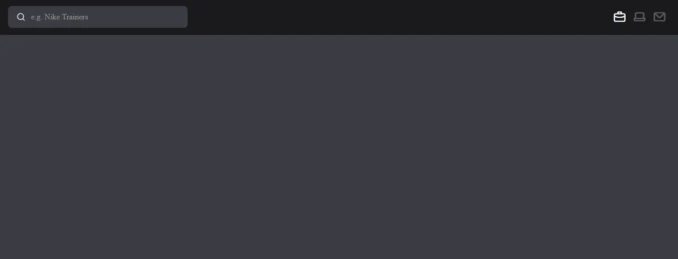
Navbar with Search Toggle
A modern responsive navigation bar featuring a search input that toggles open on mobile or small screens via a dedicated search button. The navbar contains icon buttons for cart, laptop, and messages, with active states highlighted for user clarity. On desktop, the search bar is always visible, while on smaller screens it expands to full width when activated, with a smooth background and visibility transition.

Responsive Navbar with Dropdowns
A fully responsive navigation bar featuring dropdown menus and a mobile-friendly burger toggle. The navbar displays main buttons like Home, Services, Products, and Support, with nested dropdown options that appear on hover for desktops and slide in on mobile when the burger menu is clicked. Each dropdown smoothly transitions with opacity and position changes, creating a polished and interactive navigation experience.

Fullscreen Blur Menu Navbar
A modern, fullscreen responsive navigation bar with a sleek blur background effect. The navbar features a logo and a search input, while a burger button toggles a fullscreen menu overlay. When activated, the background blurs and the menu links animate in sequentially, creating a smooth and visually appealing interaction.
Minimal Icon Navbar
A sleek, responsive navigation bar featuring a compact logo and a set of interactive icon buttons using Unicons. The navbar is fixed at the top with a dark background, ensuring visibility across all sections. Each icon highlights with full opacity and a small indicator when active, offering clear visual feedback for user interaction.

Modern Gmail-Style Navigation Bar
A clean and interactive top navigation bar inspired by Gmail’s interface. This design features a central logo with a menu icon, the site name, and a right-aligned section containing help, settings, an account avatar, and a dynamic apps dropdown menu. The dropdown grid showcases multiple services with icons and labels, providing quick access to tools like Gmail, Drive, Calendar, YouTube, Maps, and more. Smooth hover animations and scrollable dropdown enhance usability and make the interface feel modern and professional.

Navbar/Header
A Responsive Navbar/Header is a fundamental web design component that provides a clean and intuitive navigation experience. Built with pure CSS and HTML, its purpose is to create a professional and mobile-friendly menu that adapts seamlessly to different screen sizes.

Sticky Bottom Navbar
A Sticky Bottom Navbar is a web design component that keeps a navigation bar fixed to the bottom of the screen as a user scrolls. Built with HTML and CSS, its purpose is to enhance the user experience on mobile devices by making primary navigation links easily accessible with a thumb. This design is crucial for single-page applications or e-commerce sites, as it provides a persistent menu that improves site navigation and usability.

Full-Screen Hamburger Menu
Responsive Full-Screen Hamburger Menu is a visually appealing navigation menu created using HTML and CSS, featuring a hamburger icon that expands to cover the entire screen with navigation links. This design enhances user experience on mobile devices by providing a clean and minimalistic navigation option that saves space and simplifies access to important links. The menu is fully responsive, ensuring a seamless experience across various screen sizes.