15 CSS Cards
Card-based design is a popular pattern for creating modular and responsive layouts. With CSS, particularly Flexbox and Grid, you can easily create beautiful and flexible card components to display content like products, articles, or user profiles. Cards help organize information in a digestible and visually appealing way. CSS allows for rich styling of cards, including hover effects, box shadows for depth, and custom typography to create a clear information hierarchy. This collection features a variety of creative CSS card designs. Explore different layouts, hover animations, and 3D effects to showcase your content in an engaging manner.

Scroll-Reveal Content Cards
A visually engaging scroll-linked animation featuring a grid of content cards. Each card displays a background image and a keyword that dynamically reveals itself as you scroll down the page. Using modern CSS techniques like scroll-timeline and transform effects, the cards smoothly scale, fade, and animate into view.

Job Listing Card
A clean and modern job listing card showcasing company logo, role, experience level, location, salary, and profile match percentage, along with interactive share and bookmark buttons, designed with a subtle shadow, rounded corners, and responsive layout for both mobile and desktop screens.

Flip Dashboard Cards
This is a modern Flip Card component designed for dashboards and data summaries. Each card shows key metrics on the front, like counts and statuses, and flips to reveal additional details when clicked. Built using HTML and CSS with smooth 3D flip animations, it uses backface-visibility and transform to create the interactive effect.

Property Card
This is a modern Property Card built using HTML and CSS. It showcases a property with an image, title, type, description, and a call-to-action button. The card features a clean layout, soft shadows, and rounded corners for a professional look. Fully responsive, it adapts to different screen sizes, making it perfect for real estate listings, property projects, or portfolio showcases.

Business Card #2
A Business Card is a web design component that creates a professional and visually appealing digital business card. Built with HTML and CSS, its purpose is to provide an easy way to display professional contact information in a clean, organized, and printable format.

Card with a Glowing Hover Effect
A Card with a Glowing Hover Effect is a creative web design component that displays content in a clean, visually appealing box. Built with HTML and CSS, its purpose is to create a dynamic and engaging user experience. This design uses CSS to make the card appear to glow when a user hovers over it, adding a unique and modern touch to the layout.

Layered Effect Cards
A Layered Effect Cards component is a creative web design element that gives cards a sense of depth and dimension by using layered visuals. Built with HTML and CSS, its purpose is to create a visually striking and professional user experience.

Card Design
A Pure CSS Card Design is a fundamental web design component that displays content in a clean, organized, and visually appealing box. Built with HTML and CSS, its purpose is to provide a versatile and reusable container for information, such as blog posts, product details, or user profiles.
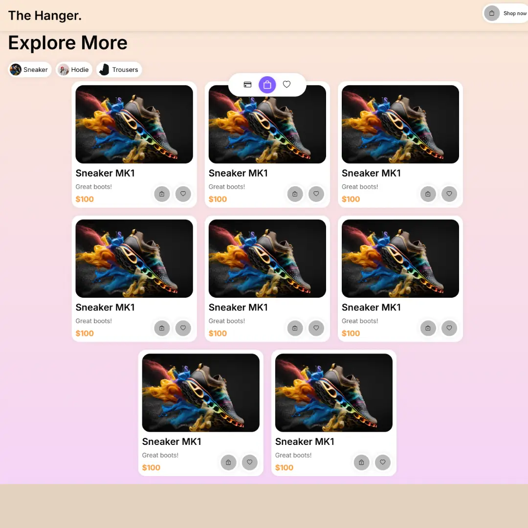
Shopping Cards
A Shopping Cards component is a fundamental web design element that displays a collection of products in a clean and organized layout. Built with HTML and CSS, its purpose is to create an engaging and user-friendly online shopping experience. This layout is crucial for any e-commerce website, as it effectively showcases product images, names, and prices, and often includes features like hover effects for a more interactive browsing experience.

Business Card
A Business Card is a web design component that creates a professional and visually appealing digital business card. Built with HTML and CSS, its purpose is to provide an easy way to display professional contact information in a clean, organized, and printable format.

Blog Card Grid
A Responsive Blog Card Grid is a modern web design component that organizes and displays a series of blog posts in a clean and visually appealing grid layout. Built with HTML for structure and CSS for styling, its purpose is to create a seamless and mobile-friendly browsing experience. The grid automatically adjusts the size and position of each card to fit different screen sizes, making it an essential feature for blogs to effectively showcase their content.

Blog Card
A Blog Card is a web design component that displays a blog post's title, image, and a short description. Built with HTML for the structure and CSS for styling, its purpose is to create a visually appealing and organized layout for a blog's content.

Movie Poster Card
A Movie Poster Card is a captivating and interactive web element that showcases films and cinematic content in a visually engaging way. Built with HTML and CSS, this component transforms static images into dynamic displays. It features key details like the movie title, release year, rating, and cast, which are often revealed through a sleek hover effect.

Neubrutalism Card
Neubrutalism Card is a visually striking card design created using HTML and CSS, featuring bold typography, high-contrast colors, and raw, unpolished elements. It enhances user experience by providing a unique and modern aesthetic, making your website elements stand out with a distinctive style.

3D Gradient Card
This component showcases a visually striking 3D gradient card created using HTML and CSS. It features a vibrant gradient background and a dynamic hover effect that makes the card appear three-dimensional.