


Open Props UI is a PURE CSS component library that uses next-generation CSS features (like container queries, CSS layers, and OKLCH color spaces) to create highly customizable components you can copy and paste directly into your project.
The library takes a refreshing approach to component distribution. Instead of importing a black-box library or NPM package, you take the provided HTML and CSS and adapt it.
Features:
- Copy-paste architecture – No npm dependencies for components, just copy the code you need
- Modern CSS foundation – Built with CSS Grid, container queries, CSS layers, and OKLCH colors
- Open Props integration – Uses the Open Props design token system for consistency
- Accessibility-first design – Follows WCAG guidelines with proper focus management and semantic markup
- Framework agnostic – Works with any framework or vanilla HTML
How to use it:
1. Install the necessary Open Props package.
# NPM
$ npm install opbeta@npm:open-props@VERSION -S
# PNPM
$ pnpm install opbeta@npm:open-props@VERSION -S
2. The default file structure:
- main.css: The entry point for all CSS imports. This is where everything starts.
- opui.css: All OPUI related imports and the necessary layer declarations.
- theme.css: The default theme CSS.
- core/normalize.css: Normalize the browser’s default styles.
- core/utils.css: Reused or optional utility-classes found here and there in the library.
- core/components.css: Import components of your choice here.
3. Browse the component registry, then copy both HTML and CSS for the components you need. All available components:
- Accordion
- Alert
- Avatar
- Badge
- Button
- Button group
- Card
- Checkbox
- Chip
- Definition list
- Dialog
- Divider
- Icon Button
- List
- Progress
- Radio
- Range
- Rich text
- Select
- Snackbar
- Spinner
- Switch
- Tab buttons
- Table
- Text field
- Textarea
- Toggle button group
- Typography
FAQs:
Q: What browsers support these components?
A: Most components work in modern browsers (Chrome 90+, Firefox 88+, Safari 14+), but some experimental features require Chrome with feature flags enabled.
Q: Can I use this in production applications?
A: Use caution with experimental features in production. The base components using stable CSS features are production-ready, but always test thoroughly in your target browsers.
Q: How do I customize component styles?
A: Since you own the CSS code, you can modify anything directly. The theme system provides CSS custom properties for common customizations, or you can edit the component CSS files directly.
Q: How do I handle browser fallbacks?
A: The library includes some fallbacks through @supports queries, but you need to add additional fallback styles for your specific browser support requirements. Consider progressive enhancement strategies for critical features.
Changelog:
v3.3.5 (02/19/2026)
- Update
v3.3.3 (01/08/2026)
- Bugfixed
- Updated package.
v3.3.0 (12/15/2025)
- Add support for icons in Switch component (ex: dark mode toggle).
v3.2.0 (12/12/2025)
- Add support for kbd element inside of <button>
v3.1.2 (11/09/2025)
- feat: var to control list hover background-color
v3.1.1 (10/23/2025)
- Bugfixes
v3.0.0 (10/22/2025)
- Update
v2.2.3 (09/21/2025)
- Revert box-sizing change from last release
v2.2.2 (08/20/2025)
- Moved out theme.css from the main bundle
- Made box-sizing declaration in normalize less intrusive
See Also:
 Rotating Loading Spinner In JavaScript – ZlataLoader.js
 1kb Relative Datetime Formatting Library – timeago.js
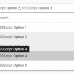 High Performance Select Box with Virtual Scroll (Vanilla JS) – Virtual Select
 Shake Html Elements with CSS3 Animations and Transforms – linkquake
 Customizable Social Share Bar In JavaScript – share-bar
 Scroll Position Indicator In Vanilla JavaScript
 JavaScript Plugin For Custom Toast Notifications – Simple Notify
 Mobile Tab Navigation UI In JavaScript And CSS