Skip to content

Typography Videos

The best videos from the fields of typography, calligraphy and lettering
The Alphabeticians follows a turning point in the life of Lida Cardozo Kindersley, who runs a renowned lettercutting workshop in Cambridge, England.
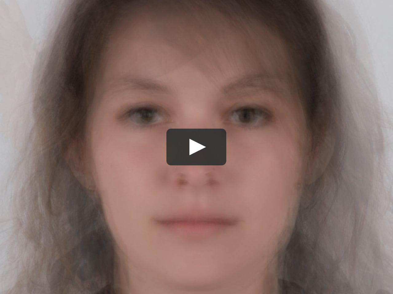
Having inherited the workshop from her husband and former teacher David Kindersley, Lida poured her soul into her work for nearly half a century. Approaching her seventieth birthday, she prepares for the next step: to hand the workshop on to her son and daughter-in-law. This moment of transition offers a portal to deeper themes: what significance do heritage crafts have in the modern world? And what legacies are we passing to future generations?
A cinematic observational documentary exploring the power of relationships and the resilience of creative spirit.

Ever been bit by a Unicode bug? Maybe you weren't treating UTF-8 encoded data correctly, or tried to read it as ASCII? Maybe you mixed up UTF-8 vs UTF-16? Unicode and character encoding might seem like a tricky topic, but let's break them down and learn about them piece by piece, from ASCII to code points to graphemes to combining character modifiers and more.
The emergence of photographic typesetting in the 1960s expanded typographic creativity and production. The classic font libraries of Monotype, Linotype, Ludlow and others were transferred to film—badly in most cases. The advent of the digital imagesetter and PostScript saw an explosion of new and derivative typefaces. Romano’s talk covers the technologies, libraries, and luminaries of the phototypesetting era.
Welcome to the world of PIPE symbols, vertical lines and bars. Why are there two pipe symbols on a computer keyboard? Why are there two vertical lines on keyboards? Why does a solid line produce a broken line? ASCII? What does Ascii and character sets have to do with this? Why is the bar broken? Why is it no longer broken? What does ANY of this mean. Find out within (disclaimer: this video might actually confuse you more than you are right now).
“Sarah Hyndman shares with us a story of type and invites us to consider our emotional response to the printed word. Each font/typeface has a personality that influences our interpretation of the words we read by evoking our emotions and setting the scene. We all understand this instinctively but it happens on a subconscious level. Sarah shows us that conscious awareness of the emotional life of fonts can be entertaining and ultimately give us more control over the decisions we make.”  

Important Information

We are placing functional cookies on your device to help make this website better.

Account

Navigation

Search

Search

Configure browser push notifications

Chrome (Android)
  1. Tap the lock icon next to the address bar.
  2. Tap Permissions → Notifications.
  3. Adjust your preference.
Chrome (Desktop)
  1. Click the padlock icon in the address bar.
  2. Select Site settings.
  3. Find Notifications and adjust your preference.