

Overview
The Design tab in Ninja Forms Views gives you complete control over the visual appearance of your form entries.
What You Can Do:
- Apply ready-made themes with a single click
- Customize table styles (borders, colors, headers, hover effects)
- Design card layouts for list views (shadows, spacing, colors)
- Apply conditional row coloring based on field values
- Add custom CSS for advanced styling
Accessing Design Settings
Step 1: Navigate to Ninja Forms → Views in your WordPress dashboard
Step 2: Edit or create a new view
Step 3: Click on the “Design” tab in the right sidebar
Note for Free Users: If you’re using the free version, you’ll see a “Pro” badge on the Design tab. Clicking it will display an upgrade prompt with a link to view Pro features.
Quick Themes
Quick Themes allow you to instantly transform the look of your views without any coding. Choose from professionally designed themes that work with all view types (Table, List, DataTable).
Note: Theme selector displays available themes based on your current view type (Table/DataTable or List).
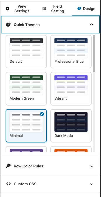

Table & DataTable Themes (20+ Options):
| Theme Name | Description | Best For |
|---|---|---|
| Default | Clean, minimal styling with subtle borders | General purpose, any website |
| Professional Blue | Blue header with clean white rows | Business, corporate sites |
| Modern Green | Fresh green accents with modern feel | Health, eco-friendly, finance |
| Vibrant | Colorful, eye-catching design | Creative projects, portfolios |
| Minimal | Ultra-clean with subtle separators only | Minimalist sites, luxury brands |
| Dark Mode | Dark background with light text | Tech sites, gaming, modern apps |
| Striped Classic | Alternating row colors for readability | Data-heavy tables, reports |
| Bordered | Defined borders around all cells | Formal documents, invoices |
| Soft Rounded | Rounded corners with soft shadows | Friendly, approachable designs |
| Corporate Gray | Professional gray tones | Enterprise, B2B sites |
| Sunset Orange | Warm orange gradient header | Food, travel, lifestyle |
| Ocean Blue | Deep blue tones with wave-like feel | Marine, travel, relaxation |
| Forest Green | Natural green palette | Nature, outdoor, organic |
| Royal Purple | Elegant purple accents | Luxury, premium services |
| Midnight Blue | Deep navy with professional look | Finance, legal, consulting |
| Rose Gold | Soft pink/gold tones | Beauty, fashion, wedding |
| Slate | Modern slate gray design | Tech, SaaS, startups |
| High Contrast | Maximum readability with strong contrast | Accessibility-focused, seniors |
| Gradient Header | Beautiful gradient in header row | Modern, creative sites |
| Custom | Full control with Table Styles panel | Unique, brand-specific designs |
List View Themes (5 Options):
| Theme Name | Description | Best For |
|---|---|---|
| Default Cards | Clean, minimalist design with subtle shadows | General purpose, business forms |
| Bordered Cards | Distinct borders around entries for clear separation | Registration lists, event attendees |
| Flat | Modern flat design without shadows or borders | Minimalist layouts, portfolios |
| Gradient | Smooth gradient backgrounds for visual appeal | Creative projects, testimonials |
| Custom | Full control with Card Styles panel | Unique designs, brand-specific requirements |
How to Apply a Theme:
- Open the Design tab
- Under “Quick Themes”, browse available themes
- Click on any theme preview to apply it instantly
- Save your view to make changes permanent
Pro Tip: The Custom theme unlocks additional panels (Table Styles or Card Styles) where you can fine-tune every design element.
Table Styles (Custom Theme)
When you select the Custom theme for Table or DataTable views, the Table Styles panel appears with extensive customization options.
The Table Styles panel provides a live preview of your customizations and allows you to adjust every aspect of your table’s appearance.
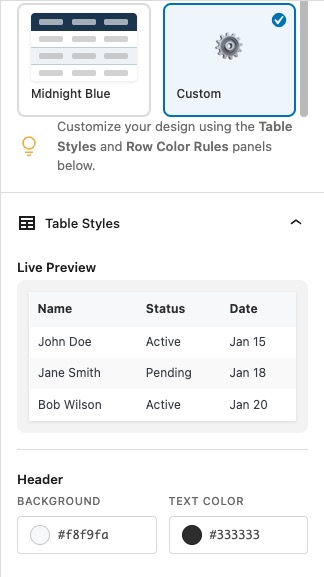
Available Options:
| Setting | Description | Options |
|---|---|---|
| Border Width | Thickness of table borders | 0-10 pixels |
| Border Color | Color of table borders | Color picker |
| Border Style | Type of border line | Solid, Dashed, Dotted, Double |
| Header Background | Background color of header row | Color picker |
| Header Text Color | Text color in header cells | Color picker |
| Hover Effect | Highlight rows on mouse hover | Toggle on/off |
| Zebra Striping | Alternate row background colors | Toggle on/off |
| Zebra Color | Color for alternate rows | Color picker (if zebra enabled) |
| Border Radius | Rounded corners for the table | 0-20 pixels |
Example Configuration:
Border Width: 2px
Border Color: #dee2e6
Border Style: Solid
Header Background: #343a40
Header Text: #ffffff
Hover Effect: Enabled
Zebra Striping: Enabled
Zebra Color: #f8f9fa
Border Radius: 8px
Result: A modern table with a dark header, subtle borders, alternating row colors, and smooth rounded corners.
Card Styles (Custom Theme)
When you select the Custom theme for List views, the Card Styles panel lets you design beautiful card layouts for each entry.
The Card Styles panel includes a live preview and lets you customize every aspect of your card design.

Available Options:
| Setting | Description | Options |
|---|---|---|
| Background Color | Card background color | Color picker |
| Border Width | Thickness of card borders | 0-10 pixels |
| Border Color | Color of card borders | Color picker |
| Border Style | Type of border line | Solid, Dashed, Dotted, Double |
| Border Radius | Rounded corners for cards | 0-50 pixels |
| Shadow Size | Drop shadow effect | None, Small, Medium, Large |
| Padding | Internal spacing inside cards | Small, Medium, Large |
| Gap Between Cards | Vertical spacing between entries | 0-100 pixels |
| Hover Effect | Highlight on mouse hover | Toggle on/off |
| Hover Scale | Slightly enlarge cards on hover | Toggle on/off |
| Label Color | Color of field labels | Color picker |
| Value Color | Color of field values | Color picker |
Example Configuration:
Background: #ffffff
Border Width: 1px
Border Color: #e0e0e0
Border Style: Solid
Border Radius: 12px
Shadow: Medium
Padding: Large
Gap: 30px
Hover Effect: Enabled
Hover Scale: Enabled
Label Color: #666666
Value Color: #333333
Result: Elegant cards with smooth shadows, generous spacing, and interactive hover effects.
Row Color Rules
Row Color Rules allow you to automatically apply background colors to entries based on field values. This is perfect for status indicators, priority levels, or any conditional formatting needs.
The Row Color Rules panel includes a live preview showing how your rules will be applied to actual entries.
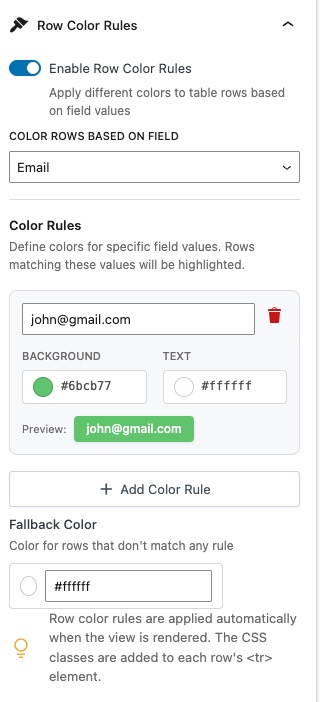
How It Works:
- Enable Row Colors: Toggle the “Enable Row Colors” switch
- Select Field: Choose which field’s value determines the color
- Add Rules: Create rules matching field values to colors
- Set Fallback: (Optional) Choose a default color for non-matching entries
Rule Structure:
| Component | Description |
|---|---|
| Field Value | The value to match (e.g., “Approved”, “Pending”, “High Priority”) |
| Background Color | Background color to apply when value matches |
| Text Color | Text color for better contrast |
| Actions | Add, remove, or reorder rules |
Example Use Case: Order Status
Field: "Order Status"
Rules:
1. "Pending"     → Yellow (#fff3cd)
2. "Processing"  → Blue (#cfe2ff)
3. "Completed"   → Green (#d1e7dd)
4. "Cancelled"   → Red (#f8d7da)
Fallback Color: Gray (#f0f0f0)
Matching Behavior:
- Exact Match: Value must match exactly (case-sensitive)
- Contains Match: Also matches if the field value contains the rule value (useful for checkboxes/multi-select)
Pro Tip: Row colors work across all view types – Table, DataTable, and List views. The color is applied to the entire row (tables) or card (lists).
Custom CSS
For advanced users, the Custom CSS panel provides a code editor where you can write custom styles that apply specifically to your view.
The Custom CSS panel includes syntax highlighting, code snippets, and a comprehensive selector reference.
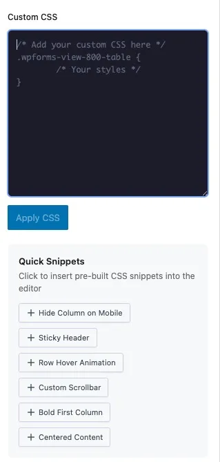
Features:
- Syntax highlighting for CSS code
- View-type specific code snippets
- Comprehensive CSS selector reference
- Scoped to your specific view
Quick Snippets (Table Views):
/* Add hover shadow to rows */
.nf-views-table tbody tr:hover {
    box-shadow: 0 4px 8px rgba(0,0,0,0.1);
}
/* Style specific column */
.nf-views-table td:nth-child(2) {
    font-weight: bold;
    color: #2271b1;
}
/* Animate row hover */
.nf-views-table tbody tr {
    transition: all 0.3s ease;
}
/* Sticky table header */
.nf-views-table thead {
    position: sticky;
    top: 0;
    z-index: 10;
}
Quick Snippets (List Views):
/* Card shadow on hover */
.nf-view-row:hover {
    box-shadow: 0 8px 16px rgba(0,0,0,0.15);
}
/* Card gradient background */
.nf-view-row {
    background: linear-gradient(135deg, #667eea 0%, #764ba2 100%);
    color: white;
}
/* Rounded image fields */
.nf-view-row img {
    border-radius: 50%;
    width: 80px;
    height: 80px;
    object-fit: cover;
}
/* Field label styling */
.nf-view-row .field-label {
    text-transform: uppercase;
    font-size: 12px;
    letter-spacing: 1px;
}
CSS Selector Reference:
| Selector | Targets |
|---|---|
.nf-view | Main view container |
.nf-views-table | Table element |
.nf-views-table thead | Table header |
.nf-views-table tbody tr | Table rows |
.nf-views-table td | Table cells |
.nf-view-row | List view cards |
.field-label | Field labels |
.field-value | Field values |
Important: Custom CSS is applied only to the specific view you’re editing. Use !important sparingly and test thoroughly on different devices.
Frequently Asked Questions
Q: Can I use Design features in the free version?
A: No, all Design features are exclusive to the Pro version. Free users will see a “Pro” badge and upgrade prompt when clicking the Design tab.
Q: Do themes affect mobile responsiveness?
A: Yes, all themes are fully responsive and automatically adapt to different screen sizes. Custom CSS should include mobile-specific styles using media queries if needed.
Q: Can I apply different row colors to different rows in the same view?
A: Yes! Row Color Rules evaluate each entry individually, so different rows can have different colors based on their field values.
Q: What happens if I switch from Custom theme to another theme?
A: Your Custom theme settings (Table/Card Styles) are preserved. If you switch back to Custom, your previous settings will still be there.
Q: Can I use Custom CSS with Quick Themes?
A: Absolutely! Custom CSS applies regardless of which theme you choose. It’s a great way to add finishing touches to pre-designed themes.
Q: Do Row Colors work with conditional display?
A: Yes, Row Colors are applied at render time. If an entry is conditionally hidden or shown, the row color rules still apply to visible entries.
Q: How do I remove all custom styles and start fresh?
A: Switch back to the “Default” theme, disable Row Colors, and clear the Custom CSS editor. Then save your view.
Q: Can I copy styles from one view to another?
A: Currently, you’ll need to manually recreate the styles. We recommend documenting your settings or using the browser’s copy/paste for Custom CSS.
Q: Will my custom styles affect other views?
A: No, all design settings are scoped to the specific view you’re editing. Each view has its own independent design configuration.
Q: Can I use CSS variables or preprocessor syntax?
A: You can use standard CSS including CSS custom properties (variables). SCSS/SASS syntax is not supported as CSS is applied directly without preprocessing.
Ready to Transform Your Views?
Upgrade to Ninja Forms Views Pro today and unlock all Design features!
View Pricing & Plans →