

Machine Learning Powered Biological Network Analysis
Video

Metabolomic network analysis can be used to interpret experimental results within a variety of contexts including: biochemical relationships, structural and spectral similarity and empirical correlation. Machine learning is useful for modeling relationships in the context of pattern recognition, clustering, classification and regression based predictive modeling. The combination of developed metabolomic networks and machine learning based predictive models offer a unique method to visualize empirical relationships while testing key experimental hypotheses. The following presentation focuses on data analysis, visualization, machine learning and network mapping approaches used to create richly mapped metabolomic networks. Learn more at www.createdatasol.com

The following presentation also shows a sneak peak of a new data analysis visualization software, DAVe: Data Analysis and Visualization engine. Check out some early features. DAVe is built in R and seeks to support a seamless environment for advanced data analysis and machine learning tasks and biological functional and network analysis.
As an aside, building the main site (in progress) was a fun opportunity to experiment with Jekyll, Ruby and embedding slick interactive canvas elements into websites. You can checkout all the code here https://github.com/dgrapov/CDS_jekyll_site.
slides: https://www.slideshare.net/dgrapov/machine-learning-powered-metabolomic-network-analysis
Try’in to 3D network: Quest (shiny + plotly)
I have an unnatural obsession with 4-dimensional networks. It might have started with a dream, but VR might make it a reality one day. For now I will settle for 3D networks in Plotly.

Presentation: R users group (more)
More: networkly
Network Visualization with Plotly and Shiny
R users: networkly: network visualization in R using Plotly
In addition to their more common uses, networks can be used as powerful multivariate data visualizations and exploration tools. Networks not only provide mathematical representations of data but are also one of the few data visualization methods capable of easily displaying multivariate variable relationships. The process of network mapping involves using the network manifold to display a variety of other information e.g. statistical, machine learning or functional analysis results (see more mapped network examples).

The combination of Plotly and Shiny is awesome for creating your very own network mapping tools. Networkly is an R package which can be used to create 2-D and 3-D interactive networks which are rendered with plotly and can be easily integrated into shiny apps or markdown documents. All you need to get started is an edge list and node attributes which can then be used to generate interactive 2-D and 3-D networks with customizable edge (color, width, hover, etc) and node (color, size, hover, label, etc) properties.
2-Dimensional Network (interactive version)
3-Dimensional Network (interactive version)

Multivariate Data Analysis and Visualization Through Network Mapping
Recently I had the pleasure of speaking about one of my favorite topics, Network Mapping. This is a continuation of a general theme I’ve previously discussed and involves the merger of statistical and multivariate data analysis results with a network.
Over the past year I’ve been working on two major tools, DeviumWeb and MetaMapR, which aid the process of biological data (metabolomic) network mapping.

DeviumWeb– is a shiny based GUI written in R which is useful for:
- data manipulation, transformation and visualization
- statistical analysis (hypothesis testing, FDR, power analysis, correlations, etc)
- clustering (heiarchical, TODO: k-means, SOM, distribution)
- principal components analysis (PCA)
- orthogonal partial least squares multivariate modeling (O-/PLS/-DA)

MetaMapR– is also a shiny based GUI written in R which is useful for calculation and visualization of various networks including:
- biochemical
- structural similarity
- mass spectral similarity
- correlation
Both of theses projects are under development, and my ultimate goal is to design a one-stop-shop ecosystem for network mapping.
In addition to network mapping,the video above and presentation below also discuss normalization schemes for longitudinal data and genomic, proteomic and metabolomic functional analysis both on a pathway and global level.
As always happy network mapping!

Enrichment Network
Enrichment is beyond random occurrence within a category. Networks can represent relationships among variables. Enrichment networks display relationships among variables which are over represented compared to random chance.
Choose Your Own Data Adventure
The question is: can we automate scientific discovery, and what might an interface to such a tool look like.

I’ve been experimenting with automating simple and complex data analysis and report generation tasks for biological data and mostly using R and LATEX. You can see some of my progress and challenges encountered in the presentation below. My ultimate goal is to push forward my current state of fill in the generic template to some kind of interactive and dynamic document generator.
While thinking of a fun way of to present the idea of human-guided data analysis and report generation, I thought of the idea for creating a simple choose your adventure story. I decided to adapt the visualization below into an interactive adventure in R which culminates in the writing of your life story using the magic of knitr.

You can download the story generator, AdventureR, and try it out for yourself. Or take a quick look at some of the possible adventures. Be forewarned some of the story endings are not for the squeamish.

On a practical level, I am in the early prototyping phase of what might a similar application look like for metabolomic data. Currently I am struggling to get beyond the linear workflow and to something more interactive, dynamic and adaptive. Nonetheless its is a beauty to behold when at the click of a button an analysis and report can be generated which would otherwise take many hours to days to manually implement. The challenge is to turn the fill in the template style into an adaptive and robust interface which can quickly guide a human domain expert through the modes of information encoded in the data.

Currently my prototype tools require well defined input templates and flow the data hierarchically down a tree of tasks (e.g. statistics, visualization, functional analysis, clustering), each coming together to generate a mapped network. Right now things are very linear and mostly fill in the template, but still very usefully mimics a set of tasks a bioinformatician might perform. My goal is to adapt the LATEX based text generator into a GUI driven markdown or html based reporting application. With the ultimate goal of increasing the speed and interactivity of the data analysis and interpretation process.

Tutorials- Statistical and Multivariate Analysis for Metabolomics
 I recently had the pleasure in participating in the 2014 WCMC Statistics for Metabolomics Short Course. The course was hosted by the NIH West Coast Metabolomics Center and focused on statistical and multivariate strategies for metabolomic data analysis. A variety of topics were covered using 8 hands on tutorials which focused on:
- data quality overview
- statistical and power analysis
- clustering
- principal components analysis (PCA)
- partial least squares (O-/PLS/-DA)
- metabolite enrichment analysis
- biochemical and structural similarity network construction
- network mapping
I am happy to have taught the course using all open source software, including: R, and Cytoscape. The data analysis and visualization were done using Shiny-based apps: DeviumWeb and MetaMapR. Check out some of the slides below or download all the class material and try it out for yourself.
2014 WCMC LC-MS Data Processing and Statistics for Metabolomics by Dmitry Grapov is licensed under a Creative Commons Attribution-NonCommercial-ShareAlike 4.0 International License.
Special thanks to the developers of Shiny and Radiant by Vincent Nijs.
Orthogonal Signal Correction Partial Least Squares (O-PLS) in R

I often need to analyze and model very wide data (variables >>>samples), and because of this I gravitate to robust yet relatively simple methods. In my opinion partial least squares (PLS) is a particular useful algorithm. Simply put, PLS is an extension of principal components analysis (PCA), a non-supervised method to maximizing variance explained in X, which instead maximizes the covariance between X and Y(s). Orthogonal signal correction partial least squares (O-PLS) is a variant of PLS which uses orthogonal signal correction to maximize the explained covariance between X and Y on the first latent variable, and components >1 capture variance in X which is orthogonal (or unrelated) to Y.
Because R does not have a simple interface for O-PLS, I am in the process of writing a package, which depends on the existing package pls.
Today I wanted to make a small example of conducting O-PLS in R, and at the same time take a moment to try out the R package knitr and RStudio for markdown generation.
You can take a look at the O-PLS/O-PLS-DA tutorials.
I was extremely impressed with ease of using knitr and generating markdown from code using RStudio. A big thank you to Yihui Xie and the RStudio developers (Joe Cheng). This is an amazing capability which I will make much more use of in the future!
Interactive Heatmaps (and Dendrograms) – A Shiny App

Heatmaps are a great way to visualize data matrices. Heatmap color and organization can be used to encode information about the data and metadata to help learn about the data at hand. An example of this could be looking at the raw data or hierarchically clustering samples and variables based on their similarity or differences. There are a variety packages and functions in R for creating heatmaps, including heatmap.2. I find pheatmap particularly useful for the relative ease in annotating the top of the heat map using an arbitrary number of items (the legend needs to be controlled for best effect, not implemented).
Heatmaps are also fun to use to interact with data!
Here is an example of a Heatmap and Dendrogram Visualizer built using the Shiny framework (and link to the code).
To run locally use the following code.
install.packages("shiny")
library(shiny)
runGitHub("Devium", username = "dgrapov",ref = "master", subdir = "Shiny/Heatmap", port = 8100)
It was interesting to debug this app using the variety of data sets available in the R datasets package (limiting options to data.frames).

My goals were to make an interface to:
- transform data and visualize using Z-scales, spearman, pearson and biweight correlations
- rotate the data (transpose dimensions) to view row or column space separately

- visualize data/relationships presented as heatmaps or dendrograms

- use hierarchical clustering to organize data

- add a top panel of annotation to display variables independent of the internal heatmap scales

- use slider to visually select number(s) of sample or variable clusters (dendrogram cut height)

There are a few other options like changing heatmap color scales, adding borders or names that you can experiment with. I’ve preloaded many famous data sets found in the R data sets package a few of my favorites are iris and mtcars. There are other datsets some of which were useful for incorporating into the build to facilitate debugging and testing. The aspect of dimension switching was probably the most difficult to keep straight (never mind legends, these may be hardest of all). What are left are informative (I hope) errors, usually coming from stats and data dimension mismatches. Try taking a look at the data structure on the “Data” tab or switching UI options for: Data, Dimension or Transformation until issues resolve. A final note before mentioning a few points about working with Shiny, missing data is set to zero and factors are omitted when making the internal heatmap but allowed in top row annotations.
Building with R and Shiny
This was my third try at building web/R/applications using Shiny.
Here are some other examples:
Principal Components Analysis ( I suggest loading a simple .csv with headers)
It has definitely gotten easier building UIs and deploying them to the web using the excellent Rstudio and Shiny tools. Unfortunately this leaves me more time to be confused by “server side” issues.
My over all thoughts (so far) :
- I have a lot to learn and the possibilities are immense
- when things work as expected it is a stupendous joy! (thank you to Shiny, R and everyone who helped!)
- when tracking down unexpected behavior I found it helpful to print app state at different levels to the browser using some simple mechanism like for instance:
#partial example

server.R
####
#create reactive objects to to "listen" for changes in states or R objects of interests
ui.opts$data<-reactive({
 tmp.data<-get(input$data)
 ui.opts$data<-tmp.data # either or
 tmp.data # may not be necessary
 })

#prepare to print objects/info to browser
output$any.name <- renderPrint({
tmp<-list()
tmp$data<-ui.opts$data()
tmp$match.dim<-match.dim
tmp$class.factor<-class.factor
tmp$dimnames<-dimnames(tmp.data)
str(tmp)
})

ui.r
####
#show/print info
mainPanel(
 verbatimTextOutput("any.name")

)
Over all two thumbs up.
Principal Components Analysis Shiny App

I’ve recently started experimenting with making Shiny apps, and today I wanted to make a basic app for calculating and visualizing principal components analysis (PCA). Here is the basic interface I came up with. Test drive the app for yourself or check out the the R code HERE.
library(shiny)
runGist("5846650")
 Above is an example of the user interface which consists of data upload (from.csv for now), and options for conducting PCA using the pcaMethods package. The various outputs include visualization of the eigenvalues and cross-validated eigenvalues (q2), which are helpful for selecting the optimal number of model components.
 The PCA scores plot can be used to evaluate extreme (leverage) or moderate (DmodX) outliers. A Hotelling’s T-squared confidence intervals as an ellipse would also be a good addition for this.
 The variable loadings can be used to evaluate the effects of data scaling and other pre-treatments.
 The next step is to interface the calculation of PCA to a dynamic plot which can be used to map meta data to plotting characteristics.
Biochemical, Chemical and Mass Spectral Similarity Network
Here is an example of a network leveraging three dominant aspects of metabolomic experiments (biochemical, chemical and mass spectral knowledge) to connect measured variables. This is a network for a blinded data set (sample ids are not known), which I’ve made for a member of my lab presenting their work at the Metabolomics Society Conference in Glasgow, Scotland.

With out knowing the experimental design we can still analyze our data for analytical effects. For example below is a principal components analysis of ~400 samples and 600 variables, where I’ve annotated the sample scores to show data aquisition date (color) and experimental samples or laboratory quality controls (shape). One thing to look for are trends or scores grouping in the PCA scores which are correlated to analytical conditions like, batch, date, technician, etc.

Finally we can take a look at the PCA variable loadings which highlights a major bottleneck in metabolomics experiments, the large amount of structurally unknown molecular features.

Even using feature rich electron impact mass spectra (GC/TOF) only 40% of the unknown variables could be connected to known species based on a cosine correlation >0.75. To give you an idea the cosine correlation or dot product between the mass spectra of two structurally very similar molecules xylose and xylitol is ~ 0.8.

Dynamic Data Visualizations in the Browser Using Shiny

After being busy the last two weeks teaching and attending academic conferences, I finally found some time to do what I love, program data visualizations using R. After being interested in Shiny for a while, I finally decided to pull the trigger and build my first Shiny app!
I wanted to make a proof of concept app which contained the following dynamics which are the basics of any UI design:
1) dynamic UI options
2) dynamically updated plot based on UI inputs
Here is what I came up with.

Check out the app for yourself or the R code HERE.
library(shiny)
runGist('5792778')
The app consists of a user interface (UI) for selecting the data, variable to plot , grouping factor for colors and four plotting options: boxplot (above), histogram, density plot and bar graph. As an added bonus the user can select to show or hide jittered points in the boxplot visualization.
Generally #2 above was well described and easy to implement, but it took a lot of trial and error to figure out how to implement #1. Basically to generate dynamic UI objects, the UI objects need to be called using the function shiny:::uiOutput() in the ui.R file and their arguments set in the server.R file using the function shiny:::renderUI(). After getting this to work everything else fell in place.
Having some experience with making UI’s in VBA (visual basic) and gWidgets; Shiny is a joy to work with once you understand some of its inner workings. One aspect I felt which made the learning experience frustrating was the lack of informative errors coming from Shiny functions. Even using all the R debugging tools having Shiny constantly tell me something was not correctly called from a reactive environment or the error was in the runApp() did not really help. My advice to anyone learning Shiny is to take a look at the tutorials, and particularly the section on Dynamic UI. Then pick a small example to reverse engineer. Don’t start off too complicated else you will have a hard time understanding which sections of code are not working as expected.
Finally here are some screen shots, and keep an eye out for more advanced shiny apps in the near future.


American Society for Mass Spectrometry 2013
I am getting ready to present at the upcoming American Society for Mass Spectrometry (ASMS) conference in Minneapolis, Minnesota (dont’cha know).
If you are around check out my talk in the section Oral: ThOB am – Informatics: Metabolomics on Thursday (06/14) at 8:30 am in room L100. Here is teaser

Above is a network representation of biochemical (red edges, KEGG RPAIRS) and structural similarities (gray edges, Tanimoto coefficient> 0.7) of > 1100 biological molecules (see here for some of their descriptions). Keep an eye out for all the R code used to generate this network as well as all the slides from my talk.
Here is my talk abstract.
Tutorials Covering Biological Data Analysis Strategies
I’ve posted two new tutorials focused on intermediate and advanced strategies for biological, and specifically metabolomic data analysis (click titles for pdfs).


Multivariate Modeling Strategy
The following is an example of a clinical study aimed at identification of circulating metabolites related to disease phenotype or grade/severity/type (tissue histology, 4 classifications including controls).
The challenge is to make sense of 300 metabolic measurements for 300 patients.
The goal is to identify metabolites related to disease, while accounting covariate meta data such as gender and smoking.
The steps
- Exploratory Data Analysis – principal components analysis (PCA)
- Statistical Analysis – covariate adjustment and analysis of covariance or ANCOVA
- Multivariate Classification Modeling – orthogonal signal correction partial least squares discriminant analysis (O-PLS-DA)
Data exploration is useful for getting an idea of the data structure and to identify unusual or unexpected trends.

PCA above conducted on autoscaled data (300 samples and 300 measurements) was useful for identifying an interesting 2-cluster structure in the sample scores (top left). Unfortunately the goal of the study, disease severity, could not explain this pattern (top center). An unknown covariate was identified causing the observed clustering of samples (top right).
Next various covariate adjustment strategies were applied to the data and evaluated using the unsupervised PCA (bottom left) and the supervised O-PLS-DA.

Even after the initial covariate adjustment for the 2-cluster effect there remained a newly visible covariate (top ;left), the source of which could not me linked to the meta data.
After data pre-treatment and evaluation of testing strategies (top right) the next challenge is to select the best classifiers of disease status. Feature selection was undertaken to improve model performance and simplify its performance.

Variable correlation with O-PLS-DA sample scores and magnitude of variable loading in the model were used to select from the the full feature set (~300) only 64 (21%) top features which explained most of the models classification performance.

In conclusion preliminary data exploration was used to identify an unknown source of variance which negatively affected the experimental goal to identify metabolic predictors of disease severity. Multivariate techniques, PCA and O-PLS-DA, were used to identify an optimal data covariate adjustment and hypothesis testing strategy. Finally O-PLS-DA modeling including feature selection, training/testing validations (n=100) and permutation testing (n=100) were used to identify the top features (21%) which were most predictive of patients classifications as displaying or not displaying the disease phenotype.
Viewing Time-Dimensional Data (in multivariate space)
The idea is that we have collected information about 30 samples at 4 intervals for 200 variables. This makes 30 * 4 * 200 = 24,000 data points!
That is a lot to keep track of if we want to start the data analysis by looking at sample-wise (30) differences in variables (200) which are also dependent on time (4).
One idea is to use orthogonal signal correction partial least squares (O-PLS) to ask the question:
1) what is the most conserved linear ordering of my data based on
2) description of my data = 3 (group)s of samples at 4 (points in time) and the starting point or t= 0 (so a total of 5 points in time).
Here is an example O-PLS scores plot for the samples (30*5 = 150 ) with polygons around the boundaries of each unique sample-group classification ( 3 * 5 = 15).

We can try to summarize the position of each group in this multivariate space (15 * 200) by plotting each groups median score and standard error for the first two O-PLS latent variables (LVs).

Above is an enticing representation of the time-course differences between 3 groups of samples for 5 time measurement points (t= 0, 30, 60, 90 and 120 minutes). Now that we have established how our samples look based on 200 measurements or variables we can examine the variable loadings for this model.

Above the loadings or relative contribution of each variable to the description of the samples is plotted for O-PLS LV1 and 2. Based on the position of the variables in the x-axis (LV1) we can say something about their relative changes in time (because O-PLS samples scores are also distributed in the x-axis with respect with time), and the variable LV2 loading (y-axis) can be used to describe changes/differences between the groups (note sample group classification pattern in the y-axis (LV2) which is independent of the change in time (x-axis, LV1).

Above we can visualize a how the sample and variable descriptions are related. For instance variables far left in the loadings (FA) start out relatively increased and then decrease as samples position increases to the right. Analogously as time increases there is an increase in the majority of variables (note the large cloud of loadings on LV1 (x-axis above)).
Another interesting thing to try is to visualize the change in groups scores which are independent of time = 0 (subtract t=0 abundance for 200 variables from t = 30, 60, 90 and 120 minute time-points on a sample-wise basis).

Above are a baseline (t= 0) normalized changes in time (above left, point color) for three groups of samples (above left, point shape). As before we can study the relationship between samples and variables on a multivariate basis by comparing the samples scores (position in LV 1 and LV2) to variable loadings.
This process (O-PLS) can be helpful for ranking the original 200 variables in two dimensions (2 lists)
1) with respect to change with time (x-axis)
2) difference between groups (y-axis).
It is interesting to note that without baseline adjustment, the group young NGT has the lowest starting FA (group scores at t= 0 are to the right of the other two groups). The relative differences between group t =0 and t = 120 positions can be used to visualize the change in FA over time (decrease, note negative loading in LV1 ).
Finally we can try to connect our multivariate observations with the easily interpretable visualizations of a single variable ( FA baseline adjusted), as a box plot representing the medians (horizontal line center of box plot) and 25-75th qantiles (rectangle top and bottom boundaries ) for the 3 groups over 4 time points.

The box plot visualization above captures a similar trend in the relative position in groups as the one we previously described using all 200 variables. This make sense given the extreme loading observed for FA, and therefore the implied contribution (influence) of this variable on the observed distribution of the sample scores.
TeachingDemos
In an effort to spread the word on how easy it is to make amazing data visualizations and harness the power of the internet to do science I’ve started a new repository for Biological and Multivariate Data Analysis Tutorials: TeachingDemos.

Data Base query and translation
- Translating Between Chemical Identifiers (intermediate)
Check out an application of my two new R packages, CTSgetR and CIRgetR, for translation between chemical identifiers in R using the Chemical Translation Service (CTS) and Chemical Identifier Resolver CIR.
Multivariate Analysis
- Principal Components Analysis (PCA) (fast and simple)
- Partial Least Squares (PLS) (fast and simple)
Network Visualizations
Biological Circuit

Network of relationships between protein and glycan components of human milk. Edge properties show the strength (line width) and direction (color) of correlations (spearmans rho, p<0.0001) between biological molecules which are represented by vertices which display the importance (size) and direction of change (color) in milk components between two experimental groups.
Connecting Lipids
 As the title states this is too easy. The hard part is how to decide when enough is enough. Here 1194 lipids tested for changes due to genotype are visualized, connected based on their Spearmans’s correlations (p<1e-3).
Here is the legend based on test between two groups.

Translating between identifiers: R interface to the Chemical Translation Service (CTS)

To enhance inference using domain knowledge it is necessary to match your query to a database containing domain knowledge.
The Chemical Translation Service (CTS) can be used to translate between molecular identifiers for many (~400K) naturally occurring biological small molecules or metabolites, which enables
CTSgetR , is an easy to use R interface to CTS, which enables translation between the following repositories of biological domain knowledge:
- “Chemical Name”
- “InChIKey”
- “InChI Code”
- “PubChem CID”
- “Pubchem SID”
- “ChemDB”
- “ZINC”
- “Southern Research Institute”
- “Specs”
- “MolPort”
- “ASINEX”
- “ChemBank”
- “MLSMR”
- “Emory University Molecular Libraries Screening Center”
- “ChemSpider”
- “DiscoveryGate”
- “Ambinter”
- “Vitas-M Laboratory”
- “ChemBlock”
Check out an example translation from the universal molecular identifier, InchiKey, to the well referenced PubChem Chemical Identifier (CID)
HERE.
Andrew’s encoding of Multivariate Data (looks informative)

Recently I came across an interesting visualization for multivariate data named the Andrews curve (plot) (original post here). This is a very interesting trigonometric transformation of a multivariate data set to x and y coordinate encoding. After a quick check I was happy to see there is a package in R for making Andrew’s plots, andrews. Here is an example of an andrews plot for a data set describing various features of automobiles, “mtcars“, which is also colored according to the number of cylinders in each vehicle (4, 6 or 8).
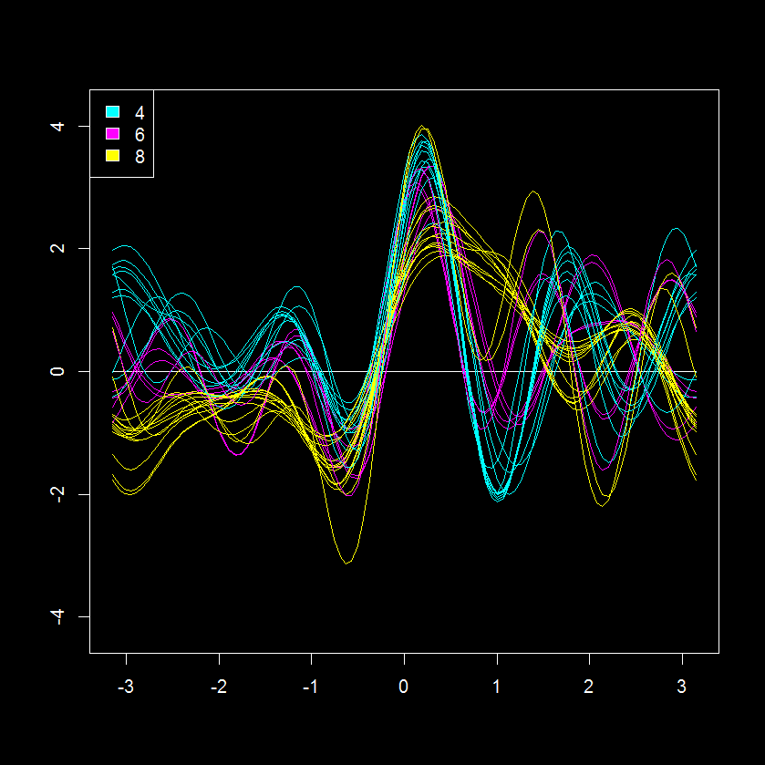 This is an interesting perspective of 11 measurements for 32 cars (shares similarity with a parallel coordinates plot). Based on this data visualization, the 8 cylinder cars seem the most similar with regards to other parameters judging from the “tightness” of their patterns (yellow lines). While the 2 and 6 cylinder cars seem more similar to each other.
Here is my modified visualizations of the Andersons plot using ggplot2 (get code HERE).


Its hard to compare the Anderson encoded and original data, but we can try with a scatterplot visualization.
 This visualization supports the previous observation, the number of cylinders has a large effect on the continuous variables like miles per hour (mpg). The effect of the other potential covariates (discreet variables like va, am, gear) is less obvious but may also be present. This would be important to include or account for when conducting predictive modeling.
To try to identify further covariates we can take a look at the at the principal component (PCA) scores, which is another method for multivariate visualization, but in this case is limited to the first two largest discreet modes of variance in the data (principal plane or component 1 and component 2).

Based on the scores, it is evident that sample clustering is fairly well explained by the number of cylinders and other correlated parameters. We can also see that loadings for PC1 (x-axis) can be used to explain cylinder # fairly well, but there is something else causing a separation in y.
Instead of autoscaling the data (mean=0, sd=1; as previously done prior to the PCA above) we can instead make an andrews encoding of the data. This will apply a trigonometric transformation to each of the variables to produce 101 x and y values for each of the 32 cars. We can combine these to create a new matrix (32 by 202) with rows representing sample (n=32) and columns the x (n=101) and y (n=101) encodings. This effectively increase our number of variables from 12 to 202, but hopefully also gives a deeper insight into any class structure.
Interestingly this encoding highlights the previously noted and yet unexplained factor (evident in scores difference in y between same cylinder vehicles). Next, we can can check the other discreet variables in the data to see if any of them can help explain the clustering pattern observed above.
After quick check it is evident that the the type of transmission (am; manual (1) or automatic (0)) nicely explains the second mode of scores variance, which is not captured by cylinders.

This is less obvious in the autoscaled PCA.

Further inspection of the andrews encoded PCA also suggest that there is yet another potential covariate, as evident from the two clusters of 8 cylinder and automatic transmission vehicles (8|0).
At first blush the andrews method coupled with a dimensional reduction technique seems like a very interesting technique for identifying covariate contributions to patterns in the data. It would be interesting to compare variable loadings from PCA of autoscaled and andrews encoded data, but it is not obvious how to do this…
If you want to replicate the analyses above or just want to apply these visualizations to your own data get all the necessary code from the example found HERE.
Tutorial- Building Biological Networks

I love networks! Nothing is better for visualizing complex multivariate relationships be it social, virtual or biological.
I recently gave a hands-on network building tutorial using R and Cytoscape to build large biological networks. In these networks Nodes represent metabolites and edges can be many things, but I specifically focused on biochemical relationships and chemical similarities. Your imagination is the limit.


If you are interested check out the presentation below.
Here is all the R code and links to relevant data you will need to let you follow along with the tutorial.
</pre>
#load needed functions: R package in progress - "devium", which is stored on github
source("http://pastebin.com/raw.php?i=Y0YYEBia")
<pre>
# get sample chemical identifiers here:https://docs.google.com/spreadsheet/ccc?key=0Ap1AEMfo-fh9dFZSSm5WSHlqMC1QdkNMWFZCeWdVbEE#gid=1
#Pubchem CIDs = cids
cids # overview
nrow(cids) # how many
str(cids) # structure, wan't numeric
cids<-as.numeric(as.character(unlist(cids))) # hack to break factor

#get KEGG RPAIRS
#making an edge list based on CIDs from KEGG reactant pairs
KEGG.edge.list<-CID.to.KEGG.pairs(cid=cids,database=get.KEGG.pairs(),lookup=get.CID.KEGG.pairs())
head(KEGG.edge.list)
dim(KEGG.edge.list) # a two column list with CID to CID connections based on KEGG RPAIS
# how did I get this?
#1) convert from CID to KEGG using get.CID.KEGG.pairs(), which is a table stored:https://gist.github.com/dgrapov/4964546
#2) get KEGG RPAIRS using get.KEGG.pairs() which is a table stored:https://gist.github.com/dgrapov/4964564
#3) return CID pairs

#get EDGES based on chemical similarity (Tanimoto distances >0.07)
tanimoto.edges<-CID.to.tanimoto(cids=cids, cut.off = .7, parallel=FALSE)
head(tanimoto.edges)
# how did I get this?
#1) Use R package ChemmineR to querry Pubchem PUG to get molecular fingerprints
#2) calculate simialrity coefficient
#3) return edges with similarity above cut.off

#after a little bit of formatting make combined KEGG + tanimoto edge list
# https://docs.google.com/spreadsheet/ccc?key=0Ap1AEMfo-fh9dFZSSm5WSHlqMC1QdkNMWFZCeWdVbEE#gid=2

#now upload this and a sample node attribute table (https://docs.google.com/spreadsheet/ccc?key=0Ap1AEMfo-fh9dFZSSm5WSHlqMC1QdkNMWFZCeWdVbEE#gid=1)
#to Cytoscape
You can also download all the necessary materials HERE, which include:
- tutorial in powerpoint
- R script
- Network edge list and node attributes table
- Cytoscape file
Happy network making!
Evaluation of Orthogonal Signal Correction for PLS modeling (O-PLS)


Partial least squares projection to latent structures or PLS is one of my favorite modeling algorithms.
PLS is an optimal algorithm for predictive modeling using wide data or data with rows << variables. While there is s a wealth of literature regarding the application of PLS to various tasks, I find it especially useful for biological data which is often very wide and comprised of heavily inter-correlated parameters. In this context PLS is useful for generating single dimensional answers for multidimensional or multi-
factorial questions while overcoming the masking effects of redundant information or multicollinearity.
In my opinion an optimal PLS-based classification/discrimination model (PLS-DA) should capture the maximum difference between groups/classes being classified in the first dimension or latent variable (LV) and all information orthogonal to group discrimination should omitted from the model.
Unfortunately this is almost never the case and typically the plane of separation between class scores in PLS-DA models span two or more dimensions. This is sub-optimal because we are then forced to consider more than one dimension or model latent variable (LV) when answering the question: how are variables the same/different between classes and which of differences are the most important.
To the left is an example figure showing how principal components (PCA), PLS-DA and orthogonal signal correction PLS-DA (O-PLS-DA) vary in their ability to capture the maximum variance between classes (red and cyan) in the first dimension or LV (x-axis).
The aim O-PLS-DA is to maximize the variance between groups in the first dimension (x-axis).
Unfortunately there are no user friendly functions in R for carrying out O-PLS. Note- the package muma contains functions for O-PLS, but it is not easy to use because it is deeply embedded within an automated reporting scheme.
Luckily Ron Wehrens published an excellent book titled Chemometrics with R which contains an R code example for carrying out O-PLS and O-PLS-DA.
I adapted his code to make some user friendly functions (see below) for generating O-PLS models and plotting their results . I then used these to generate PLS-DA and O-PLS-DA models for a human glycomics data set. Lastly I compare O-PLS-DA to OPLS-DA (trademarked Umetrics, calculated using SIMCA 13) model scores.
The first task is to calculate a large (10 LV) exploratory model for 0 and 1 O-LVs.

Doing this we see that a 2 component model minimize the root mean squared error of prediction on the training data (RMSEP), and the O-PLS-DA model has a lower error than PLS-DA. Based on this we can calculate and compare the sample scores, variable loadings, and changes in model weights for 0 and 1 orthogonal signal corrected (OSC) latent variables PLS-DA models.
Comparing model (sample/row) scores between PLS-DA (0 OSC) and O-PLS-DA (1 OSC) models we can see that the O-PLS-DA model did a better job of capturing the maximal separation between the two sample classes (0 and 1) in the first dimension (x-axis).

Next we can look at how model variable loadings for the 1st LV are different between the PLS-DA and O-PLS-DA models.

We can see that for the majority of variables the magnitude for the model loading was not changed much however there were some parameters whose sign for the loading changed (example: variable 8). If we we want to use the loadings in the 1st LV to encode the variables importance for discriminating between classes in some other visualization (e.g. to color and size nodes in a model network) we need to make sure that the sign of the variable loading accurately reflects each parameters relative change between classes.
To specifically focus on how orthogonal signal correction effects the models perception of variables importance or weights we can calculate the differences in weights (delta weights ) between PLS-DA and O-PLS-DA models.

Comparing changes in weights we see that there looks to be a random distribution of increases or decreases in weight. variables 17 and 44 were the most increased in weight post OSC and 10 and 38 most decreased. Next we probably would want to look at the change in weight relative to the absolute weight (not shown).
Finally I wanted to compare O-PLS-DA and OPLS-DA model scores. I used Simca 13 to calculate the OPLS-DA (trademarked) model parameters and then devium and inkcape to make a scores visualization.

Generally PLS-DA and OPLS-DA show a similar degree of class separation in the 1st LV. I was happy to see that the O-PLS-DA model seems to have the largest class scores resolution and likely the best predictive performance of all three algorithms, but I will need to validate this by doing model permutations and training and testing evaluations.
Check out the R code used for this example HERE.


