Tag Archives: quantile

Tukey mean-difference plot

Distributions can differ in many ways, not just in central tendency (Rousselet, Pernet & Wilcox, 2017). While obvious, this statement is at odd with common statistical practices that are focused exclusively on mean comparisons. Fortunately, there are many methods to make distributional inferences, for instance by applying generalized linear models to reaction time data (Lindeløv, 2019). Another informative approach is to make inferences about multiple quantiles, essentially an extension of q-q plots (quantile-quantile plots, Wilk & Gnanadesikan, 1968). Quantile inference methods appear to be have been reinvented multiple times (Rousselet, 2018). In this earlier post, I illustrated four very similar types of plots: quantile plots, vincentile plots, delta plots and shift functions. As far as I know, the earliest method is the shift function, introduced by Doksum (1974; 1976). Recently, while reading about Bland-Altman plots (Altman & Bland, 1983), I came across a 5th type of quantile plots, the Tukey mean-difference plot (Cleveland, 1993).

Side story: it is unclear who the Tukey in question is, as Cleveland (1993) offers no reference for the plot. A very similar plot appears in an earlier book by Chambers, Cleveland, Kleiner & Tukey, 1983. The Tukey is the 1983 book is Paul A. Tukey, not the famous John W. Tukey. Others have been down the same historical rabbit hole.

Surprisingly, several sources describe the Bland-Altman plot and the Tukey mean-difference plot as equivalent (Wikipedia; Wolfram). Equating the two methods is surprising because, even though they lead to graphs that can look similar, they ask very different questions about the data. The Bland-Altman plot is a kind of scatterplot used to assess the agreement between two methods (and more generally two paired measurements): the differences between paired observations are plotted as a function of their averages. In contrast, the Tukey mean-difference plot is a type of q-q plot used to assess distributional shape differences: the quantile differences are plotted as a function of the quantile averages. The general difference between a scatterplot and a q-q plot is vividly described in this quote from Chambers, Cleveland, Kleiner & Tukey, 1983:

“It is essential to understand the difference between a quantile-quantile plot and a scatter plot. Basically, a scatter plot is useful for studying such questions as “Is the monthly average temperature in Lincoln systematically related to the temperature in Newark?” or “If Newark has a hot month, is Lincoln likely to have hot weather in the same month?” On the other hand, the quantile-quantile plot is aimed at such questions as “Over a period of time, do the residents of Lincoln experience the same mixture of hot, mild, and cold weather as people living in Newark?” This question would be meaningful even if the two data sets spanned different years, or if we were comparing autumn temperatures in Newark with spring temperatures in Lincoln, or if Newark were in another galaxy. It is the kind of question that a home owner in Lincoln and one in Newark might be interested in if they were concerned about the cost of heating in the winter and air conditioning in the summer at the two places but had no interest in whether they experienced hot and cold spells at exactly the same time.”

In short, a scatterplot is about the relation between paired observations, whereas a q-q plot is about relative shape differences between two distributions of observations. A scatterplot can only be used when dealing with paired observations; it is irrelevant for a q-q plot.

To better understand the two types of graphs, let’s consider a series of illustrations. The next four series of plots reflect situations where the Bland-Altman plot is a useful tool: we try to estimate some ground truth using two types of instruments, and then consider how well the two sets of measurements agree.

Dependent observations

Independent measurement errors, no bias

In this first example, we get two sets of n=200 measurements that are equal to a ground truth + random errors that are independent between the sets. Also, there is no bias. In this situation, the two measurement methods agree with each other. Any pattern is due to sampling variability. Increase the sample size in the code to see what happens.

For the Bland-Altman plot, a superimposed smoother is useful to reveal trends in the scatterplot.
In this example and the following one, the two plots reveal similar trends in differences. We can also see a difference in scale: the Bland-Altman plot shows the raw differences between pairs of observations, whereas the Tukey mean-difference plot shows differences between matching quantiles, or order statistics. In the case of equal sample sizes, these quantiles are simply the sorted observations, such that the smallest observation in one group is compared to the smallest observation in the other group, and so on in rank order.

Correlated measurement errors, no bias

In this situation, the error terms have a 0.5 correlation.

Additive bias

Now in addition to the correlated noise, there is a 0.1 additive bias applied to Y.

Additive and multiplicative bias

Same as above, now with the addition of multiplicative bias.

Independent observations

Now we consider completely independent observations to illustrate that the Tukey mean-difference plot captures shape differences, like other related quantile methods. In this scenario, the Bland-Altman plot makes no sense.

Illustrate populations

Consider pairs of marginal Beta distributions. In each panel, the reference condition is X = Beta(10,10), which is compared to Y = Beta(10,10); Y = Beta(3,3); Y = Beta(8,6); Y = Beta(4,2). Why Beta distributions? That’s the way percent correct data are distributed across participants for instance (Rousselet, 2025).

Simulate data: vary shape

Now imagine we take independent samples from these populations. In that situation the Bland-Altman plot is inappropriate, because any pairing of observations would be completely arbitrary. To make it more interesting, we can also use different sample sizes: n1=100 and n2=200.

Downsample to the deciles

Since we’re plotting quantiles, we don’t need to plot so many. We can make the same graphs using the deciles only.

Downsample to the quartiles

Or even just the quartiles!

And to get confidence intervals in these plots, the percentile bootstrap would work very well, especially when combined with the Harrell-Davis quantile estimator (Rousselet, Pernet & Wilcox, 2017; Wilcox & Rousselet, 2024).

In conclusion, the Tukey mean-difference plot is another great example of a quantile graphical method, and although in some situations it can reveal similar trends as the Bland-Altman plot, the two approaches are certainly not the same.

The R code is on GitHub.

Using cluster-based permutation tests to estimate MEG/EEG onsets: How bad is it?

Guillaume A. Rousselet

The answer to this important question is in this article at the European Journal of Neuroscience. It is an extended version of work presented in a blog post published over a year ago. Although the focus is on MEG/EEG timing estimation, the conclusions and the main points about statistical issues apply broadly to brain imaging and many other scientific endeavours. As the article is open access and relatively short, I won’t repeat the content, but there is a good snapshot in the graphical abstract:

I also made an animated version of Figure 1 using gganimate. The conclusion is to avoid FDR correction if the goal is to estimate onsets. More on this topic here. Figure 1a:

Figure 1b:

I also made an animated illustration of the change point algorithm (here limited to differences in means), using code from Rebecca Killick and gganimate:

Finally, a shout out to Benedikt Ehinger, who reproduced some of the results in the article as part of the reviewing process, using his own Julia implementation. Because I had a preprint of the article on bioRxiv, he posted the replication on his blog. One of the many benefits of open science…

R functions for the hierarchical shift function

The hierarchical shift function presented in the previous post is now available in the `rogme` R package. Here is a short demo.

Get the latest version of `rogme`:

# install.packages("devtools")
devtools::install_github("GRousselet/rogme")
library(rogme)
library(tibble)

Load data and compute hierarchical shift function:

df <- flp # get reaction time data - for details `help(flp)`
# Compute shift functions for all participants
out <- hsf(df, rt ~ condition + participant)

unnamed-chunk-21-1

Because of the large number of participants, the confidence intervals are too narrow to be visible. So let’s subset a random sample of participants to see what can happen with a more smaller sample size:

set.seed(22) # subset random sample of participants
id <- unique(df$participant) 
df <- subset(df, flp$participant %in% sample(id, 50, replace = FALSE))
out <- hsf(df, rt ~ condition + participant) 
plot_hsf(out)

unnamed-chunk-25-1

Want to estimate the quartiles only?

out <- hsf(df, rt ~ condition + participant, qseq = c(.25, .5, .75))
plot_hsf(out)

unnamed-chunk-27-1

Want to reverse the comparison?

out <- hsf(df, rt ~ condition + participant, todo = c(2,1))
plot_hsf(out)

unnamed-chunk-26-1

P values are here:

out$pvalues

P values adjusted for multiple comparisons using Hochberg’s method:

out$adjusted_pvalues 

Percentile bootstrap version:

set.seed(8899)
out <- hsf_pb(df, rt ~ condition + participant)

Plot bootstrap highest density intervals – default:

plot_hsf_pb(out) 

unnamed-chunk-40-1

Plot distributions of bootstrap samples of group differences. Bootstrap distributions are shown in orange. Black dot marks the mode. Vertical black lines mark the 50% and 90% highest density intervals.

plot_hsf_pb_dist(out)


unnamed-chunk-41-1

For more examples, a vignette is available on GitHub.

Feedback would be much appreciated: don’t hesitate to leave a comment or to get in touch directly.

Hierarchical shift function: a powerful alternative to the t-test

In this post I introduce a simple yet powerful method to compare two dependent groups: the hierarchical shift function. The code is on GitHub. More details are in Rousselet & Wilcox (2019), with a reproducibility package on figshare.

Let’s consider different situations in a hierarchical setting: we’ve got trials from 2 conditions in several participants. Imagine we collected data from one participant and the results look like this:

unnamed-chunk-3-1

These fake reaction time data were created by sampling from ex-Gaussian distributions. Here the two populations are shifted by a constant, so we expect a uniform shift between the two samples. Later we’ll look at examples showing  differences most strongly in early responses, late responses, and in spread.

To better understand how the distributions differ, let’s look at a shift function, in which the difference between the deciles of the two conditions are plotted as a function of the deciles in condition 1 – see details in Rousselet et al. (2017). The decile differences are all negative, showing stochastic dominance of condition 2 over condition 1. The function is not flat because of random sampling and limited sample size. 

unnamed-chunk-4-1

Now, let’s say we collected 100 trials per condition from 30 participants. How do we proceed? There are a variety of approaches available to quantify distribution differences. Ideally, such data would be analysed using a multi-level model, including for instance ex-Gaussian fits, random slopes and intercepts for participants, item analyses… This can be done using the lme4 or brms R packages. However, in my experience, in neuroscience and psychology articles, the most common approach is to collapse the variability across trials into a single number per participant and condition to be able to perform a paired t-test: typically, the mean is computed across trials for each condition and participant, then the means are subtracted, and the distribution of mean differences is entered into a one-sample t-test. Obviously, this strategy throws away a huge amount of information! And the results of such second-tier t-tests are difficult to interpret: a positive test leaves us wondering exactly how the distributions differ; a negative test is ambiguous – beside avoiding the ‘absence of evidence is not evidence of absence’ classic error, we also need to check if the distributions do not differ in other aspects than the mean. So what can we do?

Depending on how conditions differ, looking at other aspects of the data than the mean can be more informative. For instance, in Rousselet & Wilcox (2019), we consider group comparisons of individual medians. Considering that the median is the second quartile, looking at the other quartiles can be of theoretical interest to investigate effects in early or later parts of distributions. This could be done in several ways, for instance by making inferences on the first quartile (Q1) or the third quartile (Q3). If the goal is to detect differences anywhere in the distributions, a more systematic approach consists in quantifying differences at multiple quantiles. Here we consider the case of the deciles, but other quantiles could be used. First, for each participant and each condition, the sample deciles are computed over trials. Second, for each participant, condition 2 deciles are subtracted from condition 1 deciles – we’re dealing with a within-subject (repeated-measure) design. Third, for each decile, the distribution of differences is subjected to a one-sample test. Fourth, a correction for multiple comparisons is applied across the 9 one-sample tests. I call this procedure a hierarchical shift function. There are many options available to implement this procedure and the example used here is not the definitive answer: the goal is simply to demonstrate that a relatively simple procedure can be much more powerful and informative than standard approaches.

In creating a hierarchical shift function we need to make three choices: a quantile estimator, a statistical test to assess quantile differences across participants, and a correction for multiple comparisons technique. The deciles were estimated using type 8 from the base R quantile() function (see justification in Rousselet & Wilcox, 2019). The group comparisons were performed using a one-sample t-test on 20% trimmed means, which performs well in many situations, including in the presence of outliers. The correction for multiple comparisons employed Hochberg’s strategy (Hochberg, 1988), which guarantees that the probability of at least one false positive will not exceed the nominal level as long as the nominal level is not exceeded for each quantile. 

In Rousselet & Wilcox (2019), we consider power curves for the hierarchical shift function (HSF) and contrast them to other approaches: by design, HSF is sensitive to more types of differences than any standard approach using the mean or a single quantile. Another advantage of HSF is that the location of the distribution difference can be interrogated, which is impossible if inferences are limited to a single value.

Here is what the hierarchical shift function looks like for our uniform shift example:

unnamed-chunk-7-1

The decile differences between conditions are plotted for each participant (colour coded) and the group 20% trimmed means are superimposed in black. Differences are pretty constant across deciles, suggesting a uniform shift. Most participants have shift functions entirely negative – a case of stochastic dominance of one condition over the other. There is growing uncertainty as we consider higher deciles, which is expected from measurements of right skewed distributions.

We can add confidence intervals:

unnamed-chunk-9-1

P values are available in the GitHub code.

Instead of standard parametric confidence intervals, we can also consider percentile bootstrap confidence intervals (or highest density intervals), as done here:

unnamed-chunk-14-1

Distributions of bootstrap estimates can be considered cheap Bayesian posterior distributions. They also contain useful information not captured by simply reporting confidence intervals.

Here we plot them using geom_halfeyeh() from tidybayes. 

unnamed-chunk-15-1

The distributions of bootstrap estimates of the group 20% trimmed means are shown in orange, one for each decile. Along the base of each distribution, the black dot marks the mode and the vertical lines mark the 50% and 90% highest density intervals.

Nice hey?! Reporting a figure like that is dramatically more informative than reporting a P value and a confidence interval from a t-test!

A bootstrap approach can also be used to perform a cluster correction for multiple comparisons – see details on GitHub. Preliminary simulations suggest that the approach can provide substantial increase in power over the Hochberg’s correction – more on that in another post.

Let’s look at 3 more examples, just for fun…

Example 2: early difference

Example participant:

unnamed-chunk-17-1

Shift function:

unnamed-chunk-18-1

Hierarchical shift function with confidence intervals:

unnamed-chunk-22-1

Percentile bootstrap estimate densities:

unnamed-chunk-28-1

Example 3: difference in spread

Example participant:

unnamed-chunk-29-1

Shift function:

unnamed-chunk-30-1

Hierarchical shift function with confidence intervals:

unnamed-chunk-34-1

Percentile bootstrap estimate densities:

unnamed-chunk-40-1

Example 4: late difference

Example participant:

unnamed-chunk-41-1

Shift function:

unnamed-chunk-42-1

Hierarchical shift function with confidence intervals:

unnamed-chunk-46-1

Percentile bootstrap estimate densities:

unnamed-chunk-52-1

Conclusion

The hierarchical shift function can be used to achieve two goals: 

  • to screen data for potential distribution differences using p values, without limiting the exploration to a single statistics like the mean;
  • to illustrate and quantify how distributions differ.

I think of the hierarchical shift function as the missing link between t-tests and multi-level models. I hope it will help a few people make sense of their data and maybe nudge them towards proper hierarchical modelling.

R functions for the parametric hierarchical shift function are available in the rogme package. I also plan bootstrap functions. Then I’ll tackle the case of 2 independent groups, which requires a third level quantifying differences of differences.


Illustration of continuous distributions using quantiles

In this post I’m going to show you a few simple steps to illustrate continuous distributions. As an example, we consider reaction time data, which are typically positively skewed and can differ in different ways. Reaction time distributions are also a rich source of information to constrain cognitive theories and models. So unless the distributions are at least illustrated, this information is lost (which is typically the case when distributions are summarised using a single value like the mean). Other approaches not covered here include explicit mathematical models of decision making and fitting functions to model the shape of the distributions (Balota & Yap, 2011).

For our current example, I made up data for 2 independent groups with four patterns of differences:

  • no clear differences;

  • uniform shift between distributions;

  • mostly late differences;

  • mostly early differences.

The R code is on GitHub.

Scatterplots

For our first visualisation, we use geom_jitter() from ggplot2. The 1D scatterplots give us a good idea of how the groups differ but they’re not the easiest to read. The main reason is probably that we need to estimate local densities of points in different regions and compare them between groups.

figure_scatter

For the purpose of this exercise, each group (g1 and g2) is composed of 1,000 observations, so the differences in shapes are quite striking. With smaller sample sizes the evaluation of these graphs could be much more challenging.

Kernel density plots

Relative to scatterplots, I find that kernel density plots make the comparisons between groups much easier.

figure_kde

Improved scatterplots

Scatterplots and kernel density plots can be combined by using beeswarm plots. Here we create scatterplots shaped by local density using the geom_quasirandom() function from the ggbeeswarm package. Essentially, the function creates violin plots in which the constituent points are visible. 

figure_scat_quant

To make the plots even more informative, I’ve superimposed quantiles – here deciles computed using the Harrell-Davis quantile estimator. The deciles are represented by vertical black lines, with medians shown with thicker lines. Medians are informative about the location of the bulk of the observations and comparing the lower to upper quantiles let us appreciate the amount of asymmetry within distributions. Comparing quantiles between groups give us a sense of the amount of relative compression/expansion on each side of the distributions. This information would be lost if we only compared the medians. 

Quantile plots

If we remove the scatterplots and only show the quantiles, we obtain quantile plots, which provide a compact description of how distributions differ (please post a comment if you know of older references using quantile plots). Because the quantiles are superimposed, they are easier to compare than in the previous scatterplots. To help with the group comparisons, I’ve also added plots of the quantile differences, which emphasise the different patterns of group differences.

figure_qplot

Vincentile plots

An alternative to quantiles are Vincentiles, which are computed by sorting the data and splitting them in equi-populated bins (there is the same number of observations in each bin). Then the mean is computed for each bin (Balota et al. 2008; Jiang et al. 2004). Below means were computed for 9 equi-populated bins. As expected from the way they are computed, quantile plots and Vincentile plots look very similar for our large samples from continuous variables.

figure_vinc

Group quantile and Vincentile plots can be created by averaging quantiles and Vincentiles across participants (Balota & Yap, 2011; Ratcliff, 1979). This will be the topic of another post.

Delta plots

Related to quantile plots and Vincentile plots, delta plots show the difference between conditions, bin by bin (for each Vincentile) along the y-axis, as a function of the mean across conditions for each bin along the x-axis (De Jong et al., 1994). Not surprisingly, these plots have very similar shapes to the quantile difference plots we considered earlier. 

figure_delta

Negative delta plots (nDP, delta plots with a negative slope) have received particular attention because of their theoretical importance (Ellinghaus & Miller, 2018; Schwarz & Miller, 2012).

Shift function

Delta plots are related to the shift function, a powerful tool introduced in the 1970s: it consists in plotting the difference between the quantiles of two groups as a function of the quantiles in one group, with some measure of uncertainty around the difference (Doksum, 1974; Doksum & Sievers, 1976; Doksum, 1977). It was later refined by Rand Wilcox (Rousselet et al. 2017). This modern version is shown below, with deciles estimated using the Harrell-Davis quantile estimator, and percentile bootstrap confidence intervals of the quantile differences. The sign of the difference is colour-coded (purple for negative, orange for positive).

figure_shift

Unlike other graphical quantile techniques presented here, the shift function affords statistical inferences because of it’s use of confidence intervals (the shift function also comes in a few Bayesian flavours). It is probably one of the easiest ways to compare entire distributions, without resorting to explicit models of the distributions. But the shift function and the other graphical methods demonstrated in this post are not meant to compete with hierarchical models. Instead, they can be used to better understand data patterns within and between participants, before modelling attempts. They also provide powerful alternatives to the mindless application of t-tests and bar graphs, helping to nudge researchers away from the unique use of the mean (or the median) and towards considering the rich information available in continuous distributions.

References

Balota, D.A. & Yap, M.J. (2011) Moving Beyond the Mean in Studies of Mental Chronometry: The Power of Response Time Distributional Analyses. Curr Dir Psychol Sci, 20, 160-166.

Balota, D.A., Yap, M.J., Cortese, M.J. & Watson, J.M. (2008) Beyond mean response latency: Response time distributional analyses of semantic priming. J Mem Lang, 59, 495-523.

Clarke, E. & Sherrill-Mix, S. (2016) ggbeeswarm: Categorical Scatter (Violin Point) Plots.

De Jong, R., Liang, C.C. & Lauber, E. (1994) Conditional and Unconditional Automaticity – a Dual-Process Model of Effects of Spatial Stimulus – Response Correspondence. J Exp Psychol Human, 20, 731-750.

Doksum, K. (1974) Empirical Probability Plots and Statistical Inference for Nonlinear Models in the two-Sample Case. Ann Stat, 2, 267-277.

Doksum, K.A. (1977) Some graphical methods in statistics. A review and some extensions. Statistica Neerlandica, 31, 53-68.

Doksum, K.A. & Sievers, G.L. (1976) Plotting with Confidence – Graphical Comparisons of 2 Populations. Biometrika, 63, 421-434.

Ellinghaus, R. & Miller, J. (2018) Delta plots with negative-going slopes as a potential marker of decreasing response activation in masked semantic priming. Psychol Res, 82, 590-599.

Jiang, Y., Rouder, J.N. & Speckman, P.L. (2004) A note on the sampling properties of the Vincentizing (quantile averaging) procedure. J Math Psychol, 48, 186-195.

Ratcliff, R. (1979) Group Reaction-Time Distributions and an Analysis of Distribution Statistics. Psychol Bull, 86, 446-461.

Rousselet, G.A., Pernet, C.R. & Wilcox, R.R. (2017) Beyond differences in means: robust graphical methods to compare two groups in neuroscience. The European journal of neuroscience, 46, 1738-1748.

Schwarz, W. & Miller, J. (2012) Response time models of delta plots with negative-going slopes. Psychon B Rev, 19, 555-574.

Test-retest reliability assessment using graphical methods

UPDATE (2018-05-17): as explained in the now updated previous post, the shift function for pairwise differences, originally described as a great tool to assess test-retest reliability, is completely flawed. The approach using scatterplots remains valid. If you know of other graphical methods, please leave a comment.


Test-retest reliability is often summarised using a correlation coefficient, often without illustrating the raw data. This is a very bad idea given that the same correlation coefficient can result from many different configurations of observations. Graphical representations are thus essential to assess test-retest reliability, as demonstrated for instance in the work of Bland & Altman.

The R code for this post is on github.

Example 1: made up data

Let’s look at a first example using made up data. Imagine that reaction times were measured from 100 participants in two sessions. The medians of the two distributions do not differ much, but the shapes do differ a lot, similarly to the example covered in the previous post.

figure_kde

The kernel density estimates above do not reveal the pairwise associations between observations. This is better done using a scatterplot. In this plot, strong test-retest reliability would show up as a tight cloud of points along the unity line (the black diagonal line).

figure_scatter

Here the observations do not fall on the unity line: instead the relationship leads to a much shallower slope than expected if the test-retest reliability was high. For fast responses in session 1, responses tended to be slower in session 2. Conversely, for slow responses in condition 1, responses tended to be faster in condition 2. This pattern would be expected if there was regression to the mean [wikipedia][ Barnett et al. 2005], that is, particularly fast or particularly slow responses in session 1 were due in part to chance, such that responses from the same individuals in session 2 were closer to the group mean. Here we know this is the case because the data are made up to have that pattern.

We can also use a shift function for dependent group to investigate the relationship between sessions, as we did in the previous post.

figure_sf_dhd

The shift function reveals a characteristic  difference in spread between the two distributions, a pattern that is also expected if there is regression to the mean. Essentially, the shift function shows how  the distribution in session 2 needs to be modified to match the distribution in session 1: the lowest deciles need to be decreased and the highest deciles need to be increased, and these changes should be stronger as we move towards the tails of the distribution. For this example, these changes would be similar to an anti-clockwise rotation of the regression slope in the next figure, to align the cloud of observations with the black diagonal line.  

figure_scatter_regline

To confirm these observations, we also perform a shift function for pairwise differences. 


This second type of shift function reveals a pattern very similar to the previous one. In the [previous post], I wrote that this “is re-assuring. But there might be situations where the two versions differ.” Well, here are two such situations…

Example 2: ERP onsets

Here we look at ERP onsets from an object detection task (Bieniek et al. 2016). In that study, 74 of our 120 participants were tested twice, to assess the test-retest reliability of different measurements, including onsets. The distributions of onsets across participants is positively skewed, with a few participants with particularly early or late onsets. The distributions for the two sessions appear quite similar.   

figure_ERP_kde

With these data, we were particularly interested in the reliability of the left and right tails: if early onsets in session 1 were due to chance, we would expect session 2 estimates to be overall larger (shifted to the right); similarly, if late onsets in session 1 were due to chance, we would expect session 2 estimates to be overall smaller (shifted to the left). Plotting session 2 onsets as a function of session 1 onsets does not reveal a strong pattern of regression to the mean as we observed in example 1. 

figure_ERP_scatter1

Adding a loess regression line suggests there might actually be an overall clockwise rotation of the cloud of points relative to the black diagonal.

figure_ERP_scatter1_regline

The pattern is even more apparent if we plot the difference between sessions on the y axis. This is sometimes called a Bland & Altman plot (but here without the SD lines).

figure_ERP_scatter2_regline

However, a shift function on the marginals is relatively flat.

figure_ERP_sf_dhd

Although there seems to be a linear trend, the uncertainty around the differences between deciles is large. In the original paper, we wrote this conclusion (sorry for the awful frequentist statement, I won’t do it again):

“across the 74 participants tested twice, no significant differences were found between any of the onset deciles (Fig. 6C). This last result is important because it demonstrates that test–retest reliability does not depend on onset times. One could have imagined for instance that the earliest onsets might have been obtained by chance, so that a second test would be systematically biased towards longer onsets: our analysis suggests that this was not the case.”

That conclusion was probably wrong, because the shift function for dependent marginals is inappropriate to look at test-retest reliability. Inferences should be made on pairwise differences instead. So, if we use the shift function for pairwise differences, the results are very different! A much better diagnostic tool is to plot difference results as a function of session 1 results. This approach suggests, in our relatively small sample size:


  • the earlier the onsets in session 1, the more they increased in session 2, such that the difference between sessions became more negative;
  • the later the onsets in session 1, the more they decreased in session 2, such that the difference between sessions became more positive. 

This result and the discrepancy between the two types of shift functions is very interesting and can be explained by a simple principle: for dependent variables, the difference between 2 means is equal to the mean of the individual pairwise differences; however, this does not have to be the case for other estimators, such as quantiles (Wilcox & Rousselet, 2018).

Also, tThe discrepancy shows that I reached the wrong conclusion in a previous study because I used the wrong analysis. Of course, there is always the possibility that I’ve made a terrible coding mistake somewhere (that won’t be the first time – please let me know if you spot a fatal mistake). So l Let’s look at another example using published clinical data in which regression to the mean was suspected.

Example 3: Nambour skin cancer prevention trial

The data are from a cancer clinical trial described by Barnett et al. (2005). Here is Figure 3 from that paper:

barnett-ije-2005

“Scatter-plot of n = 96 paired and log-transformed betacarotene measurements showing change (log(follow-up) minus log(baseline)) against log(baseline) from the Nambour Skin Cancer Prevention Trial. The solid line represents perfect agreement (no change) and the dotted lines are fitted regression lines for the treatment and placebo groups”

Let’s try to make a similarly looking figure.

figure_nambour_scatter

Unfortunately, the original figure cannot be reproduced because the group membership has been mixed up in the shared dataset… So let’s merge the two groups and plot the data following our shift function convention, in which the difference is session 1 – session 2.

figure_nambour_scatter2

Regression to the mean is suggested by the large number of negative differences and the negative slope of the loess regression: participants with low results in session 1 tended to have higher results in session 2. This pattern can also be revealed by plotting session 2 as a function of session 1.

figure_nambour_scatter3

The shift function for marginals suggests increasing differences between session quantiles for increasing quantiles in session 1.

figure_nambour_sf_dhd

This result seems at odd with the previous plot, but it is easier to understand if we look at the kernel density estimates of the marginals. Thus, plotting difference scores as a function of session 1 scores probably remains the best strategy to have a fine-grained look at test-retest results.

figure_nambour_kde

A shift function for pairwise differences shows a very different pattern, consistent with the regression to the mean suggested by Barnett et al. (2005).


Conclusion

To assess test-retest reliability, it is very informative to use graphical representations, which can reveal interesting patterns that would be hidden in a correlation coefficient. Unfortunately, there doesn’t seem to be a magic tool to simultaneously illustrate and make inferences about test-retest reliability.

It seems that the shift function for pairwise differences is an excellent tool to look at test-retest reliability, and to spot patterns of regression to the mean. The next steps for the shift function for pairwise differences will be to perform some statistical validations for the frequentist version, and develop a Bayesian version.

That’s it for this post. If you use the shift function for pairwise differences to look at test-retest reliability, let me know and I’ll add a link here.

References

Barnett, A.G., van der Pols, J.C. & Dobson, A.J. (2005) Regression to the mean: what it is and how to deal with it. Int J Epidemiol, 34, 215-220.

Bland JM, Altman DG. (1986). Statistical methods for assessing agreement between two methods of clinical measurement. Lancet, i, 307-310.

Bieniek, M.M., Bennett, P.J., Sekuler, A.B. & Rousselet, G.A. (2016) A robust and representative lower bound on object processing speed in humans. The European journal of neuroscience, 44, 1804-1814.

Wilcox, R.R. & Rousselet, G.A. (2018) A Guide to Robust Statistical Methods in Neuroscience. Curr Protoc Neurosci, 82, 8 42 41-48 42 30.

A new shift function for dependent groups?

UPDATE (2018-05-17): the method suggested here is completely bogus. I’ve edited the post to explain why. To make inferences about differences scores, use the difference asymmetry function or make inferences about the quantiles of the differences (Rousselet, Pernet & Wilcox, 2017).


The shift function is a graphical and inferential method that allows users to quantify how two distributions differ. It is a frequentist tool that also comes in several Bayesian flavours, and can be applied to independent and dependent groups. The version for dependent groups uses differences between the quantiles of each group. However, for paired observations, it would be also useful to assess the quantiles of the pairwise differences. This is what the this new shift function does was supposed to do.

Let’s consider the fictive reaction time data below, generated using exGaussian distributions (n = 100 participants).

figure_kde

The kernel density estimates suggest interesting differences: condition 1 is overall more spread out than condition 2; as a result, the two distributions differ in both the left (fast participants) and right (slow participants) tails. However, this plot does not reveal the pairwise nature of the observations. This is better illustrated using a scatterplot.

figure_scatter

The scatterplot reveals more clearly the relationship between conditions:
– fast participants, shown in dark blue on the left, tended to be a bit faster in condition 1 than in condition 2;
– slower participants, shown in yellow on the right, tended to be slower in condition 1 than in condition 2;
– this effect seems to be more prominent for participants with responses larger than about 500 ms, with a trend for larger differences with increasing average response latencies.

A shift function can help assess and quantify this pattern. In the shift function below, the x axis shows the deciles in condition 1. The y axis shows the differences between deciles from the two conditions. The difference is reported in the coloured label. The vertical lines show the 95% percentile bootstrap confidence intervals. As we travel from left to right along the x axis, we consider progressively slower participants in condition 1. These slower responses in condition 1 are associated with progressively faster responses in condition 2 (the difference condition 1 – condition 2 increases).

figure_sf_dhd

So here the inferences are made on differences between quantiles of the marginal distributions: for each distribution, we compute quantiles, and then subtract the quantiles.

What if we want to make inferences on the pairwise differences instead? This can be done by computing the quantiles of the differences, and plotting them as a function of the quantiles in one group. A small change in the code gives us a new shift function for dependent groups.

figure_sf_pdhd

The two versions look very similar, which is re-assuring, but does not demonstrate anything (except confirmation bias and wishful thinking on my part). But there might be situations where the two versions differ. Also, the second version makes explicit inferences about the pairwise differences, not about the differences between marginal distributions: so despite the similarities, they afford different conclusions.

Let’s look at the critical example that I should have considered before getting all excited and blogging about the “new method”. A simple negative control demonstrates what is wrong with the approach. Here are two dependent distributions, with a clear shift between the marginals.

figure_kde2

The pairwise relationships are better illustrated using a scatterplot, which shows a seemingly uniform shift between conditions.

figure_scatter2_1

Plotting the pairwise differences as a function of observations in condition 1 confirms the pattern: the differences don’t seem to vary much with the results in condition 1. In other words, differences don’t seem to be particularly larger or smaller for low results in condition 1 relative to high results.

figure_scatter2_2

The shift function on marginals does a great job at capturing the differences, showing a pattern characteristic of stochastic dominance (Speckman, Rouder, Morey & Pratte, 2008): one condition (condition 2) dominates the other at every decile. The differences also appear to be a bit larger for higher than lower deciles in condition 1.

figure_sf_dhd2

The modified shift function, shown next, makes no sense. That’s because the deciles of condition 1 and the deciles of the difference scores necessarily increase from 1 to 9, so plotting one as a function of the other ALWAYS gives a positive slope. The same positive slope I thought was capturing a pattern of regression to the mean! So I fooled myself because I was so eager to find a technique to quantify regression to the mean, and I only used examples that confirmed my expectations (confirmation bias)! This totally blinded me to what in retrospect is a very silly mistake.

figure_sf_pdhd2

Finally, let’s go back to the pattern observed in the previous shift function, where it seemed that the difference scores were increasing from low to high quantiles of condition 1. The presence of this pattern can better be tested using a technique that makes inferences about pairwise differences. One such technique is the difference asymmetry function. The idea from Wilcox (2012, Wilcox & Erceg-Hurn, 2012) goes like this: if two distributions are identical, then the difference scores should be symmetrically distributed around zero. To test for asymmetry, we can estimate sums of lower and higher quantiles; for instance, the sum of quantile 0.05 and quantile 0.95, 0.10 + 0.90, 0.15 + 0.85… For symmetric distributions with a median of zero, these sums should be close to zero, leading to a flat function centred at zero. If for instance the negative differences tend to be larger than the positive differences, the function will start with negative sums and will increase progressively towards zero (see example in Rousselet, Pernet & Wilcox). In our example, the difference asymmetry function is negative and flat, which is characteristic of a uniform shift, without much evidence for an asymmetry. Which is good because that’s how the fake data were generated! So using  graphical representations such as scatterplots, in conjunction with the shift function and the difference asymmetry function, can provide a very detailed and informative account of how two distributions differ.figure_daf2

Conclusion

I got very excited by the new approach because after spending several days thinking about test-retest reliability assessment from a graphical perspective, I thought I had found the perfect tool, as explained in the next post. So the ingredients of my mistake are clear: statistical sloppiness and confirmation bias.

The code for the figures in this post and for the new bogus shift function is available on github. I’ll will not update the rogme package, which implements the otherwise perfectly valid shift functions and difference asymmetry functions.

References

Speckman, P.L., Rouder, J.N., Morey, R.D. & Pratte, M.S. (2008) Delta plots and coherent distribution ordering. Am Stat, 62, 262-266.

Rousselet, G.A., Pernet, C.R. & Wilcox, R.R. (2017) Beyond differences in means: robust graphical methods to compare two groups in neuroscience. The European journal of neuroscience, 46, 1738-1748. [preprint] [reproducibility package]

Wilcox, R.R. (2012) Comparing Two Independent Groups Via a Quantile Generalization of the Wilcoxon-Mann-Whitney Test. Journal of Modern Applied Statistical Methods, 11, 296-302.

Wilcox, R.R. & Erceg-Hurn, D.M. (2012) Comparing two dependent groups via quantiles. J Appl Stat, 39, 2655-2664.

Bayesian shift function

Two distributions can differ in many ways, yet the standard approach in neuroscience & psychology is to assume differences in means. That’s why the first step in exploratory data analysis should always be detailed graphical representations (Rousselet et al. 2016, 2017). To help quantify how two distributions differ, a fantastic tool is the shift function – an example is provided below. It consists in plotting the difference between group quantiles, as a function of the quantiles in one group. The technique was first described in the 1970s by Doksum (1974; Doksum & Sievers, 1976), and later refined by Wilcox using the Harrell-Davis quantile estimator (Harrell & Davis, 1982) in conjunction with two percentile bootstrap methods (Wilcox 1995; Wilcox et al. 2014). The technique is related to delta plots and relative distribution methods (see details in Rousselet et al. 2017).  

The goal of this post is to get feedback on my first attempt to make a Bayesian version of the shift function. Below I describe three potential strategies. My main motivation for making a Bayesian version is that the shift function comes with frequentist confidence intervals and p values. Although I still use confidence intervals to describe sampling variability, they are inherently linked to p values and tend to be associated with major flaws in interpretation (Morey et al. 2016). And my experience is that if p values are available, most researchers will embark on lazy and irrational decision making (Wagenmakers 2007). P values would not be a problem if they were just used as one of many pieces of evidence, without any special status (McShane et al. 2017).

Let’s consider a toy example: two independent exGaussian distributions, with n = 100 in each group.

figure_data

The two groups clearly differ, as expected from the generative process (see online code). A t-test on means suggests a large uncertainty about the group difference:

difference = – 65 ms [-166, 37]

t = -1.26

p = 0.21

A shift function provides much more information about how the two groups differ.

figure_sf

The x-axis shows the quantiles of group 1 (here only the 9 deciles, which is a good default). The y-axis shows the difference between deciles of group 1 and group 2. Intuitively, the difference shows by how much group 2 would need to be shifted to match group 1, for each decile. The coloured labels show the quantile differences. I let you go back and forth between the density estimates and the shift function to understand what’s going on. Another detailed description is provided here if needed.  

Strategy 1: Bayesian bootstrap

A simple strategy to make a Bayesian shift function is to use the Bayesian bootstrap instead of a percentile bootstrap. The percentile bootstrap can already be considered a very cheap way to create Bayesian posterior distributions, if we make the strong (and wrong) assumption that our observations are the only possible ones. Rasmus Bååth provides a detailed introduction to the Bayesian bootstrap, and it’s R implementation on his blog. There is also a video.

Using the Bayesian bootstrap, and 95% highest density intervals (HDI) of the posterior distributions, the shift function looks very similar to the original version, as expected. 

figure_bbsf

Except now we’re dealing with credible intervals, and there are no p values, so users have to focus on quantification!

Strategy 2: Bayesian quantile regression

Another strategy is to use quantile regression, which comes in a Bayesian flavour using the asymmetric Laplacian likelihood family. To do that, I’m using the amazing brms R package by Paul Bürkner. 

To get started with Bayesian statistics and the brms package, I recommend this excellent blog post by Matti Vuorre. Many other great posts are available here.

Using the default priors from brms, we can fit a quantile regression line for each group and for each decile. The medians (or means, or modes) and 95% HDIs of the posterior distributions can then be used to create a shift function.

figure_bqrsf

Again, the results are quite similar to the original ones, although this time the quantiles do differ a bit from those in the previous versions because we use the medians of the posterior distributions to estimate them. Also, I haven’t looked in much detail at how well the model fits the data. The posterior predictive samples suggest the fits could be improved, but I have too little experience to make a call.

Strategy 3: Bayesian model with exGaussians

The third strategy is to fit a descriptive model to the distributions, generate samples from the posterior distributions, and compute quantiles from these predicted values. Here, since our toy model simulates reaction time data using exGaussian distributions, it makes sense to fit an exGaussian family to the data. More generally, exGaussian distributions are very good at capturing the shape of RT data (Matzke & Wagenmakers, 2009).

figure_bexgsf

Again, the results look similar to the original ones. This strategy has the advantage to require fitting only one model, instead of a new model for each quantile in strategy 2. In addition, we get an exGaussian fit of the data, which is very useful in itself. So that would probably be my favourite strategy.

Questions to you, reader

Does this make even remotely sense? 

Which strategy seems more promising?

The clear benefit of strategies 2 and 3 is that they can easily be extended to create hierarchical shift functions, by fitting simultaneously observations from multiple participants. Whereas for the original shift function using the percentile bootstrap, I don’t see any obvious way to make a hierarchical version.

You might want to ask, why not simply focus on modelling the distributions instead of looking at the quantiles? Modelling the shape of the distributions is great of course, but I don’t think it can achieve the same fine-grained quantification achieved by the shift function. Another approach of course would be to fit a more psychologically motivated model, such as a diffusion model. I think these three approaches are complementary. 

References

Doksum, K. (1974) Empirical Probability Plots and Statistical Inference for Nonlinear Models in the two-Sample Case. Annals of Statistics, 2, 267-277.

Doksum, K.A. & Sievers, G.L. (1976) Plotting with Confidence – Graphical Comparisons of 2 Populations. Biometrika, 63, 421-434.

Harrell, F.E. & Davis, C.E. (1982) A new distribution-free quantile estimator. Biometrika, 69, 635-640.

Blakeley B. McShane, David Gal, Andrew Gelman, Christian Robert, Jennifer L. Tackett (2017) Abandon Statistical Significance. arXiv:1709.07588

Matzke, D. & Wagenmakers, E.J. (2009) Psychological interpretation of the ex-Gaussian and shifted Wald parameters: a diffusion model analysis. Psychon Bull Rev, 16, 798-817.

Morey, R.D., Hoekstra, R., Rouder, J.N., Lee, M.D. & Wagenmakers, E.J. (2016) The fallacy of placing confidence in confidence intervals. Psychon Bull Rev, 23, 103-123.

Rousselet, G.A., Foxe, J.J. & Bolam, J.P. (2016) A few simple steps to improve the description of group results in neuroscience. The European journal of neuroscience, 44, 2647-2651.

Rousselet, G., Pernet, C. & Wilcox, R. (2017) Beyond differences in means: robust graphical methods to compare two groups in neuroscience, figshare.

Wagenmakers, E.J. (2007) A practical solution to the pervasive problems of p values. Psychonomic bulletin & review, 14, 779-804.

Wilcox, R.R. (1995) Comparing Two Independent Groups Via Multiple Quantiles. Journal of the Royal Statistical Society. Series D (The Statistician), 44, 91-99.

Wilcox, R.R., Erceg-Hurn, D.M., Clark, F. & Carlson, M. (2014) Comparing two independent groups via the lower and upper quantiles. J Stat Comput Sim, 84, 1543-1551.

A clearer explanation of the shift function

The shift function is a power tool to compare two marginal distributions. It’s covered in detail in this previous post. Below is a new illustration which might help better understand the graphical representation of the shift function. The R code to generate the figure is available in the README of the rogme package.

Panel A illustrates two distributions, both n = 1000, that differ in spread. The observations in the scatterplots were jittered based on their local density, as implemented in ggforce::geom_sina.

Panel B illustrates the same data from panel A. The dark vertical lines mark the deciles of the distributions. The thicker vertical line in each distribution is the median. Between distributions, the matching deciles are joined by coloured lined. If the decile difference between group 1 and group 2 is positive, the line is orange; if it is negative, the line is purple. The values of the differences for deciles 1 and 9 are indicated in the superimposed labels.

Panel C focuses on the portion of the x-axis marked by the grey shaded area at the bottom of panel B. It shows the deciles of group 1 on the x-axis – the same values that are shown for group 1 in panel B. The y-axis shows the differences between deciles: the difference is large and positive for decile 1; it then progressively decreases to reach almost zero for decile 5 (the median); it becomes progressively more negative for higher deciles. Thus, for each decile the shift function illustrates by how much one distribution needs to be shifted to match another one. In our example, we illustrate by how much we need to shift deciles from group 2 to match deciles from group 1.

More generally, a shift function shows quantile differences as a function of quantiles in one group. It estimates how and by how much two distributions differ. It is thus a powerful alternative to the traditional t-test on means, which focuses on only one, non-robust, quantity. Quantiles are robust, intuitive and informative.

figure2

the shift function: a powerful tool to compare two entire distributions


The R code for this post is available on github, and is based on Rand Wilcox’s WRS R package, with extra visualisation functions written using ggplot2. The R code for the 2013 percentile bootstrap version of the shift function was also covered here and here. Matlab code is described in another post.


UPDATE: The shift function and its cousin the difference asymmetry function are described in a review article with many examples. And a Bayesian shift function is now available! The hierarchical shift function provides a powerful alternative to the t-test.


In neuroscience & psychology, group comparison is usually an exercise that involves comparing two typical observations. This is most of the time achieved using a t-test on means. This standard procedure makes very strong assumptions:

  • the distributions differ only in central tendency, not in other aspects;
  • the typical observation in each distribution can be summarised by the mean;
  • the t-test is sufficient to detect changes in location.

As we saw previously, t-tests on means are not robust. In addition, there is no reason a priori to assume that two distributions differ only in the location of the bulk of the observations. Effects can occur in the tails of the distributions too: for instance a particular intervention could have an effect only in animals with a certain hormonal level at baseline; a drug could help participants with severe symptoms, but not others with milder symptoms… Because effects are not necessarily homogenous among participants, it is useful to have appropriate tools at hand, to determine how, and by how much, two distributions differ. Here we’re going to consider a powerful family of tools that are robust and let us compare entire distributions: shift functions.

A more systematic way to characterise how two independent distributions differ was originally proposed by Doksum (Doksum, 1974; Doksum & Sievers, 1976; Doksum, 1977): to plot the difference between the quantiles of two distributions as a function of the quantiles of one group. The original shift function approach is implemented in the functions sband and wband in Rand Wilcox’s WRS R package.

In 1995, Wilcox proposed an alternative technique which has better probability coverage and potentially more power than Doksum & Sievers’ approach. Wilcox’s technique:

  • uses the Harrell-Davis quantile estimator;
  • computes confidence intervals of the decile differences with a bootstrap estimation of the standard error of the deciles;
  • controls for multiple comparisons so that the type I error rate remains around 0.05 across the 9 confidence intervals. This means that the confidence intervals are a bit larger than what they would be if only one decile was compared, so that the long-run probability of a type I error across all 9 comparisons remains near 0.05;
  • is implemented in the shifthd function.

Let’s start with an extreme and probably unusual example, in which two distributions differ in spread, not in location (Figure 1). In that case, any test of central tendency will fail to reject, but it would be wrong to conclude that the two distributions do not differ. In fact, a Kolmogorov-Smirnov test reveals a significant effect, and several measures of effect sizes would suggest non-trivial effects. However, a significant KS test just tells us that the two distributions differ, not how.

shift_function_ex1_arrows

Figure 1. Two distributions that differ in spread A Kernel density estimates for the groups. B Shift function. Group 1 – group 2 is plotted along the y-axis for each decile (white disks), as a function of group 1 deciles. For each decile difference, the vertical line indicates its 95% bootstrap confidence interval. When a confidence interval does not include zero, the difference is considered significant in a frequentist sense.

The shift function can help us understand and quantify how the two distributions differ. The shift function describes how one distribution should be re-arranged to match the other one: it estimates how and by how much one distribution must be shifted. In Figure 1, I’ve added annotations to help understand the link between the KDE in panel A and the shift function in panel B. The shift function shows the decile differences between group 1 and group 2, as a function of group 1 deciles. The deciles for each group are marked by coloured vertical lines in panel A. The first decile of group 1 is slightly under 5, which can be read in the top KDE of panel A, and on the x-axis of panel B. The first decile of group 2 is lower. As a result, the first decile difference between group 1 and group 2 is positive, as indicated by a positive value around 0.75 in panel B, as marked by an upward arrow and a + symbol. The same symbol appears in panel A, linking the deciles from the two groups: it shows that to match the first deciles, group 2’s first decile needs to be shifted up. Deciles 2, 3 & 4 show the same pattern, but with progressively weaker effect sizes. Decile 5 is well centred, suggesting that the two distributions do not differ in central tendency. As we move away from the median, we observe progressively larger negative differences, indicating that to match the right tails of the two groups, group 2 needs to be shifted to the left, towards smaller values – hence the negative sign.

To get a good understanding of the shift function, let’s look at its behaviour in several other clear-cut situations. First, let’s consider a  situation in which two distributions differ in location (Figure 2). In that case, a t-test is significant, but again, it’s not the full story. The shift function looks like this:

shift_function_ex2_complete

Figure 2. Complete shift between two distributions

What’s happening? All the differences between deciles are negative and around -0.45. Wilcox (2012) defines such systematic effect has the hallmark of a completely effective method. In other words, there is a complete and seemingly uniform shift between the two distributions.

In the next example (Figure 3), only the right tails differ, which is captured by significant differences for deciles 6 to 9. This is a case described by Wilcox (2012) as involving a partially effective experimental manipulation.

shift_function_ex3_onesided1

Figure 3. Positive right tail shift

Figure 4 also shows a right tail shift, this time in the negative direction. I’ve also scaled the distributions so they look a bit like reaction time distributions. It would be much more informative to use shift functions in individual participants to study how RT distributions differ between conditions, instead of summarising each distribution by its mean (sigh)!

shift_function_ex4_onesided2

Figure 4. Negative right tail shift

Figure 5 shows two large samples drawn from a standard normal population. As expected, the shift function suggests that we do not have enough evidence to conclude that the two distributions differ. The shift function does look bumpy tough, potentially suggesting local differences – so keep that in mind when you plug-in your own data.

shift_function_ex5_nochange

Figure 5. No difference?

And be careful not to over-interpret the shift function: the lack of significant differences should not be used to conclude that we have evidence for the lack of effect; indeed, failure to reject in the frequentist sense can still be associated with non-trivial evidence against the null – it depends on prior results (Wagenmakers, 2007).

So far, we’ve looked at simulated examples involving large sample sizes. We now turn to a few real-data examples.

Doksum & Sievers (1976) describe an example in which two groups of rats were kept in an environment with or without ozone for 7 days and their weight gains measured (Figure 6). The shift function suggests two results: overall, ozone reduces weight gain; ozone might promote larger weight gains in animals gaining the most weight. However, these conclusions are only tentative given the small sample size, which explains the large confidence intervals.

shift_function_ex6_ozone

Figure 6. Weight gains A Because the sample sizes are much smaller than in the previous examples, the distributions are illustrated using 1D scatterplots. The deciles are marked by grey vertical lines, with lines for the 0.5 quantiles. B Shift function.

Let’s consider another example used in (Doksum, 1974; Doksum, 1977), concerning the survival time in days of 107 control guinea pigs and 61 guinea pigs treated with a heavy dose of tubercle bacilli (Figure 7). Relative to controls, the animals that died the earliest tended to live longer in the treatment group, suggesting that the treatment was beneficial to the weaker animals (decile 1). However, the treatment was harmful to animals with control survival times larger than about 200 days (deciles 4-9). Thus, this is a case where the treatment has very different effects on different animals. As noted by Doksum, the same experiment was actually performed 4 times, each time giving similar results.

shift_function_ex7_guineapigs

Figure 7. Survival time

Shift function for dependent groups

All the previous examples were concerned with independent groups. There is a version of the shift function for dependent groups implemented in shiftdhd. We’re going to apply it to ERP onsets from an object detection task (Bieniek et al., 2015). In that study, 74 of our 120 participants were tested twice, to assess the test-retest reliability of different measurements, including onsets. Typically, test-retest assessment is performed using a correlation. However, we care about the units (ms), which a correlation would get rid of, and we had a more specific hypothesis, which a correlation cannot test; so we used a shift function (Figure 8). If you look at the distributions of onsets across participants, you will see that it is overall positively skewed, and with a few participants with particularly early or late onsets. With the shift function, we wanted to test for the overall reliability of the results, but also in particular the reliability of the left and right tails: if early onsets in session 1 were due to chance, we would expect session 2 estimates to be overall larger (shifted to the right); similarly, if late onsets in session 1 were due to chance, we would expect session 2 estimates to be overall smaller (shifted to the left). The shift function does not provide enough evidence to suggest a uniform or non-uniform shift – but we would probably need many more observations to make a strong claim.

shift_function_ex8_onsets

Figure 8. ERP onsets

Because we’re dealing with a paired design, the illustration of the marginal distributions in Figure 8 is insufficient: we should illustrate the distribution of pairwise differences too, as shown in Figure 9.

shift_function_ex9_onsets_diff

Figure 9. ERP onsets with KDE of pairwise differences

Figure 10 provides an alternative representation of the distribution of pairwise differences using a violin plot.

shift_function_ex10_onsets_diff_violin

Figure 10. ERP onsets with violin plot of pairwise differences

Figure 11 uses a 1D scatterplot (strip chart).

shift_function_ex11_onsets_diff_scatter

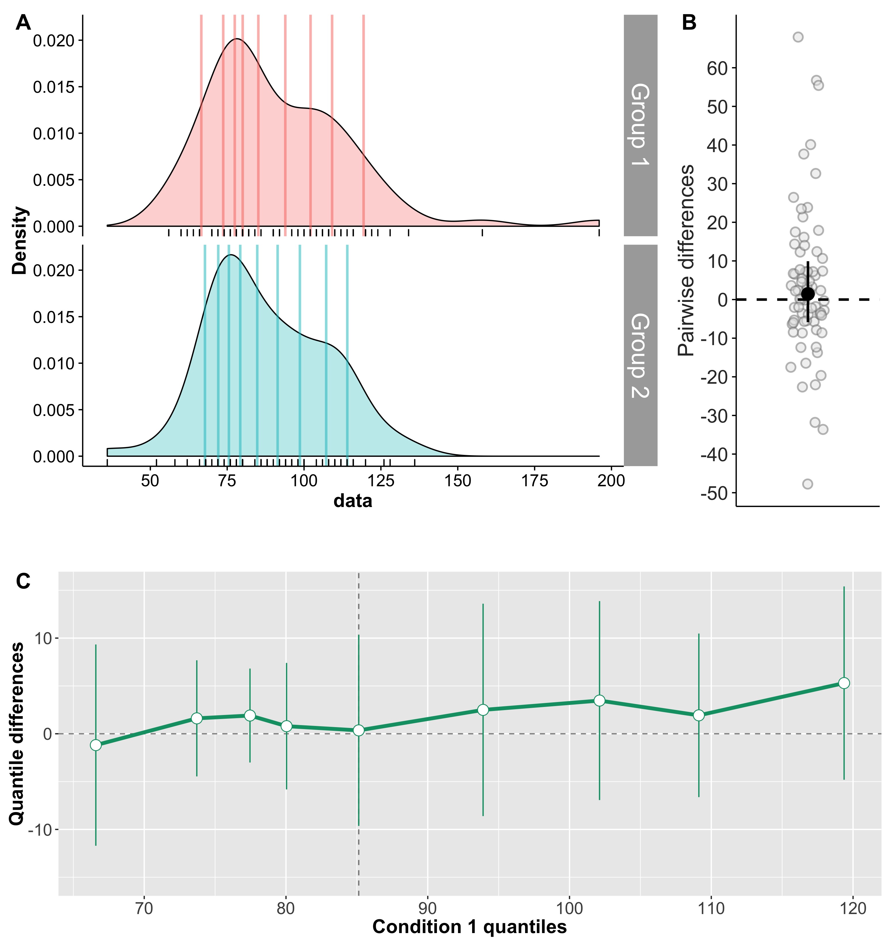
Figure 11. ERP onsets with 1D scatterplot of pairwise differences

Shift function for other quantiles

Although powerful, Wilcox’s 1995 technique is not perfect, because it:

  • is limited to the deciles;
  • can only be used with alpha = 0.05;
  • does not work well with tied values.

More recently, Wilcox’s proposed a new version of the shift function that uses a straightforward percentile bootstrap (Wilcox & Erceg-Hurn, 2012; Wilcox et al., 2014). This new approach:

  • allows tied values;
  • can be applied to any quantile;
  • can have more power when looking at extreme quantiles (<=0.1, or >=0.9).
  • is implemented in qcomhd for independent groups;
  • is implemented in Dqcomhd for dependent groups.

Examples are provided in the R script for this post.

In the percentile bootstrap version of the shift function, p values are corrected, but not the confidence intervals. For dependent variables, Wilcox & Erceg-Hurn (2012) recommend at least 30 observations to compare the .1 or .9 quantiles. To compare the quartiles, 20 observations appear to be sufficient. For independent variables, Wilcox et al. (2014) make the same recommendations made for dependent groups; in addition, to compare the .95 quantiles, they suggest at least 50 observations per group.

Conclusion

The shift function is a powerful tool that can help you better understand how two distributions differ, and by how much. It provides much more information than the standard t-test approach.

Although currently the shift function only applies to two groups, it can in theory be extended to more complex designs, for instance to quantify interaction effects.

Finally, it would be valuable to make a Bayesian version of the shift function, to focus on effect sizes, model the data, and integrate them with other results.

References

Bieniek, M.M., Bennett, P.J., Sekuler, A.B. & Rousselet, G.A. (2015) A robust and representative lower bound on object processing speed in humans. The European journal of neuroscience.

Doksum, K. (1974) Empirical Probability Plots and Statistical Inference for Nonlinear Models in the two-Sample Case. Annals of Statistics, 2, 267-277.

Doksum, K.A. (1977) Some graphical methods in statistics. A review and some extensions. Statistica Neerlandica, 31, 53-68.

Doksum, K.A. & Sievers, G.L. (1976) Plotting with Confidence – Graphical Comparisons of 2 Populations. Biometrika, 63, 421-434.

Wagenmakers, E.J. (2007) A practical solution to the pervasive problems of p values. Psychonomic bulletin & review, 14, 779-804.

Wilcox, R.R. (1995) Comparing Two Independent Groups Via Multiple Quantiles. Journal of the Royal Statistical Society. Series D (The Statistician), 44, 91-99.

Wilcox, R.R. (2012) Introduction to robust estimation and hypothesis testing. Academic Press, Amsterdam; Boston.

Wilcox, R.R. & Erceg-Hurn, D.M. (2012) Comparing two dependent groups via quantiles. J Appl Stat, 39, 2655-2664.

Wilcox, R.R., Erceg-Hurn, D.M., Clark, F. & Carlson, M. (2014) Comparing two independent groups via the lower and upper quantiles. J Stat Comput Sim, 84, 1543-1551.