


节日的时候,比如国庆,中秋,春节,给网站挂上喜庆洋洋的一对或四个(两边各一对)大红灯笼吧!一个灯笼上可以一个汉字也可以两个汉字。

四个灯笼普通版
简单而直接(放在正文<body></body>之间)——直接在页脚</body>之前加下面的一段代码即可!
<head>
<style>
.deng-box {
    position: fixed;
    top: -40px;
    right: -20px;
    z-index: 999;
}

.deng-box1 {
    position: fixed;
    top: -30px;
    right: 30px;
    z-index: 999;
}
.deng-box2 {
    position: fixed;
    top: -30px;
    left: 30px;
    z-index: 999;
}.deng-box3 {
    position: fixed;
    top: -30px;
    left: -20px;
    z-index: 999;
}
.deng-box3 .deng {
    position: relative;
    width: 120px;
    height: 90px;
    margin: 50px;
    background: #d8000f;
    background: rgba(216, 0, 15, 0.8);
    border-radius: 50% 50%;
    -webkit-transform-origin: 50% -100px;
    -webkit-animation: swing 5s infinite ease-in-out;
    box-shadow: -5px 5px 30px 4px rgba(252, 144, 61, 1);
}
.deng-box1 .deng {
    position: relative;
    width: 120px;
    height: 90px;
    margin: 50px;
    background: #d8000f;
    background: rgba(216, 0, 15, 0.8);
    border-radius: 50% 50%;
    -webkit-transform-origin: 50% -100px;
    -webkit-animation: swing 5s infinite ease-in-out;
    box-shadow: -5px 5px 30px 4px rgba(252, 144, 61, 1);
}
.deng {
    position: relative;
    width: 120px;
    height: 90px;
    margin: 50px;
    background: #d8000f;
    background: rgba(216, 0, 15, 0.8);
    border-radius: 50% 50%;
    -webkit-transform-origin: 50% -100px;
    -webkit-animation: swing 3s infinite ease-in-out;
    box-shadow: -5px 5px 50px 4px rgba(250, 108, 0, 1);
}

.deng-a {
    width: 100px;
    height: 90px;
    background: #d8000f;
    background: rgba(216, 0, 15, 0.1);
    margin: 12px 8px 8px 8px;
    border-radius: 50% 50%;
    border: 2px solid #dc8f03;
}

.deng-b {
    width: 45px;
    height: 90px;
    background: #d8000f;
    background: rgba(216, 0, 15, 0.1);
    margin: -4px 8px 8px 26px;
    border-radius: 50% 50%;
    border: 2px solid #dc8f03;
}

.xian {
    position: absolute;
    top: -20px;
    left: 60px;
    width: 2px;
    height: 20px;
    background: #dc8f03;
}

.shui-a {
    position: relative;
    width: 5px;
    height: 20px;
    margin: -5px 0 0 59px;
    -webkit-animation: swing 4s infinite ease-in-out;
    -webkit-transform-origin: 50% -45px;
    background: #ffa500;
    border-radius: 0 0 5px 5px;
}

.shui-b {
    position: absolute;
    top: 14px;
    left: -2px;
    width: 10px;
    height: 10px;
    background: #dc8f03;
    border-radius: 50%;
}

.shui-c {
    position: absolute;
    top: 18px;
    left: -2px;
    width: 10px;
    height: 35px;
    background: #ffa500;
    border-radius: 0 0 0 5px;
}

.deng:before {
    position: absolute;
    top: -7px;
    left: 29px;
    height: 12px;
    width: 60px;
    content: " ";
    display: block;
    z-index: 999;
    border-radius: 5px 5px 0 0;
    border: solid 1px #dc8f03;
    background: #ffa500;
    background: linear-gradient(to right, #dc8f03, #ffa500, #dc8f03, #ffa500, #dc8f03);
}

.deng:after {
    position: absolute;
    bottom: -7px;
    left: 10px;
    height: 12px;
    width: 60px;
    content: " ";
    display: block;
    margin-left: 20px;
    border-radius: 0 0 5px 5px;
    border: solid 1px #dc8f03;
    background: #ffa500;
    background: linear-gradient(to right, #dc8f03, #ffa500, #dc8f03, #ffa500, #dc8f03);
}

.deng-t {
    font-family: 华文行楷,Arial,Lucida Grande,Tahoma,sans-serif;
    font-size: 3.2rem;
    color: #dc8f03;
    font-weight: bold;
    line-height: 85px;
    text-align: center;
}

.night .deng-t,
.night .deng-box,
.night .deng-box1 {
    background: transparent !important;
}

@-moz-keyframes swing {
    0% {
        -moz-transform: rotate(-10deg)
    }

    50% {
        -moz-transform: rotate(10deg)
    }

    100% {
        -moz-transform: rotate(-10deg)
    }
}

@-webkit-keyframes swing {
    0% {
        -webkit-transform: rotate(-10deg)
    }

    50% {
        -webkit-transform: rotate(10deg)
    }

    100% {
        -webkit-transform: rotate(-10deg)
    }
}
</style>
<body>
<!-- 灯笼1 -->
<div class="deng-box">
<div class="deng">
<div class="xian"></div>
<div class="deng-a">
<div class="deng-b"><div class="deng-t">庆</div></div>
</div>
<div class="shui shui-a"><div class="shui-c"></div><div class="shui-b"></div></div>
</div>
</div>
<!-- 灯笼2 -->
<div class="deng-box1">
<div class="deng">
<div class="xian"></div>
<div class="deng-a">
<div class="deng-b"><div class="deng-t">国</div></div>
</div>
<div class="shui shui-a"><div class="shui-c"></div><div class="shui-b"></div></div>
</div>
</div>
<!-- 灯笼3 -->
<div class="deng-box2">
<div class="deng">
<div class="xian"></div>
<div class="deng-a">
<div class="deng-b"><div class="deng-t">度</div></div>
</div>
<div class="shui shui-a"><div class="shui-c"></div><div class="shui-b"></div></div>
</div>
</div>
<!-- 灯笼4 -->
<div class="deng-box3">
<div class="deng">
<div class="xian"></div>
<div class="deng-a">
<div class="deng-b"><div class="deng-t">欢</div></div>
</div>
<div class="shui shui-a"><div class="shui-c"></div><div class="shui-b"></div></div>
</div>
</div>
</body>
两个灯笼
注:如果只要两个,只保留<!– 灯笼1 –>和<!– 灯笼2 –>的代码即可。
<!– 灯笼1 –>
<div class=“deng-box”>
    <div class=“deng”>
        <div class=“xian”></div>
        <div class=“deng-a”>
            <div class=“deng-b”><div class=“deng-t”>国庆</div></div>
        </div>
        <div class=“shui shui-a”><div class=“shui-c”></div><div class=“shui-b”></div></div>
    </div>
</div>

<!– 灯笼2 –>
<div class=“deng-box1”>
    <div class=“deng”>
        <div class=“xian”></div>
        <div class=“deng-a”>
            <div class=“deng-b”><div class=“deng-t”>欢度</div></div>
        </div>
        <div class=“shui shui-a”><div class=“shui-c”></div><div class=“shui-b”></div></div>
    </div>
</div>
因为代码中有中文,编辑后需要将模板文件保存为 UTF-8 无 BOM(无签名)的格式,后台主题编辑中修改可以忽略,上面的灯笼代码可以随意组合,比如,一边两个,两边各两个,两边各一个。
四个灯笼推荐版
这里的灯笼和灯笼上的文字会随着页面大小而自由缩放,上面四个灯笼普通版不会。如果挡在后面的超级链接前面,链接也是可以点击的,同样上面四个灯笼普通件版不能。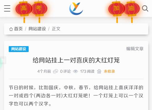
HTML代码
HTML代码如下,可以将下面的HTML代码添加到主题页脚模板 footer.php里。
<!-- 灯笼1 -->
<div class="deng-box">
<div class="deng">
<div class="xian"></div>
<div class="deng-a">
<div class="deng-b"><div class="deng-t">乐</div></div>
</div>
<div class="shui shui-a"><div class="shui-c"></div><div class="shui-b"></div></div>
</div>
</div>
<!-- 灯笼2 -->
<div class="deng-box1">
<div class="deng">
<div class="xian"></div>
<div class="deng-a">
<div class="deng-b"><div class="deng-t">快</div></div>
</div>
<div class="shui shui-a"><div class="shui-c"></div><div class="shui-b"></div></div>
</div>
</div>
<!-- 灯笼3 -->
<div class="deng-box2">
<div class="deng">
<div class="xian"></div>
<div class="deng-a">
<div class="deng-b"><div class="deng-t">节</div></div>
</div>
<div class="shui shui-a"><div class="shui-c"></div><div class="shui-b"></div></div>
</div>
</div>
<!-- 灯笼4 -->
<div class="deng-box3">
<div class="deng">
<div class="xian"></div>
<div class="deng-a">
<div class="deng-b"><div class="deng-t">春</div></div>
</div>
<div class="shui shui-a"><div class="shui-c"></div><div class="shui-b"></div></div>
</div>
</div>
CSS样式
将样式代码添加到.CSS文件中,或后台有可以添加的地方都可以。
css代码如下:
.deng-box {
    position: fixed;
    top: -30px;
    right: -30px;
    z-index: 999;
    pointer-events:none;
}
.deng-box1 {
    position: fixed;
    top: -30px;
    right: 20px;
    z-index: 999;
    pointer-events:none;
}
.deng-box2 {
    position: fixed;
    top: -30px;
    left: 30px;
    z-index: 999;
    pointer-events:none;
}
.deng-box3 {
    position: fixed;
    top: -30px;
    left: -20px;
    z-index: 999;
    pointer-events:none;
}
.deng-box3 .deng {
    position: relative;
    width: 120px;
    height: 90px;
    margin: 50px;
    background: #d8000f;
    background: rgba(216, 0, 15, 0.8);
    border-radius: 50% 50%;
    -webkit-transform-origin: 50% -100px;
    -webkit-animation: swing 5s infinite ease-in-out;
    box-shadow: -5px 5px 30px 4px rgba(252, 144, 61, 1);
}
.deng-box1 .deng {
    position: relative;
    width: 120px;
    height: 90px;
    margin: 50px;
    background: #d8000f;
    background: rgba(216, 0, 15, 0.8);
    border-radius: 50% 50%;
    -webkit-transform-origin: 50% -100px;
    -webkit-animation: swing 5s infinite ease-in-out;
    box-shadow: -5px 5px 30px 4px rgba(252, 144, 61, 1);
}
.deng {
    position: relative;
    width: 120px;
    height: 90px;
    margin: 50px;
    background: #d8000f;
    background: rgba(216, 0, 15, 0.8);
    border-radius: 50% 50%;
    -webkit-transform-origin: 50% -100px;
    -webkit-animation: swing 3s infinite ease-in-out;
    box-shadow: -5px 5px 50px 4px rgba(250, 108, 0, 1);
}

.deng-a {
    width: 100px;
    height: 90px;
    background: #d8000f;
    background: rgba(216, 0, 15, 0.1);
    margin: 12px 8px 8px 8px;
    border-radius: 50% 50%;
    border: 2px solid #dc8f03;
}

.deng-b {
    width: 45px;
    height: 90px;
    background: #d8000f;
    background: rgba(216, 0, 15, 0.1);
    margin: -4px 8px 8px 26px;
    border-radius: 50% 50%;
    border: 2px solid #dc8f03;
}

.xian {
    position: absolute;
    top: -20px;
    left: 60px;
    width: 2px;
    height: 20px;
    background: #dc8f03;
}

.shui-a {
    position: relative;
    width: 5px;
    height: 20px;
    margin: -5px 0 0 59px;
    -webkit-animation: swing 4s infinite ease-in-out;
    -webkit-transform-origin: 50% -45px;
    background: #ffa500;
    border-radius: 0 0 5px 5px;
}

.shui-b {
    position: absolute;
    top: 14px;
    left: -2px;
    width: 10px;
    height: 10px;
    background: #dc8f03;
    border-radius: 50%;
}

.shui-c {
    position: absolute;
    top: 18px;
    left: -2px;
    width: 10px;
    height: 35px;
    background: #ffa500;
    border-radius: 0 0 0 5px;
}

.deng:before {
    position: absolute;
    top: -7px;
    left: 29px;
    height: 12px;
    width: 60px;
    content: " ";
    display: block;
    z-index: 999;
    border-radius: 5px 5px 0 0;
    border: solid 1px #dc8f03;
    background: #ffa500;
    background: linear-gradient(to right, #dc8f03, #ffa500, #dc8f03, #ffa500, #dc8f03);
}

.deng:after {
    position: absolute;
    bottom: -7px;
    left: 10px;
    height: 12px;
    width: 60px;
    content: " ";
    display: block;
    margin-left: 20px;
    border-radius: 0 0 5px 5px;
    border: solid 1px #dc8f03;
    background: #ffa500;
    background: linear-gradient(to right, #dc8f03, #ffa500, #dc8f03, #ffa500, #dc8f03);
}

.deng-t {
    font-size:3.2rem;
    color: #dc8f03;
    font-weight: bold;
    line-height: 85px;
    text-align: center;
}

.night .deng-t,
.night .deng-box,
.night .deng-box1 {
    background: transparent !important;
}

@-moz-keyframes swing {
    0% {
        -moz-transform: rotate(-10deg)
    }

    50% {
        -moz-transform: rotate(10deg)
    }

    100% {
        -moz-transform: rotate(-10deg)
    }
}

@-webkit-keyframes swing {
    0% {
        -webkit-transform: rotate(-10deg)
    }

    50% {
        -webkit-transform: rotate(10deg)
    }

    100% {
        -webkit-transform: rotate(-10deg)
    }
}
以下代码选其一添加在上面CSS样式后面即可
手机浏览不显示
代码在手机上显示效果不是很好,如果不想在手机或低分辨率设备上显示,可以在上方的CSS代码后面添加:
@media (max-width: 1366px) {
    .deng-box  {
        display: none !important;
    }
    .deng-box1  {
        display: none !important;
    }
    .deng-box2  {
        display: none !important;
    }
    .deng-box3  {
        display: none !important;
    }
}
注:@media (max-width: 1366px)即为分辨率width值<=1366px的设备不显示,这里的1366px可以根据你的需要来修改。
比如:
@media (min-width: 768px){ //>=768的设备 }
@media (max-width: 1199){ //<=1199的设备 }
手机浏览缩小显示
手机或较低分辨率设备访问的时候,灯笼和灯笼上的文字会随着当前访问设备屏幕的大小而自由缩放,并且不会遮盖后面的链接。
@media screen and (max-width: 730px) {
.deng-box {
right: 55px;
zoom:0.45
}
.deng-box1 {
right: 190px;
zoom:0.45
}
.deng-box2 {
left: 190px;
zoom:0.45
}
.deng-box3 {
left: 55px;
zoom:0.45
}
}
© 版权声明
予人以享,不负所创;转载留链,致敬原创
底线,心之尺,言之界







 私信站长
私信站长


- 最新
- 最热
只看作者