
Tutorials - Part II
Here are the last 3 icon tutorials that  adrastea requested. Don't worry, I'm still working on everyone's, I promise! I'm just slow.
Also, I apologize to anyone whose textures/caps aren't credited. My folders are an unorganized disaster and one day I will clean it up.
Feel free to ask questions if something doesn't make sense or is confusing.


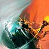
I have no idea what movie/show this is from, but I started out with this image.
I couldn't deal with how blurry the guy looked, so I pretty much cropped him out and focused on the girl. Since I didn't want him in the image at all, I used layer masks to cut her out from the image completely.
 >>
>> 
Her dress had a few spots that seemed a little pixelated, so I busted out the smudge tool and used it a very very tiny amount.
>> 
From there I used curves to try to touch up the colors just a little. I wanted to brighten her face up a bit, so I focused on how her skin and face looked and ignored the other parts of the icon while I chose my curves. The curves ended up looking a bit like this (although not exactly like the original).
>> 
Now, I knew that I wanted to keep her dress green, because that was the color in the original image. So I duplicated the layer I just created (the one with the curves) and used curves on it again to bring out the bright greens in the dress. Yes she looks like a monster, but go back in to your layer mask and paint out everything except the dress.
>> 
So when you put them together, with the dress layer on top of the layer before it, you end up with her colored the way I liked it.
+ = 
Make a new layer from visible, or merge or whatever, because that's what I'll be using for my image.
To make the background, I started with a few textures. I used three by unknown, unknown, and this one by panda virus. I wanted to stick with the green and outdoors theme, since those were both present in the original image. The green is set to "Normal" at 100% and the next two are simply set to Overlay 100%.
 +
+  +
+  =
= 
Now I added my image of the girl back in. I also decided that I needed some motion blur in there... cause I could. I'm not sure. XD So I copied the layer with her on it and did a bit of motion blur. I also moved it to the left a bit so it would just barely stick out from behind her.
+  + =
+ = 
Now I wanted to keep with the outdoors thing, and I wanted a little depth, so I used this image from planets-bend-between-us over at tumblr. I moved it to the very very bottom of the image and set it on Multiply 100% , so it would just look like bits of grass sticking up in front of her.

I also added two more textures by unknown andspooky_window. The first is set on Overlay 100% and the second was set to Screen at just 15%. And TA DA!
+ +  +
+  =
=
For this one, I started out with this image of Karthus from League of Legends (shut up I love this game).
I stuck with my beloved center crop because I wanted to play with the split coloring the image has. But that means I need to fill in the rest of the image. So, I bust out my trusty clone stamp tool and start filling in the extra space.
 >>
>> 
It looks horrible, but once you take the smudge tool to it, it will look so much better. Luckily the image already had a smudgey looking background, so we can make it work. I tend to go to town, and smudge out over the image itself. I try not to worry about little details because I can always add a copy of the original image back over the smudged one. Then, all you have to do is use layer masks to bring back out the parts you might have smudged over (like the tips of his crown in this image.)
>> 
Then, of course, I had to use curves to get the basic coloring I wanted. My curves ended up looking something like this. I also went in and smudge a little bit more under his arm.
>> 
From here on out it's mostly using textures to create the colors and details I wanted!
I started off with this texture which might be something I deformed from this one bydrankmywar. I kept it only on the right half and smudged and erased so it would only affect the red half of the image. It's on Overlay 46%.
+  + ...
+ ...
From there I added a texture by cielogris(?) on screen 65%. On top of that I used a texture by unknown twice. First on Burn 22% and then on Overlay 100%
 +
+  + + ...
Then I deformed another texture byinnocent_lexys and I added it on Overlay 100% so it would just cover the right half/the blue side.
 + ...
+ ...
To finish, I just added a texture bygallicka set to Overlay 68% and another by spooky_window set to Overlay 62%.
 +
+  =
=
So I started out with this image of the Japanese(?) poster for Brave.
Again, I am a sucker for center crops and negative space, and I thought it worked, so I rolled with it. I used curves (looks almost like this) to bring out the bright colors.
 >>
>> 
Now, I wasn't a huge fan of how the background looked, so I duplicated my image and blurred it a bit. I dragged it beneath the regular version, and then used a layer mask to cut Merida out so only the background and edges around her would be blurry.
 + =
+ = 
Then come the textures. I used 4 different ones to get the colors and softness I wanted on Merida. I started with one byspooky_window set to Overlay 100%. Then one by unknown set to Overlay 100%. After that, there is one by vol4itca(?) set on Screen 17%. Also, one more layer by unknown set to Screen at 8%
+  +
+  +
+  +
+  =
= 
After that I wanted to get rid of the purples in the background and have it more uniformly blue, so I used this texture byprettybutt with a layer mask so it didn't cover Merida. It was set to Overlay 59%. I also used the smudge tool on the very bottom of the final image to get rid of the bit of her hand that was sticking into the bottom of the image.
+  =
=
adrastea requested. Don't worry, I'm still working on everyone's, I promise! I'm just slow.Also, I apologize to anyone whose textures/caps aren't credited. My folders are an unorganized disaster and one day I will clean it up.
Feel free to ask questions if something doesn't make sense or is confusing.
I have no idea what movie/show this is from, but I started out with this image.
I couldn't deal with how blurry the guy looked, so I pretty much cropped him out and focused on the girl. Since I didn't want him in the image at all, I used layer masks to cut her out from the image completely.
>> Her dress had a few spots that seemed a little pixelated, so I busted out the smudge tool and used it a very very tiny amount.
>> From there I used curves to try to touch up the colors just a little. I wanted to brighten her face up a bit, so I focused on how her skin and face looked and ignored the other parts of the icon while I chose my curves. The curves ended up looking a bit like this (although not exactly like the original).
 >>
>> Now, I knew that I wanted to keep her dress green, because that was the color in the original image. So I duplicated the layer I just created (the one with the curves) and used curves on it again to bring out the bright greens in the dress. Yes she looks like a monster, but go back in to your layer mask and paint out everything except the dress.
>> So when you put them together, with the dress layer on top of the layer before it, you end up with her colored the way I liked it.
+ = Make a new layer from visible, or merge or whatever, because that's what I'll be using for my image.
To make the background, I started with a few textures. I used three by unknown, unknown, and this one by panda virus. I wanted to stick with the green and outdoors theme, since those were both present in the original image. The green is set to "Normal" at 100% and the next two are simply set to Overlay 100%.
 + + =
+ + = Now I added my image of the girl back in. I also decided that I needed some motion blur in there... cause I could. I'm not sure. XD So I copied the layer with her on it and did a bit of motion blur. I also moved it to the left a bit so it would just barely stick out from behind her.
+ + = Now I wanted to keep with the outdoors thing, and I wanted a little depth, so I used this image from planets-bend-between-us over at tumblr. I moved it to the very very bottom of the image and set it on Multiply 100% , so it would just look like bits of grass sticking up in front of her.
I also added two more textures by unknown and
spooky_window. The first is set on Overlay 100% and the second was set to Screen at just 15%. And TA DA! + + + = For this one, I started out with this image of Karthus from League of Legends (shut up I love this game).
I stuck with my beloved center crop because I wanted to play with the split coloring the image has. But that means I need to fill in the rest of the image. So, I bust out my trusty clone stamp tool and start filling in the extra space.
>> It looks horrible, but once you take the smudge tool to it, it will look so much better. Luckily the image already had a smudgey looking background, so we can make it work. I tend to go to town, and smudge out over the image itself. I try not to worry about little details because I can always add a copy of the original image back over the smudged one. Then, all you have to do is use layer masks to bring back out the parts you might have smudged over (like the tips of his crown in this image.)
>> Then, of course, I had to use curves to get the basic coloring I wanted. My curves ended up looking something like this. I also went in and smudge a little bit more under his arm.
 >>
>> From here on out it's mostly using textures to create the colors and details I wanted!
I started off with this texture which might be something I deformed from this one by
 drankmywar. I kept it only on the right half and smudged and erased so it would only affect the red half of the image. It's on Overlay 46%. + + ...
From there I added a texture by cielogris(?) on screen 65%. On top of that I used a texture by unknown twice. First on Burn 22% and then on Overlay 100%
+ + + ...Then I deformed another texture by
 innocent_lexys and I added it on Overlay 100% so it would just cover the right half/the blue side. + ...
To finish, I just added a texture by
gallicka set to Overlay 68% and another by spooky_window set to Overlay 62%. + = So I started out with this image of the Japanese(?) poster for Brave.
Again, I am a sucker for center crops and negative space, and I thought it worked, so I rolled with it. I used curves (looks almost like this) to bring out the bright colors.
 >>
>> Now, I wasn't a huge fan of how the background looked, so I duplicated my image and blurred it a bit. I dragged it beneath the regular version, and then used a layer mask to cut Merida out so only the background and edges around her would be blurry.
 + =
+ = Then come the textures. I used 4 different ones to get the colors and softness I wanted on Merida. I started with one by
spooky_window set to Overlay 100%. Then one by unknown set to Overlay 100%. After that, there is one by vol4itca(?) set on Screen 17%. Also, one more layer by unknown set to Screen at 8% + + + + = After that I wanted to get rid of the purples in the background and have it more uniformly blue, so I used this texture by
prettybutt with a layer mask so it didn't cover Merida. It was set to Overlay 59%. I also used the smudge tool on the very bottom of the final image to get rid of the bit of her hand that was sticking into the bottom of the image. + =
+ =