ແທັກປລັກອິນ: responsive design
-

ເຄື່ອງມືສ້າງໜ້າເວັບ ໂດຍ SiteOrigin
ສ້າງຮູບແບບໜ້າເວັບທີ່ຮອງຮັບທຸກໜ້າຈໍ (responsive) ໂດຍໃຊ້ວິດເຈັດທີ່ທ່ານຄຸ້ນເຄີຍ ແລະ ຊື່ນຊອບ ຜ່ານເຄື່ອງມືສ້າງໜ້າເວັບແບບລາກ ແລະ ວາງ ທີ່ງ່າຍດາຍນີ້.
-
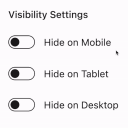
Visibility Controls for Editor Blocks
Easily hide or show Gutenberg blocks on mobile, tablet, and desktop devices using customizable breakpoints for responsive design.
-

N360 | Splash Screen
A responsive fade-in-out splash screen and landing page for your existing theme.
-
Block Responsive – Make Editor Blocks Responsive Easily
Transform any WordPress block into a fully responsive element with device-specific controls for mobile, tablet, and desktop optimization.
-

Responsive Testing: simulate different devices
With Responsiveness Check you can check the responsiveness of your website directly in your back-end.
-

Gutenwave Blocks – Gutenberg Page Builder Blocks for Block Editor & FSE
Build stunning websites with Gutenberg. Free responsive blocks, starter templates & full site editing support in one lightweight plugin.
-
-

Mobile First Content Images
Load smaller content images for mobile devcices with a mobile first approach
-

Responsive Containers
Responsive Containers provides a framework for applying styles to blocks & widgets based on how large they appear on screen.
-