Silver Bounce Looks Weak Below $71.5Silver is trying to hold near $68 after a sharp fall from the $75 region. Still, the broader H4 setup remains bearish, with price trading below EMA34 and EMA89 and the market structure still showing lower highs and lower lows.
The $67–68 area is now the key support. A strong defence from buyers may trigger a recovery toward $70 and later $71.5–72. But the macro backdrop is not very supportive. A stronger US Dollar, backed by solid US jobs data, has reduced expectations for early Fed rate cuts and continues to pressure precious metals.
Silver also faces pressure from weaker global growth concerns because it is widely used in industrial production.
Quick Setup:
Sell zone: $69.00 – $70.00
SL: $72.30
TP1: $67.00
TP2: $65.00
TP3: $63.00
Below $71.5–72, sellers still have the upper hand.
Community ideas

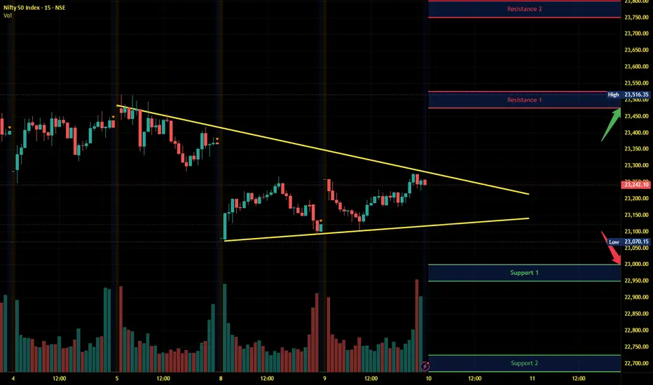
Nifty Intraday Analysis for 10th June 2026NSE:NIFTY
The market sentiment is positive amid easing out of west asia conflict for the time being and conducive effect of the GoI's removal of withholding and capital gains taxes for FPIs, and the RBI’s inclusion of long-dated bonds under FAR for G-Secs.
The upward movement may lead to 23475 – 23525 resistance range and if the index crosses and sustains above this level then may reach near 23750 – 23800 range.
On the contrary, a downward moment may drag the Index to 23000 – 22950 support range in downward momentum and if this support is broken then index may tank near 22725 – 22675 range.
NIFTY DAILY / Short Range Level Analysis for 10th June 2026NIFTY DAILY / Short Range Level Analysis for 10th June 2026.
🔕 SGMN SplD BULLISH Above => 23289.
🔕 SGMN SplD Bearish BELOW => 23198.
Mentioned analysis based on 2 consecutive candle close in 15 min Time Frame.
━━━━━🟥🟧🟨🟩🟦🟪⬛━━━━━
💥Level Interpretation / description:
✍🏻L#1: If the candle crossed & stays above the “Buy Gen”, it is treated / considered as Bullish bias. Cfm=> Confirmation.
L#2: Possibility / Probability of REVERSAL near 🔕RL/TF1 & 🔔RL/TF2
L#3: If the candle stays above “Sell Gen” but below “Buy Gen”, it is treated / considered as Sidewise. Aggressive Traders can take Long position near “Sell Gen” either retesting or crossed from Below & vice-versa i.e. can take Short position near “Buy Gen” either retesting or crossed downward from Above.
L#4: If the candle crossed & stays below the “Sell Gen”, it is treated / considered a Bearish bias.
L#5: Possibility / Probability of REVERSAL near 🔕RL/TF1 & 🔔RL/TF2
HZB (Buy side) & HZS (Sell side) => Hurdle Zone,
✍🏻 *** Specialty of “HZB#1, HZB#2 HZS#1 & HZS#2” is Sidewise (behaviour in Nature)
Rest Plotted and Mentioned on Chart
Color code Used:
Green, BLUE =. Positive bias.
Safron, RED =. Negative bias.
RED in Between Green means Trend Finder / Momentum Change
/ CYCLE Change and Vice Versa.
Notice One thing: HOW LEVELS are Working.
Use any Momentum Indicator / Oscillator or as you "USED to" to Take entry.
━━━━━🟥🟧🟨🟩🟦🟪⬛━━━━━
⚠️ DISCLAIMER:
The information, views, and ideas shared here are purely for educational and informational purposes only. They are not intended as investment advice or a recommendation to buy, sell, or hold any financial instruments. I am not a SEBI-registered financial adviser.
Trading and investing in the stock market involves risk, and you should do your own research and analysis. You are solely responsible for any decisions made based on this research.
"🔔As HARD EARNED MONEY IS YOUR's, So DECISION SHOULD HAVE TO BE YOUR's".
━━━━━🟥🟧🟨🟩🟦🟪⬛━━━━━
❇️ Follow notification about periodical View
💥 Do Comment for Stock WEEKLY Level Analysis.🚀
📊 Do you agree with this view?
✈️ HIT THE PLANE ICON if this technical observation resonates with you. It will Motivate me.
━━━━━🟥🟧🟨🟩🟦🟪⬛━━━━━
💡 If You LOOKING any CHART & want for Level and ANALYZE?
Share your desired stock names in the comments below! I will try to analyze the chart Levels, patterns and share my technical view (so far my Knowledge).
If Viewers think It can identify meaningful setups. Looking forward to hearing from all of you — let's keep this discussion going and help each other make better trading decisions.
___________🔕^^^⚫⚪^🙏🏼🙏🏼🙏🏼^⚪⚫^^^🔔___________

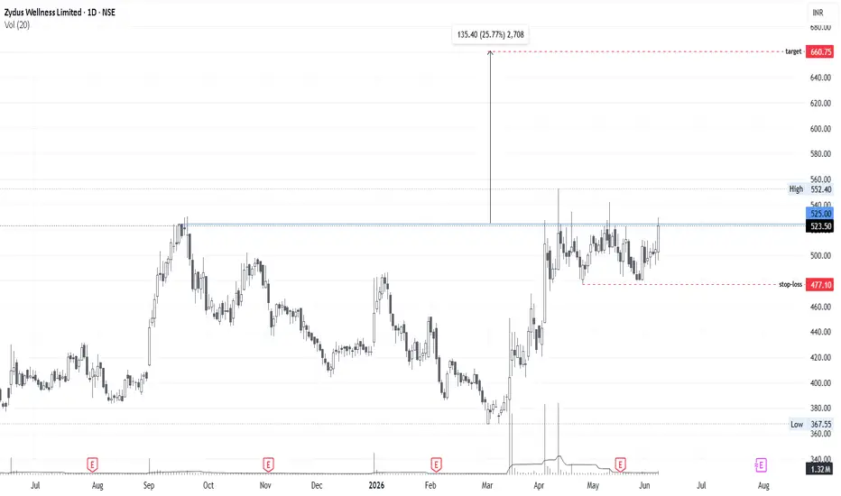
ZYDUSWELL : Near ATH BreakoutZydus Wellness is breaking it ATH level in this half bear market. Consolidation near breakout is also good..
All data is available in public domain..
CMP : 525
TG : 650
SL : 475
Stock's selection based on 5 Point Analysis:
1: Idea : Breakout.
2: Support : Volume, Delivery .
3: Technical : 21/55/200-EMA, Super trend up, RS>0 RSI.
4: Fundamental : PE, PAT, Industry & peer PE and sector performance.
5: Timing : Entry Timing on Daily chart.
Disclaimer : It is my personal view as a trader and for educational purpose only. Equity market involves risk .
Please consult your financial adviser before taking any decision.
Bitcoin Short ScalpBITSTAMP:BTCUSD
Open SHORT
Entry-1: 61507
Entry-2: 64368
TP: 58646
SL: 1hr close above 65091

A pole and then an ascending triangle.I see a pole with 26% returns in 2 days on earnings day. Then an ascending triangle pattern is being formed with the latest contraction of 4%. Looks bullish.
Disclaimer: not investing advice.

MCX (Ascending Triangle) : Breakout RetestPositional Trade setup
Price previously broke above the triangle resistance and is now retesting the breakout zone as support. Holding this level could strengthen the bullish continuation setup
DISCLAIMER
This channel is for educational and self-analysis purposes only.
We share technical levels, charts, and market insights based on publicly available information and multiple sources. These are not financial or investment recommendations.
I am not a SEBI-registered analyst. Please consult your financial advisor before making any trading or investment decisions.
DIGITAL TRADING FLOOR
✅ Technical charts & analysis
✅ Educational market updates
✅ For learning purposes only

Nifty Expiry near 23300Long Nifty Expiry
Sell Put nifty 23300 2lot
Buy Put Nifty 23200 1 Lot
Buy Put Nifty 23500 1lot
If nifty recover and price settle near 23300 then you will have max profit
Nifty if recover from current then today expiry will be near 23300

A Symmetrical Triangle on the 6-Month Timeframe🔺 The Symmetrical Triangle
A symmetrical triangle forms when price action prints a series of lower highs and higher lows, compressing into an apex — a battle between buyers and sellers reaching equilibrium. Neither side dominates. The market is coiling, storing energy like a spring.
What makes this pattern so significant here is its scale. This isn't a triangle forming over days or weeks,this structure has been carved out over multiple years.
🕯️ The 6-Month Timeframe
The 6-month timeframe is one of the rarest lenses in technical analysis. Each candle represents an entire half-year of price action — roughly 130 trading days compressed into a single bar. Two candles complete one full year. One closes at the end of June, the other at the end of December.
📊 Volume . What are Volumes ?
Volume on a symmetrical triangle tells the real story. Classically, volume contracts steadily as price converges toward the apex — and that's exactly what well-formed triangles at this scale exhibit. Declining volume during compression signals that conviction is being withheld, not absent.
On the 6-month chart, a single volume bar represents the total traded volume across six months.
⚠️ Disclaimer: This post is strictly observational and educational in nature. The charts and patterns discussed reflect historical price action and are shared solely for learning purposes. This is not financial advice, not a trade recommendation, and should not be interpreted as a signal to buy or sell any asset

BTCUSD 1H Bearish Continuation SetupThis is my Bitcoin 1H analysis, and for now my overall market direction remains bearish.
The market has been respecting a rising trading support while moving higher, but in my view this support is only helping price create a temporary pullback before the larger downside move continues. Trading support can hold price for some time, but once it breaks, the market can move aggressively toward the downside.
Before expecting a direct sell-off, I have marked two important reversal zones. To create these zones, I copied the previous demand structure and projected it forward. This gives me both a 50% reaction area and a full 100% demand completion zone.
Now the main focus is simple:
If price reaches the 50% zone and forms a strong bearish candlestick pattern, that can be an early sign of continuation.
If the market pushes higher and reaches the full demand zone, I will again look for bearish confirmation there.
Both zones remain valid until the market clearly invalidates the setup.
At the moment, I still believe there is some remaining demand in the market, which means price can continue pushing higher before the real bearish move begins. That is why I am not looking for an immediate sell without confirmation.
My approach is always to follow the main trend rather than predict reversals. Since the higher-timeframe direction is still pointing toward the downside, I am simply waiting for price to complete its conditions and provide a clean bearish confirmation.
For now, patience is key. The zones are marked, the structure is clear, and the next move will depend on how the market reacts inside these reversal areas.
Let's see how the market respects these levels and whether the bearish continuation setup plays out as expected.
This analysis is based on MMC concepts designed by Candle King. His concepts have helped me understand trend continuation, reversal zones, and market structure with much greater clarity.

NIFTY expects downsideDouble top formed, lower high seen.
Can go to the previous liquid zone at downside.

BAKNIFTY : ADAM & EVE DOUBLE BOTTOMBANK NIFTY – Swing Structure Analysis
The chart structure is becoming very interesting here.
A clear Adam & Eve Double Bottom pattern is forming near the 52,500–53,000 zone, and now Bank Nifty is approaching the major breakout area around 55,500.
The entire move now depends on whether price can sustain above this zone.
----------------------------------------------------------------------------------------------------
Structure of the Pattern
1️⃣ First Bottom = “Adam”
This is the sharp V-shaped recovery.
In your chart:
Bank Nifty fell aggressively toward the 52,500–53,000 zone
Then immediately bounced sharply
This creates the first bottom.
Characteristics:
Fast panic selling
Sharp recovery
High volatility
2️⃣ Second Bottom = “Eve”
After the first recovery, price again comes near the same support zone, but this time forms a rounded, slower bottom.
In your chart:
Second dip was smoother and more controlled
Selling pressure reduced
Buyers started absorbing supply gradually
This creates the “Eve” portion.
Characteristics:
Rounded structure
Lower volatility
Accumulation phase
Neckline / Breakout Zone
🔥 55,500 Zone
This is why this level is extremely important.
A sustained breakout above it confirms:
Double bottom activation
Trend reversal continuation
Fresh momentum rally possibility

QUESS: Inverse Head and Shoulders Bullish Reversal1. The Macro Perspective: The Inverse Head and Shoulders Formation
I am taking a LONG bias on Quess Corp Ltd (QUESS) based on the daily structure . This is a classical technical formation signaling a potential bullish trend reversal following a prolonged downtrend. After a significant downward move characterized by lower highs and lower lows, the stock formed a Left Shoulder, a deeper Head, and a higher Right Shoulder, indicating that selling pressure has reached an exhaustion point and buyers are becoming more aggressive. Fundamentally, this reversal pattern aligns with the company's strong Q4 FY26 performance, where they reported a net profit of ₹64.35 crore—a 167.42% year-on-year growth.
2. The Educational Setup: The Neckline Resistance
To understand the technical validity behind this reversal, look closely at how the price structure interacts with the core boundary:
The Neckline: The definitive line in the sand for a bullish structural shift is the resistance level connecting the highs formed between the shoulders and the head. A decisive breakout above this line is the key signal that the pattern is complete and an uptrend may be underway.
3. Current Price Action: Breakout Potential
The structure is poised for a significant move, and the recent structural formation suggests a potential shift from a bearish to a bullish market sentiment. Institutional buyers stepping in with conviction during a breakout above the neckline, ideally accompanied by high volume, would confirm the trend reversal.
4. The Trade Plan: Entries, Targets, and Risk Management
Entry Strategy: Traders often look to buy either on a confirmed breakout above the neckline resistance or on a retest of the neckline as new support.
Targets: A classical approach for measuring targets in an Inverse Head and Shoulders pattern is to take the vertical distance from the neckline to the head (the lowest point of the pattern) and project that distance upward from the breakout point.
Risk Management: A stop-loss is typically placed below the breakout resistance (neckline) or below the right shoulder to protect against a failed breakout, which would negate the bullish pattern.
5. Time Horizon:
Because this technical setup captures a clear structural reversal pattern, this is a high-alpha swing trade designed to capture a potential momentum shift. Let the trend run!

BUY TODAY SELL TOMORROW for 5%DON’T HAVE TIME TO MANAGE YOUR TRADES?
- Take BTST trades at 3:25 pm every day
- Try to exit by taking 4-7% profit of each trade
- SL can also be maintained as closing below the low of the breakout candle
Now, why do I prefer BTST over swing trades? The primary reason is that I have observed that 90% of the stocks give most of the movement in just 1-2 days and the rest of the time they either consolidate or fall
Trendline Breakout in STUDDS
BUY TODAY SELL TOMORROW for 5%

bearish Cypher Pattern Nifty may witness further downside once the Bearish Cypher pattern is completed and confirmed, indicating a potential continuation of the bearish trend

Motherson set up another upmove!Elliott Wave structure looks interesting here. Wave iii appears complete. Possible wave iv underway. RSI cooling off - could be a healthy reset before the next leg. Key Fib levels are being tested. Watching closely.

BUY TODAY SELL TOMORROW for 5%DON’T HAVE TIME TO MANAGE YOUR TRADES?
- Take BTST trades at 3:25 pm every day
- Try to exit by taking 4-7% profit of each trade
- SL can also be maintained as closing below the low of the breakout candle
Now, why do I prefer BTST over swing trades? The primary reason is that I have observed that 90% of the stocks give most of the movement in just 1-2 days and the rest of the time they either consolidate or fall
Trendline Breakout in MENONBE
BUY TODAY SELL TOMORROW for 5%

xau/usdThe XAU/USD 15-minute chart shows gold trading under strong bearish pressure after failing to sustain gains near the 4,260 resistance area. A series of large bearish candles indicates aggressive selling momentum, pushing prices down toward the 4,215 support zone. The highlighted trade setup suggests a potential long position from 4,215.586, with a stop-loss placed below 4,206.260 and a target at 4,235.780, offering a favorable risk-to-reward ratio.
Recent price action shows a rejection from lower levels, with buyers attempting to defend the support area. The appearance of small-bodied candles near support suggests that selling momentum may be weakening and that a short-term corrective bounce could develop. However, bullish confirmation remains necessary, as the overall intraday trend is still bearish.
If buyers successfully hold above 4,215, gold could recover toward 4,236. Conversely, a break below 4,206 would invalidate the bullish setup and could expose further downside toward the next support region around 4,205 and below.

Case Study: Hitachi Energy India Ltd – Bearish BreakoutHitachi Energy India Ltd is currently trading at ₹34,480 levels. On its daily chart, the stock has given a bearish trendline breakout, accompanied by a negative divergence on RSI.
This setup highlights a potential shift from uptrend to downtrend, offering an important learning opportunity for traders and students of technical analysis.
🔎 Key Observations
Trendline Breakout: Price has broken below the rising support line, signaling weakness.
RSI Divergence: Momentum indicator RSI shows negative divergence, confirming loss of buying strength.
Trend Reversal Signal: Together, these factors prepare the case for a possible transition from bullish to bearish phase.
📚 Educational Note
A bearish breakout with RSI divergence often acts as an early warning of trend reversal. Traders should recognize such signals to avoid being trapped in long positions and to prepare for potential downside opportunities.
⚖️ Risk Management
Always validate signals with volume and price action.
Use stop-losses to protect capital.
Avoid over-leveraging during trend reversal phases.
📝 Conclusion
This case study demonstrates how combining chart patterns with momentum indicators provides deeper insights into market behavior. For learners, it reinforces the importance of multi-factor analysis in technical trading.

Nifty tomorrow levelsThese are the levels for nifty tomorrow. Keep time frame in 1 minute then use this levels to take decision

XAUUSD Analysis: Potential Rounded Bottom Reversal Targeting $4,This 30-minute chart analysis of Gold (XAUUSD) shows a clear shift in market structure. After a sustained bearish trend highlighted by the early June sell-offs, price action has formed a massive rounded bottom setup.
A long position is being framed from the current support levels near $4,300. With a tight stop loss placed just below the recent swing low at $4,271, this risk-to-reward setup targets a retest of the major resistance liquidity pool at $4,473.47. Watch for a confirmed bullish breakout past the immediate overhead structure to validate the upward trajectory.

Ethereum Breakdown Risk: $1,300–$1,400 Flush Zone Still in PlayThe crypto market sell-off accelerated last week, and Ethereum is now showing clear relative weakness compared to Bitcoin.
What stands out is that ETH broke to a new low late in the week, while BTC did not.
That divergence could trigger a short-term pause in the decline, but for now, the broader structure still looks bearish rather than bullish.
The major warning sign came in May, when Ethereum failed to make a new high while Bitcoin did. That was an early sign of weakness.
Now, ETH appears to be breaking down from a potential inverted saucer formation, which keeps downside pressure in focus.
Key Trading Levels:
Bearish trend remains active below: $2,000–$2,100
Breakdown confirmation zone: Below recent lows
Downside target zone: $1,300–$1,400
Potential risk-reward entry area: $1,300–$1,400
Bullish recovery needed above: $2,000–$2,100
If Ethereum continues to trade below the $2,000–$2,100 zone, the risk of a deeper flush remains high.
However, if price reaches the $1,300–$1,400 area, sentiment may be extremely bearish by then, which could create a better long-term risk-reward setup for buyers.
For now, Ethereum needs to reclaim $2,000–$2,100 to avoid confirming a deeper breakdown.

Fair Value Gaps and Flag Patterns 📌 What Is a Fair Value Gap (FVG)?
A Fair Value Gap is one of those concepts that sounds complex but is beautifully simple once you see it.
When price moves so fast and so aggressively in one direction that it skips over a zone without proper two-sided trading, meaning buyers and sellers never truly met at those prices, it leaves behind an imbalance. That imbalance is called a Fair Value Gap.
A Bullish Fair Value Gap specifically forms during a strong upward move. It appears as a visible gap or thin zone on the chart where: This zone often acts as a point of interest in future price action. Markets have a natural tendency to revisit these areas, not always, not guaranteed,but frequently enough that they are widely watched by traders across all levels. When price returns to a bullish FVG, it is essentially returning to a zone where buyers once stepped in so aggressively
🚩 The Flag Pattern - A Pause Within the Move
After a strong, sharp move upward, often called the flagpole, price doesn't simply continue in a straight line. It breathes. It consolidates. It digests the gains.
This consolidation phase, when it forms as a parallel channel drifting slightly downward or sideways, is called a Flag Pattern. The upper boundary and lower boundary of this channel run roughly parallel to each other, hence the name, it visually resembles a flag hanging from a pole.
📊 Volume — The Heartbeat of Both Patterns
Volume ties everything together, and in this chart, it tells a very coherent story across both structures.
During the Bullish FVG formation:
Volume spikes sharply. This is expected and meaningful. A Fair Value Gap that forms on low volume is a weak imbalance. One that forms on high volume tells you that a large number of participants were aggressively involved in that move
⚠️ Disclaimer : This post is entirely educational and observational in nature. All chart patterns, concepts, and structures discussed are shared purely for learning purposes and to explain how these patterns visually appear on a chart. This is not financial advice, not a trade call, and not a directional forecast of any kind. No bias toward bullish or bearish outcomes is implied or intended.
