

Tutorials 11, and 12
Made with PSP X2, using raster layers, vector layers, layer masks and curves and channel mixer layers.
Feat. Robert Pattison and Kristen Stewart. (I'm going a little Twilight crazy, and instead of studying for my big physics exam tomorrow, I'm making icons. D:)
Make these icons, from these sources.
11. from SOURCE ONE.
12. from SOURCE TWO. and SOURCE THREE.
THIS IS IMAGE HEAVY, BTW.
So! NUMBER ELEVEN
-Step One.
Get your image, obv. I like to start by cropping my images to a square first. Not neccasarily to 100x100, because I find that that limits your final result in quality. Also, please please please don't sharpen your image throughout any of the steps. If you feel that it needs it at the end, knock your socks off, but some of the editing can make a sharpened image look baaad. Very very bad. Anywho, when I prep my images I usually start by going to Adjust>Colour>Fade Correction, and normally I use the normal setting of 45, but if this messes the image up, just go lower. Then I go to Adjust>Smart Photo Fix. Take the sharpening all the way down to 0, all the way down. I am ANAL about this. Then add a bit more colour, taking it to maybe around 60. Bring the shadows down a bit and the highlights up a bit, and try not to make the image too too bright, because we'll get into this later. There are no set rules for this step. Just try to make it a little lighter and a bit more saturated, just play around with it. Anyway, after that I got this.

It's not a huge difference from the original, I know.
Step Two
Now comes the fun stuff! Duplicate this base layer (that's right click on the layer in the layer palette and duplicate), Then mirror this duplicate (that's Ctrl+M). Now, lower the opacity on that layer to about 85% and just erase half of the image. Set up grids if you have to, but it really doesn't have to be perfect. (grids are in the view menu). So, after the erasing you have an image that looks like this , nifty noodles, huh?
Step Three.
Make a new raster layer, and fill it with a really bright saturated colour, i chose a nice blue tealy... thing. : D Like that. Duplicate it three times. Set the last two to invisible, and set the first one to Exclusion.
  OH, IT'S HIDEOUS. Just kidding. Now, CopyMerged that layer. And paste the whole thing as a new layer. Set this to Saturation or Saturation(L) at about 40% opacity. (Just really play around with your opacities and blend modes, and you can get some really interesting colourings.) Now, for those two tealy layers. They should be ABOVE this ugly layer. Set the first one to darken at about 30%, and the second one to soft light at about 25%. It's nice and ugly blue.
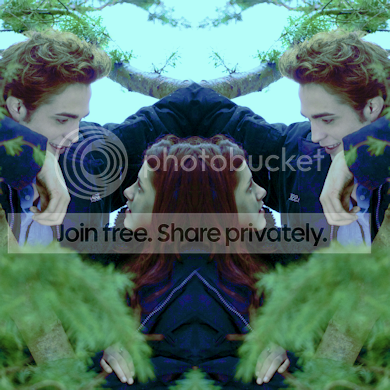
But don't worry just yet.
STEP FOUR
It is time for a curves layer. And honestly, you can go without if you want.
I'm making this tutorial from a PSD, so I can't show you the change this layer makes, Sad pants. But, I'm going to give you the coordinates for the layer.
BLUE, 2 points, 1 @ (159>129)
2@ (77>106)
GREEN, 2 points 1 @ (105>96)
2@(144>161)
RED, 1 point @ (98>156)
RGB, 2 points, 1 @ (92>79)
2@(175>186)
But those are really just guidelines. Mess around with them.
STEP FIVE
Make a new raster layer in white and set it to Soft Light at 50% opacity.
Gives you .
.
STEP SIX.
Duplicate that white layer and set it to Hue or Colour, then copy merged the whole image and paste it on top. Guassian blur this layer. It'll be black and white, and you should still be able to make out the subjects, just blurry, you don't want it to look like a texture or anything. Then set that to screen at 50%. You can skip this, it looks different on a smaller scale, but if you're doing it for a banner or something, it looks great. Also, there is a difference in the finished image here, and the image above, because of the missing curves layer. This is much bluer than the icon, but still nice.
 .
.
AND IT'S DONE. O:
TUTORIAL TWELVE.
So, I accidentaly resized this one, which might make it a little weird.
Also, ALL of the light textures and background textures are mine, so please, don't take them, without telling me here, and crediting me.
It is superrr easy to make your own light textures, if you have a digital camera. Go for a drive, set your camera so the shutter stays open for a little longer than normal, then shoot some light, and while the shutter is open, move your hand around to make interesting patterns, like i said, super easy, no?
STEP ONE.
Take the image of Kristen prep it the same way as i did in the previous tutorial and then create a layer mask. Use the paintbrush to paint black of anything you don't want to see. I removed some hair, and most of the background that was necessary to remove. , which gives you this. I messed up a bit around the edges and stuff in erasing. But because it's a small scale image, who cares? o:
STEP TWO
Take your image of Robert (and prep it like before), and paste it over the image of Kirsten as a new layer and create a layer mask over him as well and erase everything that needs to be.
 and putting them together, it looks like this.
  .
.
STEP THREE
I wanted that white box behind them to cover up some bad erasing. Ahahaha. So, I used the pen tool to trace around them in random lines. Then I used the paint brush tool to fill the area, and fix up some areas where the lines didn't meet perfectly. If you're not sure how to use the pen tool, check my mems, there's a tutorial on it in there, though I think it's for an earlier version of PSP. So far the layer pallete should be in this order. A NEW BLACK RASTER LAYER (just plain black for the background, if you're having trouble getting it to the bottom right click it and click promote to background), THE WHITE BOX, KRISTEN, ROBERT. And that's it. The layer order might get a little confusing, because we're going out of order. The box looks like this and the whole image looks like this
  .
.
STEP FOUR.
It looks boring, so i wanted to add a little snazzy snazzy. So, I whipped out my pen tool and made some randomly coloured lines in the background. Try to make them perfect diagonals so they line up, if that's the look your going for. anywho, it looks like this. , and it's pretty ugly no? So, this vector layer should go BEHIND THE WHITE BOX, and ON TOP OF THE BLACK RASTER LAYER. The image now looks like this.
  .
.
Step FIVE.
Make a new curves layer.
Blue, 2 points @ (110, 96) and (163, 174)
Green, 1 point @ (175, 173)
Red, 2 points @ (129, 114) and (181, 189)
RGB, 3 points @ (40, 61) and (99, 120) and (205, 230)
Again, mess around with it.
And make a new Channel Mixer layer.
Tick the box that said Monochrome and make changes like this.
Red: Red @ 100, Green @ 19, Blue @ 82, Constant @ -8
Green: No change.
Blue : No change.
Step SIX
Add the following light texture, resized and moved, by me. LIGHT.
And it's dooone. : D

Made with PSP X2, using raster layers, vector layers, layer masks and curves and channel mixer layers.
Feat. Robert Pattison and Kristen Stewart. (I'm going a little Twilight crazy, and instead of studying for my big physics exam tomorrow, I'm making icons. D:)
Make these icons, from these sources.
11.
from SOURCE ONE.
12.
from SOURCE TWO. and SOURCE THREE.
THIS IS IMAGE HEAVY, BTW.
So! NUMBER ELEVEN
-Step One.
Get your image, obv. I like to start by cropping my images to a square first. Not neccasarily to 100x100, because I find that that limits your final result in quality. Also, please please please don't sharpen your image throughout any of the steps. If you feel that it needs it at the end, knock your socks off, but some of the editing can make a sharpened image look baaad. Very very bad. Anywho, when I prep my images I usually start by going to Adjust>Colour>Fade Correction, and normally I use the normal setting of 45, but if this messes the image up, just go lower. Then I go to Adjust>Smart Photo Fix. Take the sharpening all the way down to 0, all the way down. I am ANAL about this. Then add a bit more colour, taking it to maybe around 60. Bring the shadows down a bit and the highlights up a bit, and try not to make the image too too bright, because we'll get into this later. There are no set rules for this step. Just try to make it a little lighter and a bit more saturated, just play around with it. Anyway, after that I got this.
It's not a huge difference from the original, I know.
Step Two
Now comes the fun stuff! Duplicate this base layer (that's right click on the layer in the layer palette and duplicate), Then mirror this duplicate (that's Ctrl+M). Now, lower the opacity on that layer to about 85% and just erase half of the image. Set up grids if you have to, but it really doesn't have to be perfect. (grids are in the view menu). So, after the erasing you have an image that looks like this
, nifty noodles, huh?Step Three.
Make a new raster layer, and fill it with a really bright saturated colour, i chose a nice blue tealy... thing. : D
Like that. Duplicate it three times. Set the last two to invisible, and set the first one to Exclusion. OH, IT'S HIDEOUS. Just kidding. Now, CopyMerged that layer. And paste the whole thing as a new layer. Set this to Saturation or Saturation(L) at about 40% opacity. (Just really play around with your opacities and blend modes, and you can get some really interesting colourings.) Now, for those two tealy layers. They should be ABOVE this ugly layer. Set the first one to darken at about 30%, and the second one to soft light at about 25%. It's nice and ugly blue. But don't worry just yet.
STEP FOUR
It is time for a curves layer. And honestly, you can go without if you want.
I'm making this tutorial from a PSD, so I can't show you the change this layer makes, Sad pants. But, I'm going to give you the coordinates for the layer.
BLUE, 2 points, 1 @ (159>129)
2@ (77>106)
GREEN, 2 points 1 @ (105>96)
2@(144>161)
RED, 1 point @ (98>156)
RGB, 2 points, 1 @ (92>79)
2@(175>186)
But those are really just guidelines. Mess around with them.
STEP FIVE
Make a new raster layer in white and set it to Soft Light at 50% opacity.
Gives you
.STEP SIX.
Duplicate that white layer and set it to Hue or Colour, then copy merged the whole image and paste it on top. Guassian blur this layer. It'll be black and white, and you should still be able to make out the subjects, just blurry, you don't want it to look like a texture or anything. Then set that to screen at 50%. You can skip this, it looks different on a smaller scale, but if you're doing it for a banner or something, it looks great. Also, there is a difference in the finished image here, and the image above, because of the missing curves layer. This is much bluer than the icon, but still nice.
.AND IT'S DONE. O:
TUTORIAL TWELVE.
So, I accidentaly resized this one, which might make it a little weird.
Also, ALL of the light textures and background textures are mine, so please, don't take them, without telling me here, and crediting me.
It is superrr easy to make your own light textures, if you have a digital camera. Go for a drive, set your camera so the shutter stays open for a little longer than normal, then shoot some light, and while the shutter is open, move your hand around to make interesting patterns, like i said, super easy, no?
STEP ONE.
Take the image of Kristen prep it the same way as i did in the previous tutorial and then create a layer mask. Use the paintbrush to paint black of anything you don't want to see. I removed some hair, and most of the background that was necessary to remove.
, which gives you this. I messed up a bit around the edges and stuff in erasing. But because it's a small scale image, who cares? o:STEP TWO
Take your image of Robert (and prep it like before), and paste it over the image of Kirsten as a new layer and create a layer mask over him as well and erase everything that needs to be.
and putting them together, it looks like this. . STEP THREE
I wanted that white box behind them to cover up some bad erasing. Ahahaha. So, I used the pen tool to trace around them in random lines. Then I used the paint brush tool to fill the area, and fix up some areas where the lines didn't meet perfectly. If you're not sure how to use the pen tool, check my mems, there's a tutorial on it in there, though I think it's for an earlier version of PSP. So far the layer pallete should be in this order. A NEW BLACK RASTER LAYER (just plain black for the background, if you're having trouble getting it to the bottom right click it and click promote to background), THE WHITE BOX, KRISTEN, ROBERT. And that's it. The layer order might get a little confusing, because we're going out of order. The box looks like this
and the whole image looks like this .STEP FOUR.
It looks boring, so i wanted to add a little snazzy snazzy. So, I whipped out my pen tool and made some randomly coloured lines in the background. Try to make them perfect diagonals so they line up, if that's the look your going for. anywho, it looks like this.
, and it's pretty ugly no? So, this vector layer should go BEHIND THE WHITE BOX, and ON TOP OF THE BLACK RASTER LAYER. The image now looks like this. .Step FIVE.
Make a new curves layer.
Blue, 2 points @ (110, 96) and (163, 174)
Green, 1 point @ (175, 173)
Red, 2 points @ (129, 114) and (181, 189)
RGB, 3 points @ (40, 61) and (99, 120) and (205, 230)
Again, mess around with it.
And make a new Channel Mixer layer.
Tick the box that said Monochrome and make changes like this.
Red: Red @ 100, Green @ 19, Blue @ 82, Constant @ -8
Green: No change.
Blue : No change.
Step SIX
Add the following light texture, resized and moved, by me. LIGHT.
And it's dooone. : D