
Full Icon Tutorial - PS7 Lotsa Adjustment Layers
For  skadi a tutorial for this icon (it's a biggie):

Right! We start with a this cap from farscape-caps.com and get:
 Sharpen it! (Filter>Sharpen>Sharpen)
 Whoa! Too dark! Duplicate the layer and set the new layer to screen:
 Ah! That's better! Now I want Sikozu to be the focus of the icon, so I'm gonna add a gradient...:
 ...This gradient in fact - the white part is clear, tho it doesn't show up on the JPEG - Set it at Soft Light at 55% Opacity
 Now she's a bit more 'forward' Hmmm some colour is now needed, I think.
 I've used this gradient by crumblingwalls set at Soft Light at 47% Opacity
 Right, great colour - but a bit too dark, so we use our first Adjustment Layer! Go to Layer>New Adjustment Layer>Selective colour. (I LOVE these layers, they're a great way of tweaking your image but still being able to back-track if it all goes horribly wrong)
 You use the drop down menu to pick the colour shade in your image you want to tweak, and move the sliders to adjust the proportion of the colours within that shade. I used these settings (more or less - I can't remember exactly):
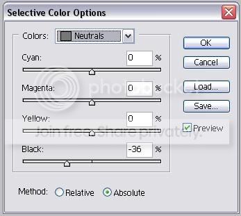 and got:
 That's sooooo much better! But Sikozu still isn't standing out enough for me. So I created a new white filled layer above the adjustment layer and added a layer mask by clicking on:
 and applied the same Black to Clear Gradient I used on my third layer. A great tutorial on these masks by jess2424 is HERE. This gives us:
 Set it to 44% Opacity and we get:
 It's really starting to come together now, but I'd like a little more colour variety. So I created a new transparent layer, used any brush to apply loadsa colour and Guassian Blurred them all together - as I showed in this tutorial - to get:
 Set this layer to difference at 43 % opacity to get:
 Oooh! I love the Greeny Blue! But it's gone all dark again! Time for a new Adjustment Layer - this time choose Curves (Layer>New Adjustment Layer>Curves). To use this adjustment layer grab the curve with your mouse and drag it about! Here's the settings I picked:
 To give:
 How amazing is that! But the image has lost a bit of definition, so duplicate the base layer, drag it to the top, and set it at Soft Light 51% Opacity:
 I could probably leave it there, but I'm fussy, and feel it's too 'Flat' looking - I added a new adjustment layer to tweak the Brightness & Contrast (Layer>New Adjustment Layer>Brightness/Contrast) with about these settings:
 And we end up with:
 Yeah! Now for a bit more orange and red colour using another Selective Colour Adjustment layer (I'm afraid I can't for the life of me remember the settings I used so I haven't posted them - but experimentation is half the fun so just try everything!) To get:
 Whew, nearly there. For a bit of decoration I created a text layer (with any old text) - White, Times New Roman, 3 pt, Overlay, and Fully Justified (to fully justify your text, if you can't find the option, go to Windows>Paragraph and the option is there in the pop up window) and placed it like this:
 then I duplicated the text layer and moved it for a little more for decoration elsewhere:
 After that - Just add Text!
And that, Ladies and Gentlemen, is this icon:
Using these layers:
 (Yes, there is a bit of a light outer glow on the 'Take what you' text - it makes it clearer when the dark text crosses over a darker part of the icon - but it's barely noticeable. Adding a light glow on a dark text going from a light to dark background, or a dark glow on a light text going into a dark to light background, making sure the colour blends in with the main, is an excellent way of stopping text from fading away as the background changes)
No Brushes Used!