Text effects tutorial - PhotoShop 7
Tips for using small and tiny text, along with different blending effects and what not to do, I will show you how to achieve this icon at the end but it is mainly a text tutorial, enjoy! Image heavy and maybe some rambling too! Useful for beginners, but experts may learn something new too:

I have been meaning to do this tutorial for ages now, and I was really in the mood to get stuck into it, so here we are, all of the tips I have learnt and picked up myself on text and making it look good, please do remember though I am not a professional graphics maker and don't know everything, this is just what I do know and hope you will be able to learn from...
We will be adding text to this base by me, you may take it if you want to. You can play around with textures before going on to add the text and experimenting with this tutorial, but I haven't because I love the crisp clean look of the base to start with, that is justmy choice though!

Let's start with small text first, please note that all of the fonts I use on this tut are from dafont and you can use the search bar to find each one.
FONT: 04b08 (a bitmap font)
Here are my settings (to get the character pallet up go to WINDOW - CHARACTER):

To make your small text clear using a bitmap font like the one I've used you need to set your aliasing at none (see bottom right hand corner of settings) otherwise it will come out like this:

But with aliasing set to none it comes out much clearer like this:

See the difference? I've found that the size you need your text set to depends on your program and the images resolution so you may need to play around with that. Bitmap (also called pixel fonts) fonts like the one I have used for the small text come out horrible if you have them too large, like this:
Now let's try some tiny text, this is really very easy to do and requires that you play around the spacing settings, I find that any font is fun to use for this but a fave of mine is either georgia or times new roman (good old classics!) for this I have used georgia set to 2pt as you can see by my character pallete:

To get it at size 2pt, simply type it into the box as the option isn't there, but you can always change your font size simply by typing it in, so if you want your font larger or smaller than the default options just type in the size you want :D
To get the characters spread out I changed this setting:
and to get the lines closer together I changed this setting:
I randomly typed in three lines of different lengths to get this:

I've found when I am doing a lot of tinytext that it is helpful to copy and paste from my LJ entries, or random text files, some people like to always make sure thattheir tiny text says something relevant to the icon, but as you can't read it I never spend a long time thinking of funny sayings or whatever to go on my icons, random typing or copying and pasting works fine for me!
If you don't change the distance of your characters and the lines, you will find you get something rather like this:

I know which I prefer the look of!
Let's put together the tinytext and small text to create a nice happy christmas (or whatever is relevant to your base) message on our base... create a new layer (LAYER - NEW LAYER) and make up your tinytext first, and then create a new layer again for your main small text and then position that on top of the tinytext:

Not very clear is it? So we're going to first lower the opacity of the tinytext by using the opacity option on your layer pallette (mine is set to 40%) and now I am going to make my small text stand out a bit more by adding a stroke (LAYER - LAYER STYLE - STROKE) my settings are:

The result:

I'm still not happy with this, and normally I would play around with the other blending options under LAYER STYLE but as this isn't the type of text that I want I am not going to do that, although if you have time please do play around with the blending options, there's a lot you can do there, but not all of them will work on small text, the outer glow is particulary handy, and you can change the colours to match whatever you are working on or even use a gradient. I can't possibly cover everything in this tutorial, but if you want any help with the blending options then leave me a comment and I will get right back to you :D
Instead of small text I am going to do something a bit more funky and use a different font altogether, don't forget to set your spacing settings all back to normal before you do this, otherwise it will look strange! hehe! But remember that whenever you are using text and want it to be a closer together or further apart then you can use those settings to make everything fit perfectly onto your icon.
FONT: Poornut (it was a default font I got with windows so not sure if it is available on dafont)
Character Settings:

I have aligned my text to the left, and placed it in the left hand corner, you can play around with the alignment and placement as getting it in the right place is what really helps the overall look.
I added an outerglow (LAYER - LAYER OPTIONS - OUTER GLOW) to my text to make it stand out on the blue bauble, my settings were:

Then I wanted to spruce the actual text up a bit so I added Bevel and Emboss (LAYER - LAYER SETTINGS - BEVEL AND EMBOSS), my settings were:
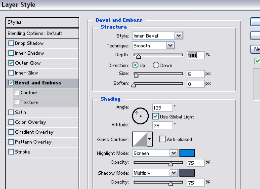
Note that I changed the colours of highlight and shadow options to match my icon, getting this result:

You don't have to use outer glow to make your text stand out, another thing I like to do is add a rectangle underneath the text instead, like this:

I used the brush tool with the square brushes that are default on PS, and set the brush settings to 63% opacity with a pale blue colour that fits the blue colour theme of the icon, I also added a stroke to my text (LAYER - LAYER STYLE - STROKE) of 1px in a dark grey colour to make it stand out that little bit more.
So you see the general things that you can do to make your text fit in and yet stand out at the same time, I love to play with my text, there are so many options for different effects and it would be impossible to put it all into this tutorial!
Let's add some brushes to make the icon more finished, I never use many brushes, preferring to keep my icons simple, but some people love adding a tonne, I used a snowflake brush from one of my sets (you can find my own brushes at graphical_love) and a couple of other brushes a small star and a scribble brush, the scribble brush was by
  lookslikerain, a 1px border using another colour out of my base, and I'm done with the result being this:
So we've covered just some of the basics of text options in this tutorial, and I sure hope I didn't ramble too much and you managed to learn some tips from it! If you have any questions at all please ask me and I will answer, let me know if you find this tut helpful and that's it :D
Please don't go hot linking my images or claiming this tut as your own because it did take me a long time to complete but feel free to link to the whole tut, tutorials really are exhausting!
I have been meaning to do this tutorial for ages now, and I was really in the mood to get stuck into it, so here we are, all of the tips I have learnt and picked up myself on text and making it look good, please do remember though I am not a professional graphics maker and don't know everything, this is just what I do know and hope you will be able to learn from...
We will be adding text to this base by me, you may take it if you want to. You can play around with textures before going on to add the text and experimenting with this tutorial, but I haven't because I love the crisp clean look of the base to start with, that is justmy choice though!
Let's start with small text first, please note that all of the fonts I use on this tut are from dafont and you can use the search bar to find each one.
FONT: 04b08 (a bitmap font)
Here are my settings (to get the character pallet up go to WINDOW - CHARACTER):
To make your small text clear using a bitmap font like the one I've used you need to set your aliasing at none (see bottom right hand corner of settings) otherwise it will come out like this:
But with aliasing set to none it comes out much clearer like this:
See the difference? I've found that the size you need your text set to depends on your program and the images resolution so you may need to play around with that. Bitmap (also called pixel fonts) fonts like the one I have used for the small text come out horrible if you have them too large, like this:
Now let's try some tiny text, this is really very easy to do and requires that you play around the spacing settings, I find that any font is fun to use for this but a fave of mine is either georgia or times new roman (good old classics!) for this I have used georgia set to 2pt as you can see by my character pallete:
To get it at size 2pt, simply type it into the box as the option isn't there, but you can always change your font size simply by typing it in, so if you want your font larger or smaller than the default options just type in the size you want :D
To get the characters spread out I changed this setting:
and to get the lines closer together I changed this setting:
I randomly typed in three lines of different lengths to get this:
I've found when I am doing a lot of tinytext that it is helpful to copy and paste from my LJ entries, or random text files, some people like to always make sure thattheir tiny text says something relevant to the icon, but as you can't read it I never spend a long time thinking of funny sayings or whatever to go on my icons, random typing or copying and pasting works fine for me!
If you don't change the distance of your characters and the lines, you will find you get something rather like this:
I know which I prefer the look of!
Let's put together the tinytext and small text to create a nice happy christmas (or whatever is relevant to your base) message on our base... create a new layer (LAYER - NEW LAYER) and make up your tinytext first, and then create a new layer again for your main small text and then position that on top of the tinytext:
Not very clear is it? So we're going to first lower the opacity of the tinytext by using the opacity option on your layer pallette (mine is set to 40%) and now I am going to make my small text stand out a bit more by adding a stroke (LAYER - LAYER STYLE - STROKE) my settings are:
The result:
I'm still not happy with this, and normally I would play around with the other blending options under LAYER STYLE but as this isn't the type of text that I want I am not going to do that, although if you have time please do play around with the blending options, there's a lot you can do there, but not all of them will work on small text, the outer glow is particulary handy, and you can change the colours to match whatever you are working on or even use a gradient. I can't possibly cover everything in this tutorial, but if you want any help with the blending options then leave me a comment and I will get right back to you :D
Instead of small text I am going to do something a bit more funky and use a different font altogether, don't forget to set your spacing settings all back to normal before you do this, otherwise it will look strange! hehe! But remember that whenever you are using text and want it to be a closer together or further apart then you can use those settings to make everything fit perfectly onto your icon.
FONT: Poornut (it was a default font I got with windows so not sure if it is available on dafont)
Character Settings:
I have aligned my text to the left, and placed it in the left hand corner, you can play around with the alignment and placement as getting it in the right place is what really helps the overall look.
I added an outerglow (LAYER - LAYER OPTIONS - OUTER GLOW) to my text to make it stand out on the blue bauble, my settings were:
Then I wanted to spruce the actual text up a bit so I added Bevel and Emboss (LAYER - LAYER SETTINGS - BEVEL AND EMBOSS), my settings were:
Note that I changed the colours of highlight and shadow options to match my icon, getting this result:
You don't have to use outer glow to make your text stand out, another thing I like to do is add a rectangle underneath the text instead, like this:
I used the brush tool with the square brushes that are default on PS, and set the brush settings to 63% opacity with a pale blue colour that fits the blue colour theme of the icon, I also added a stroke to my text (LAYER - LAYER STYLE - STROKE) of 1px in a dark grey colour to make it stand out that little bit more.
So you see the general things that you can do to make your text fit in and yet stand out at the same time, I love to play with my text, there are so many options for different effects and it would be impossible to put it all into this tutorial!
Let's add some brushes to make the icon more finished, I never use many brushes, preferring to keep my icons simple, but some people love adding a tonne, I used a snowflake brush from one of my sets (you can find my own brushes at
graphical_love) and a couple of other brushes a small star and a scribble brush, the scribble brush was by lookslikerain, a 1px border using another colour out of my base, and I'm done with the result being this:So we've covered just some of the basics of text options in this tutorial, and I sure hope I didn't ramble too much and you managed to learn some tips from it! If you have any questions at all please ask me and I will answer, let me know if you find this tut helpful and that's it :D
Please don't go hot linking my images or claiming this tut as your own because it did take me a long time to complete but feel free to link to the whole tut, tutorials really are exhausting!