tutorial!
 to
to 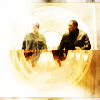 or
or 
program: photoshop cs5 on windows
difficulty: moderate

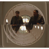
so this is the original cap i started off with. the first thing i did was crop a bit off the bottom using the rectangular marquee tool, so that the arch in the background was closer to a semicircle.
» then i duplicated the layer (ctrl+j) and flipped it upside down
» it looked a little too simple, so i duplicated that and hit edit > transform > scale > 85%
» then i did it again once more and set both resized layers to lighten.
merging all the layers together (ctrl+shift+e) gave me this base:
normally what i do at this point is duplicate the base a few times and set them all to soft light or screen, and then merge them all into one modified base, but i wanted to try something new so this is what i did instead:
» duplicated base, set to soft light 100%
» duplicated base, set to screen 100%
» this texture by
 happy_harper13, desaturated (ctrl+shift+u) so it came out like this:
you might notice that i smudged it a little at the top left. this is because when i actually put the original desaturated texture onto the icon, the dark part was too strong in the upper left corner and i wanted to make it softer.
finally, i lightened up the icon a little more with another duplicated base layer, set to screen 100% again. as you can see, the texture added some... well, texture, to the top frames of the icon which had previously been left blank.

i wanted to add some more contrast, but colour the icon at the same time, so i added a colour balance layer and a vibrance layer with the following settings:
» colour balance: shadows -9 +1 +22, midtones +20 +13 -26
» vibrance +100 (if you don't have the vibrance tool, a hue/saturation adjustment layer with saturation +25 would work too; although they don't yield the exact same result, it's close enough)

the problem with it being so bright now is that you can all see how imperfect my cropping was, haha. so let's try to hide it a little bit:
» this texture by
 midnight_road, inversed (ctrl+i) and set to soft light 50%
» light white blobs with a soft brush at the bottom left and top right corners, gaussian blurred (filter > blur > gaussian blur) at about 3 pixels and set to soft light 100%
» this texture by
 marishna, set to lighten 15%
i wanted to add a little bit of depth, so this was the next layer:
» duplicated base layer, brought to the top and desaturated
» gaussian blur at 2 pixels
» image > adjustments > brightness/contrast +150 +100
» set to soft light, 25%
 >>
>> 
just a tiny, tiny difference, but i liked the effect haha. it's starting to get washed out, though, so it's time for some colouring:
» #5d4a30 set to screen 40%
» #e99c31 set to soft light 55%
» #e8a03c set to multiply 60%
so here's the thing: i liked the way it was after the orange screen and orange soft light, but i also liked the dark orange multiply (even if it was a bit heavy). i also wanted to differentiate the top half of the circle from the bottom, so i created a layer mask (layer > layer mask > reveal all) and used the marquee and paint bucket tools on the mask to quickly black out the effects of the orange multiply from the top half. it ended up looking like this:
 >>
>>  >>
>> 
it kinda looks pretty weird still, huh? haha wait, i have to mess it up some more:
» i took this texture by
» edit > transform > flip horizontal
» then i layer masked out the part that covered the little bar framing the bottom of the icon, in order to keep it dark
» the part that ticks upward? it was intruding into the circle and i didn't like that, so i smudged it down into a softer cloud that kind of faded out to the right.

alright, from here on out i mostly just contrasted the fuq out of the icon and brightened it up:
» black to white gradient map set to soft light 100%
» brightness/contrast +20 +30
» base layer duplicated, filter > other > high pass at 10 pixels, set to soft light 100%

ahhhhh. everything's always so much better with a shitton of contrast. not done yet though, because it still looks too soft for me (haha i have issues), plus i also wanted to basically just screw around and see what i could get, so:
» made the
» created a new layer and merged all visible into that layer (ctrl+shift+alt+e) and set to soft light 100%
» made the texture visible again
» masked out most of the top half of the circle
» took the smudge tool and carefully smudged right outside the bottom right part of the circle
» used the eyedropper to pick out a colour from hank's jacket (#5d4e39) and then used the paint bucket tool to just drop it randomly inside the circle
 >>
>> 
hahahahahahahahaha idek
but yeah, it added more contrast, and welp, i can't say no to that
still not enough though!!!
» one more vibrance layer, +50 (or saturation +5)
» and one last black to white gradient map, set to soft light 100%
tada!! i stopped here originally, but then i came back to take the not-square prompt from
inspired20in20 a little further:» i used the elliptical marquee tool to cut out the icon (width 100px by height 100px)
» to add some interest i duplicated that, and used the same marquee tool to cut out a 95x95 circle and flipped that vertically
» did it again to make a 90x90 circle and flipped that vertically so it looked really similar to the original
» then i masked out the top and left the effects for the bottom half of the circle
» finally, i saved the transparency via png so it would stay as a circular circle icon. then i realized nobody ever uses circle icons so i filled in a white background and saved it again.
and that's all. nbd. this is actually the first time i've written a tutorial, so if you have any suggestions/questions feel free to let me know! if i was unclear about the techniques i used or the steps i took, go ahead and tell me about it! i don't know if this tutorial will be easily translatable -- the screencap makes this whole icon, really -- but hopefully this shows you different techniques or combinations, idk. this is actually pretty fun tbh so i might be posting some more at my graphics journal
zenetic in the future, if it turns out that this was actually helpful to anyone C: