### Describe the bug The default negative margin on the Breadcrumb component causes it to overlap elements above it at smaller screen widths. ### Steps to reproduce the bug 1. Add Basic Header component to page. 2. Add Breadcrumb component to page after Basic Header. 3. Set screen width to size less than `mobile-lg`. 4. Note the bottom border of the Basic Header is cut off because of the overlap caused by negative margin. ### Expected behavior Breadcrumb component should not overlap adjacent components by default. Additional notes from @mejiaj: > Could be an improvement to the component. > margin: units($theme-focus-width) * -1; > Should be: explicit with margin-left and margin-right. This style originally comes from focus border covering the breadcrumb link text. ### Screenshots 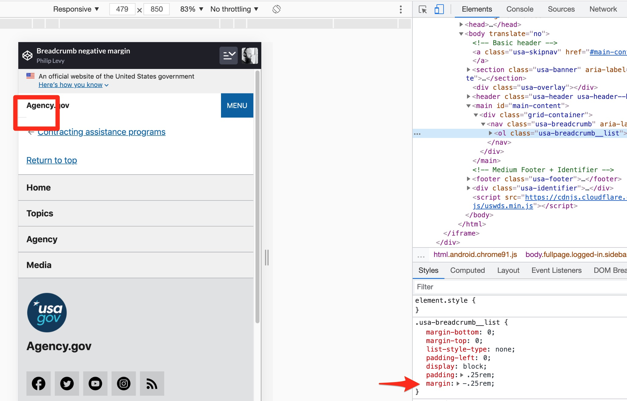 ### System setup - **USWDS version:** 2.11.1 - **Device:** MacBook Pro - **Operating system:** 10.14.6 - **Browser and version:** Chrome 91 ### Additional context [CodePen demonstrating steps to reproduction](https://codepen.io/pglevy/pen/PopLRqP)