[MRG] CSS: float the download buttons on wide screens#336
[MRG] CSS: float the download buttons on wide screens#336lesteve merged 11 commits intosphinx-gallery:masterfrom
Conversation
To make them more visible to users for download
|
Continuation of discussion on #329 |
Codecov Report
@@           Coverage Diff           @@
##           master     #336   +/-   ##
=======================================
  Coverage   91.68%   91.68%
=======================================
  Files          27       27
  Lines        1816     1816
=======================================
  Hits         1665     1665
  Misses        151      151
Continue to review full report at Codecov.
|

|
Links to the rendered pages:
And screenshot with default sphinx theme: I think that this is a usability improvement compared to what we have. |

|
Nice! The floating right is a bit weird on the readthedocs theme (which is the one we used in sphinx-gallery.github.io). From this example:
|

|
I don't think that it's that bad. What bother's you? That's it's too far on the right? |
Yeah I was wondering if there is an easy way to make it float just a bit right of the example code. If there is no easy way to do that, it's fine with me. |
|
Yeah I was wondering if there is an easy way to make it float just a bit right
of the example code. If there is no easy way to do that, it's fine with me.
Trying something...
|
* Separate behavior for full gallery and for examples

* For very large screen, avoid sending the buttong too far on the right

* Special case RTD theme
|
OK, I've tried something that should look better (and caught a design bug
in the same time :D).
Tell me how you like it
|
|
A bit too late to look at this, but for MNE before #329 we had:
#329 it broke a bit:
After this PR (e87efda) it looks just like the above until I make the screen wider, then I get:
And wider still:
These problems can be fixed, but it is worth knowing that CSS tweaking can break existing use cases a bit. By customizing our CSS in MNE perhaps we should even expect that upstream changes can do this (maybe we should put it in the docs somewhere if it's not already there?). This seems to interact nicely when building the SG docs, though -- and thus probably should anywhere CSS is not customized -- so +1 for merge from me. |


|
@larsoner : +1 adding a note for saying that customizing CSS is a bit dangerous (it will always be, CSS is unfortunately brittle). Where do you suggest that we add it? The fix on your side will be easy. In addition, it the latest commit, I've added a new class that you can capture in CSS. |
|
I've added a note in CHANGES
|
|
Also here is a possibly different sort of problem with the float -- it can sit on top of the content. It's clearest in MNE:
But even happens at some widths with the SG builds:
As for the doc, I'd put it in the "And some things can be tweaked directly in CSS:" here: http://sphinx-gallery.readthedocs.io/en/latest/advanced_configuration.html |


|
(I'm still +1 for merge even with this overlap issue, I read that "optimistic merging" article and I figure someone can fix it in a follow-up PR if it's truly irritating) |
|
The overlap cannot be fixed. If you think that it is an important problem, we can change the media query so that the behavior switches for larger screens. If people agree that the overlap is a problem they should let me know, and I'll change this behavior. |
|
FWIW in Firefox 57 I see an overlap with the text for readthedocs theme in https://341-25860190-gh.circle-artifacts.com/0/home/ubuntu/sphinx-gallery/rtd_html/auto_examples/plot_exp.html even in full-screen window (even if there is plenty of space on the right)
|

|
@lesteve I'm on Firefox 57 and I don't see such overlap on a wide screen window. This PR looks nice enough. |
|
I'd rather not have the buttons on the top, as they take a lot of
vertical space, and its a problem if users that click to see the example
have to scroll.
I am working on reducing a bit the overlap. Stay tuned.
|
This would be done via changing the ordering of the elements within the HTML template rather than tweaking the CSS, right? If so, -1 on this as it can't be reverted/fixed via CSS. |
And add transparency, to minimize the negative consequences of overlay
|
OK, I worked to reduce the overlap. Here is the link to rendered versions:
I hope that this is good to go. It can still generate some overlap, but minor, and I don't think that it is easy to do less. |
|
Here is what I get for a few views:
This one gets a scroll bar , maybe Chrome is just being weird?
I'm +0 on this change because it always makes it easier to download files or launch Binder, but depending on the resolution it can either be helpful or harmful for example readability. |


|
Darn the scrollbar is strange. Let me see if I can reproduce this and fix it. |
|
OK, new iteration, that should fix the bugs of the previous iteration and remove even more overlap: https://345-25860190-gh.circle-artifacts.com/0/home/ubuntu/sphinx-gallery/rtd_html/auto_examples/plot_choose_thumbnail.html |
|
I really like this addition, I think having the buttons float to the side definitely makes them more discoverable. +1 for an optimistic merge (though there have been quite a lot of iterations on this one already!) and spot-checking improvements as people have a chance to get to know the new behavior |
|
LGTM +1 for merge |
|
Merging, thanks a lot @GaelVaroquaux ! |
|
Great! The iterations (ie y'all being demanding bastards like I am)
really helped, IMHO.
|
|
sorry to come late here but I feel this is not an ideal decision. it makes you use a full column for just a button -> it leads to a lot of white spaces. It also forces you to use a wide screen |
|
@agramfort the button actually floats to the right, so it should (hopefully!) only use already-unused white white space, and when you decrease resolution, it should automatically float to the bottom. |
|
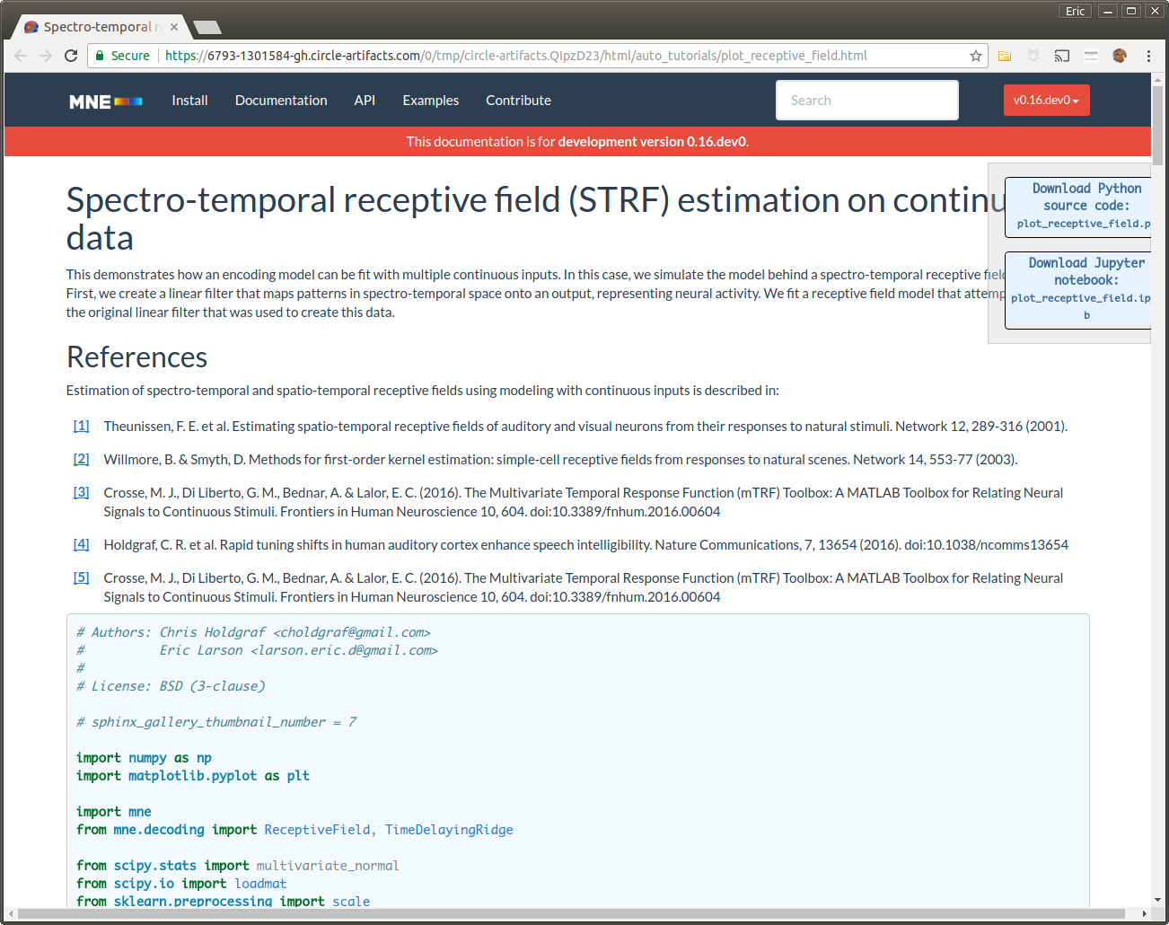
at least here
https://6793-1301584-gh.circle-artifacts.com/0/tmp/circle-artifacts.QIpzD23/html/auto_tutorials/plot_receptive_field.html
the button shows up on the title + is half hidden.
maybe it's an MNE pb though
|
|
Yes I get this behavior too at some resolutions:
We do use a width that is larger than the SG build defaults. Not sure how common it will be elsewhere. |

|
In full-width, it looks fine for me (Firefox 57 and Chrome). If I start making the window narrower I get something like @larsoner's snapshot. I don't know if there is a better way of doing it.
Other suggestions more than welcome ! |
|
Typography guidelines for readability say that very wide columns are a bad thing. You should limit the column width in the MNE CSS (eg using max-width).
IMHO: yes it's an MNE problem that should be fixed there.
Sent from my phone. Please forgive typos and briefness.
…On Jan 17, 2018, 20:33, at 20:33, Eric Larson ***@***.***> wrote:
Yes I get this behavior too at some resolutions:
> maybe it's an MNE pb though
We do use a width that is larger than the SG build defaults. Not sure
how common it will be elsewhere.
--
You are receiving this because you were mentioned.
Reply to this email directly or view it on GitHub:
#336 (comment)
|
|
In MNE our width comes from using So I suspect anyone using In any case, at the MNE end we will either modify our column width, or tweak the floating box behavior to jump to the bottom sooner. |
|
Good point about the fact that there is an inconsistency with
sphinx_boostrap_theme. Hum, maybe we can insert a rule in our CSS that
captures the sphinx-bootstrap theme, like I did for the rtd theme. That
rule could jump to the bottom sooner.
|
To make them more visible to users for download