Currently "Cancel" and "Continue" buttons have the same style. "Continue" button should be emphasized, so undecided users can lean toward this option. See example of good practice from OneSignal: 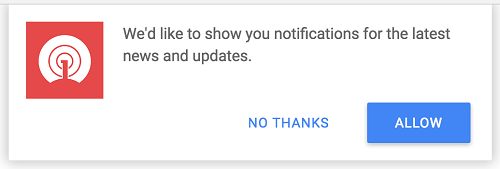
Currently "Cancel" and "Continue" buttons have the same style.
"Continue" button should be emphasized, so undecided users can lean toward this option.
See example of good practice from OneSignal: