What if a website is just too damn much? Every now and then we have a client that doesn’t require an entire site as their needs are a bit different from others. For such people, a simple landing page is all they need. But what are they? It’s easy to imagine them as a homepage stripped of everything else, but the truth is they serve very different purposes.
WHEN TO USE A LANDING PAGE
Landing pages are typically useful when you have a singular focus. Perhaps the focus is on running an ad campaign, a special offer, or pushing people towards a product.
Some use landing pages as placeholders for their full site, but more and more we see landing pages being deployed with very little concern for a future site at all. They end up being the thing users land on (get it?) after clicking a Google ad or tapping one of those cool Instagram products. These pages aren’t necessarily meant to immerse you in the philosophy of the company or provide a list of the people on their board of directors. You’ve gone there wanting one thing, they know it, and the landing page is going to give it to you. That’s it.
HOME PAGES VS. LANDING PAGES
As part of a bigger unit, a home page is best thought of as a directory of sorts for the rest of the site. Each section will be delineated and will function to send users to a different part of the site.
Up top you’ll find a navigation menu so you can jump around the site. The banner will probably tell you what the company does and have a button that lets you learn more. The services section will educate you on the wide breadth of offerings. Surely there will be some imagery of people (just like you! Weird!) using the product or benefitting from the product or service. Next maybe we’ve got a blog so you can see some use cases or learn more about what’s going on. Maybe there’s a social media section next so you can make sure you never miss a critical meme. You’ll want to know you’re dealing with actual people, so let’s toss a team page in there for good measure, and we’ll tie it all up with a footer that repeats the menu and gives contact info. The whole thing will probably be tied together with a sleek, minimalist design so that you can tell this company is efficient and knows their stuff.
A typical landing page is quite a bit less scattershot than this. Again, the focus comes down to a single goal rather than a collection of them. Here’s the product you just saw next to a giant button that says “BUY.” That’s about all you need.
When I first started making landing pages for a client in the Search Engine Optimization space, I was actually jarred by how little attention there was to actual Search Engine Optimization. To him, the ad that gets the person to the landing page is the search engine stuff, by the time the user hits the landing page, the job is to get out of the way and let the thing happen.
KEYS TO A SUCCESSFUL LANDING PAGE
So we know what a landing page won’t have (or at least what it will have less of), so what will it have instead? As you’ve probably guessed, the goal here is clarity, simplicity, and ease of use.
For this to work we need tighter than usual copy. This isn’t the time to let the CEO wax poetic about their dedication to quality, how they aren’t happy until you’re happy, or any of the other things that are purposefully hard to quantify. The user has landed here not by happenstance, but because they clicked something with intention; it’s time to get to the point.
Visuals will need to be crisp and obvious, but we won’t have as much room for nuance. This thing is to be streamlined and quick, so don’t wag your design tail in anybody’s face for too long.
It’s always important to have a clear call to action, but it’s doubly important here. Often when we meet with clients about calls to action on home pages of full sites, it can be hard to narrow it down to fewer than 3 things because a full site is trying to do so much. With a landing page though, you get one kick at the can, so make it count. This shouldn’t be too hard because the landing page by definition has a singular goal, so that’s your call to action.
MISTAKES WITH LANDING PAGES
This might be tricky to write without just inverting the previous section, because that’s pretty much what we’re definitely going to do.
The enemy of landing pages is complexity and volume. It’s hard as a business owner or employee to keep things concise because you’re excited and there’s so much to talk about. This isn’t the time for that though. That’s for your blog, and blog you should! But today we’re talking about a singular goal shot from a cannon.
I touched on design in a previous paragraph, and it begs repeating: this isn’t the time to get cute. Design it well, of course, but this isn’t the time for swooping animations and eye-catching videos. Remember, this is a different animal than your everyday web visitor. They came here to get in and get out, so make sure you’re not standing in the way of them doing that.
REAL-WORLD EXAMPLES OF LANDING PAGES IN ACTION
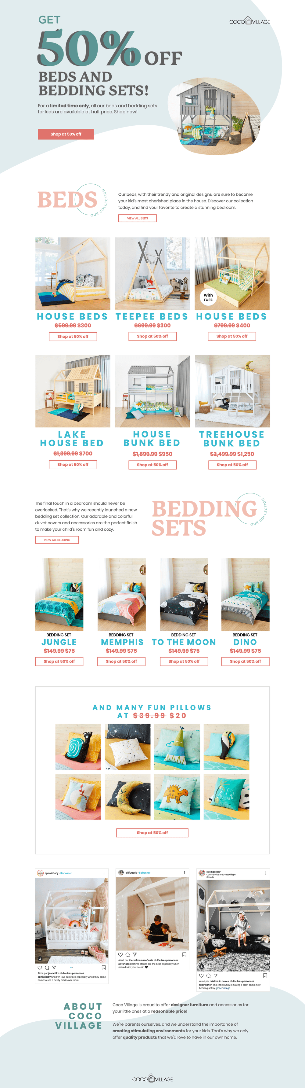
Coco Village
Coco Village does a great job of presenting what is essentially a sales brochure as a web page. You don't have to dig too hard here to see there's a sale, and you sure don't have to dig much harder to see the products. Two paragraphs adorn the bottom to tell you who they are, but beyond that, this is just a sales brochure (and a good one at that).
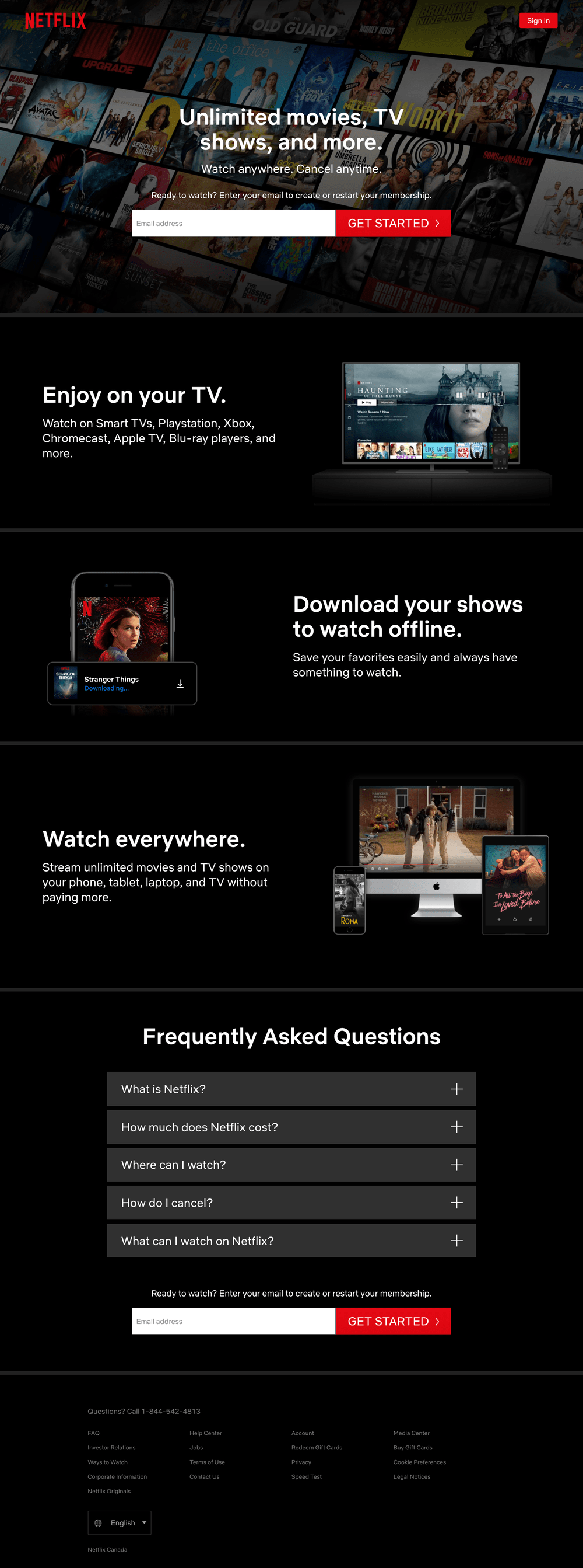
Netflix
There's plenty to learn about with Netflix, but this landing page isn't geared to someone who wants to know it all. It's a quick and effective page that outlines the 3 biggest features of the platform. The top questions new subscribers ask are found below in a collapsible accordion, so everything stays nice and compact.
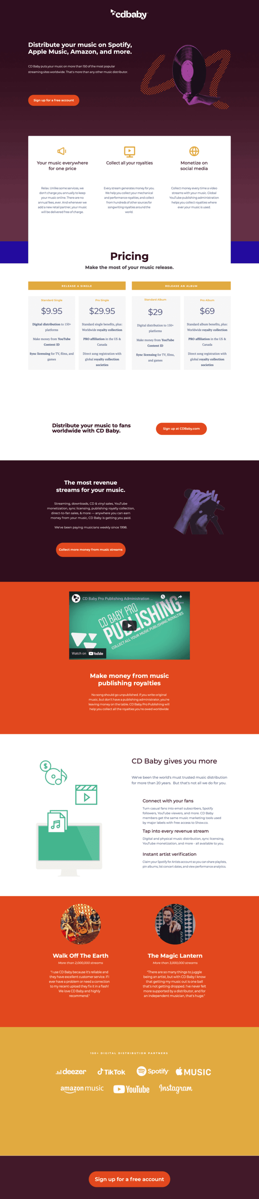
CD Baby
CD Baby goes closer to an actual site in that they hit all the hits: what they do, what they cost, and how they can help. The difference is that no one section gets more than paragraph, so we get a brilliant top-down view of what the company does.
CONCLUSION
This certainly isn’t meant to persuade anybody that a landing page is somehow superior to a full site (that would make me a curiously deficient website creator). The point is that depending on your situation, sometimes a landing page will do, and sometimes a full site will do.
If you find yourself pushing a singular product or wanting to make a splash with some form of campaign, a landing page might just do the trick.
As always, if you feel unsure if it’s time to make a landing page or a site, drop us a line and we’ll help you chart a path.
The post Landing Pages vs. Full Sites appeared first on Build Studio.
]]>What if a website is just too damn much? Every now and then we have a client that doesn’t require an entire site as their needs are a bit different from others. For such people, a simple landing page is all they need. But what are they? It’s easy to imagine them as a homepage stripped of everything else, but the truth is they serve very different purposes.
WHEN TO USE A LANDING PAGE
Landing pages are typically useful when you have a singular focus. Perhaps the focus is on running an ad campaign, a special offer, or pushing people towards a product. Some use landing pages as placeholders for their full site, but more and more we see landing pages being deployed with very little concern for a future site at all. They end up being the thing users land on (get it?) after clicking a Google ad or tapping one of those cool Instagram products. These pages aren’t necessarily meant to immerse you in the philosophy of the company or provide a list of the people on their board of directors. You’ve gone there wanting one thing, they know it, and the landing page is going to give it to you. That’s it.HOME PAGES VS. LANDING PAGES
As part of a bigger unit, a home page is best thought of as a directory of sorts for the rest of the site. Each section will be delineated and will function to send users to a different part of the site. Up top you’ll find a navigation menu so you can jump around the site. The banner will probably tell you what the company does and have a button that lets you learn more. The services section will educate you on the wide breadth of offerings. Surely there will be some imagery of people (just like you! Weird!) using the product or benefitting from the product or service. Next maybe we’ve got a blog so you can see some use cases or learn more about what’s going on. Maybe there’s a social media section next so you can make sure you never miss a critical meme. You’ll want to know you’re dealing with actual people, so let’s toss a team page in there for good measure, and we’ll tie it all up with a footer that repeats the menu and gives contact info. The whole thing will probably be tied together with a sleek, minimalist design so that you can tell this company is efficient and knows their stuff. A typical landing page is quite a bit less scattershot than this. Again, the focus comes down to a single goal rather than a collection of them. Here’s the product you just saw next to a giant button that says “BUY.” That’s about all you need. When I first started making landing pages for a client in the Search Engine Optimization space, I was actually jarred by how little attention there was to actual Search Engine Optimization. To him, the ad that gets the person to the landing page is the search engine stuff, by the time the user hits the landing page, the job is to get out of the way and let the thing happen.KEYS TO A SUCCESSFUL LANDING PAGE
So we know what a landing page won’t have (or at least what it will have less of), so what will it have instead? As you’ve probably guessed, the goal here is clarity, simplicity, and ease of use. For this to work we need tighter than usual copy. This isn’t the time to let the CEO wax poetic about their dedication to quality, how they aren’t happy until you’re happy, or any of the other things that are purposefully hard to quantify. The user has landed here not by happenstance, but because they clicked something with intention; it’s time to get to the point. Visuals will need to be crisp and obvious, but we won’t have as much room for nuance. This thing is to be streamlined and quick, so don’t wag your design tail in anybody’s face for too long. It’s always important to have a clear call to action, but it’s doubly important here. Often when we meet with clients about calls to action on home pages of full sites, it can be hard to narrow it down to fewer than 3 things because a full site is trying to do so much. With a landing page though, you get one kick at the can, so make it count. This shouldn’t be too hard because the landing page by definition has a singular goal, so that’s your call to action.MISTAKES WITH LANDING PAGES
This might be tricky to write without just inverting the previous section, because that’s pretty much what we’re definitely going to do. The enemy of landing pages is complexity and volume. It’s hard as a business owner or employee to keep things concise because you’re excited and there’s so much to talk about. This isn’t the time for that though. That’s for your blog, and blog you should! But today we’re talking about a singular goal shot from a cannon. I touched on design in a previous paragraph, and it begs repeating: this isn’t the time to get cute. Design it well, of course, but this isn’t the time for swooping animations and eye-catching videos. Remember, this is a different animal than your everyday web visitor. They came here to get in and get out, so make sure you’re not standing in the way of them doing that.REAL-WORLD EXAMPLES OF LANDING PAGES IN ACTION
Coco Village
Coco Village does a great job of presenting what is essentially a sales brochure as a web page. You don't have to dig too hard here to see there's a sale, and you sure don't have to dig much harder to see the products. Two paragraphs adorn the bottom to tell you who they are, but beyond that, this is just a sales brochure (and a good one at that).
Netflix
There's plenty to learn about with Netflix, but this landing page isn't geared to someone who wants to know it all. It's a quick and effective page that outlines the 3 biggest features of the platform. The top questions new subscribers ask are found below in a collapsible accordion, so everything stays nice and compact.
CD Baby
CD Baby goes closer to an actual site in that they hit all the hits: what they do, what they cost, and how they can help. The difference is that no one section gets more than paragraph, so we get a brilliant top-down view of what the company does.
CONCLUSION
This certainly isn’t meant to persuade anybody that a landing page is somehow superior to a full site (that would make me a curiously deficient website creator). The point is that depending on your situation, sometimes a landing page will do, and sometimes a full site will do. If you find yourself pushing a singular product or wanting to make a splash with some form of campaign, a landing page might just do the trick. As always, if you feel unsure if it’s time to make a landing page or a site, drop us a line and we’ll help you chart a path.The post Landing Pages vs. Full Sites appeared first on Build Studio.
]]>