
Searchable Dropdowns: Making Long Lists User-Friendly
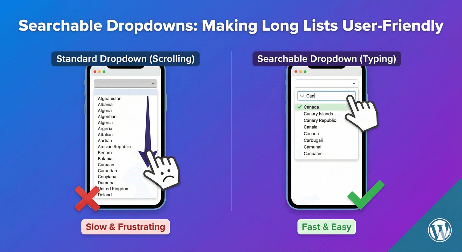
A dropdown with 200 countries. A list of 50 states. Hundreds of product options. Scrolling through long dropdown lists is frustrating—and causes form abandonment.
Searchable dropdowns solve this by letting users type to filter options instantly. Instead of scrolling, they type “can” and see Canada at the top.
In this guide, you’ll learn when to use searchable dropdowns and how to set them up in your WordPress forms.
The Problem with Long Dropdowns
Standard dropdowns become unusable as options increase:
User Experience Issues
- Endless scrolling – Finding “United States” in an alphabetical country list means scrolling past 180+ countries
- Mobile nightmare – Tiny scroll areas on touch screens
- Time-consuming – Users spend 10+ seconds finding one option
- Error-prone – Easy to accidentally select the wrong item
- Frustrating – Repeated for multiple dropdown fields
When Dropdowns Become Problematic
| Number of Options | User Experience |
|---|---|
| 5-10 options | ✅ Easy to scan |
| 10-20 options | ⚠️ Manageable |
| 20-50 options | ⚠️ Getting tedious |
| 50+ options | ❌ Needs search |
| 100+ options | ❌ Search essential |
How Searchable Dropdowns Work
A searchable dropdown combines a text input with a dropdown list:
- User clicks the dropdown field
- A search box appears (or the field itself becomes searchable)
- User types a few characters
- Options filter in real-time to match the input
- User selects from the filtered short list
Example: Country Selection
Without search: Scroll through 200+ countries to find “Germany”
With search: Type “ger” → see Germany, Algeria, Nigeria → click Germany
Time saved: 10+ seconds → 2 seconds
Common Use Cases for Searchable Dropdowns
Country Selection
The classic example. With 195+ countries, search is essential:
- Type “uni” → United States, United Kingdom, United Arab Emirates
- Type “aus” → Australia, Austria
- Type “new” → New Zealand, New Caledonia
State/Province Selection
50 US states, 13 Canadian provinces, or regions worldwide:
- Type “cal” → California
- Type “new” → New York, New Jersey, New Hampshire, New Mexico
Product Categories
E-commerce sites with hundreds of product types:
- Type “laptop” → Laptops, Laptop Accessories, Laptop Bags
- Type “phone” → Phones, Phone Cases, Phone Chargers
Job Titles/Industries
Career forms with extensive job lists:
- Type “engineer” → Software Engineer, Civil Engineer, Mechanical Engineer
- Type “market” → Marketing Manager, Market Analyst, Marketplace Specialist
Languages
Language preference with 100+ options:
- Type “span” → Spanish
- Type “chin” → Chinese (Simplified), Chinese (Traditional)
Universities/Schools
Educational institution lists:
- Type “harvard” → Harvard University
- Type “MIT” → Massachusetts Institute of Technology
Timezones
400+ timezone options:
- Type “pacific” → Pacific/Auckland, Pacific/Honolulu, US/Pacific
- Type “new york” → America/New_York
Setting Up Searchable Dropdowns
Here’s how to create searchable dropdowns with Auto Form Builder:
Step 1: Install Auto Form Builder
- Go to Plugins → Add New
- Search for “AFB” (the short name for Auto Form Builder)
- Find “AFB – Auto Form Builder – Drag & Drop Form Creator“
- Click Install Now, then Activate
Step 2: Add a Dropdown Field
- Create or edit your form
- Drag the Dropdown field onto your form
- Click to open settings
Step 3: Add Your Options
Enter your list of options. For long lists, you can:
- Type manually – Enter each option one by one
- Bulk add – Paste a list of options (one per line)
Step 4: Enable Search
In dropdown settings, look for the Searchable or Enable Search option. Toggle it ON.
The dropdown will now include a search/filter box that filters options as users type.
Step 5: Configure Search Behavior
Depending on your form builder, you may have options like:
- Minimum characters – Start filtering after X characters typed
- Search position – Match from start of option or anywhere
- Placeholder text – “Type to search…” or “Search countries…”
Dropdown Field Best Practices
1. Always Enable Search for 20+ Options
If your dropdown has more than 20 options, enable search. It’s that simple. Users will thank you.
2. Use Clear Placeholder Text
Tell users they can search:
- “Select a country (type to search)”
- “Choose your state…”
- “Search or select…”
3. Order Options Logically
Even with search, option order matters:
- Alphabetical – Best for names (countries, states)
- Most common first – Put popular options at top (US, UK, Canada)
- Grouped – Categories with separators
4. Include Common Variations
Users might search for:
- “USA” or “United States” or “US” or “America”
- “UK” or “United Kingdom” or “Britain” or “England”
If possible, include common abbreviations or variations that map to the same option.
5. Test on Mobile
Searchable dropdowns should work smoothly on touch devices:
- Search input is easily tappable
- Keyboard appears for typing
- Options are large enough to tap accurately
When NOT to Use Searchable Dropdowns
Searchable dropdowns aren’t always the answer:
Short Lists (Under 10 Options)
For 5-10 options, a standard dropdown is faster. No need to type when you can see everything at once.
When Users Don’t Know the Exact Term
Search requires users to know what to type. If they’re browsing/exploring options, a categorized list or radio buttons might work better.
Yes/No or Binary Choices
Use radio buttons instead. Two options don’t need a dropdown at all.
Numeric Ranges
For age ranges or quantity selection, consider:
- Number input field
- Slider
- Short dropdown (1-10)
Alternatives to Searchable Dropdowns
Depending on your data, consider these alternatives:
Auto-Complete Text Field
User types freely, suggestions appear below. Good when users might enter values not in your list.
Cascading Dropdowns
Break one long list into two shorter ones:
- First dropdown: Select continent
- Second dropdown: Select country (filtered by continent)
Radio Buttons with “Other”
Show top 5-7 options as radio buttons with an “Other” option that reveals a text field.
Grouped/Categorized Options
Use optgroups to organize options by category:
- North America
- Canada
- Mexico
- United States
- Europe
- France
- Germany
- United Kingdom
Pre-Built Option Lists
Don’t reinvent the wheel. Here are common lists you’ll need:
Countries
195 UN member states plus territories. Consider putting common countries (US, UK, Canada, Australia) at the top, then alphabetical.
US States
50 states plus DC and territories. Alphabetical works well.
Canadian Provinces
13 provinces and territories. Short enough that search is optional.
Timezones
Use standard timezone identifiers (America/New_York, Europe/London). Group by region.
Languages
ISO language codes with display names. Put common languages first.
Industries
Standard industry classification lists (NAICS, SIC) or custom lists for your audience.
Performance Considerations
Very Large Lists (1000+ Options)
For extremely large lists:
- Load options on demand – Fetch from server as user types
- Set minimum characters – Require 2-3 characters before searching
- Limit results shown – Display top 20 matches, not all 500
Page Load Impact
Long option lists increase page size. For lists over 500 options, consider:
- Loading options via AJAX
- Breaking into cascading dropdowns
- Using server-side search
Accessibility
Ensure searchable dropdowns are accessible:
Keyboard Navigation
- Tab to focus the field
- Type to search
- Arrow keys to navigate options
- Enter to select
- Escape to close
Screen Readers
- Proper ARIA labels
- Announce number of results
- Announce selected option
Visual Indicators
- Clear focus states
- Highlighted current option
- Loading indicator while searching
Frequently Asked Questions
How many options before I need search?
Enable search for any dropdown with 20+ options. For 50+ options, search is essential. Some users appreciate search even for 10-15 options.
Should the search match from the beginning or anywhere?
“Anywhere” matching is more forgiving. Searching “york” finds “New York.” Beginning-only matching is faster for known terms.
Can users still scroll through all options?
Yes, searchable dropdowns typically show the full list initially. Search filters it down, but users can still scroll if they prefer.
What if users misspell their search?
Basic search doesn’t handle typos. For important fields (like country), ensure common misspellings are covered or use fuzzy matching if available.
Do searchable dropdowns work on mobile?
Yes, and they’re often better on mobile than standard dropdowns because typing is faster than scrolling through a long list with a tiny scroll area.
Summary
Make long dropdown lists user-friendly:
- Identify long lists – Any dropdown with 20+ options
- Enable search – Let users type to filter
- Use clear placeholders – “Type to search…”
- Order logically – Popular items first, then alphabetical
- Test on mobile – Ensure smooth touch experience
- Consider alternatives – Cascading dropdowns, grouped options
Conclusion
Long dropdown lists kill form completion rates. Searchable dropdowns transform the experience—users find their option in seconds instead of scrolling endlessly.
Whether it’s countries, states, products, or any list with 20+ options, adding search functionality makes your forms faster and more user-friendly.
Auto Form Builder lets you create dropdown fields with searchable functionality, helping users quickly find what they need in even the longest lists.
Ready to improve your forms? Download Auto Form Builder and make your dropdown lists user-friendly today.


